Floral still life painting, though a major genre, never quite resonated with me. An early teacher once said that flowers were boring— it’s just petal after petal, repetitive work. The elaborate Dutch master bouquets, which I never loved, seemed to confirm his view. Over time, I discovered artists like Shirley Trevena, with her vibrant, stylized designs, and Richard Schmid, with his fresh, organic blooms. Their work—whether bold or subtle—was far from dull. My perspective began to shift.
While taking online courses at Watts Atelier, I followed Jeff Watts’ still life exercises (more here) and realized flowers are a great way to practice color mixing. I’ve created a few floral paintings with varying success (eg 1, eg 2), but even with the setup in front of me, I often relied too much on photos. Photos help capture the ever-changing shapes of the fresh flowers, but lose the subtle hues and shades in the petals, especially in shadow areas. Recently, I watched some videos of Michael Klein and Ashwini Bharathula painting, and their skillful, thoughtful process captivated me. There’s no tedious repetition; each stroke results from careful evaluation and beautiful execution. Inspired, I embraced florals and decided to focus on them for a while. I deliberately avoided taking photos of the setup this time to train my eyes.
Here are my recent paintings:
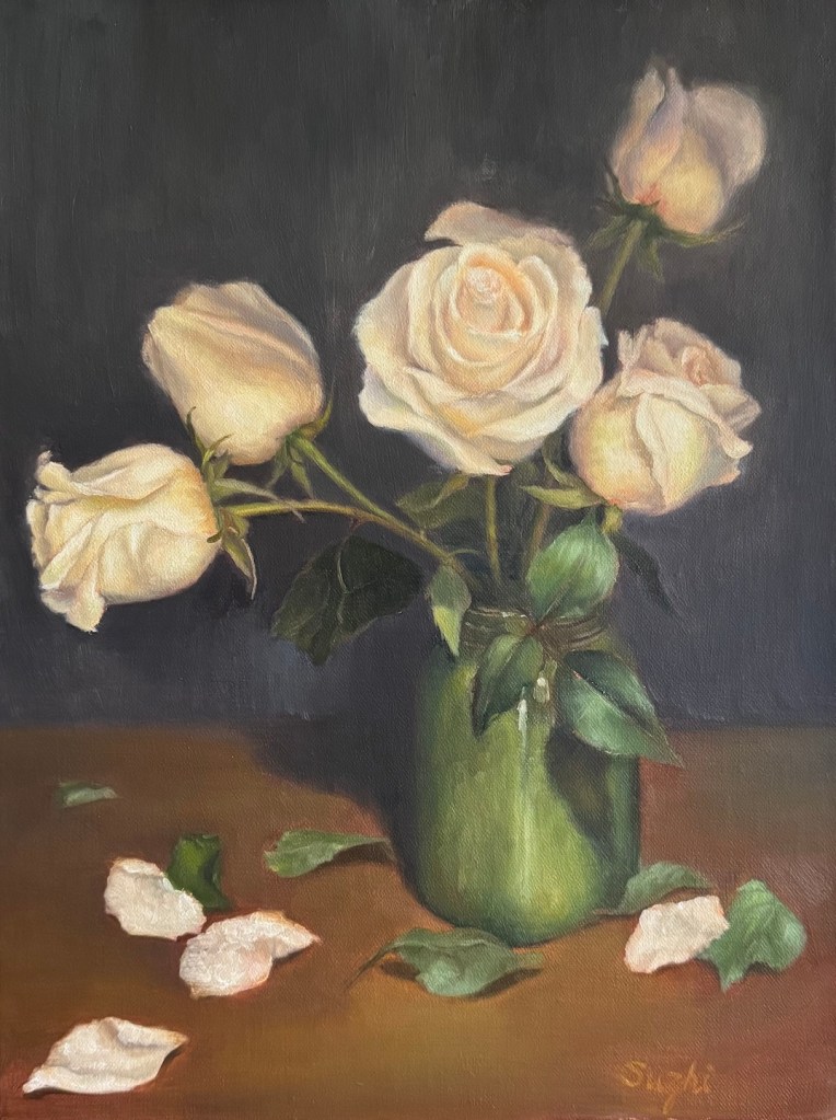

The two with whitish roses were the most challenging. Reflecting on it, white is such a difficult color—catching every bit of light—that I probably should’ve tackled it later with more experience. In the green vase painting, I struggled to make the flowers stand out. Up close, they look fine, but from afar, they’re flat. I had to darken the petal shadows more than I thought I saw to give them depth. The glass vase piece, with its scattered, broken petal pattern, was hard to unify. In the end, I leaned into the chaos, using short strokes to disrupt the background and table too, hoping this fragmented style would tie everything together.
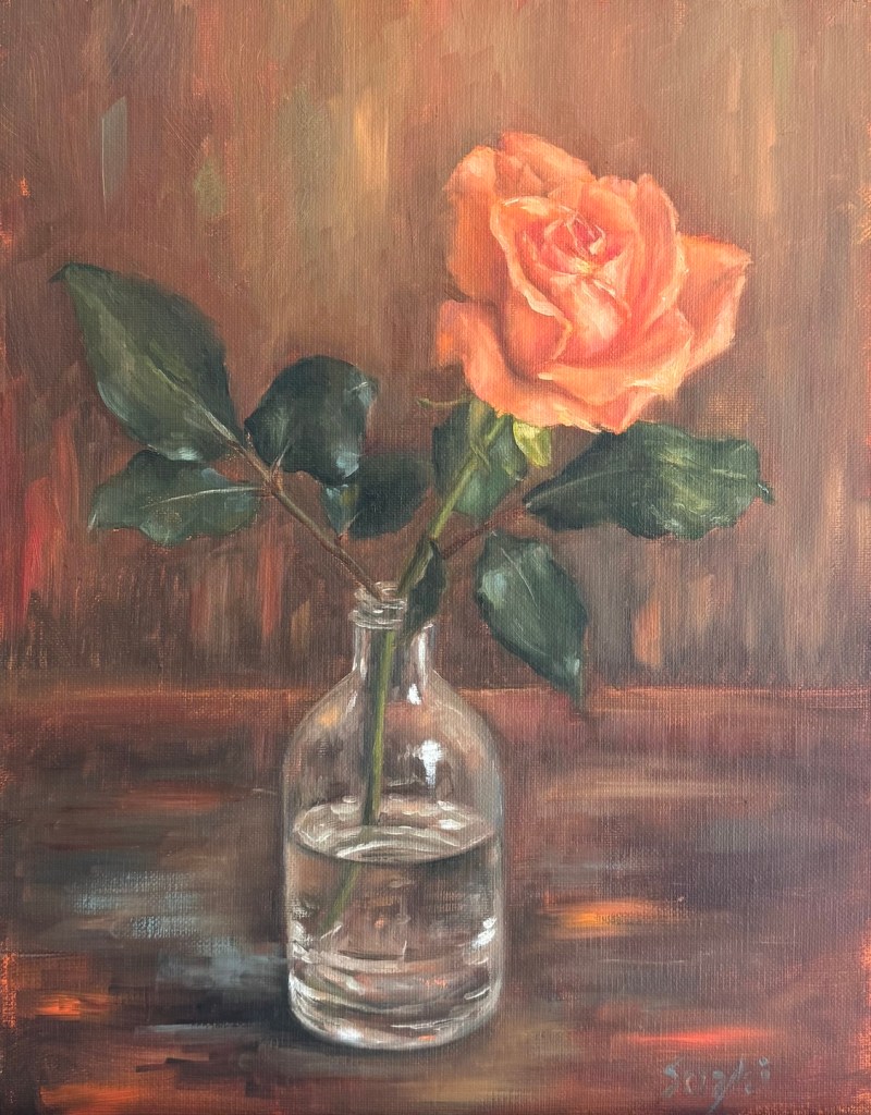
Overwhelmed by the whites, I turned to a warm-colored flower next. The background in the setup had neutral tones and the lighting was plain daylight, but I warmed the surroundings up to match the flower’s glow.
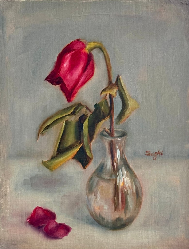
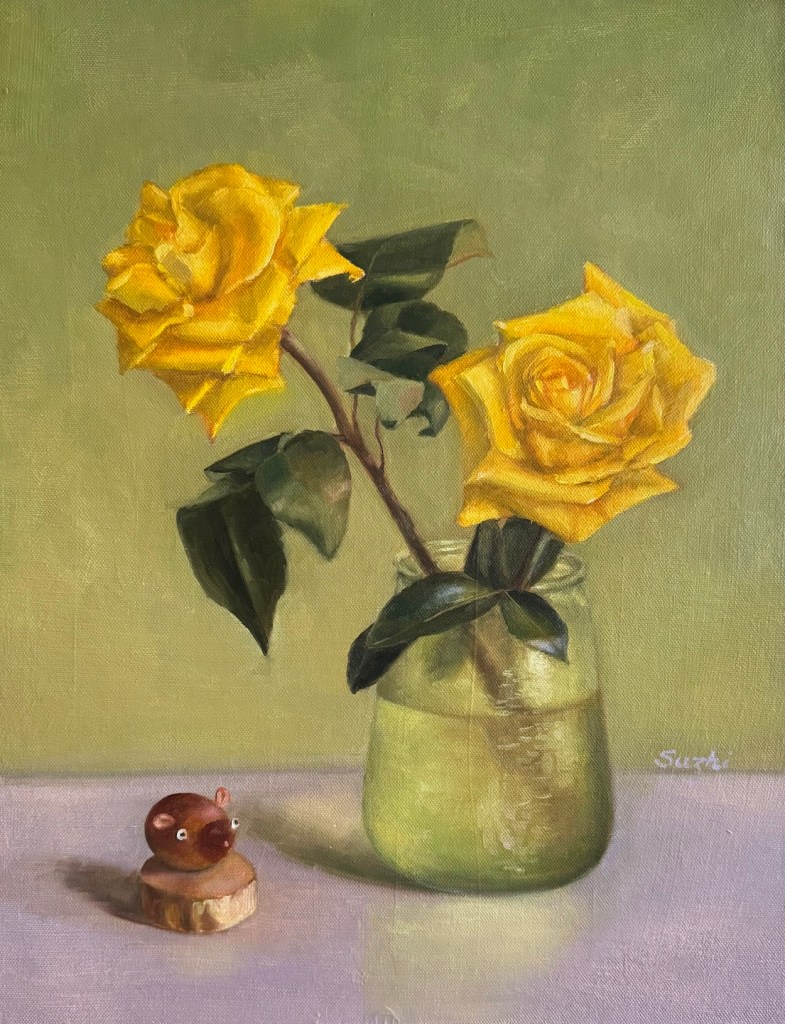
The red rose bud painting brought me the most joy—a small piece I finished in one sitting. Aiming for a quick study, I used bold, decisive strokes to lay down contrasting color blocks. Pleased with the result, I carried this approach into the yellow roses painting, giving it a slightly stylized feel.
That’s my June wrapped up! With summer just beginning and flowers in full bloom, I’m excited to keep exploring.

Pingback: Petal Progress Continued | ZHI SU
Pingback: Petal Progress Continued | ZHI SU