Category Archives: #portrait

A Portrait Detour

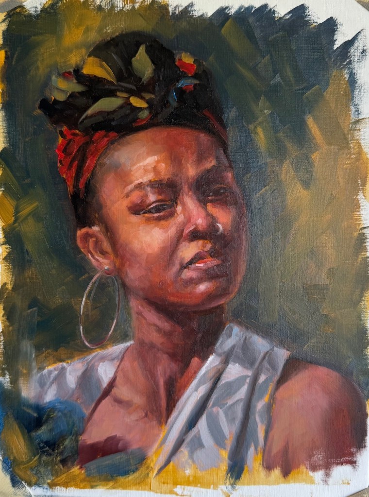
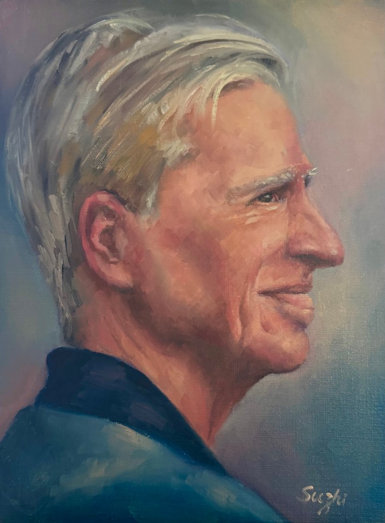
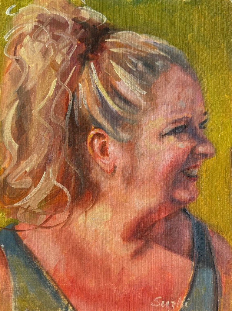
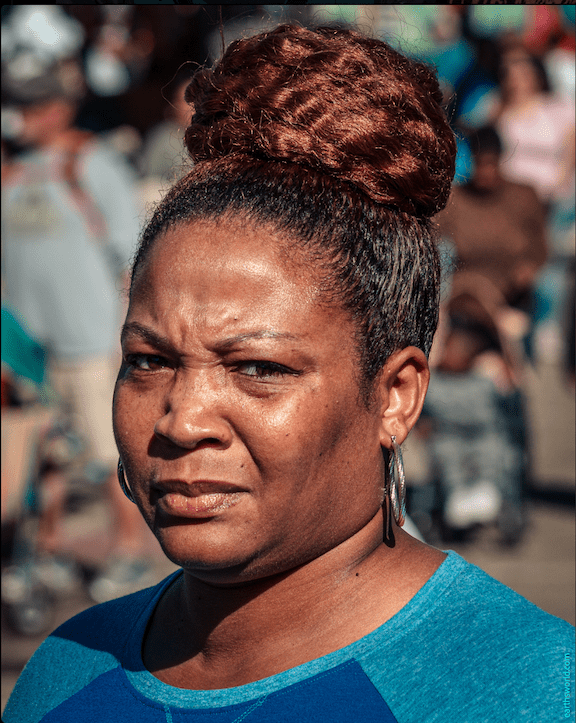
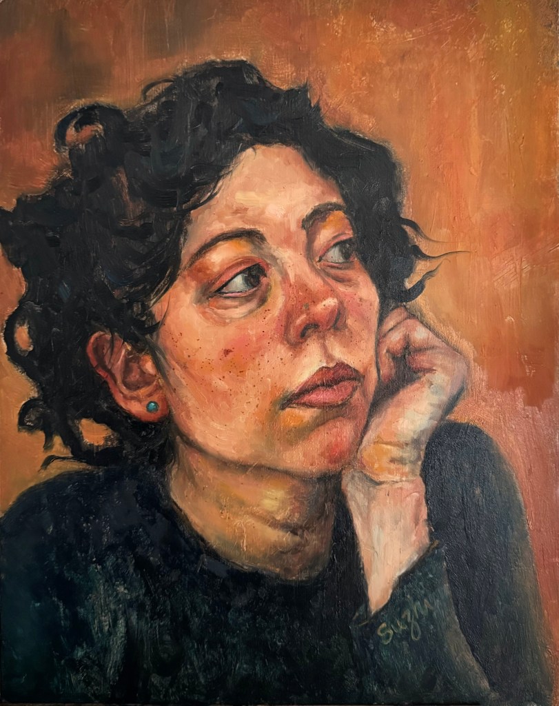
For most of September, I continued working on a new series featuring rabbits. I’ll dedicate a post to that when I’m done, hopefully soon. In moments of frustration, hesitation, or simply needing to look at something different, I distracted myself with a couple of portraits.

The inspiration, once again, came from the one and only earthsworld, though by the time I was done, the original photographs had mostly become scaffolding. I had three things in mind: don’t copy the photo, think in big shapes, and work some patterns into the painting.

I also wanted the two portraits to go in different directions. One would have stronger value and color contrasts; the other would stay closer in value, softer and more subdued.
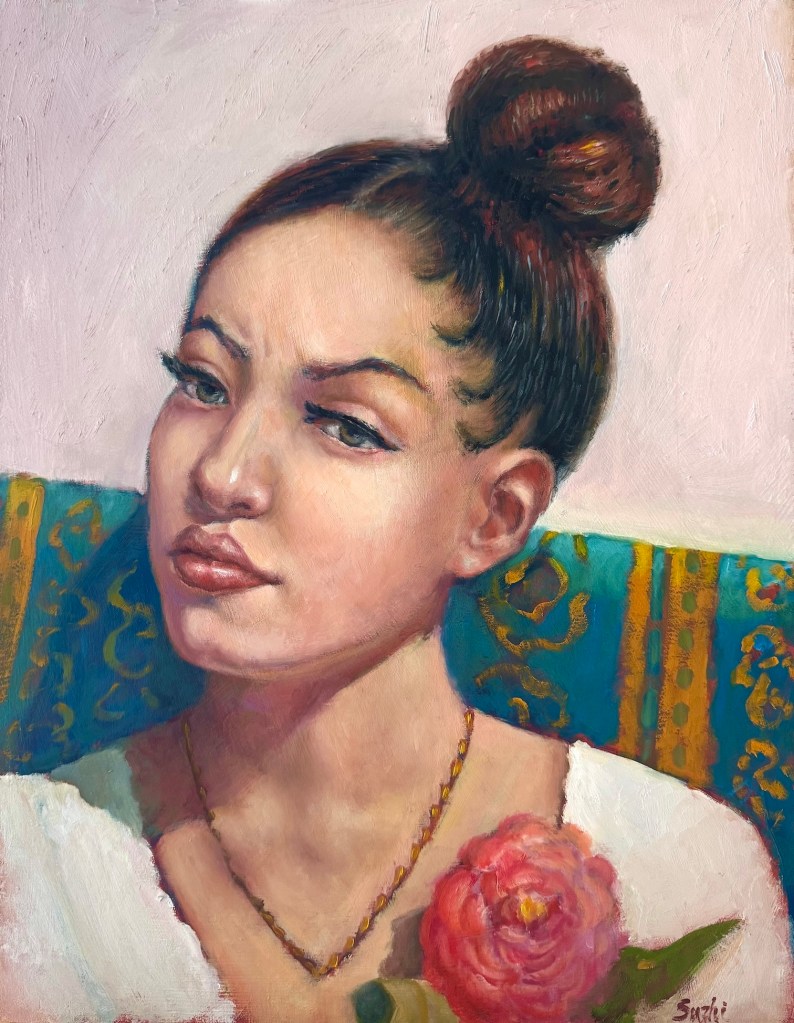
Rose and Teal, oil on board, 14 x 18 in. September 2026

The woman with the high bun was meant to be the colorful one. I started with a fairly simple warm-cool contrast: the warm skin, flower, and touches of gold against that large teal shape running behind her. From there, I tried to let some visual rhythms travel through the painting. The curls and loops in her hair echo the curving lines in the sofa pattern, which in turn pick up the shapes of the flower petals. I didn’t want the patterns to simply decorate the background. Ideally, they would help pull the whole painting together.

For the most part, I think that worked.

The yellow pattern on the teal surface, though, was a little random. I knew I wanted something there, but I didn’t design it carefully enough before painting it, so parts of it feel more improvised than intentional. The flower suffered a similar fate. By the time I got there, apparently I had decided a flower was just a pink blob with enough petals to make its identity clear.

Still, I like the overall effect. The larger shapes remained reasonably intact, and the portrait feels decorative without becoming too ornamental. Most importantly, I managed not to chase every little detail in the reference, which, for me, counts as progress.

The second portrait was supposed to be almost the opposite.
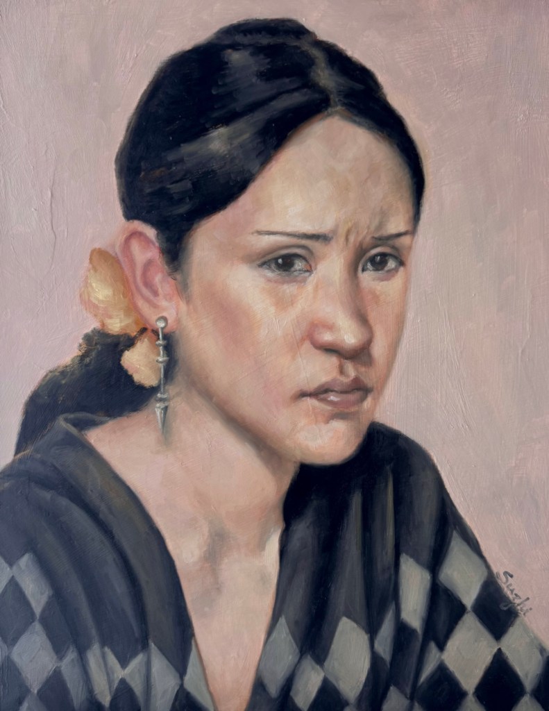
Checkered, oil on board, 14 x 18, September 2026

Before I started, I had a very clear mental image: a pale, pastel-ish painting with a narrow value range. The checkerboard sweater would be loose and barely defined, more suggestion than pattern. The face would emerge quietly from the surrounding grays and pinks. Nothing too sharp. Nothing too black.

That was the plan.

Halfway through, I found myself carefully painting folds into the sweater and defining one checker after another. Apparently the checkerboard had other ideas. Eventually the lower half of the painting became much stronger and more structured than I had intended.

I stopped. Left it alone on the easel for a few days, and looked at it from time to time. 

Finally I decided that rather than trying to drag the painting back toward my original idea, I would follow where it had already gone. I deepened the black of the hair, strengthened the eyes, and clarified some of the facial features. That gave the upper part enough visual weight to hold its own against the sweater.

It is definitely not the painting I pictured before I started. But I like it.

There is something satisfying about the contrast between her very controlled, almost stern expression and all those large geometric shapes below. The darkened hair and the sweater also emphasizes the big shapes I aimed for from the beginning, just much more insistently than expected.

These two paintings reminded me of something that seems to happen over and over in my studio. I start with a fairly specific goal, then at some point the painting wanders off. Sometimes I fight it and make things worse. Sometimes I follow it and end up somewhere more interesting. The art is to pick the battle.

I still want to paint that second portrait I originally imagined: pale, quiet, loosely defined, with the pattern barely there. Someday I’ll give it another try.

For now, back to the rabbits.
Pear Maniac Continued

March kicked off with two leftover thoughts from the previous month. While cleaning up my studio, I also unearthed a block of hot press paper and I decided to give it a try.

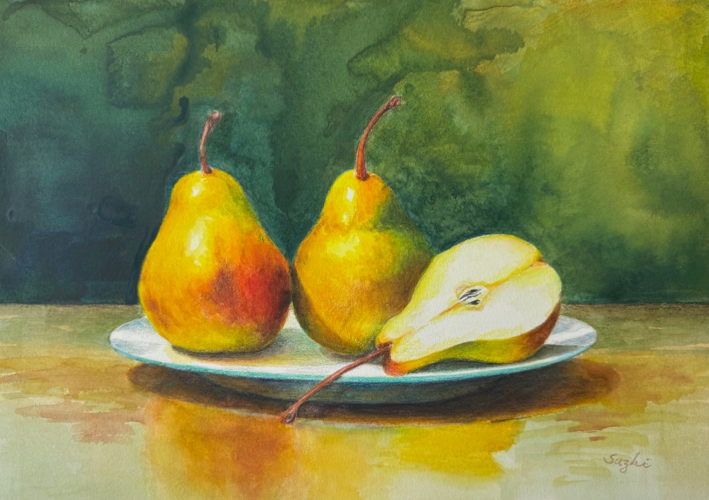
Two and Half, watercolor on hot press paper, 10×14, March 2026

As you can see, I approached it exactly the same way I would on cold press. The water and pigments mostly sat on the surface instead of sinking in, leaving some interesting but completely unintended marks. I do love the extra vibrance the colors gained, but I suspect hot press works best for well-defined shapes with minimal water. (Here’s a beautiful example of what hot press can do when handled right: Painting wet-into-wet on hot-press watercolor paper.)
Meanwhile, I finally tested the Canson Acrylic paper I mentioned before with a layer of shellac. It definitely improved the paint flow.

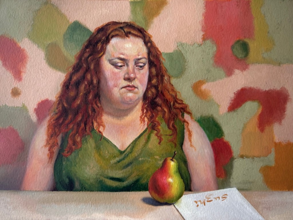
Stare, oil on paper, 11 x 15, March 2026
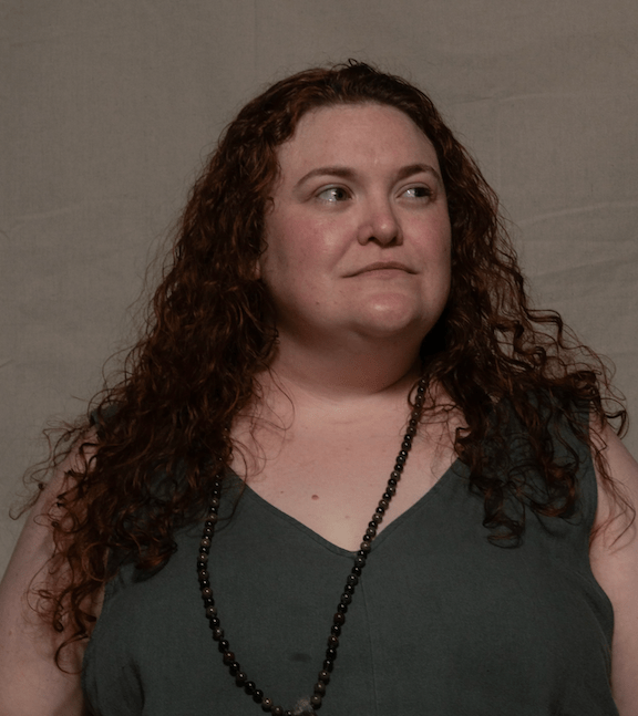
Reference photo from East Oaks Studio Live Stream Session 44

In this painting, I had much less trouble getting the paints to cooperate, but I struggled a lot with designing the woman’s expression and rendering the plumpness. The original reference came from East Oaks Studio, but I borrowed her general features but recreate the overall image to fit my little “plot.”

Next, I imagined a classical, nearly monochromatic head study and decided to practice it on a pear instead. I’m still not sure I handled the edges quite right, but it was a simple enough exercise. I might revisit this idea later.

While juggling all these paintings with their mixed goals, I spent quite a bit of time designing the last two watercolors, both centered on our favorite theme. One is a still life with abstract patterns in the background, and the other is a semi self-portrait.

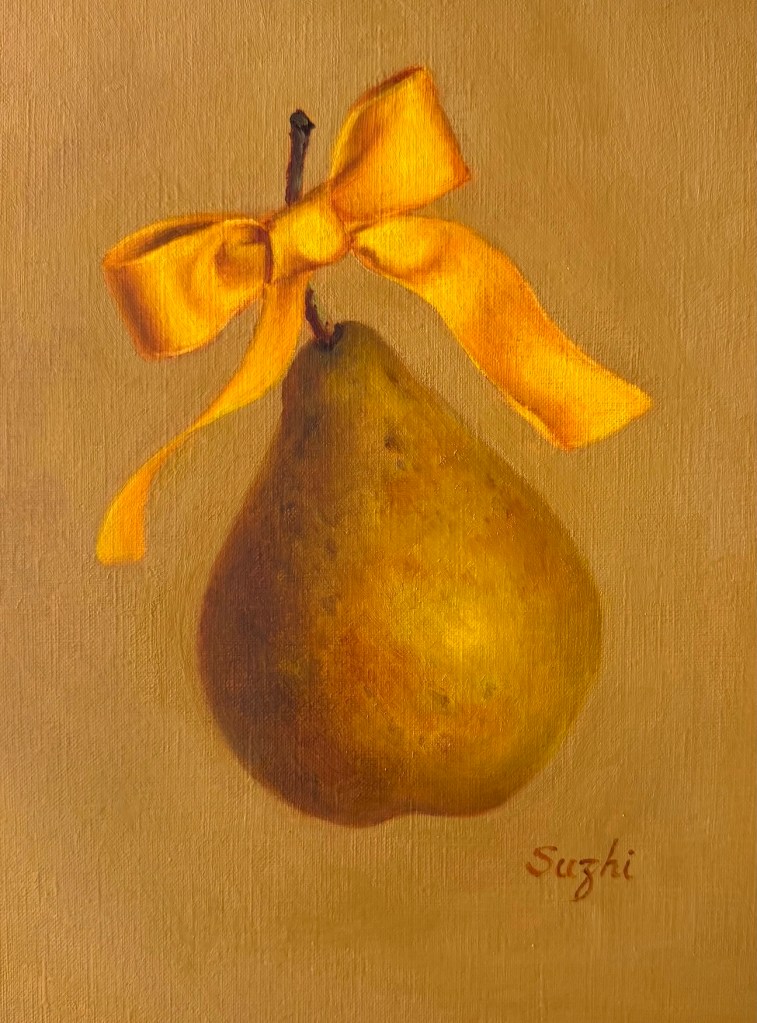
Golden Bow, oil on paper, 9 x 12, March 2026

My original vision for the still life was actually a painting with much more elaborate, sharply defined patterns in the spirit of Klimt, in oil on canvas or watercolor on hot-press paper. Either way, it would have been a much more time-consuming project. I’m still holding onto that thought. This simpler cold-press version became more of a test of the main composition. I may come back and develop the idea further in the future.

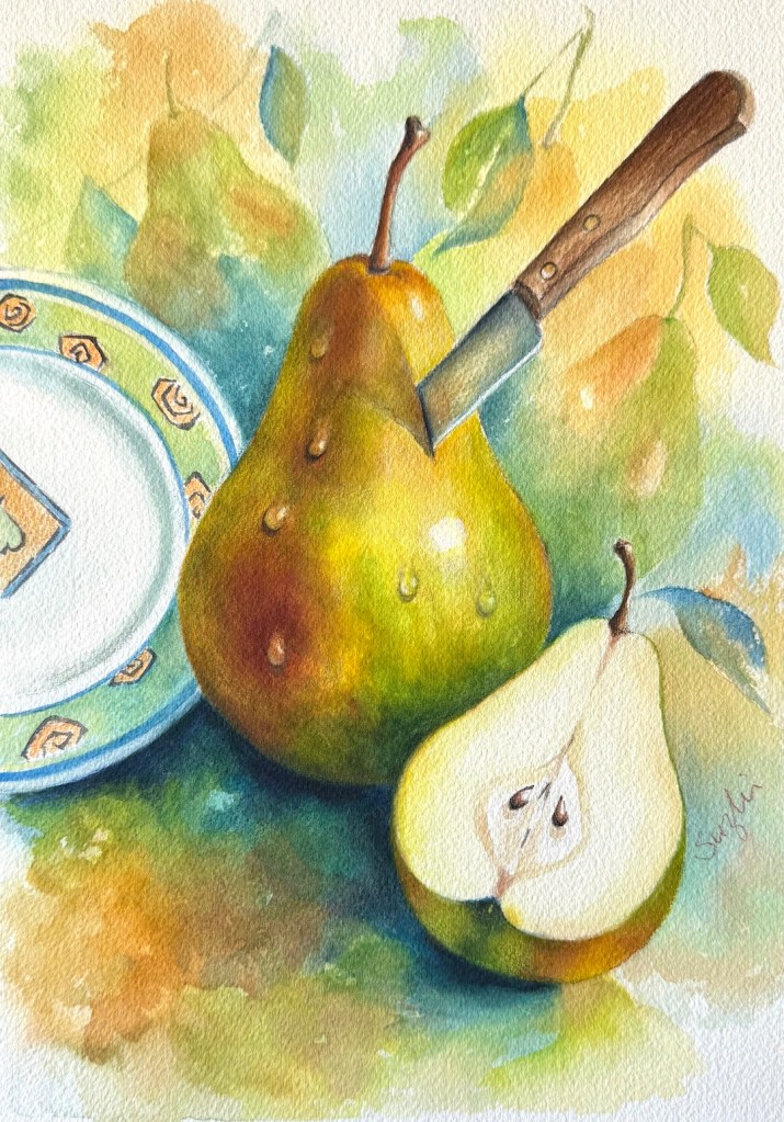
Knife and Plate: watercolor on paper, 10 x 14, March 2026

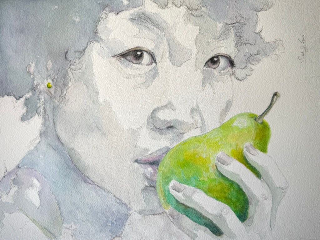
The final piece is, in my opinion, the best design of the month. I wanted a flat, almost monochromatic self-portrait (of course it’s a younger and prettier version of me), paired with one very saturated, juicy pear. In my original sketch, the head was meant to stay much flatter and more abstract. But as I painted, I couldn’t resist sharpening the features, especially around the eyes. I’m still not sure whether that was an improvement or a distraction. I had to drag myself away from the piece so I wouldn’t overwork it into a full realist portrait.

Kiss or Bite, watercolor on paper, 10 x 13, March 2026

Overall, I love the design, the visible pencil marks, and that satisfying feeling of something unfinished yet strangely complete.

March turned out to be a fruitful month. Am I done with pears? Check back in a month.

Experimenting with Portrait Creation

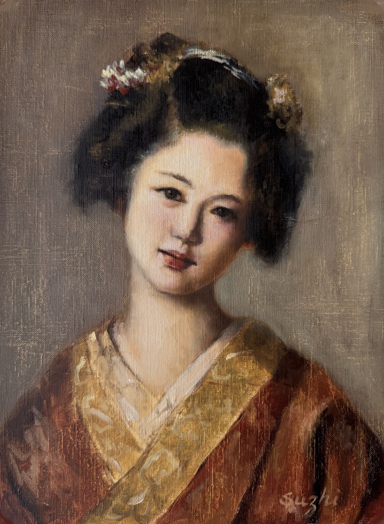
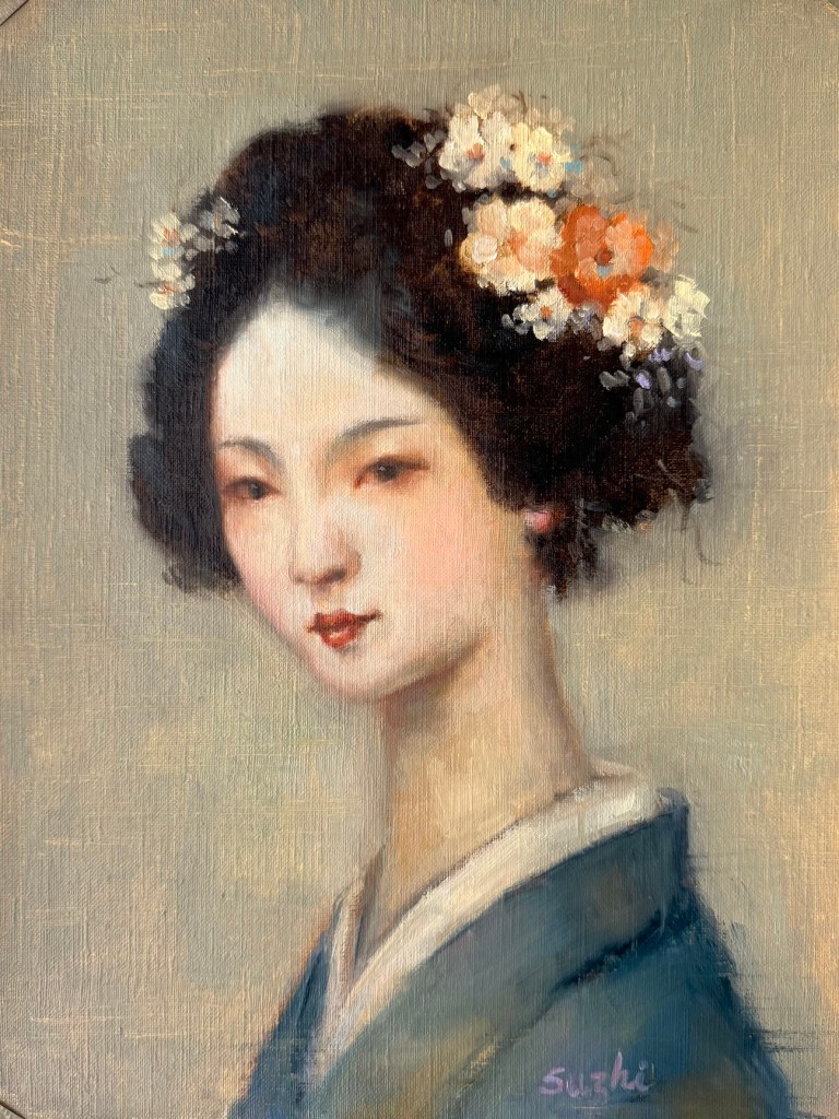
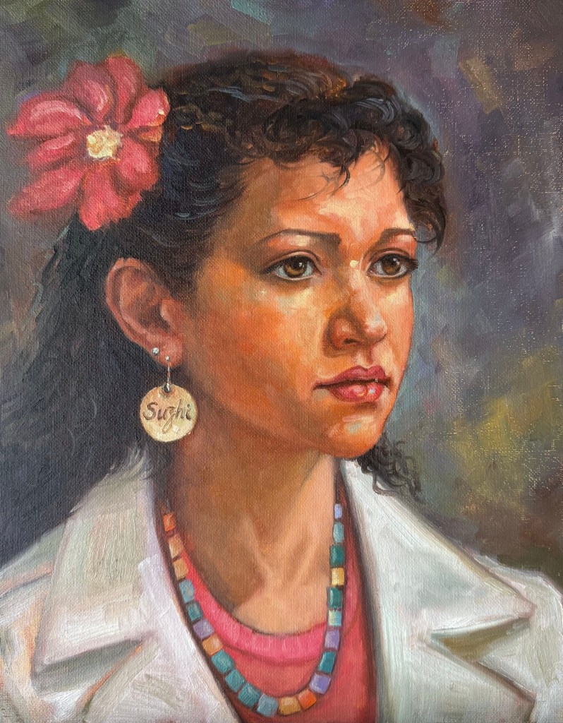
The freedom I enjoyed while painting the last sketch in August encouraged me to keep experimenting along the same path. I began September by completely abandoning human references. My logic was simple: if I didn’t have a photo to lean on, I could concentrate on artistic expression. Too often, when I started a portrait, I had ideas beyond likeness and accuracy, but as the work progressed, those ideas got lost in the pursuit of a “correct” painting.

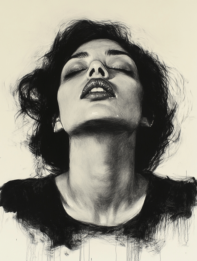
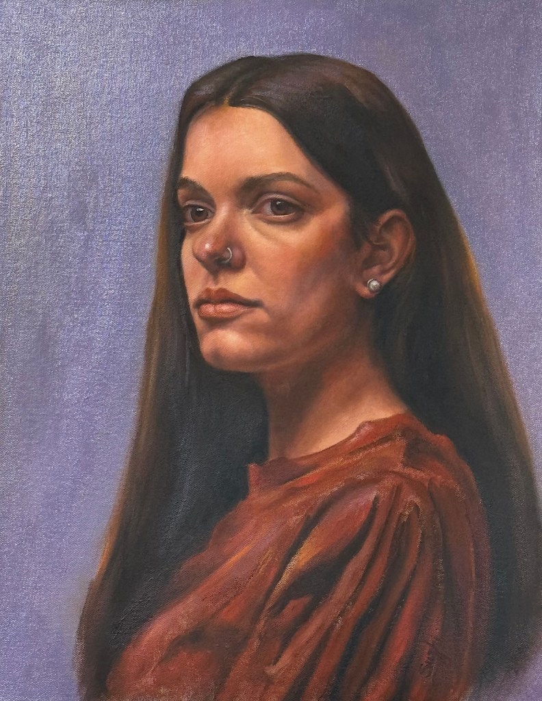
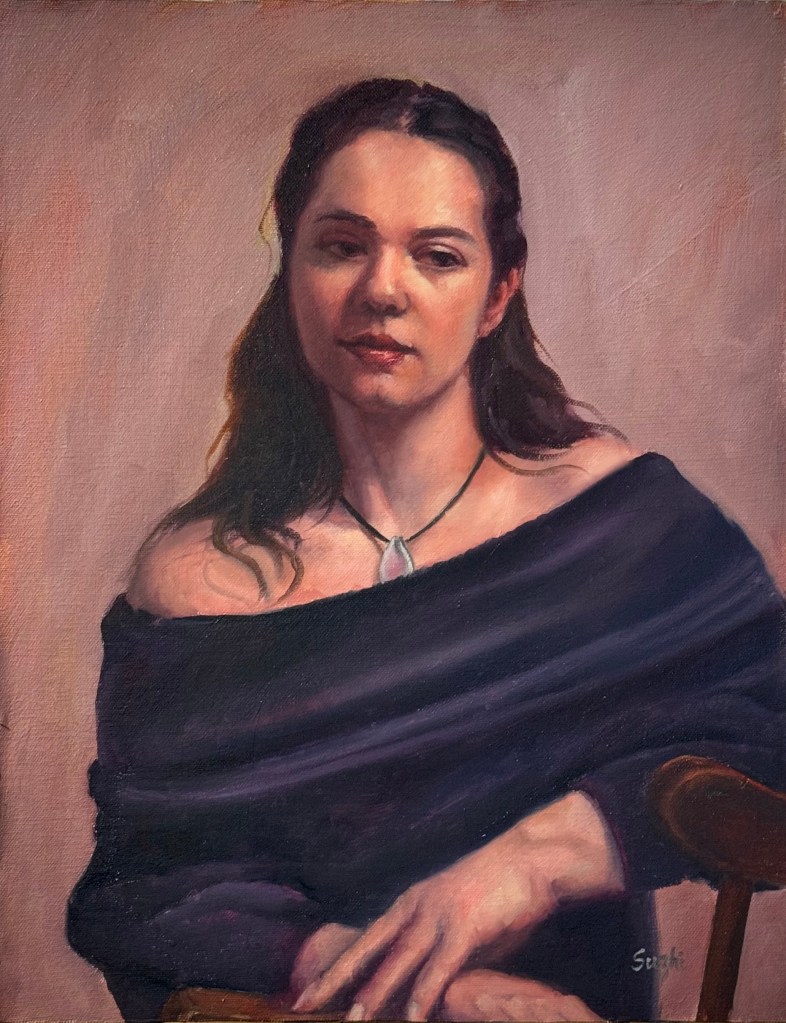
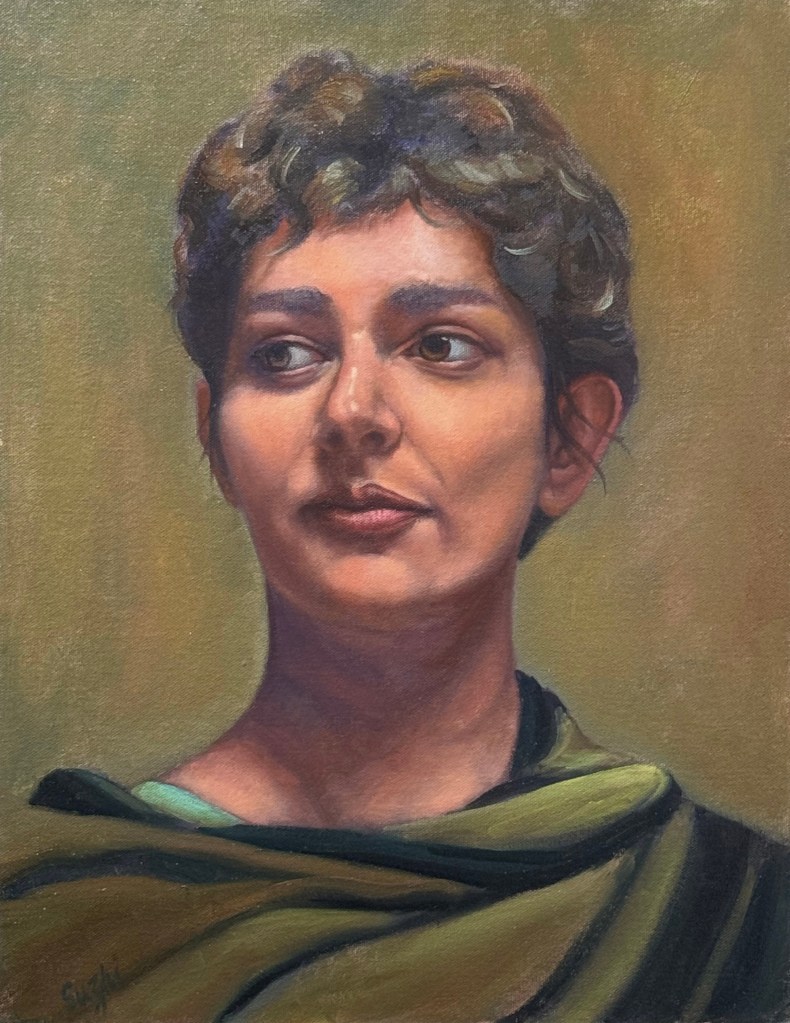
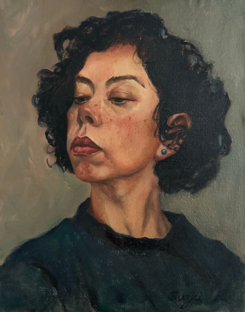
I began with two portraits of traditional Japanese women, aiming for an atmosphere of softness and antiquity. Next came two modern women, with a focus on expressiveness. Here are the paintings:

To some extent, I think I achieved what I set out to do—especially in the paintings of the modern women. Looseness has always been difficult for me when a photo sits in front of me. But these exercises also revealed a problem: without a reference to a real person, my “inventions” tend to drift toward the generic and idealized. If I kept going this way, the future paintings might all start looking alike.

So in the next piece, I returned to reworking an actual photo reference. While I liked the result, the painting tightened up compared to those done without references.

Then I tried something in between. I didn’t use a photo, but I did use a face I know very well. Instead of inventing features from scratch, I largely followed what I thought was me (with plenty of upgrades, of course). The result was also somewhere in between. It’s not as loose as the invented portraits, but more relaxed than those painted from a photo. And to be honest, I really like my new look.

One more thing delighted me in these experiments: I’ve been thinking and tried in recent years about returning watercolor (without abandoning oil). In some of these works, I managed—at least partly—to capture the fluidity of watercolor I’ve missed so much. It’s not perfect, but it’s got me excited to keep playing around.

Portrait Sketches +

August was a busy month for everything except art. I only managed a few portrait sketches. It’s been a while since I focused on this genre, so for inspiration, I turned to my beloved photographer, Earthsworld, whose work I referenced in a small series called “Turquoise in Earth’s World.”

Unlike those turquoise painting, this time I spent at most 2 to 3 hours on each piece. I started every one with a Zorn palette, but sometimes deviated from it later on for convenience. Some sketches are on paper, others on canvas board. In most of them, I aimed for a resemblance to the reference, and only simplified the backgrounds or clothing patterns for aesthetics and to save time. The exception is the last one, where I attempted something creative – I used Earthsworld’s photo only as an inspiration to reinvent a character in my mind. As you can see, the neck area doesn’t make much sense anatomically, and if this becomes a full painting, I need to and will spend more time figuring it out. Enjoy:

The last one:

Petal Progress Continued

July kept the floral theme in my studio, with petals and my learning progressing. 

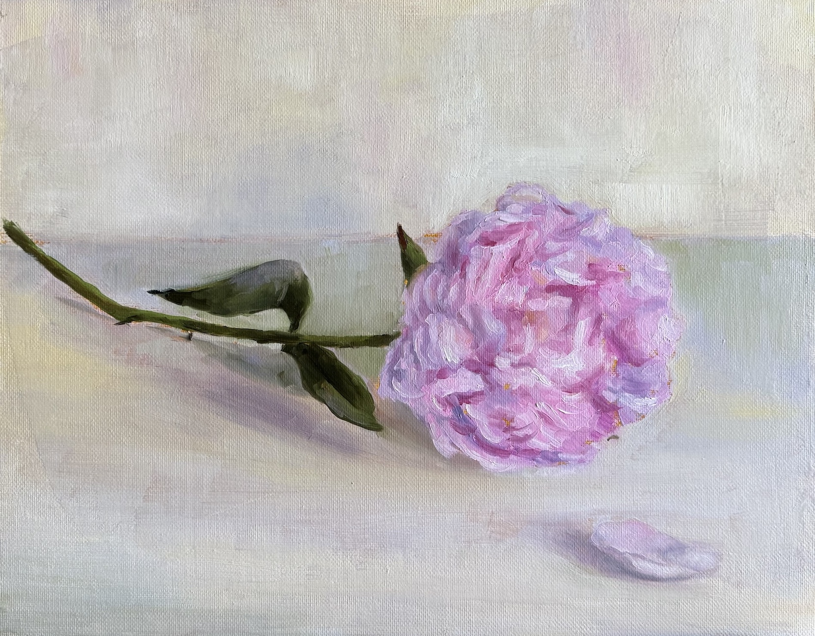
First up, I tried my hand at a peony. As I have mentioned before, Michael Klein is a big influence to me in the floral adventure, and peonies are featured in many of his creations. Those fluffy blooms look dreamy, but they’re a nightmare to paint and arrange. Petals were numerous and messy, dropping faster than I could arrange them in any manageable shape — whether in vase or on canvas. Soon I gave up my grand vision of a complex still life, and managed a simple single flower sketch.

Peony, oil on canvas board, 11 x 14, July 2025

To comfort myself afterwards, I moved back to roses, a familiar subject. I thought a Trompe l’oeil (French: deceive the eye) would make the painting of a single rose more challenging and fun. The idea was basically a hyper realistic painting. Getting the shadows and texture just right was trickier than I expected. My rose still looks like a painting. Here I have a better understanding of why people always say you don’t paint exactly what you see, even in a realistic painting. I used ambient room light in my setting, and the rose was largely in a unified color. To make it “pop”, I need to accentuate the value contrast, vary the saturation, and better define the edges. To make it look real, I need to invent the reality – how ironic! As you can see, I didn’t go through these steps. I am not entirely sure I have the skill to reach the final goal, and honestly, I like the painting as is now. Sometimes you call it done and move on.

Yellow Rose, oil on canvas board, 9 x 12, July 2025

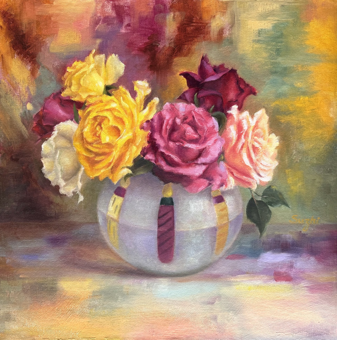
Next came a colorful bouquet, and my strong desire to paint something vibrant. In setting up the reference, my first thought was a dark, solid background for contrast. It worked, but it felt too safe. Leaning into the chaos, I draped a multicolored scarf behind the bouquet. I painted the scarf and surface in an abstract style, playing with saturation and value to keep things lively but balanced. 

Colorful, oil on canvas board, 18 x 18in, July 2025

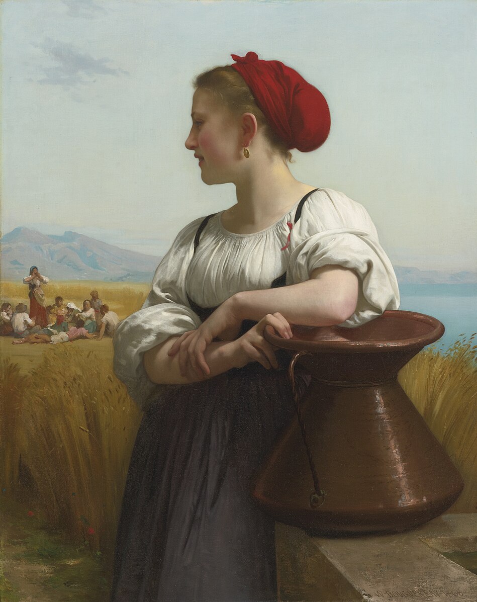
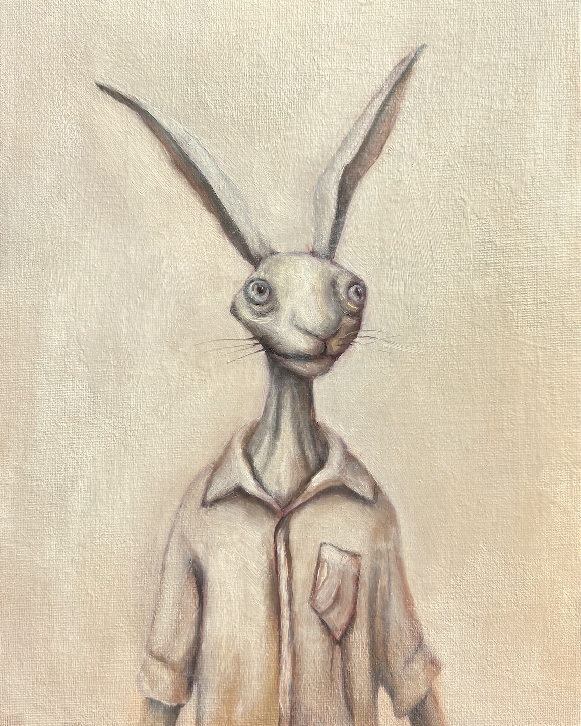
Between these floral adventures, I did a partial study of a Bouguereau painting. I’ve always admired his delicate and subtle handling of human faces, and this is also a study of handling backlighting. The softness is achieved through close value and gentle brushwork. When the entire face is away from light, the values are further condensed – something I still need to work on. I also painted a “selfie” as an alternate character—don’t ask. I was hoping for a Morandi-ish low-chroma tranquility… or, a quirky experiment in calm tones.

Selfie, oil on canvas board, 8×10 in, July 2025

Lastly, MidJourney has pushed out video generation in recent months, and now you can upload your own image for animation (see the painting for the first video here). Like these:

Don’t laugh. The bizarreness comes from my own skill issues – both in painting and in prompting. Look at the shadows in the second video, that wisdom wasn’t from me. There are millions of fantastic generative videos out there for us to see the potential of extending and alternating the life of our paintings. Always more things to experience and explore!

The Making of a Selfie

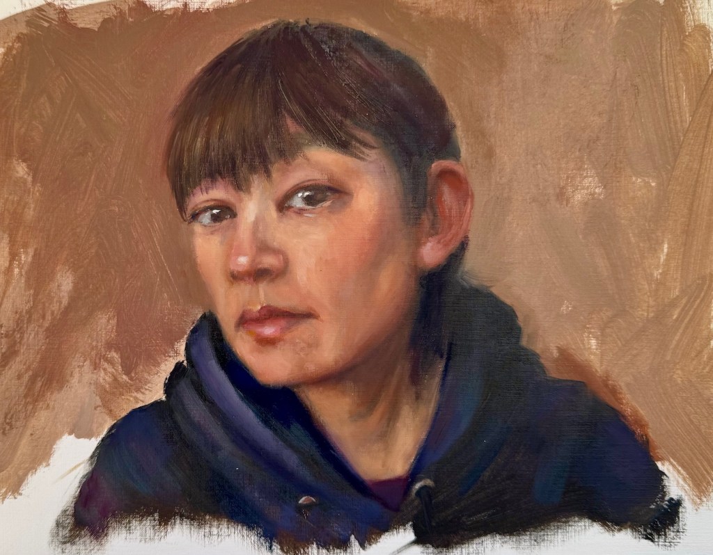
Two things have become a common practice for me. One: after a break from art making, I get back into the practice with some quick portrait sketches. Two: when I’m stumped for ideas, I turn the brush on myself and paint a self-portrait. Back in January, after a string of trips, I followed this pattern. I painted a series of head sketches. One of them was me – live model with a fresh hair cut, why not?

Each time I painted myself, the likeness never feels right, and limited by the using of a mirror, the expression and posture often come out stiff and uninspired. So, did this sketch have the potential to be developed into a real painting? What could I do to make it better and more engaging?

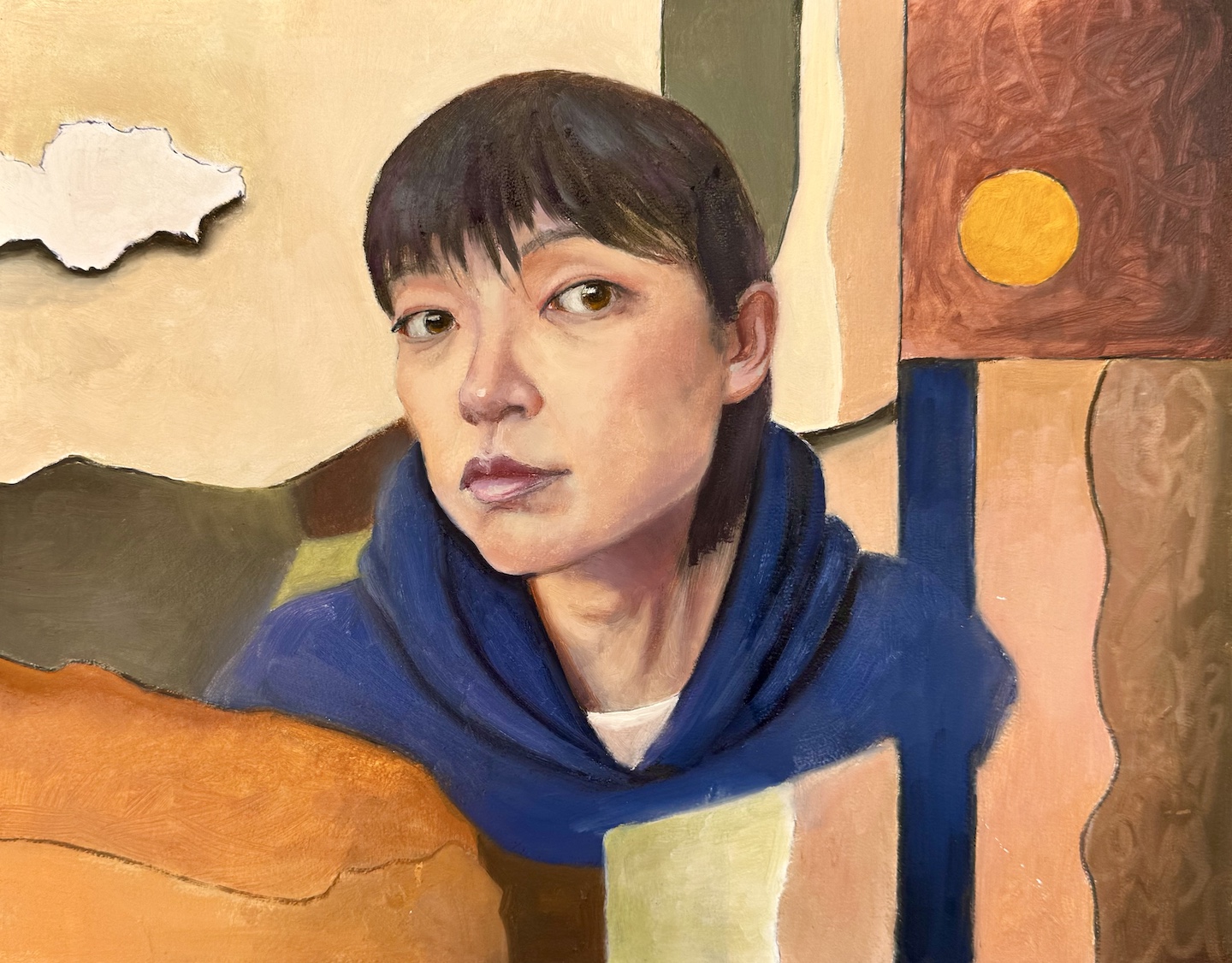
In a more serious attempt, I envisioned a flatter and more stylized approach. I picked warm tones close to my skin color for the background – partly for harmony, partly to pop against my blue hoodie. I used abstract shapes to balance the realistic face. To lean into the flat design, I outlined everything with a Sharpie first, and then filled in the colors, letting some of the black lines show through. The collage-like result is a step up from the sketch. I wanted the face to stay more stylized and almost blend into the fragmented background, but the more I worked on it the more it slid back into a standard realistic portrait. Eventually, I just stopped.

Me, oil on board, 11 x 14 in, Feb. 2025

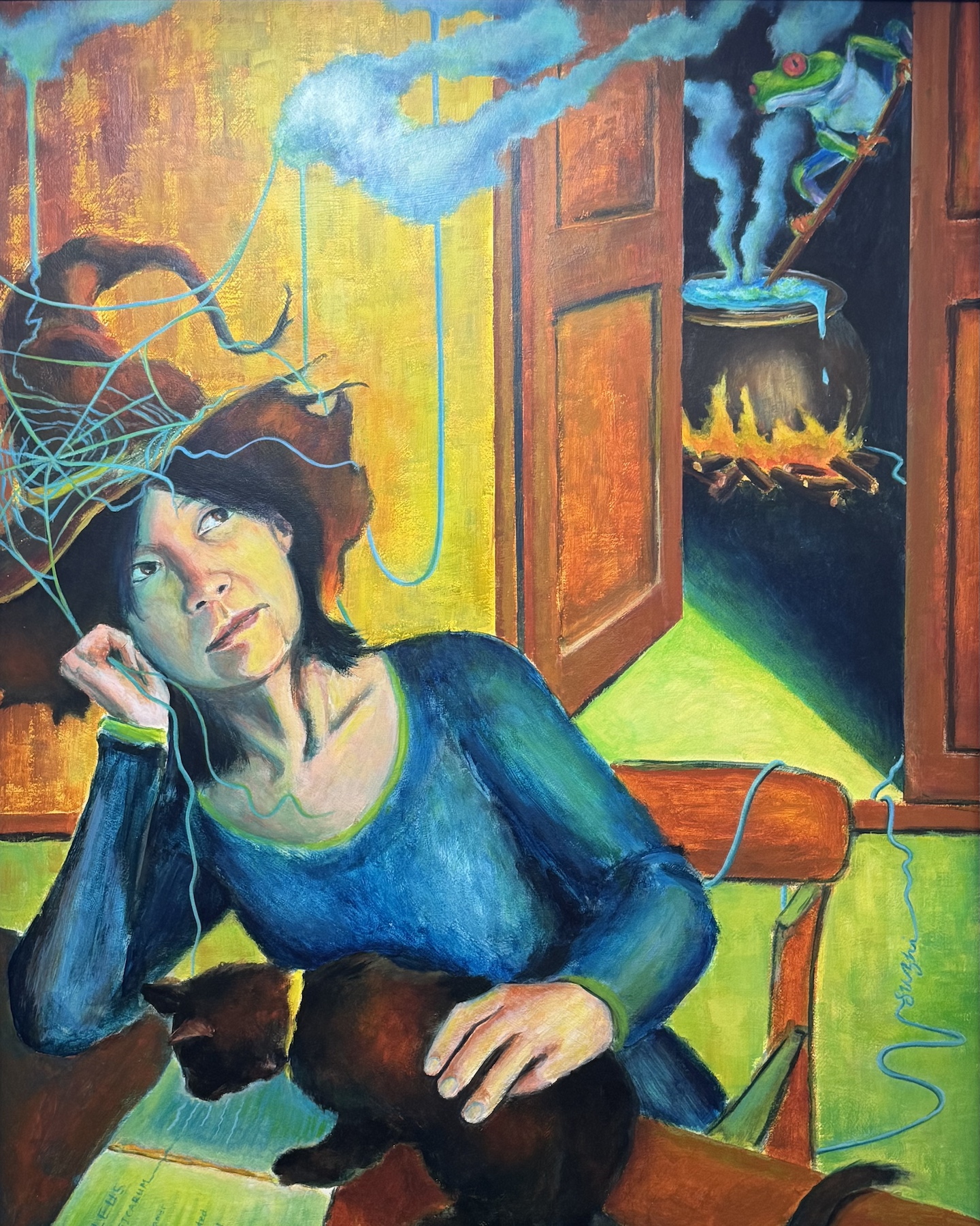
That got me thinking: Is aesthetic the only thing I could work on? What else could I do to make the painting a bit more meaningful? I recalled a self-portrait I did years ago in a class. The teacher told us to paint ourselves in a different role. I went with a witch – surrounded by classic witchy themes with my own spin: a frog brewing potions and a black cat reading the Malleus Maleficarum (often considered the first major anti-witchcraft document). While the painting was crude in execution, but dreaming it up and piecing it together was a blast.

Me, acrylic on board, 30 x 24i in, April 2020

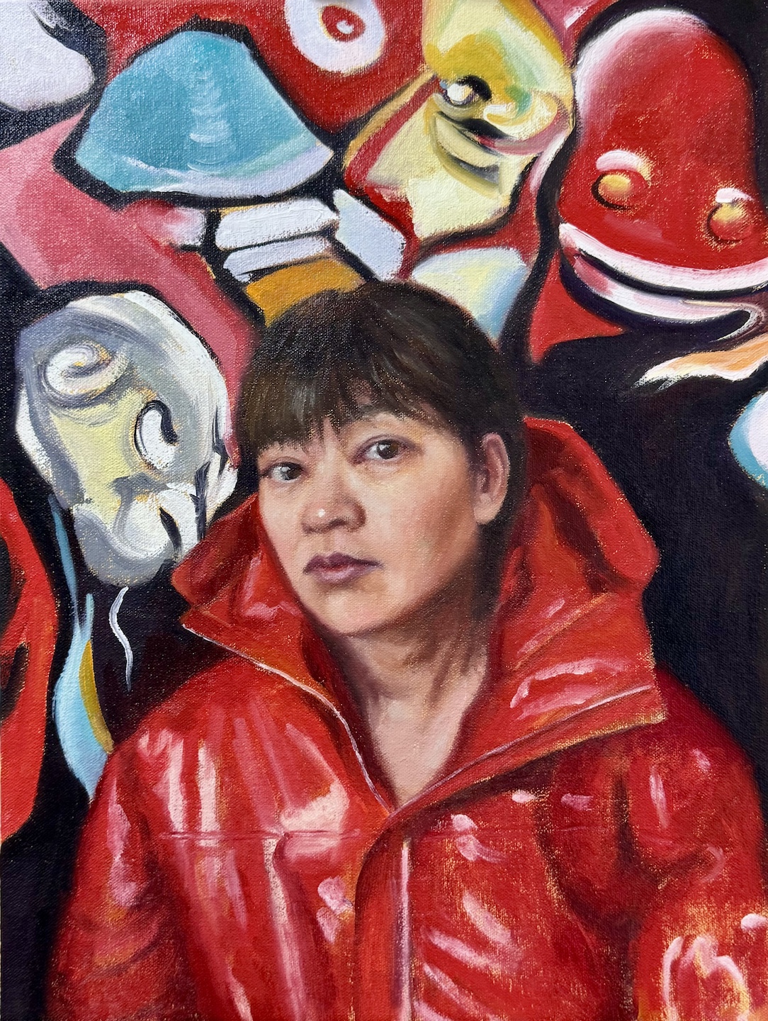
So why not give it some character? Pick a costume I’d never wear in real life (I’m a muted-hoodie kind of person), or visualize some thoughts I usually keep under wraps? I went for a bolder color and more dynamic palette. I still wanted the face to feel like part of the design, but this time, I let it be drowned by the unsettling shapes, vibrant colors and swirling energy. I kept the ideas of black outlines but used the paint instead of Sharpie this time, allowing more varied and expressive marks. That hint of punk—is it just wild imagination, or a quiet piece of me sneaking out?

Me, oil on canvas board, 12 x 16 in, March 2025

In retrospect, neither of my paintings addressed the likeness or posture issues that bothered me in the first place. In the process of further creation, they became irrelevant. Painting’s at its best when it’s a journey—when it’s messy, exploratory, and forces you to reckon with yourself.

Art Podcasts – My Short List

Most of the time when I paint, I listen to audiobooks and podcasts on a variety of topics—philosophy, technology, economics, even geopolitics—the majority of which aren’t art-related. I find music distracting, as if the two art forms are vying for my attention. The eclectic mix of subjects I explore keeps me engaged, and even when I don’t fully grasp the discussion, the thrill of learning something new oddly fuels my creativity and deepens my focus on painting.

That said, I do follow a handful of art podcasts from time to time. My initiation to this experience was The Draftsmen Podcast, hosted by artists and instructors Stan Prokopenko and Marshall Vandruff. They dive into the craft of drawing, painting, and image-making, offering practical advice for aspiring artists—especially those skipping art school—on finding resources, building a self-learning system, and promoting their work. The podcast ran for three seasons before pausing due to the hosts’ busy schedules, but all episodes are still available on YouTube. Even if you don’t listen to the old talks, check out their channel for the episode covers—hilarious parodies of famous paintings featuring the duo. It’s a clever, arty touch.

The Week in Art from The Art Newspaperis my go-to for global art news. It delivers insider insights into exhibitions, museums, and auctions. Sometimes it  also covering major copyright lawsuits and policy changes that ripple through the art world—content I’d otherwise overlook. It’s the one podcast I can truly “listen” to without needing visuals.

My favorite and the most relevant is The Undraped Artist, hosted by Jeff Hein, a master realist painter himself. His guests are some of the world’s most accomplished traditional artists—like Jeffrey T. Larson,Michael Klein,  Scott Christensen, Alex Venezia, and Mario A. Robinson. Interviews typically begin with the artist’s early days in art, trace their career paths, and explore insights on painting techniques and professional growth. Jeff often examines the guest’s work on air, offering comments and asking questions. For this reason, watching on YouTube—especially during these segments—is ideal, though the audio alone is still rich with inspiration.

A fresh addition to my list is Idiosyncratic Nightmare, where hosts Michael Klein and Stephen Bauman—both highly accomplished realist artists—interview a guest while creating their portrait. In the first two episodes, Bauman sketches with graphite, and Klein paints in oil. It’s like watching two master demos unfold simultaneously, paired with a thoughtful conversation. The candid interview with Tania Rivilis taps into the struggles almost all artists experienced. It is a comfort and encouragement at the same time. This one’s a must-watch on YouTube, and do stay till the end of each episode where the duo speed painting their portrait to a more finished stage. I’m rooting for this podcast to take off.

Finally, there’s Talk Art, recommended by my pal Grok3. Hosted by actor Russell Tovey and gallerist Robert Diament, it’s possibly the longest-running art podcast around, now in its 24th season. I haven’t tuned in yet, but I’m excited to explore its extensive interviews with artists of various caliber—also not just realists, but a broader mix of voices from the art scene. With so many back episodes, it’s a goldmine for anyone needing something to listen to while painting.

Share your favorite and happy listening—and watching!

Master Studies and Some More

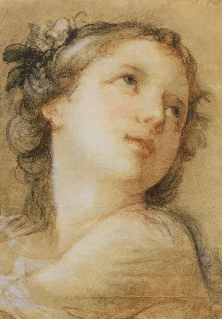
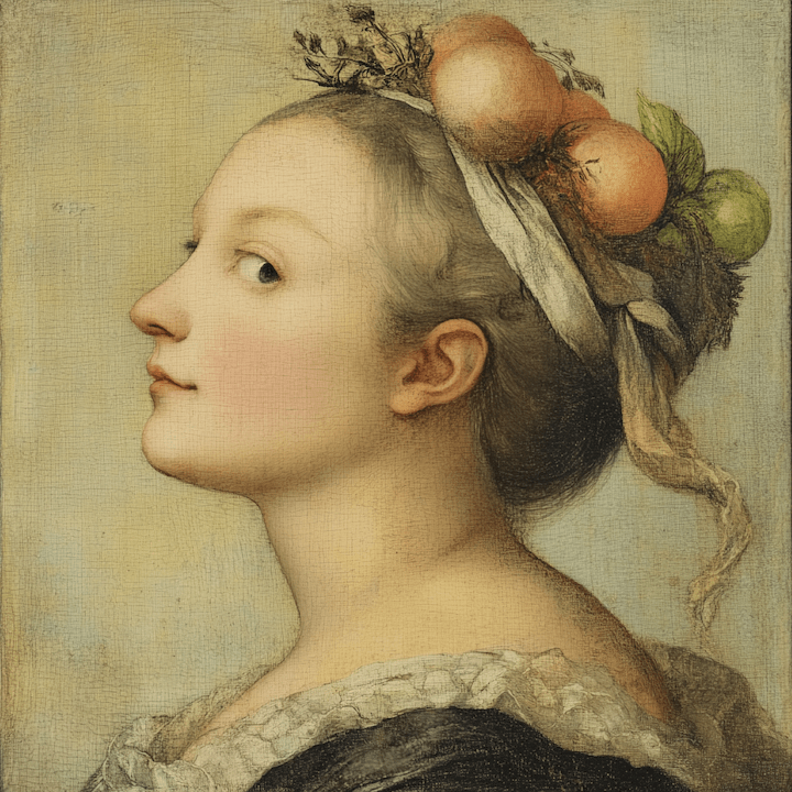
Charles-Joseph Natoire (1700-1777), a prominent French Rococo painter and draftsman, was celebrated for his decorative paintings, mythological scenes, and religious paintings. Natoire was one of the artists who helped popularize the use of pastels in the 18th century. He often employed delicate pinks, blues, and greens to create a light, airy atmosphere in his works. His paintings are characterized by their pastel hues, delicate brushwork, and a playful charm.

“Head of a Bacchante” (1741) is a fine example of his mastery in pastels. A bacchante, a female follower of Bacchus, the Roman god of wine, fertility, and theatrical performance, is often depicted in art as ecstatic or in states of divine possession.  Pastel allows for a softness and blendability not easily achieved with oil paints, making it ideal for capturing the delicate features and expressions of mythological figures.

I saw this painting at the Getty Center, where I was drawn to Natoire’s emphasis on grace, charm, and a certain lightness. The luminous quality of the skin tones, achieved through soft, atmospheric light, created a sense of intimacy and warmth. His fluid, graceful brushwork contributed to the overall elegance, and a well-controlled value range allows smooth transitions between forms.

In attempting a master copy, I focused on replicating the subtle value changes. I have a tendency of using high contrast and high saturation in my own portrait painting. I hope, by compress and control the two, I could achieve a softness and luminous effect that is missing in my works. While oil paint is not as ideal to achieve this goal as pastel, I figured I would still learn a lot by pushing it as far as I could. I started a bit too heavy handed, and later had to spend layer upon layer to lighten things up, and contract the range of values. The result still felt too defined in some places, lacking the ethereal quality of Natoire’s original. Some of the airiness of the original comes from Natoire’s dancing line work, which I don’t have the skill to imitate with a brush. While Natoire captured a goddess, I painted a mortal – a lovely one, I think. 

After Natoire, oil on canvas board, 9 x 12 in. August, 2024

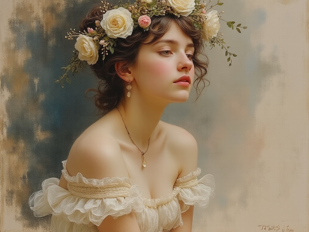
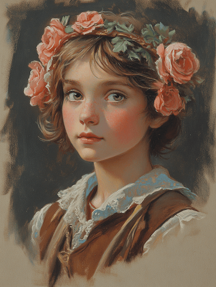
Curious about modern interpretations, I requested a pastel painting of a bacchante from both Grok 2 and MidJourney 6.1. Grok gave me a photo-realistic beauty with a somewhat painterly background. It seems Grok doesn’t respond well to traditional medium. MidJourney, on the other hand, at least attempted to emulate ‘a painting.’ 

One can also twig the many perimeters MidJourney offers to achieve varied result: 

If I provide Natoire’s original as a prompt, MidJourney could fake a couple of masterpieces:

Me and my bots, we all had fun!

Some Filler Projects

There are a couple of still life projects ongoing, and in between, I completed a few portraits using models from East Oaks Studio’s live streaming. Previously I focused on trying to finish the sketch, smaller in size, within 2 to 3 hours, aligning with each streaming session. This time, I used bigger panels, and allowed myself as much time as I wanted. The results are more rendered and complete-looking pieces:

Evee, oil on canvas panel, 14 x 18 in, July 2024
Tina, oil on canvas panel, 14 x 18 in, July 2024
Kailey, oil on canvas panel, 14 x 18 in, July 2024

A few notes:

  • I call these “filler projects” because they were not part of my summer plan. However, I find that while waiting for a layer to dry, or stalling at certain stages of the painting, doing something different alleviates my anxiety. It’s so much better than idling around not achieving anything!
  • I neither went for close likeness nor the exotic look in my previous Schiele-ish attempt. However, I do feel that Schiele exercise has left its mark.
  • For me, the greatest gain from these paintings is that I have started to consolidate my method. In each case, I started with a Zorn palette, and added to it as I went on.
  • Mix it up and never stop painting!

Channeling a Bit of Schiele?

Feeling a bit lost with my portrait practice recently, I ventured to try something new. I was attracted to the works of the Austrian Expressionist, Egon Schiele (1890 -1918) by his unique use of colors and lines, and his focus on conveying strong emotions. After indulging myself with his art for a while, I have a desire to break from likeness and accuracy and focus on a feeling, a mood, or an air. Hence the following:

Monica, oil on canvas board, 11 x 14, May 2024
Still Monica, oil on canvas board, 11 x 14, May 2024
Annie, oil on canvas board, 11 x 14, May 2024

A few notes:

  • These are not done as studies of Schiele. I personally don’t think his style is replicable.
  • I tried to manipulate the mood with different color schemes.
  • I deviated from the reference a lot, with invented or exaggerated expressions.
  • As always, I found my shaky mastery of anatomy and the lack of understanding of the light effects the biggest barriers to go further in creation.
  • I am not sure where I go with this: it is fun to do something different, but it is also a painful reminder that I need to practice the basics more.
  • But again, did I say it is fun? So at least once in a while …