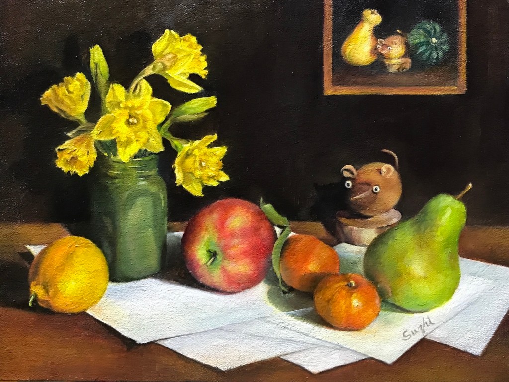
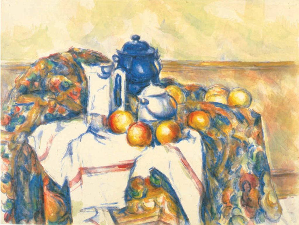
I first saw Pablo Picasso’s Still Life with Pitcher and Apples decades ago at the Musée national Picasso-Paris. It’s a mid-sized canvas (65 × 43 cm) with a simple domestic arrangement painted in a realistic style and muted colors. When surrounded by the artist’s more famous Cubist experiments, this piece was actually quite eye-catching to me.
The painting dates from 1919, right in the middle of Picasso’s so-called “return to classicism” period. After the visual fireworks of Cubism and the disruption of World War I, many artists (including Picasso) felt a pull toward order, solidity, and older traditions. For him, the turning point came during a 1917 trip to Italy. Walking among the ancient ruins and frescoes of Pompeii and Herculaneum left a deep mark. The chalky, fresco-like palette and the calm monumentality in this still life feel like a direct echo of those weathered walls.
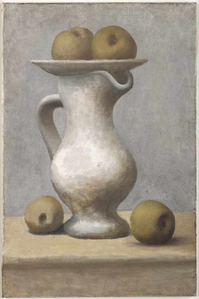
The big, sculptural shapes and slightly off-kilter perspective also bring to mind Paul Cézanne. You feel like you’re looking slightly down at the table surface while simultaneously gazing up at the plate balanced on the pitcher’s rim – a spatial effect that only happens when you look at something truly grand. Meanwhile, the overall tranquility, the way the objects seem to breathe in their own dusty light, reminds me of Giorgio Morandi. Both Cézanne and Morandi have shaped how I see still life: not as decoration, but as a slow conversation between forms, space, and light.
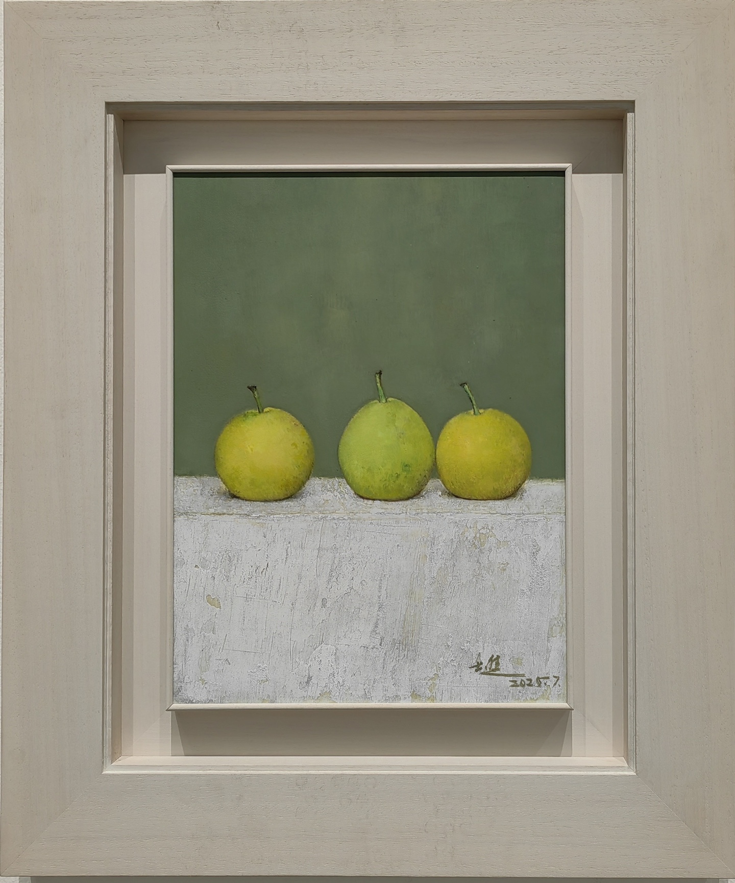
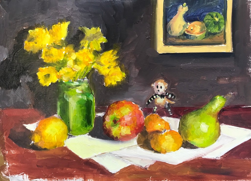
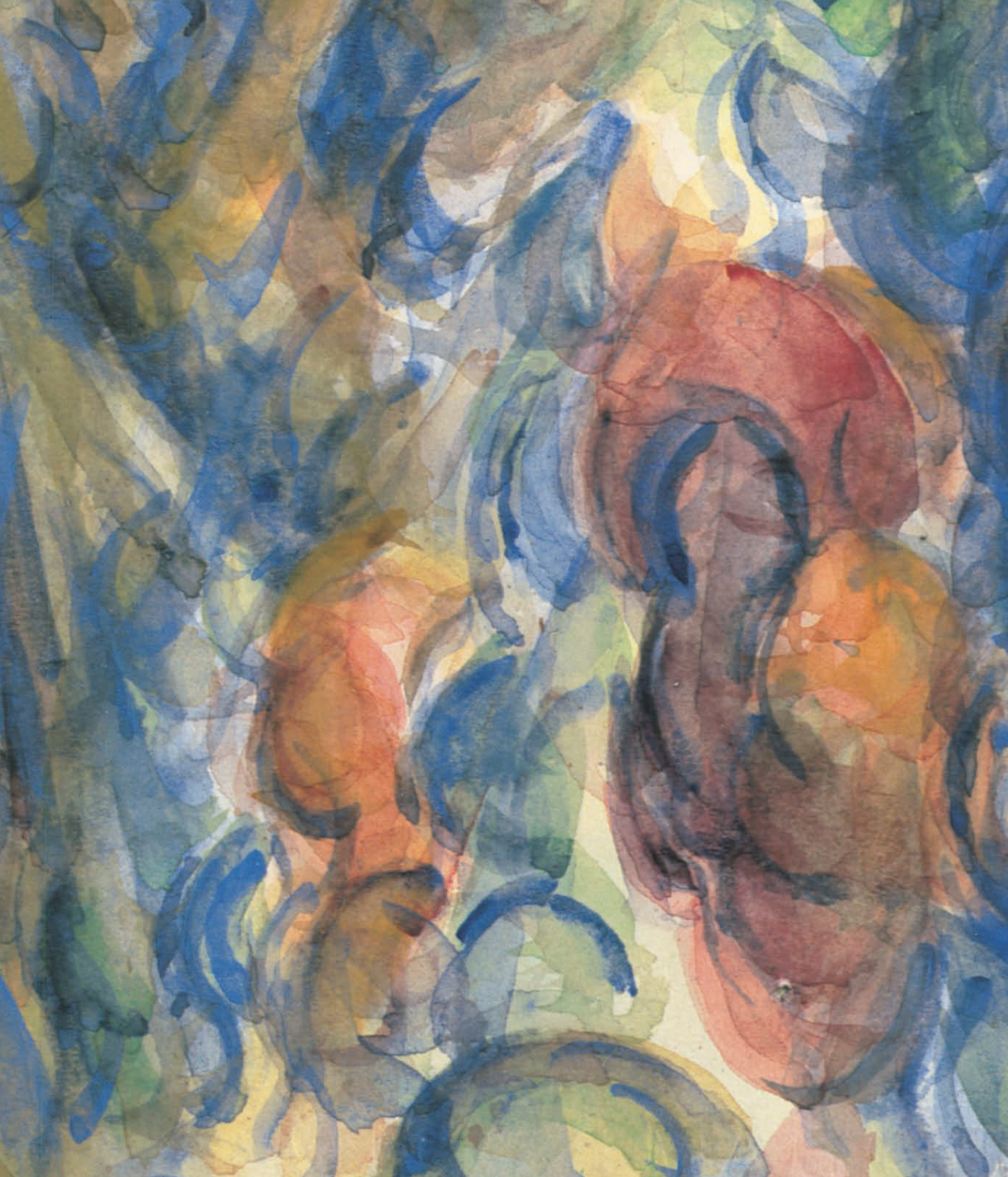
While hunting for fresh ideas to keep my pear journey going, I decided to do a direct study of this Picasso with a deliberate pear twist. The original composition looks deceptively simple, but it’s full of subtle choices. It forms almost a top-bottom and left-right symmetry, broken only by pulling the jar slightly off center and rolling one apple a little forward. Most artists would instinctively avoid this kind of arrangement, and it seems Picasso was pushing the limits as much as possible. I followed the basic scheme but broke the symmetry further to give it more life and movement. (More importantly, I’m not Picasso. I didn’t want to risk flirting with poor composition!)
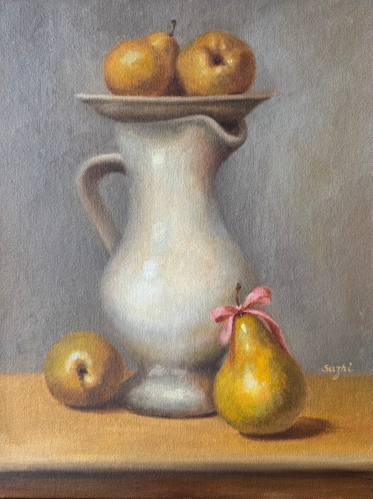
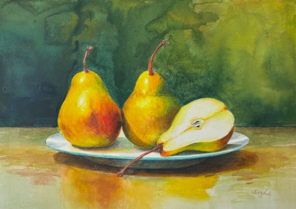
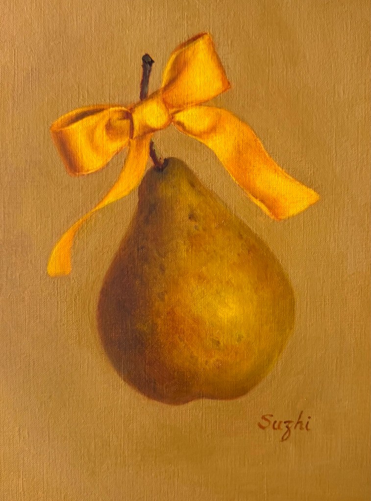
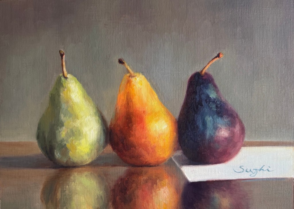
My version keeps the same central white pitcher and the plate perched on top, but I swapped in pears for the apples. The colors are much more saturated and warm: golden yellows with touches of greens that glow against the softer gray background. One pear on the table wears the pink bow I promised I’d revisit after Golden Bow (yes, the one from last month’s “Pear Maniac Continued”). It adds a tiny spark of playfulness and ties this piece back to my ongoing pear obsession.
What surprised me while researching for this writeup is how many art historians and critics interpret the pitcher itself as a hidden portrait of a voluptuous woman. Its swelling curves suggesting a generous torso, the open spout like a mouth, the rounded forms on top echoing breasts or eyes. That reading completely escaped me! I did notice the sumptuous curves and the overall sensuality of the forms, and I did wish to replicate that same generous, bodily presence in my study. Now looking at mine and the original side by side, my pitcher is not as sexy as Picasso’s, but the plump, curvaceous pears sing a louder tune. I completely changed the subject! Picasso had a lifelong habit of turning everyday objects into something human and alive; I am just in pear mood.
Painting this study felt like a quiet dialogue across time: Picasso’s restrained classicism meeting my warmer, juicier pear world. It reminded me why I keep returning to still life — it’s never really “just objects.” There’s always a pulse underneath.
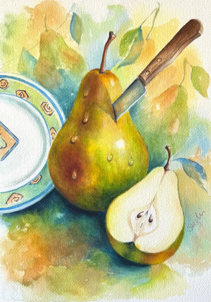
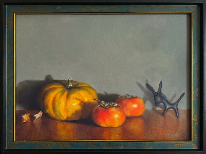
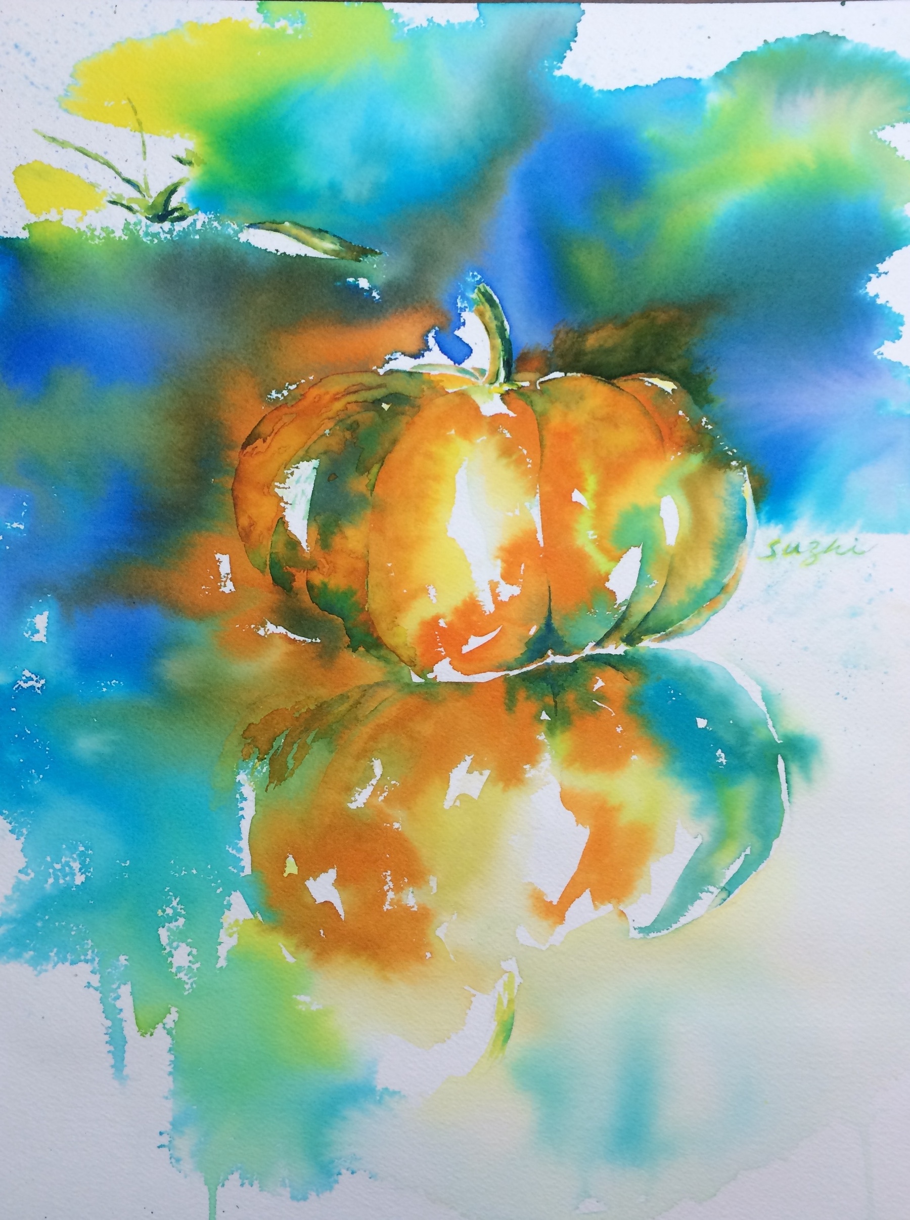
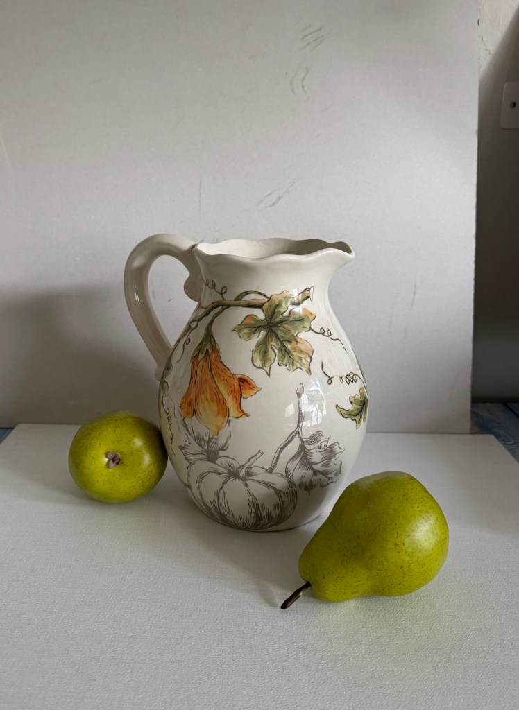
After the study comes the creation. I also set up a real jar and pears in my kitchen. My jar had some pumpkin patterns on it, and I changed them to pears. Even though I didn’t place a plate on top, my painting still has four “fruits”: two as patterns on the jar and one real pear on each side.
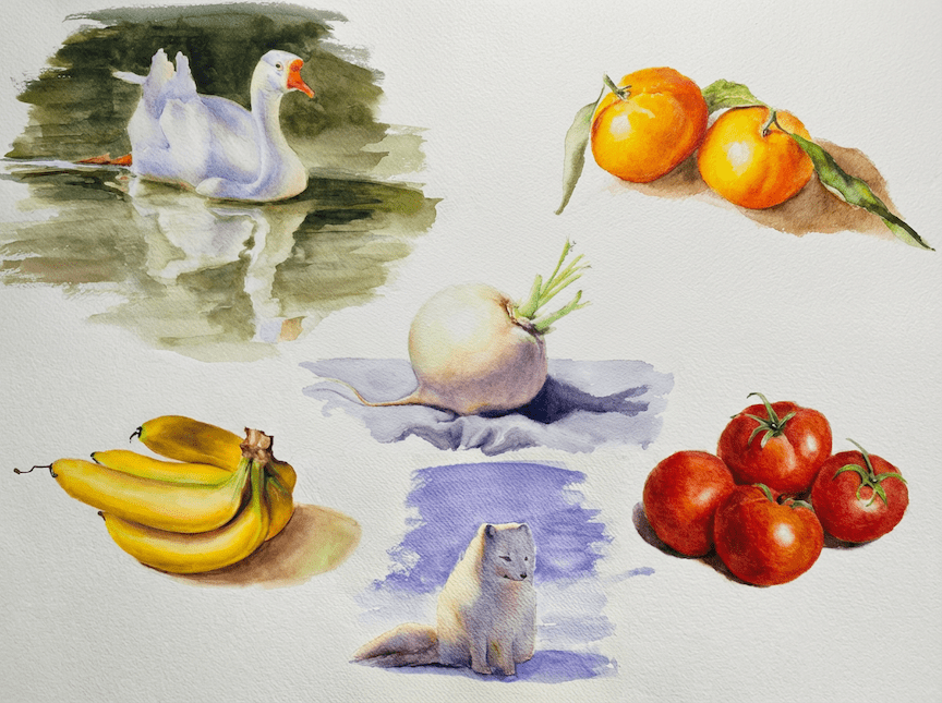
In the beginning I had two conflicting ideas. One was to follow the Picasso piece and do a muted-color painting, and the other was to go the opposite direction and make it colorful. I decided to try both in watercolor first (it’s faster). As always, even the “muted” one turned out more saturated than I planned, but I would say the overall effect is still on the quiet side. The colorful one… well, the warm lighting and shadow patterns almost devour the subjects. It’s dramatic, a little chaotic and I guess it landed on the maniac part of the pear journey.
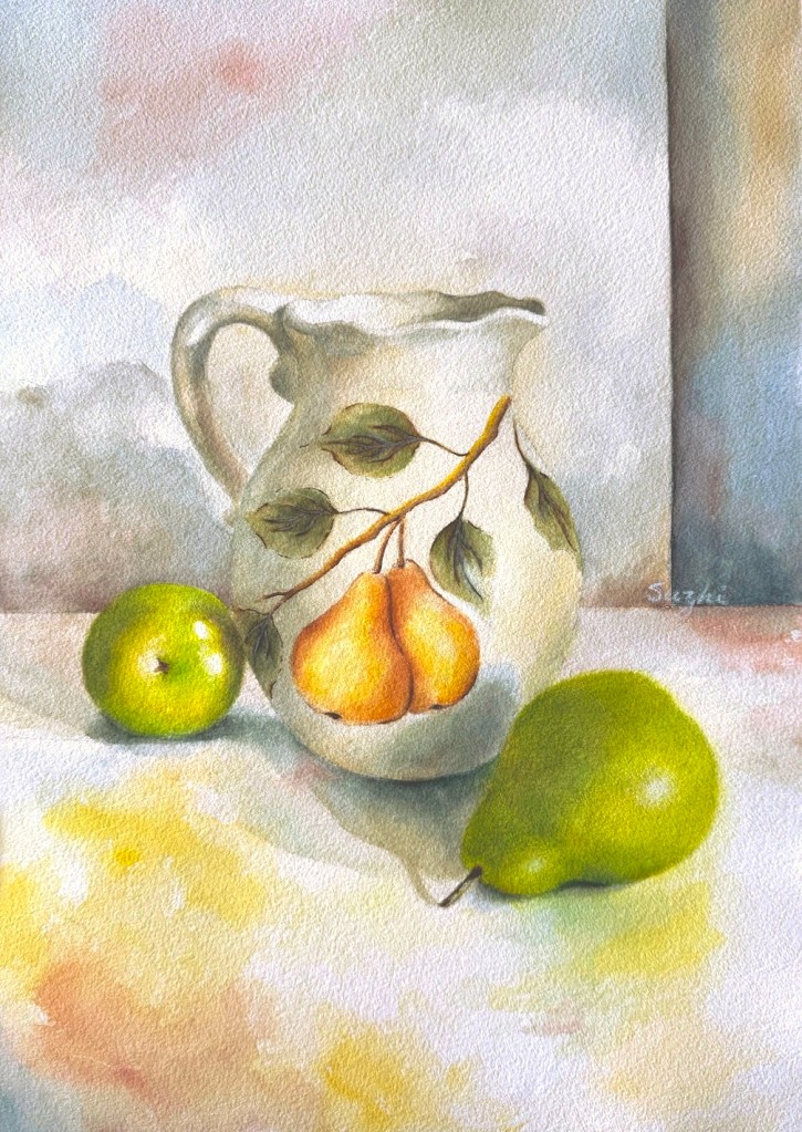
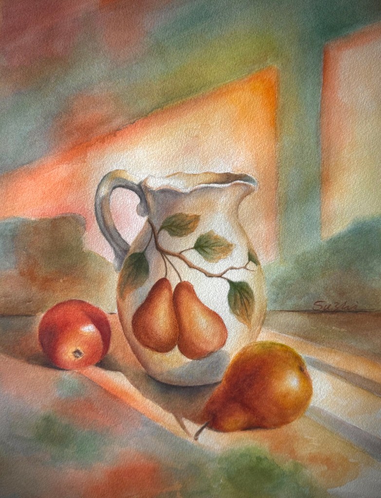
I treated these two paintings as testing ground so I didn’t spend too much time on them. I don’t know yet if I would further develop these into oil paintings. To turn them into stronger watercolors, I clearly need more practice with designing patterns on objects, and figuring out how to paint big shadows without mudding the colors. For now, I just enjoyed the experiments. Failure or success, I had a really good month of painting.