Monthly Archives: April 2020

Color Studies (4) – Triadic Colors

I changed the title of the previous post for better record keeping. I am still staying home, still doing art.

This week I tried triads – 3 colors evenly spaced around the color wheel. A word on color wheel: I use a commercial one from The Color Wheel Company. Many artist make their own, especially if you work in watercolor, because different brands of colors do differ slightly. It makes sense to lay out your frequently used colors in a circle, add shade and tint, or even make a value chart for each of it. You can also make a list of the complementary, analogous and triadic color schemes. I think this kind of work may help you to understand your color better, and I always feel like I should do it, but … What can I say? I am lazy and unorganized.

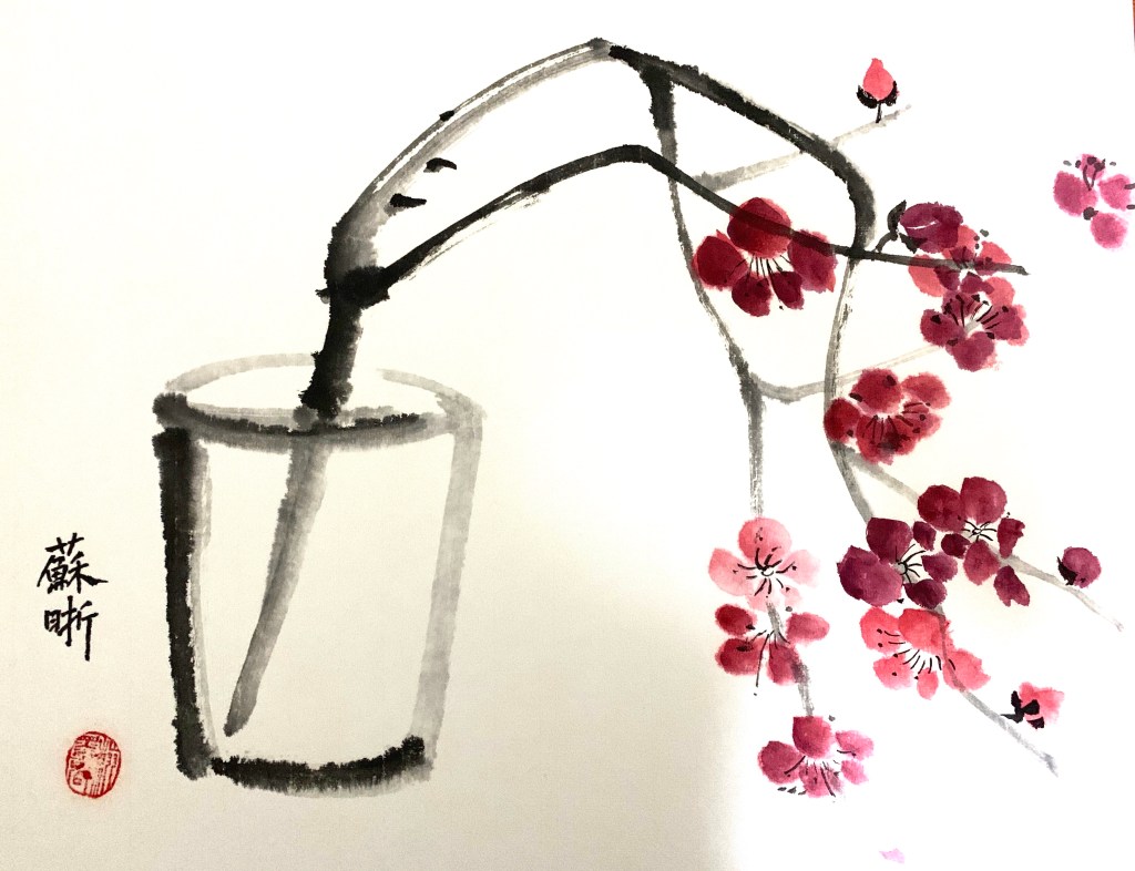
Back to triads. They are somewhere between analogous and complementaries. Much more vibrant than the former, and less contrasting than the latter. More importantly, the color spectrum yielded is much richer – if you mix them properly, they can give you almost everything.

That caused a problem for me. As you can see from my first try, I used red, blue and yellow, and I mixed them, got everything, and confused myself. What’s the difference between using a triad and using everything then?

Portrait of a Young Woman, watercolor on paper, 7.5 x 10 in, April 2020

So I tried to separate the colors in later attempts:

Portrait of a Young Woman, watercolor on paper, 7.5 x 10 in, April, 2020
Portrait of a Young Man, watercolor on paper, 7.5 x 10 in, April, 2020

Of course later after a few minutes of googling, I found out that when using a triad in a design, you usually choose a dominant color and that’s how to differentiate it from using everything.

So far I’ve tried some of the most commonly used color schemes. These are things I learned from doing these studies:

  • Limiting palette helps me to explore the potential of each color more extensively.
  • It also forces me to pay more attention to value.
  • Colors are very distracting, so it’s good to have a strategic approach. Do I want a harmonious piece or a contrasting one? Do I want the solemnness or the richness? Etc.
  • Restrictions spur creativity.

There are more color combos one could explore: tetrad – four colors consisted of two sets of complementary; split complementary – choose one color, and add the two on each side of the complementary (a narrower triad) etc. Maybe I’ll come back to these in future. Maybe.

Color Studies (3) – Analogous Colors

In order to push myself to work more, I participated a “100 Day Art Challenge” by New Masters Academy, of which I became a member last year upon a Black Friday sale. I committed myself to figure or portrait drawings or paintings for 100 days. We’ll see how it turns out.

Since it’s not a small commitment (for me at least), I think it would be a good idea to shoot a couple of more birds in the meantime, such as incorporating some color studies into the challenge.

This week I did a couple of small paintings using analogous colors. Analogous colors are a group of 3 to 5 colors next to each other on a color wheel. From a design point of view, complimentary colors are for contrast, and analogous ones are for harmony.

I tried to limit my choices to 3. With tint and shade of each color and various intensity, there should be enough to work with. In theory.

For the first painting, I planned to use red-orange, orange, and yellow-orange. In practice, the darkest I could get is a deep shade of red-orange. As it seemed not dark enough, I kept adding black to it, and in some places, I just used black directly. The black also contributed to the greenish color in the background. Meanwhile, since I mixed my yellow-orange with yellow and orange, some of that yellow also got in. Looking back, I blamed my disastrous control of color on a lack of design. The reference I chose has strong contrast, and darker colored clothing. If I want to use colors in a limited way, I need to go beyond a literal reading of the reference, and have a better strategy for value:

Portrait of a Young Woman, watercolor on paper, 9 x 12in, April 2020

For the second painting, I chose yellow-green, green, and blue-green. I think I still got the value wrong in some places, but at least I stayed within my color choices:

Female Figure, watercolor on paper, 9 x 12 in, April 2020

The last one I used blue, blue-violet, and violet. I started this painting with Tombow water-soluble markers. Tombow has a hard and a brush tip, allowing more diverse lines. However, they are not as water-soluble as Crayola. There are lines I couldn’t disappear with water, and a big part of the painting process was to resolve the problems caused by those lines.

Portrait of a Woman, watercolor on paper, 9 x 12 in, April 2020

In the end, I am very glad I did this experiment. Even with the painting I cheated, I can still see how analogous colors help bringing things together. It’s not that each painting has to follow a color formula, but these are tools to help us to achieve harmony. Because of that unifying power, using analogous colors is also a great way to create a mood in paintings.

Stay Home Doing Art

Based on my very limited survey, this is how people around me spend their time nowadays: cooking; shopping online for groceries; cleaning and reorganizing their homes; zoom meetings. I have my fair share of cooking and shopping everyday, and decided to do some house keeping for a change. And these are the thing I dug out:

Sorry for the weird shadows in the pictures. Obviously the person who took the photos for me also wanted to sign the paintings with his shadows. To some extend, this is a Chinese tradition among art collectors. In some old Chinese pieces, if you see many seals filling in the empty spaces, many of them are not belong to the artist, but the collectors (a way to say “this is mine!”).

Most of the paintings above are done by copying old masters. This is the way of learning traditional Chinese painting through time. In some of these pieces, I combined elements from different paintings and I remember the teacher was quite surprised by that “Oh, you started creating already!” Composing your own piece usually follows years after years of copying, and it’s not a common thing for beginners. Since Chinese paintings are usually signed and dated with Chinese calligraphy, that’s another thing you are supposed to practice for years by copying masters.

Staying home is a good time to copy and study old masters. This is probably the most efficient way of improving skills, but if you only do that for longer period of time, the side effect might be daunting your creativity. Strike a balance.

I know the title “Stay Home Doing Art” is a bit misleading this time. It is actually stay home digging out art. Hope next time I could post “doing art” for real.

Life Drawing Gone Crazy in a Crazy Time

I’ve been taking a life drawing class at a community college this year. My professor is great at teaching and extremely knowledgeable about anatomy. This is her last year at the school and she planned a happy ending to her teaching career and a smooth transition back to a full time artist. Now she has to move her class online through Zoom, and for someone who’s not particularly tech savvy, this is not easy. It’s been a couple of weeks now, but our class is still not on track. Meanwhile, she has found some really good materials for us to practice on our own. Here’s a list of stuffs she recommended and/or I’ve been using:

  • Proko – by Stan Prokopenko. It contains some of the best instruction videos on figure drawing. Enough free stuffs, but if you pay, more structured lessons and practice materials. I personally have been using this site for a while, and am a big fan of their Draftsmen Podcast.
  • Love Life Drawing – Great advice for beginners or artist seeking improvement.
  • New Masters Academy – They have a subscription plan that allows access to tons of good art classes or master classes. The free stuffs including many timed life drawing videos featuring photos of clothed or nude models.
  • Croquis Cafe – Videos and photos of models for life drawing. This is probably the closest you can get online to a real life drawing experience. Great models and so many to choose from. My only problem with it is that after they moved to Vimeo, the streaming is less smooth.

This is not just a time for staying in, but also coping, adapting and discovering!

Here’s a quick drawing I did:

Shanon, Charcoal on paper, 18 x 24 in.

Obviously, it asked for more. Hence:

Shanon, Gouache on paper, 18 x 24 in.