Monthly Archives: May 2020

Dancers

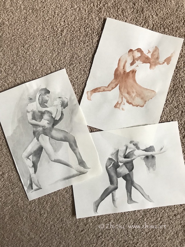
Found a beautiful book, The Art of Movement by Ken Brewer and Deborah Ory. It’s a collection of dance photography. It’s a great book to study figures and motions. I did some sketches and drawings from it:

Dancers, watercolor on paper, May 2020
Couple Dancers, watercolor on paper, May 2020
Infinity, charcoal on paper, 18 x 24 in, May 2020

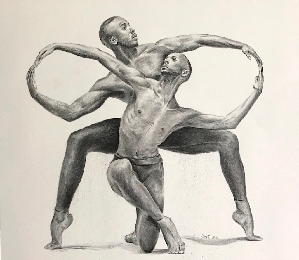
The last one is a strange pose. It has an enclosed and squarish quality and a lot of symmetry. The lighting is mainly top-down, making it more grounded and static. It’s not a composition that I would normally choose to work on. On the other hand, there’s a nice contrast between the infinity loop formed by the arm, and zig-zag pattern formed by heads, torso and the legs in the middle. There’s tension and connection between the two dancers at the same time and that’s what I was aiming for when starting the piece. However, as I worked on, and as always, I was distracted by the details, and lost my focus. I think the zigzagging is there, but the details of the hands cut in the flow of the loop. I also think the value contrast is not enough and shapeless. I think this is mainly because I am still copying what I see instead of using it as a reference to create. I hope when I have a better grasp of human figure, I could look beyond the photo and draw my interpretation.

Copying Masters (11) – Yoshitoshi

Japanese woodblock printing (ukiyo-e) has a profound influence in western art since 19th century. “Japonism” has a visible presence in the art of many big names, such as Van Gogh, Degas, Gauguin etc.

Tsukioka Yoshitoshi 月岡芳年 (1839 -1892; also named as Taiso Yoshitoshi 大蘇芳年) was generally regarded as the last great master of the this art tradition. He was a very bold, imaginative and prolific artist. Some of the images he created are regarded as gruesome and disturbing. His most famous series are One Hundred Aspects of the Moon (1885–1892), and New Forms of Thirty-Six Ghosts (1889–1892).

In “Kiyomori sees hundreds of skulls at Fukuhara,” from the series New Forms of Thirty-Six Ghosts, Yoshitoshi portrayed the famous Japanese general (or soldier-dictator) Taira Kiyomori (平清盛, 1118 – 1181), who created the the first samurai-dominated government. The main attraction for me is the decisive and effective line work, and the presence of the character:

The original:

My copy:

After Yoshitoshi, watercolor and ink on paper, 11 x 15 in, 2020

A few notes:

  • This is not an exact copy, partially because the paper I used was a failed texture experiment. I have to work with un-intended marks here and there.
  • Copying line work is a tricky business: you want to be careful because the ink is permanent; but if you are too careful you’ll lose the force and the gesture of the line.
  • Sometimes having random textures or marks on paper is not necessarily a bad thing. You are forced to be creative since you have to work around or work against it.
  • My general has funny little hands.

Here’s my attempt of the ukiyo-e style:

Where to, watercolor and ink on paper, 11 x 15 in, 2019

This earlier post is in that line too:

Full moon, watercolor on paper, 11 x 14, 2019

By the way, the art of ukiyo-e fell out of fashion in Japan in the late 19th century but saw a come back since the 70s in Asia. Some young artists incorporated the line works and the fanciful contents into Chinese fine brush painting or watercolor painting.

Copying Masters (10) – Bernini

I am quite into drawing and painting humans recently, both portrait and figure. I find it a great way to practice hand eye coordination, and overall drawing and painting skills. While human faces and bodies are complicated, they are more organized than landscape. Learn the anatomy and you’ll have a sure way to approach them. They are also less forgiving than many other subjects – when you do it wrong, it’s quite obvious.

As always, copying masters is an effective way of learning. This time I chose an early drawing by Gian Lorenzo Bernini (1598 – 1680), the father of Baroque sculpture. The drawing, Seated Male Nude, was collected by Princeton Art Museum. I am attracted to this drawing by its succinct use of marks, especially the highlights, so economic and so effective. I tried to draw on tinted paper before, and often ended up drawing a figure on top of the paper, instead of letting the color of the paper show through.

I figured if I wanted to let the paper work, I’d better keep it clean. So instead of jumping on it, I did some practice before hand. For example:

After Bernini, ink on newsprint
After Bernini, pencil on paper

Finally, the copy:

After Bernini, pastel pencil on paper, May 2020

A few notes:

  • I am glad I did those hatchings last week. My lines are still not neat and organized as the master’s (of course), but the hatching practice do help.
  • The preliminary studies paid off (I did more than those shown above). I did a very light-handed drawing first and managed not to disturb the paper too much (less erasing). The final lines are sharper and cleaner this way.
  • I only recently started to pay attention to this issue. In both drawing and watercolor painting, if the paper is too disturbed, it affects the final result. I know some watercolor artist draw on a different piece of paper and then transfer the image to the watercolor paper (carbon paper, light box, projector etc.)
  • I had a lot of fun drawing the effect of an old paper. LOL.

Hatching, Cross Hatching

I love artworks with beautiful lines or expressive brush strokes. Mark making is an art in itself. One good way to practice line quality is to use a non erasable tool. I used a variety of pens before, dipping pen, micron pen, even ballpoint pen. This week I dug out a cheap fountain pen (the type that Chinese kids used in school to learn writing) and some Faber-Castell Pitt pen, and decided to practice hatching and cross hatching.

There are at least two ways to do hatching (cross or not), one is to follow the form to the object (with the direction of the lines), the other is to use one direction only, and let the value changes indicate the form. My plan was to use the latter approach and focus on value studies, but what I found out is that it’s very counterintuitive not to chase the form.

Portrait of Diana, Faber-Castell pitt pen, 9 x 12 in, April 2020
Serge, Faber-Castell pitt pen, 9 x 12 in, May 2020
Self-portrait, fountain pen, 9 x 12 in, May 2020

Faber-Castell is permanent, while fountain pen ink is somewhat water-soluble. I used a little bit water to wash over part of the drawing and reapplied lines here and there.

I find the sound of a pen scratching over paper very therapeutic, and hatching a great way to exercise control and study value.