Category Archives: acrylic

Show News

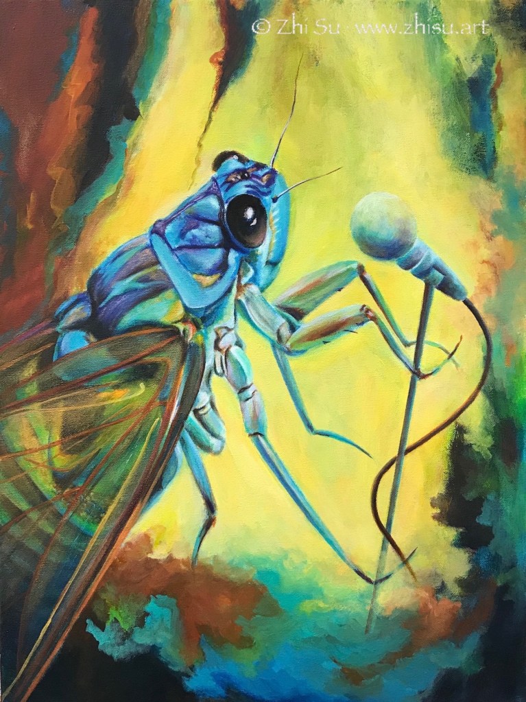
I am not a particular fan of insects, but the sound of cicadas is a constant in my childhood memory. Summer time in Beijing when the city was still haze free, kids with long bamboo sticks were searching for cicadas in the canopies of trees. The molt makes good ingredient in traditional Chinese medicine, probably for treating cold. When I first saw the picture of a blue cicada I was delightfully surprised. I never knew cicada could be this pretty. The ones we had in Beijing were black and brown. Yet, we all romanticize our memory, don’t we?

Acrylic painting of Blue Cicada with a microphone
Sing, acrylic on canvas, 18 x 24 in, 2020

“Sing” participated the annual show at the Pacific Art League last year and this year’s Santa Clara Valley Watercolor Society‘s annual show (accepting all water media now).

“Summer Dream,” which currently on view at the Pacific Art League gallery, was inspired by two of my previous pieces. The design came from “Marching” (not obvious, I know, long story still developing), while the color theme “Landscape.”

Summer Dream, acrylic on canvas, 22 x 28 in, 2021

By the way, naming the artwork is probably the hardest part of the creative process, at least for me. While “Sing” may be self-evident, it was still an afterthought. As for “Summer Dream,” hehe, I grabbed it out of nowhere the minute before submitting it for the show, and had to check the register sheet to remember what it was when I brought the artwork in. 😂

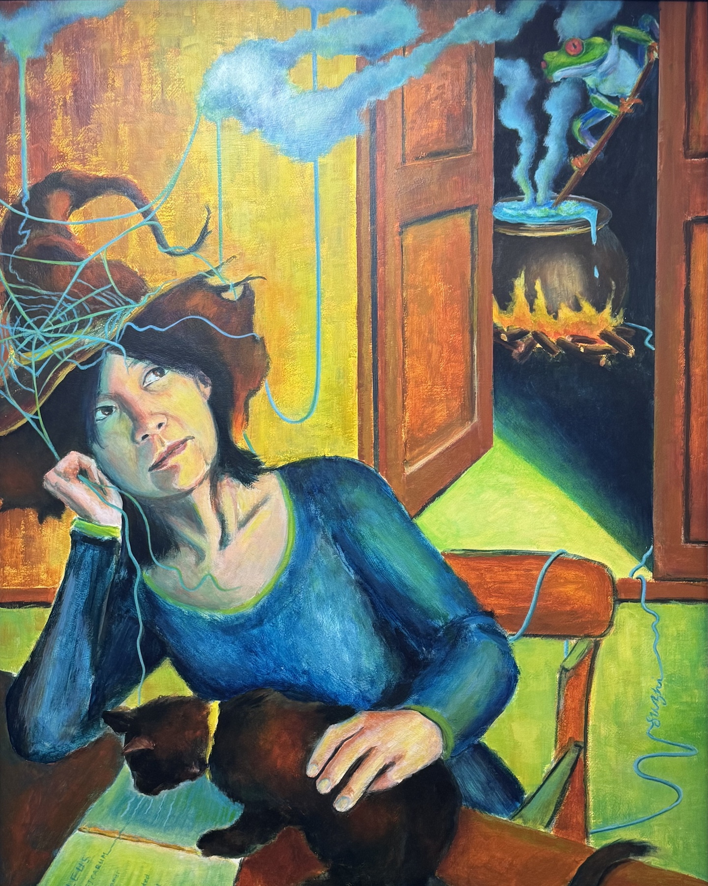
Happy Halloween – Self-portrait?

This painting was done earlier this year, but gosh, is there a better time to post it?

Acrylic painting of the artist in witch hat, blue robe, black cat, cauldron, tree frog, spider web
Self-portrait, acrylic on masonite board, 30 x 24 in, 2020

In case you wonder, the cat is reading The Malleus Maleficarum (The Hammer of Witches), a 15th century treatise on witchcraft, written by the Catholic clergyman Heinrich Kramer. The book had a great influence on the prosecution of witchcraft in later centuries. You need to know your enemy I guess!

My First 3D Art – The Story of Yang Guifei

Yang Guifei 杨贵妃 (719-756), Imperial Consort Yang, is one of the four best known beauties in ancient China. She married Emperor Xuanzong 玄宗 (685-762) of Tang Dynasty in essence, granted the highest rank among the Emperor’s harem, but was not his official wife (I believe he didn’t have one at the time.) Her family rose to power because of the Emperor’s favoritism, but also caused a lot of tension in the court. During a rebellion that forced the Emperor to escape the capital, the imperial guards blamed Yang Guifei for distracting the Emperor from his royal duty and forced him to kill her. Her short but eventful life was commemorated in poetry, paintings, dramas, and novels throughout Chinese history till today. The legend even goes beyond China. Some Japanese believe she didn’t die but escape to Japan.

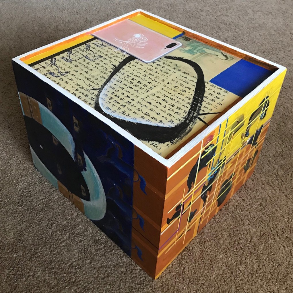
In the outskirt of Xi’an, a city in central China, and once the ancient capital of Tang Dynasty, there’s a tourist site called Huaqing Palace. It’s said to be the royal resort of Emperor Xuazong and Yang Guifei. I visited the site two years ago, and was fascinated by the story and the modern obsession of it in China. I always wanted to make an artwork about it, but find it very hard to condense a rich narrative. Eventually, I did it with 5 paintings – 5 sides of a box.

Wood box with acrylic paintings on sides, peony, collage, abstract  design
Wood box with acrylic paintings on sides, bracelet, collage, abstract  design

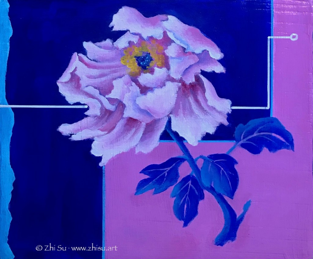
The story begins with a peony. In Chinese culture, peony not only implies beauty, but it’s beauty in richness and glory. It’s the national flower of China today. The blooming flower is Yang in her innocent years. The background design is a twist of the Taoist symbol. Legend has it she spent some years practicing Taoism in a temple before entering the palace, a fashionable thing to do among upperclass women at the time.

Acrylic painting of a pink peony

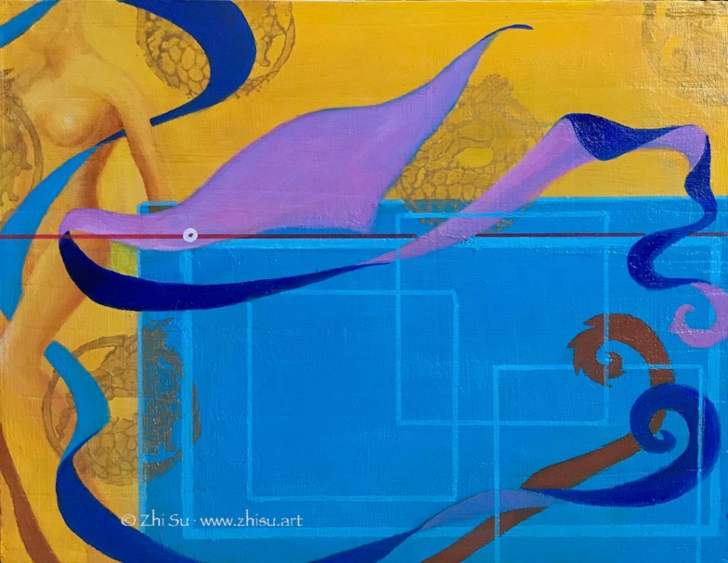
The story continue on to the Huaqing Palace panel, where she enjoyed the Emperor’s love. Yellow is an imperial color in Chinese culture, and dragon is a sign of the emperors. The figure on the left is after an modern statue of Yang in Huaqing Palace. Among the four ancient Chinese beauties, Yang was regarded as the plump one (that also reflects the aesthetics of the Tang Dynasty). However, her modern statue is not only slim, but also western – makes you wonder about the presentation, representation, and the interpretation of history. The ribbons were often used in traditional dance and Yang was an excellent dancer according to legend. Huaqing Palace is also a site for hot spring, and you can still see the pools where Yang and the Emperor enjoy themselves today.

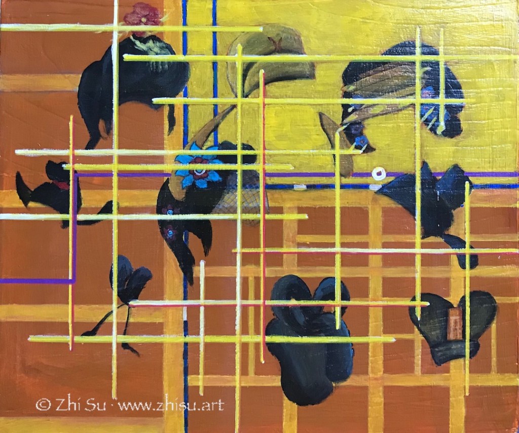
The next panel is a part of the map of the capital of Tang Dynasty, with the yellow part represents the royal palace. The hairdos and hats were an indication of the social position back then. As illustrious as the imperial couple, they were both just chess pieces on a political power grid. This is especially true for a woman like Yang. However she’s favored by the Emperor, she’s never the only woman around him.

The final part of her life story features a broken jade bracelet. Yang Guifei’s maiden name Yuhuan, in Chinese means jade bracelet. In Chinese culture, broken jade is also a symbol of the death of someone beautiful or virtuous. The battle horses and banners referenced ancient paintings about Tang battle scenes.

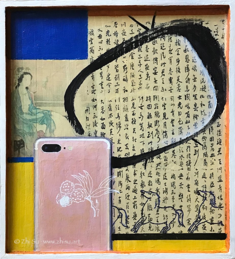
The top of the box is a collage of how Yang’s life story was remembered throughout history. The calligraphy is part of a long poem Chang hen ge 长恨歌, “Song of Everlasting Sorrow,” written by Tang poet Bai Juyi 白居易 (772-846). The poem is a retell of the love story of Yang and the Emperor. The painting next to it is done by a Japanese woman artist Uemura Shoen in 1922. There are still TV dramas produced present days in China. The cell phone is both our means to access history nowadays, and a tool to fulfill our desire to share some glory of a celebrity. I change the Apple symbol to Lichee fruits – a favorite of Yang Guifei. Legend has it the Emperor ordered the battle horses to transport the fresh fruit (native to southern China) to the capital (central China) for her in three days!

Collage, acrylic painting, transfer of Chinese calligraphy, traditional Chinese woman, pink iPhone

The most difficult part of the project is to balance the narrative and the art. I have a story to tell, but I also hope viewers could find the work interesting to look at even though they don’t know anything about the story. I want the symbols and the designs I use serve both as literary and artistic devices. For example, there a line running though the four sides of the story with a tiny circle on each side. It loosely follows the geographic route from her birth place, to the Huaqing palace, the capital, and finally her death place. The color changes of the line correspond to the vicissitude of her life. It links the narrative, and I hope it also moves the eyes.

The project is acrylic on a wooden box, and the surface of the box was quite textured. I sanded it, gessoed it, but it’s still very different from painting on canvas or masonite board. It’s a lot of work. Having so many surfaces to work on expand my ability to tell a complex story, but it also gives me the trouble of finding a place for it in the house! 🙂 Honestly speaking, I couldn’t tell if any of these makes sense, but I had a great time working on this project.

Show News and Some More

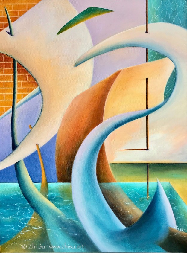
I recently became a member of the Pacific Art League and joined their 99th Anniversary Exhibit, “Beyond 2020.” My painting “Sail” was selected into the gallery show, and will be on view at their Palo Alto gallery till January 2021. Here’s the piece:

Abstract acrylic painting, sail
Sail, acrylic on canvas, 18 x 24 in, 2019

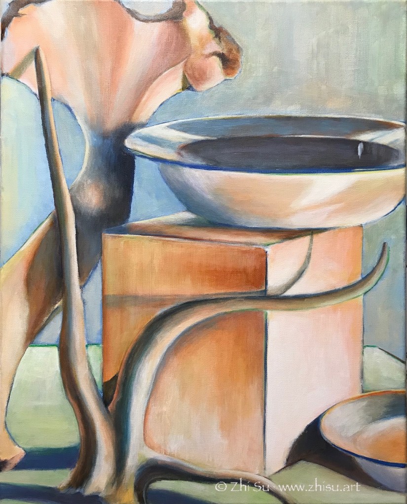
The painting was inspired by a still life study I did before:

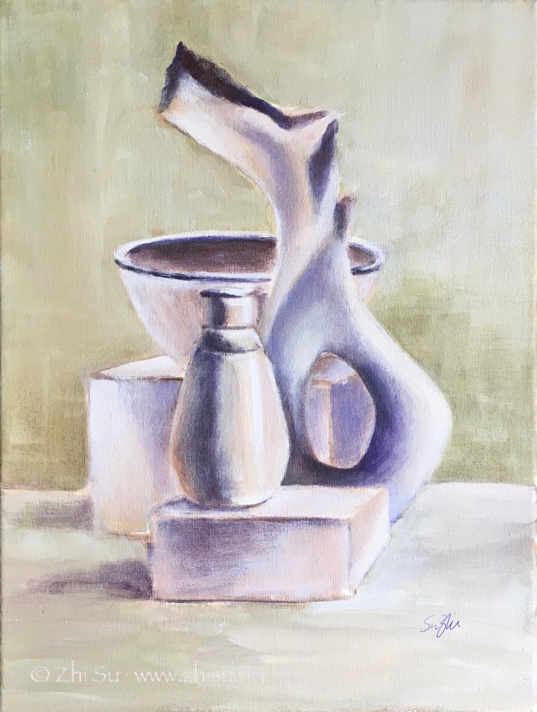
Acrylic still life painting, bowl, block, bones
Still life, acrylic on canvas, 16 x 20 in, 2019

My still life study was focused on how to paint white with color, but I found the way the lines curved, meandered and crossed very intriguing. After the painting was done, I kept looking at it and tried to follow those lines in my mind and in my sketchbook. The objects gradually disappeared and the lines and shapes led me to new ideas, and eventually, a new painting.

Show News

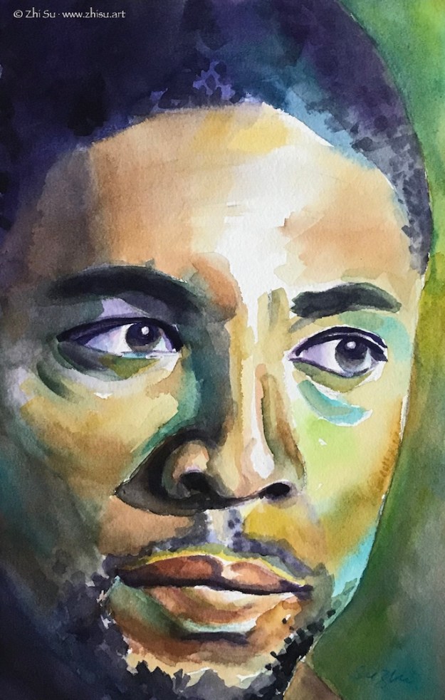
“Lamonte,” one of my 100 Day Art Challenge paintings, entered 6th Annual Figures & Faces Art Exhibition at Fusion Art Gallery as a finalist:

Watercolor painting of model Lamonte
Portrait of Lamonte, watercolor on paper, 9 x 12 in, July 2020

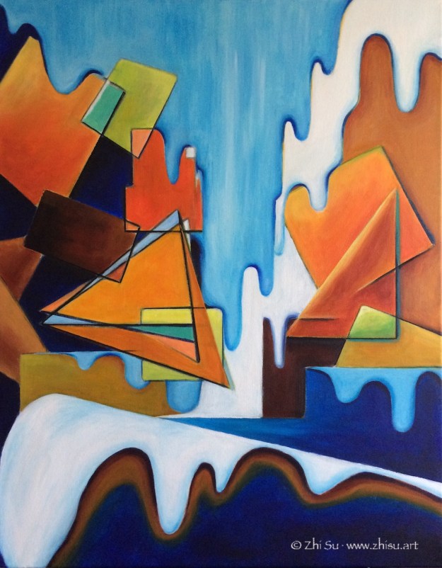
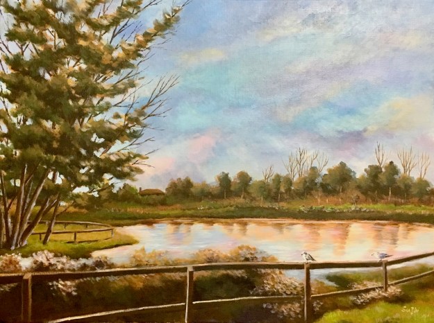
“Waterfall” and “Penitencia Creek Park” entered “Landscape” show at Grey Cube Gallery as finalist:

Landscape, acrylic on canvas, 24 x 30, 2017
Waterfall, acrylic on canvas, 24 x 30
Acrylic landscape painting, Penitencia Creek Park, trees, lake, birds
Penitencia Creek Park, acrylic on canvas, 16 x 20 in, 2019

Small steps, but moving forward nonetheless!

Copying Masters (12) – Modigliani (1884 – 1920)

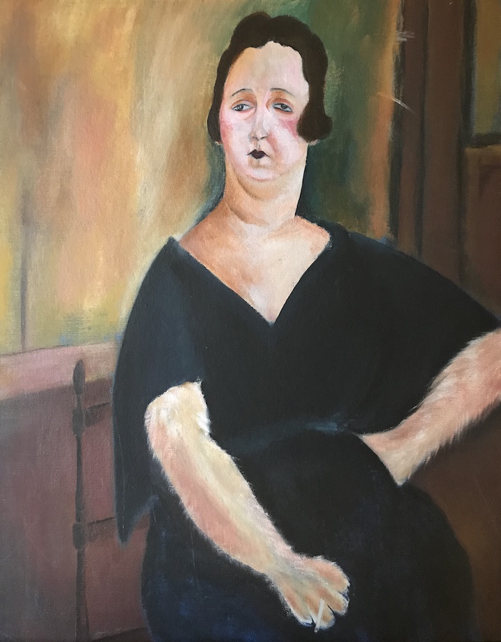
Amedeo Modigliani is an Italian artist famous for his uniquely stylized portraits. I always like his paintings and attempted a study years before. Somehow Modigliani’s Madame Amédée reminded me of my neighbor’s cat, and my original plan was to use the composition of the original painting, and replace the head with that of a cat’s. It didn’t work out and I switched back to the lady. The result wasn’t much of a copy, and you can still see the trace of my deviation.

Original

Madame Amédée (Woman with Cigarette), oil on canvas, 39.5 x 25.5 in, 1918

My copy:

Woman with a paw, acrylic on canvas panel, 16 x 20 in, 2016

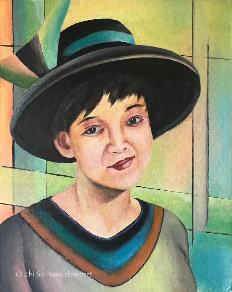
This is another try. This time it was not a copy, but I tried to stylize a self-portrait. I meant to focus on the inner world of subject, but somehow it was all spilled over into the background. As a result I went way beyond his typical palette, which is quite muted.

Me with a hat, acrylic on canvas board, 16 x 20 in, 2017

After learning drawing and painting humans for a while, I find myself even more fascinated by Modigliani’s ability to go beyond realist forms while stay true to the spirit and character of his subjects. I probably will do more studies of Modigliani in future.

More on Monochromatic and Morandi

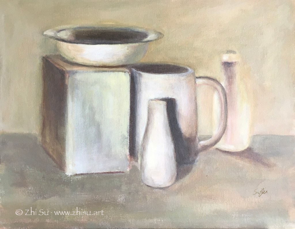
As I mentioned before, the paintings of Giorgio Morandi (1890-1964) often have a monochromatic look, even though he used a lot of colors. The result is a very restful and understated effect – something I always find difficult to achieve. Usually the more time I spent on a piece, the more colorful it becomes, as if keeping quiet on canvas or paper is against my nature. The same goes with details and edges. The more time spent, the more definition, and the looseness and gestures are lost.

So I tried a couple with limited time and clear goals. 1)No more than 2 hours per piece; 2) limited palette to create near monochromatic effect; 3) less definition; 4) lost edges; 5) be quiet.

Still life, acrylic on canvas, 9 x 12 in, 2019
Still life, acrylic on canvas board, 16 x 20 in, 2019

I think goal setting with time restriction is an effective way of practicing. Right? :))

Color Studies (2) – Monochromatic

Of the three components of color, hue, value and saturation, I personally find value the most difficult. Colors are attractive and distracting, and it could be difficult to discern values accurately from all the colors in front of us. Monochromatic painting is a great way to train your eyes this way.

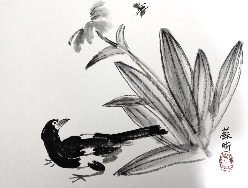
In traditional Chinese brush paintings, many of which are monochromatic, it’s the value changes through the control of water that create the art. I took a few lessons of Chinese brush painting one summer, and lessons were mainly copying old masters. This is one of the paintings I copied:

After Qi Baishi, ink on Xuan paper, summer 2018

Monochromatic is a good strategy when time is limited. In life painting, it saves the trouble of finding the right skin color and allows me to focus on value and shape.

Woman, ink on watercolor paper, 9 x 12 in, 2018

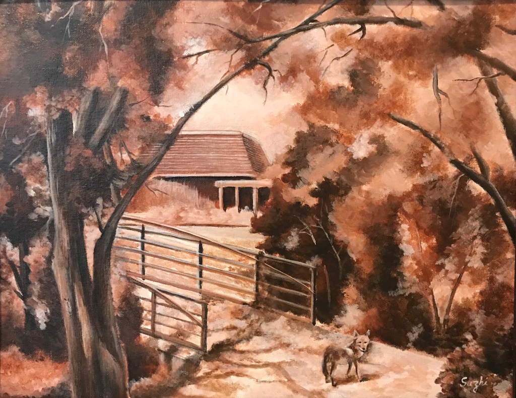
In landscape scene with overwhelming branches and leaves, monochromatic approach simplifies the view. This plein air was done in burnt sienna. I included some of the visitors I had during the painting – out of proportion, I know, but a lot of fun.

Fox and Caterpillar at West Valley, acrylic on canvas board, 16 x 20 in, 2018

More than often, monochromatic painting is used as underpainting. It serves as a value map, but also allow some color strategies. (I found this post by Mitchel Albala very helpful.)

Another approach is to do a monochromatic underpainting, and glaze over it with transparent colors, often times many layers. For acrylic, that means adding quite some medium to the color. My selfie is done this way – dozens of layers. I have to admit, I doubt I will ever use this method again. Too tedious.

Selfie, acrylic on canvas board, 16×20 in , 2018

I think in theory it could be done with watercolor too, for watercolor is transparent in nature. Even the opaque ones, with enough water, become transparent to some extent. From what I heard, to glaze in watercolor, the key is to wait for the underpainting or the previous layer really really dry, bone dry. Maybe someday I will try it.

Color Studies (1) – Complementary and Temperature

A most common way to practice complementary colors is simple choose a pair and limited your palette to those two (plus tints, shades, mixtures maybe). Like this:

Pastel drawing of a horse(?) skull
Skull (horse?), soft pastel on paper, 18×24 in, 2018

Whichever pair of colors we choose, it is most likely one warm and one cool. In a painting lesson I took years back, we used the complementaries a bit differently. We create a painting in cool colors, and paint the warm complementaries on top. Here’s the result:

Still life, acrylic on canvas board, 16×20 in, 2018

Unfortunately I failed to take a picture of the cool painting underneath, though I did let the cool colors showed through here and there. The colors were not strictly restricted to one pair of complementary colors, but it is within certain range.

I’d say the result is quite different than if I started with these topical colors. There’s a solidity and unity unique to this method.

Pairs (IV) and a New Thing for Me

My painting journey started with watercolor, and on the way, I also picked up acrylic and gouache. In other words, all water medium. Part of the reason I never tried oil is that I have more than enough art materials at home already, and I doubt I could ever use them up. Another part is that, I thought acrylic is the modern replacement of oil, and it could do everything oil can do.

Over the years, I met more than a few artists attesting that oil and acrylic are not the same at all. I started to wonder if I should give it try. A few weeks ago I attended a free lecture at University Art by an artist representing Williamsburg Oils (now part of Golden), and received some free colors. Well, I shouldn’t waste them, should I?

I dug out my very first acrylic landscape, and did a simplified copy of it in oil. Here they are:

Seascape, acrylic on canvas board, 12×16 in, 2015 (?)
Seascape, oil on paper, 9x12in, Feb. 2020

A few notes:

  • The acrylic painting was varnished, hence the sheen.
  • The oil painting was done on acrylic/oil paper. I don’t know if that makes a difference for the outcome.
  • I only have a few oil colors to work with.

I LOVE how oil colors can be pushed around freely and mixed smoothly, even the next day! I do feel I have more control of precision with acrylic, but that could simply because I have no skill with oil at this stage. For now, I would love to try more landscapes or portraits with oil, but for more modern and abstract paintings, I will stay with acrylic. Also, if you work with collage and complicated textures and patterns, acrylic is probably much easier.