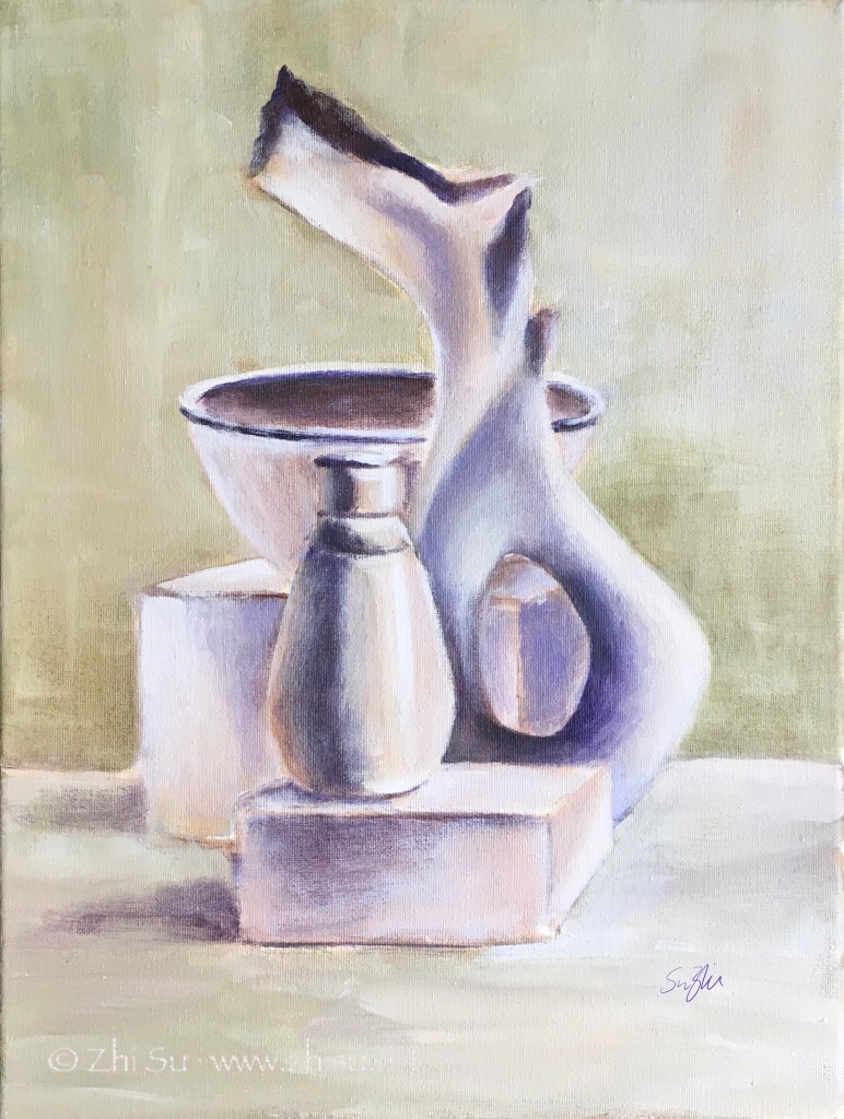
As I mentioned before, the paintings of Giorgio Morandi (1890-1964) often have a monochromatic look, even though he used a lot of colors. The result is a very restful and understated effect – something I always find difficult to achieve. Usually the more time I spent on a piece, the more colorful it becomes, as if keeping quiet on canvas or paper is against my nature. The same goes with details and edges. The more time spent, the more definition, and the looseness and gestures are lost.
So I tried a couple with limited time and clear goals. 1)No more than 2 hours per piece; 2) limited palette to create near monochromatic effect; 3) less definition; 4) lost edges; 5) be quiet.

I think goal setting with time restriction is an effective way of practicing. Right? :))
