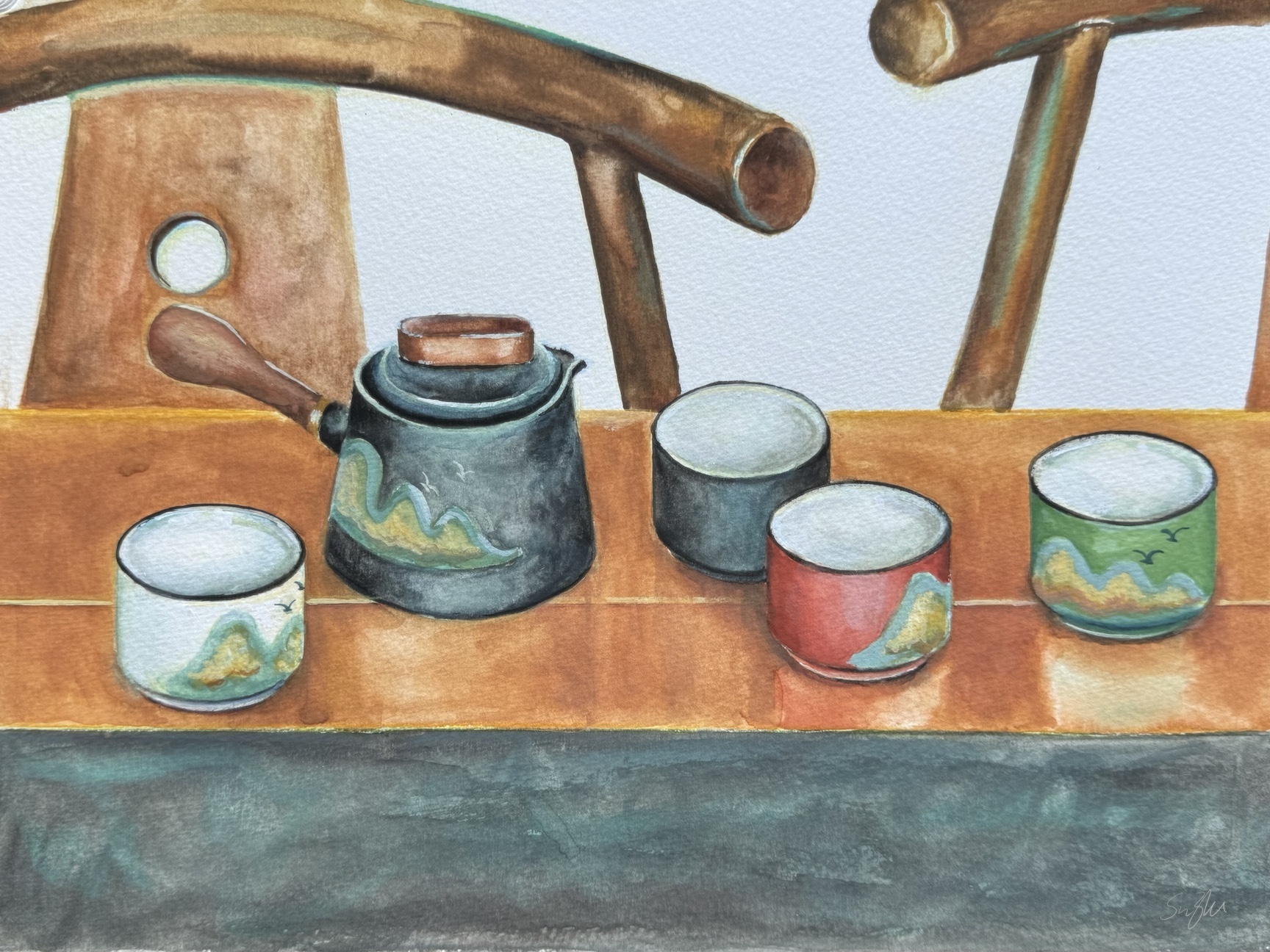
Tag Archives: #stilllifepainting

Cézanne – Reading Notes (2)

Among the books I read on Cézanne, two of them focuses on his watercolor. They are Cézanne in the Studio: Still Life in Watercolors by Carol Armstrong, and Cézanne’s Watercolors: Between Drawing and Painting by Matthew Simms.

The two watercolor books are a rich collection of the artist’s sketches, finished and unfinished works in the medium. Watercolor and gouache were often used by old masters as studies for a bigger oil piece, and it seems to the be case for Cézanne early on. However, later in his life, when his reputation began to be established, he increasingly make watercolors as independent works of art.

Cézanne’s watercolor is as unconventional as his oil paintings. The charcoal drawings, the white of the paper, and even the artist’s changing thought all become part of the composition. We see the draft, the negotiating and the final status on one page. This provides a unique window into the artist’s painting and the thinking process.

Still life with Green Melon, watercolor on paper, c.1906
Still Life with Apples, a Bottle and a Milk Pot, watercolor on paper, c. 1904

Unlike J. M. W. Turner (1775 – 1851) and other watercolorists, Cézanne adopts a touch by touch and color by color method. He layers translucent patches with gestural brushwork, resulting in a vibrant and casual overall appearance, with fragmentary and kaleidoscopic details. However, the actual process was deliberate and labor-intensive.

Still Life with Blue Pot, watercolor and graphite on paper, 48.1 x 632 cm, c 1900-1906

Contemporary figurative artist Ted Nuttall also employs transparent patches of colors to create energetic and vibrant paintings. While both artists are deliberate in their approach, Nuttall’s use of dots helps complete the painting, whereas Cézanne’s colors, used as lines, remain exploratory.

Africa, Ted Nuttall, watercolor on paper.

On a side note, for those interested, Cézanne uses a limited palette, as revealed by this nerdy study: “An Investigation of Paul Cézanne’s Watercolors With Emphasis on Emerald Green.”

Some Breakfast …

As promised, eggs and jars and some more:

A few notes:

  • All these are oil on canvas board, 11 x 14 in. I want to keep the studies small so that I could do more.
  • Eggs are difficult, either in terms of shape, value or solidity. There’s a fabricated story in China about how Da Vinci was forced by his master to sketch hundreds of eggs. Well, I do see the need of it.
  • My problem with over saturation manifested itself best with the bread. I probably wouldn’t eat that last one :))).

Some Flowers

Late 2022 I started a few personal projects that were build upon whatever I learned at Watts. The plan was to start with some small paintings of florals, eggs, jars etc., and gradually grow into bigger more complicated arrangements.

I am happy to report that for the most part, I have been on schedule. Here are the florals I have done so far, and I hope they are proper celebration for the New Year and the Spring Festival:

Peonies, oil on canvas, 9 x 12 in. 2022
Sumo Oranges and Flowers, oil on canvas, 11 x 14 in, 2022
Flower Pot, oil on canvas board, 9 x 12 in. 11 2022
Lilies, oil on canvas board, 11x 14 in, 12 2022

Stay tuned for the eggs and jars! 🙂

Our turn, finally …

Years ago in a watercolor class, we practiced rendering glasses by choosing from a couple of setups. I got ambitious and turned the practice into a full painting:

Still Life, watercolor on paper, 14 x 20 in, c2015

The roses were supposed to be a different setting, and I didn’t choose it because I thought apples would be easier. However, in composing the whole piece, I thought the glimpse of the flowers would be interesting. As you can see, I indeed didn’t know how to handle those petals and leaves back then, but I think they added liveliness to the scene. I remember some fellow artist commented, “The roses are saying,’We are here! Our turn! Our turn!'”

Recently when looking through some old reference photos, I was surprised to see that I actually took a few shots of the roses at the time. Hence, their turn:

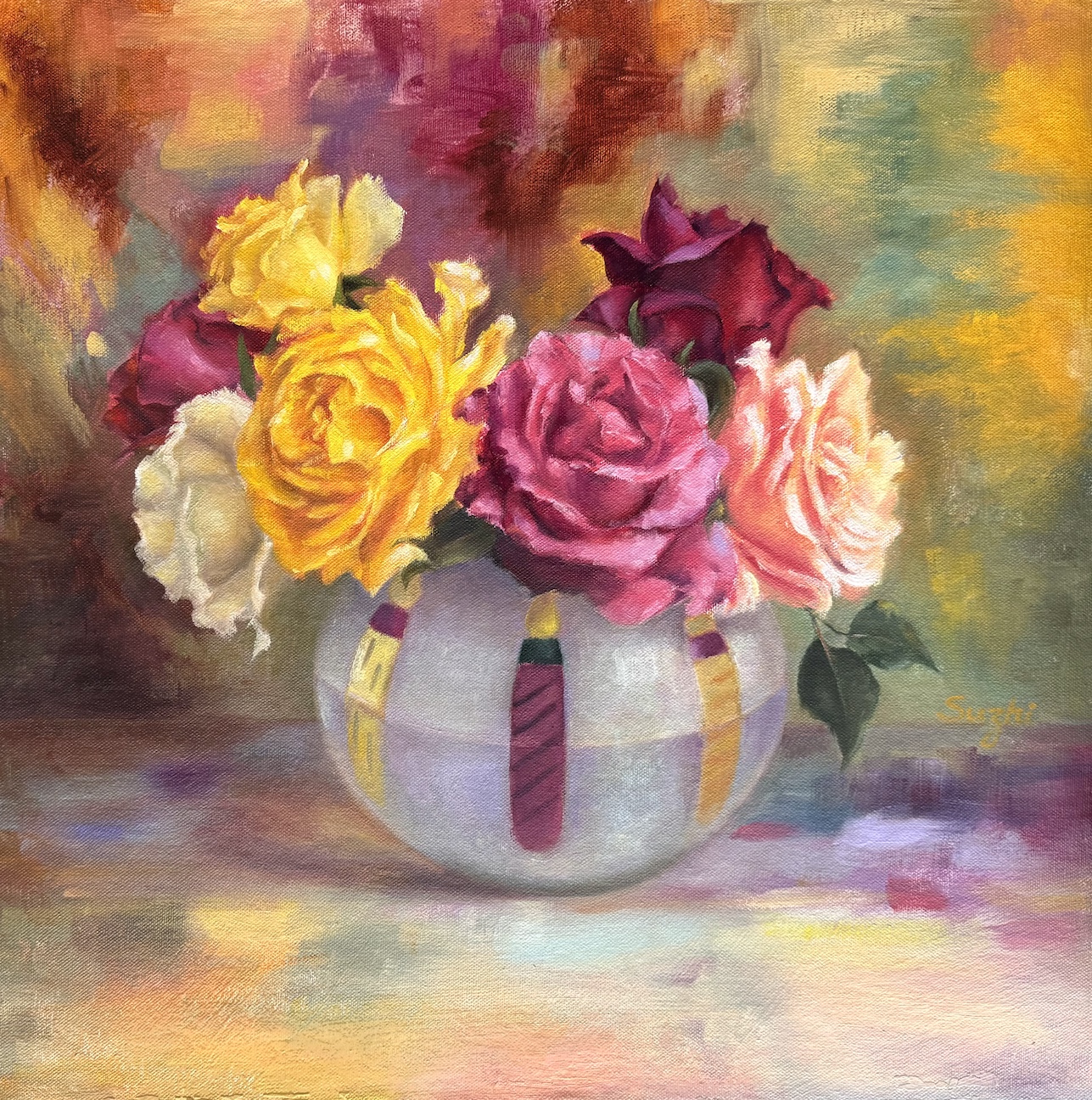
Red Roses, oil on canvas board, 11 x 14 in, August, 2022

Hehe, the petals and the leaves are still challenging, but I feel they are happy to be in the spotlight!

Oil and Watercolor

The way I learned to paint in oil, is to start with an underpainting. It could be a monochromatic value sketch, or a diluted full color draft. Either way, the underpainting would be covered by thicker paints as I progress and hopefully the process took the work to a better place. Once in a while, I just fell in love with the underpainting, and the continuation of the work was saturated with doubts.

This river landscape (a Watts homework) was an example. The one on the left was the underpainting and the one on the right, the final work. I hesitated quite a while after the first draft about whether I should proceed at all. There was a liveliness and richness of color that I loved and didn’t know how to preserve when I added more paint to it. Also got lost was a sense of flatness, something more graphic and watercolor-y. This is not to say the underpainting was a better painting, but it makes me wonder the different directions I could have taken in finishing up this work (if it is not a homework in realistic landscape). Even some of the pencil marks begged to stay!

Moreover, can I achieve a watercolor effect with oil paints? Well, somebody can.

Those men were children once. Julian Meagher, 100 cm x 100 cm. Oil on linen, 2015

That’s Australian artist Julian Meagher, who painted in oil but managed to achieve the transparency and the lucid aesthetics of watercolor. Apart from his website, Amber Creswell Bell’s collection Still Life: Contemporary Painters has a good section on Mr. Meagher’s work. He painted with extremely diluted oil paint, and did not hesitate to use the white of linen canvas instead of white paint. The result is a good combination of precision and fluency.

His works remind me of Giorgio Morandi (1890 – 1964), one of my favorite still life artists (as I mentioned many times before). The technical approach couldn’t be more different. Morandi is opaque and static, while Mr. Meagher is more colorful and vibrant, cleaner and much more scaled up. However, the solitude, the quietness and the thoughtfulness are there.

The more I see good art, the more I am wowed by the range and the potential of the each medium. We are only limited by our skills! (Is this a good thing or a bad thing? :))) )

The Still Life Batch (2)

All done, for now:

Red Roses and Pot, oil on canvas board, 11 x 14, 2022
Roses, oil on canvas board, 11 x 14, 2022
Pomegranates and Vase, oil on canvas board, 11 x 14, 2022
Flowers and Vase, oil on canvas board, 11 x 14, 2022

According to Mr. Watts, there would be many more levels of still life courses after the gesture one. However, the people at the Atelier see no plans for new releases. I still have some catching up to do in the landscape area, but otherwise, I will focus on my own practice and projects in the coming months.

The Still Life Batch (1)

Speeding things up …

Lilies, oil on canvas board, 11 x 14, 2022
Flowers and Shells, oil on canvas board, 11 x 14, 2022
Sunflowers, oil on canvas board, 11 x 14, 2022
Still Life, oil on canvas board, 11 x 14, 2022

The first one is a Zorn palette without time limit, and the rest are supposed to be gesture with an open palette. My plan is to finish the still life course soon, and I will write more about it when it’s all done.

A Delayed Plan for 2022: Portrait, Still Life, Landscape and More

2022 for me is not only moving on from the beloved Zorn palette, but also a broadening of the subject matters. The plan is to keep practicing portrait and still-life, with an emphasis on loosening up and becoming more gestural. Meanwhile, I will add landscape and later figures to the learning schedule. For medium, oil is the focus for now, but I’d like to do more watercolor sketches with or without ink.

Here are some my recent homework from Watts:

Oil painting of orchid flowers and a Buddha statue with drapery, realism
Orchid and Buddha, 11 x 14, oil on canvas board, Dec. 2021
Pine trees in front of snowy mountain, oil painting, landscape
Pines, 11 x 14, oil on canvas board, Jan. 2022
Oil painting of crashing waves and rocks, seascape
Waves 1, 11 x 14, oil on board, Jan. 2022
Oil painting of an old man, gesture portrait, realism
Old man, 11 x 14, oil on canvas board, Feb, 2022

A few notes:

  • Landscape is not a particular interest of mine, but for years, I used it as a check-mark to see if I have made any progress in techniques. After doing other subject matters for a while, I would attempt a few landscapes to see if I feel more confident and comfortable. It never did!
  • It took me some time to figure out that apart from value control, the key to a successful landscape painting is shape design. To deliver a believable tree, on surface you have more leeway than doing a portrait, but the lack of definitive guidance (the shape of an eye, a nose etc.), you need to come up with your own. That freedom can be a curse.
  • Looking above, it suddenly hits me that before doing trees, it might be a good idea to practice more bearded and hairy portraits first! 😉

More Limited Palettes and Moving on …

Zorn is not the only limited palette used by artists. Well-known landscape artist Scott L. Christensen stayed with lemon yellow, cadmium red, ultramarine blue and white for many years, and his method has many followers. Presidential portrait artist Mark Carder teaches a palette of 5 colors, permanent alizarin crimson, cadmium yellow pale, french ultramarine, titanium white and burnt umber. Karen Blackwood painted her award winning coastal sceneries mainly with alizarin crimson, cadmium yellow pale, ultramarine blue, titanium white and viridian.

It’s not hard to see that all these are some versions of the primary colors. Replacing Zorn’s ivory black with Ultramarine and yellow ochre with a brighter yellow allows a more chromatic and less muted approach to painting.

Using a limited palette doesn’t mean you can’t use other colors. The above mentioned artists, Zorn included, all supplement their palette whenever necessary. Limiting color choices is to create harmony and in training, helps us focusing more on values. Eventually, we need to listen to the painting itself for what color comes in.

I have been staying with Zorn for months now, and it serves well for portrait painting. As I moving on to more still life and floral paintings, I began adding more colors to my palette. Zorn is still my starting point and foundation for each painting. Here are some recent exercises from my Watts classes:
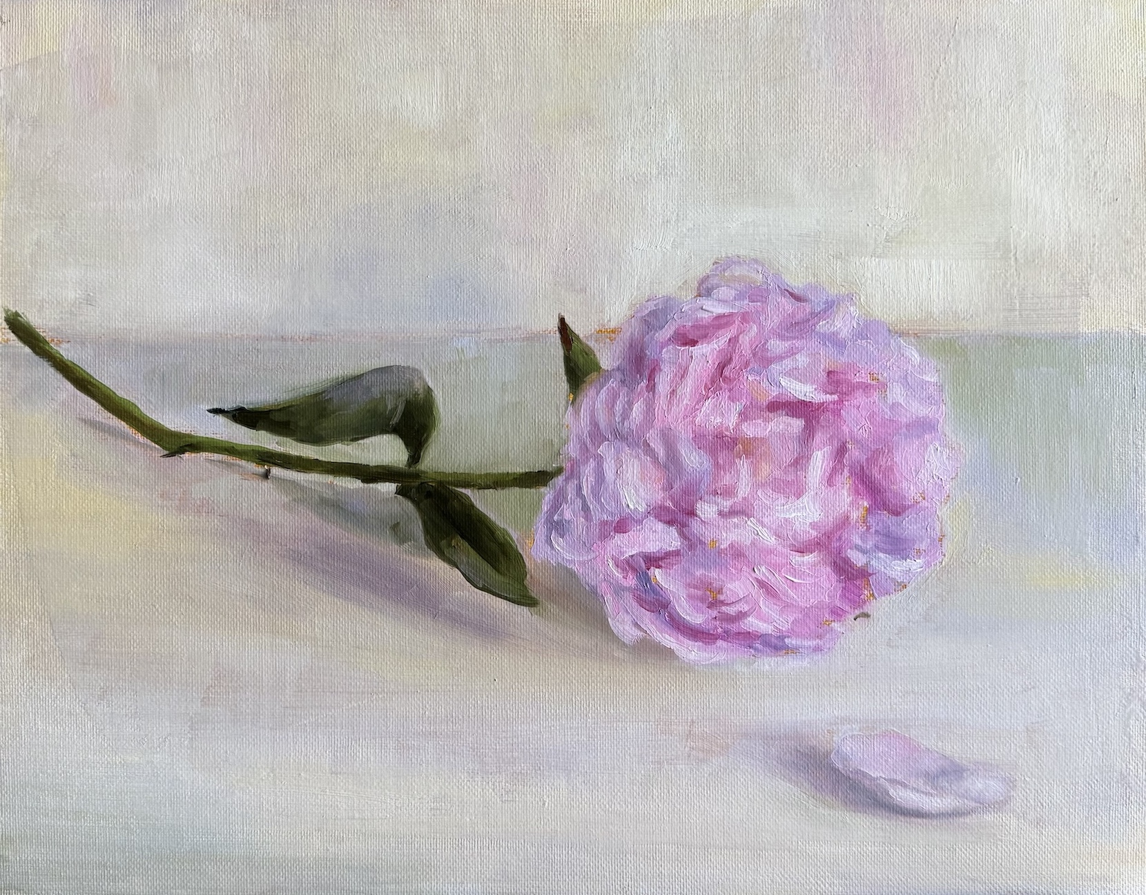
Oil painting of sunflowers in bronze jar, realism
Sunflowers, oil on canvas board, 11 x 14 in, 2021
Oi painting of Irises in a blue vase, drapery, realism
Irises, oil on canvas board, 11 x 14 in, 2021
Oil painting of pink roses in a bronze vase, drapery, realism
Roses, oil on canvas board, 11 x 14 in, 2021

Something Seasonal … :)))

Oil painting of skull, side view, burnt umber
Skull – side view, oil on canvas board, 9 x 12, 2021
Oil painting of skull, quarter view, burnt umber
Skull – quarter view, oil on MDF board, 11 x 14, 2021
Oil painting of skull, front view, blue
Skull – front view, oil on canvas board, 11 x 14, 2021

A few notes:

  • Still homework from Watts, burnt umber pick out, burnt umber and white, phthalo-blue, black and white respectively.
  • I like MDF board covered with canvas better than MDF board with gesso, because it’s more absorbent. On gessoed board, the paint takes longer to settle which can be frustrating. However, if you like the super smooth and realistic look, board it is.
  • I need to learn how to take photos of oil paintings. 😉
  • Happy Halloween! 🎃 👻