As I mentioned before, the paintings of Giorgio Morandi (1890-1964) often have a monochromatic look, even though he used a lot of colors. The result is a very restful and understated effect – something I always find difficult to achieve. Usually the more time I spent on a piece, the more colorful it becomes, as if keeping quiet on canvas or paper is against my nature. The same goes with details and edges. The more time spent, the more definition, and the looseness and gestures are lost.
So I tried a couple with limited time and clear goals. 1)No more than 2 hours per piece; 2) limited palette to create near monochromatic effect; 3) less definition; 4) lost edges; 5) be quiet.
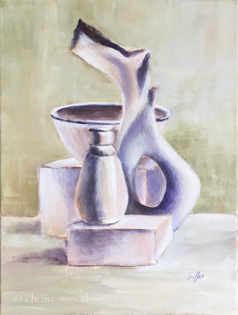
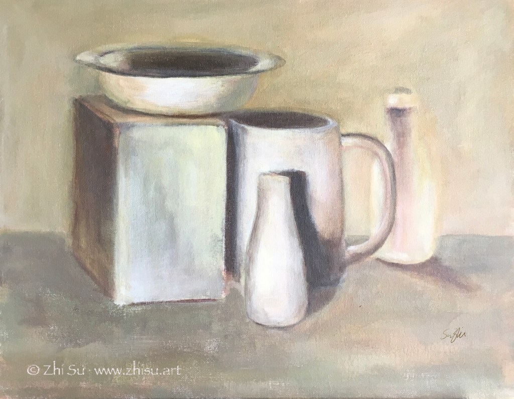
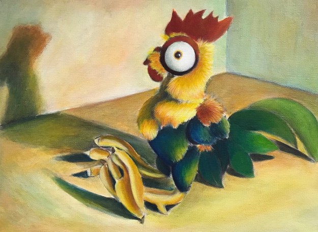
Still life, acrylic on canvas, 9 x 12 in, 2019Still life, acrylic on canvas board, 16 x 20 in, 2019
I think goal setting with time restriction is an effective way of practicing. Right? :))
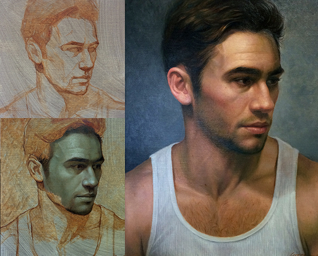
Verdaccio is a greenish gray color achieved by mixing of black (often mars , yellow, and white. It’s used by old masters for underpainting, especially in fresco painting. In portrait or figure painting, the greenish gray served as a complementary to the pinkish flesh color, and it also creates a contrast in temperature. The result is a more vibrant skin tone.
Contemporary artist Cuong Nguyen applies the verdaccio technique to not only oil painting, but also pastel and watercolor, with stunning result.
You can see in pastel drawing, Cuong really pushes the green. Another sample from him:
Don’t be fooled by the layout of the above poster though. This is not a 4 or 5 step drawing. You need to sharpen your pastel pencils, apply lightly, and work many, many, many layers.
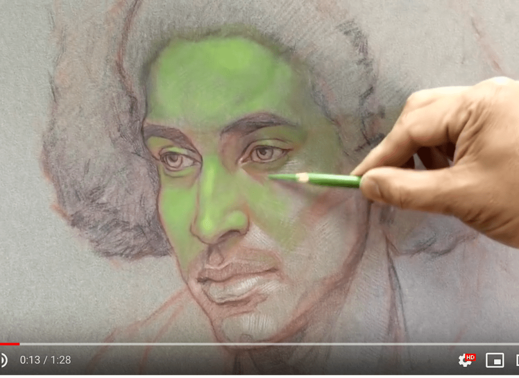
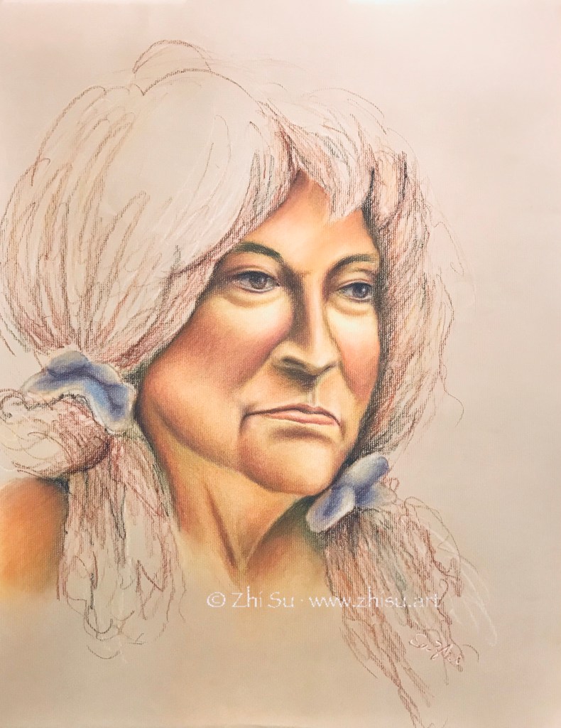
I tried this method in a simplified way during a life drawing session, and here’s the result:
Wenda, pastel on paper, 18 x 24 in, 2019
Since camera was not allowed during life drawing, I didn’t record the early stage of this piece. I did start with leaf green, and my fellow artists thought I was going for a Halloween theme. Here are some other things I noticed:
CarbOthello pastel pencils are great. Versatility and control at the same time.
While it takes many layers to cover the green, a little bit showing through is not that bad. After all, our veins are sort of that color.
If you want to achieve Cuong’s level realism, you need a better quality paper to take more layers; keep your pencils sharp (which I totally ignored), and a lot of patience.
Be careful about the fixatives. I used Krylon Workable Fixatif. It makes my drawing darker and grainier.
Some day, I’ll try this verdaccio technique in oil.
Of the three components of color, hue, value and saturation, I personally find value the most difficult. Colors are attractive and distracting, and it could be difficult to discern values accurately from all the colors in front of us. Monochromatic painting is a great way to train your eyes this way.
In traditional Chinese brush paintings, many of which are monochromatic, it’s the value changes through the control of water that create the art. I took a few lessons of Chinese brush painting one summer, and lessons were mainly copying old masters. This is one of the paintings I copied:
After Qi Baishi, ink on Xuan paper, summer 2018
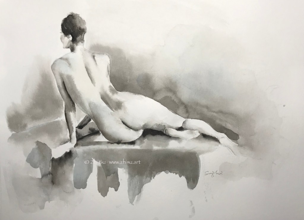
Monochromatic is a good strategy when time is limited. In life painting, it saves the trouble of finding the right skin color and allows me to focus on value and shape.
Woman, ink on watercolor paper, 9 x 12 in, 2018
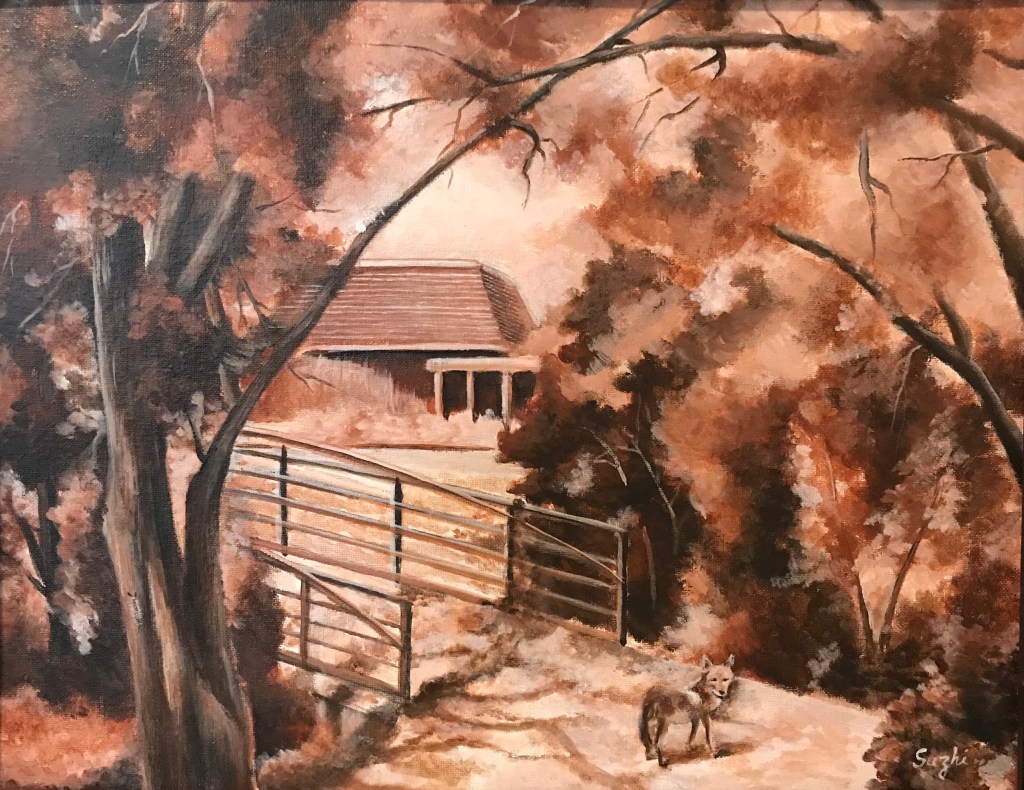
In landscape scene with overwhelming branches and leaves, monochromatic approach simplifies the view. This plein air was done in burnt sienna. I included some of the visitors I had during the painting – out of proportion, I know, but a lot of fun.
Fox and Caterpillar at West Valley, acrylic on canvas board, 16 x 20 in, 2018
More than often, monochromatic painting is used as underpainting. It serves as a value map, but also allow some color strategies. (I found this post by Mitchel Albala very helpful.)
Another approach is to do a monochromatic underpainting, and glaze over it with transparent colors, often times many layers. For acrylic, that means adding quite some medium to the color. My selfie is done this way – dozens of layers. I have to admit, I doubt I will ever use this method again. Too tedious.
Selfie, acrylic on canvas board, 16×20 in , 2018
I think in theory it could be done with watercolor too, for watercolor is transparent in nature. Even the opaque ones, with enough water, become transparent to some extent. From what I heard, to glaze in watercolor, the key is to wait for the underpainting or the previous layer really really dry, bone dry. Maybe someday I will try it.
A most common way to practice complementary colors is simple choose a pair and limited your palette to those two (plus tints, shades, mixtures maybe). Like this:
Skull (horse?), soft pastel on paper, 18×24 in, 2018
Whichever pair of colors we choose, it is most likely one warm and one cool. In a painting lesson I took years back, we used the complementaries a bit differently. We create a painting in cool colors, and paint the warm complementaries on top. Here’s the result:
Still life, acrylic on canvas board, 16×20 in, 2018
Unfortunately I failed to take a picture of the cool painting underneath, though I did let the cool colors showed through here and there. The colors were not strictly restricted to one pair of complementary colors, but it is within certain range.
I’d say the result is quite different than if I started with these topical colors. There’s a solidity and unity unique to this method.