Tag Archives: #landscapepainting

Oil and Watercolor

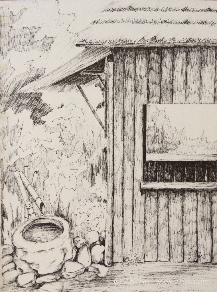
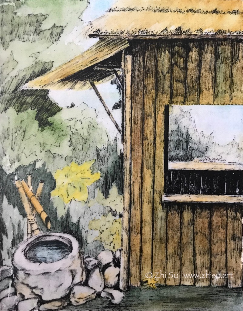
The way I learned to paint in oil, is to start with an underpainting. It could be a monochromatic value sketch, or a diluted full color draft. Either way, the underpainting would be covered by thicker paints as I progress and hopefully the process took the work to a better place. Once in a while, I just fell in love with the underpainting, and the continuation of the work was saturated with doubts.

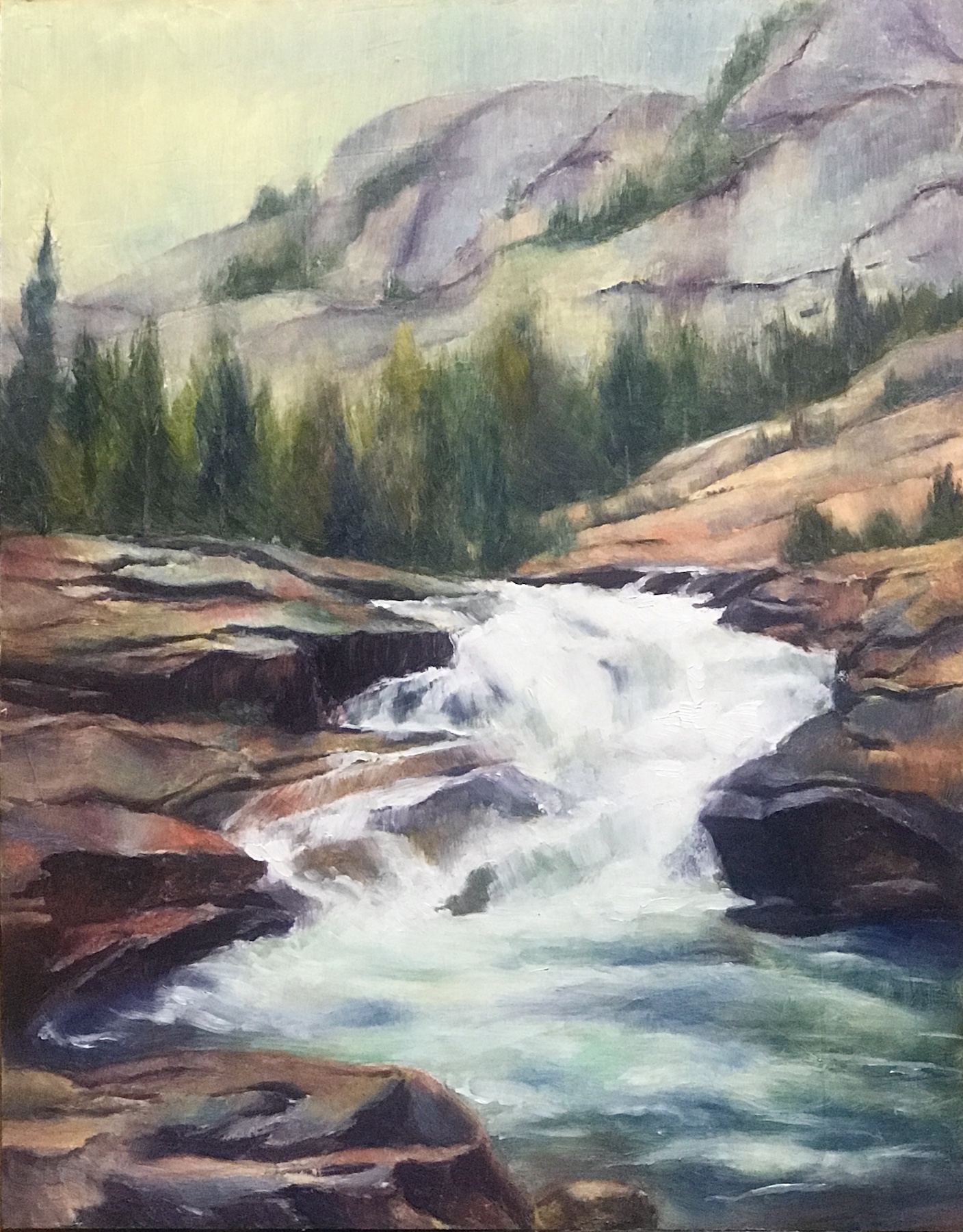
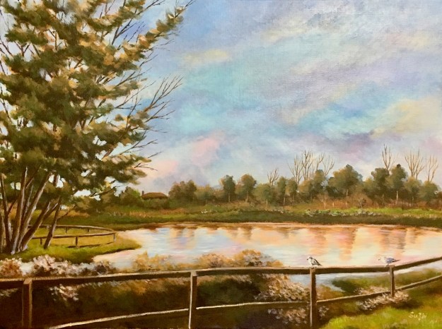
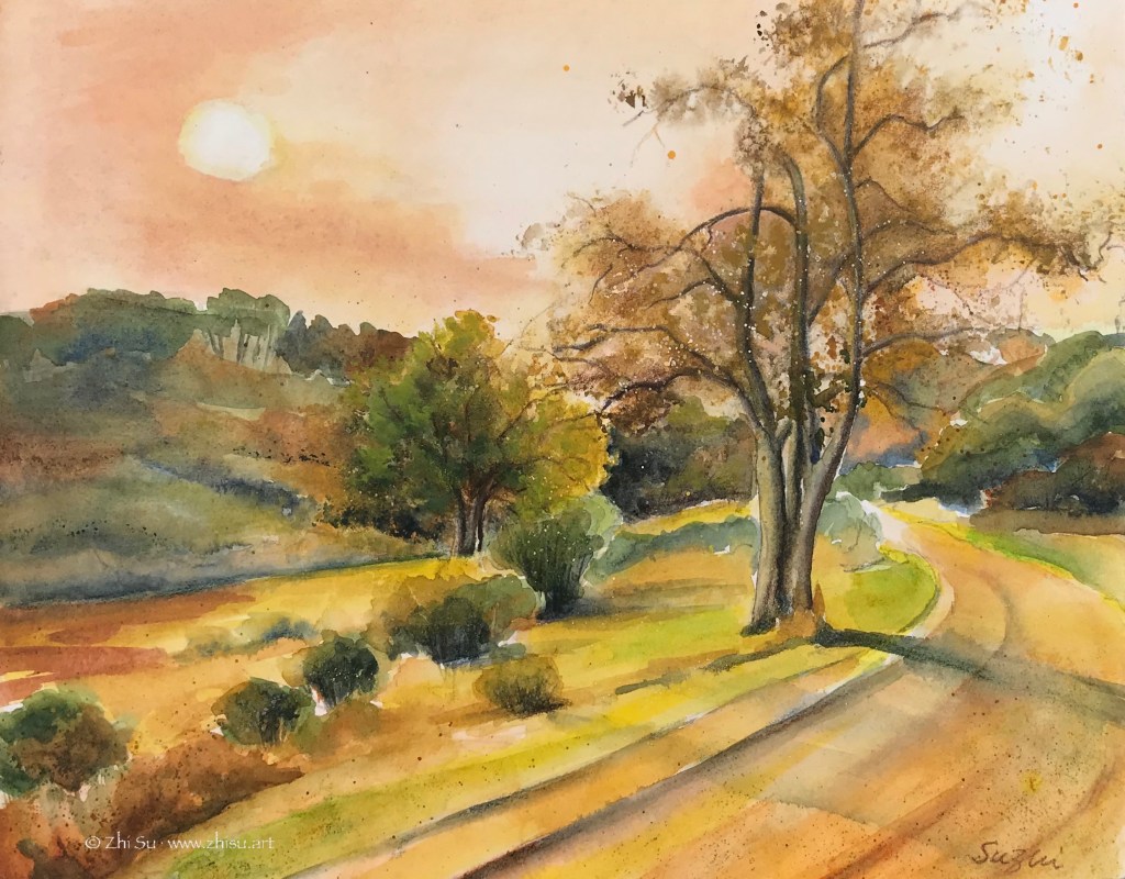
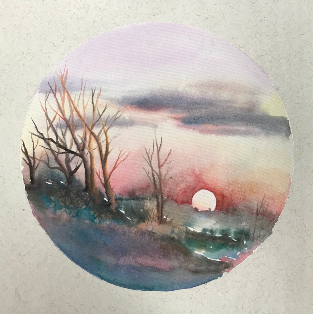
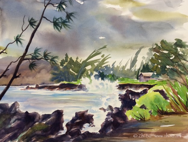
This river landscape (a Watts homework) was an example. The one on the left was the underpainting and the one on the right, the final work. I hesitated quite a while after the first draft about whether I should proceed at all. There was a liveliness and richness of color that I loved and didn’t know how to preserve when I added more paint to it. Also got lost was a sense of flatness, something more graphic and watercolor-y. This is not to say the underpainting was a better painting, but it makes me wonder the different directions I could have taken in finishing up this work (if it is not a homework in realistic landscape). Even some of the pencil marks begged to stay!

Moreover, can I achieve a watercolor effect with oil paints? Well, somebody can.

Those men were children once. Julian Meagher, 100 cm x 100 cm. Oil on linen, 2015

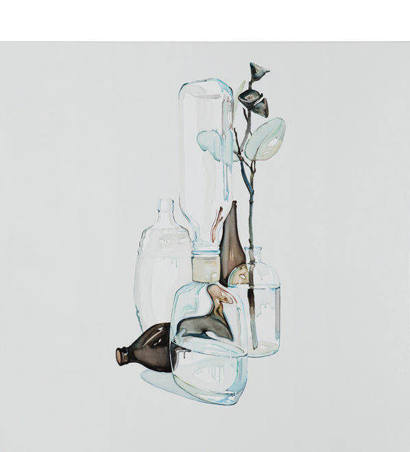
That’s Australian artist Julian Meagher, who painted in oil but managed to achieve the transparency and the lucid aesthetics of watercolor. Apart from his website, Amber Creswell Bell’s collection Still Life: Contemporary Painters has a good section on Mr. Meagher’s work. He painted with extremely diluted oil paint, and did not hesitate to use the white of linen canvas instead of white paint. The result is a good combination of precision and fluency.

His works remind me of Giorgio Morandi (1890 – 1964), one of my favorite still life artists (as I mentioned many times before). The technical approach couldn’t be more different. Morandi is opaque and static, while Mr. Meagher is more colorful and vibrant, cleaner and much more scaled up. However, the solitude, the quietness and the thoughtfulness are there.

The more I see good art, the more I am wowed by the range and the potential of the each medium. We are only limited by our skills! (Is this a good thing or a bad thing? :))) )

A Delayed Plan for 2022: Portrait, Still Life, Landscape and More

2022 for me is not only moving on from the beloved Zorn palette, but also a broadening of the subject matters. The plan is to keep practicing portrait and still-life, with an emphasis on loosening up and becoming more gestural. Meanwhile, I will add landscape and later figures to the learning schedule. For medium, oil is the focus for now, but I’d like to do more watercolor sketches with or without ink.

Here are some my recent homework from Watts:

Oil painting of orchid flowers and a Buddha statue with drapery, realism
Orchid and Buddha, 11 x 14, oil on canvas board, Dec. 2021
Pine trees in front of snowy mountain, oil painting, landscape
Pines, 11 x 14, oil on canvas board, Jan. 2022
Oil painting of crashing waves and rocks, seascape
Waves 1, 11 x 14, oil on board, Jan. 2022
Oil painting of an old man, gesture portrait, realism
Old man, 11 x 14, oil on canvas board, Feb, 2022

A few notes:

  • Landscape is not a particular interest of mine, but for years, I used it as a check-mark to see if I have made any progress in techniques. After doing other subject matters for a while, I would attempt a few landscapes to see if I feel more confident and comfortable. It never did!
  • It took me some time to figure out that apart from value control, the key to a successful landscape painting is shape design. To deliver a believable tree, on surface you have more leeway than doing a portrait, but the lack of definitive guidance (the shape of an eye, a nose etc.), you need to come up with your own. That freedom can be a curse.
  • Looking above, it suddenly hits me that before doing trees, it might be a good idea to practice more bearded and hairy portraits first! 😉

Show News

“Lamonte,” one of my 100 Day Art Challenge paintings, entered 6th Annual Figures & Faces Art Exhibition at Fusion Art Gallery as a finalist:

Watercolor painting of model Lamonte
Portrait of Lamonte, watercolor on paper, 9 x 12 in, July 2020

“Waterfall” and “Penitencia Creek Park” entered “Landscape” show at Grey Cube Gallery as finalist:

Landscape, acrylic on canvas, 24 x 30, 2017
Waterfall, acrylic on canvas, 24 x 30
Acrylic landscape painting, Penitencia Creek Park, trees, lake, birds
Penitencia Creek Park, acrylic on canvas, 16 x 20 in, 2019

Small steps, but moving forward nonetheless!

Orange Day

If you are on the west coast you know what I am talking about. The sky is literally orange the whole day, from Oregon to California! I painted this scenery a while ago, as a sunset scene. I mounted to a cradled wood panel, and varnished it (see my previous post about hanging with frame). I believe the varnish darkened the painting a bit, and the result is a perfect depiction of today:

Orange Day, watercolor on paper,11 x 14 in, 2020

As much as I enjoy being a prophet, I miss my neighborhood’s normal color:

Neighborhood walk 1, watercolor on paper, 9 x 12 in, 2020

Looking Out of My Window

Sometimes when I run out of ideas, I stare at the trees outside my window. Occasionally, I draw or sketch them:

Since I am a bit running out of topic recently, I turned my window scene into a couple of paintings:

Window Scene 1, watercolor on paper, August, 2020
Window Scene 2, watercolor on paper, August 2020

There are usually squirrels dancing on the branches and crows meeting on those roofs, and once in a while, I am waken up by wood peckers attacking the trunks. Some day, I will manage to catch them in my “window paintings.” 🙂

Color Studies (2) – Monochromatic

Of the three components of color, hue, value and saturation, I personally find value the most difficult. Colors are attractive and distracting, and it could be difficult to discern values accurately from all the colors in front of us. Monochromatic painting is a great way to train your eyes this way.

In traditional Chinese brush paintings, many of which are monochromatic, it’s the value changes through the control of water that create the art. I took a few lessons of Chinese brush painting one summer, and lessons were mainly copying old masters. This is one of the paintings I copied:

After Qi Baishi, ink on Xuan paper, summer 2018

Monochromatic is a good strategy when time is limited. In life painting, it saves the trouble of finding the right skin color and allows me to focus on value and shape.

Woman, ink on watercolor paper, 9 x 12 in, 2018

In landscape scene with overwhelming branches and leaves, monochromatic approach simplifies the view. This plein air was done in burnt sienna. I included some of the visitors I had during the painting – out of proportion, I know, but a lot of fun.

Fox and Caterpillar at West Valley, acrylic on canvas board, 16 x 20 in, 2018

More than often, monochromatic painting is used as underpainting. It serves as a value map, but also allow some color strategies. (I found this post by Mitchel Albala very helpful.)

Another approach is to do a monochromatic underpainting, and glaze over it with transparent colors, often times many layers. For acrylic, that means adding quite some medium to the color. My selfie is done this way – dozens of layers. I have to admit, I doubt I will ever use this method again. Too tedious.

Selfie, acrylic on canvas board, 16×20 in , 2018

I think in theory it could be done with watercolor too, for watercolor is transparent in nature. Even the opaque ones, with enough water, become transparent to some extent. From what I heard, to glaze in watercolor, the key is to wait for the underpainting or the previous layer really really dry, bone dry. Maybe someday I will try it.

Copying Masters (7) – Zoltan Szabo

Zoltan Szabo (1928-2003) was born in Hungary and later immigrated to Canada, then US. He was a modern master of transparent watercolor, and his technique books are popular among watercolorist. I learned to use big brushes and bold colors from reading his paintings.

The study of “The Last Wink” though, was for a different purpose. It is the harmony of unity of the colors that attracts me. I have a tendency to be too “colorful” with my paintings, and often don’t know how to control it. I like how the colors in this Szabo painting is so rich yet without being noisy.

The painting is collected in his book Zoltan Szabo’s 70 Favorite Watercolor Techniques.

The original:

Zoltan Szabo, The Last Wink, watercolor on paper, 13.75″ x 18″

My copy:

After Zoltan Szabo, watercolor on rice paper, 2019

While Szabo’s original was on cold press watercolor paper, my study was done on pre-matted rice paper. It is intended for Chinese brush painting, and is very delicate and absorbent.

Pairs (II) – Color or No Color?

Park in Beijing, Ink drawing
Park in Beijing, micron pen on sketchbook
ink drawing with watercolor glaze
Park in Beijing, mixed media on canvas

I did a sketch with micron pen while traveling in Beijing many years ago. I quite like the result, but also wondered what it would look like with some color. I didn’t want to paint over the drawing, fearing that I might ruin it. So this was the solution I came up with:

  • I first made a photocopy of the drawing.
  • Then I transferred it onto a canvas (‘Glue’ the photocopy onto the canvas with acrylic medium and scrubbed off the paper when it’s dry. The image will stay.)
  • Next I glazed over the image with watercolor. The surface was not comparable to regular watercolor paper, so I only did a few layers of light washes.
  • When it’s bone dry, I varnished it with acrylic medium (gloss). I didn’t know there were spray-on varnishes back then, so I brushed on the medium, It did disturb the paint a bit, but since it’s very dry and very light layers, it’s not that bad.
  • Since it’s varnished, I could hang it without glass. And I still have my original sketch! 🙂

Pairs (I) – Watercolor vs Acrylic

I posted this landscape in acrylic before, and I recently uncovered a watercolor version of it. So, sorry for repeating myself, but it’s interesting to look at them together:

landscape, trees, acrylic
Path, acrylic on canvas board, 12 x 16, 2015
landscape, trees, watercolor
Path, watercolor, 2015

I like the less defined forms and more spontaneous color ranges a wet-on-wet watercolor creates, but I also like the dark values the acrylic painting can bring out. The reference I used for the two is the same, and whatever difference you see from the these paintings are not by design. It seems the mediums just lead me there. How bizarre!