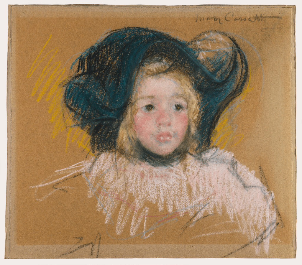
A couple of years ago, I went to Degas, Impressionism, and the Paris Millinery Trade exhibition at the Legion of Honor Museum in San Francisco. Among the 40 Impressionist paintings and drawings about French fashion, American artist Mary Cassatt (1844 – 1926)’s pastel drawing made quite an impression on me. The gentle and soft gradation on the face of the little kid is surrounded by quick and dynamic lines, showcasing of the caring nature of a woman and the expressiveness of an artist.
The original:
Mary Cassatt, Head of Simone in a Green Bonnet with Wavy Brim (No. 2), c. 1904, pastel on paper, 16 x 17.875 in.
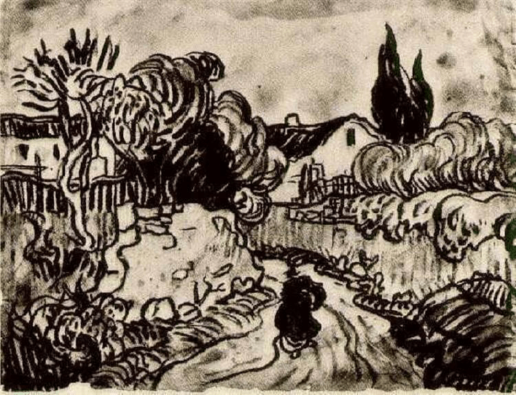
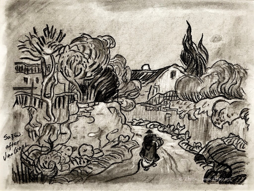
Zoltan Szabo (1928-2003) was born in Hungary and later immigrated to Canada, then US. He was a modern master of transparent watercolor, and his technique books are popular among watercolorist. I learned to use big brushes and bold colors from reading his paintings.
The study of “The Last Wink” though, was for a different purpose. It is the harmony of unity of the colors that attracts me. I have a tendency to be too “colorful” with my paintings, and often don’t know how to control it. I like how the colors in this Szabo painting is so rich yet without being noisy.
Zoltan Szabo, The Last Wink, watercolor on paper, 13.75″ x 18″
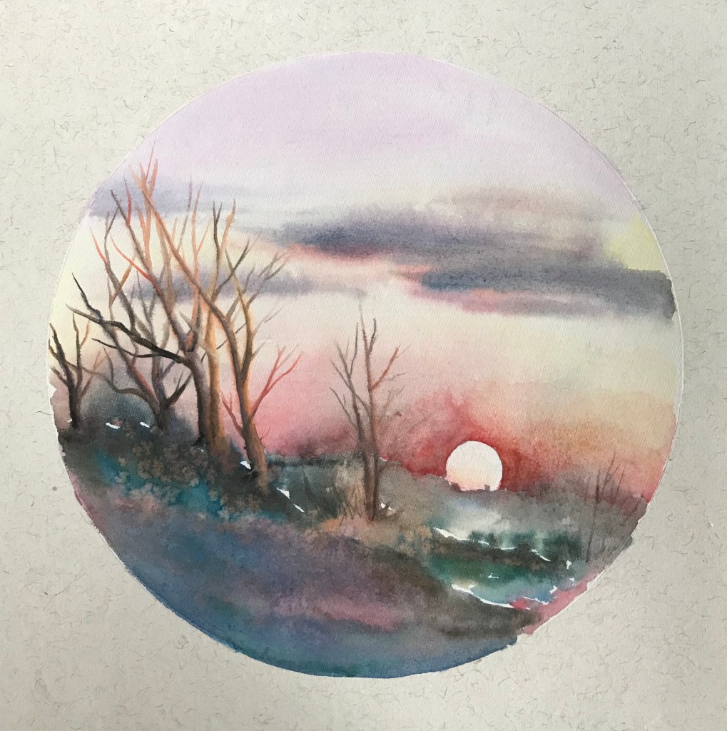
My copy:
After Zoltan Szabo, watercolor on rice paper, 2019
While Szabo’s original was on cold press watercolor paper, my study was done on pre-matted rice paper. It is intended for Chinese brush painting, and is very delicate and absorbent.
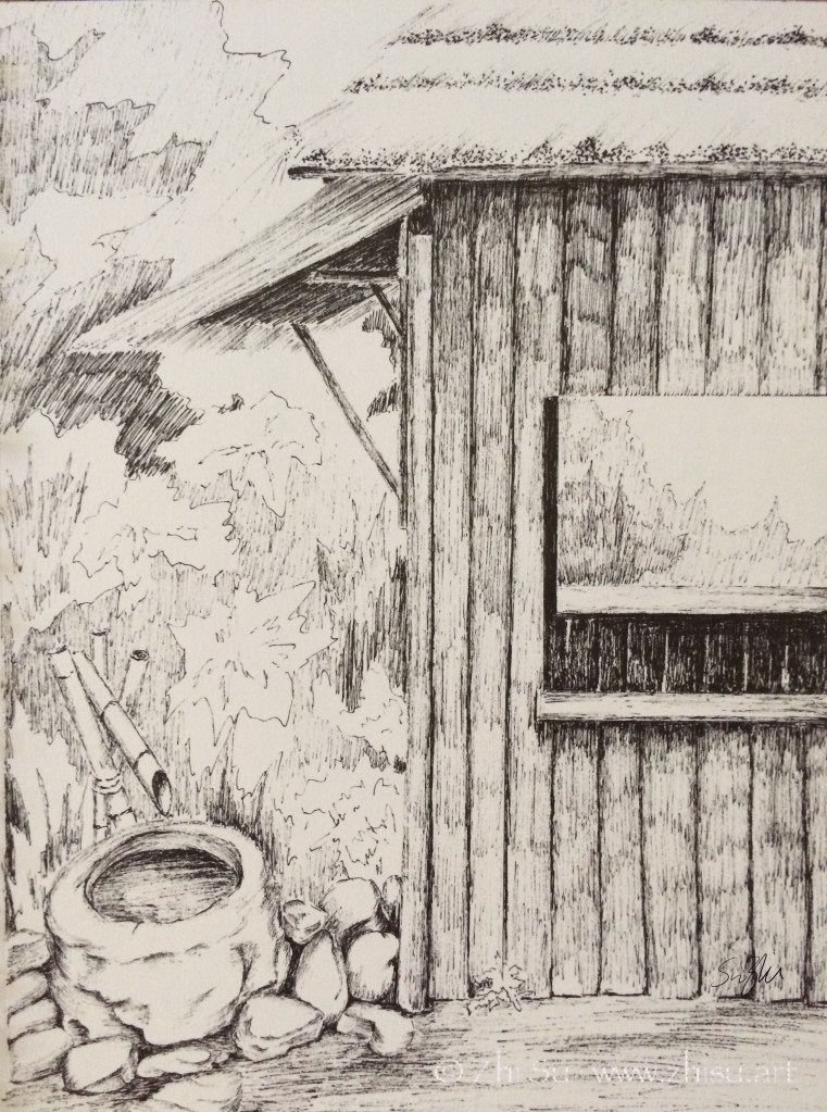
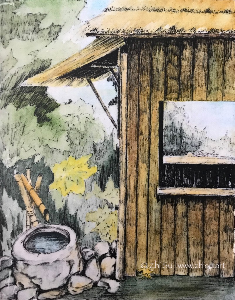
Park in Beijing, micron pen on sketchbookPark in Beijing, mixed media on canvas
I did a sketch with micron pen while traveling in Beijing many years ago. I quite like the result, but also wondered what it would look like with some color. I didn’t want to paint over the drawing, fearing that I might ruin it. So this was the solution I came up with:
I first made a photocopy of the drawing.
Then I transferred it onto a canvas (‘Glue’ the photocopy onto the canvas with acrylic medium and scrubbed off the paper when it’s dry. The image will stay.)
Next I glazed over the image with watercolor. The surface was not comparable to regular watercolor paper, so I only did a few layers of light washes.
When it’s bone dry, I varnished it with acrylic medium (gloss). I didn’t know there were spray-on varnishes back then, so I brushed on the medium, It did disturb the paint a bit, but since it’s very dry and very light layers, it’s not that bad.
Since it’s varnished, I could hang it without glass. And I still have my original sketch! 🙂
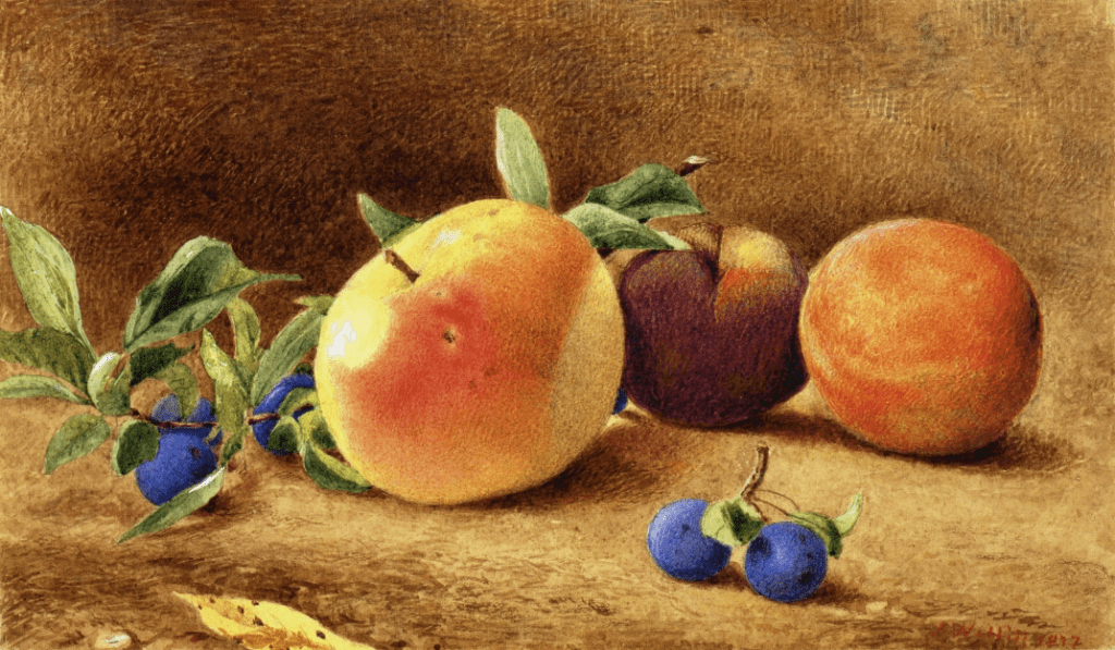
J. W. Hill (1812-1879) was a British born American watercolorist and lithographer. I came across his work in a still life anthology and was taken with soft, serene and tangible feeling he created with watercolor, quite different from the wet-in-wet method I was taught in. Upon close-up examination, it is full of tiny strokes, like an engraving. Some of the strokes in the background created interesting patterns and was applied in a very painterly way. Maybe that’s how you do impasto with watercolor! 😁
In my copy, I didn’t go for the strokes. I was at a moment that my colors often ran wild. I think Hill’s Study of Fruit is a good example of unity and harmony with colors, and that’s what I went for.
I almost missed this: obviously yesterday was J. W. Hill’s birthday. So happy birthday Mr. Hill! 🎂
J.W. Hill, Study of Fruit, 1877. Watercolor on paper, 6.13 x 10.63 in.
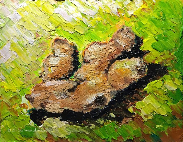
This was an assignment from a painting class (acrylic) a while ago. The purpose was to learn impasto. I chose ginger because I thought the bumpy, textured surface might go well with the technique, and also I usually bought them in bulk from Costco.
It’s a small painting with a single object, and I figured I could get it done in no time. I was so wrong.
There were two things that I couldn’t get used to. First, as someone who started painting first with watercolor, I wasn’t used to putting a lot of paint on canvas. For the purpose of this assignment, we were supposed to achieve a measurable thickness. And acrylic, a water-based medium, dries flat! I ended up working in layers, waited for a long time (longer then usual acrylic time at least) for the paint to dry, and went back to add more and more.
Another thing was the purpose of impasto technique itself. It supposed to be more about expressiveness than rendering, and I had trouble leaving my strokes in and my details out. So I kept going back and forth adding things in and taking them out. I have done so many paintings on this tiny canvas, and what a heavily loaded ginger! 🙂
I posted this landscape in acrylic before, and I recently uncovered a watercolor version of it. So, sorry for repeating myself, but it’s interesting to look at them together:
Path, acrylic on canvas board, 12 x 16, 2015Path, watercolor, 2015
I like the less defined forms and more spontaneous color ranges a wet-on-wet watercolor creates, but I also like the dark values the acrylic painting can bring out. The reference I used for the two is the same, and whatever difference you see from the these paintings are not by design. It seems the mediums just lead me there. How bizarre!