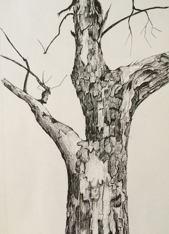
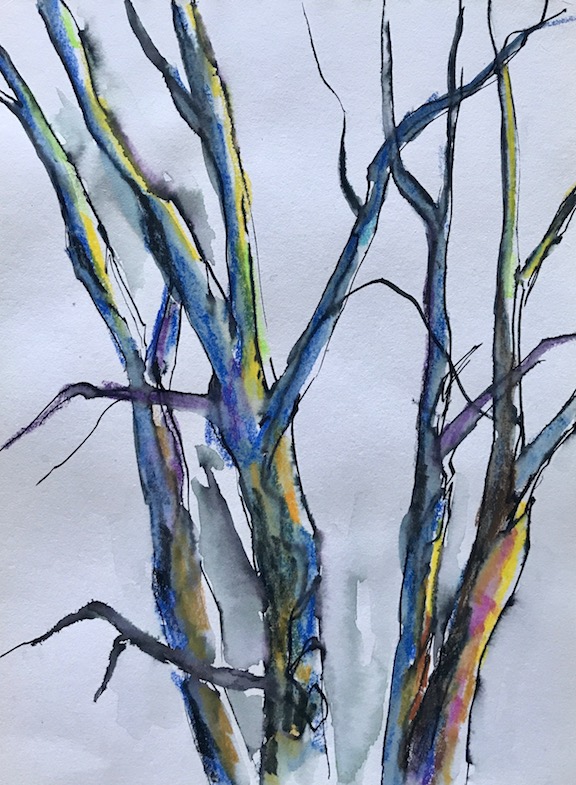
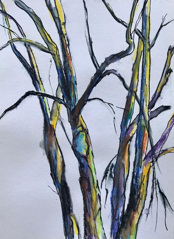
Sometimes when I run out of ideas, I stare at the trees outside my window. Occasionally, I draw or sketch them:
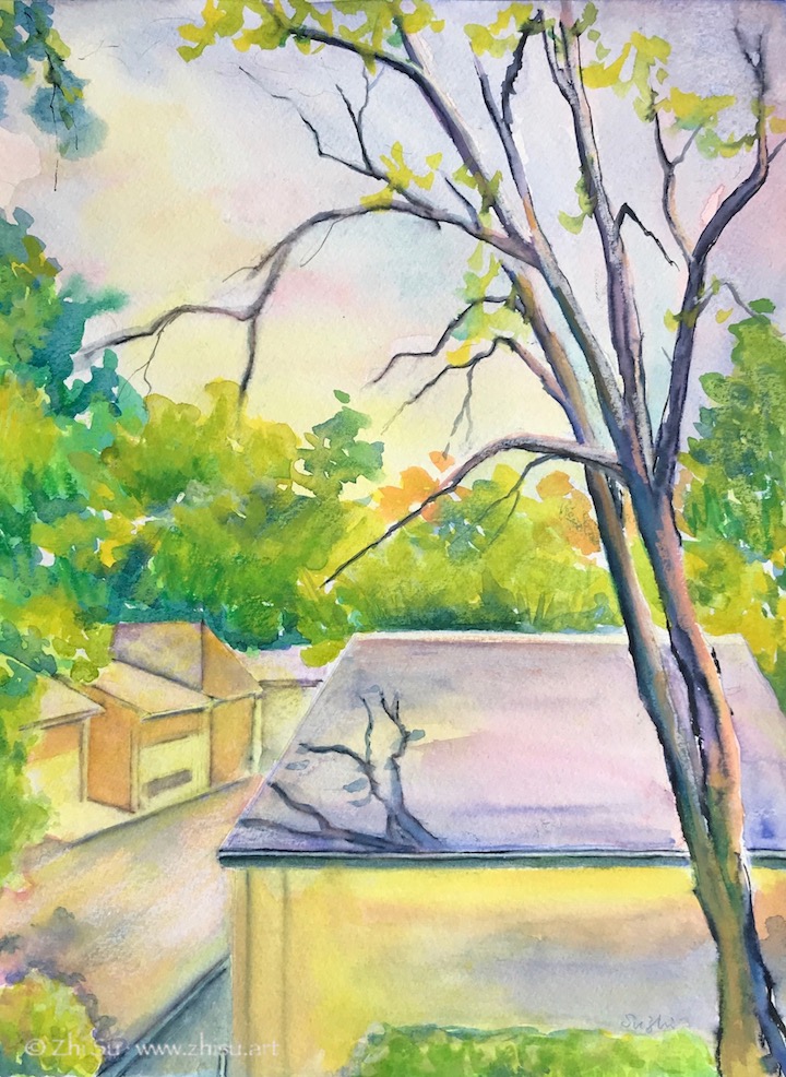
Since I am a bit running out of topic recently, I turned my window scene into a couple of paintings:
Window Scene 1, watercolor on paper, August, 2020Window Scene 2, watercolor on paper, August 2020
There are usually squirrels dancing on the branches and crows meeting on those roofs, and once in a while, I am waken up by wood peckers attacking the trunks. Some day, I will manage to catch them in my “window paintings.” 🙂
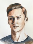
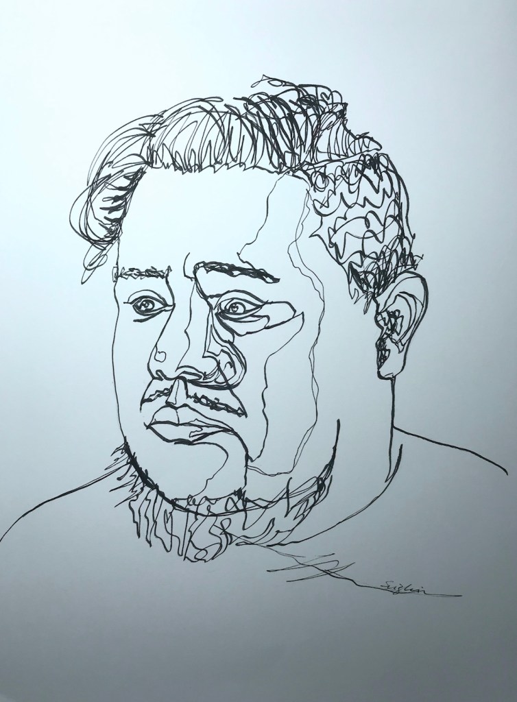
Elegant Writer is a special type of water-soluble marker that bleeds in various colors. They have chiseled nibs and are probably made for calligraphy. I couldn’t remember when I bought my set, but somehow for many years, rarely used them. It’s time to give these markers a chance before they completely dry out.
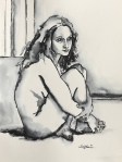
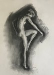
Black Elegant Writer on paper:
Dorian, marker on paper, 10 x 14 in, July 2020
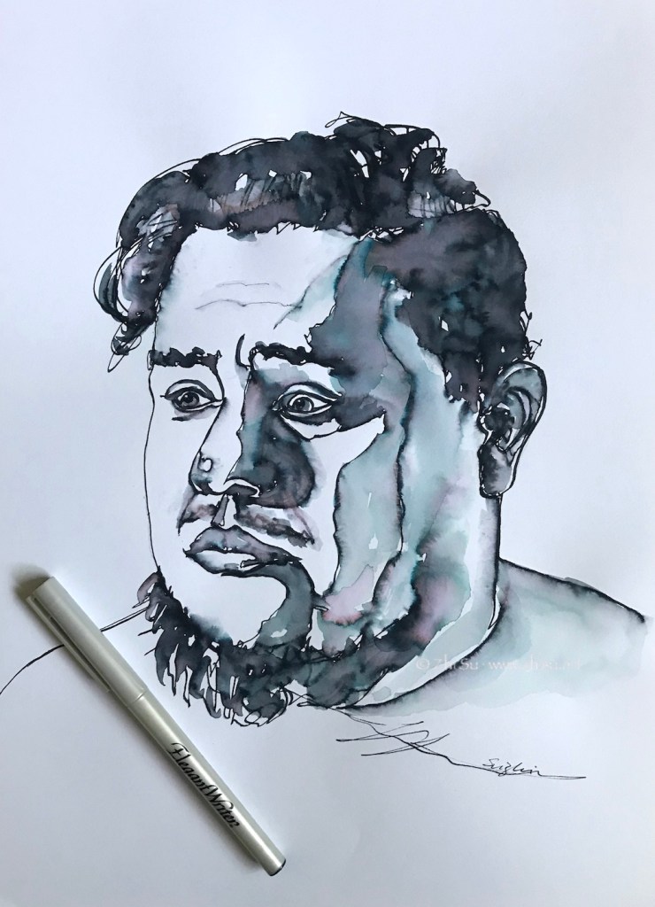
Add water to the above drawing:
Dorian, marker on paper, July 2020
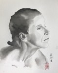
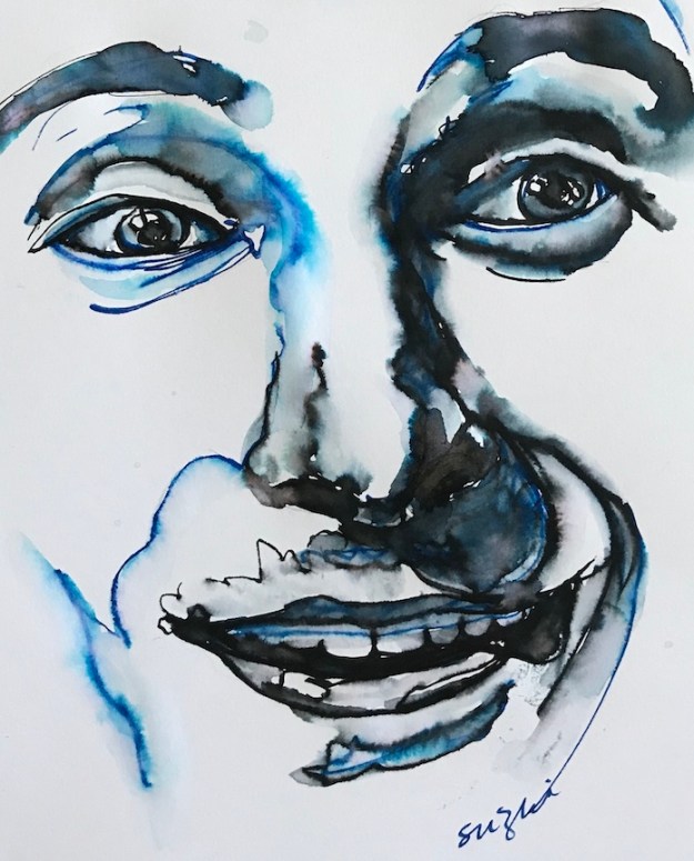
Blue and black:
Serge, marker on paper, 7 x 8 in, July 2020
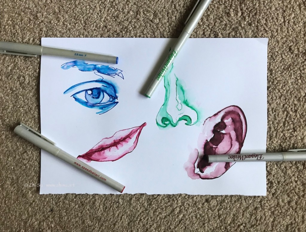
Testing other colors:
Colorful features, July 2020
A few notes:
I used regular Canson drawing paper, and I believe to what extend it’s soluble depends on paper. So test it.
The black one is the most interesting. It bleeds in blueish, greenish and reddish gray and really adds to the drawing.
The blue one gives out some pinkish hue in addition to blue, but the green, red and the brown ones are pretty much just their own colors.
The red, blue and green colors are more staining than black.
I have no training in calligraphy, but I can see a trained hand could produce more interesting lines with a chiseled nib.
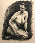
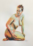
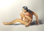
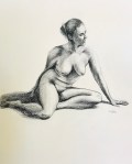
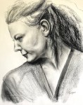
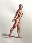
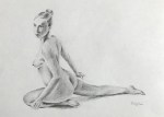
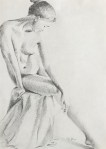
Feeling very tongue-tied recently, and I am constantly looking for things to loosen up. I’ve been practicing figure drawing for a while and mainly paying attention to proportion, anatomy and value. I understand there are a lot more to practice in each area, but I thought maybe I could take a break, try a different approach, loose, casual, and free?
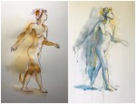
For years I have in my possession a great book by Bill Buchman called Expressive Figure Drawing. It is full of eye-opening and inspiring artworks, and each time I went through it, I had the feeling that I want to fly (not literally or course, with my pen and brushes and colors). So once again I went through the book, dug out some colorful ink and dipping pens (free dancing colorful lines is another dream of mine), and ready, set, go –
Bridgette, 9 x 12 in, June 2020Jeff, 9 x 12 in, June 2020
LOL at myself, what a tangled and tightened mess! The second I picked up the pen, my attention was all on accuracy and likeness. I managed to approach value with a different method, but there’s no real freedom in it. I think it’s probably because even though I have learned the basics of figure drawing, I haven’t practiced enough to internalize them yet. I guess I can only set myself free when I am able to deliver the correct proportion, anatomy and values without thinking about them. More practice, in other words.
On the other hand, these drawings do reflect my current mental status – neurotic but still managed. 😂
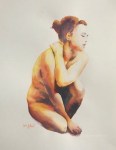
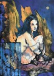
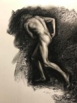
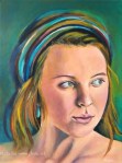
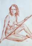
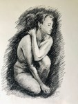
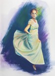
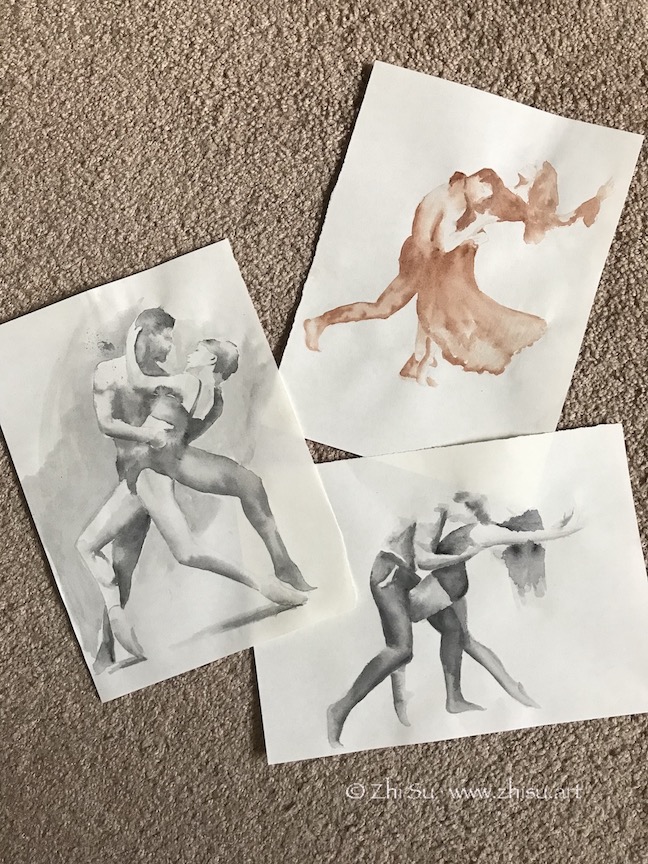
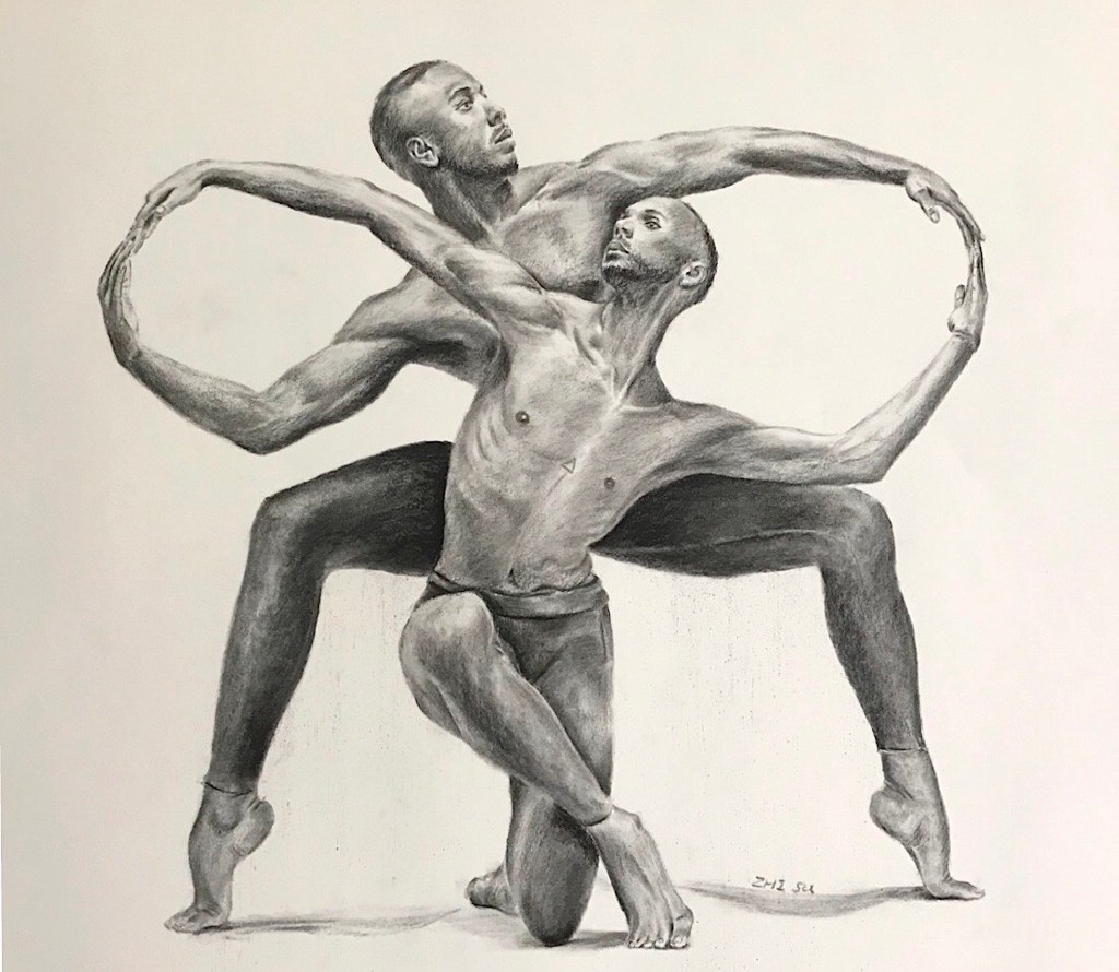
Found a beautiful book, The Art of Movement by Ken Brewer and Deborah Ory. It’s a collection of dance photography. It’s a great book to study figures and motions. I did some sketches and drawings from it:
Dancers, watercolor on paper, May 2020Couple Dancers, watercolor on paper, May 2020Infinity, charcoal on paper, 18 x 24 in, May 2020
The last one is a strange pose. It has an enclosed and squarish quality and a lot of symmetry. The lighting is mainly top-down, making it more grounded and static. It’s not a composition that I would normally choose to work on. On the other hand, there’s a nice contrast between the infinity loop formed by the arm, and zig-zag pattern formed by heads, torso and the legs in the middle. There’s tension and connection between the two dancers at the same time and that’s what I was aiming for when starting the piece. However, as I worked on, and as always, I was distracted by the details, and lost my focus. I think the zigzagging is there, but the details of the hands cut in the flow of the loop. I also think the value contrast is not enough and shapeless. I think this is mainly because I am still copying what I see instead of using it as a reference to create. I hope when I have a better grasp of human figure, I could look beyond the photo and draw my interpretation.
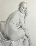
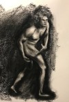
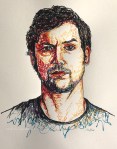
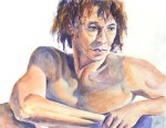
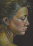
I love artworks with beautiful lines or expressive brush strokes. Mark making is an art in itself. One good way to practice line quality is to use a non erasable tool. I used a variety of pens before, dipping pen, micron pen, even ballpoint pen. This week I dug out a cheap fountain pen (the type that Chinese kids used in school to learn writing) and some Faber-Castell Pitt pen, and decided to practice hatching and cross hatching.
There are at least two ways to do hatching (cross or not), one is to follow the form to the object (with the direction of the lines), the other is to use one direction only, and let the value changes indicate the form. My plan was to use the latter approach and focus on value studies, but what I found out is that it’s very counterintuitive not to chase the form.
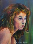
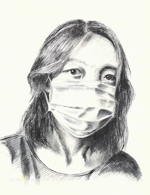
Portrait of Diana, Faber-Castell pitt pen, 9 x 12 in, April 2020Serge, Faber-Castell pitt pen, 9 x 12 in, May 2020
Self-portrait, fountain pen, 9 x 12 in, May 2020
Faber-Castell is permanent, while fountain pen ink is somewhat water-soluble. I used a little bit water to wash over part of the drawing and reapplied lines here and there.
I find the sound of a pen scratching over paper very therapeutic, and hatching a great way to exercise control and study value.
Park in Beijing, micron pen on sketchbookPark in Beijing, mixed media on canvas
I did a sketch with micron pen while traveling in Beijing many years ago. I quite like the result, but also wondered what it would look like with some color. I didn’t want to paint over the drawing, fearing that I might ruin it. So this was the solution I came up with:
I first made a photocopy of the drawing.
Then I transferred it onto a canvas (‘Glue’ the photocopy onto the canvas with acrylic medium and scrubbed off the paper when it’s dry. The image will stay.)
Next I glazed over the image with watercolor. The surface was not comparable to regular watercolor paper, so I only did a few layers of light washes.
When it’s bone dry, I varnished it with acrylic medium (gloss). I didn’t know there were spray-on varnishes back then, so I brushed on the medium, It did disturb the paint a bit, but since it’s very dry and very light layers, it’s not that bad.
Since it’s varnished, I could hang it without glass. And I still have my original sketch! 🙂