Category Archives: pastel

Copying Masters (10) – Bernini

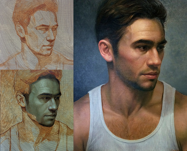
I am quite into drawing and painting humans recently, both portrait and figure. I find it a great way to practice hand eye coordination, and overall drawing and painting skills. While human faces and bodies are complicated, they are more organized than landscape. Learn the anatomy and you’ll have a sure way to approach them. They are also less forgiving than many other subjects – when you do it wrong, it’s quite obvious.

As always, copying masters is an effective way of learning. This time I chose an early drawing by Gian Lorenzo Bernini (1598 – 1680), the father of Baroque sculpture. The drawing, Seated Male Nude, was collected by Princeton Art Museum. I am attracted to this drawing by its succinct use of marks, especially the highlights, so economic and so effective. I tried to draw on tinted paper before, and often ended up drawing a figure on top of the paper, instead of letting the color of the paper show through.

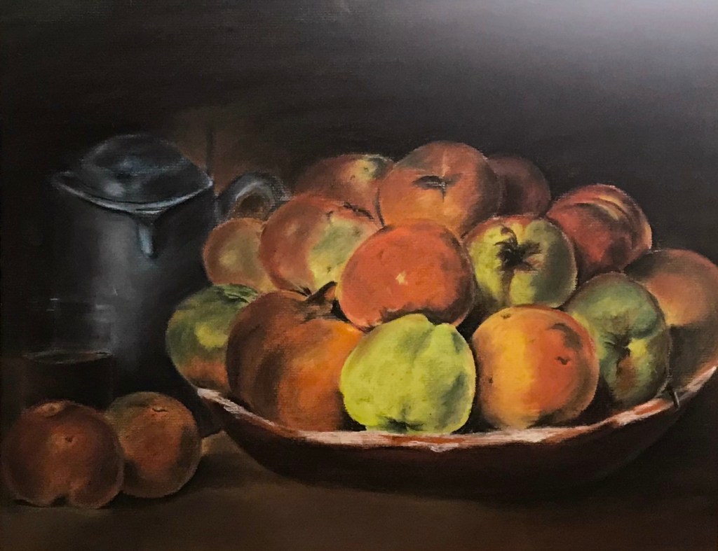
I figured if I wanted to let the paper work, I’d better keep it clean. So instead of jumping on it, I did some practice before hand. For example:
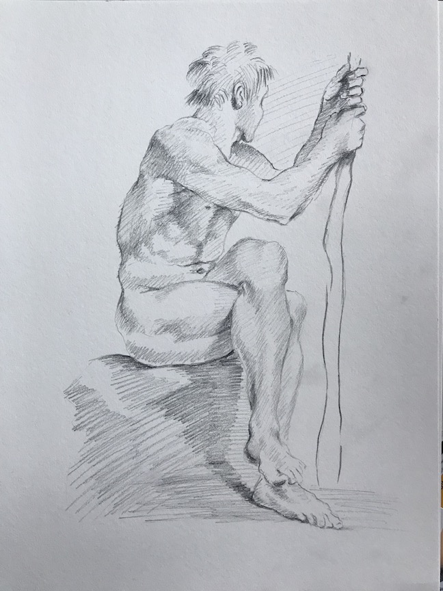
After Bernini, ink on newsprint
After Bernini, pencil on paper

Finally, the copy:

After Bernini, pastel pencil on paper, May 2020

A few notes:

  • I am glad I did those hatchings last week. My lines are still not neat and organized as the master’s (of course), but the hatching practice do help.
  • The preliminary studies paid off (I did more than those shown above). I did a very light-handed drawing first and managed not to disturb the paper too much (less erasing). The final lines are sharper and cleaner this way.
  • I only recently started to pay attention to this issue. In both drawing and watercolor painting, if the paper is too disturbed, it affects the final result. I know some watercolor artist draw on a different piece of paper and then transfer the image to the watercolor paper (carbon paper, light box, projector etc.)
  • I had a lot of fun drawing the effect of an old paper. LOL.

More on Color Studies (1) – Verdaccio

Verdaccio is a greenish gray color achieved by mixing of black (often mars , yellow, and white. It’s used by old masters for underpainting, especially in fresco painting. In portrait or figure painting, the greenish gray served as a complementary to the pinkish flesh color, and it also creates a contrast in temperature. The result is a more vibrant skin tone.

Contemporary artist Cuong Nguyen applies the verdaccio technique to not only oil painting, but also pastel and watercolor, with stunning result.

Here is a poster from his oil painting workshop:

MICHAEL.jpg
Cuong Nguyen, oil painting, workshop poster.

Here is a screenshot from his pastel drawing youtube video:

You can see in pastel drawing, Cuong really pushes the green. Another sample from him:

Cuong_Nguyen_workshops

Don’t be fooled by the layout of the above poster though. This is not a 4 or 5 step drawing. You need to sharpen your pastel pencils, apply lightly, and work many, many, many layers.

I tried this method in a simplified way during a life drawing session, and here’s the result:

Wenda, pastel on paper, 18 x 24 in, 2019

Since camera was not allowed during life drawing, I didn’t record the early stage of this piece. I did start with leaf green, and my fellow artists thought I was going for a Halloween theme. Here are some other things I noticed:

  • CarbOthello pastel pencils are great. Versatility and control at the same time.
  • While it takes many layers to cover the green, a little bit showing through is not that bad. After all, our veins are sort of that color.
  • If you want to achieve Cuong’s level realism, you need a better quality paper to take more layers; keep your pencils sharp (which I totally ignored), and a lot of patience.
  • Be careful about the fixatives. I used Krylon Workable Fixatif. It makes my drawing darker and grainier.

Some day, I’ll try this verdaccio technique in oil.

Copying Masters (8) – Mary Cassatt

A couple of years ago, I went to Degas, Impressionism, and the Paris Millinery Trade exhibition at the Legion of Honor Museum in San Francisco. Among the 40 Impressionist paintings and drawings about French fashion, American artist Mary Cassatt (1844 – 1926)’s pastel drawing made quite an impression on me. The gentle and soft gradation on the face of the little kid is surrounded by quick and dynamic lines, showcasing of the caring nature of a woman and the expressiveness of an artist.

The original:

Mary Cassatt, Head of Simone in a Green Bonnet with Wavy Brim (No. 2), c. 1904, pastel on paper, 16 x 17.875 in.

My copy:

Copying Masters (1) – Gustave Courbet (1819 -1877)

I believe if there’s a shortcut in learning art, that would be copying masters. It forces me to look at each piece so closely, I start to see not just their composition, color or value choices, but also the procedures in execution. It helps a lot in thinking through and carrying out my own work. I just wish I could do more and more often. [*Most of the copies in this series were done a while ago and the link to the “original” was not necessarily the reference I used at the time.]

The first one is an assignment from a years ago drawing class. Courbet’s (French painter leading the 19th century Realism movement) original is an oil painting, and my copy is done with soft pastel.

Courbet’s (from Wikimedia):

Still Life with Apples and Pomegranate Oil on canvas 17 3/8 x 24 in (44 x 61 cm)

My copy:

What I learned is that pastel is a powerful and versatile painting tool, but it takes patience to build it up. Secondly, it’s not easy to “let it go.” Certain things meant to fade into the background or merge with the environment, but it takes skill and vision to achieve that.