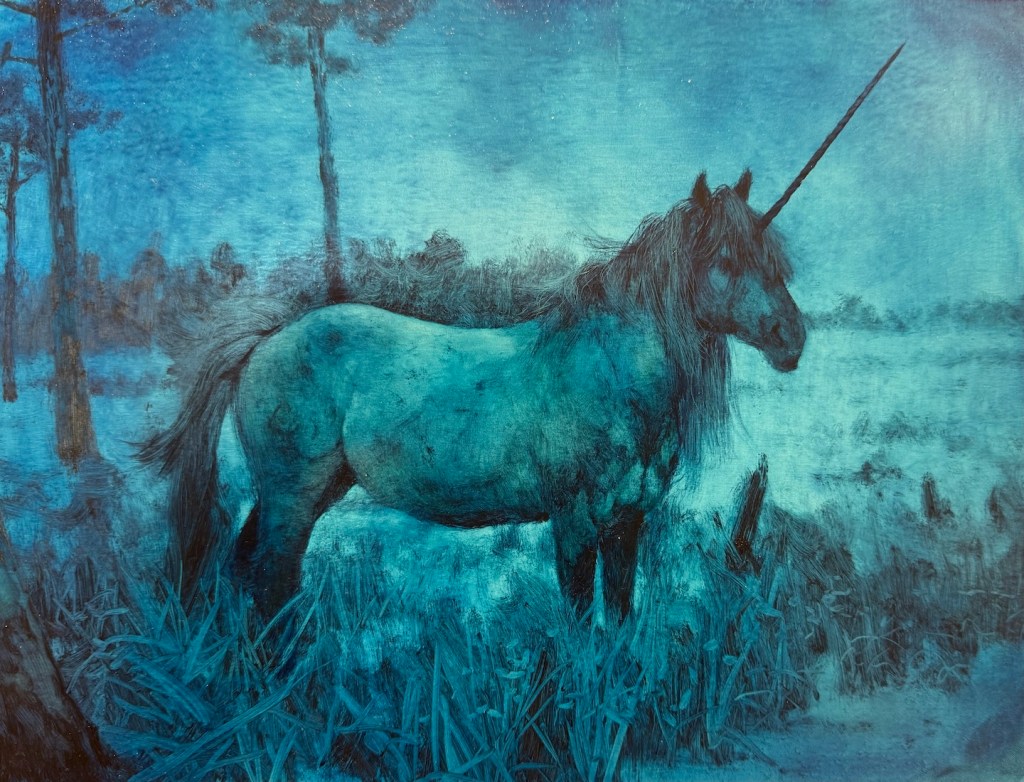
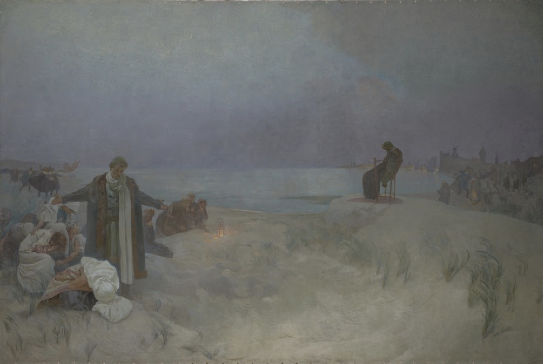
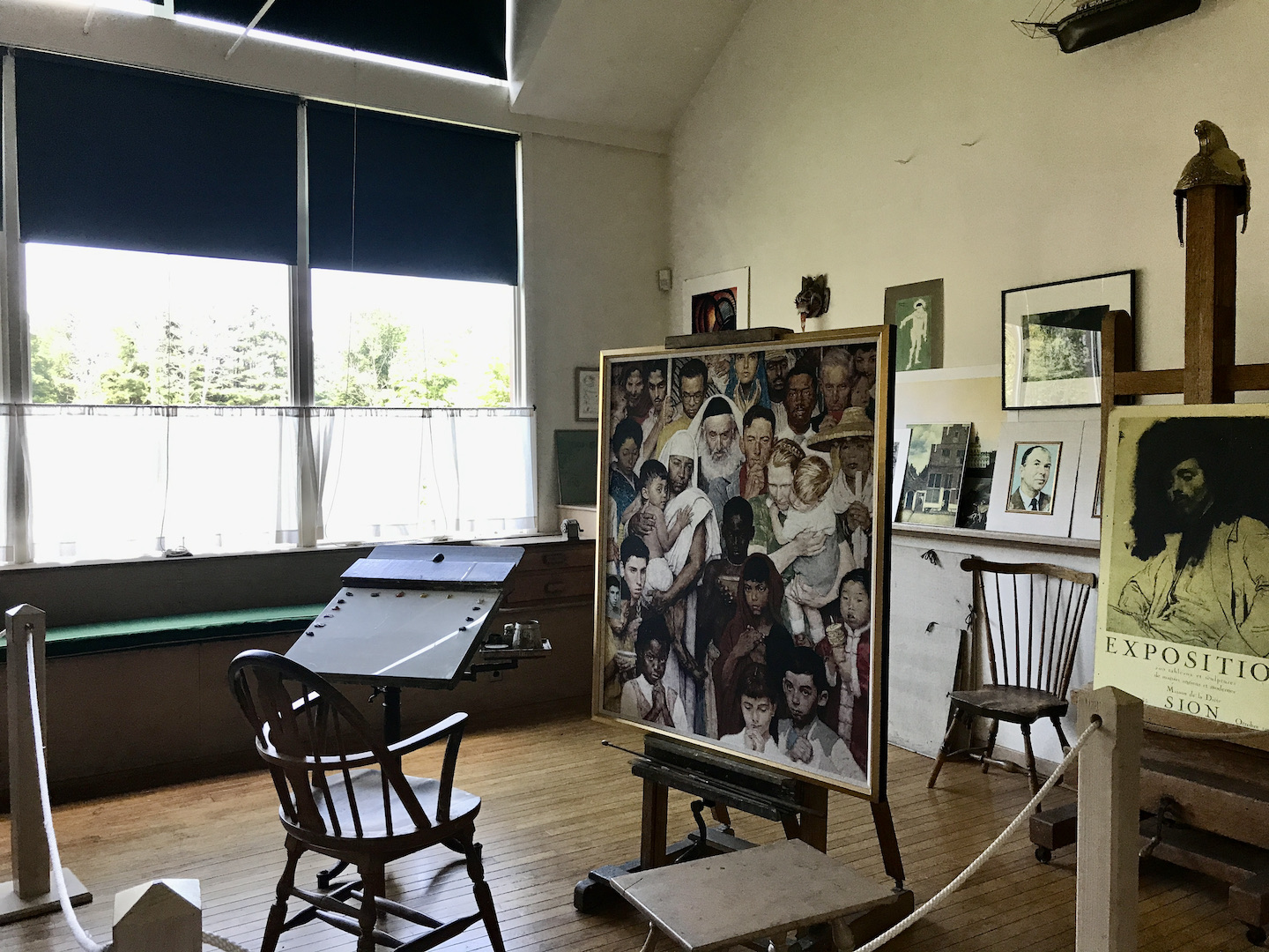
There are two museums in America that hold major collections of Andrew Wyeth (1917–2009). The Farnsworth Art Museum in Maine and the Brandywine Museum of Art in Pennsylvania. The latter happened to be on my way from Ithaca to Philadelphia. I had every intention of stopping by, but life (and flight schedules) had other ideas. Instead, I found myself in Tokyo two weeks later, standing in the crowded galleries of the Tokyo Metropolitan Art Museum for their major retrospective, Andrew Wyeth: Boundaries or Windows. It felt fitting, almost inevitable, like I was chasing Wyeth around the globe to catch another facet of his quiet, persistent vision.
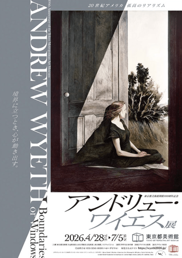
The show had already been running for six weeks but was still packed. The audience ranged in age and felt noticeably younger than some of the more sedate crowds I have seen in San Francisco museums. The exhibition was organized around the theme of “boundaries,” a motif that appears repeatedly throughout Wyeth’s work through windows, doors, frozen waterways, and distant landscapes. Rather than following a strict chronological order, it was divided into five sections: The Painter Andrew Wyeth, Light and Shade, The Olson House in New England, An Expanding vision, Boundaries or Windows. This arrangement let the show move from who Wyeth was and how he worked, through the way light and shadow carried ideas of life and death, to the central role of the Olson House, then outward to a broader vision, and finally to the boundaries theme that pulled everything together. It was well-curated and thoughtfully organized around that single idea, and it gave me plenty to think about long after I left.
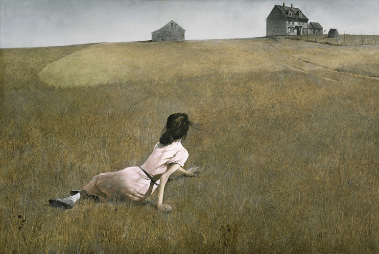
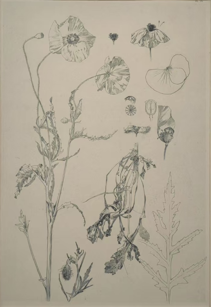
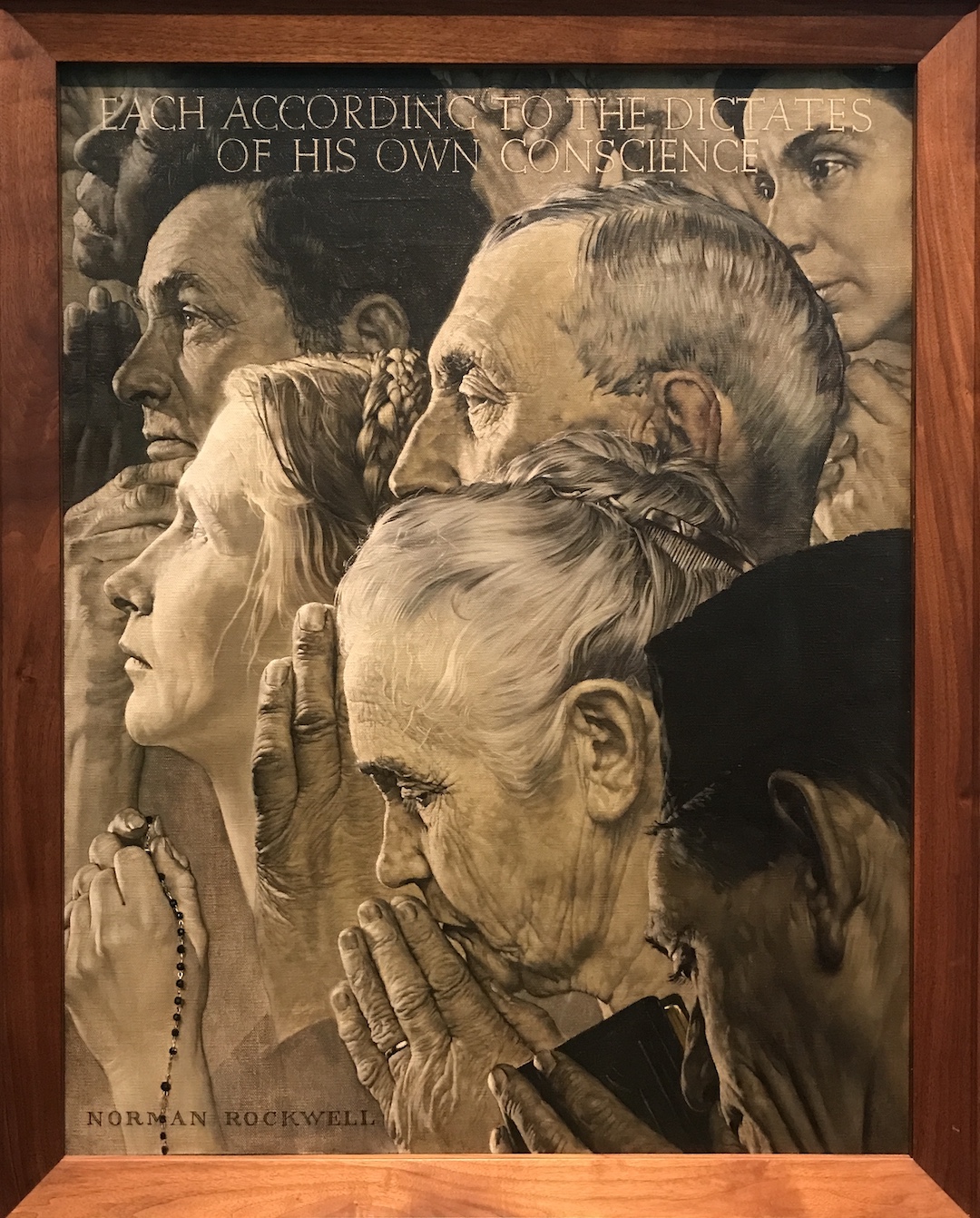
My initiation with Wyeth came in a composition class where we studied famous paintings using the concept of notan, trying to divide the composition into black and white. Artists like Winslow Homer, Norman Rockwell, and Wyeth were the easiest to analyze because they rely on strong value contrast and clear geometric divisions. With Wyeth especially, many paintings feel built from big, simple shapes and stark light-dark separations. Yet the closer I looked, the more questions appeared. Christina’s World (1948) and Garret Room (1961) are powerful, deeply humane images, but what about the sharp edges on that distant house, or the way the brightest white almost pushes out of the frame? Where does that quiet uneasiness come from?
Standing in the Tokyo galleries, the first thing that struck me was the wintery, subdued color palette. The lack of bright color gives the work a certain pressure and presence, but it also feels familiar, almost like the restraint of traditional Chinese or Japanese ink painting. Most of Wyeth’s subjects come from just two places: Chadds Ford, Pennsylvania, where he was born and lived much of his life, and Cushing, the small coastal town in Maine where he spent summers for decades. His work grew out of the narrative tradition of Winslow Homer and Victorian storytelling, but he turned it toward the hunters, farmers, and ordinary country people of those two specific landscapes. He captured the lingering spirit of frontier values, the loneliness of labor, the struggle with nature, and the quiet will to endure. To some critics it looked merely regional. To the wider public, it reads deeply American, and it traveled.
Though his father, the famous illustrator N.C. Wyeth, taught him directly, Wyeth grew up feeling somewhat overlooked in that large artistic household. He had a solitary, introspective childhood. You might assume the pale palette mirrors that inner life, but he always insisted he was simply staying true to what he saw in nature. He once remarked that he had complained more than once about his paintings looking too pale and washed out, yet the colors he chose matched the country he lived in. Winter colors here are exactly like that. If he came across a blue robin or anything bright and colorful he liked it, of course, but for him the colors of nature were always best.
Then there is the composition I had already noticed in class. Strong value contrasts, clearly defined shapes, and big masses of dark and light create tension and focus. Wyeth himself said the sense of movement in his pictures came from careful arrangement and composition rather than expressive brushwork. From a distance many of the paintings read like abstract arrangements of shape and value. His unconventional cropping and vantage points echo experiments I saw in Utagawa Hiroshige’s (1797-1858) ukiyo-e prints “One Hundred Famous Views of Edo” at the Ota Memorial Museum of Art, another crowded Tokyo show that made the connection feel alive.
Close looking reveals his process. He started many works with loose, quick watercolor washes, then shifted into tempera, using drybrush on the elements that mattered most to him. “Drybrush is layer upon layer,” he explained. “It is what I would call a definite weaving process. You weave the layers of dry brush over and within the broad washes of watercolor.” Some people think painstaking realism signals emotional detachment. With Wyeth the opposite is true. The care feels like deep attention, almost tenderness. He often ignored the rules art teachers drill into students. Perspectives can feel skewed or emotionally distorted rather than optically correct. Edges sometimes stay sharp or textured even in the distance. The brightest highlights or deepest shadows land where they create the strongest feeling, not where conventional light logic would place them. These choices make his subjects feel a little uncanny, charged with psychological weight rather than simple description. His realism was never just a polite counterpoint to Abstract Expressionism. It was its own distinct thing, rooted in feeling, memory, and inner projection. The works read like personal novels that somehow remain universal.
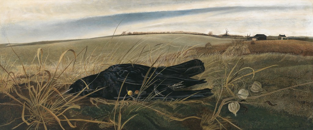
Take Winter Fields (1942). The composition and brushwork are stylized, not strictly true to life, yet the painting still feels natural and real. It shows a dead, frozen crow he found near his home in Chadds Ford. He brought the bird into the studio, sketched it, and painted it in exquisite detail from a low, worm’s-eye view that makes the small creature loom large against its surroundings. The painting was made during World War II, and the stark image of a dead bird in a bleak field recalls dead bodies on battlefields. Despite the apparent precision, the distant trees are rendered as sharply as the crow in the foreground, something the human eye would not actually see. The effect compresses space toward the picture plane and is strengthened by the delicate, overlapping blades of grass that form a lace-like surface pattern. In the middle of the war he once remarked that you do not need to paint tanks and guns to capture its feeling. You should be able to paint it in something as simple as a dead leaf falling from a tree. In remote Chadds Ford he did exactly that, letting nature and landscape carry poignant narratives of loss.
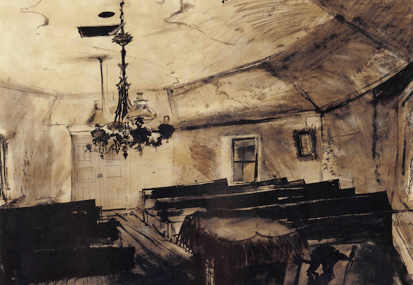
Grass is not the only place he hid a bird. In Mother Archie’s Church (1945), do you see the crow in the shadow? Without the white pigeon, the painting would read almost as an abstract play of shapes and value. The old Quaker meetinghouse stood on the site of the bloody Battle of the Brandywine and later became a church for the local Black community. By the time Wyeth painted it the building was already collapsing. He remembered attending services there occasionally, but eventually the building collapsed. As if reluctant to dwell in the sense of loss, the light illuminates and animates the pigeon and lifts the whole image into something more allegorical and cinematic. Especially when you track down the preparatory study for the work, the storytelling becomes more obvious. In fact, a lot of his paintings remind me of the cinematography in The Assassination of Jesse James by the Coward Robert Ford. Lingering lights, vast bleakness, solitary figures, all pregnant with narratives. Time feels slowed and charged with things left unsaid.
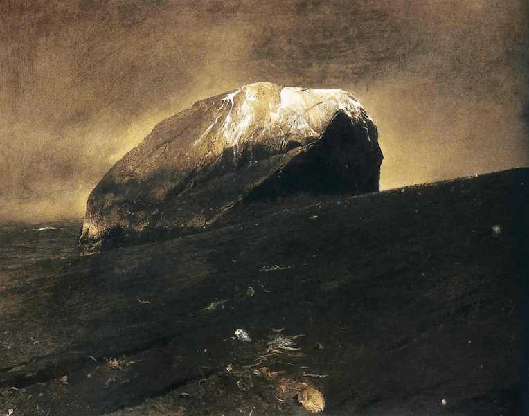
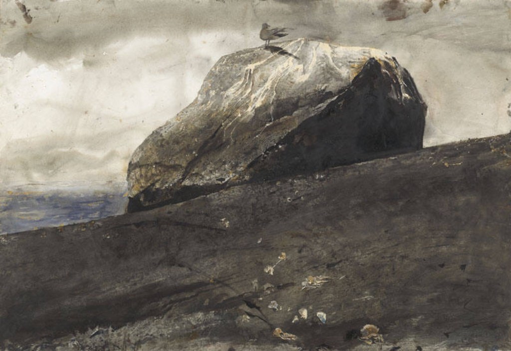
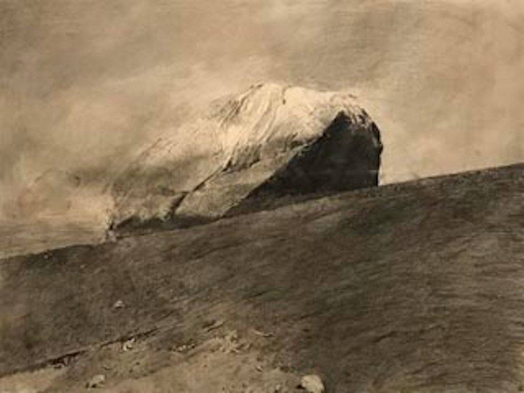
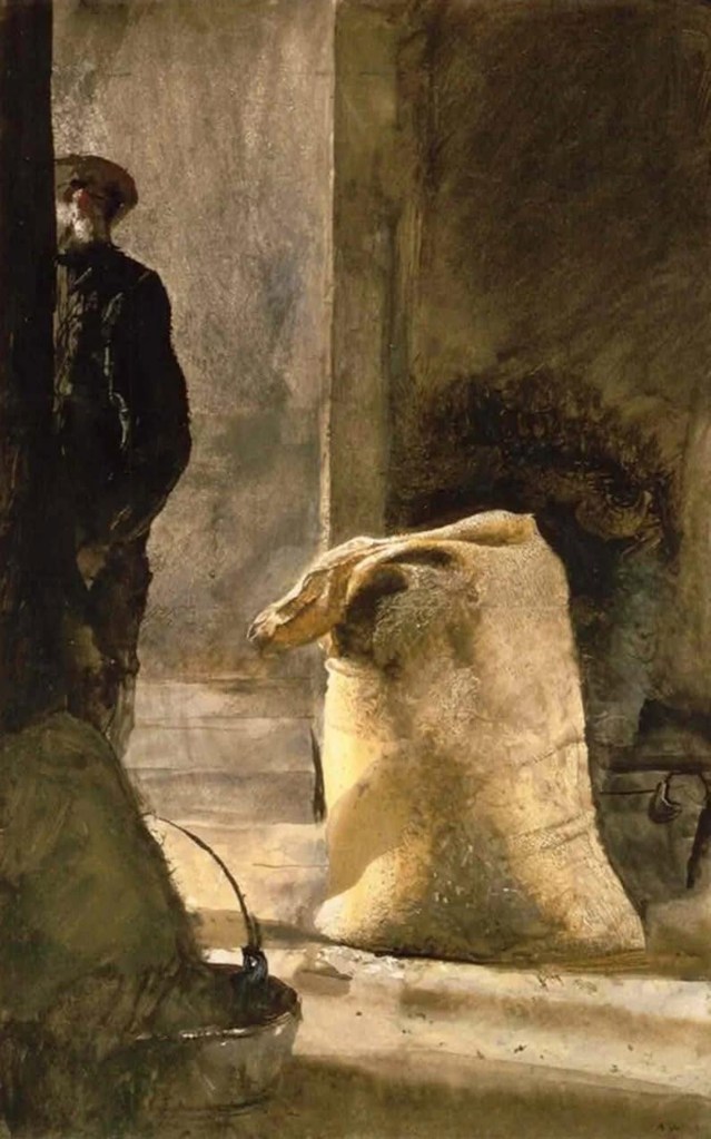
Flint (1975) is another case in point. Wyeth made several studies for it. In one the stone sits dead center with a seagull perched on top. In the final version he shifted the stone slightly off center, removed the bird, and added delicate highlights to the shells and fish bones in the foreground. The flint still reads as monolithic and eternal. The single dramatic light from above turns it into the central character of its own small drama. In Wyeth’s imagination, things like rocks or boats could stand in as metaphorical portraits or even self-portraits. He often drew parallels between the rocky Maine shore and the weathered lobstermen and fishermen he knew. Grain Bag from 1961, for example, he considered a portrait of Alvaro Olson, Christina’s brother.
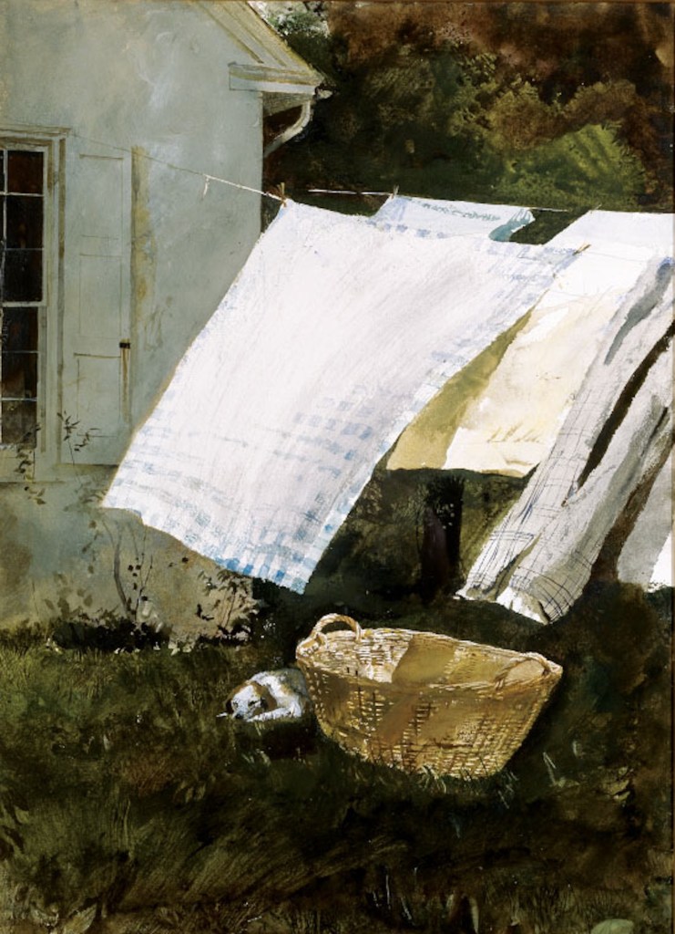
Wyeth once said, “I’m very conscious of the ephemeral nature of the world. There are cycles. Things pass. They just do not hold still.” It is almost as if his task was to eternalize a passing moment. The statuesque flint does that. So does the wind in Light Wash from 1961. The scene is set in Chadds Ford and shows the back of a house with a laundry line full of clothes drying in the breeze. A small dog rests behind a straw laundry basket. The contrast between the light-colored laundry and the darker surroundings is carved out with sharp lines, almost like a boundary. Yet the two worlds are not frozen apart. The wind is clearly moving the laundry, blurring and crossing that division. The basket below hints at the moment just before or after, while the dog, the only living presence, could stir at any second. He catches solitude, movement, and something more.
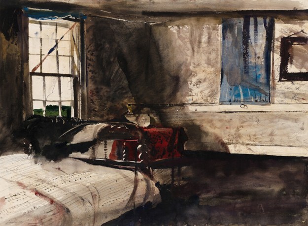
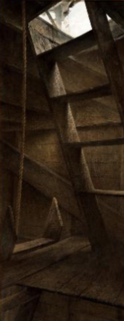
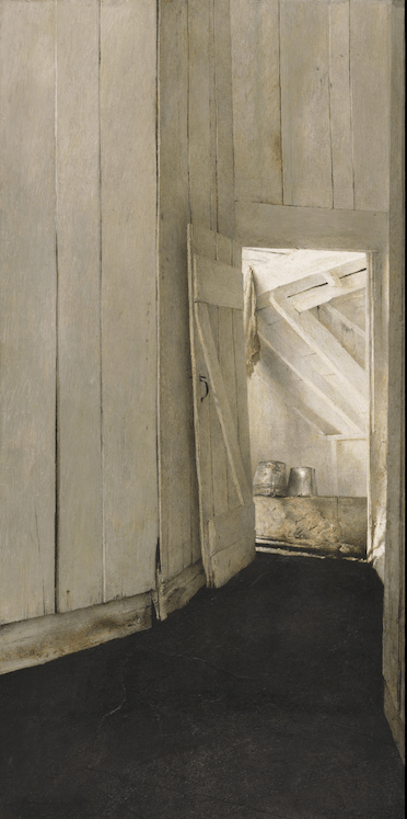
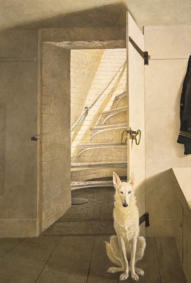
Two of my favorites from the show were both interiors, one earlier and one later. Spool Bed from 1947 has a muted overall palette but uses more saturated color for accents. The wet areas feel less controlled. Black ink bleeds softly into the surrounding space. Broad, expressive brushstrokes and lines of varying weight run and cross, yet what comes through is a dead silence, a sense of desolation. Light Station from 1983 shows the interior of a lighthouse on tiny Southern Island, Maine, which the Wyeths owned. The family dog Nome sits obediently in front of a door that opens onto a staircase leading up. Light from the lighthouse spills down from above. Positioned by the entrance, Nome seems to guard it. If the spool-bed painting carries a ghostly, abandoned feeling, this one feels meticulously kept and watched over. Notice where Wyeth placed his darkest dark and his whitest white. The painting still holds its balance. While you look at the elegant dog, your mind keeps wondering where the owner of that half-shown sailor jacket went, and where those stairs actually lead.
I kept thinking how naturally all of this sits with certain East Asian sensibilities. The quiet melancholy, the sense of accumulated time and memory, the way life and death feel continuous rather than opposed, the faint hope glimmering inside desolation. It resonates with ideas of impermanence and the Japanese sense of mono no aware.
Wyeth’s deep independence, his refusal to chase whatever happened to be fashionable, reads as profoundly American. That same independence also spoke to artists in China in the 1980s. At a time when many young painters were still working under the long shadow of Soviet-style revolutionary realism, Wyeth’s pictures arrived like a revelation. His quiet, desolate yet poetic style, focused on the inner life of ordinary people, offered something different: a way to hold on to hard-won figurative skills while leaving room for personal feeling, small sorrows, warmth, and poetry. The “Wyeth wind” that blew through Chinese art circles back then has not entirely died down. As one observer put it, his work showed that art did not have to be about t grand historical or ideological themes. It could simply attend to the small joys and sorrows of everyday life with honesty and craft. Wyeth’s simplicity and seclusion feel almost like the ancient Chinese hermits. As Tao Yuanming put it, “There is true meaning here, yet when I try to speak of it I forget the words.”
That possibility still feels radical. These days contemporary sections in museums across continents can start to blur together, concept-heavy, visually thin, strangely interchangeable. Wyeth’s stubborn commitment to place, technique, and inner truth stands out. He stayed true to himself, to the tools he mastered, and to the emotional and philosophical weight he wanted to carry. The result is work that still draws crowds of all ages in Tokyo, work that feels both deeply local and quietly global.
I left the museum thinking that chasing Wyeth had been worth every detour. His pictures do not shout. They linger. And in that lingering they keep offering the same generous question they have been asking for decades: What if the old tools, handled with care and feeling, are still more than enough? It comes down to purity of heart and a deep, wholehearted passion for art.