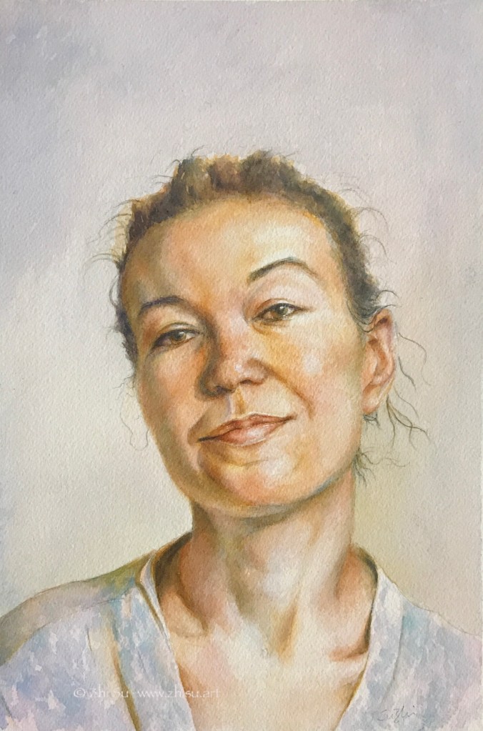
Felicia, watercolor on paper, Fall, 2021Old Man, watercolor on paper, Fall 2021Charlotte, gouache on watercolor-board, Fall 2021
A few notes:
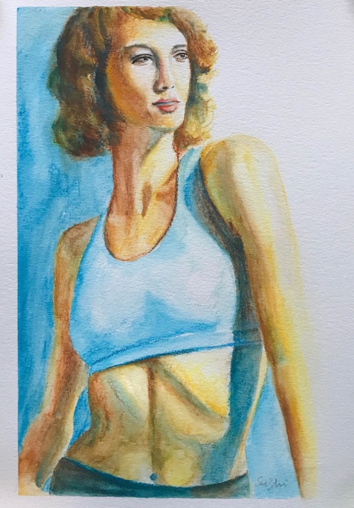
For the watercolor paintings, I planned two different approaches, a softer and muted one, vs a more vibrant and contrasted one. The results were somewhere in the middle. Especially for the first painting, I wish I had softened some edges and let go certain definitions instead of spelling out everything I saw.
The gouache one is a homework from Watts. It is a practice of the Zorn palette and the tiling technique. I found both the medium and the technique challenging. Tiling is to juxtapose thick layers of close-value paints and blend them (if necessary) later. It’s a good preparation and practice for oil painting, but it requires a lot of patience in value control and shape design. Hehe, patience! 😉
I first came to know this panel St. Francis Renounces All Worldly Goods, attributed to Giotto (1267 -1337), in Glenn Vilppu’s composition class at New Masters Academy. (He has a composition class on his own website and it’s very pricey. I don’t think they are the same thing. The NMA one is more like a masterpiece composition appreciation class.)
Honestly speaking, I knew little about Middle Ages art. It’s the section in a museum I often skip, assuming those paintings are mostly more about religion than art. I was surprised to see Mr. Vilppu going back that far to talk about composition. If I remembered it right, he sees many religious paintings as comic strips and superhero stories of the time. I guess that makes them the predecessor of the modern narrative art!
This panel is from a series of St. Francis stories. The figures are quite realistic, with vivid expressions and movement. The stage setting is deliberate. The artist used a series of verticals and horizontals to group the subjects and surroundings, and then use diagonals from clothing, figure and architectures to guide the eye. All this builds up to see the otherwise obscure hand in the air. There’s drama and clarity in the narrative.
What strikes me most, is the way the artist divided the panel. It’s cut in half horizontally in the middle, and vertically, there’s an obvious space to part the surface in two, also in the middle. If this is from a modern artist, I’d call it bold, but I don’t know Giotto or Late Middle Ages art enough to call it anything. While I watched Glenn’s lesson, I doodled some composition lines of the piece trying to make sense of them. Later, I developed a few pieces from that design:
Giotto Studies 1, Gouache on black paper, 9 x10 in, 2020Giotto Studies 2, Gouache on black paper, 9 x10 in, 2020Giotto Studies 3, Gouache on black paper, 9 x10 in, 2020
I show the pieces in the sequence of when they were designed, but I actually finished the painting of the third one first, and showed it in a previous post.
You can see how I took more and more liberty with the composition, or I should say, the design finds its own life.
I use Giotto Studies as the title for now for lack of a better one. These are not real studies though. I merely scratched the surface and stole a few lines.
I want to say this is like a one stone two birds thing. I read a masterpiece closely, and got inspiration for something new.
I know what I could do next time I am running out of ideas to paint! 🙂
Nikki, watercolor on paper, 9 x 12, September, 2020Astrid in Design, gouache on paper, 9 x 10, September 2020
Here’s what I find out so far:
It behaves like a good quality 140lb watercolor paper. So in theory, you can use water.
However, as one can imagine, transparent color doesn’t fire well on black paper. You need a lot of pigment for a color to show, and the colors still dry lighter. So you can’t really use a lot of water.
Like any type of black paper, how you deal with value on it is quite counterintuitive.
In the first painting I used mostly watercolor and mixed in some gouache white in the highlight area. The second painting is gouache. I personally like the the gouache one better.
I feel like I am very lack of imagination with this paper. For the second painting, I believe I could achieve similar effect with ink resist method. While using black paper makes it easier in certain ways, ink resist could have some unexpected result. In other words, it is not particularly empowering.
It could be just I don’t know how to make the most out of it.
I have a Strathmore black drawing paper pad that I bought for colored pencil drawings. Unfortunately after a few attempts, I came to the conclusion that colored pencil is too testing for my patience and on black paper, that’s even more so. A drawing like the following, to reach the desired effect (smoother skin, brighter color etc.), would need probably another 20 to 50 layers of coloring (or skills I don’t have to begin with):
Lily, colored pencil, 9 x 12 in, 2020
So what to do with the rest of the paper? Gouache came to mind because the colors come thick and don’t need much water (or at least you can use it that way).
Jazmine, gouache on paper, 9 x 12 in, 2020
I very much like the effect, but as you can see there are wrinkles on paper caused by accidental water drops.
Here’s another one:
Monique, gouache on paper, 9 x 12 in, 2020
After I did these paintings, I found out that Stonehenge actually has a line of black watercolor paper. Order placed already, and stay tuned!
Caran d’Ache is a brand not a specific product, but I only know that now! The product is Caran d’Ache Classic Neocolor II Water-Soluble Pastels. My former watercolor teacher introduced it to me many years ago, and called it Caran d’Ache. Even though I bought a 40 colors pack, all these years, I never bothered to read the words on the package, and thus I never knew it was pastel!
I didn’t like Caran d’Ache back then. It’s waxy and leaves a mark like that of a crayon. It also won’t completely dissolve in water. I didn’t appreciate texture very much at that time, and was afraid of any mark that I couldn’t get rid of or hide. I only recently started to pay attention to marks making and textures, and how they enrich composition and set free expression. That why I decided to give the product more chances.
Here are some of ways I tried. First I just used it to sketch, and them apply water and watercolor on top of it. Toward the end, I used them to add more accents.
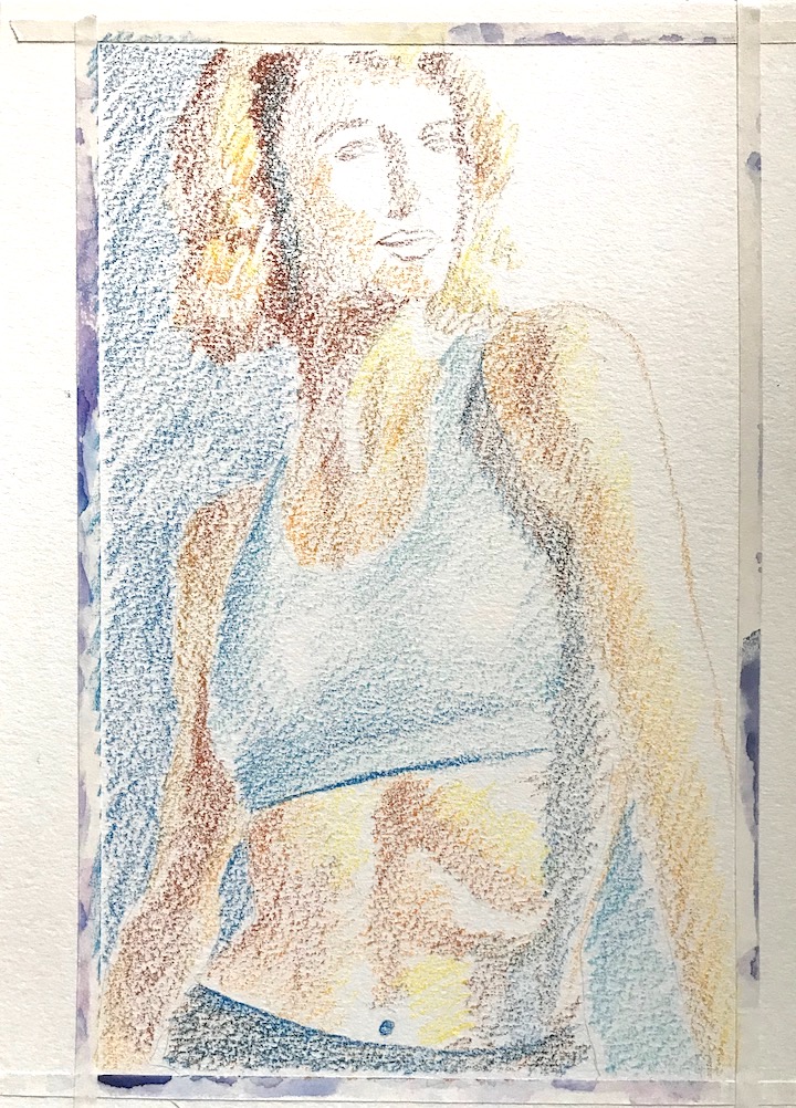
Catherine, draft. Catherine, watercolor, 7.5 x 10 in, 2020
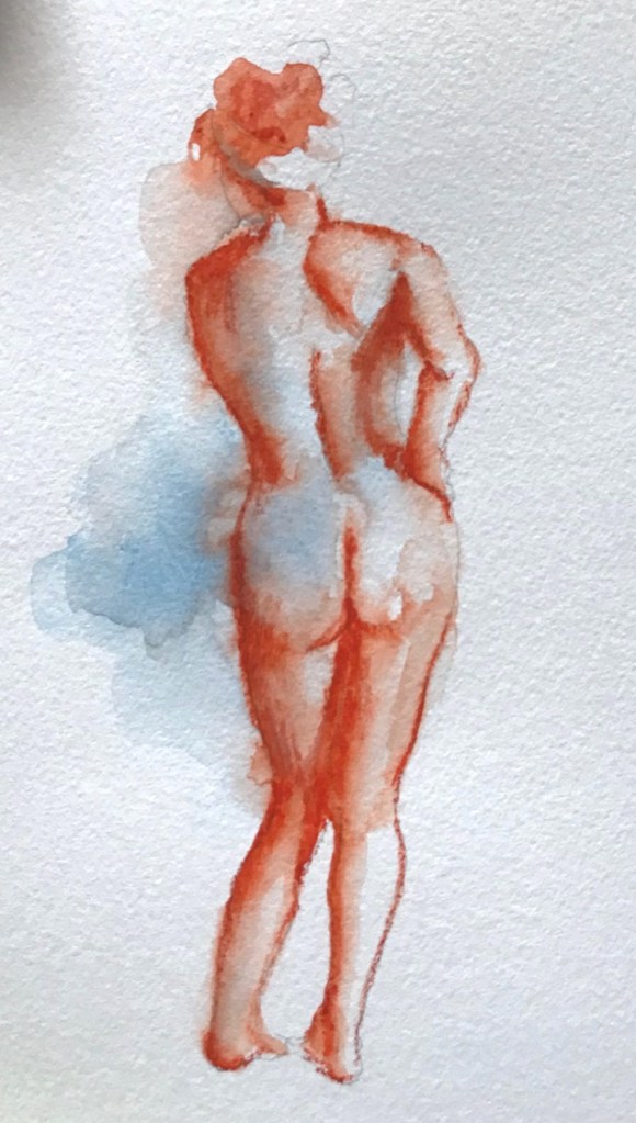
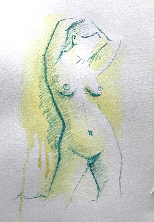
I also tried to wet the paper first, with some color, and then applied the Caran d’Ache before the paper dried. Some color bleeds more than others. In the red color figure, I went back and force a bit with the pastel and a wet brush to achieve a desirable result. In the greenish one, the paper dried quickly, and I was only able to do a drawing.
Female figure, 5 x 10 in, 2020Female figure, 9 x 12 in, 2020
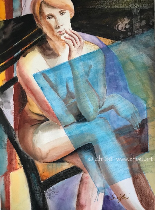
Here a lot of the design in the painting came as an after thought, and Caran d’Ache is a very convenient tool to draw out ideas. While it won’t completely dissolve, it’s easy to hide it with gouache, and it’s also effective in adding textures:
Tigger, watercolor and gouache on paper, 18 x 24in.
A few notes about Caran d’Ache:
It’s versatile but overall, works better in expressive drawing – where you don’t care to hide your marks.
It’s useful in finalizing or amending a painting,
I am not entirely satisfied with the way I am using it, still too careful and too timid.
I feel like if I am more competent with or have more confidence in my drawing skill, I could make better use of this tool.
I’ll keep playing with it. I have a hunch that it will set me free some day. 🙂
The second painting is done on the back of an old painting (of a broccoli). When I soak the gouache painting in ink, I got some unintended texture. It’s probably because of the unevenness of the paper. I might have done some lifting or scrubbing for the old painting. I decided it didn’t hurt.
In general it’s fun to think about how many ways you can deal with a subject.
Now a few more words about old paintings. Good watercolor papers are expensive, so I never throw away old paintings, no matter how ugly they are. There are always ways to reuse them:
The obvious one is to paint on the back. If the paper is not flat, you can soak it in water, then lay it flat and add some weight on it (or re-stretch it). Sometimes the texture of the paper on the back is different. It’s still workable.
Another way is to examine the old painting and see if there are some elements can be used. The flames in the second painting was modeled after the leaves of the broccoli on the other side. Look at it upside down, side ways, hold it up against strong light, you may discover something different.
You can also directly use it. Tear it apart and make it into a new collage.
Take a picture of it and manipulate it into a new digital art with Photoshop, Procreate, etc.
These methods are not exclusive, and that one piece of paper can generate many artworks!
I’ve been taking a life drawing class at a community college this year. My professor is great at teaching and extremely knowledgeable about anatomy. This is her last year at the school and she planned a happy ending to her teaching career and a smooth transition back to a full time artist. Now she has to move her class online through Zoom, and for someone who’s not particularly tech savvy, this is not easy. It’s been a couple of weeks now, but our class is still not on track. Meanwhile, she has found some really good materials for us to practice on our own. Here’s a list of stuffs she recommended and/or I’ve been using:
Proko – by Stan Prokopenko. It contains some of the best instruction videos on figure drawing. Enough free stuffs, but if you pay, more structured lessons and practice materials. I personally have been using this site for a while, and am a big fan of their Draftsmen Podcast.
Love Life Drawing – Great advice for beginners or artist seeking improvement.
New Masters Academy – They have a subscription plan that allows access to tons of good art classes or master classes. The free stuffs including many timed life drawing videos featuring photos of clothed or nude models.
Croquis Cafe – Videos and photos of models for life drawing. This is probably the closest you can get online to a real life drawing experience. Great models and so many to choose from. My only problem with it is that after they moved to Vimeo, the streaming is less smooth.
This is not just a time for staying in, but also coping, adapting and discovering!
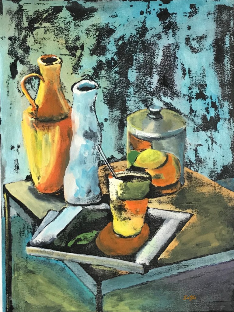
I only recently came to know there’s such a thing called ink resist, and was pretty impressed by some of the artworks with this method. So I gave it a try. The result is a meh, but I l had fun and learned something.
Still life, ink and gouache on watercolor paper
So these are the steps I followed:
pencil drawing;
painting with gouache but leave some area blank; (some people leave only the pencil marks uncovered to achieve neat outlines)
after the painting is completely dry, covered the whole page with sumi ink;
again, wait till it’s completely dry, wash off the ink (I used the garden hose, no kidding.)
and again, wait till it’s dry, and went back to fix here and there. (This step is optional, but I wasn’t that lucky.)
And here are the things I learned:
Like drawing on black paper, this method is a bit counter-intuitive. The areas left blank in the first painting round will be the darkest after the wash. So planning ahead is important, which I didn’t do. In my painting, the blacks serve more like random texture than an organic part of the value pattern.
The paint should be thick, to “resist” the ink and also because gouache is easy to wash off.


