Anders Zorn (1860 -1920) was a great Swedish artist well-versed in watercolor, oil, etching and sculpture. He not only left behind many beautiful artworks, but also a unique palette. As shown above, the Zorn palette consists of only four colors, commonly described as ivory black, titanium white, yellow ochre and cadmium red. Did Zorn really paint with only these colors? Many artists don’t believe so, but the four colors probably served as the backbone of his approach. Zorn believes such a limited palette helps achieving a coherent portrayal of light. Nowadays, some art schools use Zorn palette as a transition from grisaille to full palette painting.
The choice of colors seems odd for me at first. Coming from watercolor, I almost never used white, and used black only in the form of ink, mainly for line work. It’s quite a shock to me to find out that the ivory black, cad red and ochre are in fact a muted version of the primary colors, and the white, as the coolest color in the set, plays big role in controlling the temperature of mixtures we derive.
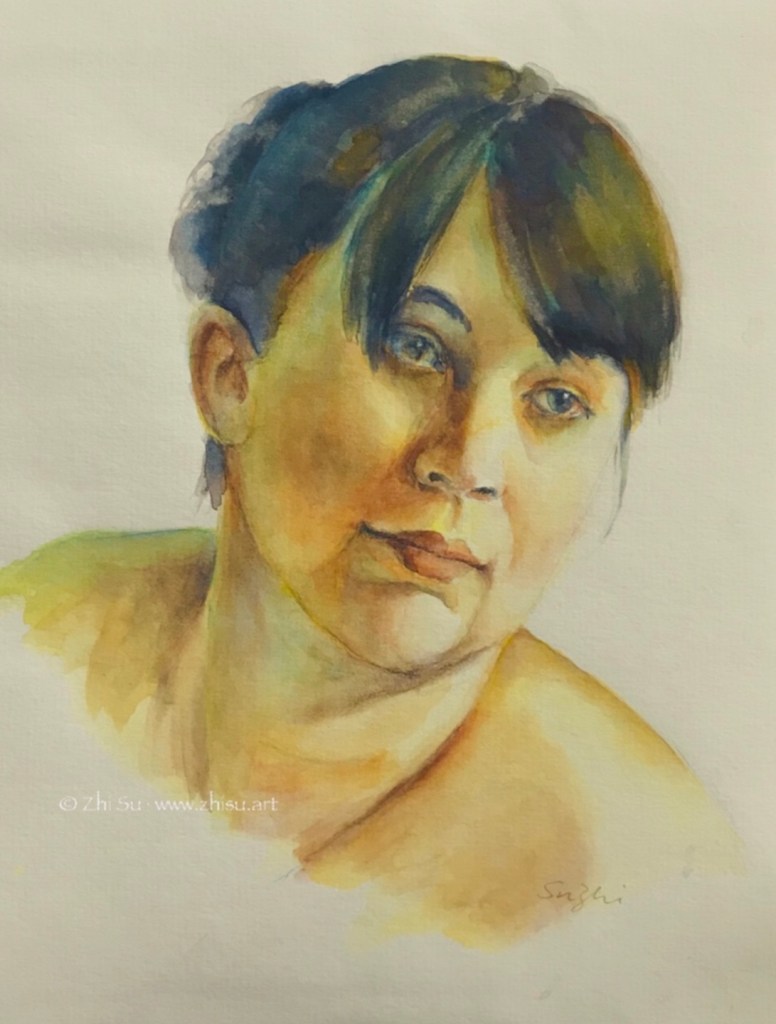
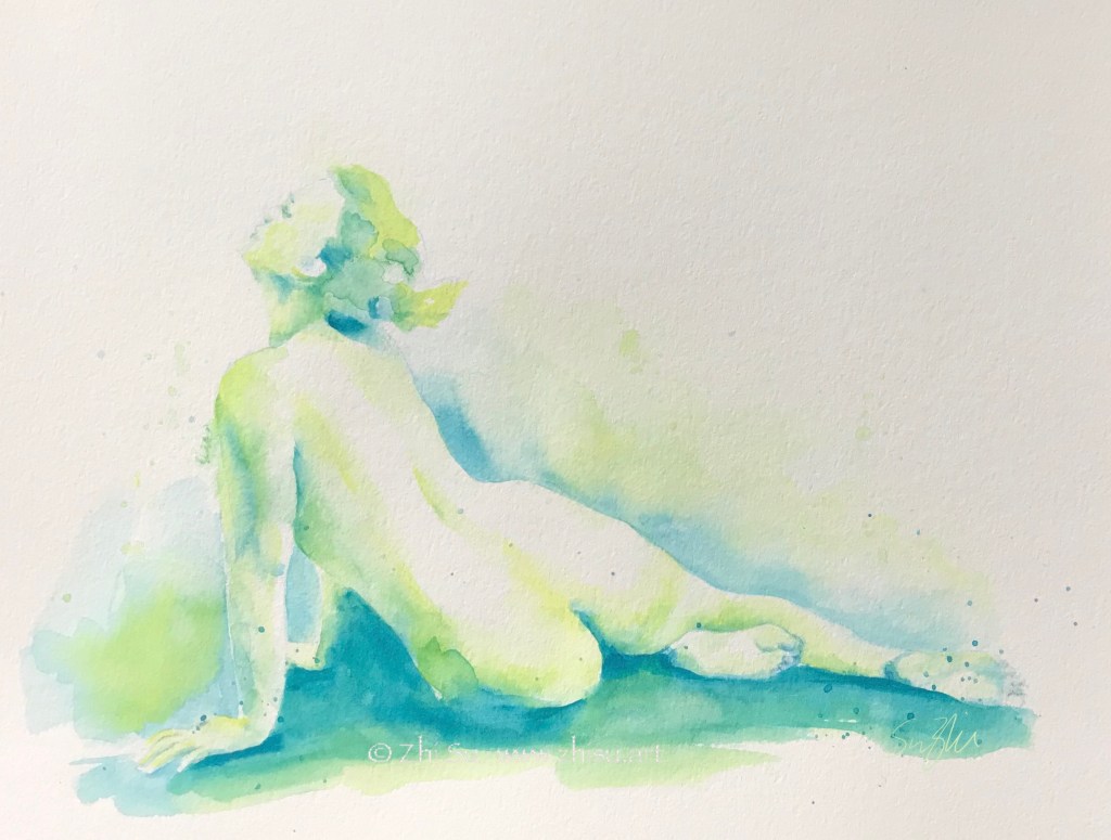
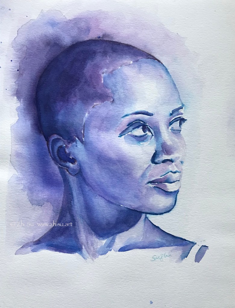
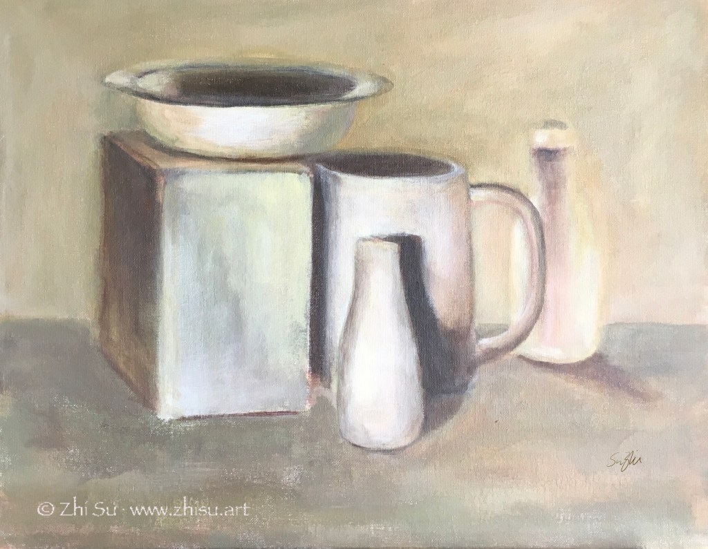
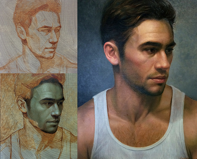
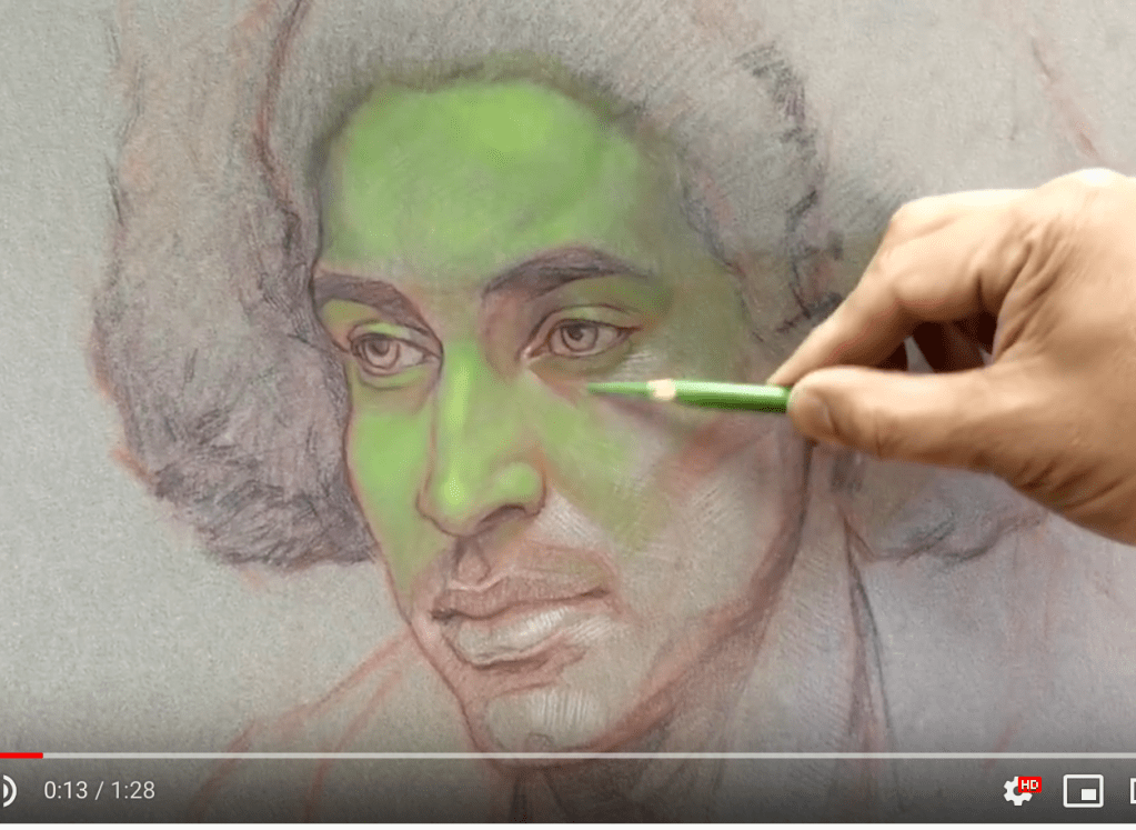
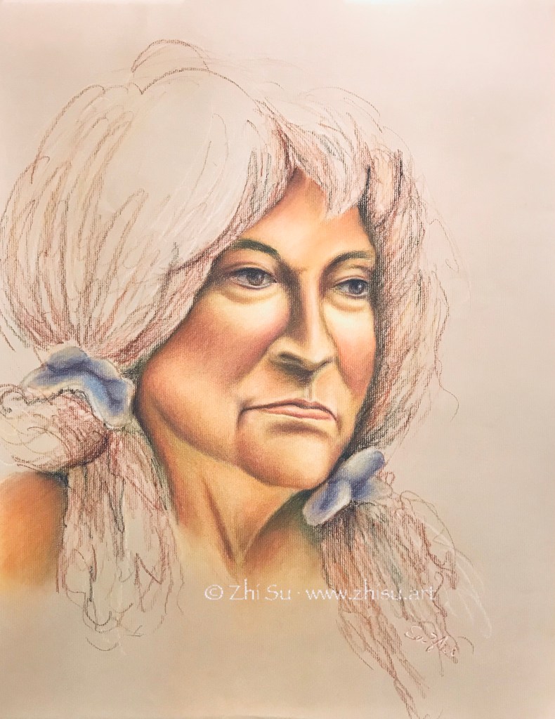
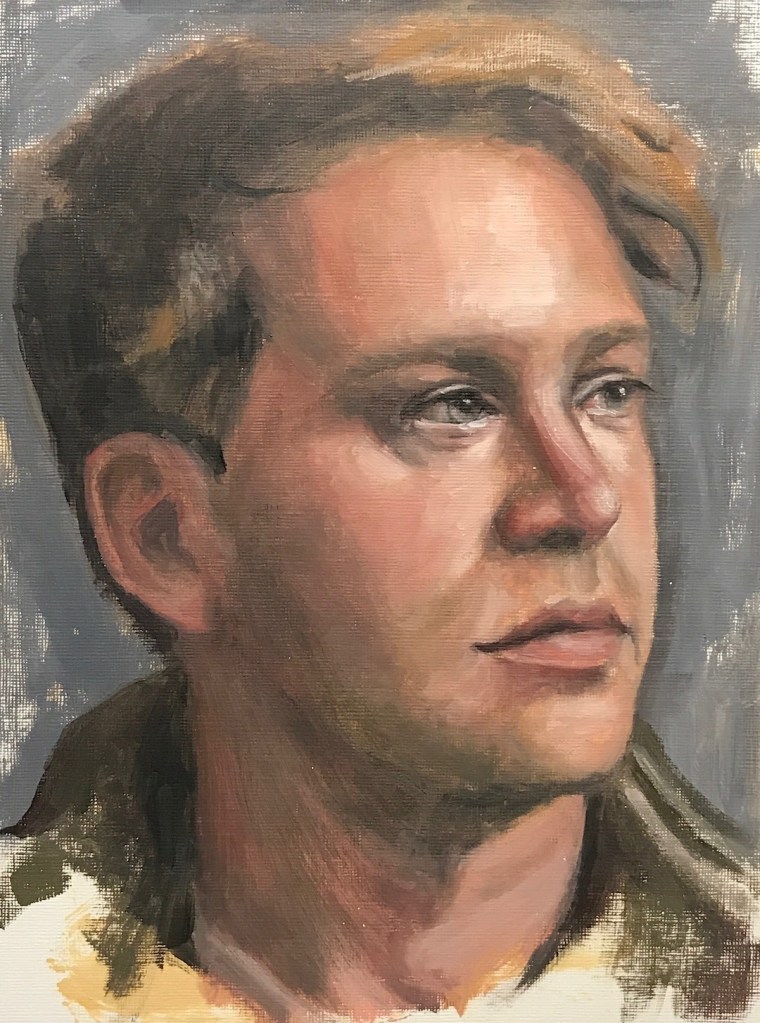
Here are some exercises I did with the Zorn palette. They are not finished paintings, but a part of my continuous efforts in portrait painting and experiments to find out the potential of this limited palette:


A few notes:
- Zorn is not a “pretty” palette, but some of the “muds” you see in my paintings are due to my poor ability to keep my brushes clean, or a lack of assertiveness in my strokes. Not his problem! 🙂
- Since it is not a “pretty” palette, the approaches have to be value based, and it’s a great exercises of control in that sense. You can also practice this method with gouache.
- I got conflicting information on whether ivory black is considered a warm or cool black, but I think it doesn’t matter. It is less overwhelming than mars black and therefore more versatile. It makes beautiful green, brown, and blue with the rest of the colors.
- White is the only true cool in this set, and some artists use lead white, which is probably less overpowering than titanium. I couldn’t find lead white and titanium white works fines if you don’t use it too aggressive and too early.
- Apart from cad red, you can also use Vermilion or brick red.
- I do see artists adding blue to the black, use a chromatic black, adding a different shade of red, etc. As a practice, I’ll keep the painting within the simple version of these four colors and focus on values and consistency in atmosphere. Fun is the next step.