In order to push myself to work more, I participated a “100 Day Art Challenge” by New Masters Academy, of which I became a member last year upon a Black Friday sale. I committed myself to figure or portrait drawings or paintings for 100 days. We’ll see how it turns out.
Since it’s not a small commitment (for me at least), I think it would be a good idea to shoot a couple of more birds in the meantime, such as incorporating some color studies into the challenge.
This week I did a couple of small paintings using analogous colors. Analogous colors are a group of 3 to 5 colors next to each other on a color wheel. From a design point of view, complimentary colors are for contrast, and analogous ones are for harmony.
I tried to limit my choices to 3. With tint and shade of each color and various intensity, there should be enough to work with. In theory.
For the first painting, I planned to use red-orange, orange, and yellow-orange. In practice, the darkest I could get is a deep shade of red-orange. As it seemed not dark enough, I kept adding black to it, and in some places, I just used black directly. The black also contributed to the greenish color in the background. Meanwhile, since I mixed my yellow-orange with yellow and orange, some of that yellow also got in. Looking back, I blamed my disastrous control of color on a lack of design. The reference I chose has strong contrast, and darker colored clothing. If I want to use colors in a limited way, I need to go beyond a literal reading of the reference, and have a better strategy for value:

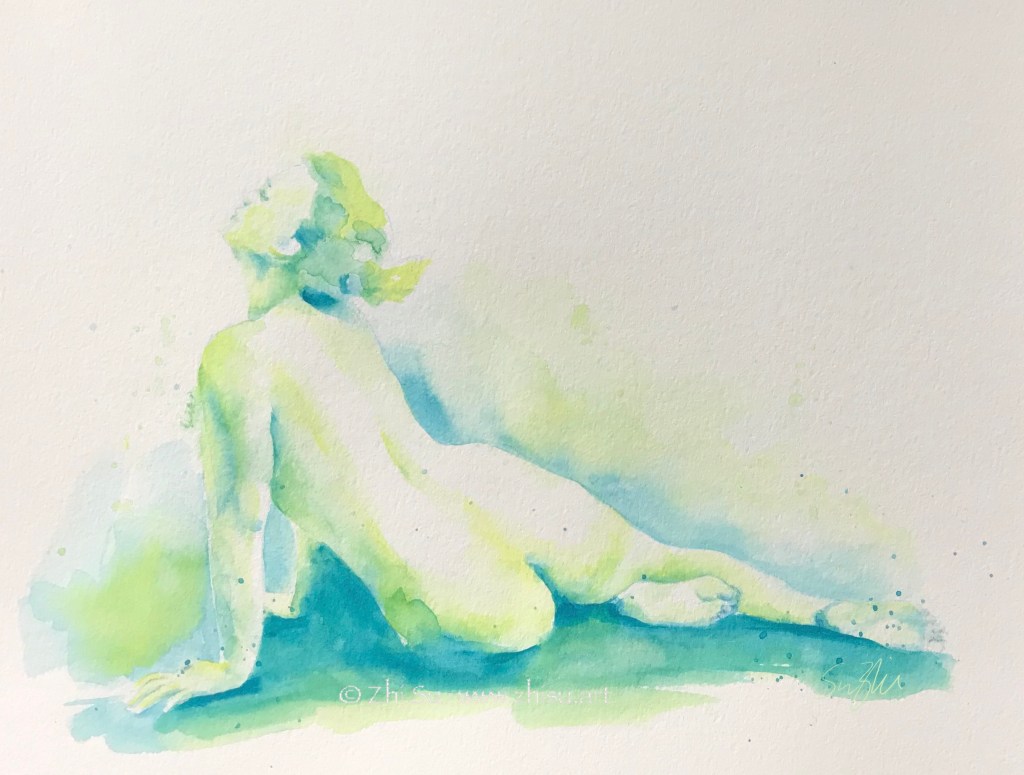
For the second painting, I chose yellow-green, green, and blue-green. I think I still got the value wrong in some places, but at least I stayed within my color choices:
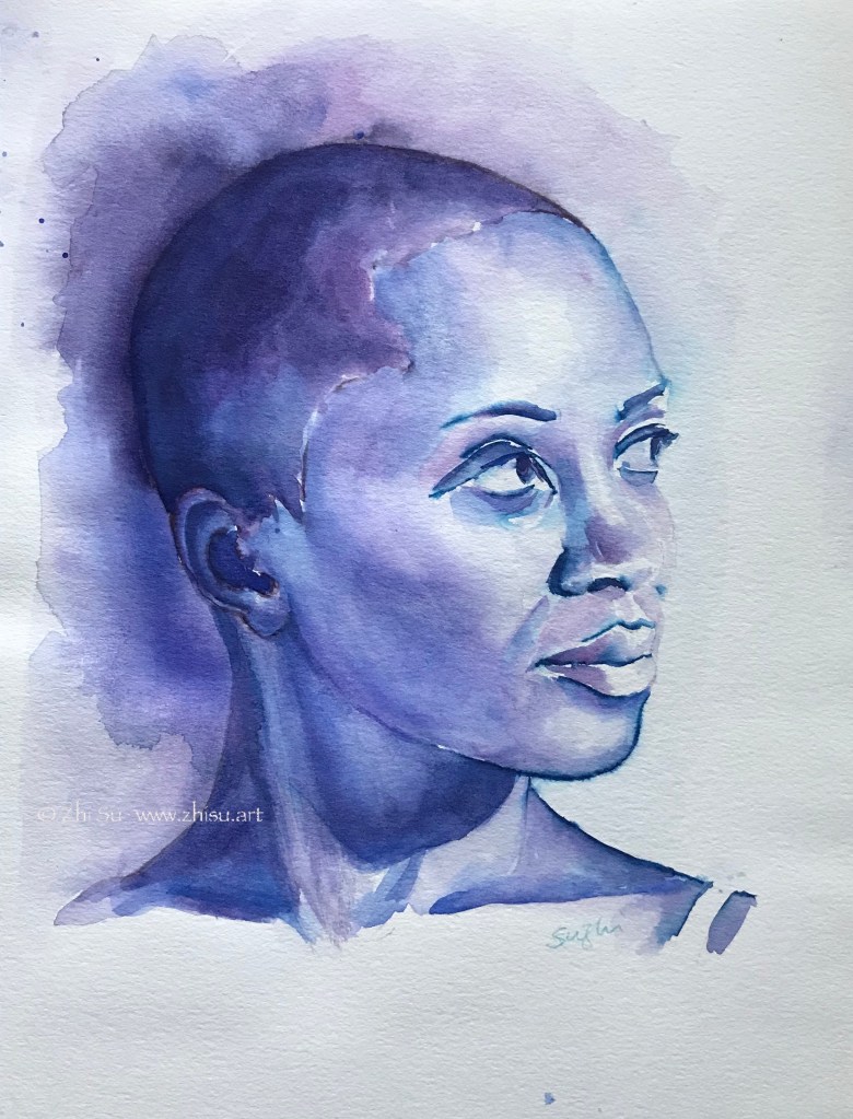
The last one I used blue, blue-violet, and violet. I started this painting with Tombow water-soluble markers. Tombow has a hard and a brush tip, allowing more diverse lines. However, they are not as water-soluble as Crayola. There are lines I couldn’t disappear with water, and a big part of the painting process was to resolve the problems caused by those lines.
In the end, I am very glad I did this experiment. Even with the painting I cheated, I can still see how analogous colors help bringing things together. It’s not that each painting has to follow a color formula, but these are tools to help us to achieve harmony. Because of that unifying power, using analogous colors is also a great way to create a mood in paintings.
