This painting was done earlier this year, but gosh, is there a better time to post it?
Self-portrait, acrylic on masonite board, 30 x 24 in, 2020
In case you wonder, the cat is reading The Malleus Maleficarum (The Hammer of Witches), a 15th century treatise on witchcraft, written by the Catholic clergyman Heinrich Kramer. The book had a great influence on the prosecution of witchcraft in later centuries. You need to know your enemy I guess!
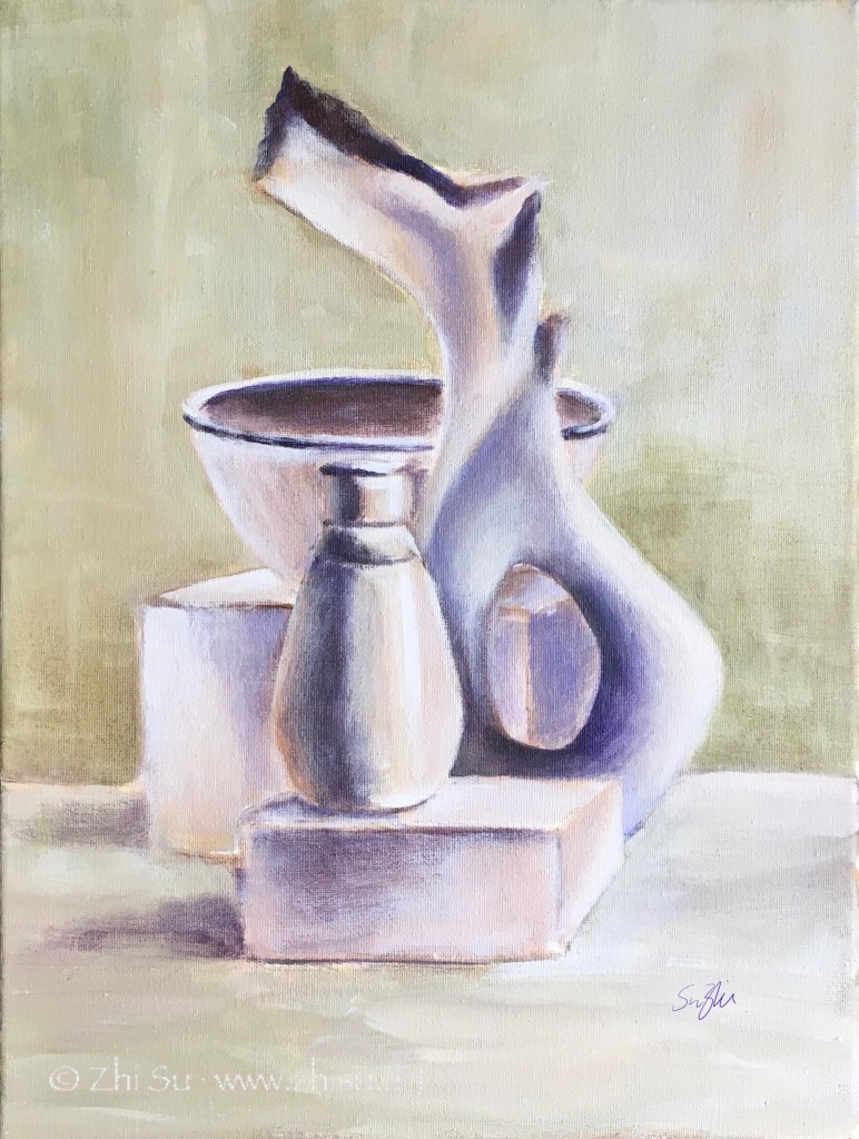
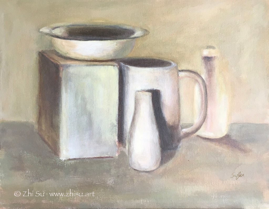
As I mentioned before, the paintings of Giorgio Morandi (1890-1964) often have a monochromatic look, even though he used a lot of colors. The result is a very restful and understated effect – something I always find difficult to achieve. Usually the more time I spent on a piece, the more colorful it becomes, as if keeping quiet on canvas or paper is against my nature. The same goes with details and edges. The more time spent, the more definition, and the looseness and gestures are lost.
So I tried a couple with limited time and clear goals. 1)No more than 2 hours per piece; 2) limited palette to create near monochromatic effect; 3) less definition; 4) lost edges; 5) be quiet.
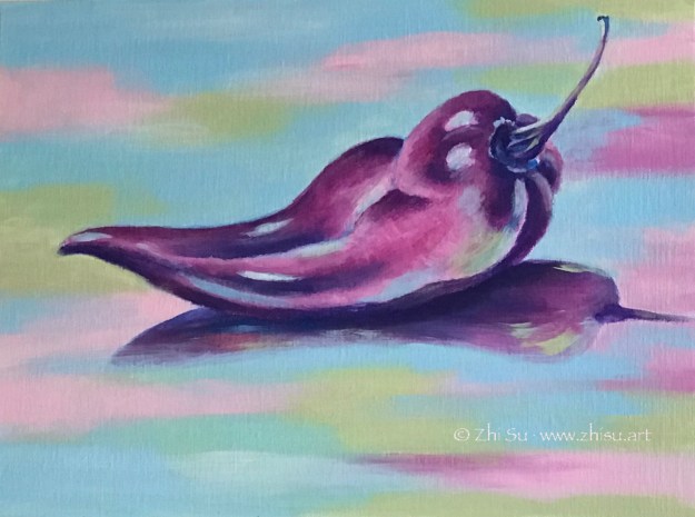
Still life, acrylic on canvas, 9 x 12 in, 2019Still life, acrylic on canvas board, 16 x 20 in, 2019
I think goal setting with time restriction is an effective way of practicing. Right? :))
A most common way to practice complementary colors is simple choose a pair and limited your palette to those two (plus tints, shades, mixtures maybe). Like this:
Skull (horse?), soft pastel on paper, 18×24 in, 2018
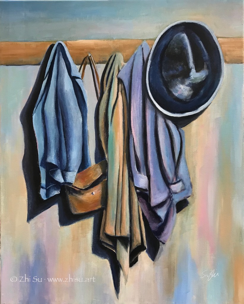
Whichever pair of colors we choose, it is most likely one warm and one cool. In a painting lesson I took years back, we used the complementaries a bit differently. We create a painting in cool colors, and paint the warm complementaries on top. Here’s the result:
Still life, acrylic on canvas board, 16×20 in, 2018
Unfortunately I failed to take a picture of the cool painting underneath, though I did let the cool colors showed through here and there. The colors were not strictly restricted to one pair of complementary colors, but it is within certain range.
I’d say the result is quite different than if I started with these topical colors. There’s a solidity and unity unique to this method.
This was a class assignment – choose an artist to study, and then paint in his/her style. I was very into Giorgio Morandi at the time (still am now), and he became the subject of my study. To my delight, during my research, I found out that Morandi was very much influenced by another favorite artist of mine, Paul Cézanne; and he in turn, heavily influenced a contemporary artist I admire, Wayne Thiebaud (b. 1920). Have I found my “art parents?” (A term I learned from Draftsmen Podcast, S1E5.)
So I set up a still life scene and gave it a try:
Still life 1, acrylic on canvas, 16 x 20 in, Spring 2018
I know, there’s nothing Morandi about it (see my previous post about his style). The objects are asserting and the colors are singing. I don’t dislike it as a painting, but it’s definitely not the reservedness and tranquility I was after. So I gave it another try:
Still life 2, acrylic on canvas, 16 x 20 in, Spring 2018
Well, this is still not Morandi. It’s still me, and it’s very hard not to be me. I understand I will never be Morandi, and that’s not the point of studying a master. If every painting is a self expression, every study of other’s style is a self reflection. I have a lot of passions that I don’t know how to control, and observations I don’t know how to choose and let go.
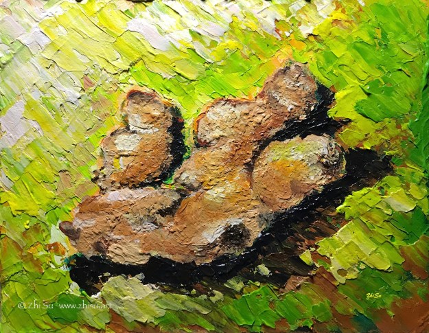
This was an assignment from a painting class (acrylic) a while ago. The purpose was to learn impasto. I chose ginger because I thought the bumpy, textured surface might go well with the technique, and also I usually bought them in bulk from Costco.
It’s a small painting with a single object, and I figured I could get it done in no time. I was so wrong.
There were two things that I couldn’t get used to. First, as someone who started painting first with watercolor, I wasn’t used to putting a lot of paint on canvas. For the purpose of this assignment, we were supposed to achieve a measurable thickness. And acrylic, a water-based medium, dries flat! I ended up working in layers, waited for a long time (longer then usual acrylic time at least) for the paint to dry, and went back to add more and more.
Another thing was the purpose of impasto technique itself. It supposed to be more about expressiveness than rendering, and I had trouble leaving my strokes in and my details out. So I kept going back and forth adding things in and taking them out. I have done so many paintings on this tiny canvas, and what a heavily loaded ginger! 🙂
I posted this landscape in acrylic before, and I recently uncovered a watercolor version of it. So, sorry for repeating myself, but it’s interesting to look at them together:
Path, acrylic on canvas board, 12 x 16, 2015Path, watercolor, 2015
I like the less defined forms and more spontaneous color ranges a wet-on-wet watercolor creates, but I also like the dark values the acrylic painting can bring out. The reference I used for the two is the same, and whatever difference you see from the these paintings are not by design. It seems the mediums just lead me there. How bizarre!
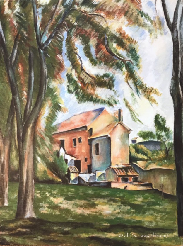
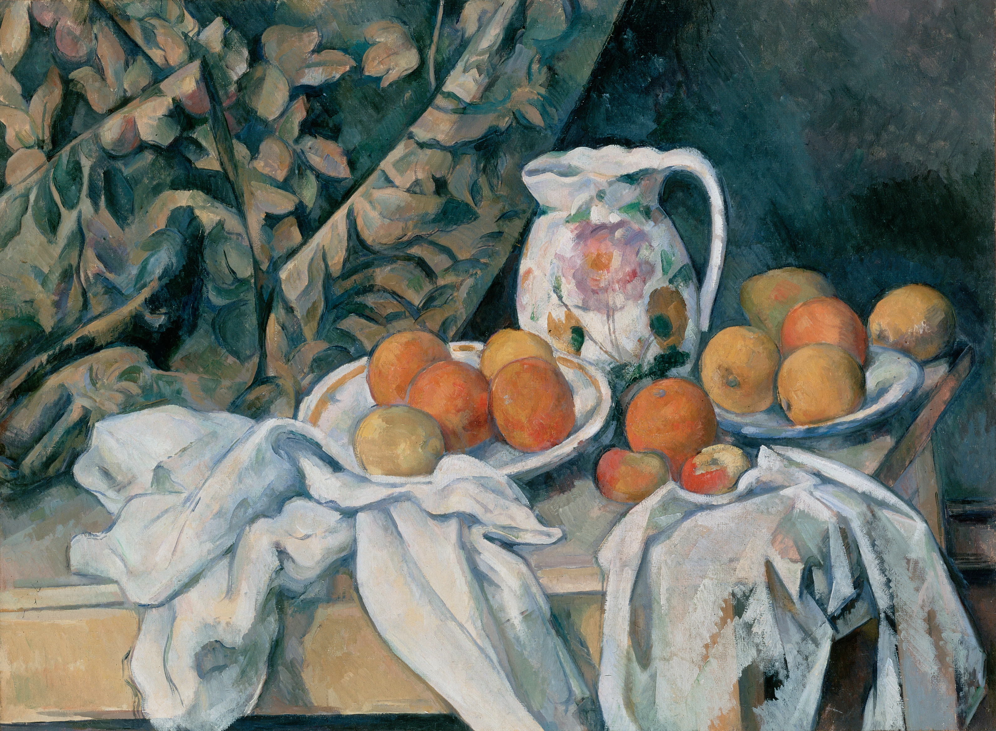
Cézanne’s original is packed with details, there’s subtle changes of color and value on every plane of the house. The trees are built with expressive but economic strokes. I got lost among the leaves.
Paul Cézanne (1839–1906) is probably the most influential Post-Impressionist artist, and definitely the most inspiring for me. His colors are layered and strokes deliberate. It takes a lot more work than it seems. In this study I copied only a small section of the original painting.


