Tag Archives: #fruits

Fruits, Eggs, and More

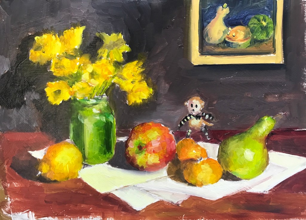
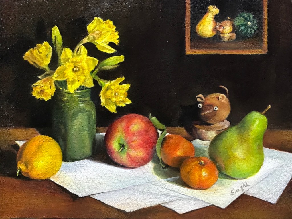
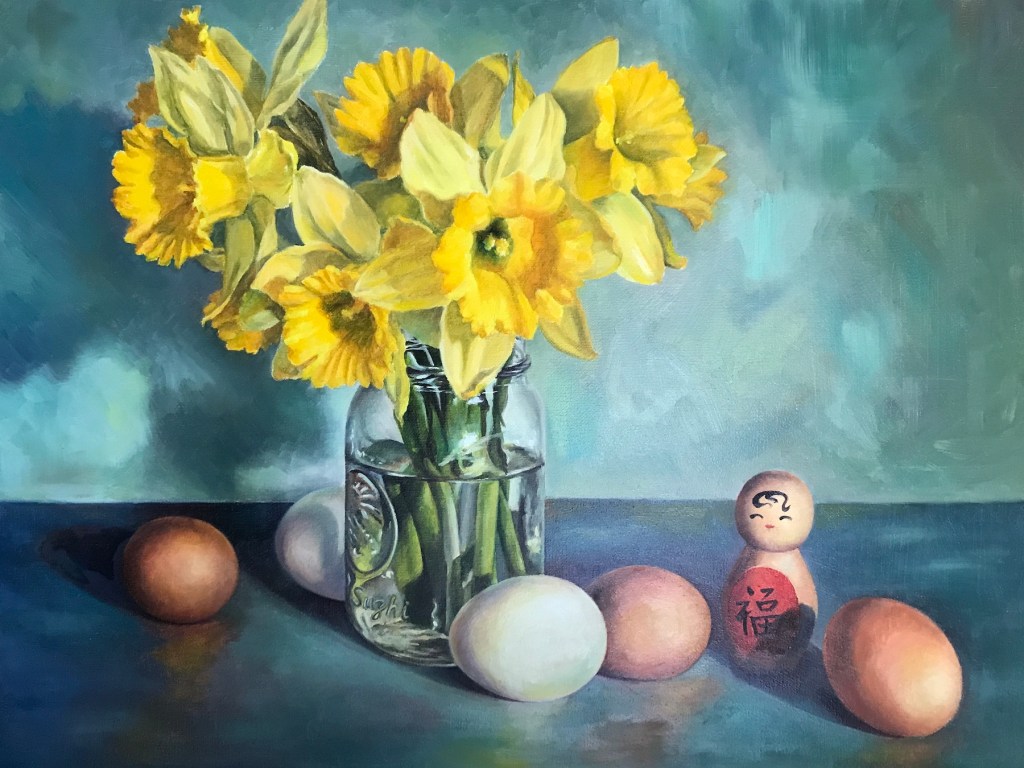
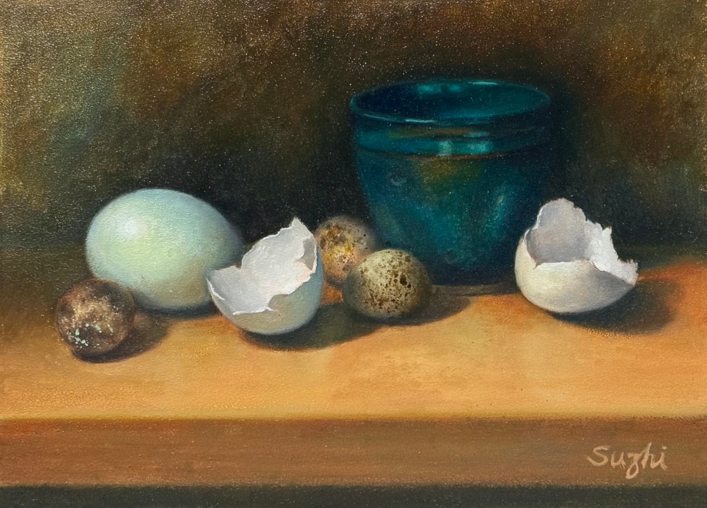
Moderate still life endeavors on various surfaces:

Wooden Cup, oil on canvas board, 11 x 14, Spring 2024
Oil and Orange, oil on MDF board, 9 x 14, Spring 2024
Quail Eggs and Shells, oil on aluminum board, 9 x 12, Spring 2024

Two things I am struggling with:
1. Sunken-in: it is the appearance of a dull matte area in a section of an oil painting, usually caused by overly absorbent grounds, too much solvent, or earthy pigments. In my case, it is the umber and the black. I tried oiling out – apply one part Gamsol + one part Galkyd to the dull area. It helps for a while, but overtime, it might go back a little. Varnishing is supposed to be another way to improve, but so far I find that even less helpful. The process is demanding of patience too, for you need to wait till the paints touch dry to apply the rescue, and then wait for the rescue to dry to see if it actually works.
2. Taking a decent photo. I assume it would be better if the I wait long enough for the paints to be drier, and somehow there’s no sunken-in – the shine is even. Or, invest in a better than iPhone camera? 😳

Daffodils 

I know it’s the wrong season. I started these paintings in early spring, when Trader Joe’s still carried those cheap bunches of daffodils. It is a nostalgic flower for me; my father used to raise them around Spring Festivals. It is also a challenging flower to paint – yellow is not an easy color to keep clean. In addition, I wanted to try doing a quick preliminary study beforehand, a practice many accomplished artists advocate. 

Here they are:

Daffodils and Fruits, oil sketch on paper, 9 x 12 in. 2023
Daffodils and Fruits, oil on canvas board, 12 x 16 in, 2023
Daffodils and Eggs, watercolor sketch on paper, 10 x 10 in, 2023
Daffodils and Eggs, oil on canvas, 18 x 24 in, 2023

And here’s what I got from this experience:

  • As your can see, I did a one hour oil sketch before Daffodils and Fruits, and I liked the sketch better than the final painting itself. The looseness brings out a movement and a sense of humor that diminished in the meticulously rendered final painting. I am seriously  considering setting a timer for my future paintings.
  • The study for Daffodils and Eggs was done in watercolor and it was overworked for the purpose.
  • The blue overtone was an improvisation. The original setting was dull and it worked better with the watercolor than oil medium. I wanted to add some drama and energy to the rather mundane setup. I feel I made the right choice.
  • For me, doing a study beforehand took a bit of freshness out of the final painting process. It could be I was just doing it for the sake of doing it rather than as a process of exploring.
  • It occurred to me that still life as a genre that could be the most expressive for a realistic artist. You don’t get to do that much “directing” in portraiture or landscape. Though at this state, my main focus is still honing my technique, I need to be more thoughtful in choosing and orchestrating the subjects.
  • I did put a signature on Daffodils and Eggs. Can you find it?