I don’t know what sparks the initial idea for a painting in other artists. For me, oftentimes, it has nothing to do with art. As someone genetically at high risk for diabetes, the only way I could justify buying a bag of cookies was to tell myself, “I’m going to use them in a painting!”
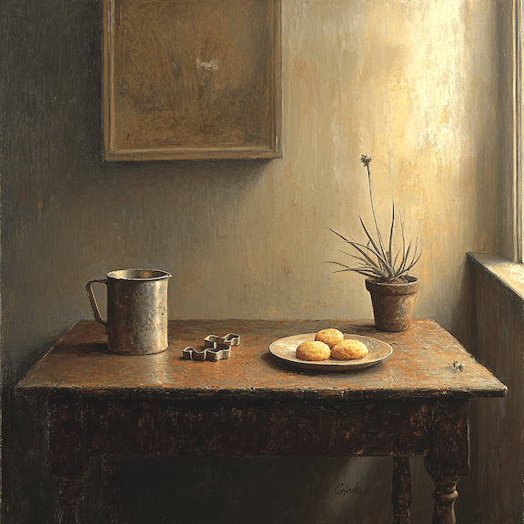
And so it began. Adding a few related items – a cookie cutter, a mug, a wooden table -I threw the ingredients into the AI pot of MidJourney. Among the results it generated, one caught my eyes.
MidJourney v6.1
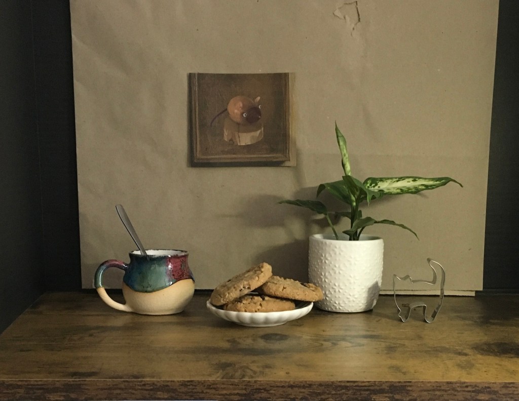
Using it as a guide, I set up my own reference: a small plate to hold the cookies, the new mug I just acquired from a craft show, and a potted plant I picked up from Home Depot. However, I didn’t care much about the background I devised. Why didn’t I just borrow MidJourney’s! I liked the idea of a painting hanging behind the objects, but I didn’t want it to feel generic. One of my cookie cutters was cat-shaped, so to add some fun, I featured a wooden mouse in the painting. The mouse is my zodiac sign, and the little wood carving was a gift from my daughter. This is how a still life became a self-portrait!
Photo of my setup
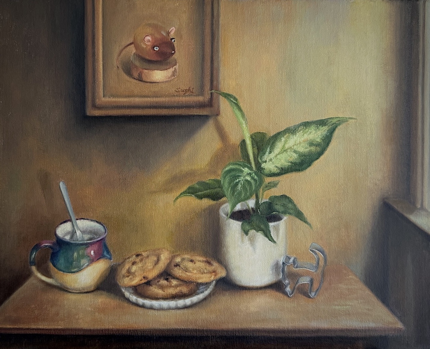
When mixing reality with “fantasy,” lighting is the tricky part. I placed a light source on the right, but whether it replicated the effect in the AI-generated image is a question mark. Whether the lighting in the AI generation was accurate to begin with is an even bigger question mark. I decided to make the painting less about light and shadow!
After the plant’s leaves grew bigger and shifted positions, and after the cookies were replaced several times, I finally completed the painting.
Cookies, oil on canvas, 14 x 18 in, April 2025
The cookies were actually durable enough, but how else could I nibble an entire bag away without guilt? Though the painting is not strictly realistic, its atmosphere and staging accurately reflects my mood during the process. The objects were dear to my heart and the whimsical dynamism is quintessentially me. I’m grateful to live in a time with more tools to find inspiration and support in creating art.
PS:
MidJourney has come a long way since I first used it, and I recently ran another comparison test by revisiting some old prompts. (Please see my first and second tests. )
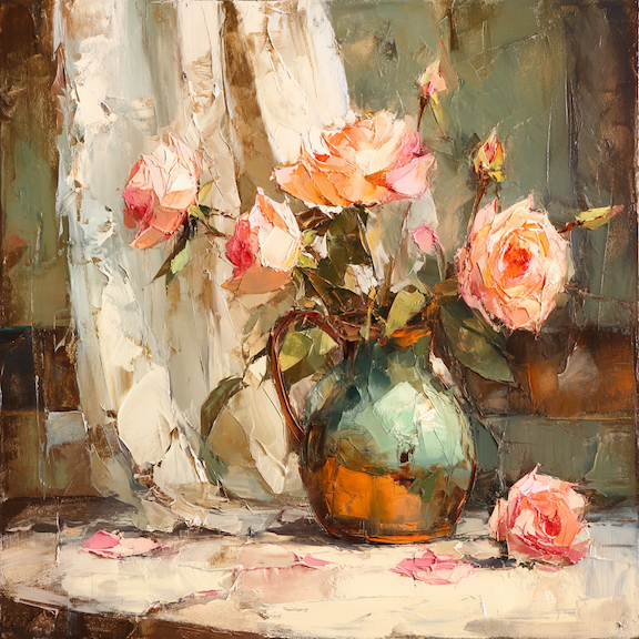
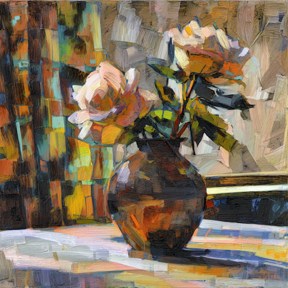
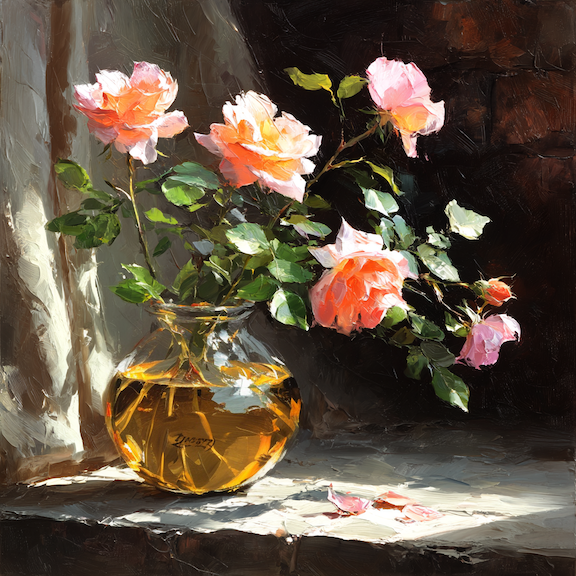
For “oil painting, still life, bronze vase, light pink roses, curtain, table, realism, expressive strokes, zorn palette,” now I got these:
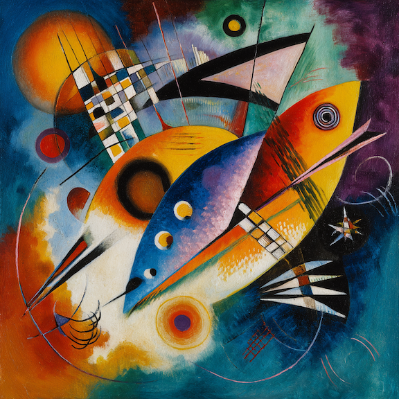
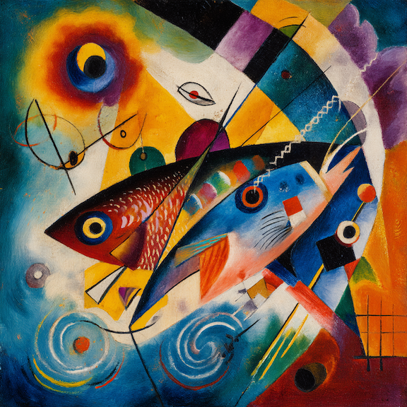
For “kandinsky with expressive bold strokes, fish, abstract colors:”
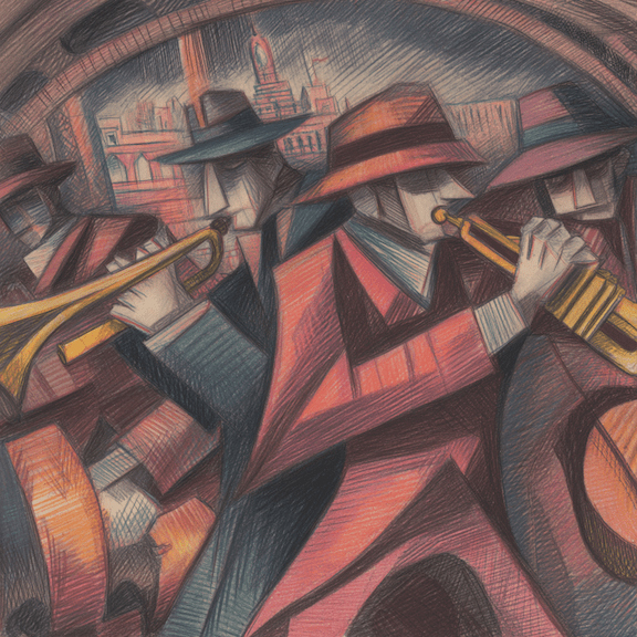
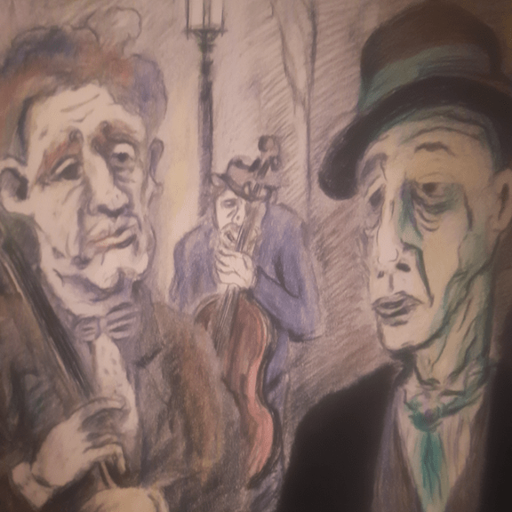
For “André Masson drawing, colored pencil, street musicians, metro, gloomy:”
This isn’t entirely a fair comparison because, as the model becomes more sophisticated, there are more ways to manipulate prompts for varied results. If you are willing to spend some time rating images, MidJourney builds a profile of your preferences, so the results start reflecting your taste, to some extent, regardless of the prompt.
with my profile added
You can also add style references to prompt for more control over the generated style:
Style: Persian Nouveau BloomStyle: Tapestry Synthesia
You can even edit the result to your liking – not quite Photoshop yet, but the result can be wild.
replaced the vase with a glass one using MidJourney Editor
What’s interesting is that, when comparing the Kandinsky and Masson results, it’s not always clear that the newer models are better.
The Today Art Museum in Beijing recently hosted “Brilliant and Epic,” an Alphonse Mucha exhibition showcasing nearly 200 original works, from posters and paintings to drawings and decorative designs. Intertwining the splendor of Mucha’s commercial art with the grandeur of his nationalistic narratives, the show intended to reveal the duality of his legacy: a master of Art Nouveau’s aesthetic revolution and a spiritual chronicler of Slavic heritage. Inspired by this exhibition, I offer not a formal review but a personal reflection on Mucha’s art, his destiny as an artist, and the enduring resonance of his vision.
A Personal Encounter: Mucha’s Painterly Mastery
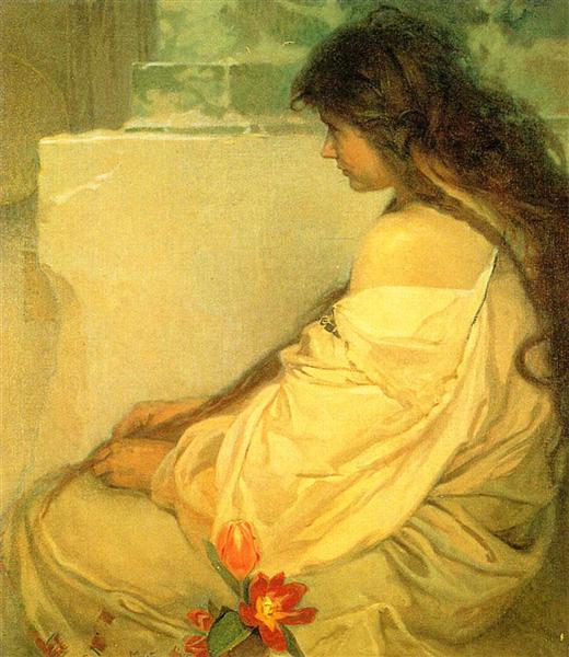
My first encounter with Alphonse Mucha was not through his iconic posters but in a composition class, where I studied two of his 1920s oil paintings: Fate (1920) and Girl with Loose Hair and Tulips (1920). These works captivated me with their bold compositions and nuanced value choices. In Girl, the natural curvature of the seated figure contrasts with the geometric wall behind her, while her cascading hair divides the canvas into expansive shapes. The intricate folds of her dress and the unruly texture of her hair play against the wall’s emptiness, with muted tones punctuated by the vibrant red of a tulip. The result is a serene yet vibrant harmony, a balance of peace and subtle tension. Similarly, Fate juxtaposes a vast cream-white space above with the intricate patterns and folds below, the woman’s intense gaze and powerful hands set against the soft texture of the fabric. Every inch of these paintings feels deliberate, a testament to Mucha’s skill.
Fate, oil on canvas, 51.5×533.5cm, 1920Girl with Loose Hair and Tulips, oil on canvas, 77 x 67 cm, 1920
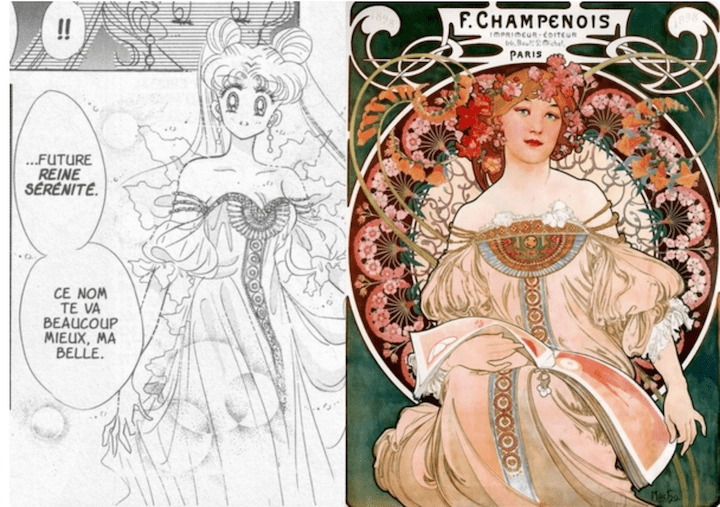
My composition teacher remarked that Mucha’s fame as a decorative artist often overshadows his prowess as a painter. I was struck by Mucha’s use of liubai (leaving blank space), a technique central to traditional Chinese painting, where open spaces balance intricate details to achieve a minimalist-maximalist harmony, while guiding the viewer’s eyes without overwhelming them. Walking through the exhibition, it was obvious that the posters and designs reinforced how this harmony, rooted in liubai 留白, distinguishes Mucha’s work across mediums. Furthermore, both his painterly and decorative works were grounded in realistic sketches and live models, revealing a traditional approach beneath his stylized designs.
My composition teacher remarked that Mucha’s fame as a decorative artist often overshadows his prowess as a painter. I was struck by Mucha’s use of liubai (leaving blank space), a technique central to traditional Chinese painting, where open spaces balance intricate details to achieve a minimalist-maximalist harmony, while guiding the viewer’s eyes without overwhelming them. Walking through the exhibition, it was obvious that the posters and designs reinforced how this harmony, rooted in liubai 留白, distinguishes Mucha’s work across mediums. Furthermore, both his painterly and decorative works were grounded in realistic sketches and live models, revealing a traditional approach beneath his stylized designs.
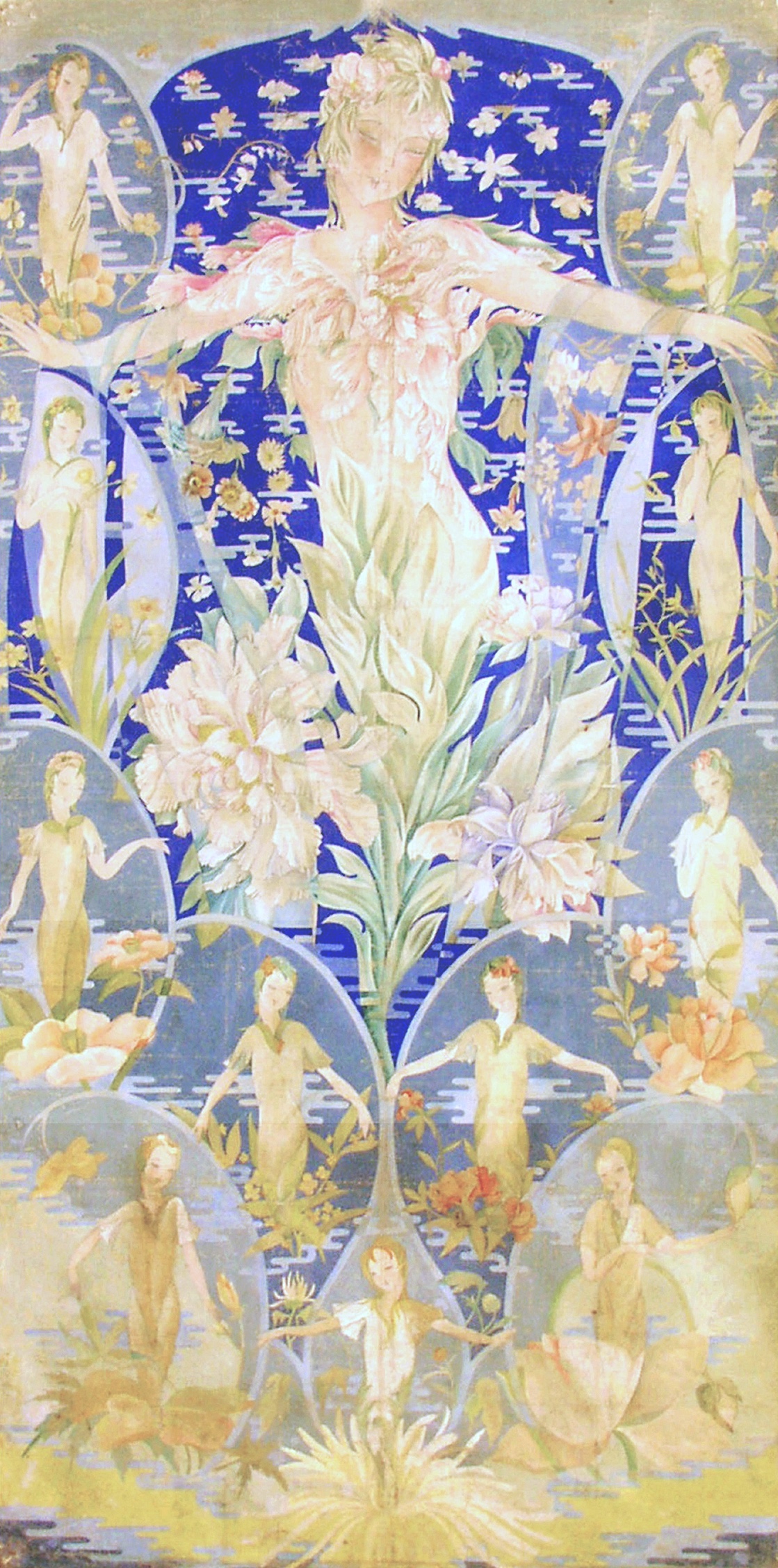
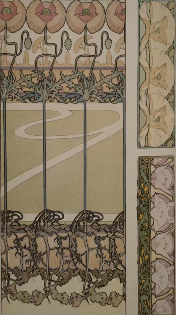
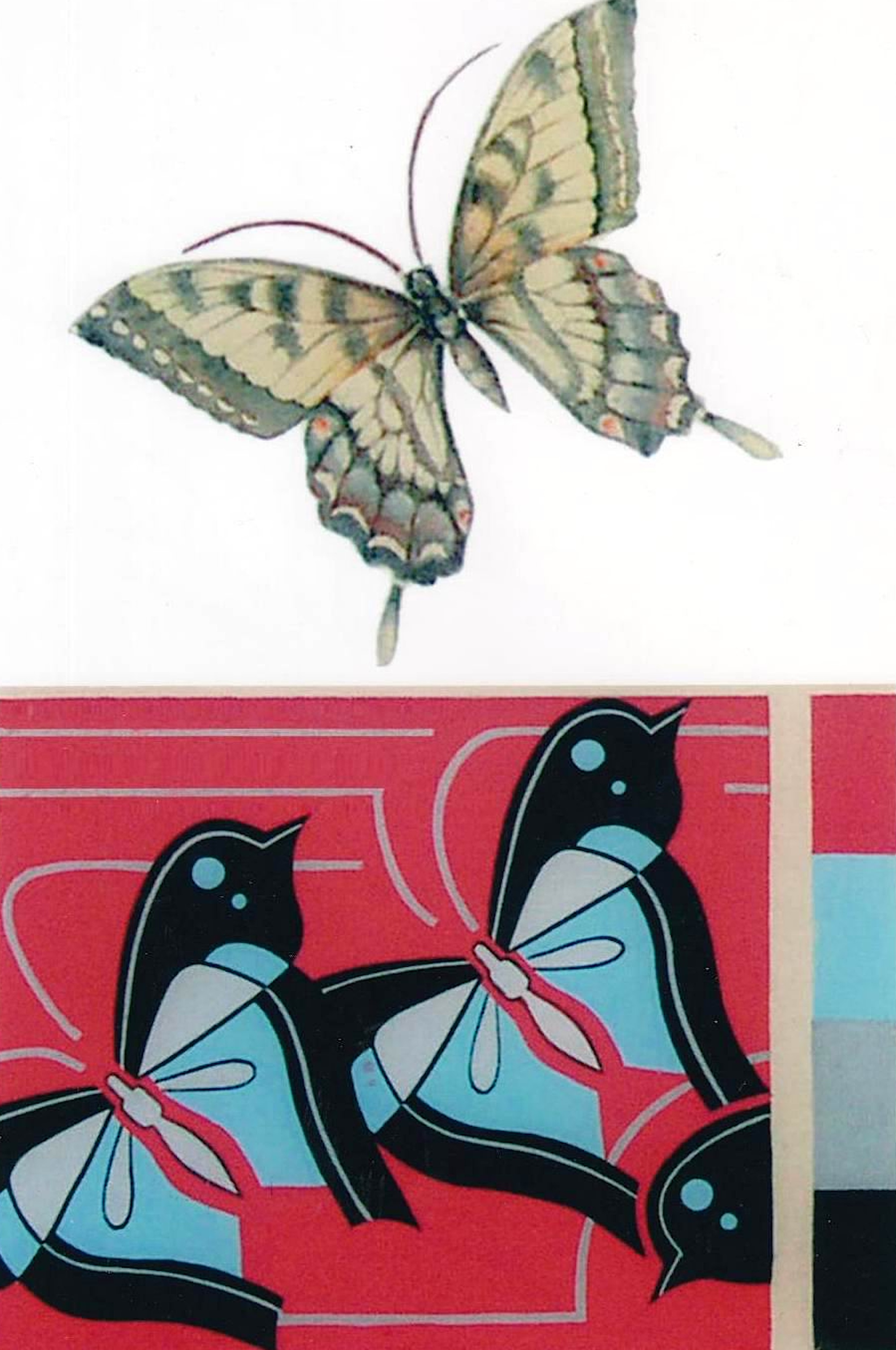
There’s also a personal layer in my appreciation of Mucha’s art. My own maternal grandparents were both decorative artists active in China during the 1930s and 40s. Though I never met them, seeing their surviving works instilled in me an early fascination with design and pattern. One of my grandmother’s paintings (“Peony, King of Flowers”), features twelve female figures representing the flowers of each month, with peonies at the center, echoing Mucha’s fusion of women and blossoms into a harmonious union of humanity and nature. (See more about my grandma’s art and life at Xuying Art Gallery)
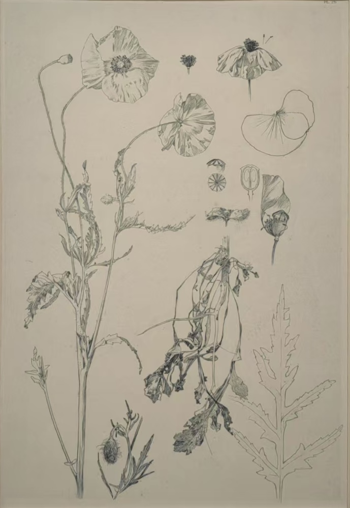
The Beijing exhibition also included Mucha’s Documents Décoratifs (1902) and Figures Décoratives, which illuminate his design process. Starting with naturalistic drawings, he stylized the forms into patterns, further abstracted the pattens to space-filling shapes, and finally applied it to various objects. My grandmother’s sketches, found in her archived drafts, follow a similar path.
Mucha, poppy drawingMucha, poppy patternMucha, poppy patternLi Xuying, Butterfly: painting, pattern Li Xuying: Table cloth design with butterfly pattern
The overlapping principles and methods Mucha and my grandparents used in creating artworks make me think that the divide between fine art, decorative art, and even commercial art is so arbitrary – barriers the entire Art Nouveau movement sought to break. Whether painting or designing, for a product or for a gallery, there’s no shortcut to achieving an effective artwork. As long as the artist stays true to his craft and vision, there’s no high or low in the process.
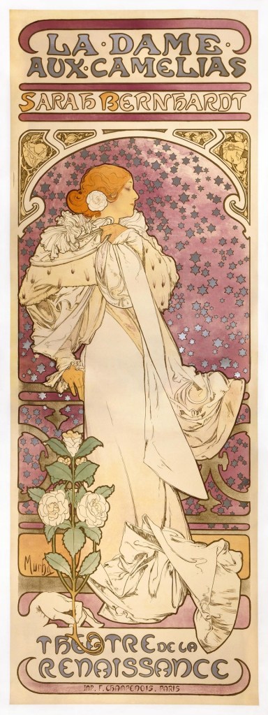
Mucha’s Destiny: Art for the People
Born in 1860 in Ivančice, Moravia, Alphonse Mucha rose from modest beginnings to become the king of Art Nouveau, yet his ambitions reached beyond artistic movements. Trained in Munich and Paris, his career soared with the 1894 Gismonda poster for Sarah Bernhardt, launching the “Style Mucha”—sinuous lines, floral motifs, and idealized women. But Mucha saw his talent as a divine gift, carrying a responsibility to serve a higher purpose. He declared, “I wish to be an artist who paints for the people, rather than one who pursues art merely for art’s sake.” With this conviction, Mucha created posters not just for products but as art for all, choosing the format to democratize beauty. Works like The Seasons (1896) or The Arts (1898), with no commercial tie, were affordable and visible on Paris streets, meant to uplift the masses. Yet, his vision faced irony. The models for his elegant figures were often poor women, whose reality was far removed from the flowing bouquets, lace, and ornate garments of his art. His idealized style became a fashion for wealthy salons, an escapism that defined Art Nouveau’s allure. Mucha lamented this disconnect: “I saw my works decorating the salons of high society… My time, my most precious time, consumed on these, while my homeland was like a stagnant pool drying up. In my soul, I knew I was sinfully squandering what belonged to my people.”
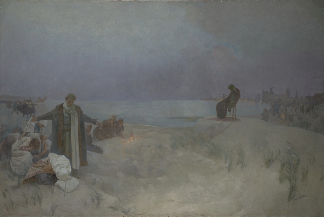
The Last Days of Jan Amos Komenský in Naarden, oil on canvas, 8.1 x 6.1 m, 1912
This frustration drove him to create The Slav Epic (1912–1926), a series of 20 monumental canvases celebrating Slavic history and identity. Donated to Prague in 1928, it responded to the formation of Czechoslovakia, reflecting Mucha’s Czech pride and vision of Slavic unity. The Beijing exhibition’s final section featured a digital, animated version of the Epic on a large screen, a choice I found misguided. In The Last Days of Jan Amos Komenský in Naarden, the original’s somber stillness conveys profound hope, but animating the grass or figures dilutes its emotional weight. Perhaps I am old-fashioned, but I believe each art form has its own language, and I am never a fan of the popular trend of “immersion” experience where famous paintings are translated into 3D projection. On the other hand, I can sympathize with the show organizers’ intention in doing so – likely an attempt to draw a larger, younger crowd with modern technology. Given his own efforts to democratize art through accessible posters, one could argue that Mucha might very well embrace all the novel methods to spread beauty!
Mucha’s Legacy: Beauty, Unity, and Revival
Mucha believed truth, love, and beauty formed the foundation of the human spirit. Art Nouveau, with its organic forms and curves, rose against the academic rigidity and the drabness of industrialization. Mucha’s flowing lines and harmonious designs offered an antidote, a vision of creation rathe than destruction. Yet, by the 1930s, as modernism embraced abstraction, his style fell out of favor, seen as outdated. After his death in 1939, his work was neglected, with The Slav Epic stored away until the 1960s.
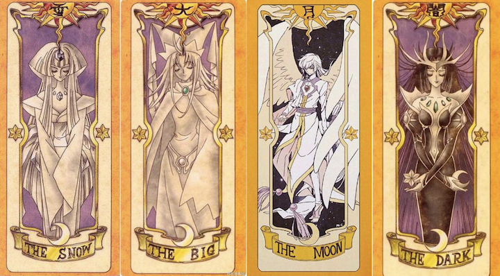
Naoko TakeuchiCLAMP
The 1960s counterculture revived Mucha’s aesthetic, his sinuous lines inspiring psychedelic rock posters and album covers. His influence extended to Japanese manga, particularly among the “Year 24 Group” of female artists in the 1970s, who pioneered shōjo manga. Works like Naoko Takeuchi’s Sailor Moon and CLAMP’s Cardcaptor Sakura echo Mucha’s floral backgrounds, geometric halos, and vine-wrapped compositions. Mucha’s influence on popular art laid the groundwork for his global resurgence, evident in recent exhibitions worldwide. This is also not the first time Mucha has been exhibited in Beijing. In fact, Mucha is so loved by the Chinese that there’s a museum dedicated to him in central China. I believe Mucha’s resurgence reflects more than stylistic appeal. Much of postmodern aesthetics prioritize incomprehensibility or deconstruction, while rejecting traditional beauty. Mucha’s art, rooted in continuous creation and human connection, offers a counterpoint. He wrote, “We must hold on to the hope that humanity can unite as one, and the more we understand each other, the closer this hope will become a reality.” His revival signals a yearning for love, beauty, and unity in a fragmented world.
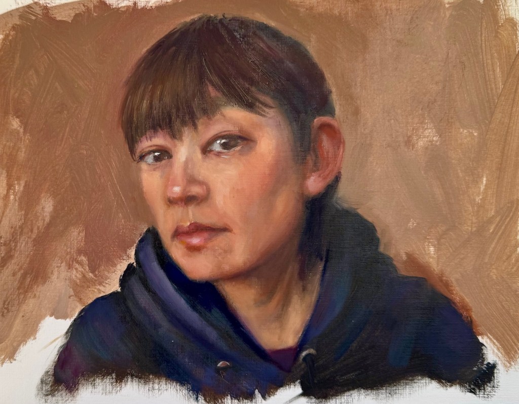
Two things have become a common practice for me. One: after a break from art making, I get back into the practice with some quick portrait sketches. Two: when I’m stumped for ideas, I turn the brush on myself and paint a self-portrait. Back in January, after a string of trips, I followed this pattern. I painted a series of head sketches. One of them was me – live model with a fresh hair cut, why not?
Each time I painted myself, the likeness never feels right, and limited by the using of a mirror, the expression and posture often come out stiff and uninspired. So, did this sketch have the potential to be developed into a real painting? What could I do to make it better and more engaging?
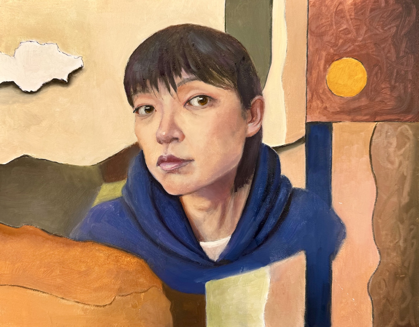
In a more serious attempt, I envisioned a flatter and more stylized approach. I picked warm tones close to my skin color for the background – partly for harmony, partly to pop against my blue hoodie. I used abstract shapes to balance the realistic face. To lean into the flat design, I outlined everything with a Sharpie first, and then filled in the colors, letting some of the black lines show through. The collage-like result is a step up from the sketch. I wanted the face to stay more stylized and almost blend into the fragmented background, but the more I worked on it the more it slid back into a standard realistic portrait. Eventually, I just stopped.
Me, oil on board, 11 x 14 in, Feb. 2025
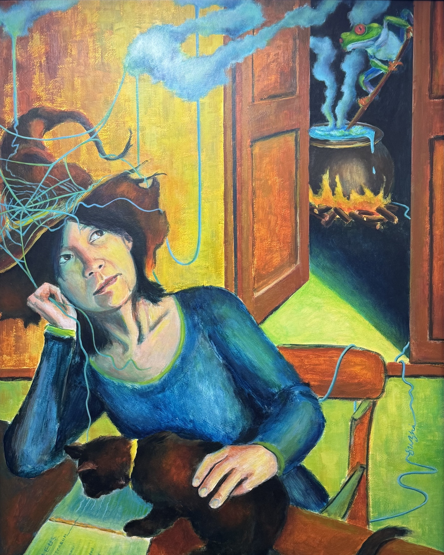
That got me thinking: Is aesthetic the only thing I could work on? What else could I do to make the painting a bit more meaningful? I recalled a self-portrait I did years ago in a class. The teacher told us to paint ourselves in a different role. I went with a witch – surrounded by classic witchy themes with my own spin: a frog brewing potions and a black cat reading the Malleus Maleficarum (often considered the first major anti-witchcraft document). While the painting was crude in execution, but dreaming it up and piecing it together was a blast.
Me, acrylic on board, 30 x 24i in, April 2020
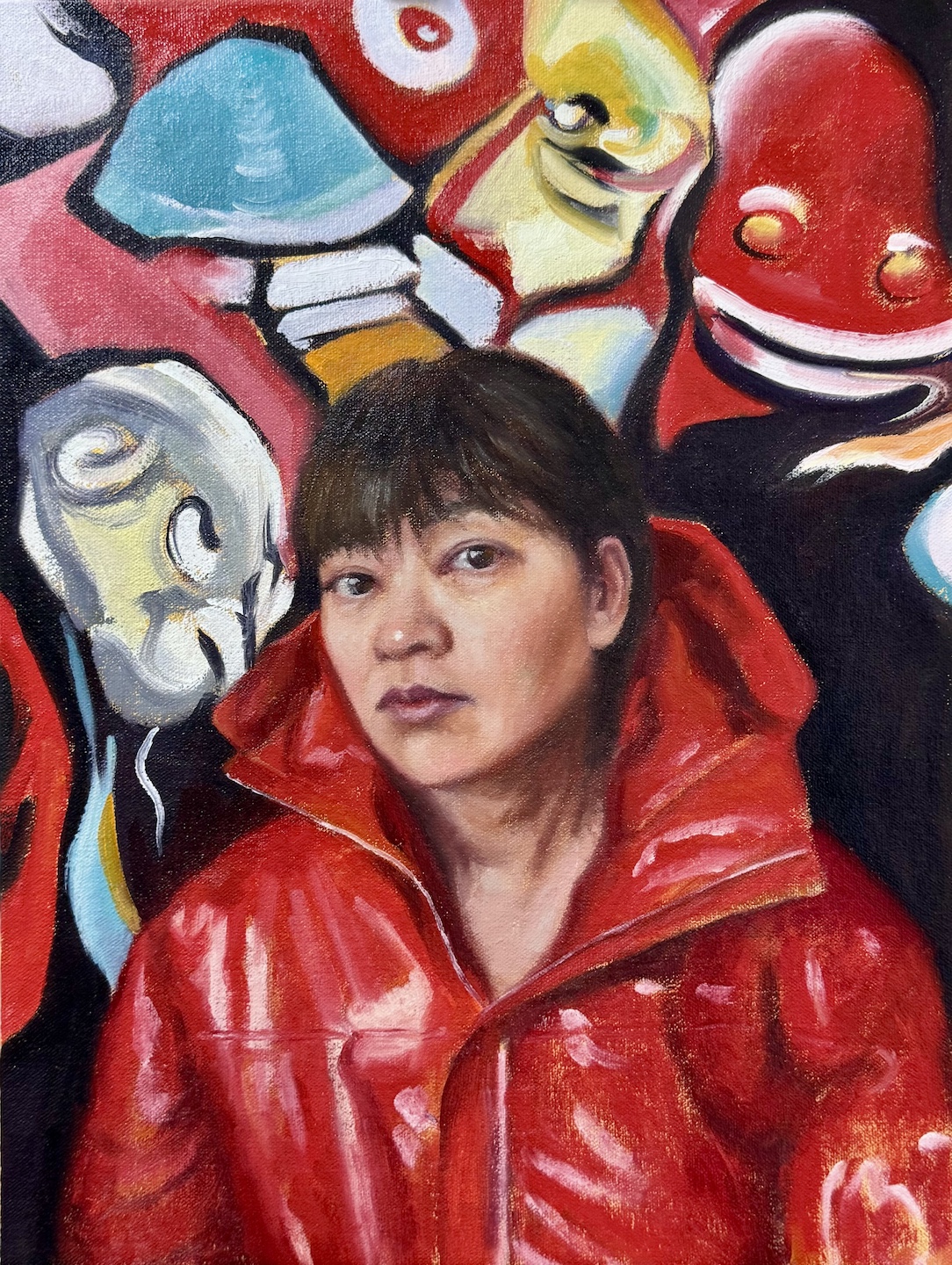
So why not give it some character? Pick a costume I’d never wear in real life (I’m a muted-hoodie kind of person), or visualize some thoughts I usually keep under wraps? I went for a bolder color and more dynamic palette. I still wanted the face to feel like part of the design, but this time, I let it be drowned by the unsettling shapes, vibrant colors and swirling energy. I kept the ideas of black outlines but used the paint instead of Sharpie this time, allowing more varied and expressive marks. That hint of punk—is it just wild imagination, or a quiet piece of me sneaking out?
Me, oil on canvas board, 12 x 16 in, March 2025
In retrospect, neither of my paintings addressed the likeness or posture issues that bothered me in the first place. In the process of further creation, they became irrelevant. Painting’s at its best when it’s a journey—when it’s messy, exploratory, and forces you to reckon with yourself.
Most of the time when I paint, I listen to audiobooks and podcasts on a variety of topics—philosophy, technology, economics, even geopolitics—the majority of which aren’t art-related. I find music distracting, as if the two art forms are vying for my attention. The eclectic mix of subjects I explore keeps me engaged, and even when I don’t fully grasp the discussion, the thrill of learning something new oddly fuels my creativity and deepens my focus on painting.
That said, I do follow a handful of art podcasts from time to time. My initiation to this experience was The Draftsmen Podcast, hosted by artists and instructors Stan Prokopenko and Marshall Vandruff. They dive into the craft of drawing, painting, and image-making, offering practical advice for aspiring artists—especially those skipping art school—on finding resources, building a self-learning system, and promoting their work. The podcast ran for three seasons before pausing due to the hosts’ busy schedules, but all episodes are still available on YouTube. Even if you don’t listen to the old talks, check out their channel for the episode covers—hilarious parodies of famous paintings featuring the duo. It’s a clever, arty touch.
The Week in Art from The Art Newspaperis my go-to for global art news. It delivers insider insights into exhibitions, museums, and auctions. Sometimes it also covering major copyright lawsuits and policy changes that ripple through the art world—content I’d otherwise overlook. It’s the one podcast I can truly “listen” to without needing visuals.
My favorite and the most relevant is The Undraped Artist, hosted by Jeff Hein, a master realist painter himself. His guests are some of the world’s most accomplished traditional artists—like Jeffrey T. Larson,Michael Klein, Scott Christensen, Alex Venezia, and Mario A. Robinson. Interviews typically begin with the artist’s early days in art, trace their career paths, and explore insights on painting techniques and professional growth. Jeff often examines the guest’s work on air, offering comments and asking questions. For this reason, watching on YouTube—especially during these segments—is ideal, though the audio alone is still rich with inspiration.
A fresh addition to my list is Idiosyncratic Nightmare, where hosts Michael Klein and Stephen Bauman—both highly accomplished realist artists—interview a guest while creating their portrait. In the first two episodes, Bauman sketches with graphite, and Klein paints in oil. It’s like watching two master demos unfold simultaneously, paired with a thoughtful conversation. The candid interview with Tania Rivilis taps into the struggles almost all artists experienced. It is a comfort and encouragement at the same time. This one’s a must-watch on YouTube, and do stay till the end of each episode where the duo speed painting their portrait to a more finished stage. I’m rooting for this podcast to take off.
Finally, there’s Talk Art, recommended by my pal Grok3. Hosted by actor Russell Tovey and gallerist Robert Diament, it’s possibly the longest-running art podcast around, now in its 24th season. I haven’t tuned in yet, but I’m excited to explore its extensive interviews with artists of various caliber—also not just realists, but a broader mix of voices from the art scene. With so many back episodes, it’s a goldmine for anyone needing something to listen to while painting.
Share your favorite and happy listening—and watching!
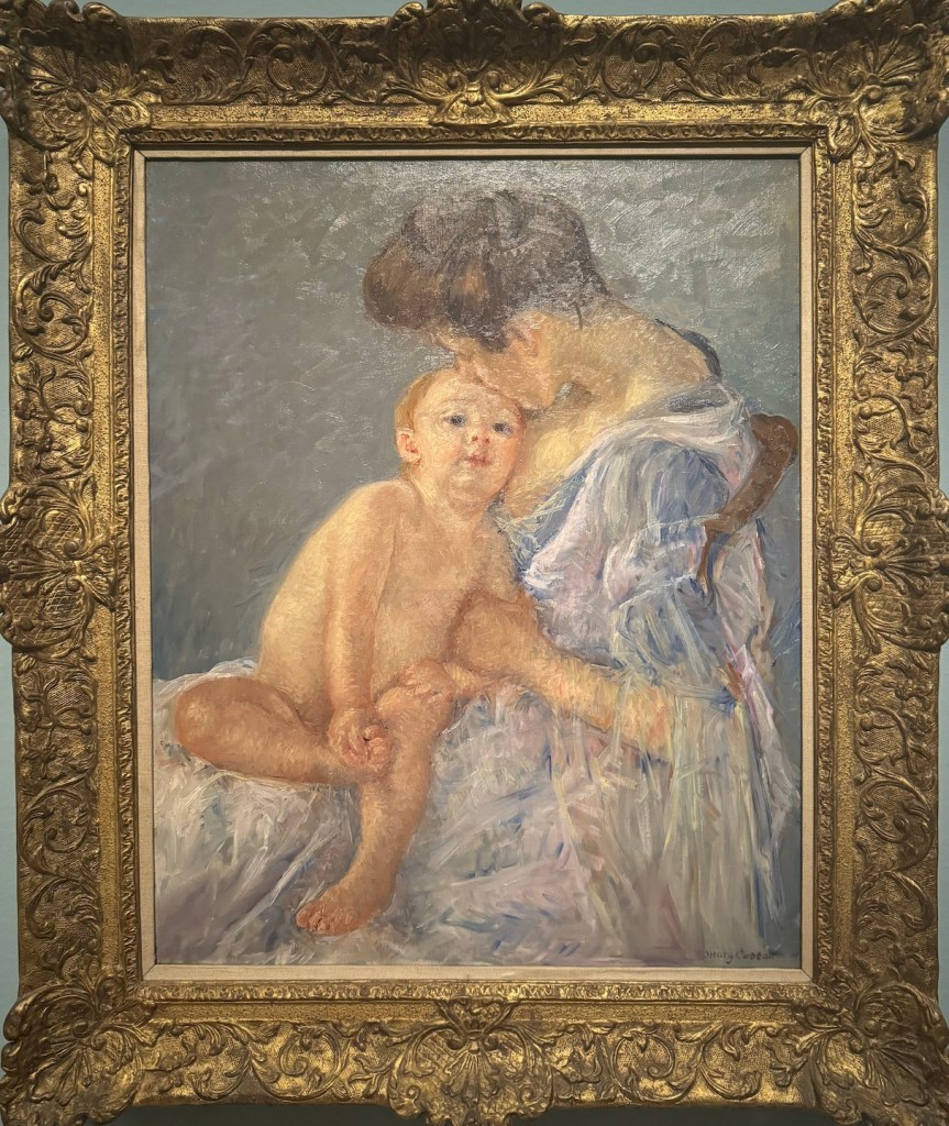
Fine Arts Museums of San Francisco recently offered a fascinating opportunity to view the works of two remarkable women artists: American Impressionist Mary Cassatt (1844-1926) at the Legion of Honor and Art Deco icon Tamara de Lempicka (1898-1980) at the de Young. Mary Cassatt at Work is the first major U.S. presentation of Cassatt’s work in over 25 years. With more than 100 pieces, the exhibition surveys Cassatt’s materials and processes across 50 years of art-making. Tamara de Lempicka, meanwhile, with more than 120 drawings and paintings, marks her first full museum retrospective in the United States. While both navigated the challenges of working in a male-dominated art world, their approaches to subject matter, artistic expression, public persona, and ultimate position in art history reveal contrasting yet equally compelling perspectives on the complexities of modernity.
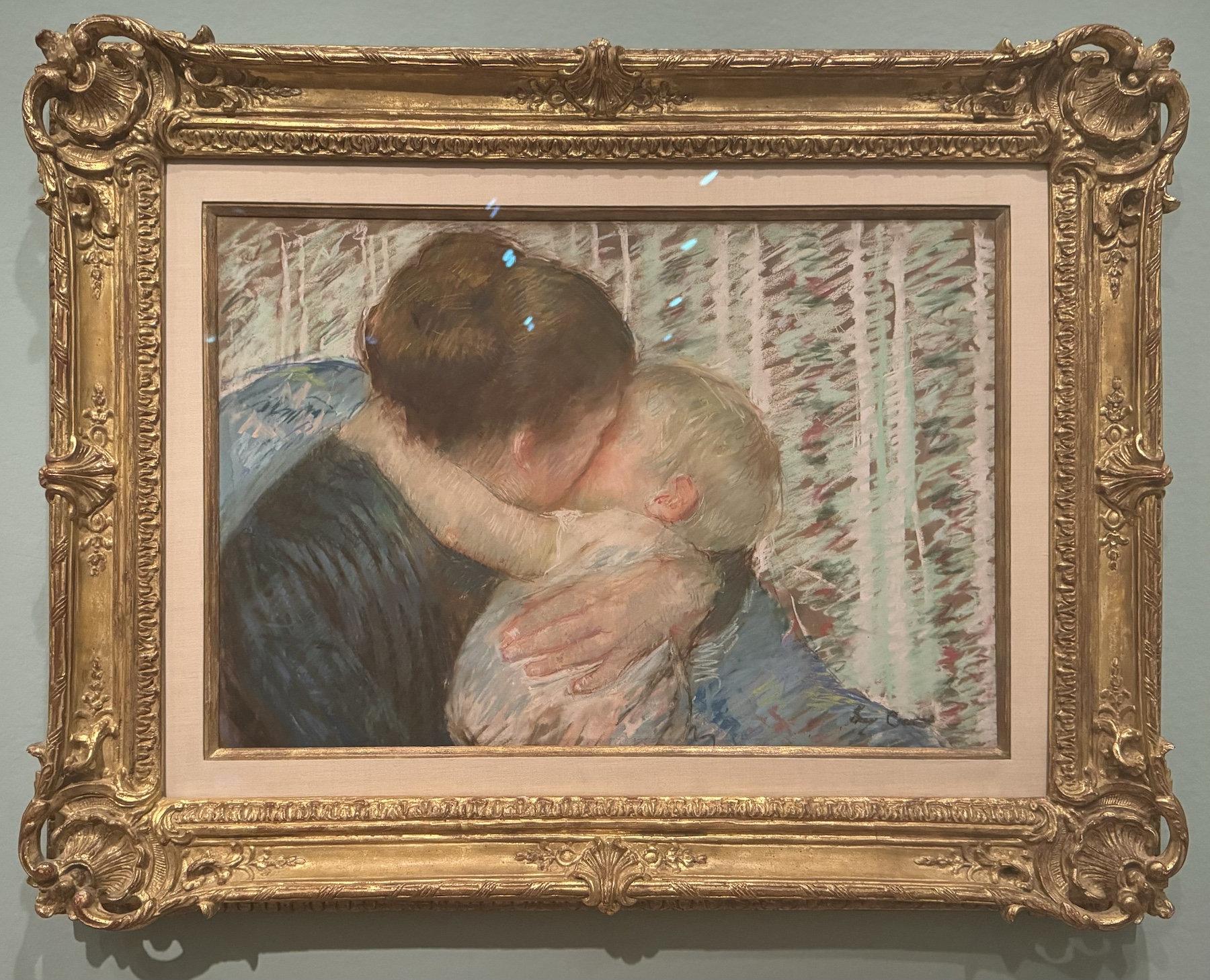
Maternity, oil on canvas, 1906Maternity, details
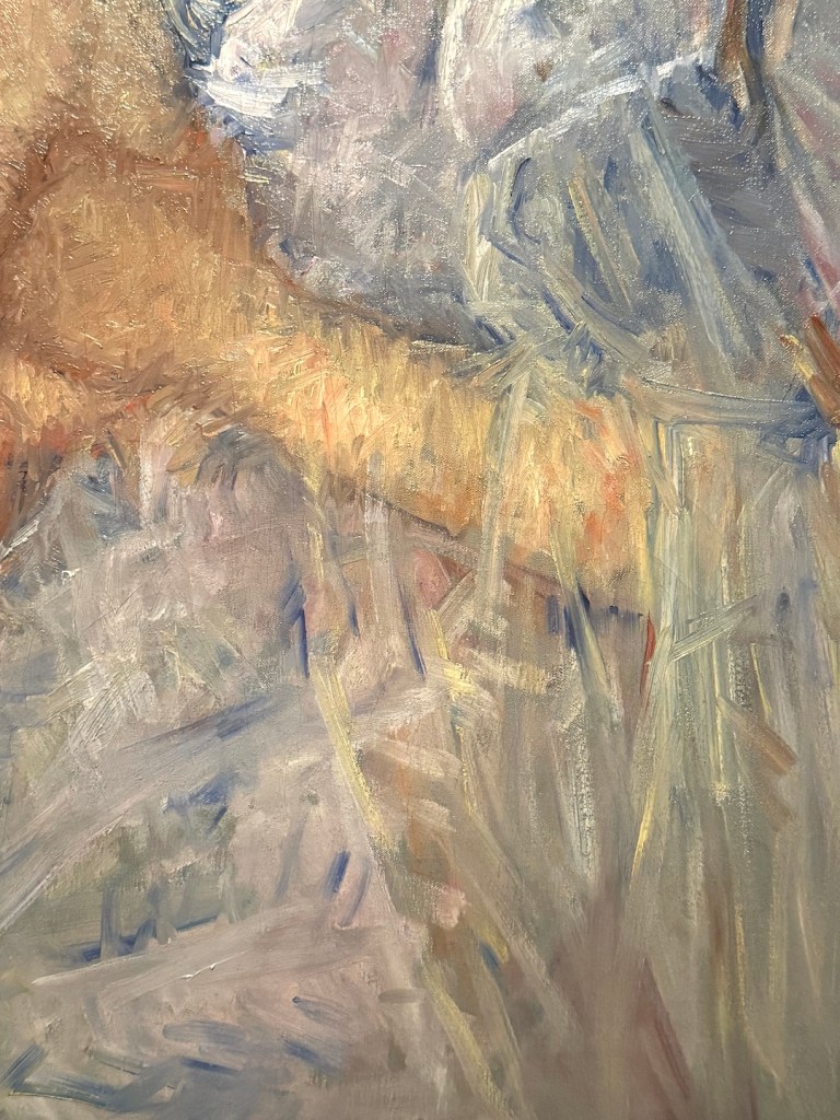
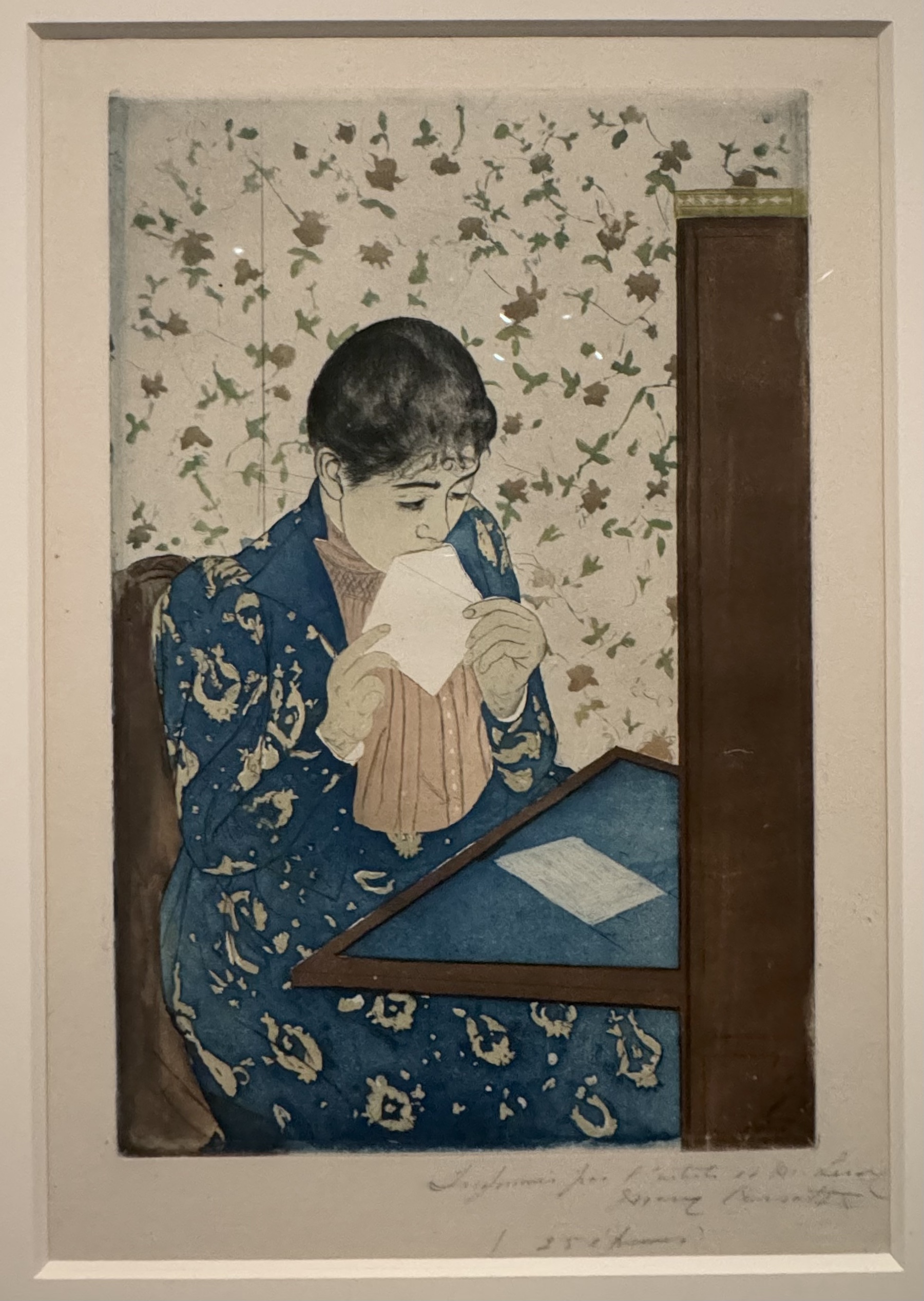
Mary Cassatt was born in Pennsylvania, USA, into a well-to-do family and defied societal norms to pursue a career as a professional artist. She trained in Philadelphia before moving to Paris in 1866, where she would become one of the few American artists to join the Impressionist movement. Cassatt is celebrated for her paintings of women and children, but the exhibition sheds light on many aspects of her artistic exploration in both techniques and subject matters. In her oil and pastel painting, the airy and light infused brushwork, while typical of the impressionists, was also energetic and abstract, in sharp contrast with the delicate linework of her drypoint prints. Her composition, the use of big shapes and patterns, was influenced by Japanese woodblock prints, a craft she herself attempted.
Mother Marie Dressing Her Baby after its Bath, drypoint, 1890The Letter, color drypoint, 1890-91
Apart from her technical versatility, the most interesting aspect to me was her choice of subject matter. Her earlier works often featured people around her. She chronicled her immediate surroundings, capturing her parents reading, her sister sewing, and domestic employees doing house work and taking care of children. Her later works narrowed in more and more on the mother-child theme. The composition was more staged, the brushwork more polished.
Cassatt didn’t have children. Her focus on domesticity could be seen as a way to compensate for this lack in her own life. It could also have been a calculated choice to manufacture a narrative or a niche presence for her art. Many of her paintings, while seemingly catching an intimate moment, were created using paid models in carefully crafted studio fictions. Her own mother called her a woman who was “intent on fame and money.” This single-minded focus rendered her commercial success, but in comparison, her later art was less intriguing and experimental. In a time when woman had less opportunity to make a name in art, a woman artist must be more conscious about how she’s perceived by her peers and the public. The trade-off might have been necessary for a woman to succeed in this field.
A Goodnight Hug, pastel on brown paper, 1880In the Loge, oil on canvas, 1878
Two paintings from the show stood out for me. “A Goodnight Hug,” a pastel, is the best showcase of her skills. It is impressionist in style, with a penetrating sense of intimacy, but it is carefully designed to avoid cheap sentimentalism. The soft, curvy shapes of the mother and child contrast with the straight lines and scratchy, broken patterns in the background, making the piece visually intriguing. “In the Loge”, 1878, another a masterpiece in design, also offers an important perspective on female agency. It features the side view of an elegant woman at the opera. Dressed in black, she is intently scrutinizing the performance through opera glasses. The woman dominates the painting, but her attention is elsewhere. The light-colored balconies curve and extend to partition the background into big shapes. Tiny figures of audience serve almost as decorations, except for one man, who is looking at her through glasses. The painting depicts a woman in public, consciously aware of her surrounding, but decided to pursue her own interests, ignoring male gaze. Her face is delicate but determined. The poster-like composition has a modern simplicity that echoes the decisiveness of the subject.
While Cassatt presented herself as a serious and dedicated artist, committed to her craft and the pursuit of artistic excellence, Tamara de Lempicka is a more colorful image in the public eye. She embodied the spirit of the Roaring Twenties. Her “modern woman” is achieved not just through her art, but also her own life style, which mirrored the Art Deco aesthetic she became known for—sleek, luxurious, and bold.
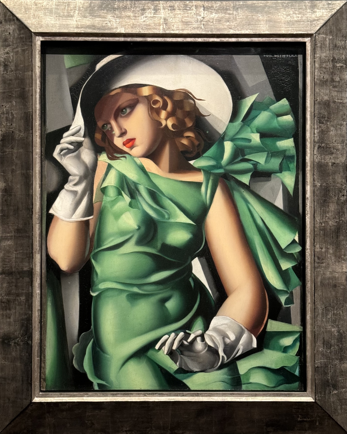
Young Woman in Green, oil on board, 1931Portrait of Mrs Rufus Bush, oil on canvas, 1929
Born Maria Gorska in Warsaw, Poland, she later adopted the aristocratic title “de Lempicka” and crafted a persona as a glamorous, independent, and sexually liberated artist. She studied under André Lhote (1885-1962), the pioneer of synthetic cubism. Soon Lempicka surpassed her teacher and formed her distinctive style, the sensual and monumental forms of the Italian sculptures with the geometric aesthetics Futurism.
Lempicka’s early works were portraits of familiar people and humble still lifes, then she moved on to explore the sexual agency through female nudes. Her clothed figures, often members of high society dressed in the latest high fashion, are set against compressed skyscrapers in the background, reflecting the opulence and modernity of the time.
La Belle Rafaela, oil on canvas, 1927Still Life of Fruit and Draped Silk, oil on canvas board, 1949
Lempicka embraced the role of the “artist as celebrity,” using her charisma and personal style to promote her work. She achieved considerable commercial success, with her paintings selling for high prices and attracting the attention of wealthy patrons. However, her popularity waned in the 1940s as artistic tastes shifted. Her 1941 show in San Francisco was an attempt to revive her popularity. It featured her paintings of people in distress due to the war, as well as some religious pieces. The artworks seemed contrived and inauthentic, and the review was mixed. Her later works saw a return to an overlooked subject – still lifes, with more polished skills. As the aesthetics moving on to an expressive display of brushstrokes, her high finish and renaissance invisibility fell out of fashion.
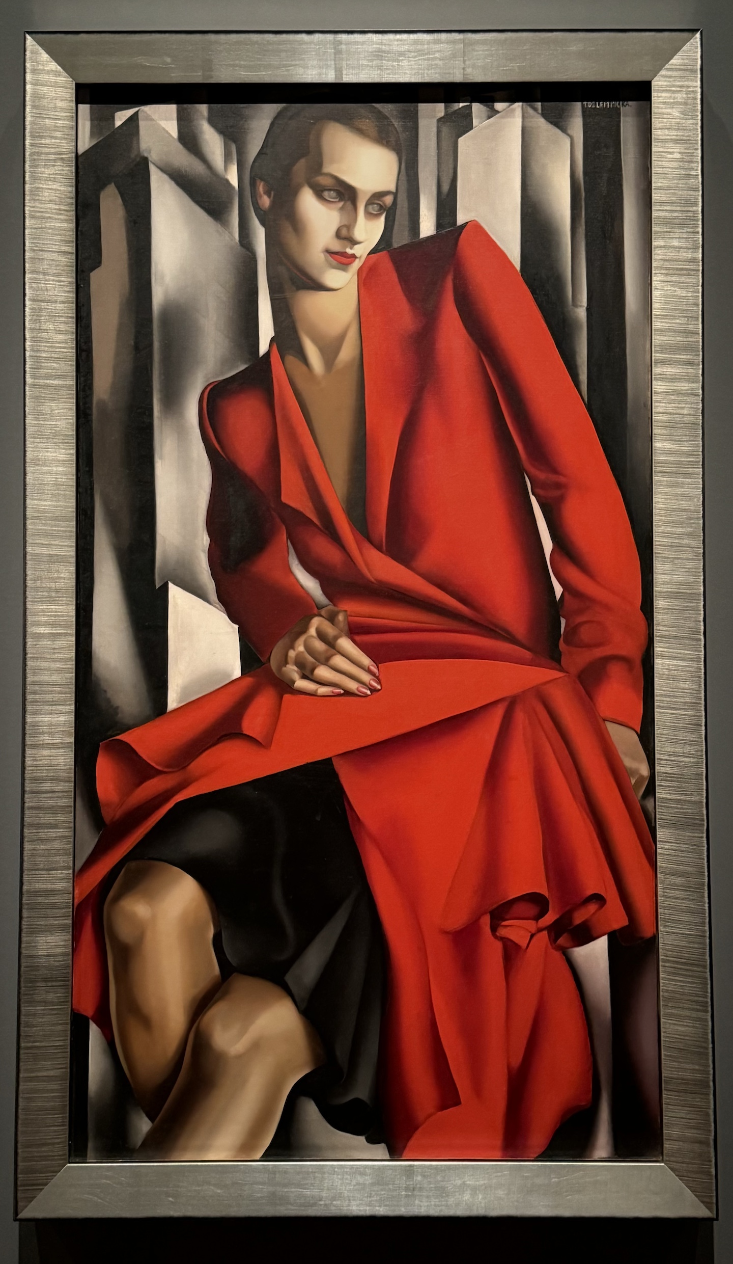
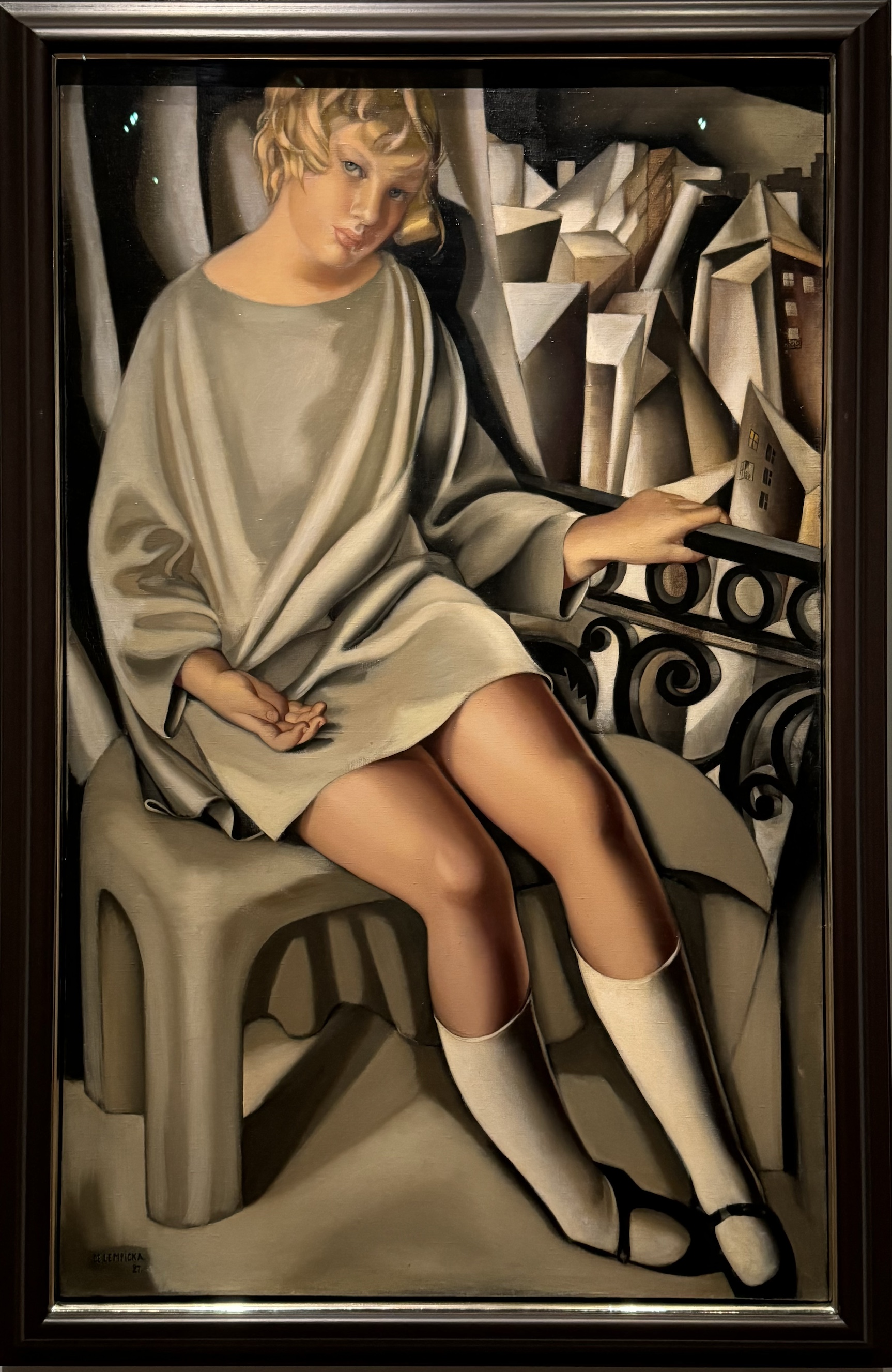
Kizette on the Balcony, oil on canvas, 1927
The paintings I like the most in the show are those where Lempicka used her daughter as the model, represented by “Kizette on the Balcony,” a piece that brought her first recognition. Unlike Cassatt, Lempicka married and had children, but she tried hard not to be seen as a mother. When “Kizette on the Balcony” was shown in Paris, it was simply titled “On the Balcony.” However, there is a sense of intimacy and sensitivity that makes this piece endearing. The young girl sitting on the balcony fills the plane, forms a diagonal relationship to the confines of the frame. This dynamism add liveliness to the painting. The smooth curvilinear shapes of the body set against the crowded sharp-edged geometric buildings in the background, symbolizing the contrast between childhood and the mature world. The girl’s presence is almost towering, and her expression inquisitive. There is wondering, but no hesitation.
Both artists presented modern women of their own time, albeit through different approaches and with different intentions. Cassatt’s pursuit of artistic excellence and her commitment to a more “appropriate” subject for a woman artist helped secure her status as a major figure in Impressionism. Lempicka’s approach to promoting her art through a glamorous life style may have hindered a more serious critical appraisal of her work. Cassatt presented herself as loyal to the practice of art. Lempicka chose to live through it. As an amateur artist living in a time with fewer restrictions for women, the exhibition begs the question of how a woman presents herself in a professional world and what one should prioritize as an artist – something I don’t often think about. Perhaps, this is one of the most enduring questions left behind by these shows.
Between trips and holidays, I only managed a few small paintings, and here they are:
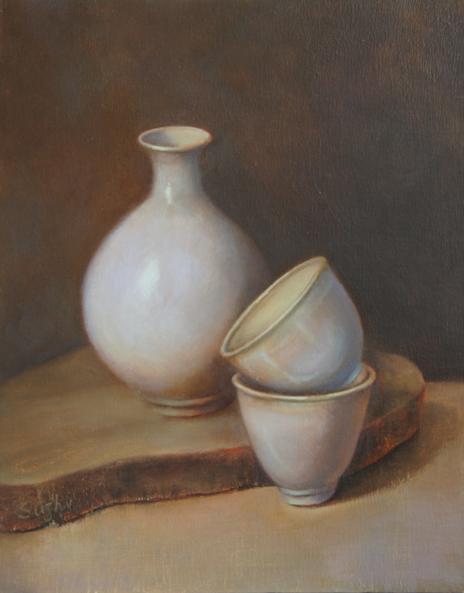
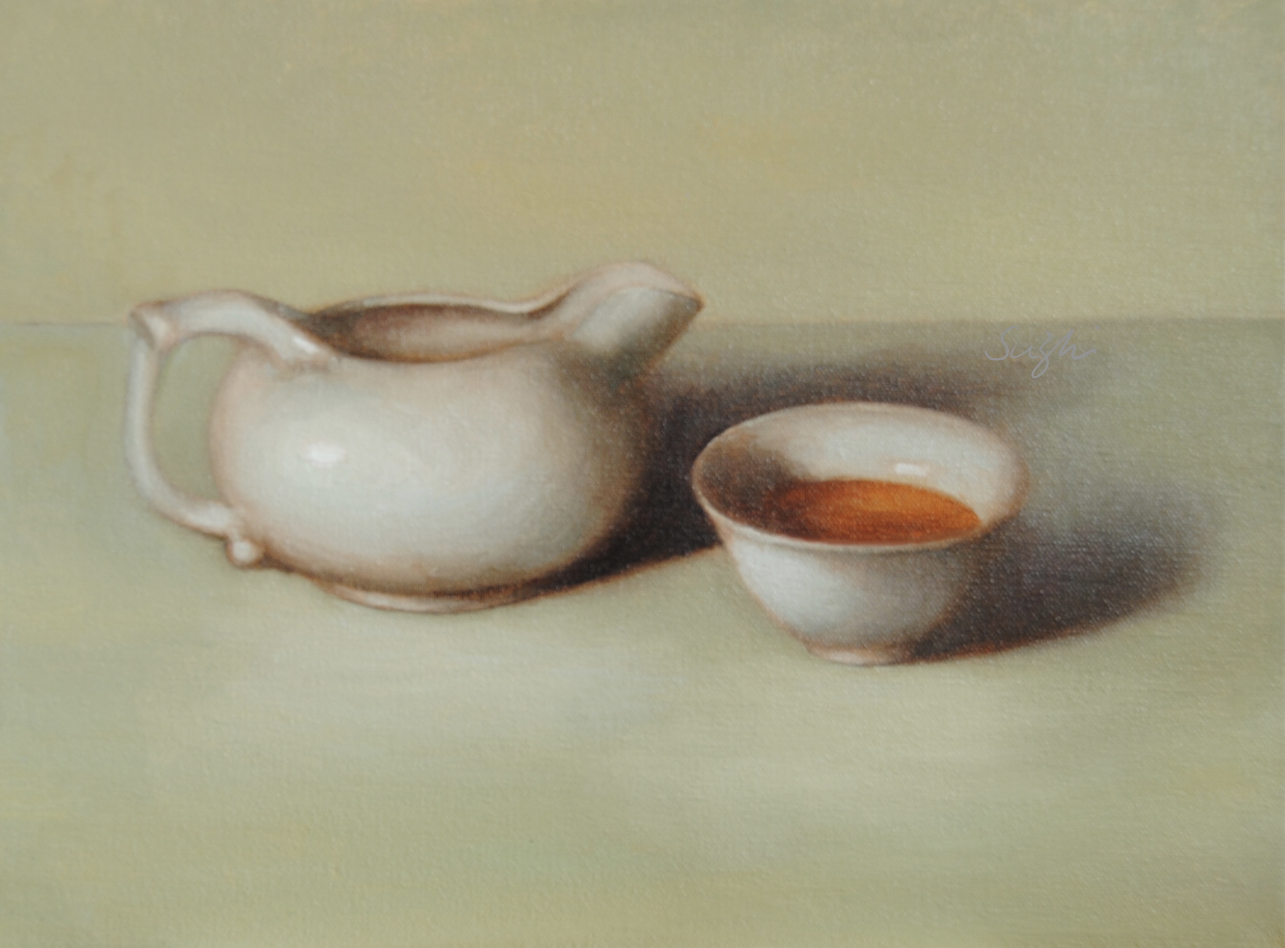
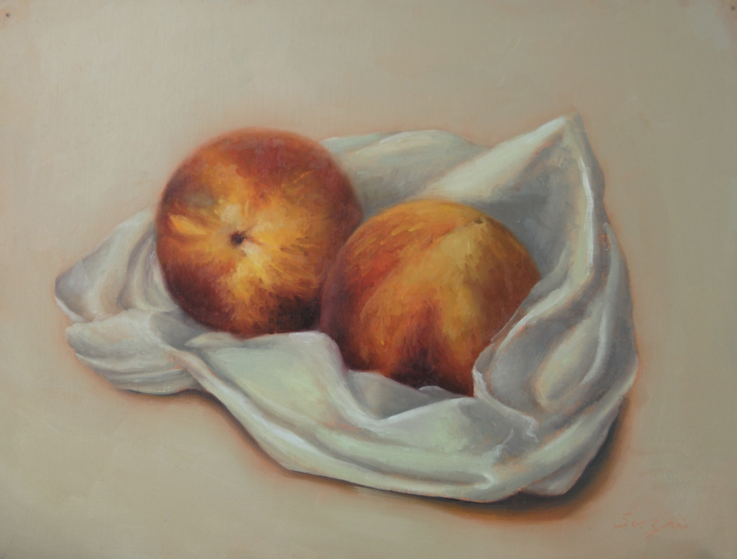
Turtle, oil on canvas, 12 x 16 in, Fall 2024Bottle and Cups, oil on canvas board, 11 x 14, Fall 2024Tea Time, oil on canvas board, 9 x 12, November 2024Peaches, oil on paper, 9 x 12, Fall 2024
The turtle one shows my natural noisiness. I have doubts about the subjects all the way: I believe the arrangement works compositionally, but is it too manipulated? I also know I was sloppy with the flowers. Overall, however, there’s a delightful tone from the piece that makes me like it. I guess that’s my Happy Holidays!
With the bottle and the teapot ones, I was really going for a sense of tranquility and harmony. I hope I am at least close. The peaches one is about texture. I wanted to capture that fuzzy and velvety glow of both the fruit and the plastic bag. Did I?
I have given up on washing my brushes with soap for a couple of years. Each time after painting, I clean my brushes with Gamsol, wipe them dry with a paper towel, dip them in a mixture of safflower oil and clover oil (98:2), and lie them flat in a tray with a cover. The recipe is from Draw Mix Paint. Ever since I adopted this method, I haven’t destroyed any brush yet. Since my last trip was a long one, before I left, I covered my brushes with the mixture, put them in a sealed palette box, and store the whole thing in the refrigerator. Two and a half months later, they are fresh and ready to go. Yay!
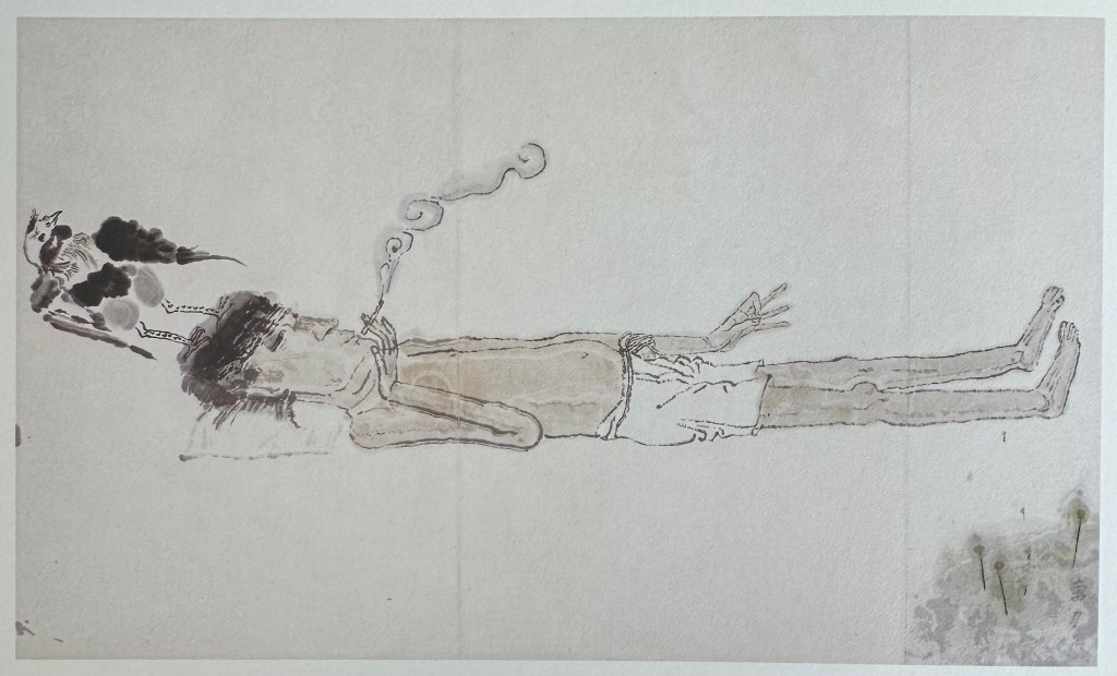
[Note: The title is a quote from Spanish sculptor Francisco Baron’s preface to Car Li’s 1992 solo show in Spain.]
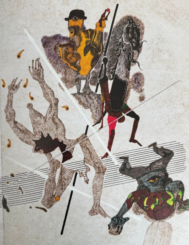
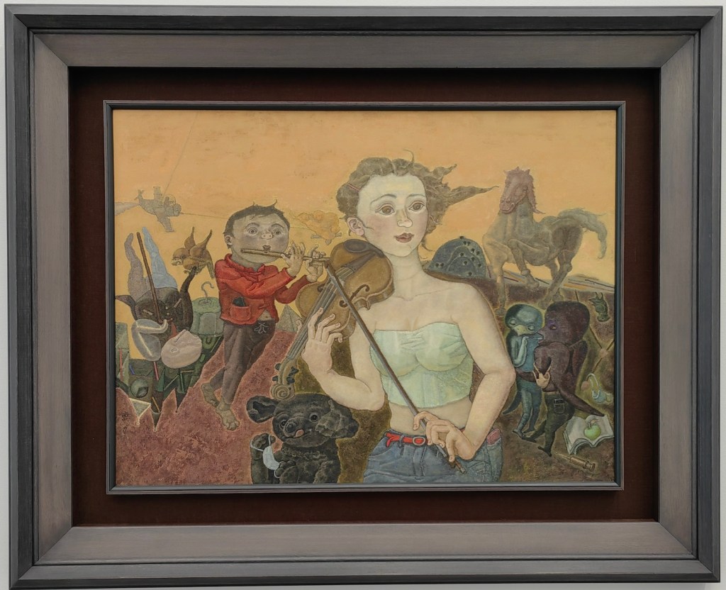
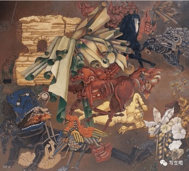
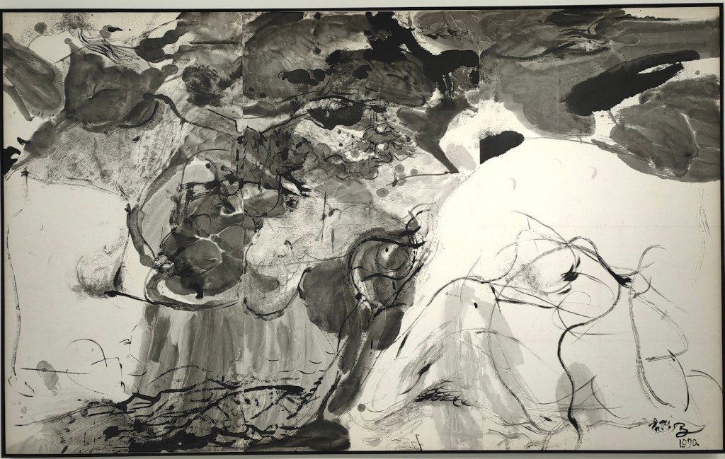
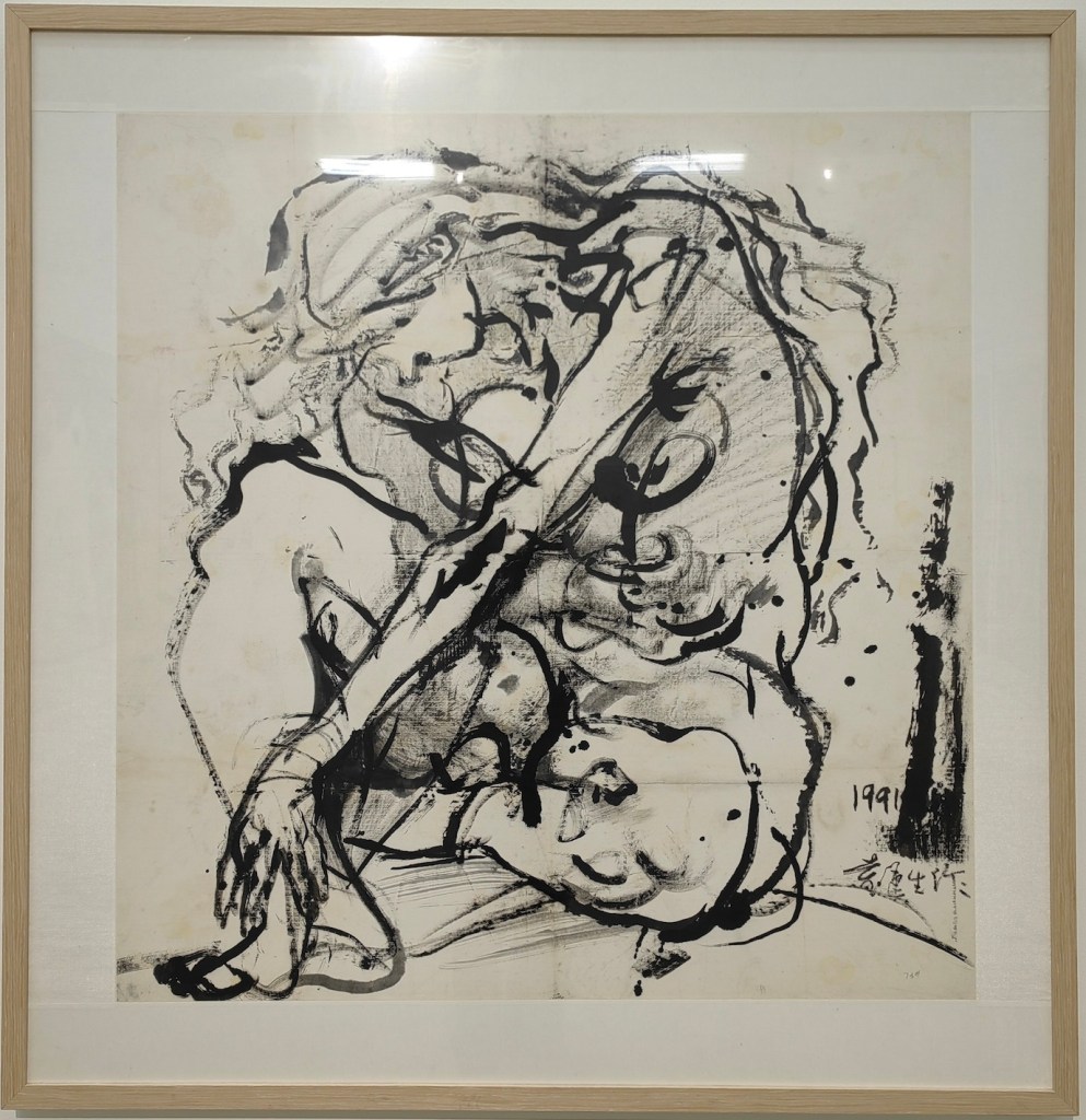
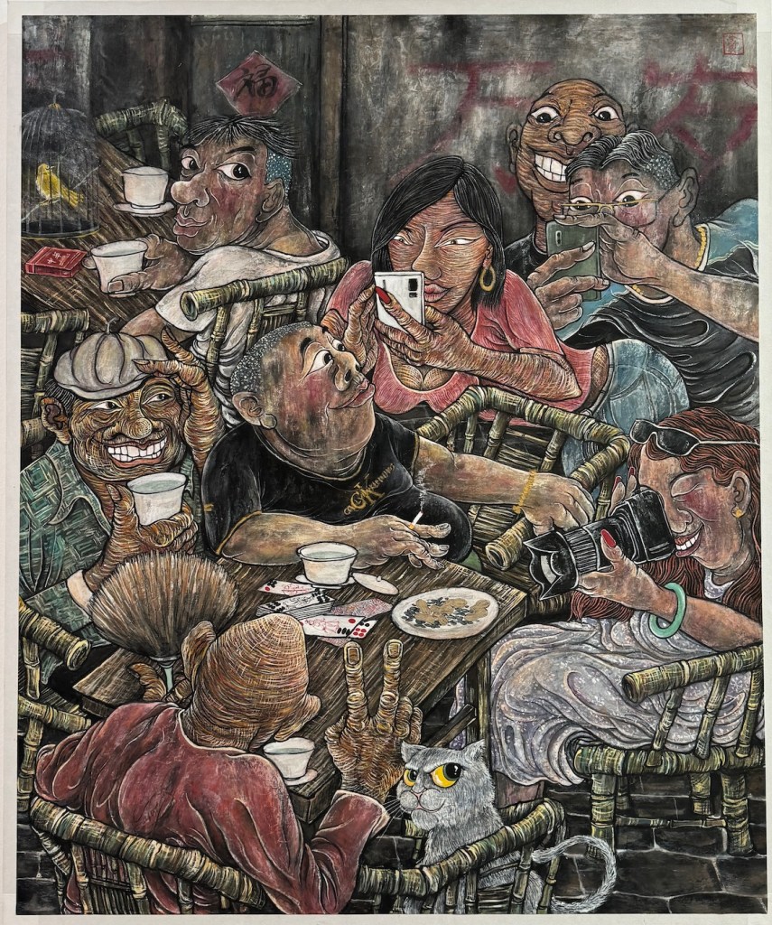
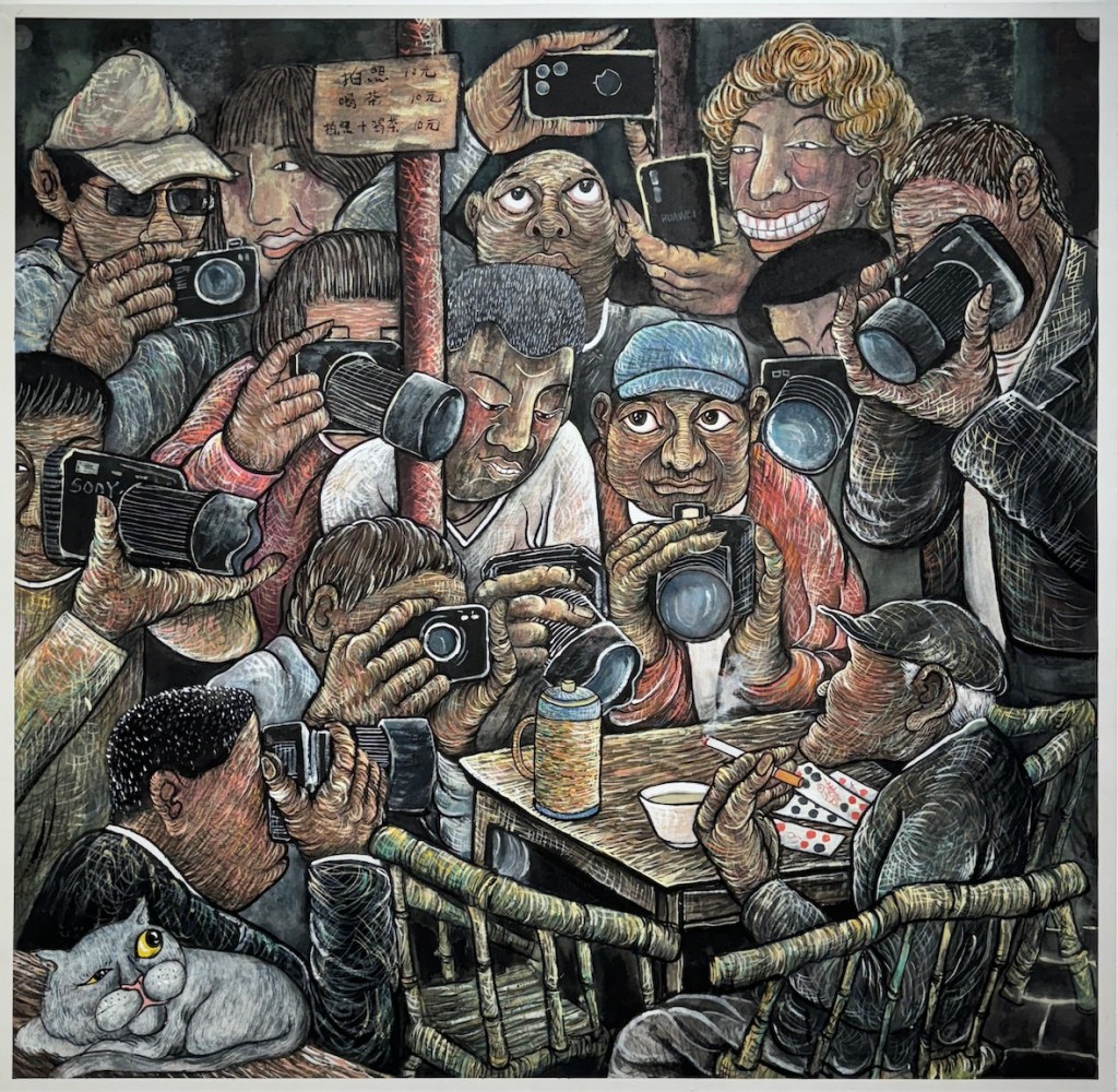
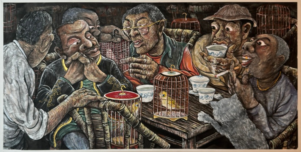
During my recent trip to China, I visited many exhibitions, and the works of one artist appeared in multiple shows, leaving a strong impression on me. He is Cao Li 曹力 (1954-), a professor of the Mural Department at the Central Academy of Fine Arts 中央美术学院. Cao Li has received traditional art training but does not carry the baggage of the academic style; in his work, he is unrestricted, and his imagination and artistic inspiration traverse ancient and modern, East and West. His themes range from reality to dreams, and his media include line drawing, watercolor, oil painting, wood carving, stone relief, etc.. His ability to move freely across different media reminds me of James Jean, though in terms of artistic expression, Cao Li is more mature and unrestrained. His works exhibit the absurdity of Dali, the seclusion of Klee, the alienating humor of Klimt, the multidimensional thinking of Picasso, the simplicity and innocence of Matisse, and the romantic imagination of Chagall. They also draw inspiration from traditional Chinese paintings, especially the murals of Dunhuang 敦煌, Yongle 永乐 Palace, and certain cave sculptures.
Cao Li, Hmong Girls, mixed media on cardboard, 25 x 25 cm, 2023Cao Li, oil on canvas, 2023Cao Li, Stroll, watercolor on paper, 25 x 38cm, 1981Cao Li, A Glimpse of the Small Town, oil on canvas, 90 x 90 cm, 1989Cao Li, Sketch No. 3, mixed media on paper, 22 x 17 cm, 1998
In the artist’s own words, “Art knows no boundaries; it is the product of the soul, an expression of true feelings, the natural flow of life, a free flight. Nature itself is not art; only what flows through the filter of an artist’s soul can be called ‘art.’ It’s like the process of making wine: grains and grapes themselves do not intoxicate, but after brewing, impurities are removed, leaving the essence that can captivate and enchant people.”
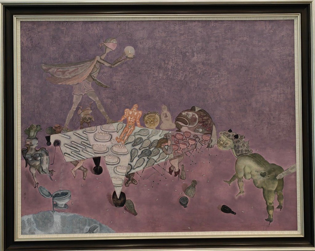
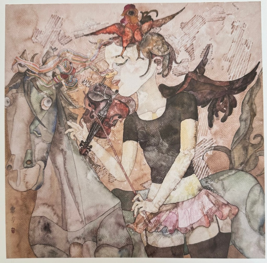
Cao Li, Violinist with Wings, mixed media, 40 x 40cm, 2014Cao Li, oil on canvas, 2023Cao Li, String Ensemble, oil on canvas, 120 x 100cm, 2023
Cao Li enjoys music, a recurring theme in his paintings. His lines, compositions, and colors move like melodies, possessing a lively rhythm. Influenced by his line drawings, his oil paintings almost always start with a planar structure of lines as the initial outline and main framework. He then enriches, thickens, and adds depth to the work through the organic organization of colors. He says, “I control the blocks of color, dots of color, color areas, and lines in the same way a composer arranges notes, tones, rhythms, and tempo. Once these ‘force points’ are placed in the right spots and combined in myriad ways, the disrupted calm space is reordered.”
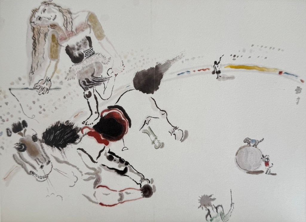
Cao Li, Under the Papaya Tree Sketch, ink on paper, 25 x 21cm, 1989Cao Li, Under the Papaya Tree, oil on canvas, 80 x 90 cm, 1990Cao Li, The Circus, ink on paper, 44.5 x 32 cm, 2003Cao Li, Three Approaches, ink on paper, 54 x 32cm, 2003
One aspect that interests me when viewing works by Chinese artists is their effort to blend traditional Chinese art with Western painting. The design of figures and the use of color in Cao Li’s works have a distinctly national character. His ink paintings even introduce modernist traditions. His teacher, the renowned artist Yuan Yunsheng 袁运生 (1937-), has taken this fusion even further by applying Abstract Expressionism to ink painting. In the 798 Art District in Beijing, I was fortunate enough to see an exhibition of his works.
Yuan Yunsheng, Song of Mind No. 2, oil on canvas, 102 x 100 cm, 1980Yuan Yunsheng, Pervade, ink on paper, 179 x 285 cm, 1990Yuan Yunsheng, Christina II, ink on paper, 105 x 101 cm, 1991Yuan Yunsheng, Spring Outing, oil on canvas, 240 x 560 cm, 2018
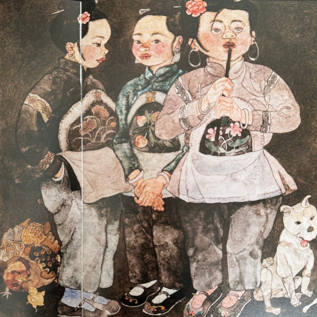
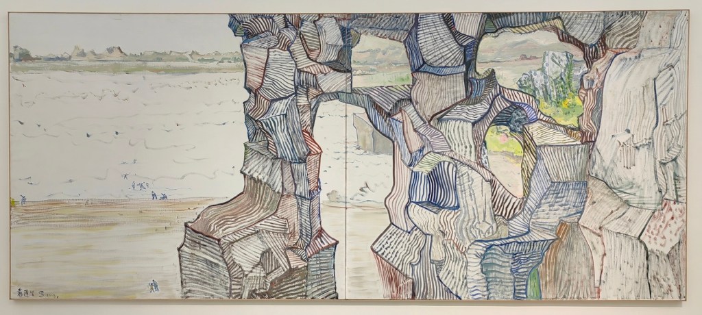
While visiting the Sichuan Fine Arts Institute 四川美术学院, I had the chance to view the “Chinese Painting MFA Invitational Exhibition 2000-2020.” These young artists originally studied Chinese painting, but now their works clearly show influences from oil painting, printmaking, and other art forms. Their use of media has also moved far beyond traditional paper and ink. They draw inspiration from the collision of diverse cultures, creating works that are more personal and profound. Unfortunately most of the artworks on display have glass cover, and makes it very difficult to photograph. I only captured a tiny portion of the treasures on display.
Wang Mayan, Experiment in the Cloud, colors on silk, 53 x 29 cm, 2023Ma Yuanyuan, Silk Road Fantasies, heavy color on paper, 240 x 235 cm, 2023Wei Jiujie, No Man’s Land, colors on silk, 37 x 50 cm each, 2019Ma Yuanyuan, Colorful World No. 2, mixed media, 200 x 200 cm, 2019Zha Lijun, 2018-2020, ink on paper, 388 x 182 cm, 2021
Here are some paintings from one of my favorite artists from the show:
Qi Zhiyue, A Seat at the Table, heavy colors on paper, 68 x 136cm, 2021Qi Zhiyue, A ‘Ye’ for Life, heavy colors on paper, 115 x 95cm, 2019Qi Zhiyue, Ka Ka Ka, heavy colors on paper, 110 x 110cm, 2020Qi Zhiyue, Topic, heavy colors on paper, 68 x 136cm, 2020
Amid all the talking about the “lying flat” culture in China, it is quite exciting to see the art scene there is lively and flourishing.
P.S. Unlike in America, most of the Chinese artists don’t maintain personal websites. Artron 雅昌 is platform where many artists post their works, but the level of accuracy and maintenance vary. You can find more works from Cao Li here: 作品
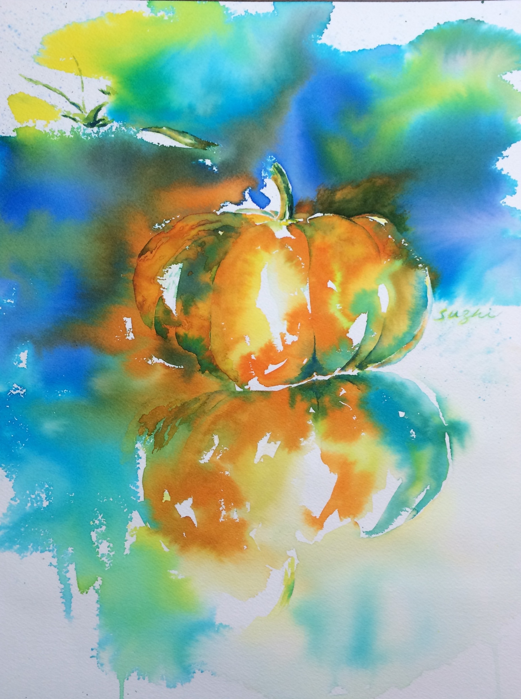
Nothing spooky here, just an old pumpkin! I can’t recall when I did this, maybe 10 years ago, when I could still feel the “water” in watercolor. Time flies!
Pumpkin, watercolor on paper, 9 x 12, 2015
In the past, when I travelled, even with those lengthy stays abroad, I didn’t do any art. These past months when I stayed in China, inspired by all the art shows I attended (I will talk about these more in the future), I thought I should have kept things going. Oil being too troublesome, I managed to find watercolor paper and paint. My intention was to do some quick sketches or simple paintings, and these are what I’ve done:
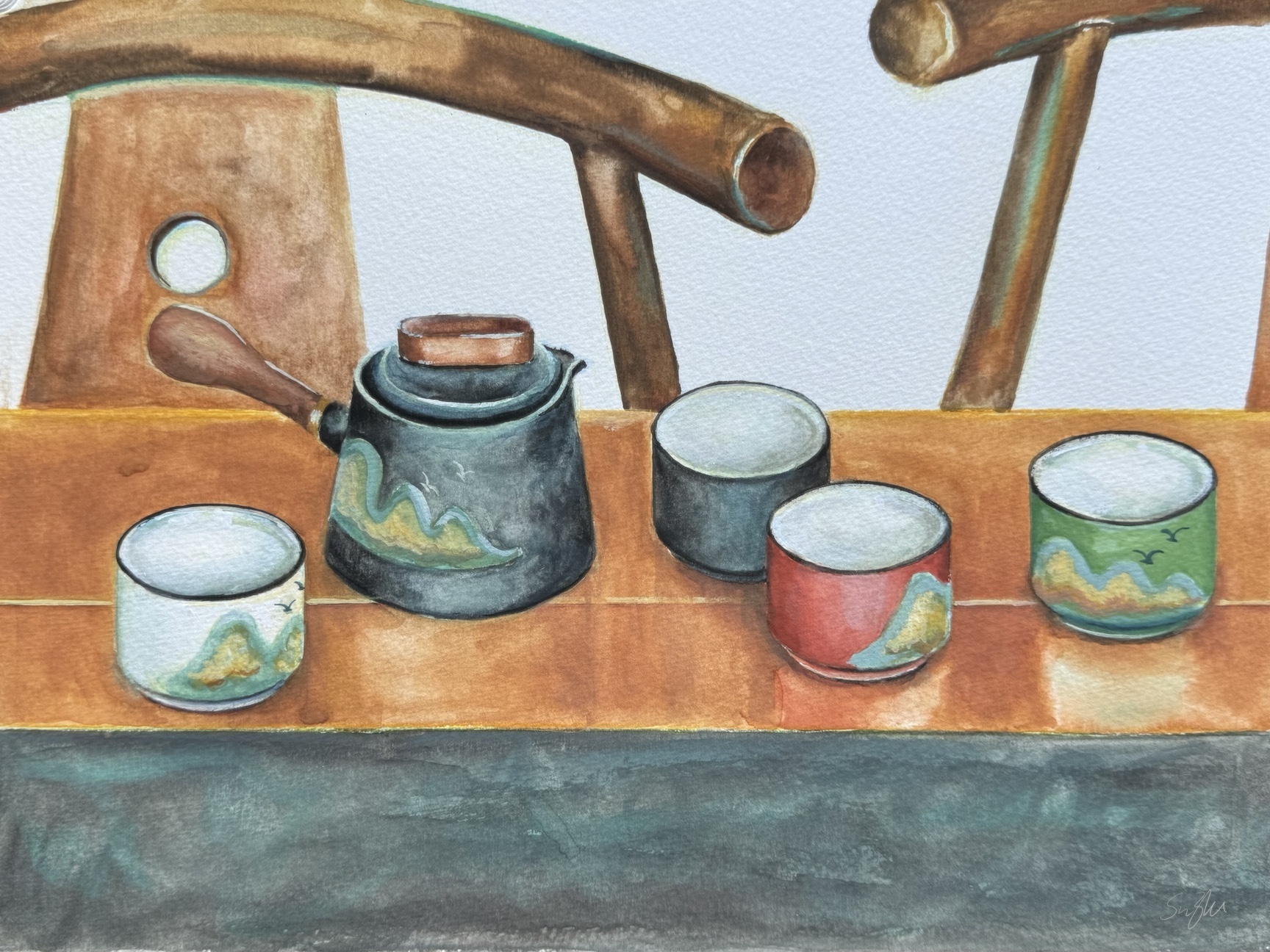
Tea-set, watercolor on paper, 9 x 12, Sept. 2024Fruit plate, watercolor on paper, 9 x 12, Oct. 2024
I found myself using watercolor the same way I use oil paint – controlled and layered. Despite their tight look, I didn’t spend that much time on each of these pieces, mainly because I gave up. I could have fine-tuned a lot more details, further emphasized the shadows and highlights, etc., but that was not what I set out to do. I missed the singing and dancing of colors in water.
In a way, the old pumpkin painting was not finished either, and the values probably don’t make sense. However, it was fun, and in my mind, it was what watercolor is supposed to be.
I am not upset though. I haven’t practiced watercolor for a while so a bit lack of touch is fair game. I like my compositions and color choices, and that’s something. Most importantly, I didn’t let the trip completely cut off my art practice, and that’s quite a step forward!
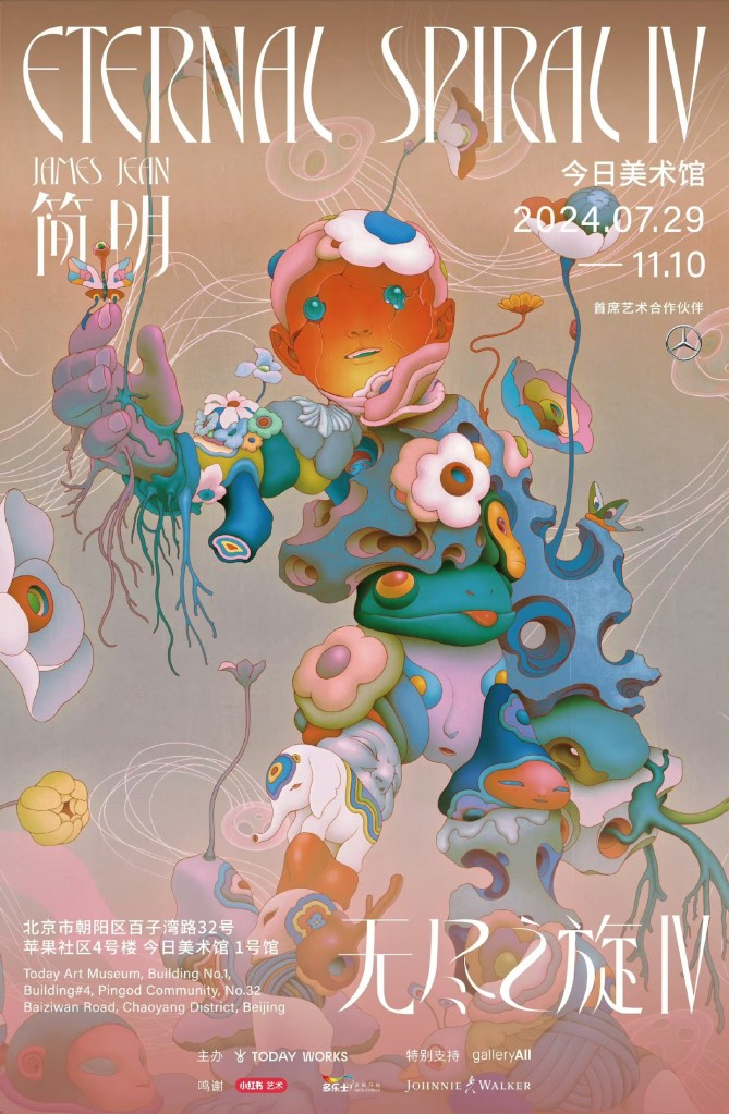
Recently in Beijing, I had the chance to visit Eternal Spiral IV, an exhibition by Taiwanese-American artist James Jean. It was a revelation. Jean began his career working for DC and Marvel, before transitioning fully to fine art in 2008. This exhibition showcases more than 200 pieces spanning over two decades of his creative journey, including paintings, sculptures, animations, installations, and even tapestries—a true multimedia experience.
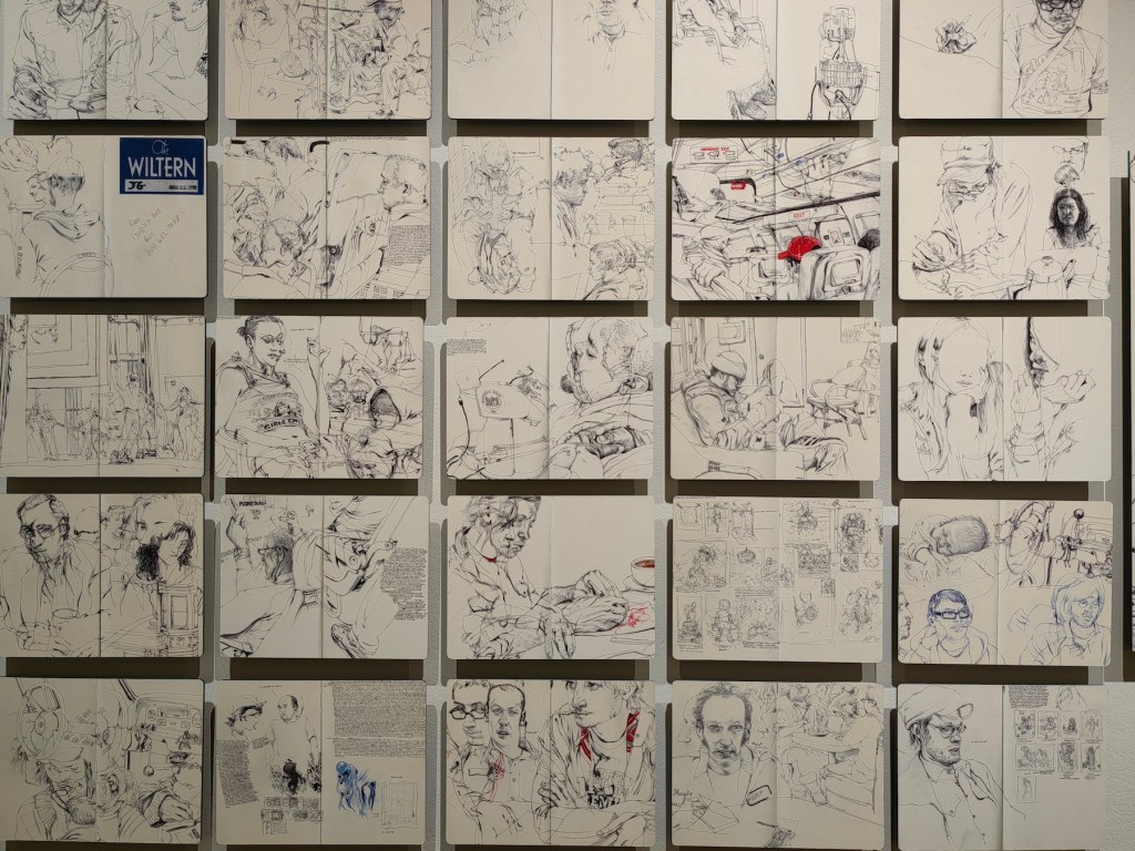
The exhibition begins with Jean’s sketchbooks and drafts. These aren’t just technical studies; they offer a rare glimpse into his process. His lines are filled with energy, precision, and constant revision. As someone who has always been afraid to sketch freely, seeing how even a master like Jean frequently changes his mind, makes mistakes, and abandons ideas was oddly reassuring. It made me realize that sketching is a form of exploration, a space to make mistakes and grow, not something to shy away from due to fear of imperfection.
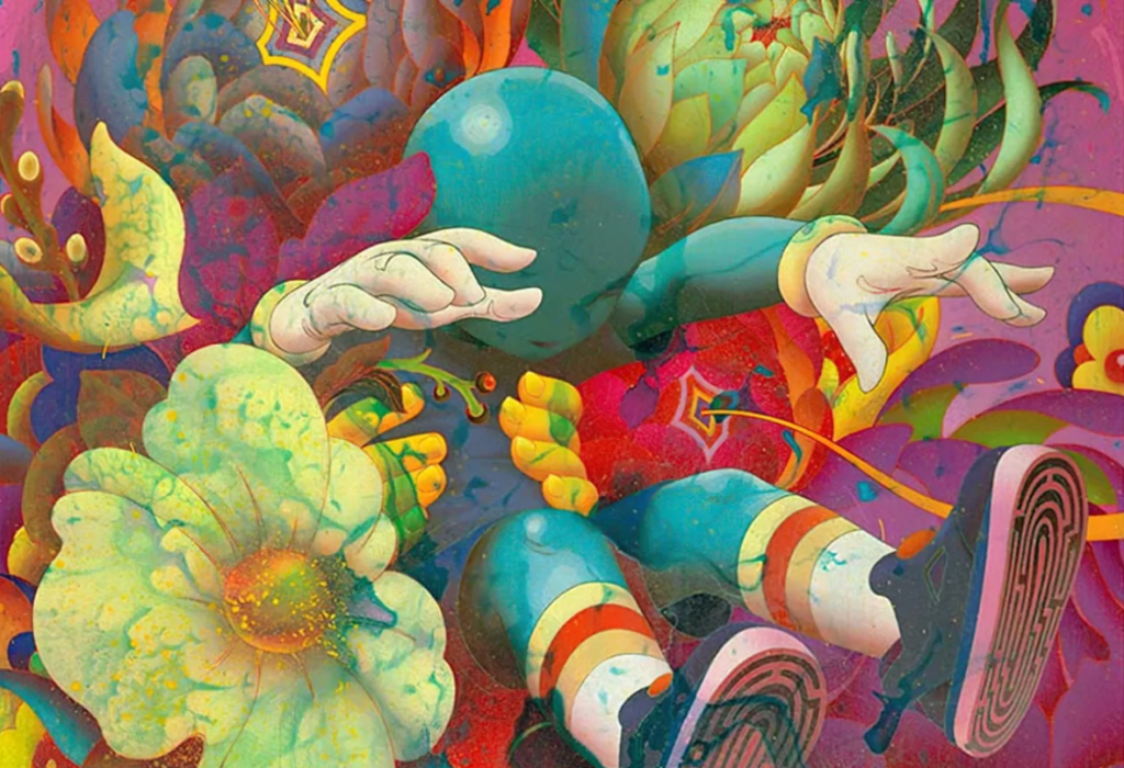
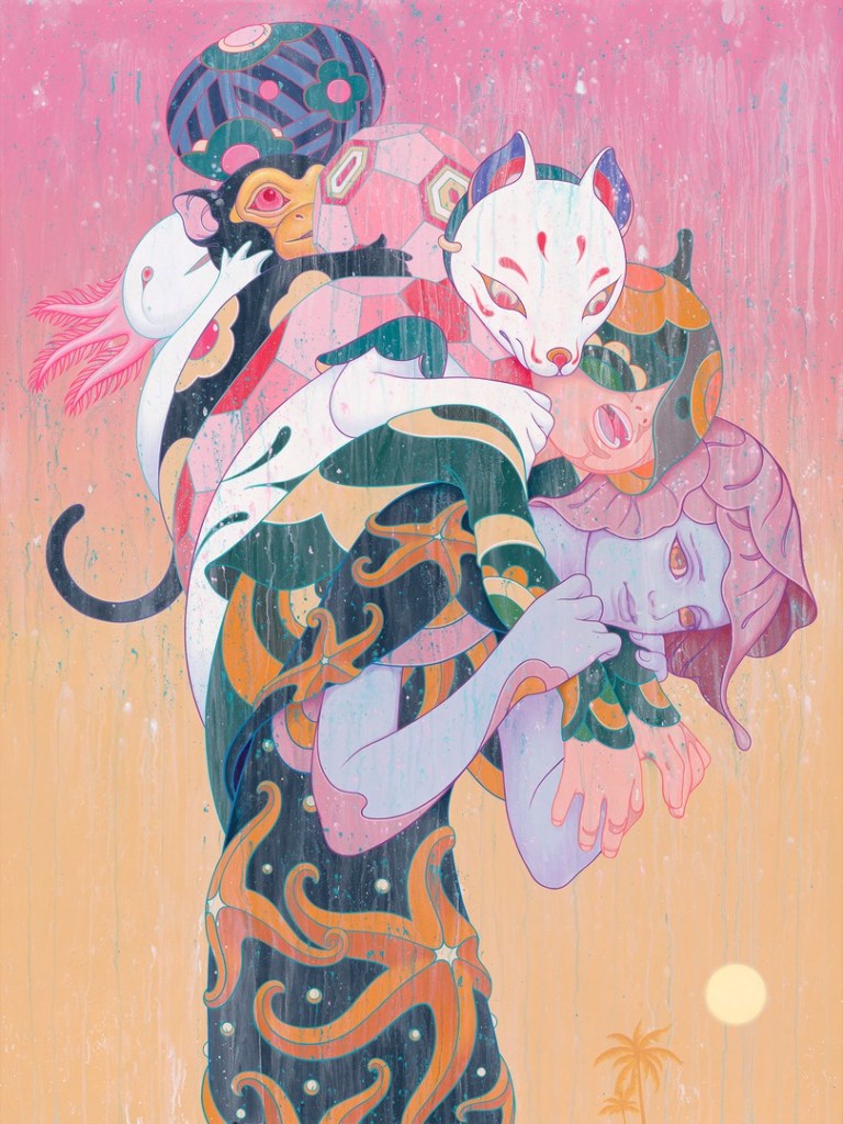
From sketches, the exhibition moves into Jean’s paintings, mostly done in acrylic. His style is a fusion of cultural influences that reflects his identity as a “cultural nomad.” He draws from sources as varied as Chinese scroll paintings, Japanese woodblock prints, and Baroque art, blending them seamlessly with contemporary culture and digital techniques. The result is a layered, intricate narrative that feels at once both timeless and modern. His dream-like compositions often depict creatures and plants spilling out of the canvas, creating fantastical worlds where reality and fantasy blur together. These hallucinatory landscapes are vibrant yet tranquil, chaotic yet serene—like stepping into someone else’s dream. He plays with delicate lines and bold colors, using vibrant pinks, blues, oranges, and golds to make his worlds feel alive. “I enjoy making colors vibrate against each other to create sparks in the eye,” Jean said.
BanquetIIPiggiback
The keynote painting of the show was Jean’s newest piece, Chimera, inspired by a visit to the Kaiyuan 开元 Temple in Quanzhou 泉州, Fujian 福建. The temple’s “Kirin Wall” and the tangled banyan roots influenced the composition, which also weaves in Jean’s personal family history. His ancestors were from Fujian, but much of that history was lost when his grandparents moved to Taiwan. In Chimera, the roots reach out, searching for something to grasp, much like Jean’s own search for his heritage. Quanzhou happened to be my ancestral home too, and I have visited Kaiyuan Temple as a child. To some extent, I resonate with the tension between the desire to search for one’s root and the acute sense of disconnection. Jean has talked about the creation of this painting on his Instagram.
Chimera as the poster of Eternal Spiral IV
One particularly unique aspect of this exhibition is how it integrates social media. Jean, who has over a million followers on platforms like Instagram and Xiaohongshu 小红书, included 11 time-lapse videos of his creative process. I’d never seen social media incorporated into a gallery setting like this before, and it added an intriguing link between the fantasy world create by the artist and the mundane modern life.
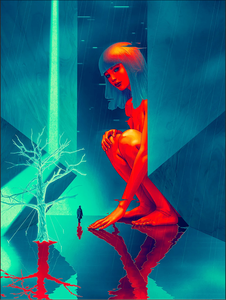
The show includes prints of Jean’s series “Seven Phases,” a collection of 7 paintings representing each member of the beloved K-pop group BTS in the “spirits of flowers”. There are also prints of posters he designed for films like Everything Everywhere All at Once and The Shape of Water. Guillermo del Toro personally asked him to create the poster for the latter, which he rendered in vivid charcoal. My favorite is his poster for Blade Runner 2049— romantic and surreal. Jean’s ability to move between fine art and pop culture, and across different media, speaks to his versatility and boundless creativity.
7 PhasesBlade Runner 2049
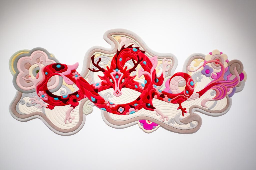
A surprise for me was Jean’s love for tapestries. He has engaged with this unconventional medium for a while and his 2024 piece Year of the Dragon made its debut here. It features a dragon—one of the most powerful figures in the Chinese zodiac—woven from a mix of flowers and plants. The dragon symbolizes strength, but Jean reinterprets it in his signature style, making it feel both traditional and personal. This reimagining of cultural symbols is a recurring theme in his work.
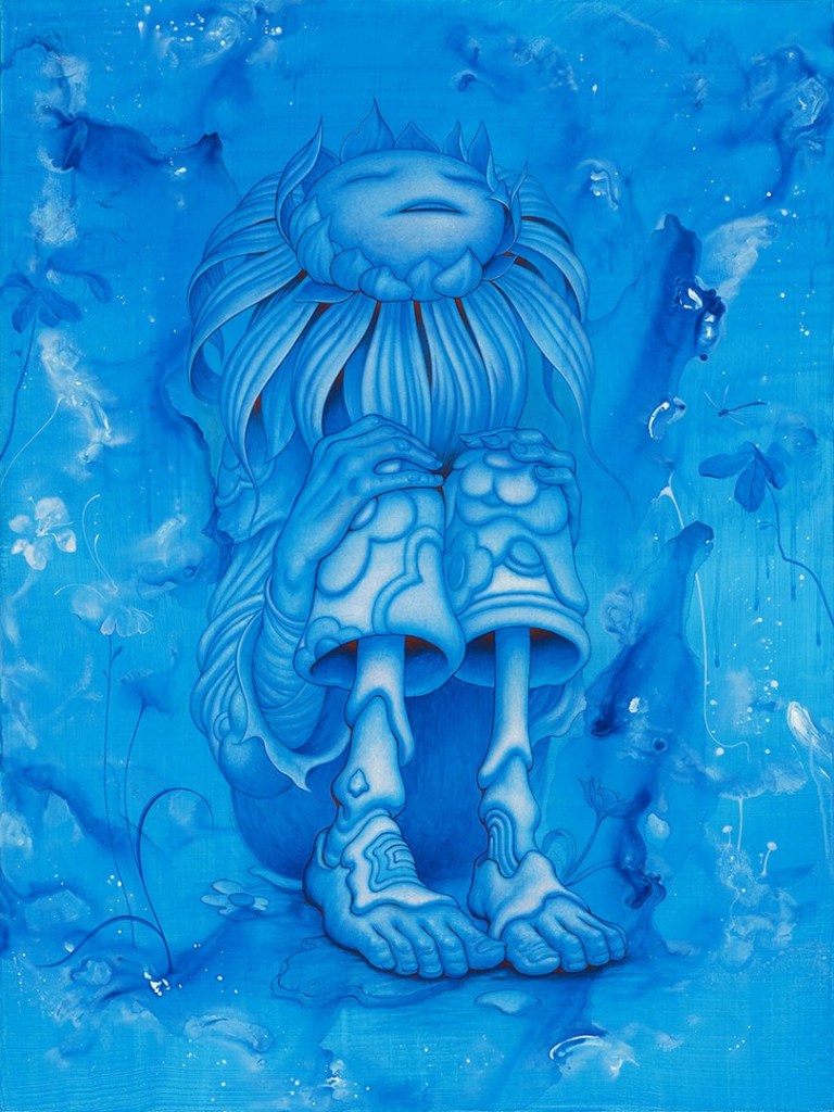
Jean’s versatility doesn’t stop with tapestries. His sculptures, some standing over three meters tall, bring characters from his paintings into the physical world. They blend European myths, Asian folklore, and fairy tale elements. Some sculptures are based on the artist’s painting, and shown with large-scale animation, completing the cycle from 2D to 3D to “4D.”
Sunflower (Painting)Sunflower (Sculpture)Sunflower (Animation, please click the image to see the video)
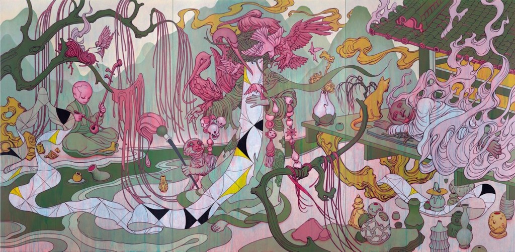
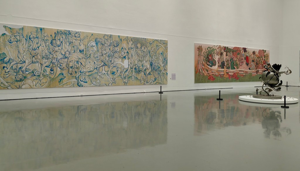
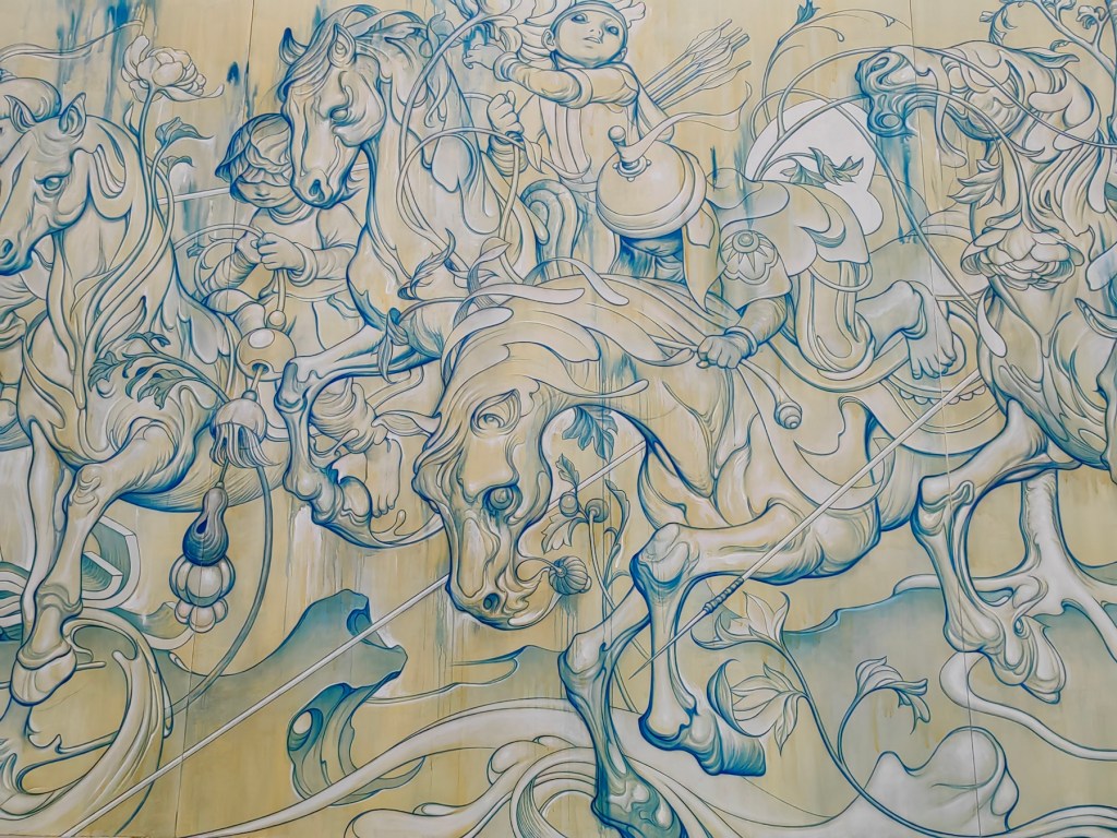
The final room of the exhibition left me in awe. Six massive paintings, each over 10 meters long, sprawling yet detailed, demonstrating Jean’s ability to create on both an epic and intimate scale. Descendants—Blue Wood, inspired by Seoul’s Lotte World Tower and the fairy tale Jack and the Beanstalk. Aviary depicts an imagined world inspired by Chinese folk legends. Monks, bird deities, erhu … many traditional Chinese elements intertwine, emerging from the mind of a sleeping monk enveloped in flames. An enigmatic dreamscape!
Aviary, acrylic on three canvases, 246 x 120”Stampede and PassageStampede (detail), acrylic on four canvases, 432 x 132”, 2019
Eternal Spiral IV is more than just an exhibition of James Jean’s talent; it’s an invitation into his ever-shifting, multi-dimensional world where dreams, myths, and reality collide. It left me in awe and inspired. In Jean’s own words, “ultimately, it’s about having the freedom to create whatever imagery I want.” I believe that freedom comes from his impeccable skill and dedication to art. While Jean’s art has a distinct style, but he has managed to breakthrough with constant searching for both meaning and new ways of expression.
Did I mention that his first NFT “Slingshot” was sold at $469,696.35? I have also picked up my long abandoned sketchbook. 🙂
Slingshot (3m tall statue, part of the “Pantheon” collection in the show)
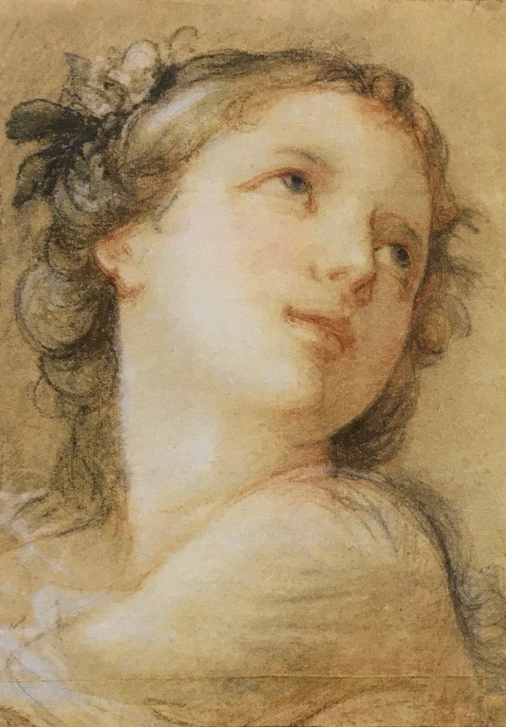
Charles-Joseph Natoire (1700-1777), a prominent French Rococo painter and draftsman, was celebrated for his decorative paintings, mythological scenes, and religious paintings. Natoire was one of the artists who helped popularize the use of pastels in the 18th century. He often employed delicate pinks, blues, and greens to create a light, airy atmosphere in his works. His paintings are characterized by their pastel hues, delicate brushwork, and a playful charm.
“Head of a Bacchante” (1741) is a fine example of his mastery in pastels. A bacchante, a female follower of Bacchus, the Roman god of wine, fertility, and theatrical performance, is often depicted in art as ecstatic or in states of divine possession. Pastel allows for a softness and blendability not easily achieved with oil paints, making it ideal for capturing the delicate features and expressions of mythological figures.
I saw this painting at the Getty Center, where I was drawn to Natoire’s emphasis on grace, charm, and a certain lightness. The luminous quality of the skin tones, achieved through soft, atmospheric light, created a sense of intimacy and warmth. His fluid, graceful brushwork contributed to the overall elegance, and a well-controlled value range allows smooth transitions between forms.
In attempting a master copy, I focused on replicating the subtle value changes. I have a tendency of using high contrast and high saturation in my own portrait painting. I hope, by compress and control the two, I could achieve a softness and luminous effect that is missing in my works. While oil paint is not as ideal to achieve this goal as pastel, I figured I would still learn a lot by pushing it as far as I could. I started a bit too heavy handed, and later had to spend layer upon layer to lighten things up, and contract the range of values. The result still felt too defined in some places, lacking the ethereal quality of Natoire’s original. Some of the airiness of the original comes from Natoire’s dancing line work, which I don’t have the skill to imitate with a brush. While Natoire captured a goddess, I painted a mortal – a lovely one, I think.
After Natoire, oil on canvas board, 9 x 12 in. August, 2024
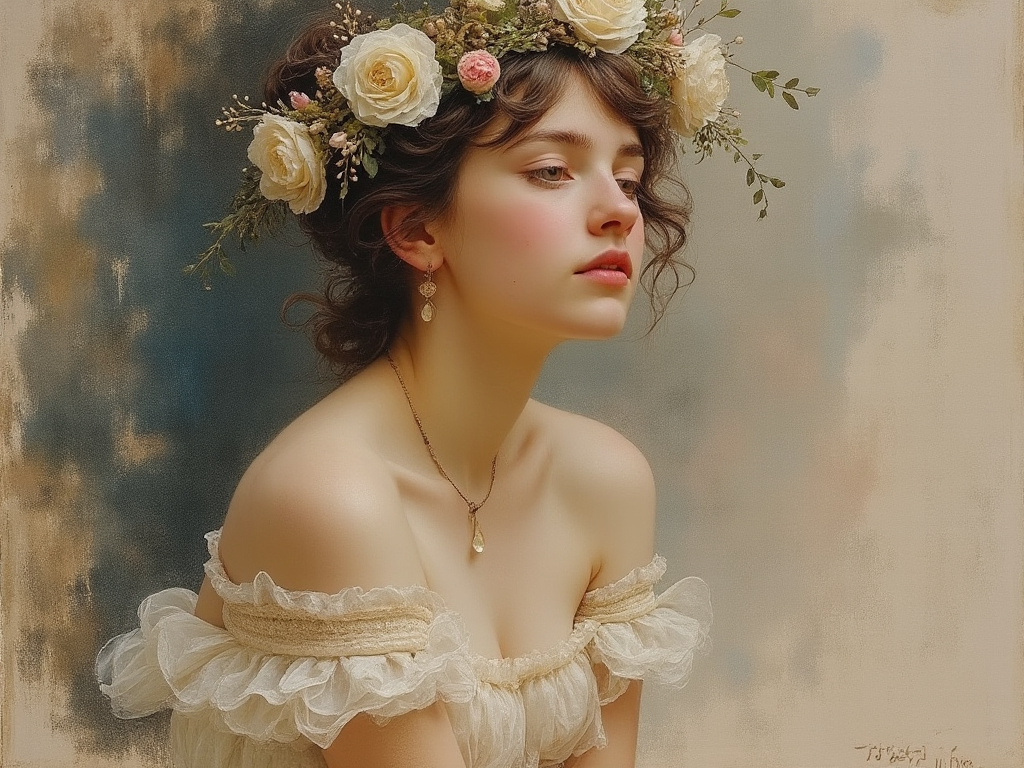
Curious about modern interpretations, I requested a pastel painting of a bacchante from both Grok 2 and MidJourney 6.1. Grok gave me a photo-realistic beauty with a somewhat painterly background. It seems Grok doesn’t respond well to traditional medium. MidJourney, on the other hand, at least attempted to emulate ‘a painting.’
GrokMidJourney
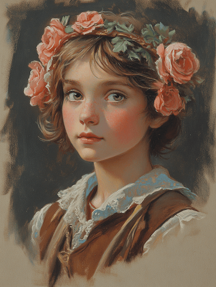
One can also twig the many perimeters MidJourney offers to achieve varied result:
MidJourneyMidJourney
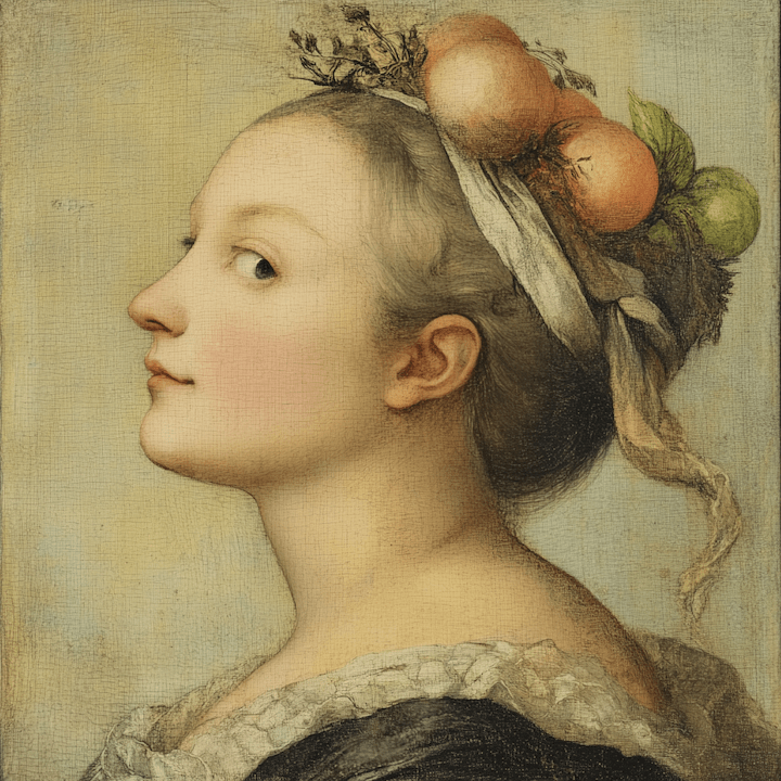
If I provide Natoire’s original as a prompt, MidJourney could fake a couple of masterpieces: