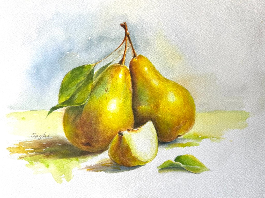
March kicked off with two leftover thoughts from the previous month. While cleaning up my studio, I also unearthed a block of hot press paper and I decided to give it a try.
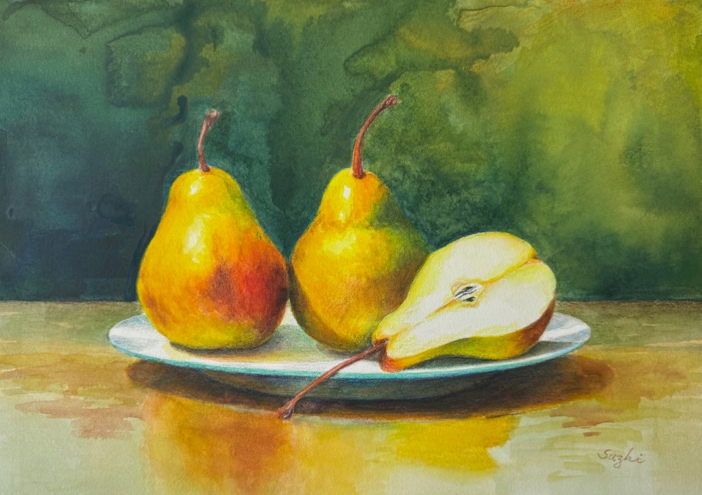
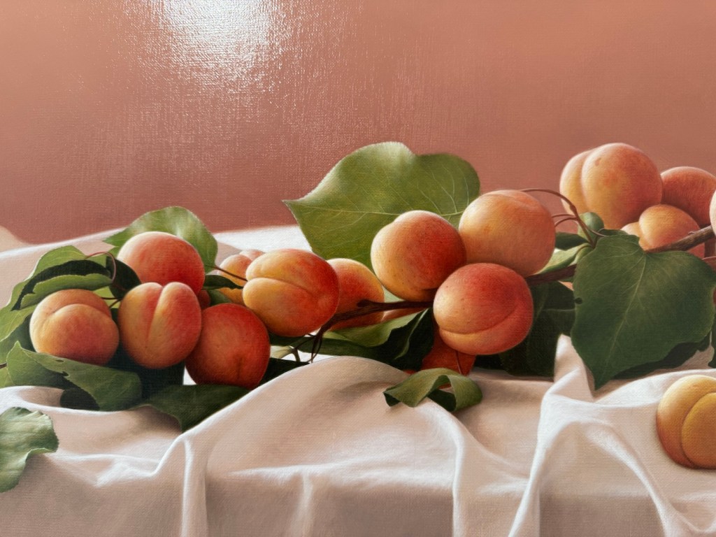
Two and Half, watercolor on hot press paper, 10×14, March 2026
As you can see, I approached it exactly the same way I would on cold press. The water and pigments mostly sat on the surface instead of sinking in, leaving some interesting but completely unintended marks. I do love the extra vibrance the colors gained, but I suspect hot press works best for well-defined shapes with minimal water. (Here’s a beautiful example of what hot press can do when handled right: Painting wet-into-wet on hot-press watercolor paper.)
Meanwhile, I finally tested the Canson Acrylic paper I mentioned before with a layer of shellac. It definitely improved the paint flow.
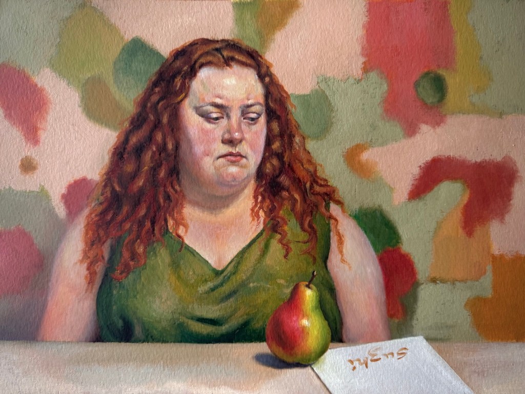
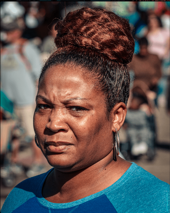
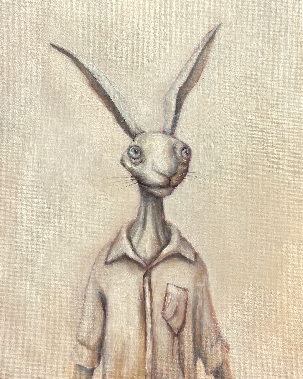
Stare, oil on paper, 11 x 15, March 2026Reference photo from East Oaks Studio Live Stream Session 44
In this painting, I had much less trouble getting the paints to cooperate, but I struggled a lot with designing the woman’s expression and rendering the plumpness. The original reference came from East Oaks Studio, but I borrowed her general features but recreate the overall image to fit my little “plot.”
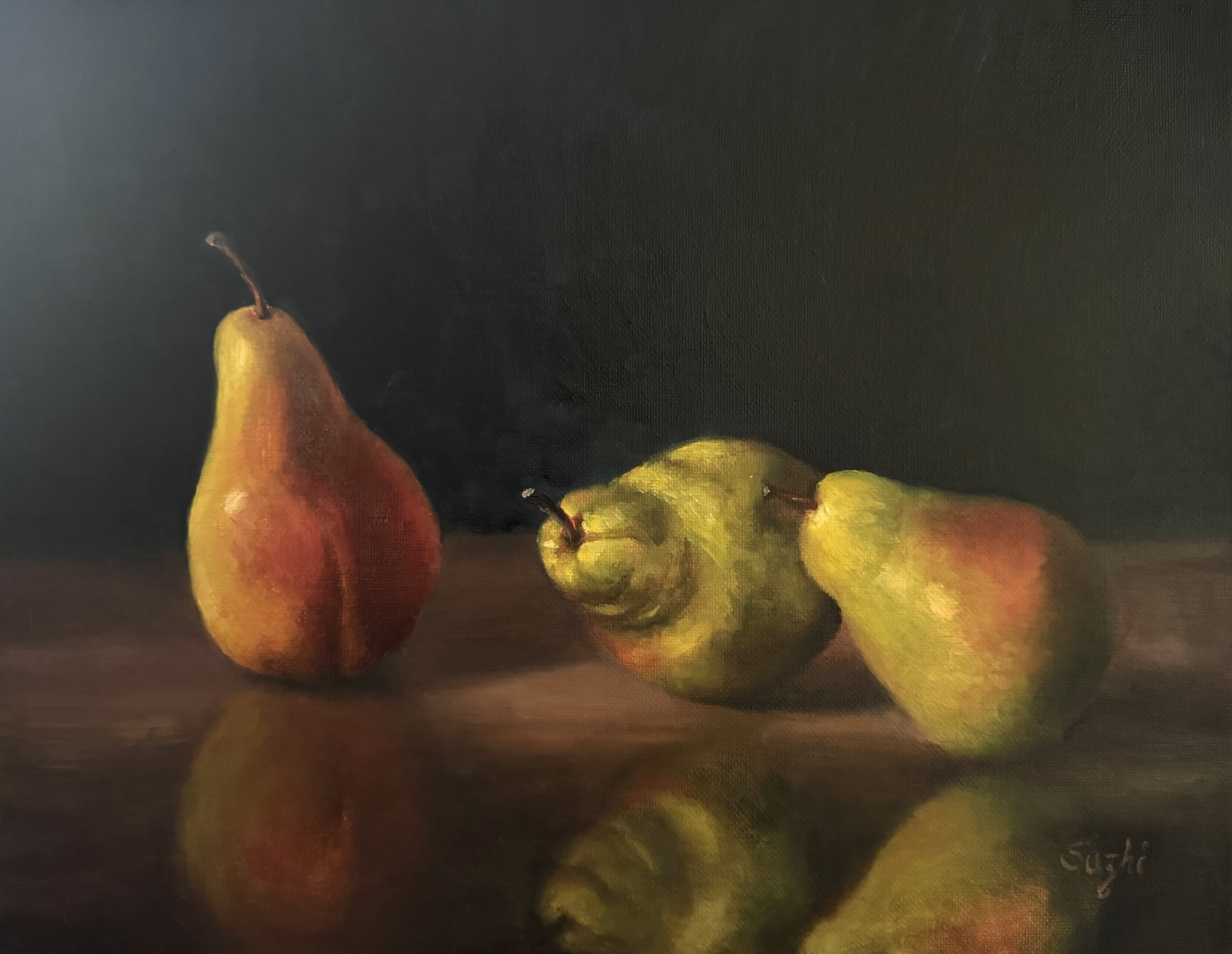
Next, I imagined a classical, nearly monochromatic head study and decided to practice it on a pear instead. I’m still not sure I handled the edges quite right, but it was a simple enough exercise. I might revisit this idea later.
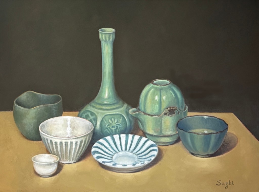
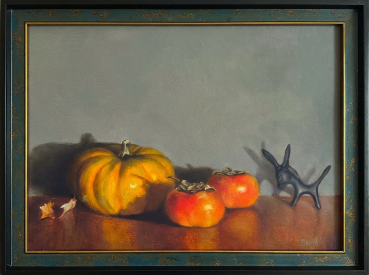
While juggling all these paintings with their mixed goals, I spent quite a bit of time designing the last two watercolors, both centered on our favorite theme. One is a still life with abstract patterns in the background, and the other is a semi self-portrait.
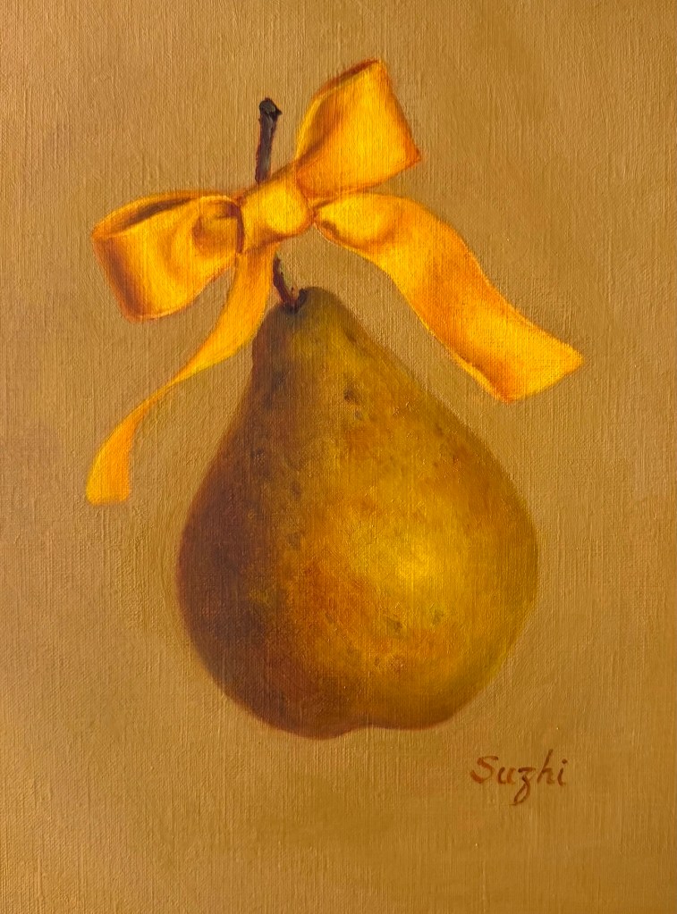
Golden Bow, oil on paper, 9 x 12, March 2026
My original vision for the still life was actually a painting with much more elaborate, sharply defined patterns in the spirit of Klimt, in oil on canvas or watercolor on hot-press paper. Either way, it would have been a much more time-consuming project. I’m still holding onto that thought. This simpler cold-press version became more of a test of the main composition. I may come back and develop the idea further in the future.
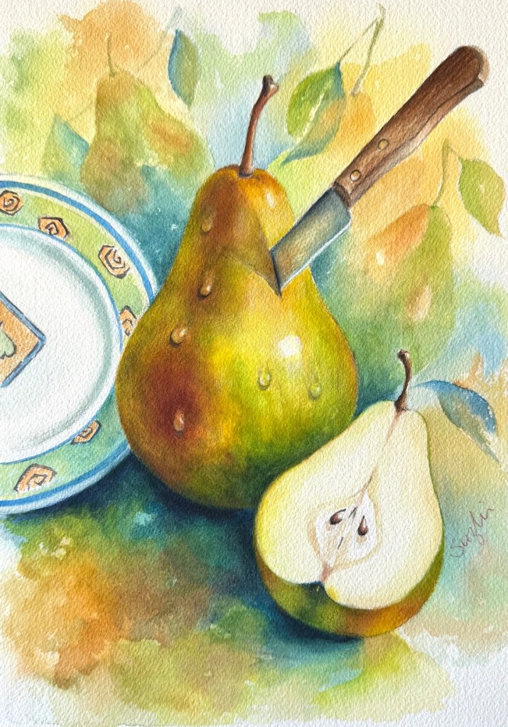
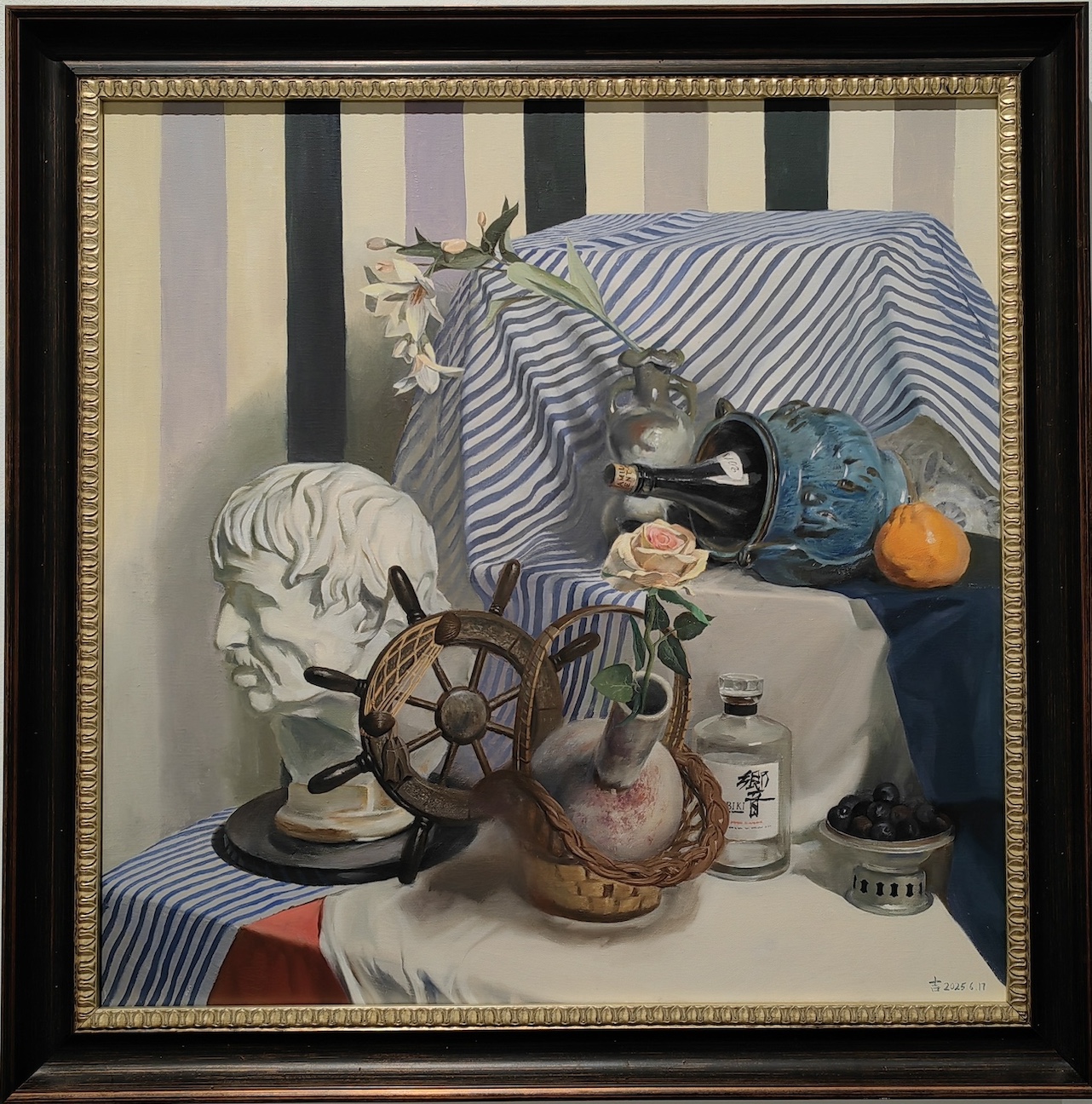
Knife and Plate: watercolor on paper, 10 x 14, March 2026
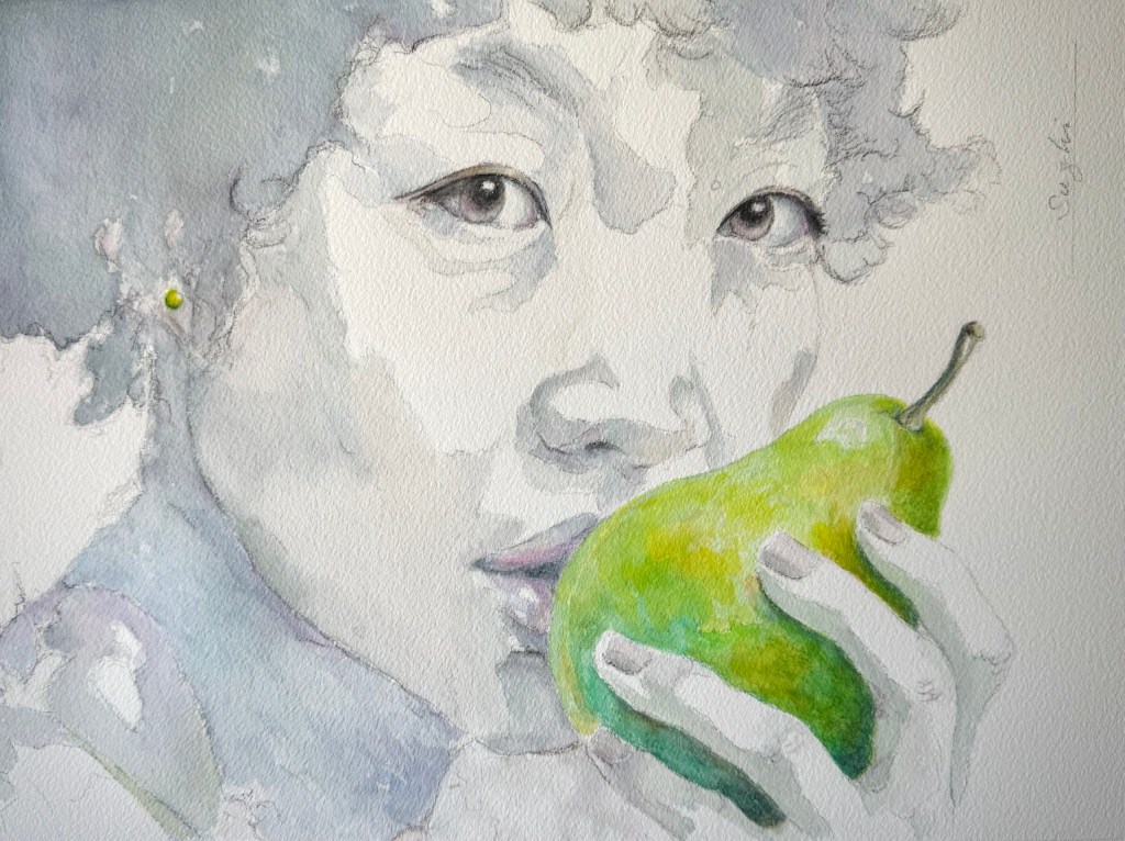
The final piece is, in my opinion, the best design of the month. I wanted a flat, almost monochromatic self-portrait (of course it’s a younger and prettier version of me), paired with one very saturated, juicy pear. In my original sketch, the head was meant to stay much flatter and more abstract. But as I painted, I couldn’t resist sharpening the features, especially around the eyes. I’m still not sure whether that was an improvement or a distraction. I had to drag myself away from the piece so I wouldn’t overwork it into a full realist portrait.
Kiss or Bite, watercolor on paper, 10 x 13, March 2026
Overall, I love the design, the visible pencil marks, and that satisfying feeling of something unfinished yet strangely complete.
March turned out to be a fruitful month. Am I done with pears? Check back in a month.
February slipped by faster than I expected. I had some ideas about “strategizing” for 2026 (see previous post), but the month didn’t cooperate with any real planning. When I’ve been away from oils for a stretch, I usually warm up with quick portrait sketches. This time I happened to watch a live sketching session centered on pears at the beginning of the month, and so I thought, why not try pear portraits instead? I picked up three from the local grocer, arranged them simply, and set off quickly.
Midway through though, I lost interest in the setup. The lighting was too conventional, the composition flat, and the whole thing uninspiring. I decided to add reflections on the surface to give it more life. Mostly I just added frustration. As the paint thickened and got tacky, I gave up. Here’s the oil painting I set aside:
Three Pears, oil on canvas board, 11×14, Feb. 2026
I switched to watercolor instead. In a recent cleanup effort, I found some unused Arches blocks. I’ve done a little watercolor in recent months, but only small sketches on inexpensive paper. I couldn’t wait to see what good quality paper could deliver after these practices. By then the pears were starting to rot, so I worked without a reference. Here’s the first attempt:
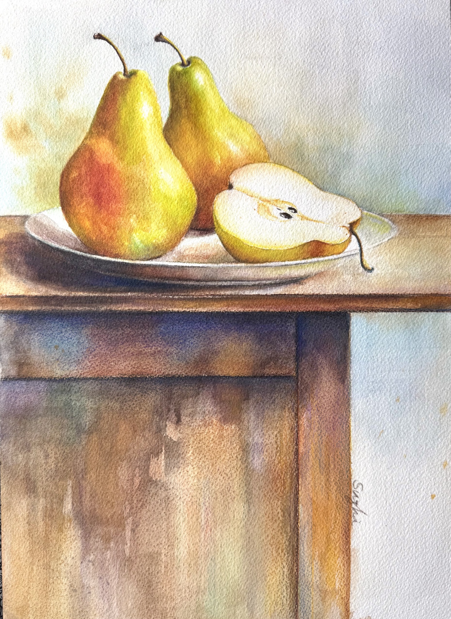
Two and Half, watercolor on paper, 10 x 14, Feb. 2026
As expected, the paper could hold much more water than the cheap alternatives, but the texture was rougher than I remembered, which affected only the initial pencil drawing so far. The painting turned out muddier than intended, and that’s what happens without a clear plan. I originally wanted almost no background. just white space to frame the pears. Once I considered it finished, though, the large white areas felt too empty and didn’t support the cut pear properly. I began adding background colors, changed direction a few times, and a couple of unintended mixes later, everything neutralized into gray. The forms of the whole pears suffered too. With everything around muddied, I didn’t want to kill the fresher red-orange even though it was supposed to be in the shadow. I felt like choosing between two wrongs. You can mix colors on paper, of course, but it helps to know exactly how you want to approach it. This piece isn’t abandoned, but it feels unresolved.
For the next one I made a conscious effort to avoid overworking the background. I still adjusted the pears more than I should have, but the result has better volume and value range, even if the colors lost a bit of their brightness. Pears do come in rustier, subdued tones, so I’ll take that as a feature rather than a flaw. This piece was also done without a reference.
Huddling, watercolor on paper, 11 x 14, Feb 2026
That gave me enough confidence to keep going. I returned to oil and worked on two different compositions at the same time, both on paper. One focused on color and a re-attempt at reflections, on Canson XL Oil and Acrylic paper; the other, on texture, on Canson Acrylic paper.
Display, oil on paper, 9 x 11, Feb. 2026
I have used the XL oil and acrylic paper before with a thin layer of shellac, but I found it was unnecessary. The paper handles paint very well and feels forgiving. Of all the paintings surfaces I’ve tried, this is the easiest to use and I like it more each time. The plain acrylic paper has a coarser surface that makes blending trickier, but it worked nicely for suggesting the wood grain of the table and backboard. It also encouraged (or forced) me to keep the pear colors varied and abstract rather than uniform. I may try a layer of shellac on it next time to see if it improves flow.
On the table, oil on paper, 11 x 15, Feb, 2026
February passed in a mix of small frustrations and a few satisfying moments. I’m glad I moved between watercolor and oil. It kept the process interesting. I hope to maintain the momentum.
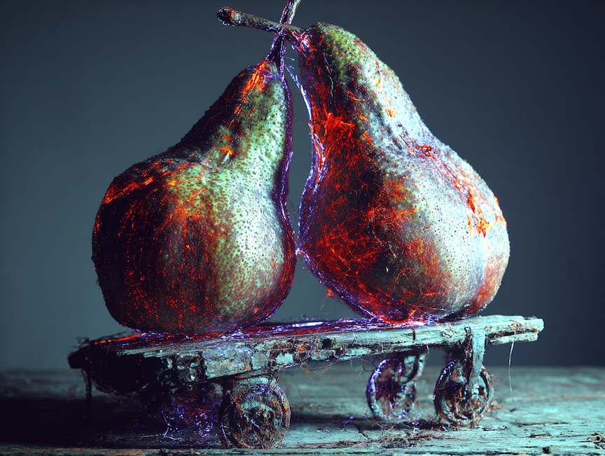
And just for fun, here’s a MidJourney piece on the same subject that I really like. The colorful glow and the roller-skate-like cart give it an eerie and playful feeling, quite beyond my imagination.
January brought me home after a long stretch away, and for the first time in months I finally had time to just zone out, daydream, and do some belated New Year planning.
As someone who’s deeply introverted and home-loving, I actually spent quite some part of last year outside my comfort zone. I visited many exhibitions, immersed myself in incredible paintings by other artists, and played extensively with AI image generation. Those experiences were thrilling in their own ways. I’m still in awe of what AI can conjure in seconds, and I still find it genuinely useful as a brainstorming and reference tool. Yet all of it, the shows, the scrolling, the endless prompting, only made my hands itch to pick up a brush. Nothing digital or vicarious can match the slow, stubborn satisfaction of standing at the easel for three or four hours, building something stroke by stroke, decision by decision, until it finally exists.
In parallel, I’ve been revisiting watercolor through basic exercises focused on values, color relationships, temperature, and edge quality. These aren’t flashy pieces; they’re deliberate drills. But every time I return to them, I’m reminded how deceptively simple the core theories of painting really are and how easy it is to overlook one of them the moment I get excited about a subject. When a painting fails (or just falls flat), it’s almost always because I ignored or half-applied one of those fundamentals.
While reorganizing my studio recently, I pulled out a few unposted oil still life paintings from last year. Seeing them with fresher eyes—after months of looking at masterworks and grinding through exercises, I can now spot exactly where I leaned too heavily on “copying what I saw” instead of using what I know.
Group Portrait 1, oil on canvas, 18 x 24in, 2025
My shapes and overall compositions still hold up; I’m happy with those choices. But the values? In several passages I could have orchestrated them more deliberately to create stronger focus, depth, and mood. For instance, “Group Portrait 1”, for the small white cup and the dish in the center, the reflective surface and the blue strips makes the lighting not as informative as on others. I wrestled with those forms for hours. Now I realize I could have analyzed and designed the value patterns based on my knowledge (where the lightest light, darkest dark and mid-tones should be given the light source and the object’s shape), and considered their roles in the whole picture. With more intentional grouping and subordination, those objects could have popped or tucked in with far less effort.
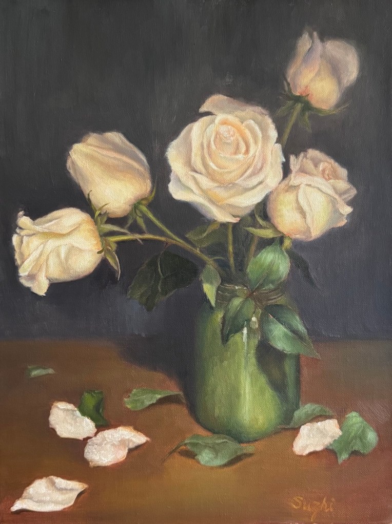
Pink Roses, oil on canvas board, 16 x 20in, 2025
The roses suffered from a similar issue. I got lost in distinguishing individual petals too soon, instead of first establishing the big value structure across the entire bouquet, then each rose. Had I done that, the flowers would feel more alive and integrated.
Color-wise, I still like the overall harmony in these pieces. The palettes feel cohesive and quiet, which suits my taste. But there’s room to push sophistication further. In the roses, I could have borrowed subtle echoes of the background tones into the petals themselves to make the roses more atmospheric. In the “Group Portrait 2”, I could have let the objects’ colors bounce into the paper underneath, unifying the scene better.
Group Portrait 2, oil on canvas board, 12 x 16in, 2025
These aren’t harsh self-criticisms: they’re just clearer observations now that I’ve had distance and review. The artists whose work I admire most probably didn’t arrive at their mastery through secret techniques; they simply became relentlessly consistent at remembering and applying the fundamentals while they painted.
So for 2026, I’m keeping the plan very simple (and hopefully realistic): I want to strategize how to apply what I know and constantly remind myself of the fundamentals during the process, making every session an effective practice. Who knows? By the end of the year, these conscious efforts might turn into subconscious habits, and I might finally make the progress I’m looking for.
My previous trips to Shanghai were defined by the city’s kinetic buzz—skyscrapers, street food, and endless energy. This time, however, I dedicated the trip entirely to the city’s rich art scene.
But the centerpiece of the trip was supposed to be the famous Shanghai Biennale. Founded in 1996 as mainland China’s first international contemporary art biennale, it has long been one of Asia’s most influential cultural events. After a positive experience at the Chongqing Biennale last year, my hopes for Shanghai were high.
This year’s edition, titled “Does the Flower Hear the Bee?”, aimed to operate at the intersection of human and nonhuman intelligence, featuring over 250 works by 67 individual artists from around the world. Most exhibits were installation or multimedia works that occupied vast spaces, often incorporating sound. They were meant to provide an “immersive experience” —the exhibition buzzword of the decade. Yet, walking through the Power Station of Art, I felt a profound emptiness and noisiness at the same time. The installations were not much different from the student shows I have seen at the Central Academy of Fine Arts (CAFA) over the last two decades. Obscure intentions, clichéd designs, and soundscapes meant to be unique to each piece instead bled into one another. I know it is also a cliché to criticize modern art as “flash” or “trying too hard to shock,” but I genuinely felt these works were demanding my attention without providing much in return. There was not much to see, only fatigue.
At the same venue, I saw Lin Tianmiao’s “There’s No Fun in It.” As a pioneer of Chinese installation art, Lin’s work was slightly more compelling than the Biennale. The two thematic axes unfolding in the exhibition—“Body” and “Everyday Objects”—presented a panoramic view of the artist’s continual experimentation with new materials and modes of expression. The “Body” constituted the core of her inward perception and self-reflection, while “Everyday Objects” functioned as vehicles for observing and responding to the external world. The exhibition was intended to invite viewers “to reconsider the fraught entanglements of body and everyday life.” Yet, the amount of space it demanded did not match the experience it provided. Lin Tianmiao states: “Bodily sensation is often the most reliable. It is not only the source of perception but also the material and medium of creation.” While I appreciated the point, I still believe that with great artistry, one can achieve that sensation in the small space of a single painting. That said, the show was coherent in meaning and proficient in technique; I enjoyed it more than the Biennale.
To understand my skepticism regarding installation art, I have to take you back a few decades to when the medium first arrived in China. It burst onto the scene in the mid-1980s amid the modern art wave, heavily influenced by American artist Robert Rauschenberg. Young artists credited him with bringing postmodernism to China, believing it would shape the landscape of Chinese art for decades to come. For these young artists, these new concepts were weapons to shatter the rigid, Soviet-influenced art systems in the post-Cultural Revolution era.
In February 1989, the China/Avant-Garde Exhibition opened at the National Art Museum of China. Growing up next door to the venue, this show was my initiation into installation art. The official record paints a vivid picture: banners paved across the plaza, condoms scattered in exhibition halls, and artists hatching eggs on the second floor. The museum eventually had to remove fake notices hung in restrooms, and the show was famously shut down after artist Xiao Lu fired gunshots into her installation Dialogue. I was young and not particularly art-literate. To me, it looked like a collection of weird stunts, but it was great fun. What young soul doesn’t enjoy chaos and the out-of-the-ordinary?
Little did I know at the time that this show was the epitome of the early stage of China’s installation art. After the events of 1989, modern art in China hit a nadir. Publications folded, and artists fled to France, the US, and Japan. It wasn’t until the mid-90s that artists returning from overseas revived the medium, shifting focus from grand political discourse to individual experience. Still, the National Art Museum never hosted anything that avant-garde again. In China, installation art became categorized within the broader framework of “Conceptual Art.” Due to the indifference and wariness of mainstream art circles, it remained marginalized in the allocation of resources. Some young artists mistakenly believed that only installation art was true avant-garde and that painting was dying, leading their practice to become purely performative.
In the 1980s and 90s, installation and multimedia art were radical challenges to traditional forms. But can they still claim that subversive power in 2025? Today, “immersive” is a commercial cliché. It is the part of the venue that sells the most expensive tickets. And while an installation strives to provoke bodily sensation—an immersive experience—people can simply walk through projections of Starry Night or watch an animated Mucha. Why do I need to read a three-paragraph wall text to understand your grievance or why a pile of bricks is a masterpiece, when I can enjoy the new form of a time-tested beauty? To me, most of the installation art can be summarized as “There’s No Fun in It.”
This is not to say I am entirely against installation art. Over the years, some exhibitions have left a positive impression. In 2015, UCCA at 798 hosted William Kentridge’s Notes Towards a Model Opera. It was a comprehensive retrospective including works from nearly every major project the artist had undertaken up to that moment. The exhibition spanned a vast array of media: ink and charcoal drawings, kinetic sculptures, multi-channel video artworks, and a large-scale installation in the form of an operatic model. In his hand-drawn animations, he filmed the incremental creation, erasure, and reworking of drawings. The technology involved was called for by the art, not added to call attention to itself. One of the centerpieces was the Soho Eckstein cycle, a combination of art, storytelling, technology, and political messaging—a true interdisciplinary masterpiece. You could say these were postmodern artworks that were actually beautiful and therefore relatable. Art can be weird or shocking, but it must possess an aesthetic language that connects viscerally. What makes art “art” still matters even in postmodernism, and an installation only becomes powerful when it delivers both meaning and beauty, not just statement or protest in a different form.
With my expectations tempered, I walked into the Rockbund Art Museum to see “The Great Camouflage.” The venue itself is an Art Deco gem, built in 1933 for the Royal Asiatic Society. The exhibition layout was obscure and chaotic. At one point, I was told there was more to see in an elevator hall, and only found the piece after bumping into a janitor’s closet and a fuse box. The artwork consisted of three fliers with poorly printed words: “What time is it on the clock of the world,” posted on a window.
But then, I found it.
The piece that gripped me was Wang Tuo’s Distorting Words (2019), a three-channel 4K video installation running about 24 minutes. It is the second chapter of his Northeast Tetralogy, a critical examination of the geopolitical, ideological, and cultural transformations of Northeast China.
Distorting Words weaves together four stories to create a disorienting portrait of historical recurrence:
The Martyr (1919): Guo Qinguang, a student activist in the May Fourth Movement, died of exhaustion after the protest, though it was widely believed at the time that he died of police violence. His death evoked immense public anger toward the government.
The Avenger (2019): The execution of Zhang Koukou, a man who killed three neighbors to avenge his mother’s death decades prior. His death triggered intense debate regarding societal duty and justice.
The Ghost: A retelling of “The Hanging Ghost” from the classic Strange Tales from a Chinese Studio (Liaozhai Zhiyi). In this version, a scholar with a hidden death wish repeatedly witnesses a woman hanging herself. Wang Tuo uses this to suggest that our internal desires summon historical traumas—we are not just watching the past; we are willing it to return.
The Shaman: A story adapted from anthropologist Claude Lévi-Strauss regarding a Zuni boy accused of sorcery. To survive torture, the boy invents a story, “confessing” to being a shaman and performing a trick to “lose” his powers. He survives because he gave the crowd the performance they needed to validate their beliefs.
Wang Tuo uses these threads to explore “Pan-Shamanism.” He suggests that figures like Guo Qinguang and Zhang Koukou are not just individuals, but mediums—shamans forced to perform the roles of “martyr” or “avenger” to satisfy the collective psychological needs of society. The video is beautifully shot, skillfully edited, and accompanied by an evocative soundtrack by the underground band Manchufeierzi. This was an installation where the narrative, the aesthetic, and the philosophy coalesced perfectly. It did what great art should do: it bypassed my cynicism and connected directly.
The logical next step was trying to find where I could watch the other installations in the series, but another aspect of installation art struck me: the works were nowhere to be found. Unless there is another physical exhibition in my vicinity, I may never be able to see them.
I hadn’t thought about the transient nature of installation art before. Many works are site-specific, even perishable—dismantled after the show, most never sold. While Wang Tuo’s video installations can be reassembled and shown again, many cannot. I understand that part of the agenda is to challenge permanence (and my idea that there is a universal beauty standard) and to challenge commodification, much like Banksy’s self-destructing Girl with Balloon, an artwork shredded itself upon sale. The irony is that the most rebellious form has become the most exclusive. Contrast this with traditional fine art, which is easily reproduced and disseminated; installations are available only to those who have the time, money, and proximity to visit a museum in a major city. While traditional fine art can reach audiences through a smartphone, installation art’s dependence on traditional gatekeepers—like museums, galleries, and public institutions—is absolute.
This distinction feels increasingly vital in the age of AI. Tools like Midjourney can generate “Van Gogh-style” swirls or “Dalí-esque” dreams. The Mona Lisa is an image that permeates culture; you can own it on a postcard, a puzzle, a T-shirt, or a screen. Technology and commercialization have democratized fine art, and in doing so, destroyed traditional gatekeeping. What protest could be louder and more effective than this? Who are the true rebels now?
Maybe VR and the Metaverse can finally help installation art catch up.
As the tagline on the high-speed rail—an inspiration for Wang Tuo—reads: “The high-speed rail sets off at dusk and arrives at dawn, covering 2,000 km a night.”
We are moving fast. There will be a different world in the morning.
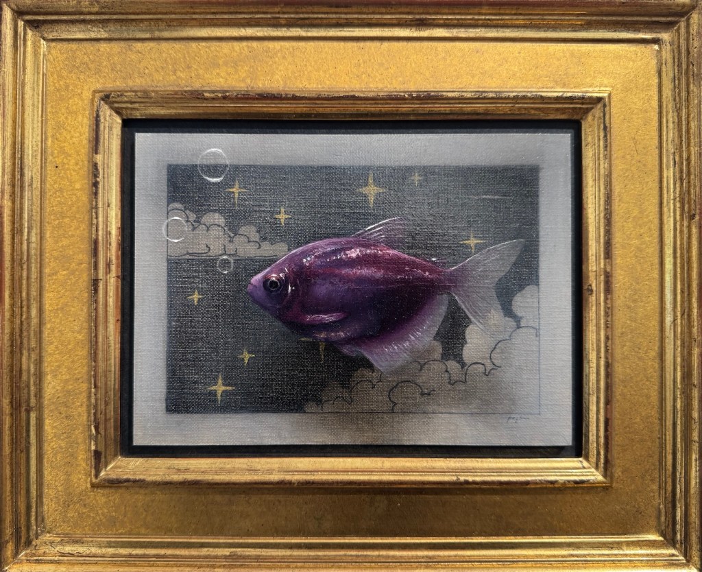
Happy New Year! Here’s my first installation art, brought to you by Grok Imagine:
November had me on the other side of the globe again. This time I packed a couple of recent paintings to give as gifts for family. Lucky for me, framing in Beijing is much cheaper than in the States. I can afford to elevate my paintings a bit, which definitely makes the presentation better and adds to my confidence. Here are some of the paintings I gifted:
During my last long stay in Beijing, I decided to make the most of the situation by practicing watercolor. Oil wasn’t an option and watercolor stuff barely takes up any room. I am happy to report that I’ve actually stuck with the plan. My current goal in practice is trying to keep the colors clean. Small steps, but still moving forward.
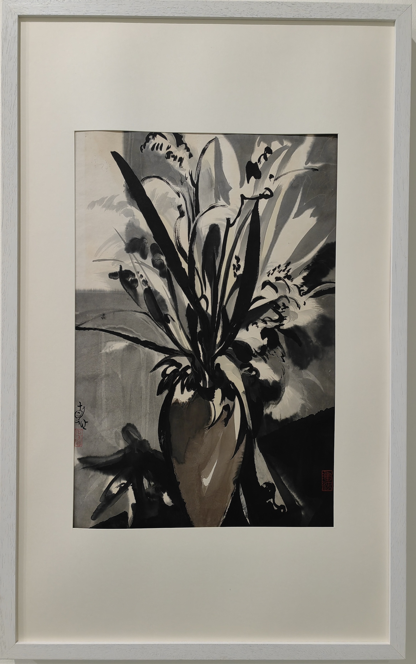
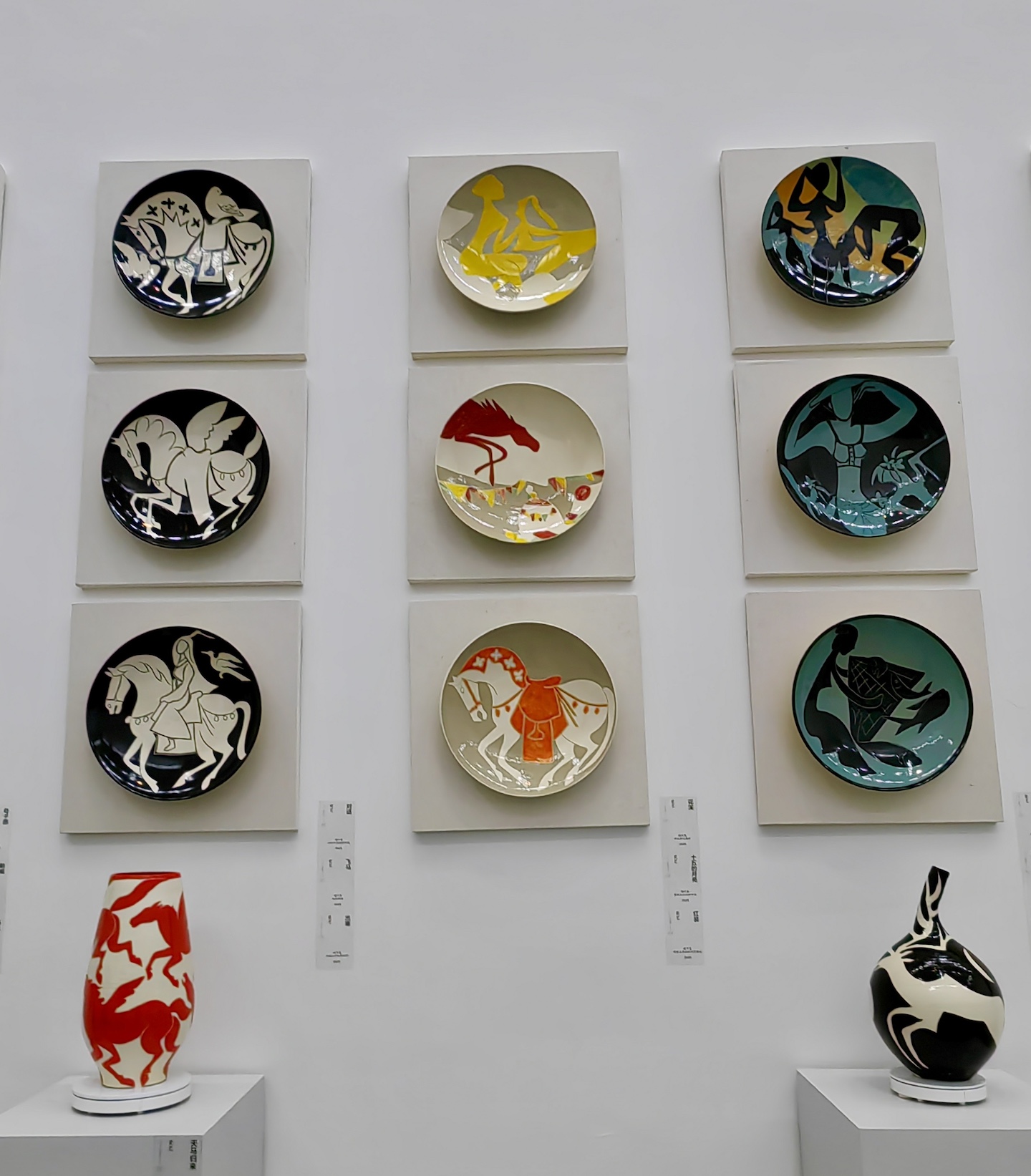
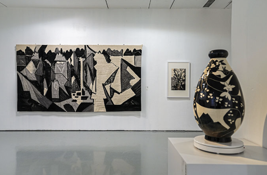
Gallery-wise, I saw Liu Jude’s 刘巨德 solo show at the Today Art Museum: Hearts Aflame for the Firmament. Liu studied at the Central Academy of Craft Art in 1965 and later worked under Pang Xunqin 庞薰琹 (1906 – 1985) in 1978, researching the comparison between traditional Chinese decorative art and Western modern art. He believes that painting should imitate the Tao that births all things: using the invisible Tao to paint visible objects, and using visible objects to paint the invisible Tao. His art isn’t constrained by the classification of genre or technique; he adheres to the traditions of Chinese decorative art but modernizes that formal beauty, making him unique in the Chinese art world. The exhibition featured over 200 new pieces by Liu and more than 100 ceramic debuts. Divided into “Ode to Peace” and “Ode to Hometown,” the show presented a kind of “chaotic beauty” and deep emotions for his roots.
In his artist statement, Liu mentioned: “Every time I paint, on the clean Xuan paper, I always put down thick black ink first, trying to occupy, grasp, and stabilize the whole space. As for what object that ink block, dot, or line represents, it is ambiguous, and I am not entirely clear. It is precisely this uncertain relationship of abstract points and lines that triggers me, pulling me to wander with it.”
In comparison, the National Still Life Exhibition hosted by the Chinese Academy of Oil Painting felt … fine. Technically solid, just not particularly exciting.
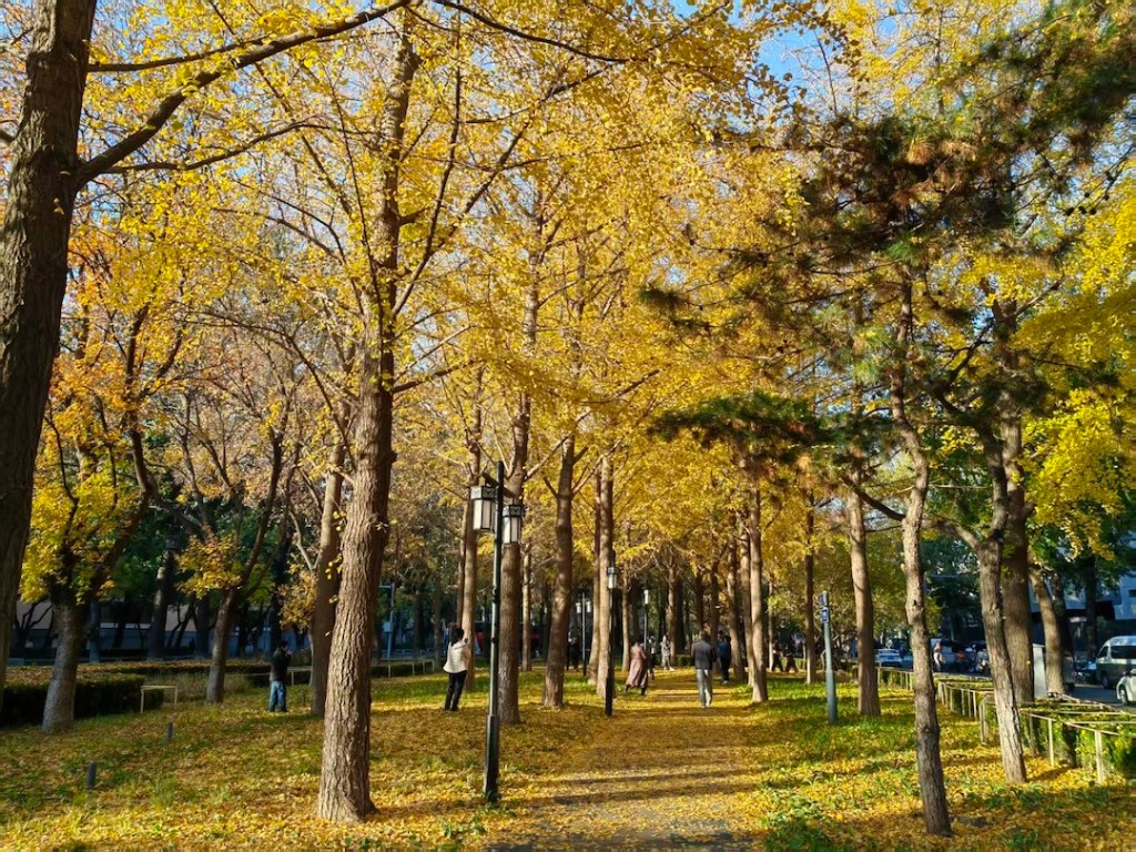
Finally, on one perfectly sunny mid-November day, I took this photo of a path covered in golden ginkgo leaves, a staple scene in Beijing’s autumn. Doubao, ByteDance’s (owner of TikTok) AI app, turned it into a watercolor painting. Love it or hate it, AI art will be a staple of the art world.
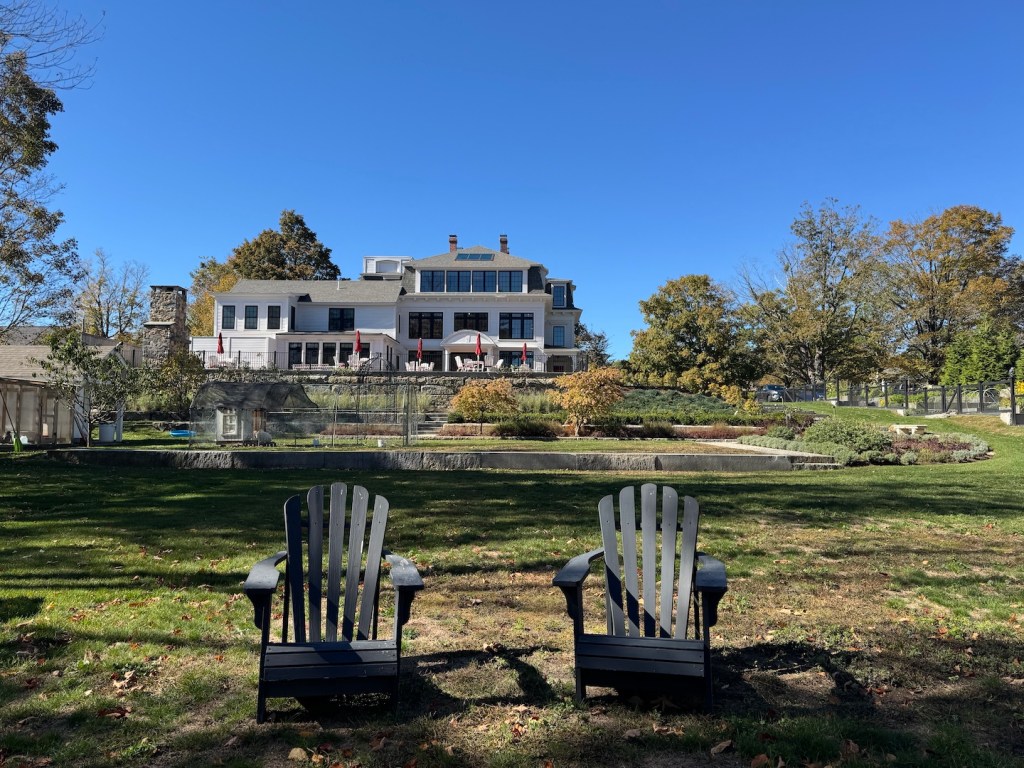
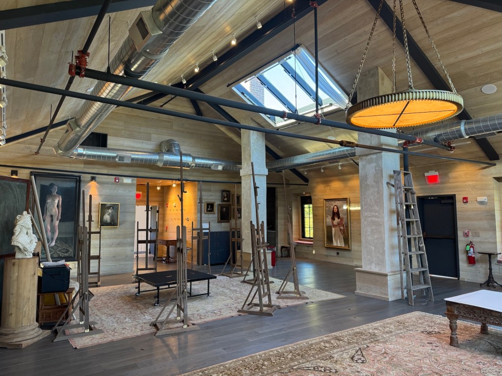
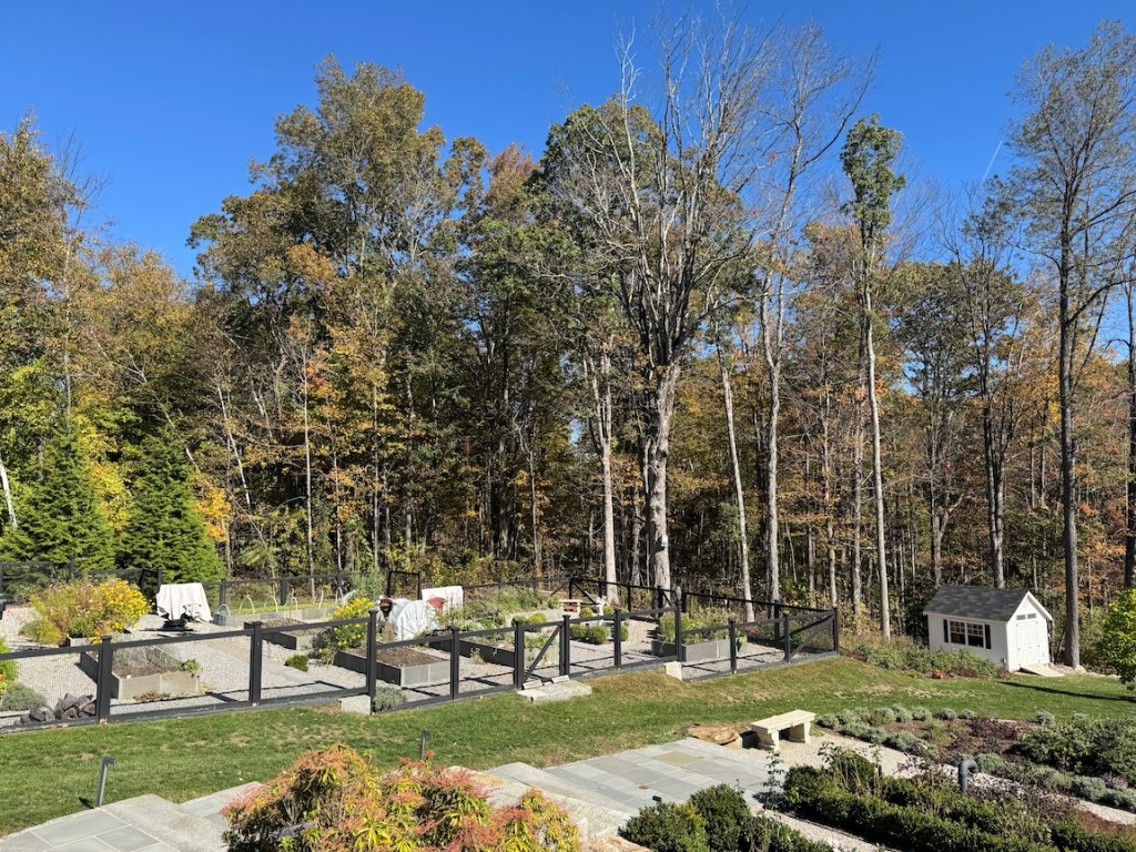
If you’re driving from Boston westward—say, toward Ithaca like I was—take a detour to New Salem, Massachusetts. Nestled in the vibrant fall foliage of a classic New England town, the New Salem Museum and Academy of Fine Art (NSMA) is a treat for anyone who loves realist art.
The NSMA sits on 2 acres, surrounded by a vegetable and rose garden and a serene pond. The three-story 19th-century building was once part of the New Salem Academy. In 2023, Laura and Vincent Barletta purchased it, turning their passion for art into a public treasure. Their journey as collectors began 20 years ago when they fell in love with Michael Klein’s painting “Leaving Home” in a New York gallery. Two decades later, Klein, a leading artist in the revival of representational painting in America, was enlisted to curate and direct the museum and its academy. Their mission is to create a stronghold for contemporary realist art.
The museum, housed on the first two floors, showcases a collection of contemporary realist masterpieces, primarily from living artists, such as Jeffrey T. Larson, Jordan Sokol, Jeremy Lipking, Colleen Barry, Michael Klein, Kate Lehman, Oliver Czarnetta, Daniel Sprick and more. It also features historical gems by John Singer Sargent and Andrew Wyeth, connecting the past and present. The Barlettas’ commitment to sharing their private collection with the public sets NSMA apart. Many artworks, once acquired by private collectors, end up hidden in storage. By opening their collection, the Barlettas ensure these works remain vibrant and accessible.
Justin CoburnJamie CorethDaniel SprickMichael Klein Antonio CazorlaMark PughMiriam HoffmanBrad KunkleCindy ProciousMichael Klein
The museum represent the Barlettas’, especially Laura’s taste in art, but it also embodies Michael Klein’s curatorial vision. Like his paintings, the display is a thoughtful and gentle invitation to experience truth and beauty. It is intimate but not small. Strolling from one gallery to another, you enjoy a natural flow of richness in substance and dynamic cohesion. The value of the art and the quality of the setting are in perfect harmony.
The collection is rotated and expanded regularly. I watched YouTube walkthroughs of past exhibitions, and the displays were different from what I saw, making NSMA a destination worth multiple trips.
The third floor houses the NSMA Academy, a hub for aspiring artists. It offers workshops and classes led by professionals like Rachel Li for painting and Stephen Saxenian for sculpting. The academy fosters creativity and skill development, creating a space for artists to grow and connect. NSMA also hosts an annual International Painting Competition with a sizable award, welcoming all subject matters in representational art. You can view the 2025 finalists on their website or watch a video review by artist David Kassan.
AcademyVegetable Garden
Following a tip from NSMA’s website, I visited the nearby New Salem General Store, a charming spot that’s part convenience shop, post office, and bakery. I grabbed a couple of freshly baked energy cookies and a hot apple cider, then picnicked in NSMA’s back garden. The view of the pond, paired with the treats, was unforgettable, a perfect complement to the museum visit.
The Pond
Michael Klein once said, “Painting is a luxury that brings joy to our lives; it allows us time to sit in front of nature and be awed by the beauty that exists.” (“Art, God, and Beauty”, Realism Today) NSMA is the perfect manifestation of that. Whether you’re an art enthusiast or just looking for a unique stop, NSMA delivers inspiration and beauty.
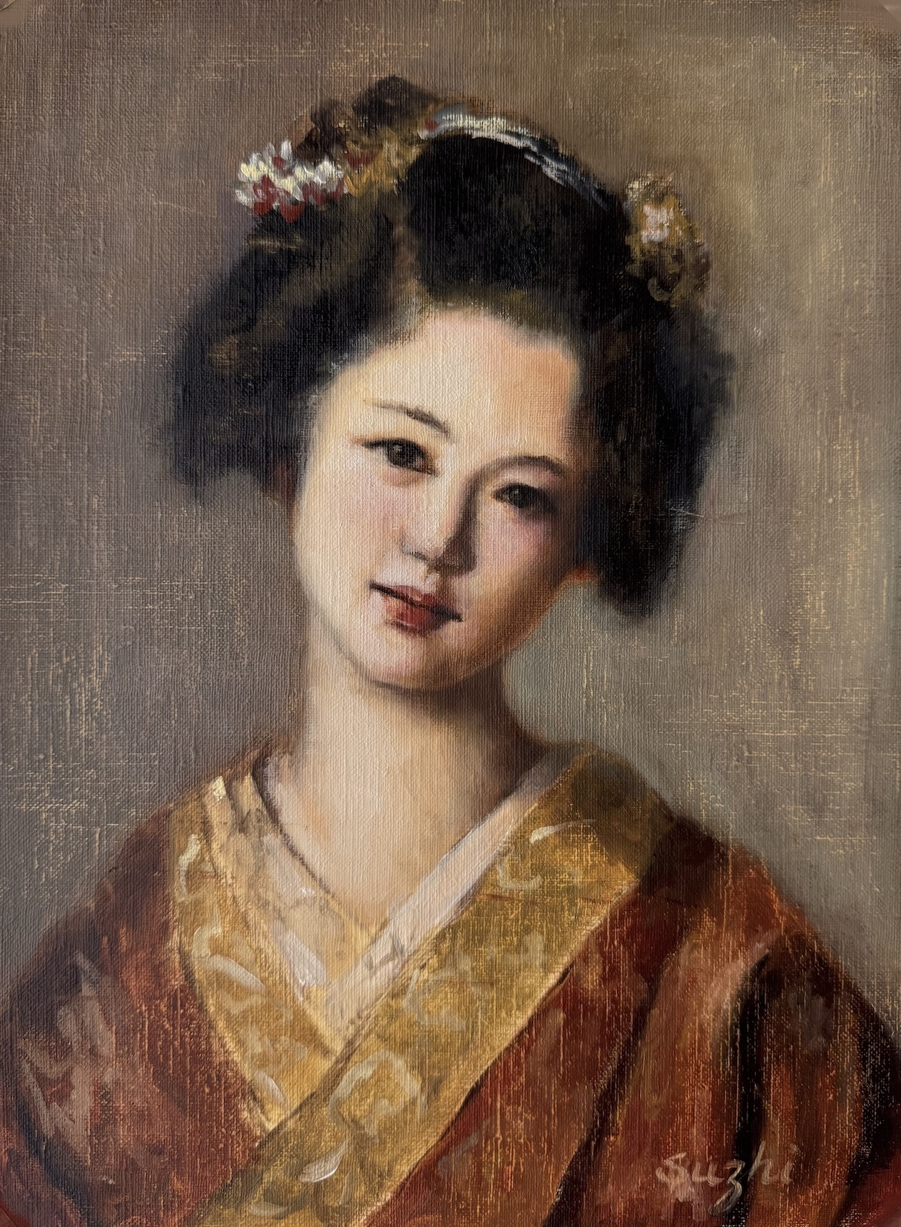
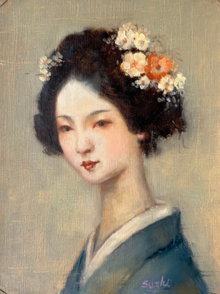
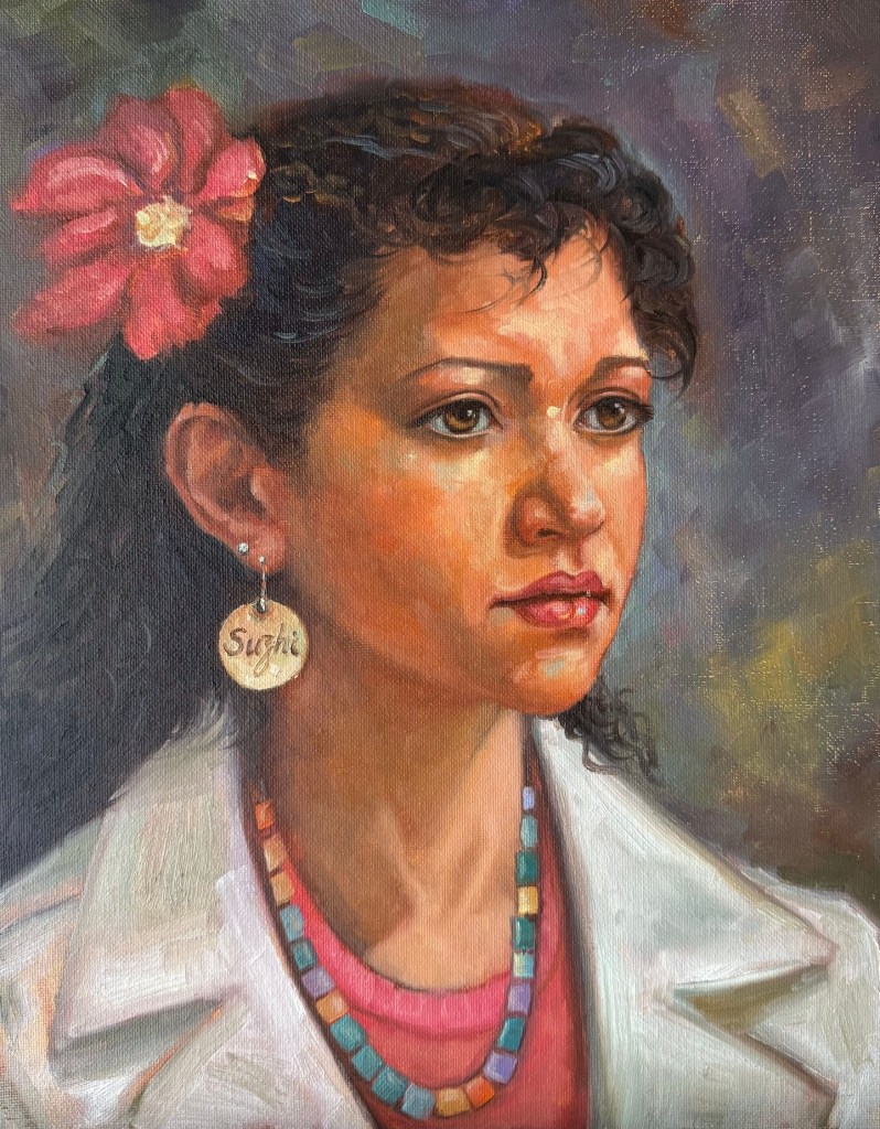
The freedom I enjoyed while painting the last sketch in August encouraged me to keep experimenting along the same path. I began September by completely abandoning human references. My logic was simple: if I didn’t have a photo to lean on, I could concentrate on artistic expression. Too often, when I started a portrait, I had ideas beyond likeness and accuracy, but as the work progressed, those ideas got lost in the pursuit of a “correct” painting.
I began with two portraits of traditional Japanese women, aiming for an atmosphere of softness and antiquity. Next came two modern women, with a focus on expressiveness. Here are the paintings:
To some extent, I think I achieved what I set out to do—especially in the paintings of the modern women. Looseness has always been difficult for me when a photo sits in front of me. But these exercises also revealed a problem: without a reference to a real person, my “inventions” tend to drift toward the generic and idealized. If I kept going this way, the future paintings might all start looking alike.
So in the next piece, I returned to reworking an actual photo reference. While I liked the result, the painting tightened up compared to those done without references.
from Earthsworld
Then I tried something in between. I didn’t use a photo, but I did use a face I know very well. Instead of inventing features from scratch, I largely followed what I thought was me (with plenty of upgrades, of course). The result was also somewhere in between. It’s not as loose as the invented portraits, but more relaxed than those painted from a photo. And to be honest, I really like my new look.
One more thing delighted me in these experiments: I’ve been thinking and tried in recent years about returning watercolor (without abandoning oil). In some of these works, I managed—at least partly—to capture the fluidity of watercolor I’ve missed so much. It’s not perfect, but it’s got me excited to keep playing around.
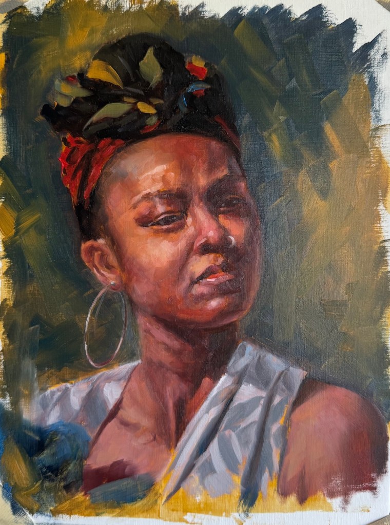
August was a busy month for everything except art. I only managed a few portrait sketches. It’s been a while since I focused on this genre, so for inspiration, I turned to my beloved photographer, Earthsworld, whose work I referenced in a small series called “Turquoise in Earth’s World.”
Unlike those turquoise painting, this time I spent at most 2 to 3 hours on each piece. I started every one with a Zorn palette, but sometimes deviated from it later on for convenience. Some sketches are on paper, others on canvas board. In most of them, I aimed for a resemblance to the reference, and only simplified the backgrounds or clothing patterns for aesthetics and to save time. The exception is the last one, where I attempted something creative – I used Earthsworld’s photo only as an inspiration to reinvent a character in my mind. As you can see, the neck area doesn’t make much sense anatomically, and if this becomes a full painting, I need to and will spend more time figuring it out. Enjoy:
July kept the floral theme in my studio, with petals and my learning progressing.
First up, I tried my hand at a peony. As I have mentioned before, Michael Klein is a big influence to me in the floral adventure, and peonies are featured in many of his creations. Those fluffy blooms look dreamy, but they’re a nightmare to paint and arrange. Petals were numerous and messy, dropping faster than I could arrange them in any manageable shape — whether in vase or on canvas. Soon I gave up my grand vision of a complex still life, and managed a simple single flower sketch.
Peony, oil on canvas board, 11 x 14, July 2025
To comfort myself afterwards, I moved back to roses, a familiar subject. I thought a Trompe l’oeil (French: deceive the eye) would make the painting of a single rose more challenging and fun. The idea was basically a hyper realistic painting. Getting the shadows and texture just right was trickier than I expected. My rose still looks like a painting. Here I have a better understanding of why people always say you don’t paint exactly what you see, even in a realistic painting. I used ambient room light in my setting, and the rose was largely in a unified color. To make it “pop”, I need to accentuate the value contrast, vary the saturation, and better define the edges. To make it look real, I need to invent the reality – how ironic! As you can see, I didn’t go through these steps. I am not entirely sure I have the skill to reach the final goal, and honestly, I like the painting as is now. Sometimes you call it done and move on.
Yellow Rose, oil on canvas board, 9 x 12, July 2025
Next came a colorful bouquet, and my strong desire to paint something vibrant. In setting up the reference, my first thought was a dark, solid background for contrast. It worked, but it felt too safe. Leaning into the chaos, I draped a multicolored scarf behind the bouquet. I painted the scarf and surface in an abstract style, playing with saturation and value to keep things lively but balanced.
Colorful, oil on canvas board, 18 x 18in, July 2025
Between these floral adventures, I did a partial study of a Bouguereau painting. I’ve always admired his delicate and subtle handling of human faces, and this is also a study of handling backlighting. The softness is achieved through close value and gentle brushwork. When the entire face is away from light, the values are further condensed – something I still need to work on. I also painted a “selfie” as an alternate character—don’t ask. I was hoping for a Morandi-ish low-chroma tranquility… or, a quirky experiment in calm tones.
Bouguereau StudyBouguereau’s OriginalSelfie, oil on canvas board, 8×10 in, July 2025
Lastly, MidJourney has pushed out video generation in recent months, and now you can upload your own image for animation (see the painting for the first video here). Like these:
Don’t laugh. The bizarreness comes from my own skill issues – both in painting and in prompting. Look at the shadows in the second video, that wisdom wasn’t from me. There are millions of fantastic generative videos out there for us to see the potential of extending and alternating the life of our paintings. Always more things to experience and explore!
Floral still life painting, though a major genre, never quite resonated with me. An early teacher once said that flowers were boring— it’s just petal after petal, repetitive work. The elaborate Dutch master bouquets, which I never loved, seemed to confirm his view. Over time, I discovered artists like Shirley Trevena, with her vibrant, stylized designs, and Richard Schmid, with his fresh, organic blooms. Their work—whether bold or subtle—was far from dull. My perspective began to shift.
While taking online courses at Watts Atelier, I followed Jeff Watts’ still life exercises (more here) and realized flowers are a great way to practice color mixing. I’ve created a few floral paintings with varying success (eg 1, eg 2), but even with the setup in front of me, I often relied too much on photos. Photos help capture the ever-changing shapes of the fresh flowers, but lose the subtle hues and shades in the petals, especially in shadow areas. Recently, I watched some videos of Michael Klein and Ashwini Bharathula painting, and their skillful, thoughtful process captivated me. There’s no tedious repetition; each stroke results from careful evaluation and beautiful execution. Inspired, I embraced florals and decided to focus on them for a while. I deliberately avoided taking photos of the setup this time to train my eyes.
Here are my recent paintings:
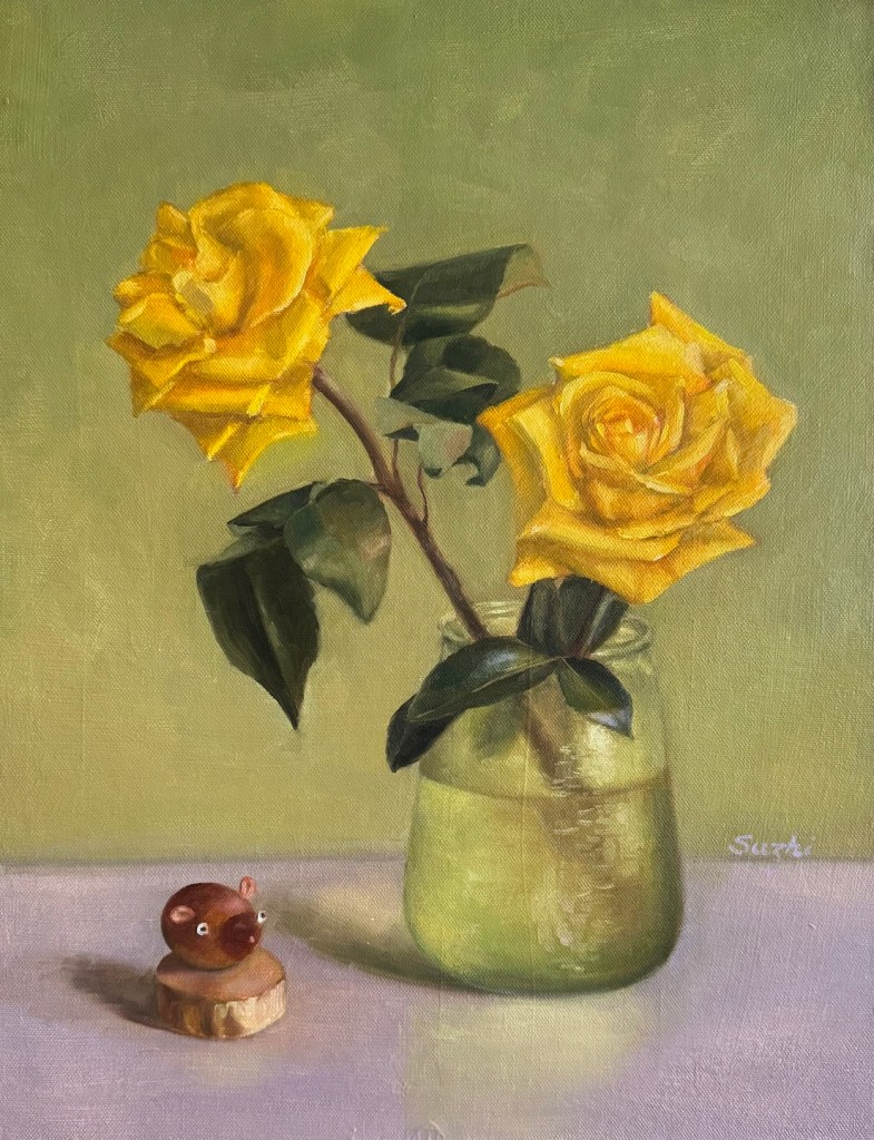
Roses in Green Vase, oil on canvas board, 12 x 16, 04/2025Roses in Glass Vase, oil on canvas board, 14 x 18, 06/2025Warmth, oil on canvas board, 11 x 14, 06/2025Red, oil on paper, 9 x 12, 06/2025Yellow Roses, oil on canvas board, 14 x 18, 06/2025
The two with whitish roses were the most challenging. Reflecting on it, white is such a difficult color—catching every bit of light—that I probably should’ve tackled it later with more experience. In the green vase painting, I struggled to make the flowers stand out. Up close, they look fine, but from afar, they’re flat. I had to darken the petal shadows more than I thought I saw to give them depth. The glass vase piece, with its scattered, broken petal pattern, was hard to unify. In the end, I leaned into the chaos, using short strokes to disrupt the background and table too, hoping this fragmented style would tie everything together.
Overwhelmed by the whites, I turned to a warm-colored flower next. The background in the setup had neutral tones and the lighting was plain daylight, but I warmed the surroundings up to match the flower’s glow.
The red rose bud painting brought me the most joy—a small piece I finished in one sitting. Aiming for a quick study, I used bold, decisive strokes to lay down contrasting color blocks. Pleased with the result, I carried this approach into the yellow roses painting, giving it a slightly stylized feel.
That’s my June wrapped up! With summer just beginning and flowers in full bloom, I’m excited to keep exploring.