Category Archives: Oil

November’s Bits and Pieces

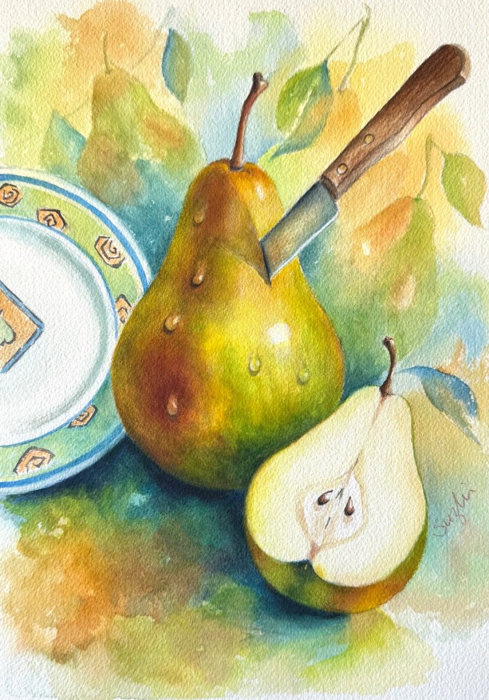
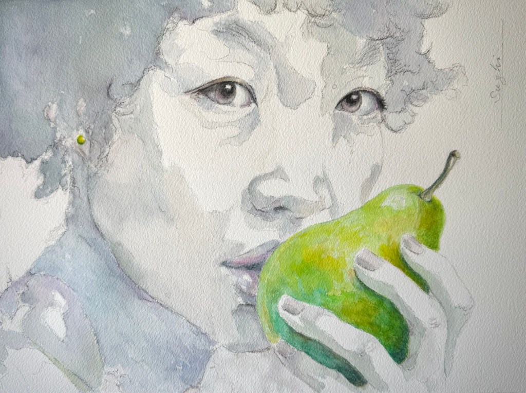
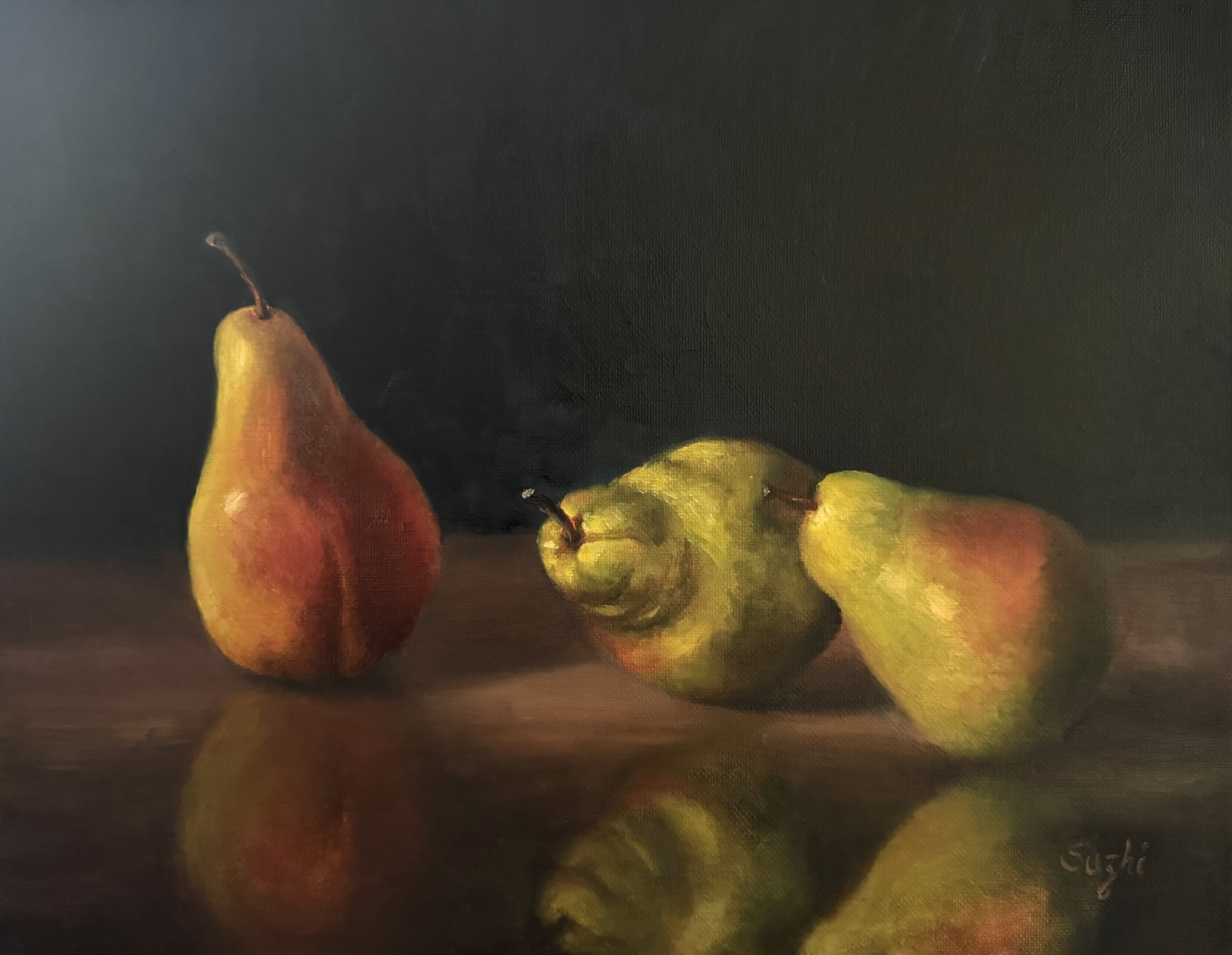
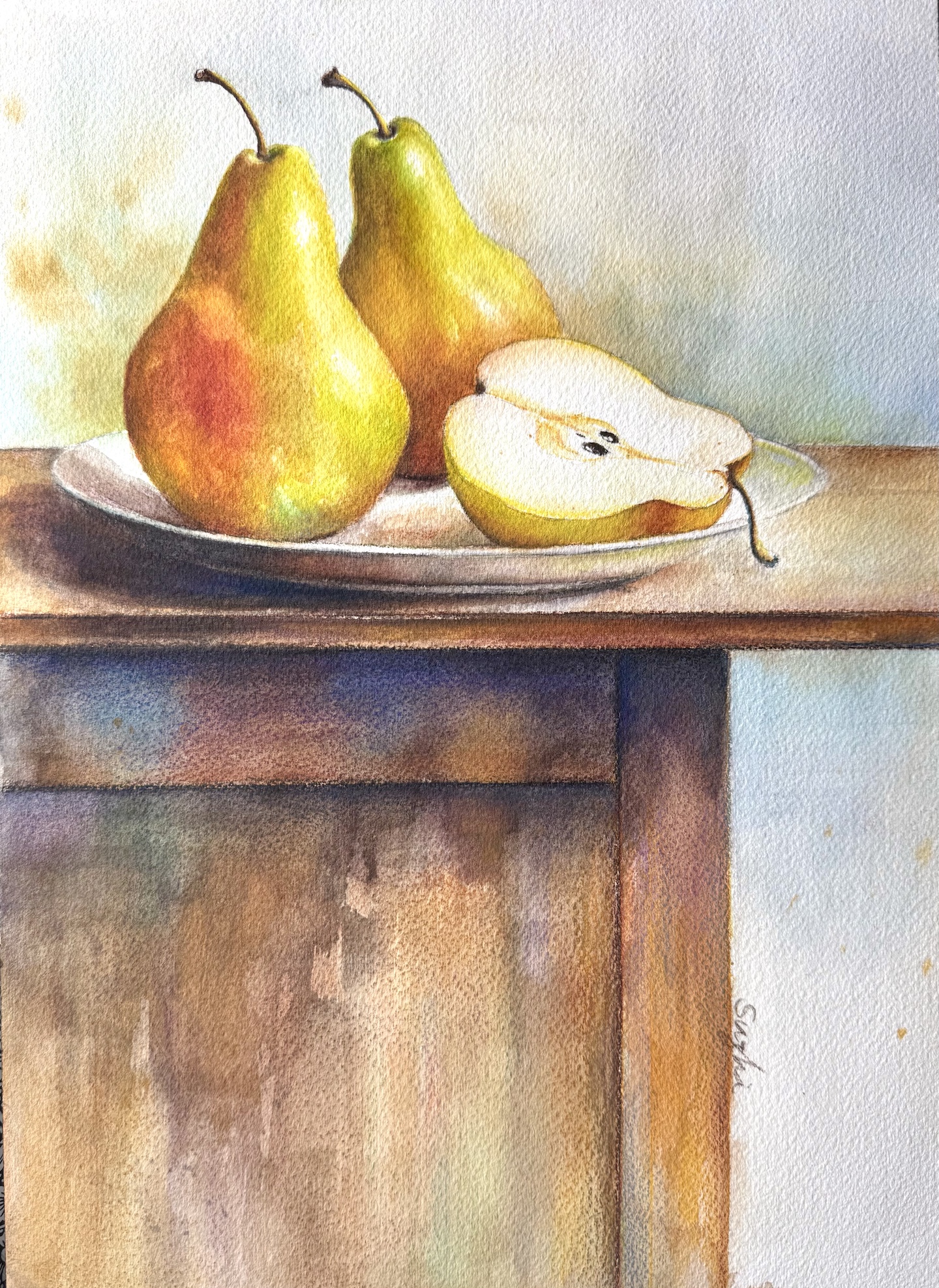
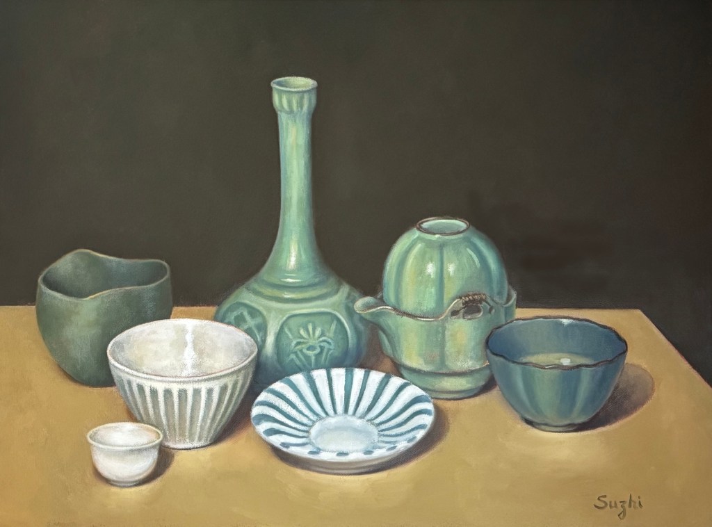
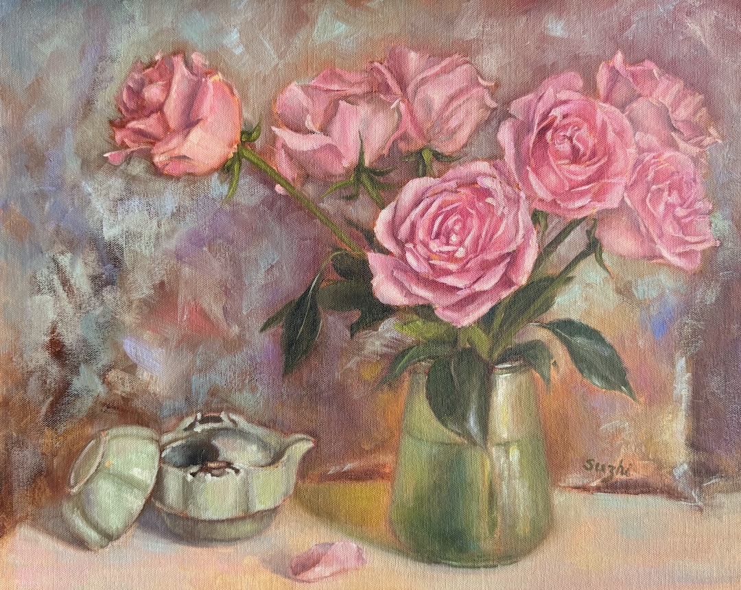
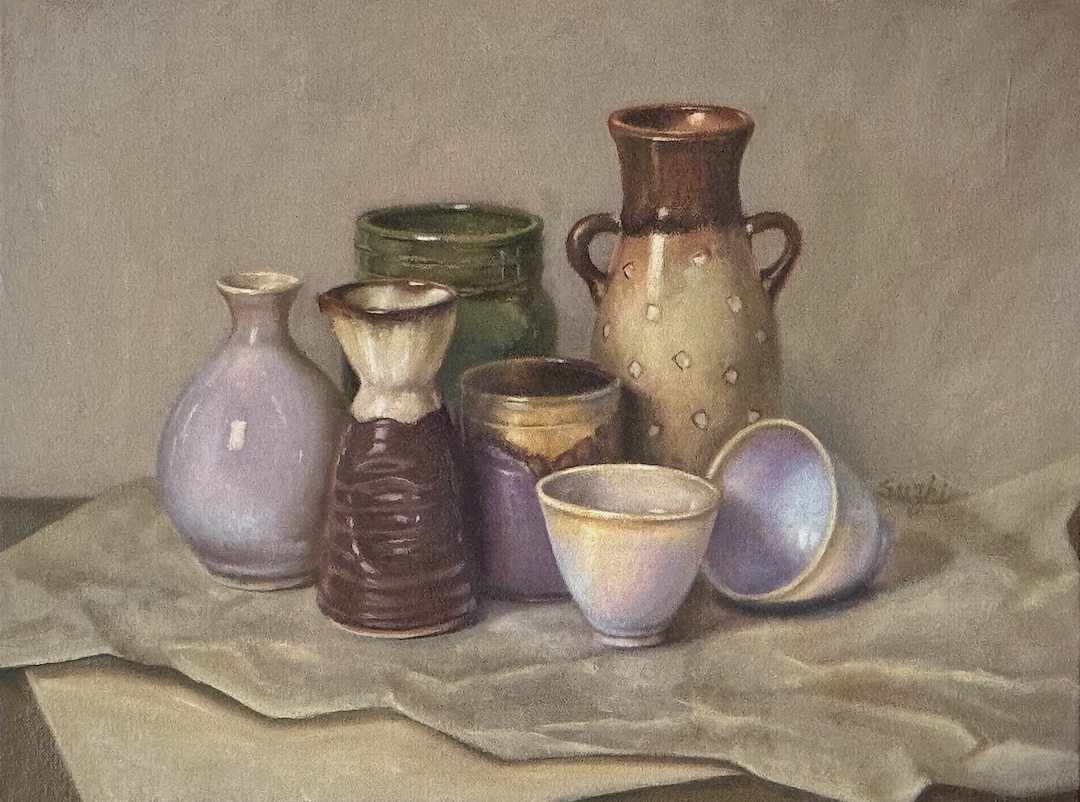
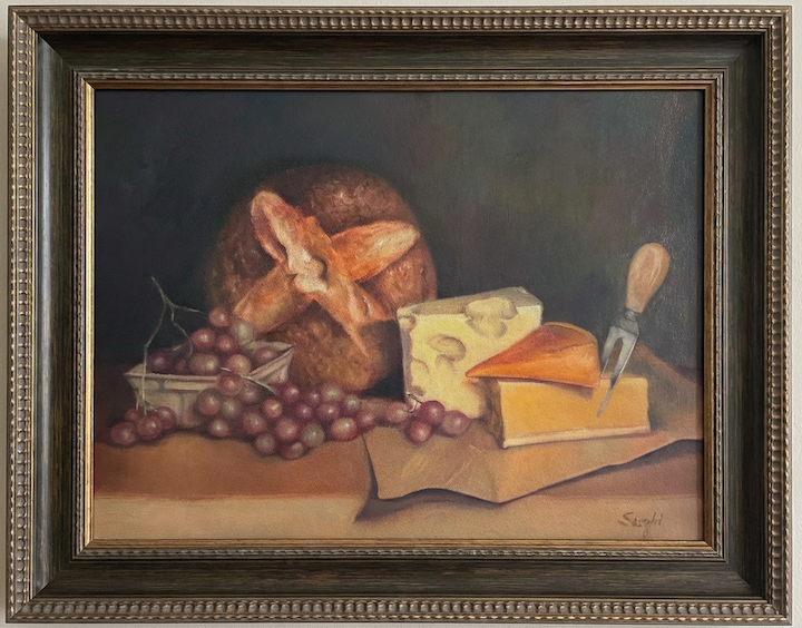
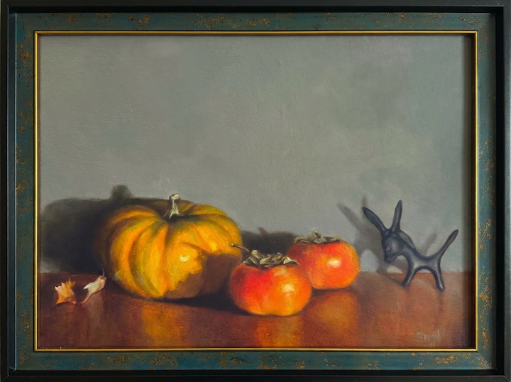
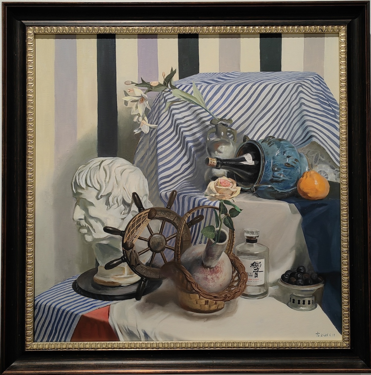
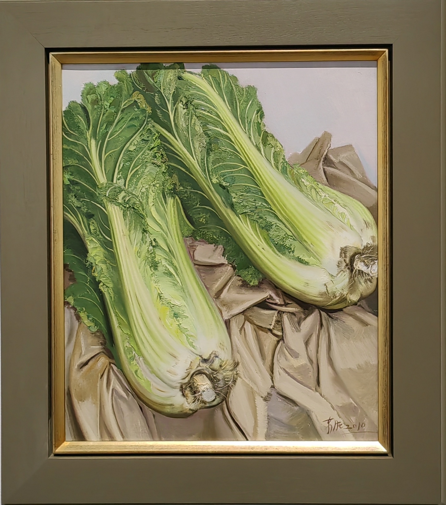
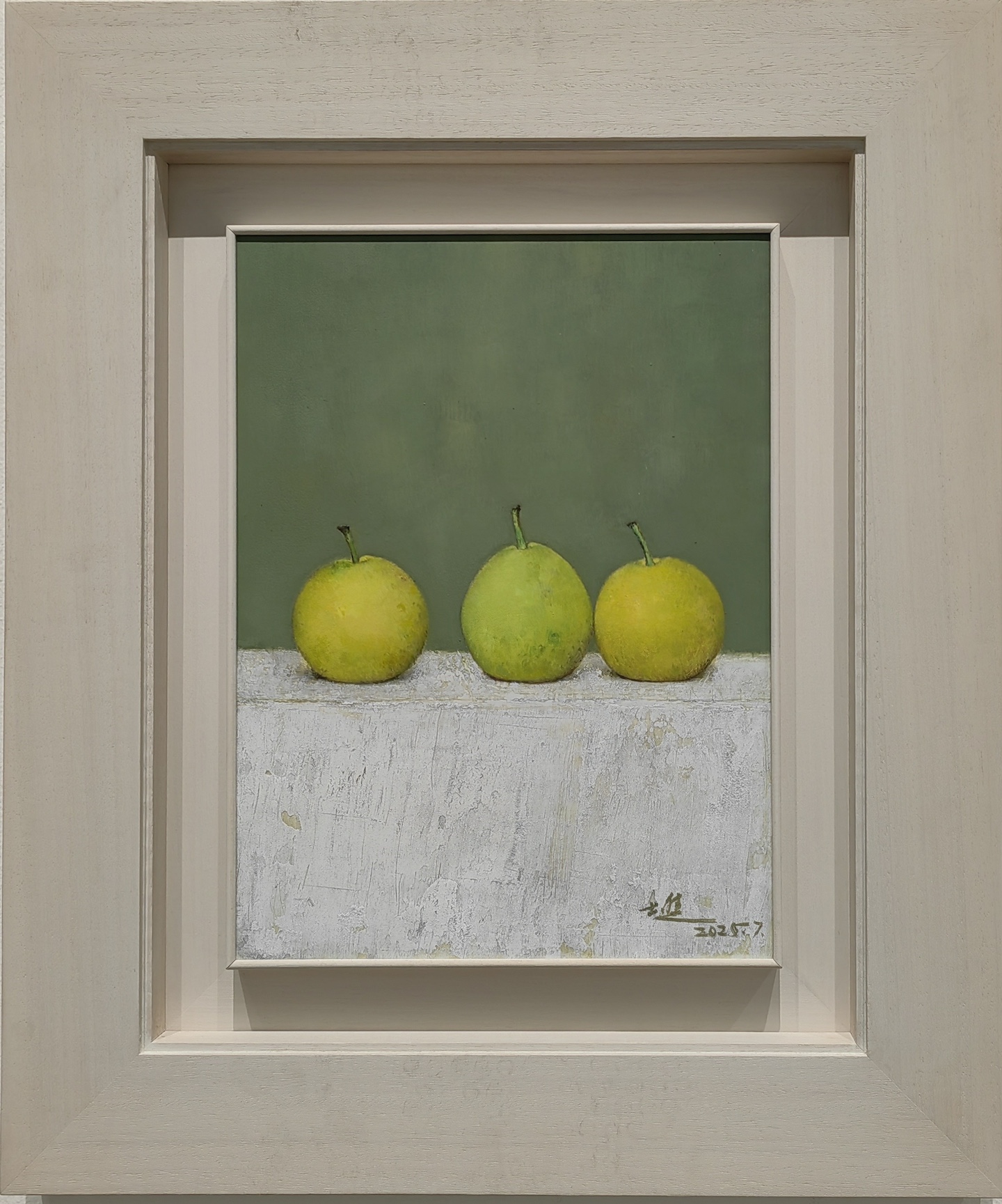
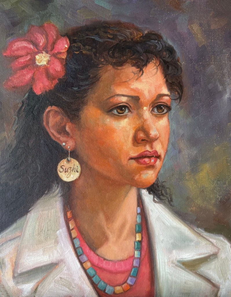
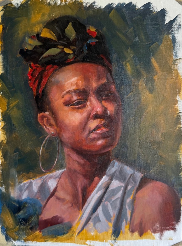
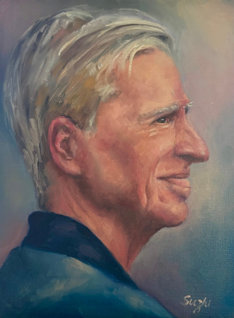
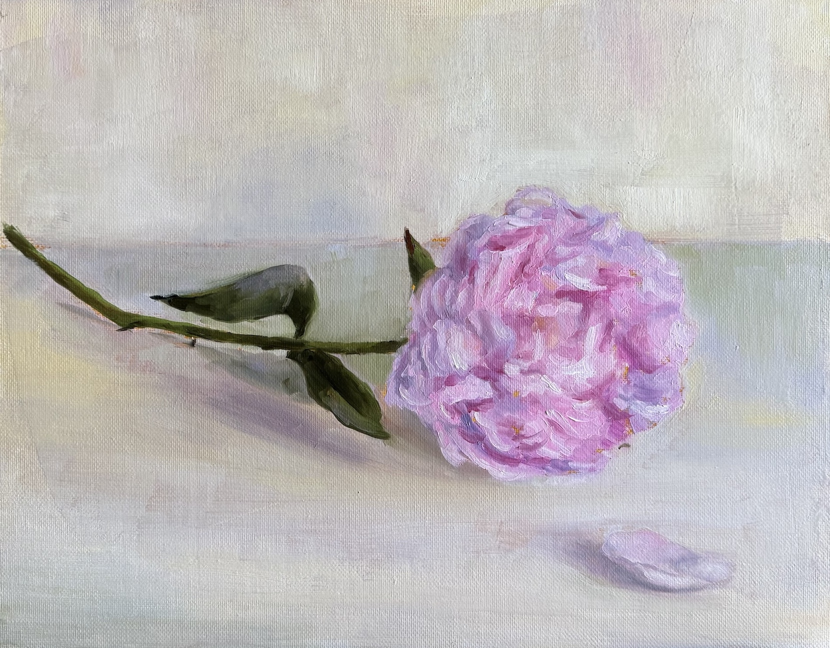
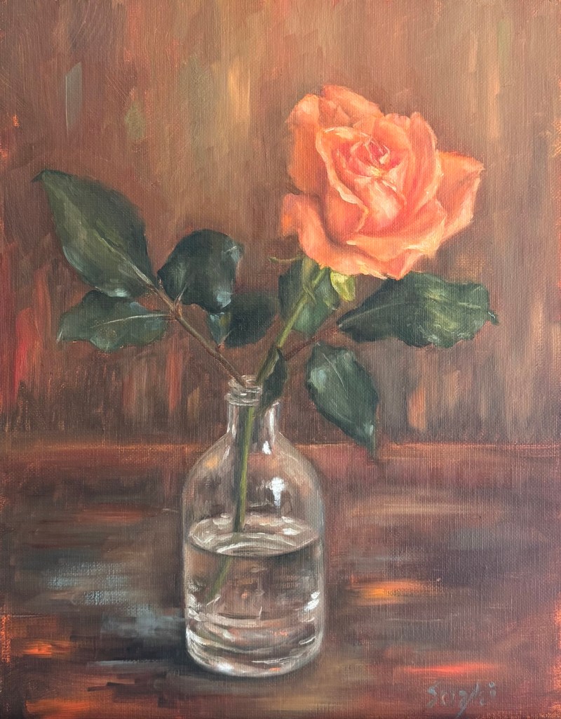
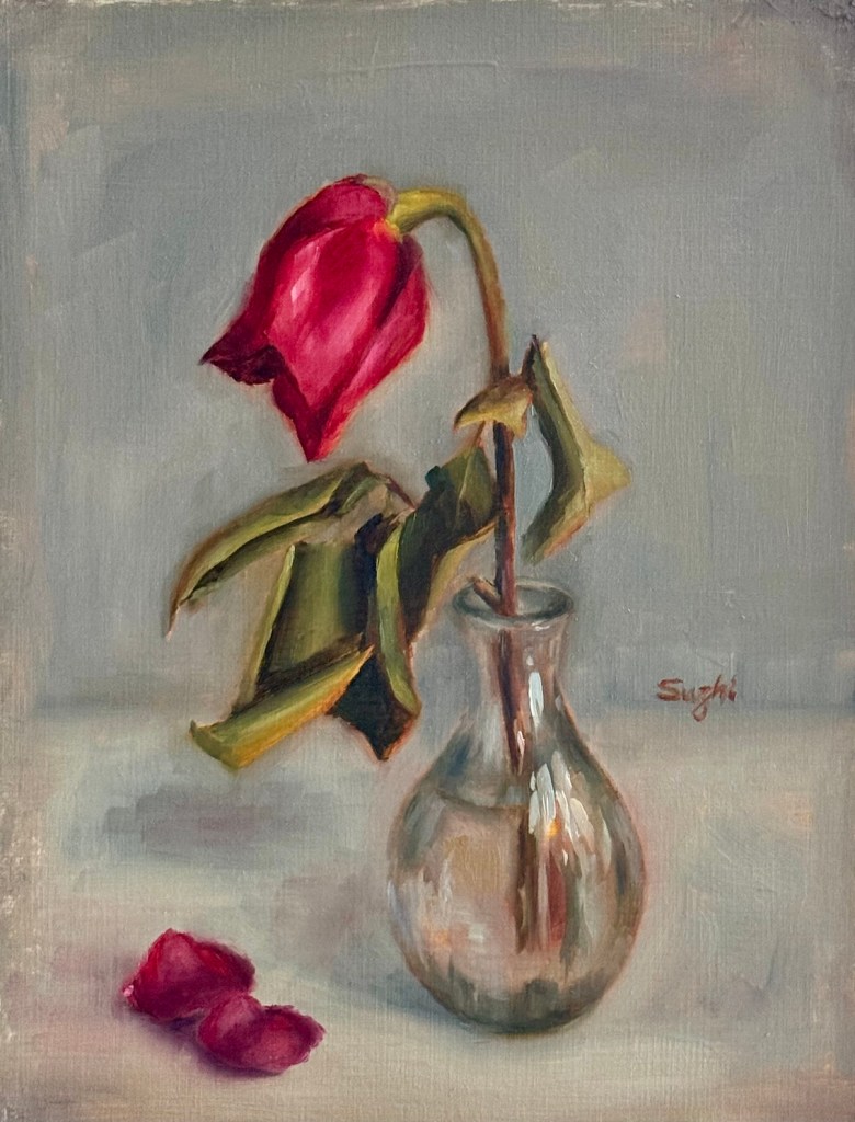
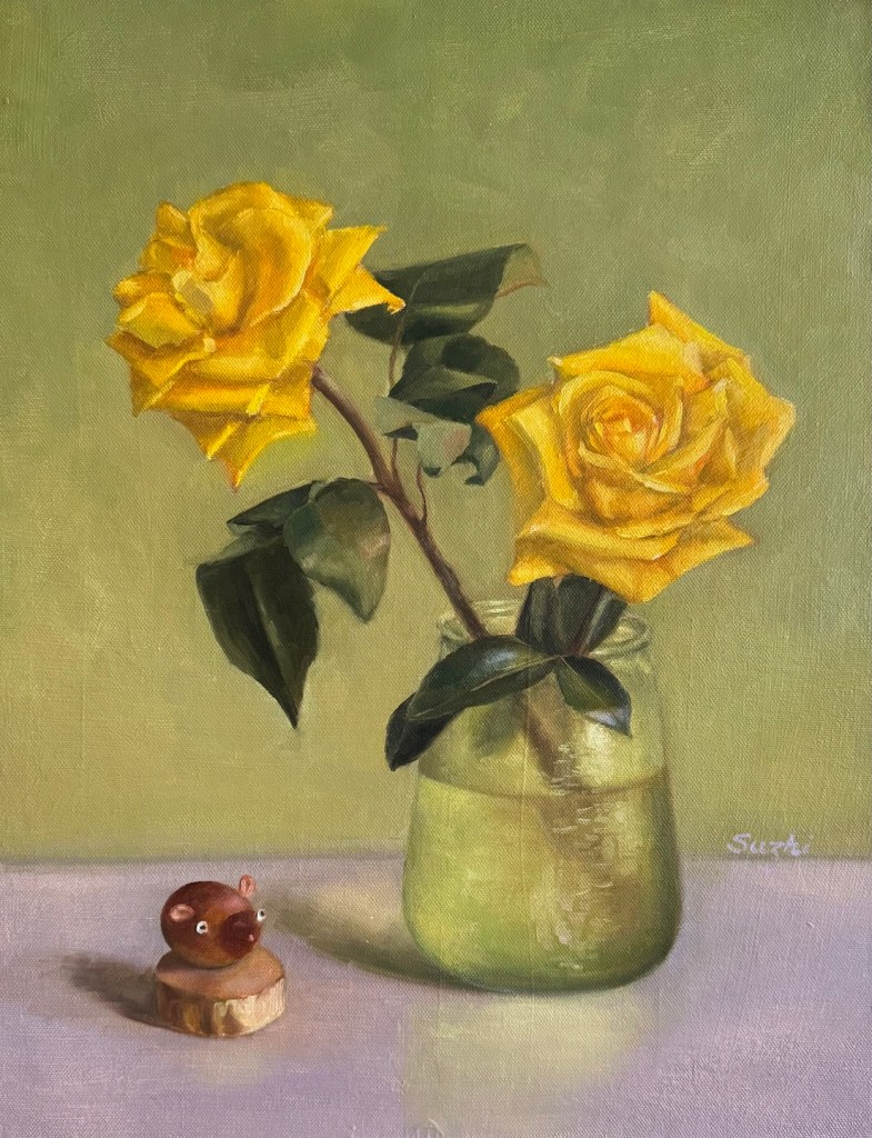
November had me on the other side of the globe again. This time I packed a couple of recent paintings to give as gifts for family. Lucky for me, framing in Beijing is much cheaper than in the States. I can afford to elevate my paintings a bit, which definitely makes the presentation better and adds to my confidence. Here are some of the paintings I gifted:

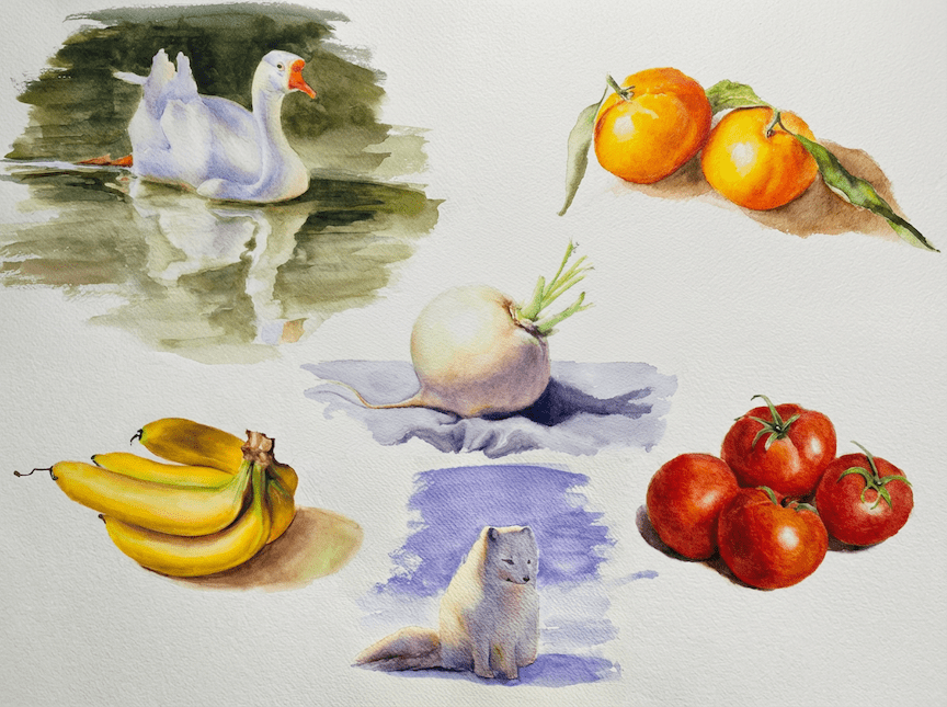
During my last long stay in Beijing, I decided to make the most of the situation by practicing watercolor. Oil wasn’t an option and watercolor stuff barely takes up any room. I am happy to report that I’ve actually stuck with the plan. My current goal in practice is trying to keep the colors clean. Small steps, but still moving forward.

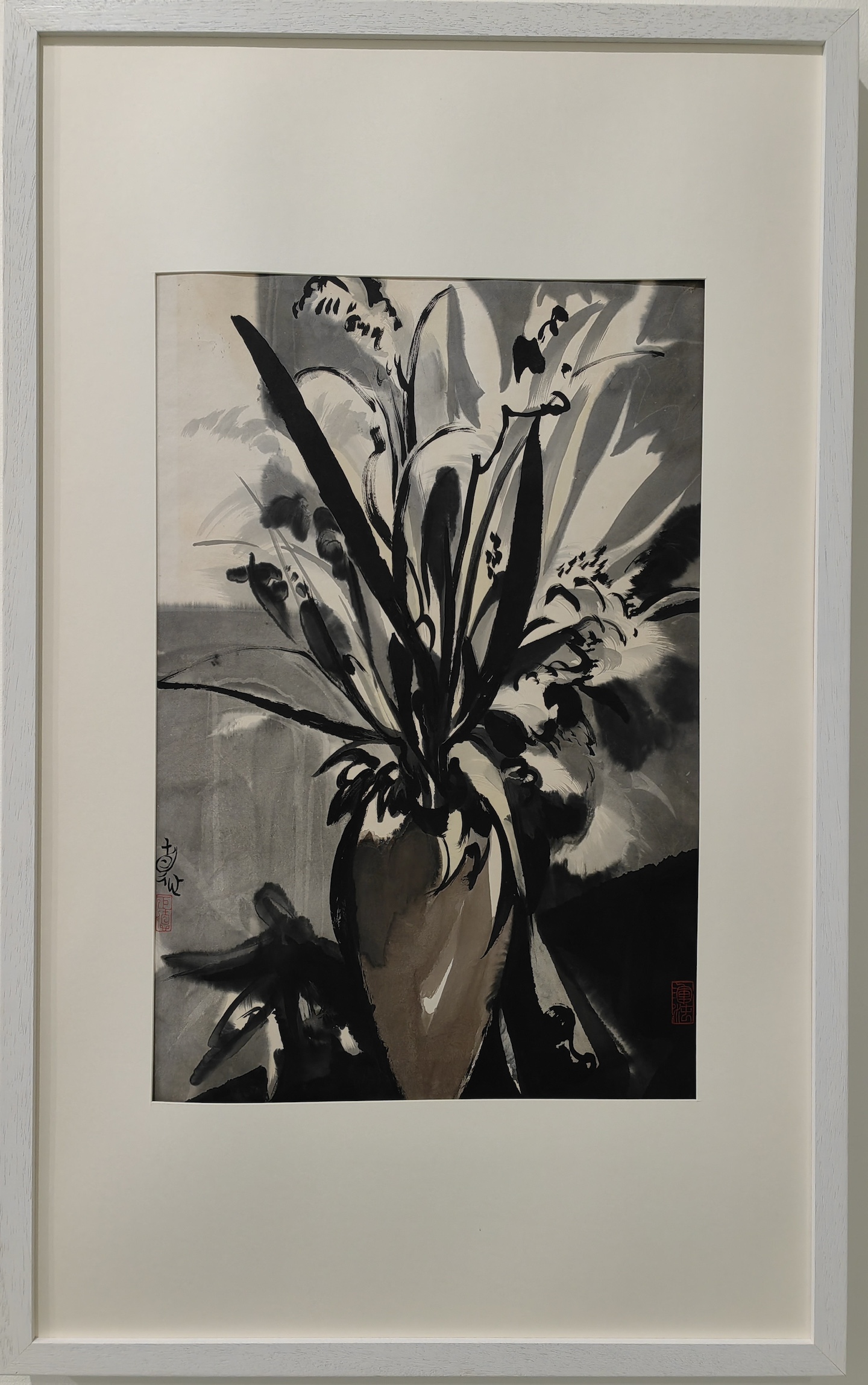
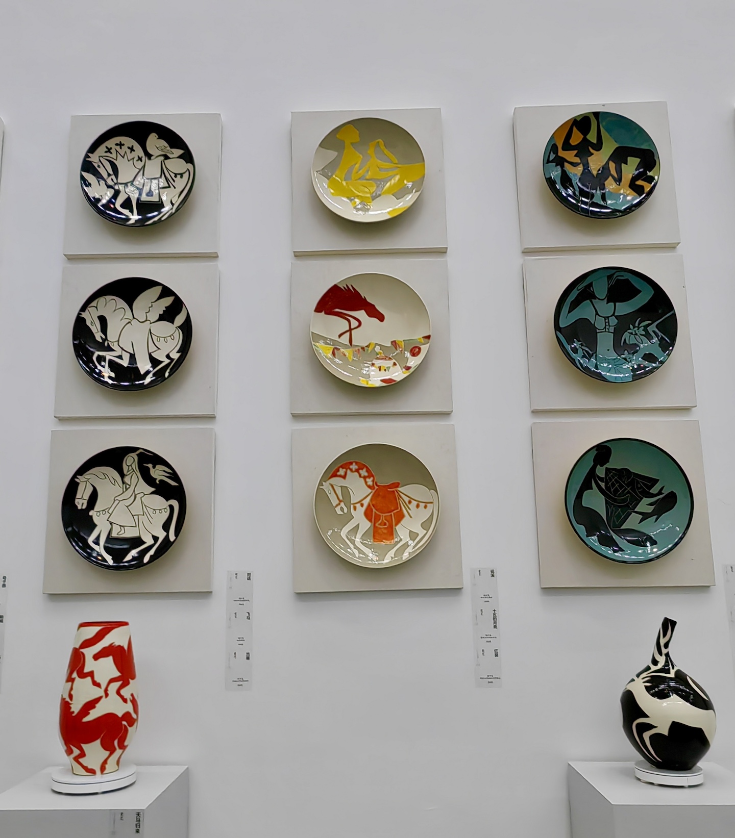
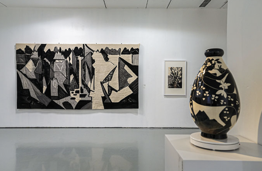
Gallery-wise, I saw Liu Jude’s 刘巨德 solo show at the Today Art Museum: Hearts Aflame for the Firmament. Liu studied at the Central Academy of Craft Art in 1965 and later worked under Pang Xunqin 庞薰琹 (1906 – 1985) in 1978, researching the comparison between traditional Chinese decorative art and Western modern art. He believes that painting should imitate the Tao that births all things: using the invisible Tao to paint visible objects, and using visible objects to paint the invisible Tao. His art isn’t constrained by the classification of genre or technique; he adheres to the traditions of Chinese decorative art but modernizes that formal beauty, making him unique in the Chinese art world. The exhibition featured over 200 new pieces by Liu and more than 100 ceramic debuts. Divided into “Ode to Peace” and “Ode to Hometown,” the show presented a kind of “chaotic beauty” and deep emotions for his roots.

In his artist statement, Liu mentioned: “Every time I paint, on the clean Xuan paper, I always put down thick black ink first, trying to occupy, grasp, and stabilize the whole space. As for what object that ink block, dot, or line represents, it is ambiguous, and I am not entirely clear. It is precisely this uncertain relationship of abstract points and lines that triggers me, pulling me to wander with it.”

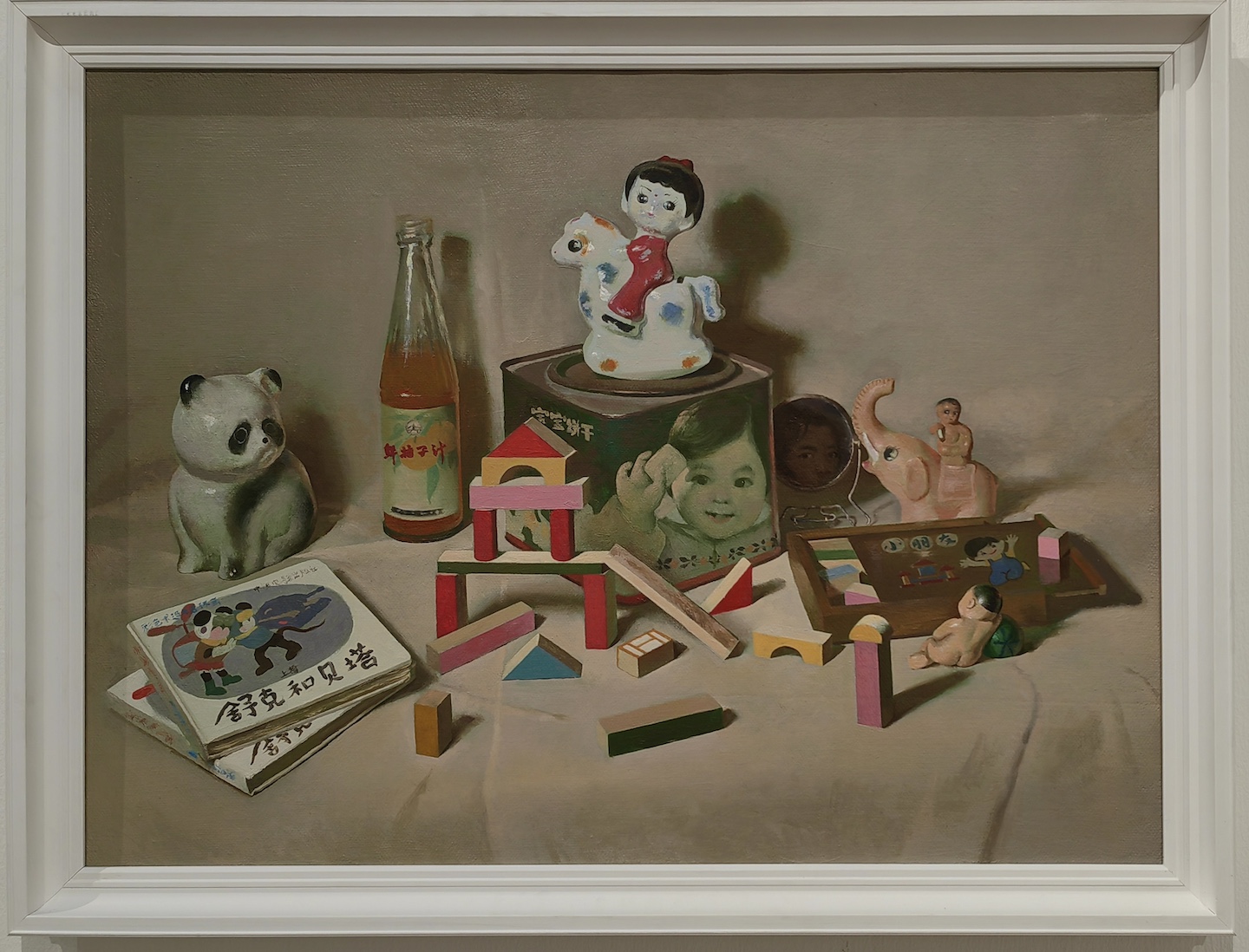
In comparison, the National Still Life Exhibition hosted by the Chinese Academy of Oil Painting felt … fine. Technically solid, just not particularly exciting.

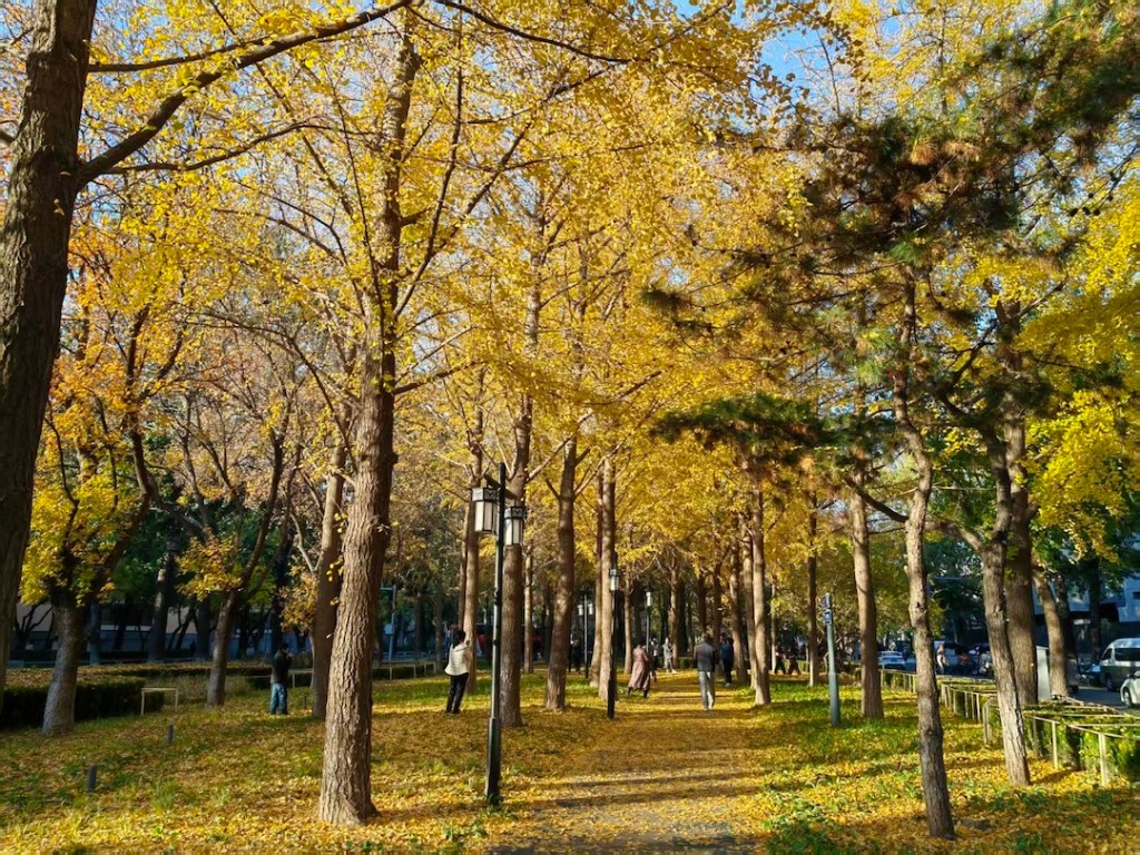
Finally, on one perfectly sunny mid-November day, I took this photo of a path covered in golden ginkgo leaves, a staple scene in Beijing’s autumn. Doubao, ByteDance’s (owner of TikTok) AI app, turned it into a watercolor painting. Love it or hate it, AI art will be a staple of the art world.

Experimenting with Portrait Creation

The freedom I enjoyed while painting the last sketch in August encouraged me to keep experimenting along the same path. I began September by completely abandoning human references. My logic was simple: if I didn’t have a photo to lean on, I could concentrate on artistic expression. Too often, when I started a portrait, I had ideas beyond likeness and accuracy, but as the work progressed, those ideas got lost in the pursuit of a “correct” painting.
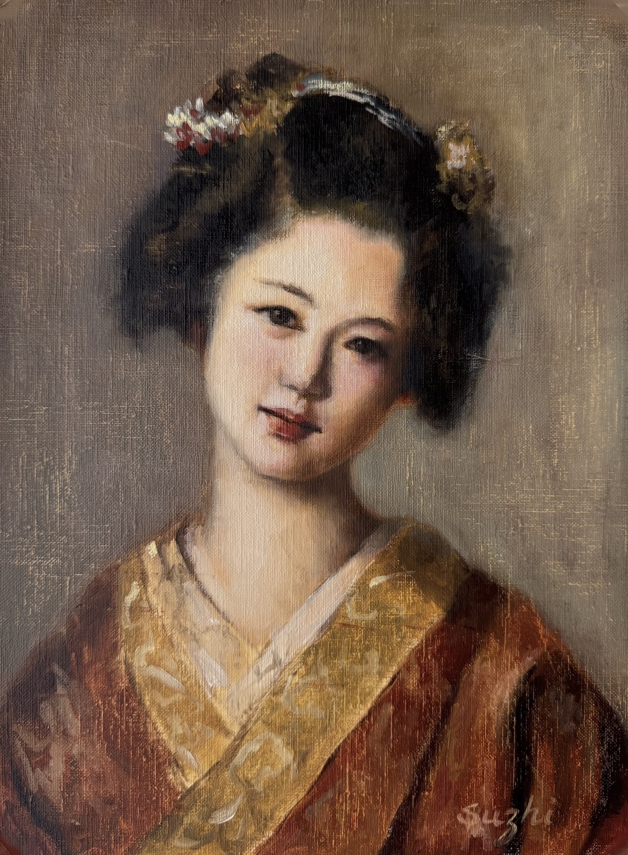
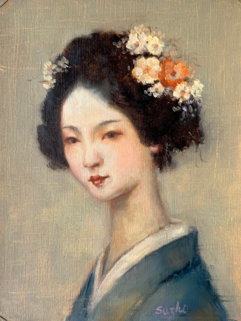
I began with two portraits of traditional Japanese women, aiming for an atmosphere of softness and antiquity. Next came two modern women, with a focus on expressiveness. Here are the paintings:

To some extent, I think I achieved what I set out to do—especially in the paintings of the modern women. Looseness has always been difficult for me when a photo sits in front of me. But these exercises also revealed a problem: without a reference to a real person, my “inventions” tend to drift toward the generic and idealized. If I kept going this way, the future paintings might all start looking alike.

So in the next piece, I returned to reworking an actual photo reference. While I liked the result, the painting tightened up compared to those done without references.

Then I tried something in between. I didn’t use a photo, but I did use a face I know very well. Instead of inventing features from scratch, I largely followed what I thought was me (with plenty of upgrades, of course). The result was also somewhere in between. It’s not as loose as the invented portraits, but more relaxed than those painted from a photo. And to be honest, I really like my new look.

One more thing delighted me in these experiments: I’ve been thinking and tried in recent years about returning watercolor (without abandoning oil). In some of these works, I managed—at least partly—to capture the fluidity of watercolor I’ve missed so much. It’s not perfect, but it’s got me excited to keep playing around.
Portrait Sketches +

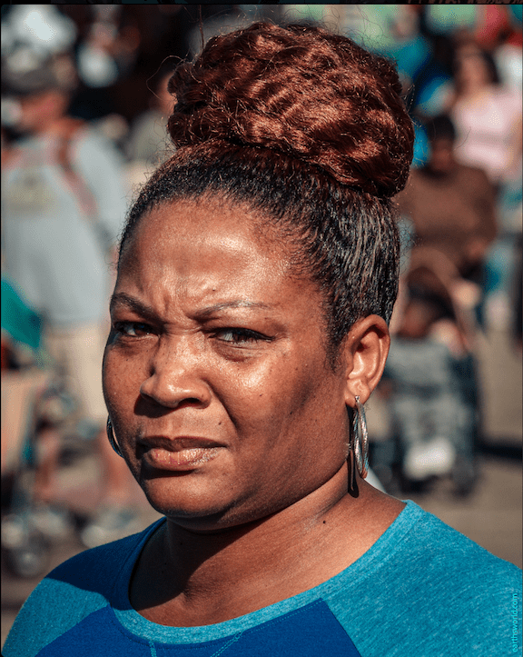
August was a busy month for everything except art. I only managed a few portrait sketches. It’s been a while since I focused on this genre, so for inspiration, I turned to my beloved photographer, Earthsworld, whose work I referenced in a small series called “Turquoise in Earth’s World.”

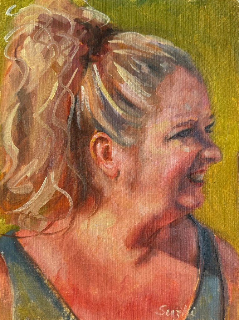
Unlike those turquoise painting, this time I spent at most 2 to 3 hours on each piece. I started every one with a Zorn palette, but sometimes deviated from it later on for convenience. Some sketches are on paper, others on canvas board. In most of them, I aimed for a resemblance to the reference, and only simplified the backgrounds or clothing patterns for aesthetics and to save time. The exception is the last one, where I attempted something creative – I used Earthsworld’s photo only as an inspiration to reinvent a character in my mind. As you can see, the neck area doesn’t make much sense anatomically, and if this becomes a full painting, I need to and will spend more time figuring it out. Enjoy:

The last one:

Petal Progress Continued

July kept the floral theme in my studio, with petals and my learning progressing. 

First up, I tried my hand at a peony. As I have mentioned before, Michael Klein is a big influence to me in the floral adventure, and peonies are featured in many of his creations. Those fluffy blooms look dreamy, but they’re a nightmare to paint and arrange. Petals were numerous and messy, dropping faster than I could arrange them in any manageable shape — whether in vase or on canvas. Soon I gave up my grand vision of a complex still life, and managed a simple single flower sketch.

Peony, oil on canvas board, 11 x 14, July 2025

To comfort myself afterwards, I moved back to roses, a familiar subject. I thought a Trompe l’oeil (French: deceive the eye) would make the painting of a single rose more challenging and fun. The idea was basically a hyper realistic painting. Getting the shadows and texture just right was trickier than I expected. My rose still looks like a painting. Here I have a better understanding of why people always say you don’t paint exactly what you see, even in a realistic painting. I used ambient room light in my setting, and the rose was largely in a unified color. To make it “pop”, I need to accentuate the value contrast, vary the saturation, and better define the edges. To make it look real, I need to invent the reality – how ironic! As you can see, I didn’t go through these steps. I am not entirely sure I have the skill to reach the final goal, and honestly, I like the painting as is now. Sometimes you call it done and move on.

Yellow Rose, oil on canvas board, 9 x 12, July 2025

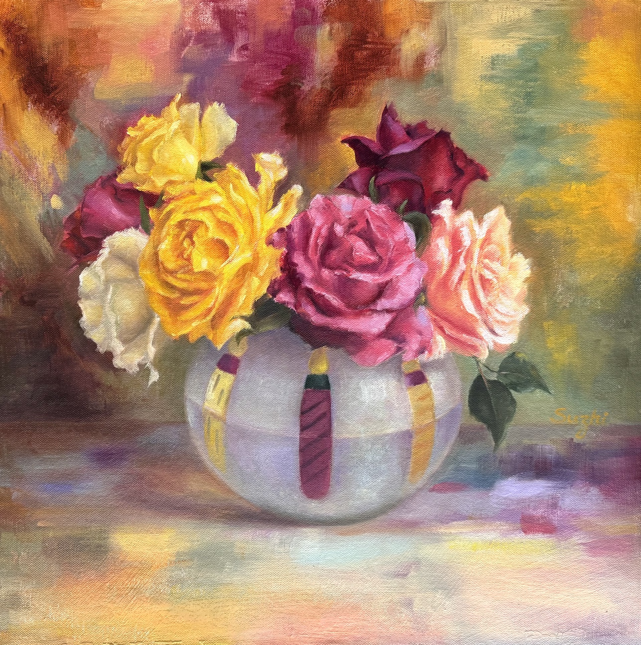
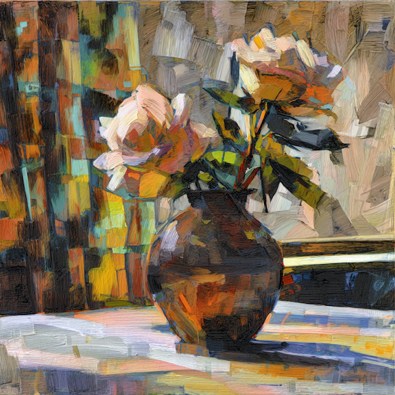
Next came a colorful bouquet, and my strong desire to paint something vibrant. In setting up the reference, my first thought was a dark, solid background for contrast. It worked, but it felt too safe. Leaning into the chaos, I draped a multicolored scarf behind the bouquet. I painted the scarf and surface in an abstract style, playing with saturation and value to keep things lively but balanced. 

Colorful, oil on canvas board, 18 x 18in, July 2025

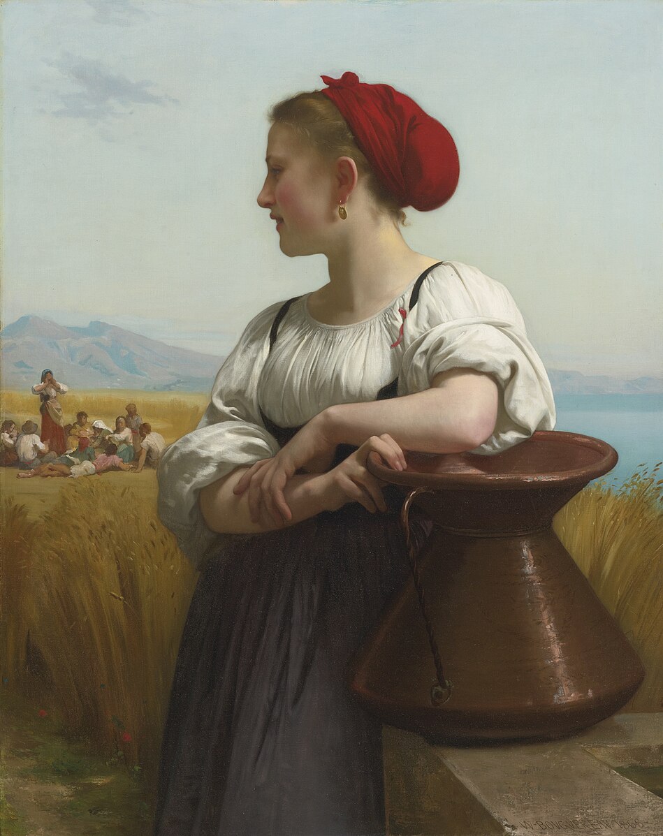
Between these floral adventures, I did a partial study of a Bouguereau painting. I’ve always admired his delicate and subtle handling of human faces, and this is also a study of handling backlighting. The softness is achieved through close value and gentle brushwork. When the entire face is away from light, the values are further condensed – something I still need to work on. I also painted a “selfie” as an alternate character—don’t ask. I was hoping for a Morandi-ish low-chroma tranquility… or, a quirky experiment in calm tones.

Selfie, oil on canvas board, 8×10 in, July 2025

Lastly, MidJourney has pushed out video generation in recent months, and now you can upload your own image for animation (see the painting for the first video here). Like these:

Don’t laugh. The bizarreness comes from my own skill issues – both in painting and in prompting. Look at the shadows in the second video, that wisdom wasn’t from me. There are millions of fantastic generative videos out there for us to see the potential of extending and alternating the life of our paintings. Always more things to experience and explore!

Petal Progress – An Abundance of Roses

Floral still life painting, though a major genre, never quite resonated with me. An early teacher once said that flowers were boring— it’s just petal after petal, repetitive work. The elaborate Dutch master bouquets, which I never loved, seemed to confirm his view. Over time, I discovered artists like Shirley Trevena, with her vibrant, stylized designs, and Richard Schmid, with his fresh, organic blooms. Their work—whether bold or subtle—was far from dull. My perspective began to shift.

While taking online courses at Watts Atelier, I followed Jeff Watts’ still life exercises (more here) and realized flowers are a great way to practice color mixing. I’ve created a few floral paintings with varying success (eg 1, eg 2), but even with the setup in front of me, I often relied too much on photos. Photos help capture the ever-changing shapes of the fresh flowers, but lose the subtle hues and shades in the petals, especially in shadow areas. Recently, I watched some videos of Michael Klein and Ashwini Bharathula painting, and their skillful, thoughtful process captivated me. There’s no tedious repetition; each stroke results from careful evaluation and beautiful execution. Inspired, I embraced florals and decided to focus on them for a while. I deliberately avoided taking photos of the setup this time to train my eyes. 

Here are my recent paintings:

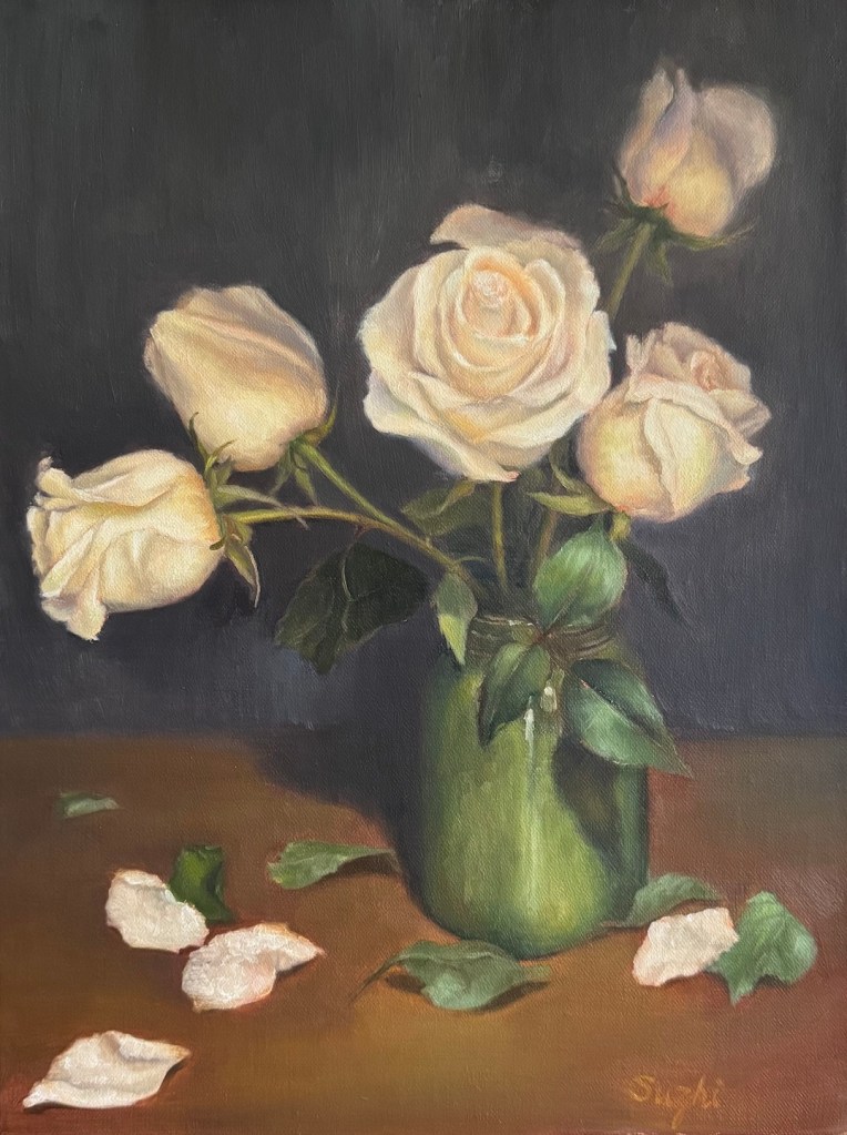
The two with whitish roses were the most challenging. Reflecting on it, white is such a difficult color—catching every bit of light—that I probably should’ve tackled it later with more experience. In the green vase painting, I struggled to make the flowers stand out. Up close, they look fine, but from afar, they’re flat. I had to darken the petal shadows more than I thought I saw to give them depth. The glass vase piece, with its scattered, broken petal pattern, was hard to unify. In the end, I leaned into the chaos, using short strokes to disrupt the background and table too, hoping this fragmented style would tie everything together.

Overwhelmed by the whites, I turned to a warm-colored flower next. The background in the setup had neutral tones and the lighting was plain daylight, but I warmed the surroundings up to match the flower’s glow.

The red rose bud painting brought me the most joy—a small piece I finished in one sitting. Aiming for a quick study, I used bold, decisive strokes to lay down contrasting color blocks. Pleased with the result, I carried this approach into the yellow roses painting, giving it a slightly stylized feel.

That’s my June wrapped up! With summer just beginning and flowers in full bloom, I’m excited to keep exploring.

The Making of a Still Life Painting in Times of AI and More

I don’t know what sparks the initial idea for a painting in other artists. For me, oftentimes, it has nothing to do with art. As someone genetically at high risk for diabetes, the only way I could justify buying a bag of cookies was to tell myself, “I’m going to use them in a painting!” 

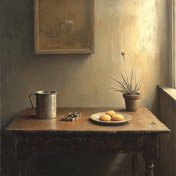
And so it began. Adding a few related items – a cookie cutter, a mug, a wooden table -I threw the ingredients into the AI pot of MidJourney. Among the results it generated, one caught my eyes. 

MidJourney v6.1

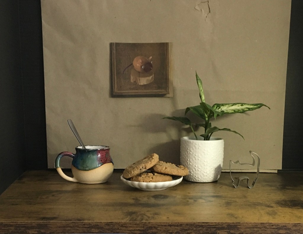
Using it as a guide, I set up my own reference: a small plate to hold the cookies, the new mug I just acquired from a craft show, and a potted plant I picked up from Home Depot. However, I didn’t care much about the background I devised. Why didn’t I just borrow MidJourney’s! I liked the idea of a painting hanging behind the objects, but I didn’t want it to feel generic. One of my cookie cutters was cat-shaped, so to add some fun, I featured a wooden mouse in the painting. The mouse is my zodiac sign, and the little wood carving was a gift from my daughter. This is how a still life became a self-portrait! 

Photo of my setup

When mixing reality with “fantasy,” lighting is the tricky part. I placed a light source on the right, but whether it replicated the effect in the AI-generated image is a question mark. Whether the lighting in the AI generation was accurate to begin with is an even bigger question mark. I decided to make the painting less about light and shadow!

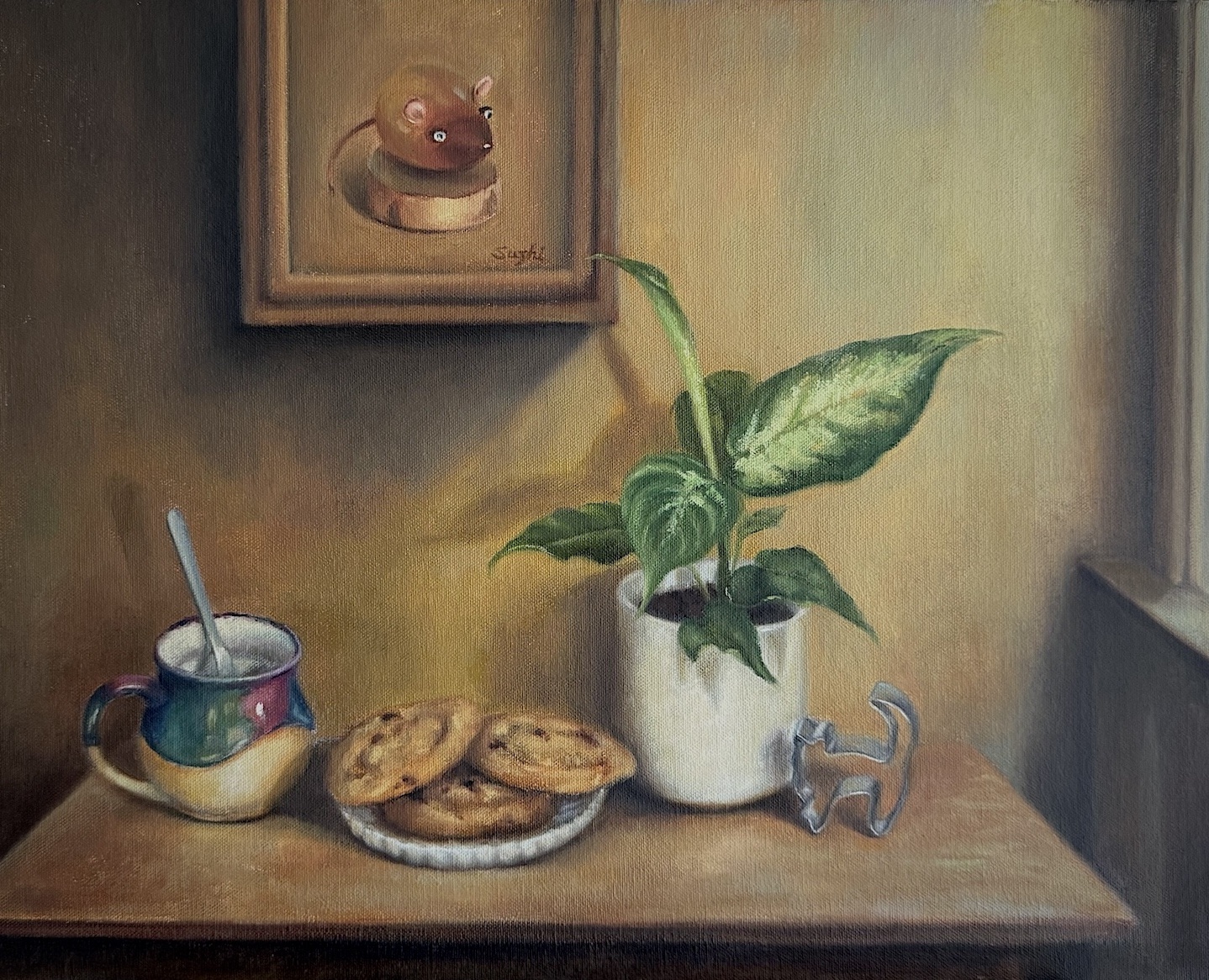
After the plant’s leaves grew bigger and shifted positions, and after the cookies were replaced several times, I finally completed the painting.

Cookies, oil on canvas, 14 x 18 in, April 2025

The cookies were actually durable enough, but how else could I nibble an entire bag away without guilt? Though the painting is not strictly realistic, its atmosphere and staging accurately reflects my mood during the process. The objects were dear to my heart and the whimsical dynamism is quintessentially me. I’m grateful to live in a time with more tools to find inspiration and support in creating art.

PS: 

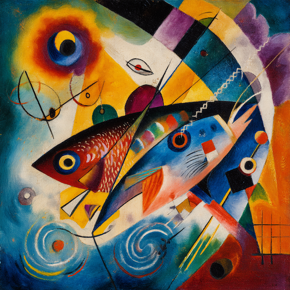
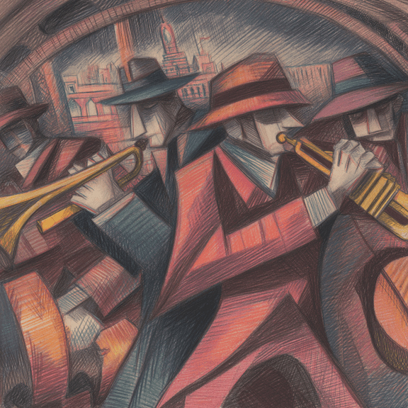
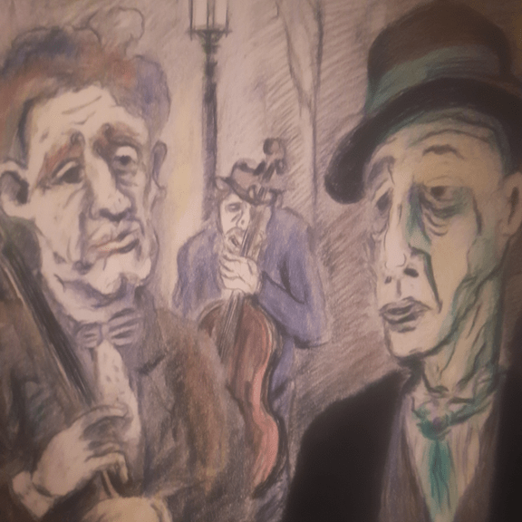
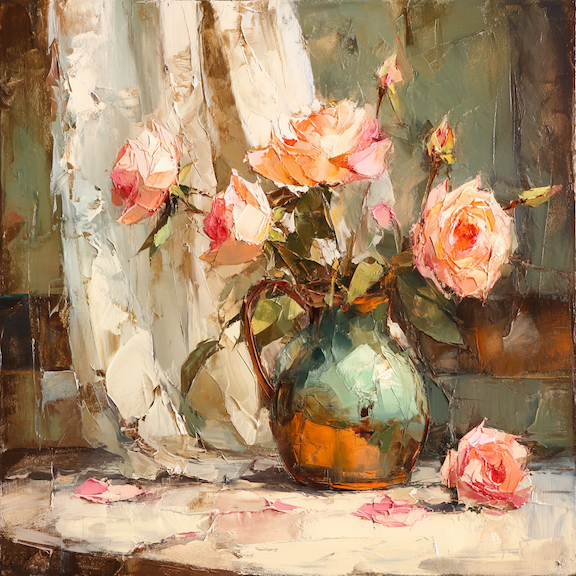
MidJourney has come a long way since I first used it, and I recently ran another comparison test by revisiting some old prompts. (Please see my first and second tests. )

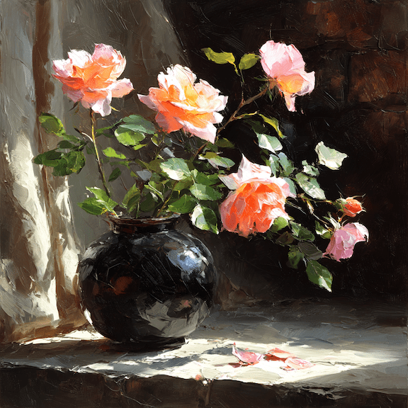
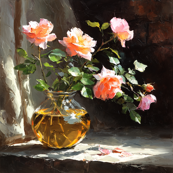
For “oil painting, still life, bronze vase, light pink roses, curtain, table, realism, expressive strokes, zorn palette,” now I got these:

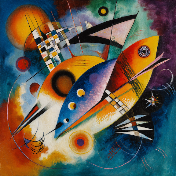
For “kandinsky with expressive bold strokes, fish, abstract colors:”

For “André Masson drawing, colored pencil, street musicians, metro, gloomy:”

This isn’t entirely a fair comparison because, as the model becomes more sophisticated, there are more ways to manipulate prompts for varied results. If you are willing to spend some time rating images, MidJourney builds a profile of your preferences, so the results start reflecting your taste, to some extent, regardless of the prompt.

with my profile added

You can also add style references to prompt for more control over the generated style:

You can even edit the result to your liking – not quite Photoshop yet, but the result can be wild. 

replaced the vase with a glass one using MidJourney Editor

What’s interesting is that, when comparing the Kandinsky and Masson results, it’s not always clear that the newer models are better.

The Making of a Selfie

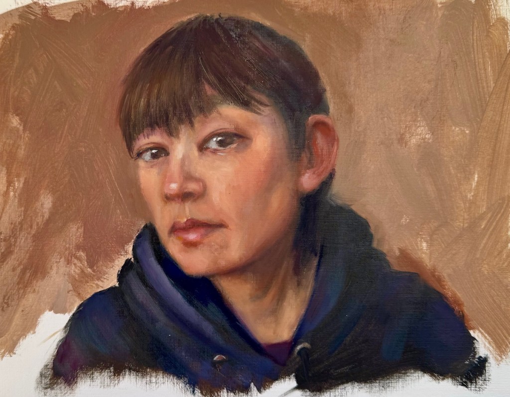
Two things have become a common practice for me. One: after a break from art making, I get back into the practice with some quick portrait sketches. Two: when I’m stumped for ideas, I turn the brush on myself and paint a self-portrait. Back in January, after a string of trips, I followed this pattern. I painted a series of head sketches. One of them was me – live model with a fresh hair cut, why not?

Each time I painted myself, the likeness never feels right, and limited by the using of a mirror, the expression and posture often come out stiff and uninspired. So, did this sketch have the potential to be developed into a real painting? What could I do to make it better and more engaging?

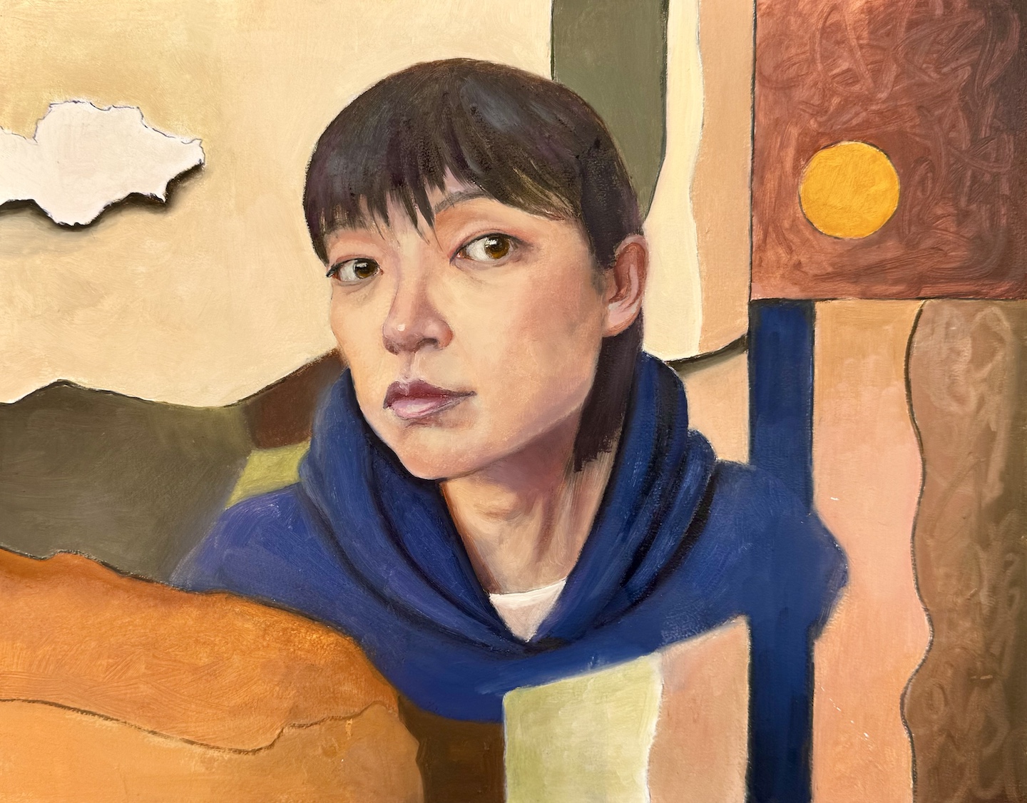
In a more serious attempt, I envisioned a flatter and more stylized approach. I picked warm tones close to my skin color for the background – partly for harmony, partly to pop against my blue hoodie. I used abstract shapes to balance the realistic face. To lean into the flat design, I outlined everything with a Sharpie first, and then filled in the colors, letting some of the black lines show through. The collage-like result is a step up from the sketch. I wanted the face to stay more stylized and almost blend into the fragmented background, but the more I worked on it the more it slid back into a standard realistic portrait. Eventually, I just stopped.

Me, oil on board, 11 x 14 in, Feb. 2025

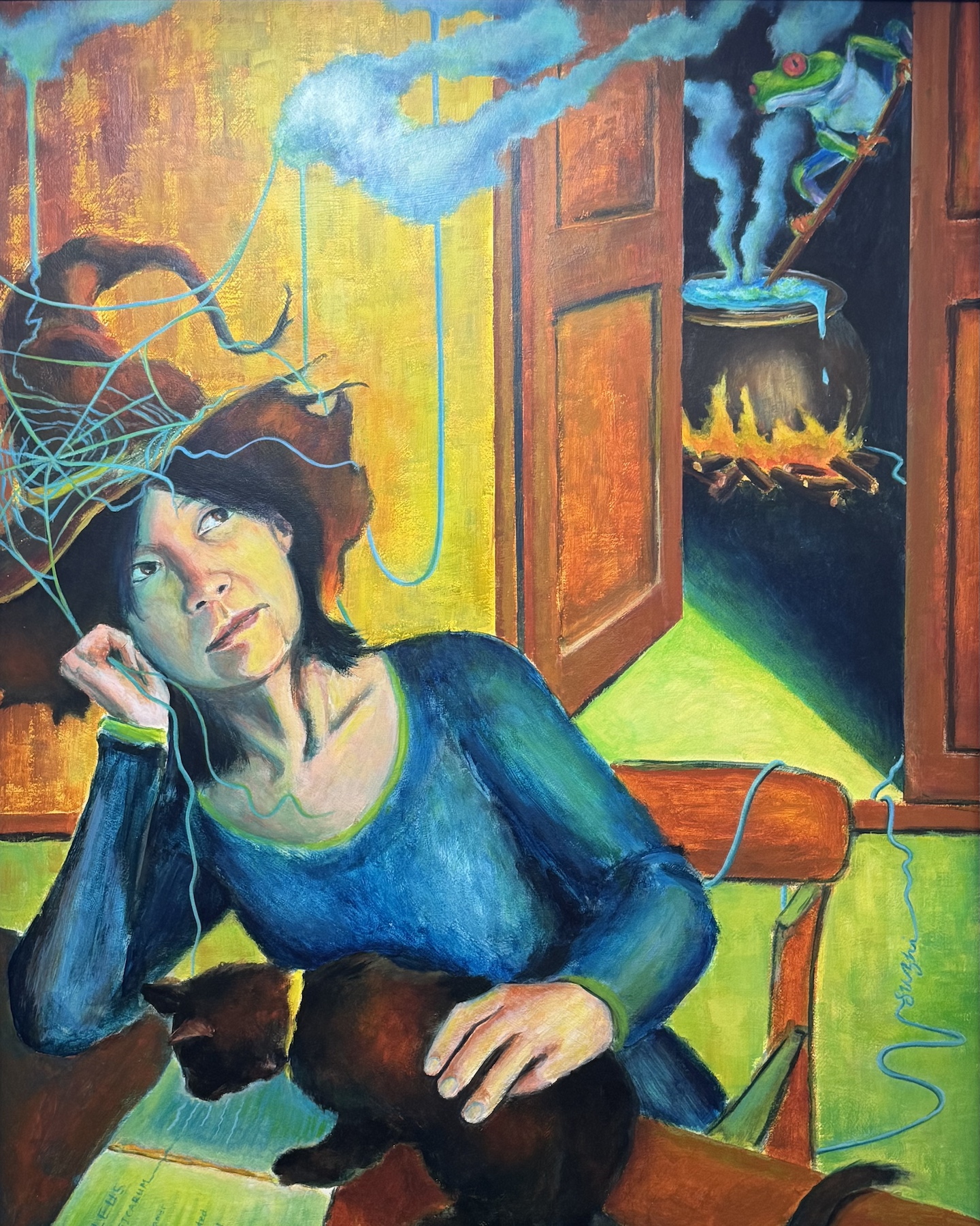
That got me thinking: Is aesthetic the only thing I could work on? What else could I do to make the painting a bit more meaningful? I recalled a self-portrait I did years ago in a class. The teacher told us to paint ourselves in a different role. I went with a witch – surrounded by classic witchy themes with my own spin: a frog brewing potions and a black cat reading the Malleus Maleficarum (often considered the first major anti-witchcraft document). While the painting was crude in execution, but dreaming it up and piecing it together was a blast.

Me, acrylic on board, 30 x 24i in, April 2020

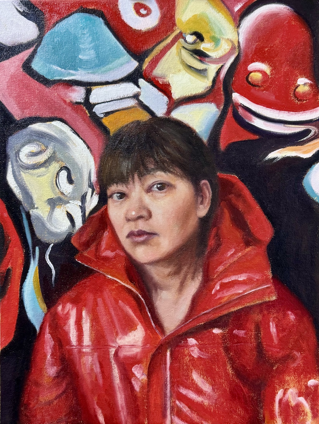
So why not give it some character? Pick a costume I’d never wear in real life (I’m a muted-hoodie kind of person), or visualize some thoughts I usually keep under wraps? I went for a bolder color and more dynamic palette. I still wanted the face to feel like part of the design, but this time, I let it be drowned by the unsettling shapes, vibrant colors and swirling energy. I kept the ideas of black outlines but used the paint instead of Sharpie this time, allowing more varied and expressive marks. That hint of punk—is it just wild imagination, or a quiet piece of me sneaking out?

Me, oil on canvas board, 12 x 16 in, March 2025

In retrospect, neither of my paintings addressed the likeness or posture issues that bothered me in the first place. In the process of further creation, they became irrelevant. Painting’s at its best when it’s a journey—when it’s messy, exploratory, and forces you to reckon with yourself.

Happy New Year! Still Life and Brushes

Between trips and holidays, I only managed a few small paintings, and here they are:

Turtle, oil on canvas, 12 x 16 in, Fall 2024
Bottle and Cups, oil on canvas board, 11 x 14, Fall 2024
Tea Time, oil on canvas board, 9 x 12, November 2024
Peaches, oil on paper, 9 x 12, Fall 2024

The turtle one shows my natural noisiness. I have doubts about the subjects all the way: I believe the arrangement works compositionally, but is it too manipulated? I also know I was sloppy with the flowers. Overall, however, there’s a delightful tone from the piece that makes me like it. I guess that’s my Happy Holidays!

With the bottle and the teapot ones, I was really going for a sense of tranquility and harmony. I hope I am at least close. The peaches one is about texture. I wanted to capture that fuzzy and velvety glow of both the fruit and the plastic bag. Did I? 

I have given up on washing my brushes with soap for a couple of years. Each time after painting, I clean my brushes with Gamsol, wipe them dry with a paper towel, dip them in a mixture of safflower oil and clover oil (98:2), and lie them flat in a tray with a cover. The recipe is from Draw Mix Paint. Ever since I adopted this method, I haven’t destroyed any brush yet. Since my last trip was a long one, before I left, I covered my brushes with the mixture, put them in a sealed palette box, and store the whole thing in the refrigerator. Two and a half months later, they are fresh and ready to go. Yay!

Happy 2025 and happy painting!

“He Makes the Distance Between All Things Disappear.”

[Note: The title is a quote from Spanish sculptor Francisco Baron’s preface to Car Li’s 1992 solo show in Spain.]

During my recent trip to China, I visited many exhibitions, and the works of one artist appeared in multiple shows, leaving a strong impression on me. He is Cao Li 曹力 (1954-), a professor of the Mural Department at the Central Academy of Fine Arts 中央美术学院. Cao Li has received traditional art training but does not carry the baggage of the academic style; in his work, he is unrestricted, and his imagination and artistic inspiration traverse ancient and modern, East and West. His themes range from reality to dreams, and his media include line drawing, watercolor, oil painting, wood carving, stone relief, etc.. His ability to move freely across different media reminds me of James Jean, though in terms of artistic expression, Cao Li is more mature and unrestrained. His works exhibit the absurdity of Dali, the seclusion of Klee, the alienating humor of Klimt, the multidimensional thinking of Picasso, the simplicity and innocence of Matisse, and the romantic imagination of Chagall. They also draw inspiration from traditional Chinese paintings, especially the murals of Dunhuang 敦煌, Yongle 永乐 Palace, and certain cave sculptures. 

In the artist’s own words, “Art knows no boundaries; it is the product of the soul, an expression of true feelings, the natural flow of life, a free flight. Nature itself is not art; only what flows through the filter of an artist’s soul can be called ‘art.’ It’s like the process of making wine: grains and grapes themselves do not intoxicate, but after brewing, impurities are removed, leaving the essence that can captivate and enchant people.”

Cao Li enjoys music, a recurring theme in his paintings. His lines, compositions, and colors move like melodies, possessing a lively rhythm. Influenced by his line drawings, his oil paintings almost always start with a planar structure of lines as the initial outline and main framework. He then enriches, thickens, and adds depth to the work through the organic organization of colors. He says, “I control the blocks of color, dots of color, color areas, and lines in the same way a composer arranges notes, tones, rhythms, and tempo. Once these ‘force points’ are placed in the right spots and combined in myriad ways, the disrupted calm space is reordered.”

One aspect that interests me when viewing works by Chinese artists is their effort to blend traditional Chinese art with Western painting. The design of figures and the use of color in Cao Li’s works have a distinctly national character. His ink paintings even introduce modernist traditions. His teacher, the renowned artist Yuan Yunsheng 袁运生 (1937-), has taken this fusion even further by applying Abstract Expressionism to ink painting. In the 798 Art District in Beijing, I was fortunate enough to see an exhibition of his works.

While visiting the Sichuan Fine Arts Institute 四川美术学院, I had the chance to view the “Chinese Painting MFA Invitational Exhibition 2000-2020.” These young artists originally studied Chinese painting, but now their works clearly show influences from oil painting, printmaking, and other art forms. Their use of media has also moved far beyond traditional paper and ink. They draw inspiration from the collision of diverse cultures, creating works that are more personal and profound. Unfortunately most of the artworks on display have glass cover, and makes it very difficult to photograph. I only captured a tiny portion of the treasures on display. 

Here are some paintings from one of my favorite artists from the show:

Amid all the talking about the “lying flat” culture in China, it is quite exciting to see the art scene there is lively and flourishing.

P.S. Unlike in America, most of the Chinese artists don’t maintain personal websites. Artron 雅昌 is platform where many artists post their works, but the level of accuracy and maintenance vary. You can find more works from Cao Li here: 作品

Master Studies and Some More

Charles-Joseph Natoire (1700-1777), a prominent French Rococo painter and draftsman, was celebrated for his decorative paintings, mythological scenes, and religious paintings. Natoire was one of the artists who helped popularize the use of pastels in the 18th century. He often employed delicate pinks, blues, and greens to create a light, airy atmosphere in his works. His paintings are characterized by their pastel hues, delicate brushwork, and a playful charm.

“Head of a Bacchante” (1741) is a fine example of his mastery in pastels. A bacchante, a female follower of Bacchus, the Roman god of wine, fertility, and theatrical performance, is often depicted in art as ecstatic or in states of divine possession.  Pastel allows for a softness and blendability not easily achieved with oil paints, making it ideal for capturing the delicate features and expressions of mythological figures.

I saw this painting at the Getty Center, where I was drawn to Natoire’s emphasis on grace, charm, and a certain lightness. The luminous quality of the skin tones, achieved through soft, atmospheric light, created a sense of intimacy and warmth. His fluid, graceful brushwork contributed to the overall elegance, and a well-controlled value range allows smooth transitions between forms.

In attempting a master copy, I focused on replicating the subtle value changes. I have a tendency of using high contrast and high saturation in my own portrait painting. I hope, by compress and control the two, I could achieve a softness and luminous effect that is missing in my works. While oil paint is not as ideal to achieve this goal as pastel, I figured I would still learn a lot by pushing it as far as I could. I started a bit too heavy handed, and later had to spend layer upon layer to lighten things up, and contract the range of values. The result still felt too defined in some places, lacking the ethereal quality of Natoire’s original. Some of the airiness of the original comes from Natoire’s dancing line work, which I don’t have the skill to imitate with a brush. While Natoire captured a goddess, I painted a mortal – a lovely one, I think. 

After Natoire, oil on canvas board, 9 x 12 in. August, 2024

Curious about modern interpretations, I requested a pastel painting of a bacchante from both Grok 2 and MidJourney 6.1. Grok gave me a photo-realistic beauty with a somewhat painterly background. It seems Grok doesn’t respond well to traditional medium. MidJourney, on the other hand, at least attempted to emulate ‘a painting.’ 

One can also twig the many perimeters MidJourney offers to achieve varied result: 

If I provide Natoire’s original as a prompt, MidJourney could fake a couple of masterpieces:

Me and my bots, we all had fun!