Category Archives: Paintings

The Making of a Selfie

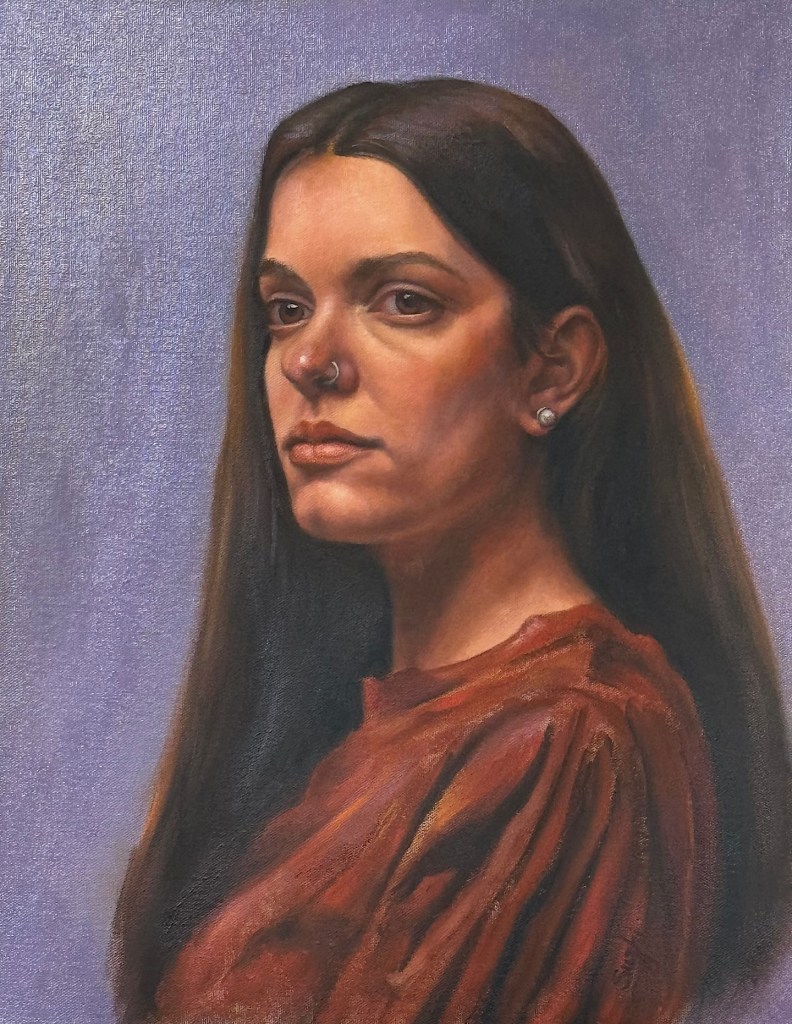
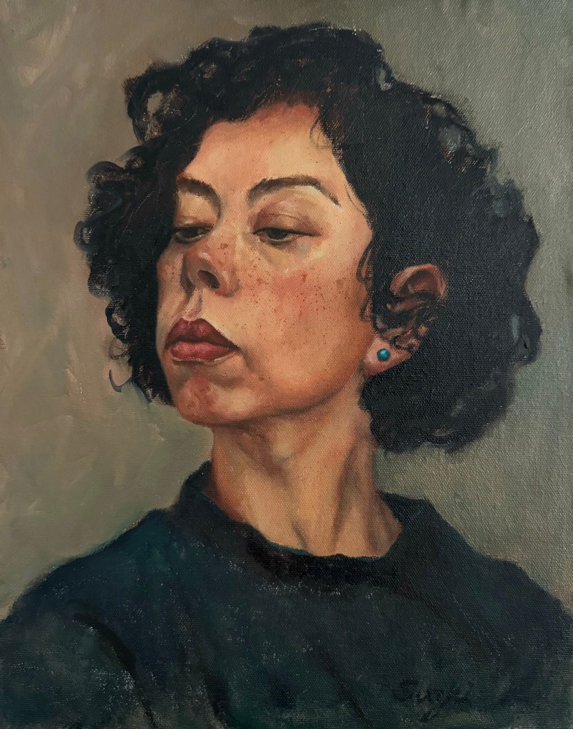
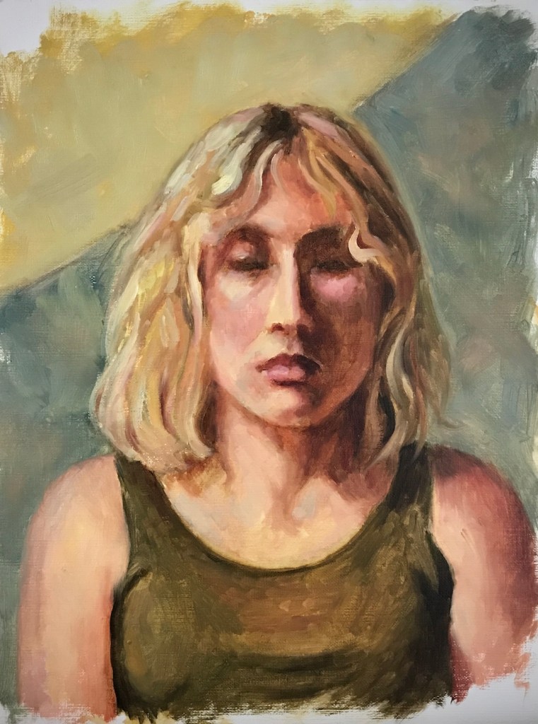
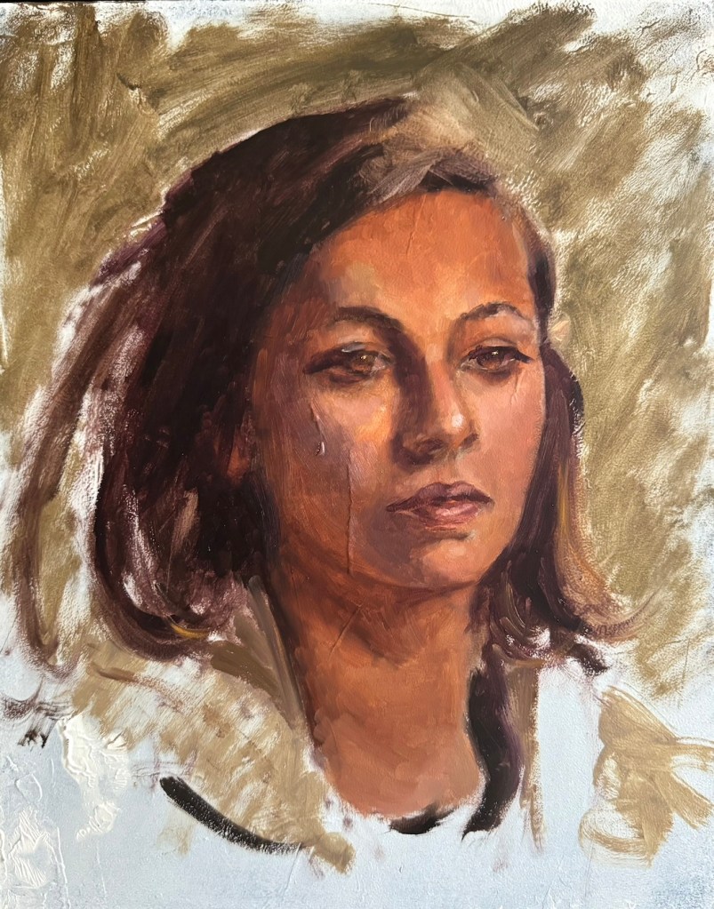
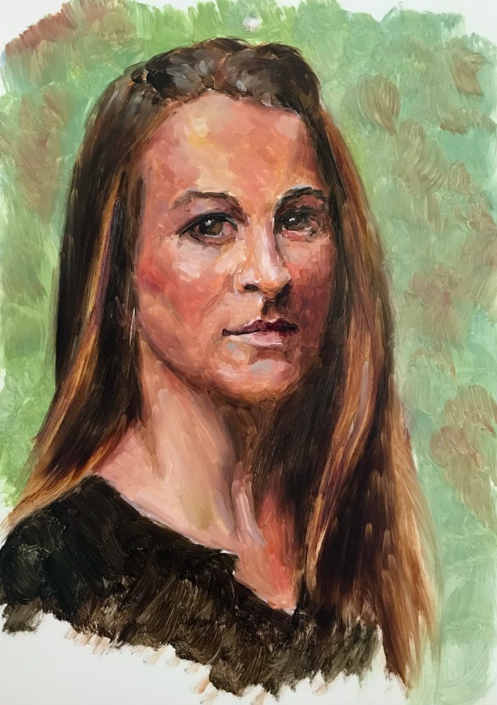
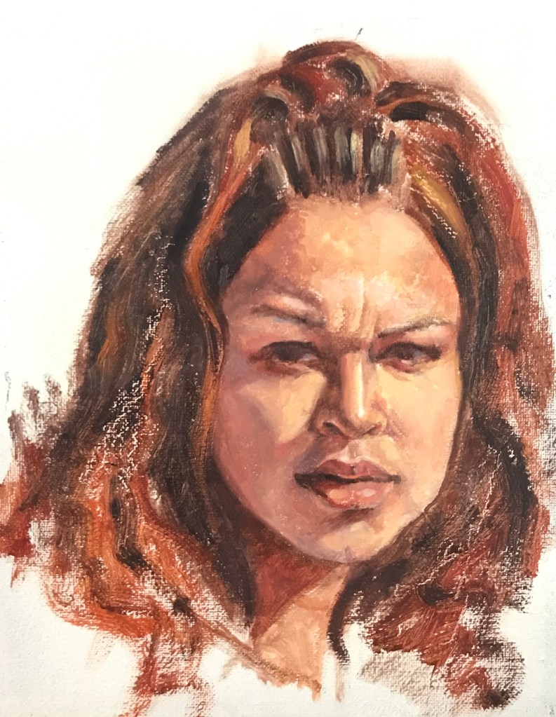
Two things have become a common practice for me. One: after a break from art making, I get back into the practice with some quick portrait sketches. Two: when I’m stumped for ideas, I turn the brush on myself and paint a self-portrait. Back in January, after a string of trips, I followed this pattern. I painted a series of head sketches. One of them was me – live model with a fresh hair cut, why not?

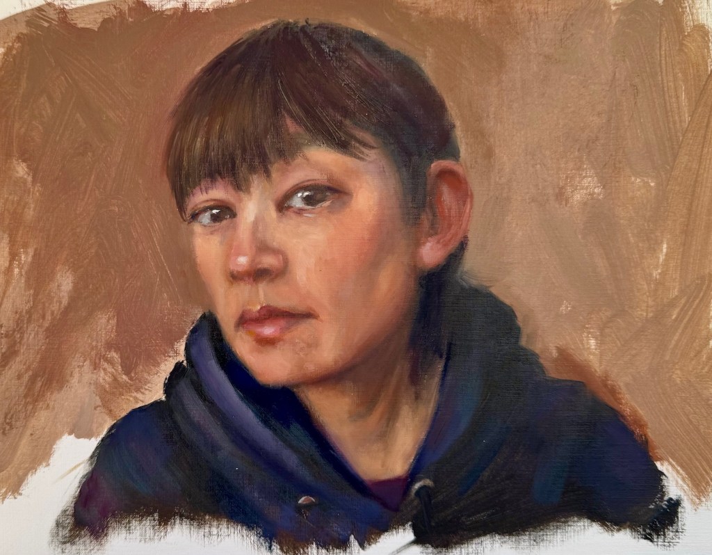
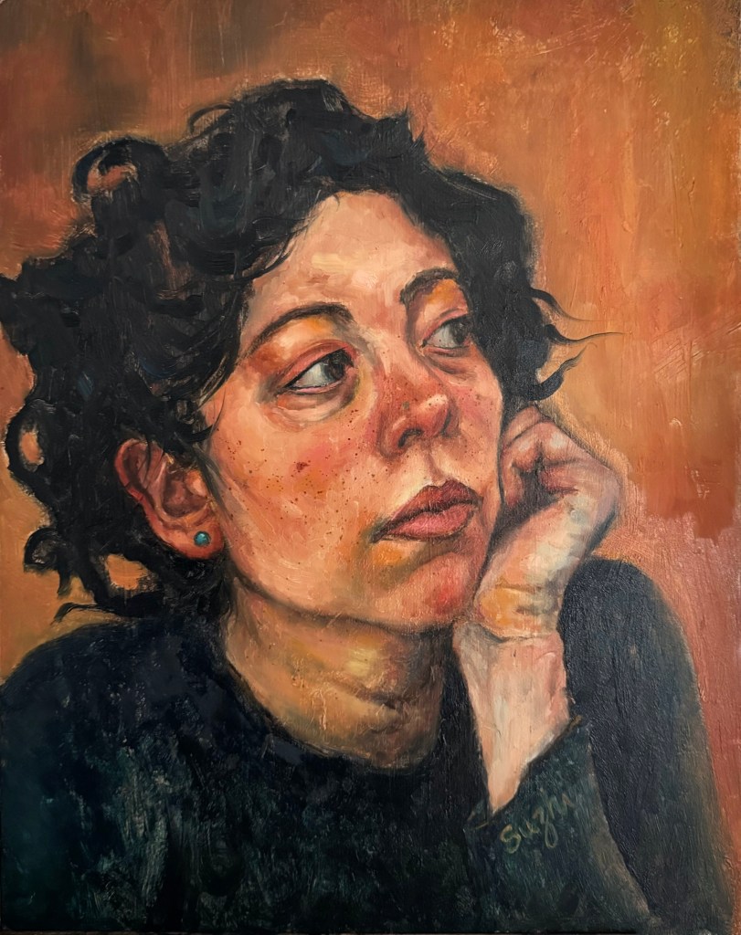
Each time I painted myself, the likeness never feels right, and limited by the using of a mirror, the expression and posture often come out stiff and uninspired. So, did this sketch have the potential to be developed into a real painting? What could I do to make it better and more engaging?

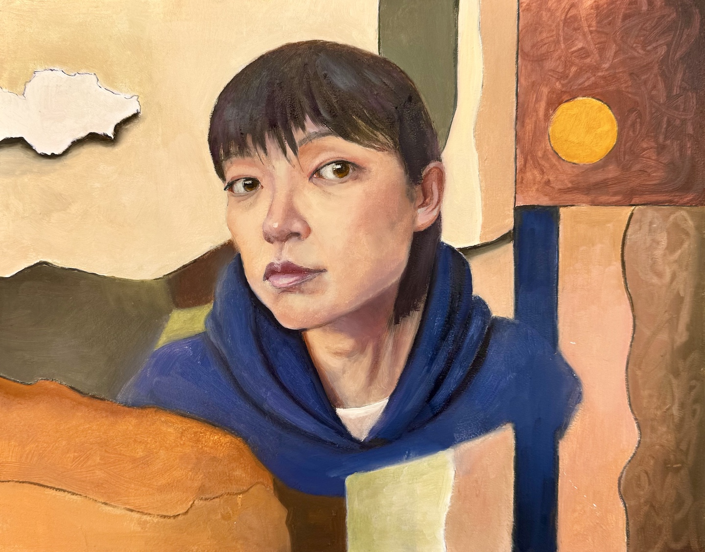
In a more serious attempt, I envisioned a flatter and more stylized approach. I picked warm tones close to my skin color for the background – partly for harmony, partly to pop against my blue hoodie. I used abstract shapes to balance the realistic face. To lean into the flat design, I outlined everything with a Sharpie first, and then filled in the colors, letting some of the black lines show through. The collage-like result is a step up from the sketch. I wanted the face to stay more stylized and almost blend into the fragmented background, but the more I worked on it the more it slid back into a standard realistic portrait. Eventually, I just stopped.

Me, oil on board, 11 x 14 in, Feb. 2025

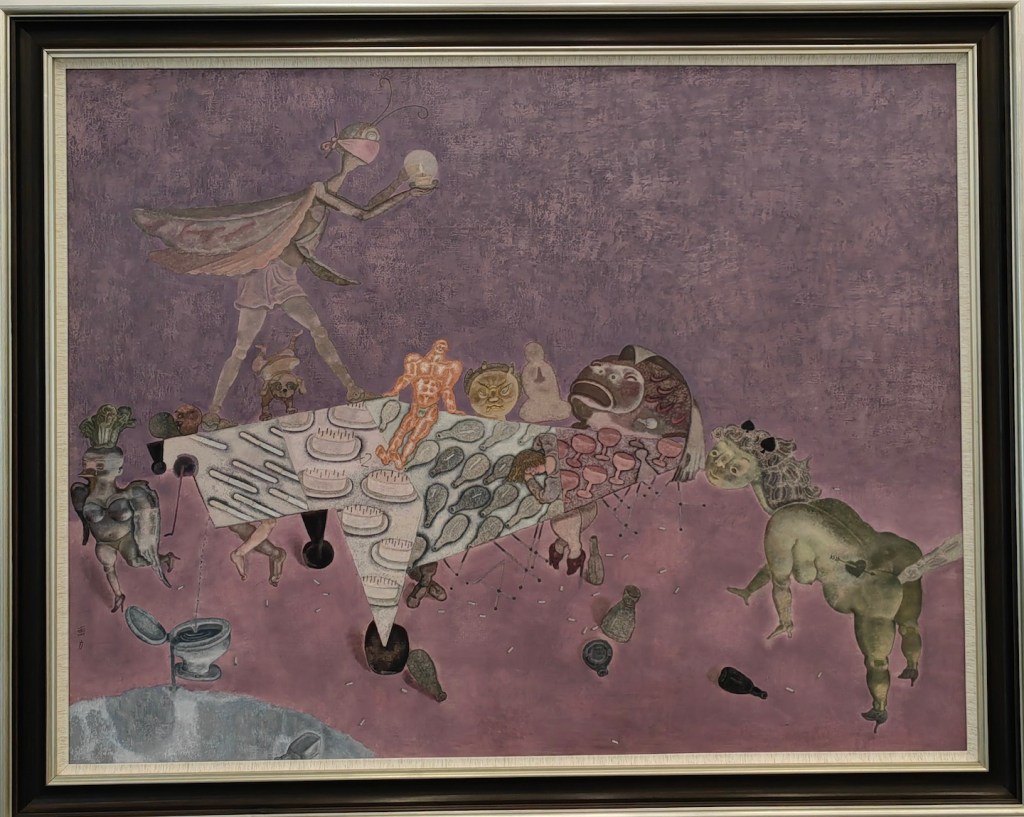
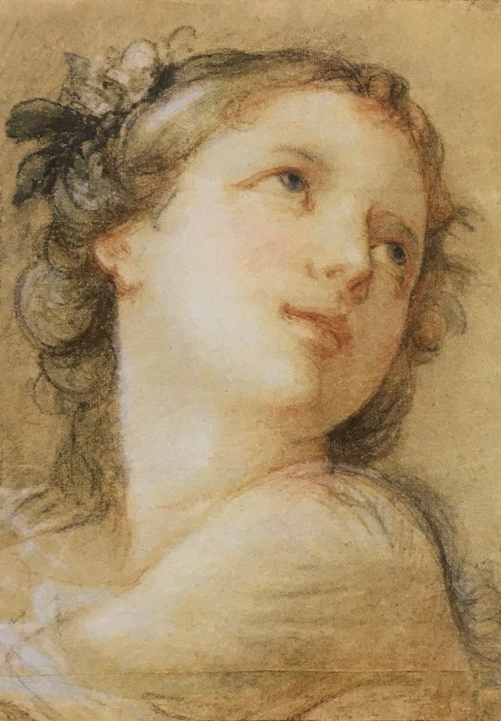
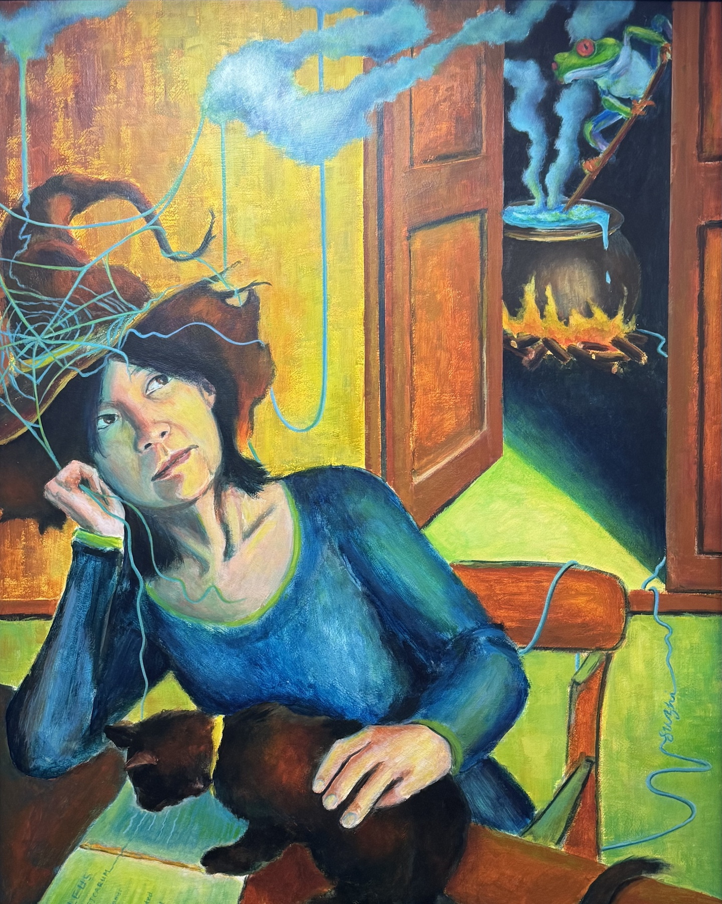
That got me thinking: Is aesthetic the only thing I could work on? What else could I do to make the painting a bit more meaningful? I recalled a self-portrait I did years ago in a class. The teacher told us to paint ourselves in a different role. I went with a witch – surrounded by classic witchy themes with my own spin: a frog brewing potions and a black cat reading the Malleus Maleficarum (often considered the first major anti-witchcraft document). While the painting was crude in execution, but dreaming it up and piecing it together was a blast.

Me, acrylic on board, 30 x 24i in, April 2020

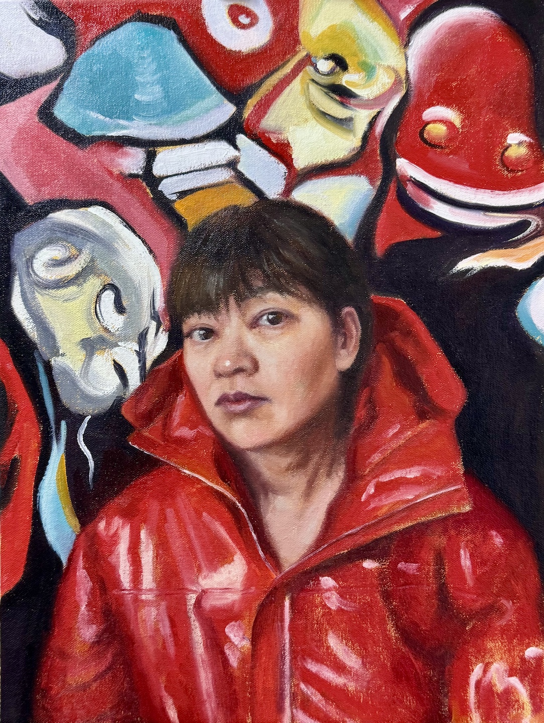
So why not give it some character? Pick a costume I’d never wear in real life (I’m a muted-hoodie kind of person), or visualize some thoughts I usually keep under wraps? I went for a bolder color and more dynamic palette. I still wanted the face to feel like part of the design, but this time, I let it be drowned by the unsettling shapes, vibrant colors and swirling energy. I kept the ideas of black outlines but used the paint instead of Sharpie this time, allowing more varied and expressive marks. That hint of punk—is it just wild imagination, or a quiet piece of me sneaking out?

Me, oil on canvas board, 12 x 16 in, March 2025

In retrospect, neither of my paintings addressed the likeness or posture issues that bothered me in the first place. In the process of further creation, they became irrelevant. Painting’s at its best when it’s a journey—when it’s messy, exploratory, and forces you to reckon with yourself.

Happy New Year! Still Life and Brushes

Between trips and holidays, I only managed a few small paintings, and here they are:

Turtle, oil on canvas, 12 x 16 in, Fall 2024
Bottle and Cups, oil on canvas board, 11 x 14, Fall 2024
Tea Time, oil on canvas board, 9 x 12, November 2024
Peaches, oil on paper, 9 x 12, Fall 2024

The turtle one shows my natural noisiness. I have doubts about the subjects all the way: I believe the arrangement works compositionally, but is it too manipulated? I also know I was sloppy with the flowers. Overall, however, there’s a delightful tone from the piece that makes me like it. I guess that’s my Happy Holidays!

With the bottle and the teapot ones, I was really going for a sense of tranquility and harmony. I hope I am at least close. The peaches one is about texture. I wanted to capture that fuzzy and velvety glow of both the fruit and the plastic bag. Did I? 

I have given up on washing my brushes with soap for a couple of years. Each time after painting, I clean my brushes with Gamsol, wipe them dry with a paper towel, dip them in a mixture of safflower oil and clover oil (98:2), and lie them flat in a tray with a cover. The recipe is from Draw Mix Paint. Ever since I adopted this method, I haven’t destroyed any brush yet. Since my last trip was a long one, before I left, I covered my brushes with the mixture, put them in a sealed palette box, and store the whole thing in the refrigerator. Two and a half months later, they are fresh and ready to go. Yay!

Happy 2025 and happy painting!

“He Makes the Distance Between All Things Disappear.”

[Note: The title is a quote from Spanish sculptor Francisco Baron’s preface to Car Li’s 1992 solo show in Spain.]

During my recent trip to China, I visited many exhibitions, and the works of one artist appeared in multiple shows, leaving a strong impression on me. He is Cao Li 曹力 (1954-), a professor of the Mural Department at the Central Academy of Fine Arts 中央美术学院. Cao Li has received traditional art training but does not carry the baggage of the academic style; in his work, he is unrestricted, and his imagination and artistic inspiration traverse ancient and modern, East and West. His themes range from reality to dreams, and his media include line drawing, watercolor, oil painting, wood carving, stone relief, etc.. His ability to move freely across different media reminds me of James Jean, though in terms of artistic expression, Cao Li is more mature and unrestrained. His works exhibit the absurdity of Dali, the seclusion of Klee, the alienating humor of Klimt, the multidimensional thinking of Picasso, the simplicity and innocence of Matisse, and the romantic imagination of Chagall. They also draw inspiration from traditional Chinese paintings, especially the murals of Dunhuang 敦煌, Yongle 永乐 Palace, and certain cave sculptures. 

In the artist’s own words, “Art knows no boundaries; it is the product of the soul, an expression of true feelings, the natural flow of life, a free flight. Nature itself is not art; only what flows through the filter of an artist’s soul can be called ‘art.’ It’s like the process of making wine: grains and grapes themselves do not intoxicate, but after brewing, impurities are removed, leaving the essence that can captivate and enchant people.”

Cao Li enjoys music, a recurring theme in his paintings. His lines, compositions, and colors move like melodies, possessing a lively rhythm. Influenced by his line drawings, his oil paintings almost always start with a planar structure of lines as the initial outline and main framework. He then enriches, thickens, and adds depth to the work through the organic organization of colors. He says, “I control the blocks of color, dots of color, color areas, and lines in the same way a composer arranges notes, tones, rhythms, and tempo. Once these ‘force points’ are placed in the right spots and combined in myriad ways, the disrupted calm space is reordered.”

One aspect that interests me when viewing works by Chinese artists is their effort to blend traditional Chinese art with Western painting. The design of figures and the use of color in Cao Li’s works have a distinctly national character. His ink paintings even introduce modernist traditions. His teacher, the renowned artist Yuan Yunsheng 袁运生 (1937-), has taken this fusion even further by applying Abstract Expressionism to ink painting. In the 798 Art District in Beijing, I was fortunate enough to see an exhibition of his works.

While visiting the Sichuan Fine Arts Institute 四川美术学院, I had the chance to view the “Chinese Painting MFA Invitational Exhibition 2000-2020.” These young artists originally studied Chinese painting, but now their works clearly show influences from oil painting, printmaking, and other art forms. Their use of media has also moved far beyond traditional paper and ink. They draw inspiration from the collision of diverse cultures, creating works that are more personal and profound. Unfortunately most of the artworks on display have glass cover, and makes it very difficult to photograph. I only captured a tiny portion of the treasures on display. 

Here are some paintings from one of my favorite artists from the show:

Amid all the talking about the “lying flat” culture in China, it is quite exciting to see the art scene there is lively and flourishing.

P.S. Unlike in America, most of the Chinese artists don’t maintain personal websites. Artron 雅昌 is platform where many artists post their works, but the level of accuracy and maintenance vary. You can find more works from Cao Li here: 作品

Happy Halloween and the Forgotten Watercolor

Nothing spooky here, just an old pumpkin! I can’t recall when I did this, maybe 10 years ago, when I could still feel the “water” in watercolor. Time flies!

Pumpkin, watercolor on paper, 9 x 12, 2015

In the past, when I travelled, even with those lengthy stays abroad, I didn’t do any art. These past months when I stayed in China, inspired by all the art shows I attended (I will talk about these more in the future), I thought I should have kept things going. Oil being too troublesome, I managed to find watercolor paper and paint. My intention was to do some quick sketches or simple paintings, and these are what I’ve done:

Tea-set, watercolor on paper, 9 x 12, Sept. 2024
Fruit plate, watercolor on paper, 9 x 12, Oct. 2024

I found myself using watercolor the same way I use oil paint – controlled and layered. Despite their tight look, I didn’t spend that much time on each of these pieces, mainly because I gave up. I could have fine-tuned a lot more details, further emphasized the shadows and highlights, etc., but that was not what I set out to do. I missed the singing and dancing of colors in water.

In a way, the old pumpkin painting was not finished either, and the values probably don’t make sense. However, it was fun, and in my mind, it was what watercolor is supposed to be. 

I am not upset though. I haven’t practiced watercolor for a while so a bit lack of touch is fair game. I like my compositions and color choices, and that’s something. Most importantly, I didn’t let the trip completely cut off my art practice, and that’s quite a step forward!

Master Studies and Some More

Charles-Joseph Natoire (1700-1777), a prominent French Rococo painter and draftsman, was celebrated for his decorative paintings, mythological scenes, and religious paintings. Natoire was one of the artists who helped popularize the use of pastels in the 18th century. He often employed delicate pinks, blues, and greens to create a light, airy atmosphere in his works. His paintings are characterized by their pastel hues, delicate brushwork, and a playful charm.

“Head of a Bacchante” (1741) is a fine example of his mastery in pastels. A bacchante, a female follower of Bacchus, the Roman god of wine, fertility, and theatrical performance, is often depicted in art as ecstatic or in states of divine possession.  Pastel allows for a softness and blendability not easily achieved with oil paints, making it ideal for capturing the delicate features and expressions of mythological figures.

I saw this painting at the Getty Center, where I was drawn to Natoire’s emphasis on grace, charm, and a certain lightness. The luminous quality of the skin tones, achieved through soft, atmospheric light, created a sense of intimacy and warmth. His fluid, graceful brushwork contributed to the overall elegance, and a well-controlled value range allows smooth transitions between forms.

In attempting a master copy, I focused on replicating the subtle value changes. I have a tendency of using high contrast and high saturation in my own portrait painting. I hope, by compress and control the two, I could achieve a softness and luminous effect that is missing in my works. While oil paint is not as ideal to achieve this goal as pastel, I figured I would still learn a lot by pushing it as far as I could. I started a bit too heavy handed, and later had to spend layer upon layer to lighten things up, and contract the range of values. The result still felt too defined in some places, lacking the ethereal quality of Natoire’s original. Some of the airiness of the original comes from Natoire’s dancing line work, which I don’t have the skill to imitate with a brush. While Natoire captured a goddess, I painted a mortal – a lovely one, I think. 

After Natoire, oil on canvas board, 9 x 12 in. August, 2024

Curious about modern interpretations, I requested a pastel painting of a bacchante from both Grok 2 and MidJourney 6.1. Grok gave me a photo-realistic beauty with a somewhat painterly background. It seems Grok doesn’t respond well to traditional medium. MidJourney, on the other hand, at least attempted to emulate ‘a painting.’ 

One can also twig the many perimeters MidJourney offers to achieve varied result: 

If I provide Natoire’s original as a prompt, MidJourney could fake a couple of masterpieces:

Me and my bots, we all had fun!

Some Filler Projects

There are a couple of still life projects ongoing, and in between, I completed a few portraits using models from East Oaks Studio’s live streaming. Previously I focused on trying to finish the sketch, smaller in size, within 2 to 3 hours, aligning with each streaming session. This time, I used bigger panels, and allowed myself as much time as I wanted. The results are more rendered and complete-looking pieces:

Evee, oil on canvas panel, 14 x 18 in, July 2024
Tina, oil on canvas panel, 14 x 18 in, July 2024
Kailey, oil on canvas panel, 14 x 18 in, July 2024

A few notes:

  • I call these “filler projects” because they were not part of my summer plan. However, I find that while waiting for a layer to dry, or stalling at certain stages of the painting, doing something different alleviates my anxiety. It’s so much better than idling around not achieving anything!
  • I neither went for close likeness nor the exotic look in my previous Schiele-ish attempt. However, I do feel that Schiele exercise has left its mark.
  • For me, the greatest gain from these paintings is that I have started to consolidate my method. In each case, I started with a Zorn palette, and added to it as I went on.
  • Mix it up and never stop painting!

Channeling a Bit of Schiele?

Feeling a bit lost with my portrait practice recently, I ventured to try something new. I was attracted to the works of the Austrian Expressionist, Egon Schiele (1890 -1918) by his unique use of colors and lines, and his focus on conveying strong emotions. After indulging myself with his art for a while, I have a desire to break from likeness and accuracy and focus on a feeling, a mood, or an air. Hence the following:

Monica, oil on canvas board, 11 x 14, May 2024
Still Monica, oil on canvas board, 11 x 14, May 2024
Annie, oil on canvas board, 11 x 14, May 2024

A few notes:

  • These are not done as studies of Schiele. I personally don’t think his style is replicable.
  • I tried to manipulate the mood with different color schemes.
  • I deviated from the reference a lot, with invented or exaggerated expressions.
  • As always, I found my shaky mastery of anatomy and the lack of understanding of the light effects the biggest barriers to go further in creation.
  • I am not sure where I go with this: it is fun to do something different, but it is also a painful reminder that I need to practice the basics more.
  • But again, did I say it is fun? So at least once in a while …

Fruits, Eggs, and More

Moderate still life endeavors on various surfaces:

Wooden Cup, oil on canvas board, 11 x 14, Spring 2024
Oil and Orange, oil on MDF board, 9 x 14, Spring 2024
Quail Eggs and Shells, oil on aluminum board, 9 x 12, Spring 2024

Two things I am struggling with:
1. Sunken-in: it is the appearance of a dull matte area in a section of an oil painting, usually caused by overly absorbent grounds, too much solvent, or earthy pigments. In my case, it is the umber and the black. I tried oiling out – apply one part Gamsol + one part Galkyd to the dull area. It helps for a while, but overtime, it might go back a little. Varnishing is supposed to be another way to improve, but so far I find that even less helpful. The process is demanding of patience too, for you need to wait till the paints touch dry to apply the rescue, and then wait for the rescue to dry to see if it actually works.
2. Taking a decent photo. I assume it would be better if the I wait long enough for the paints to be drier, and somehow there’s no sunken-in – the shine is even. Or, invest in a better than iPhone camera? 😳

Hold Yourself Responsible

One reason I avoided painting people when I started making art was that I knew if the drawing was off, everyone could tell, regardless of training. Still-lifes or landscapes, however, are more forgiving. You still need to achieve a decent eclipse and get the essential perspective right. Yet, unless I show you the reference photo, it’s not apparent the actual size of my apple and its distance from the mug; it’s not evident that the tree has more branches or the buildings are intricately designed. This applies not only to drawing, but also to colors and values. I can make things up as I go, and that’s my creative freedom, right?

I recently viewed some demos from the renowned still life and portrait artist Dale Zinkowski. He painted a simple setup of eggs in the span of 4 hours. I was surprised that during those 4 hours, he devoted the entire first hour to the drawing, not even a complicated one. Most of this time was spent measuring to ensure the accurate positioning of the eggs. Really? Is such meticulousness necessary? Who would notice? As if hearing my question, he began explaining his rationale for taking the time to get the drawing right. It was to hold himself responsible when nobody was watching. His comment makes me think a lot about my own practice. Indeed, in a realist painting, an artist’s job is not to religiously copy everything seen. However, when you spend time designing the setup (Dale said he spent a lot of time putting the eggs in a desirable position), you don’t dismiss it without a good reason. Every observation, measurement, and comparison sharpen your visual acuity. Every drawing revision to align more closely with what you see enhances hand-eye coordination. By holding yourself responsible, you improve the efficiency of your practice, and you get more from each painting experience. It’s not about having to replicate the exact color of the egg before you, but striving for a matching color enriches your skill set, and ultimately, it gives you more freedom in artistic creation. 

This practice might be a simple truth for many, but having taken excessive liberty with my drawing for so long, I’ve wondered why I haven’t made sufficient progress. For me, this was a light bulb that just went on moment. What ensues is implementing this practice. 

Share a few of my recent still life paintings:

Pumpkin Couple, oil on paper, 9 x 12, 2023
Apples, oil on canvas board, 11 x 14, 2023
Vase and Scarf, oil on canvas board, 11 x 14, 2024

Portrait Sketches (2)

Painting along a live stream (even a recorded one) is like painting with companies or painting while listening to podcasts. It makes the practice fun and is quite addictive. I have to refrain myself from doing just that as my daily painting routine. Right now, I limited the portrait sketches to one or two per week as an addition to personal projects.

Here are some of the things I have learned from doing these sketches so far:

  • Get everything ready before starting: palette, surface, easel position, brushes to use, lighting, drinking water, etc.
  • Keep it simple: I use a limited palette – my go-to one is the Zorn palette, but it could be even simpler. Susan Lyon recommended Ultramarine Blue, Transparent Red Oxide, and Titanium White. I could try a different combo each time or play with one set to further extend.
  • Make use of old painting surfaces: old watercolor, acrylic, and oil paintings were gessoed or oil grounded – things that are no longer loved but not yet thrown away find a new life. Oil painting paper is also good, especially with a thin layer of shellac on it. Now, this is of course, assuming I am practicing, not selling.
  • Aim to finish within the time limit: To achieve this, I need to take my time in the beginning to do a decent drawing. Meanwhile, this will force me to forego a lot of details and focus on big forms. On one occasion, I didn’t get a good reference and had to take a low-quality screenshot from the streaming. That turned out to be one of my favorite sketches – I was forced to let go more!

Here are some of the 2 to 3 hours sketches I have done:

For comparison, this is a portrait done in 5 hours:

Model From East Oaks Studio, oil on paper, 9 x 12, November 2023