Charles-Joseph Natoire (1700-1777), a prominent French Rococo painter and draftsman, was celebrated for his decorative paintings, mythological scenes, and religious paintings. Natoire was one of the artists who helped popularize the use of pastels in the 18th century. He often employed delicate pinks, blues, and greens to create a light, airy atmosphere in his works. His paintings are characterized by their pastel hues, delicate brushwork, and a playful charm.
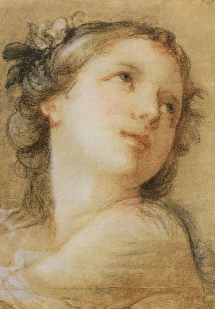
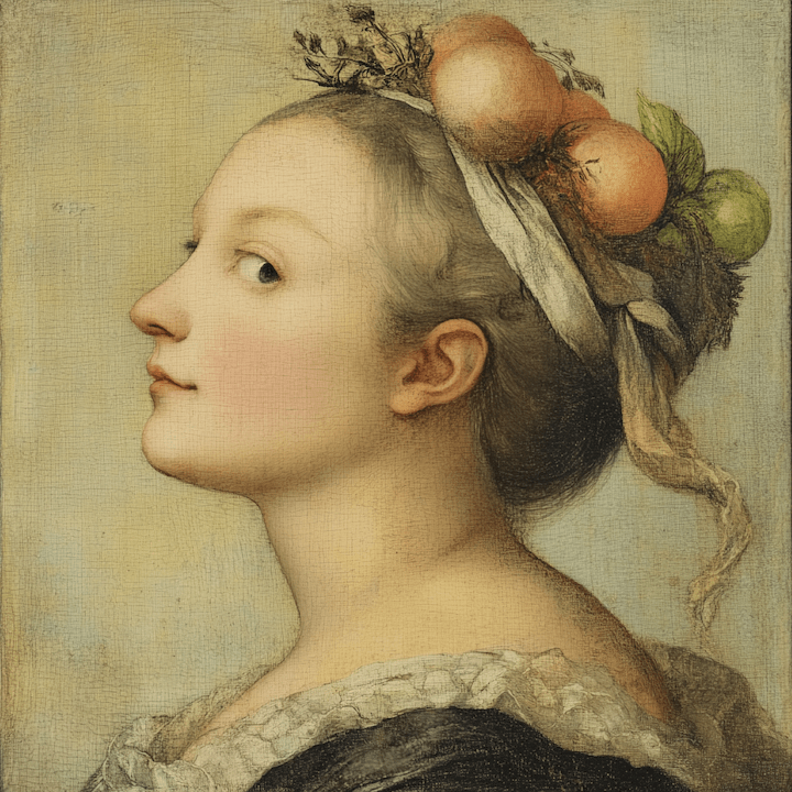
“Head of a Bacchante” (1741) is a fine example of his mastery in pastels. A bacchante, a female follower of Bacchus, the Roman god of wine, fertility, and theatrical performance, is often depicted in art as ecstatic or in states of divine possession. Pastel allows for a softness and blendability not easily achieved with oil paints, making it ideal for capturing the delicate features and expressions of mythological figures.
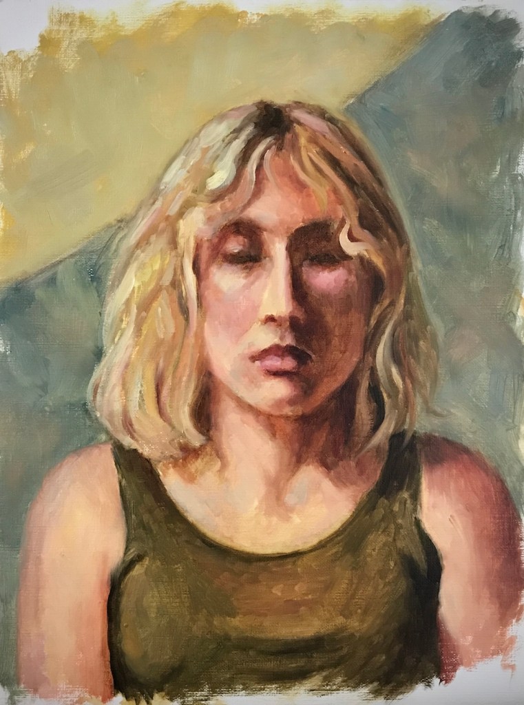
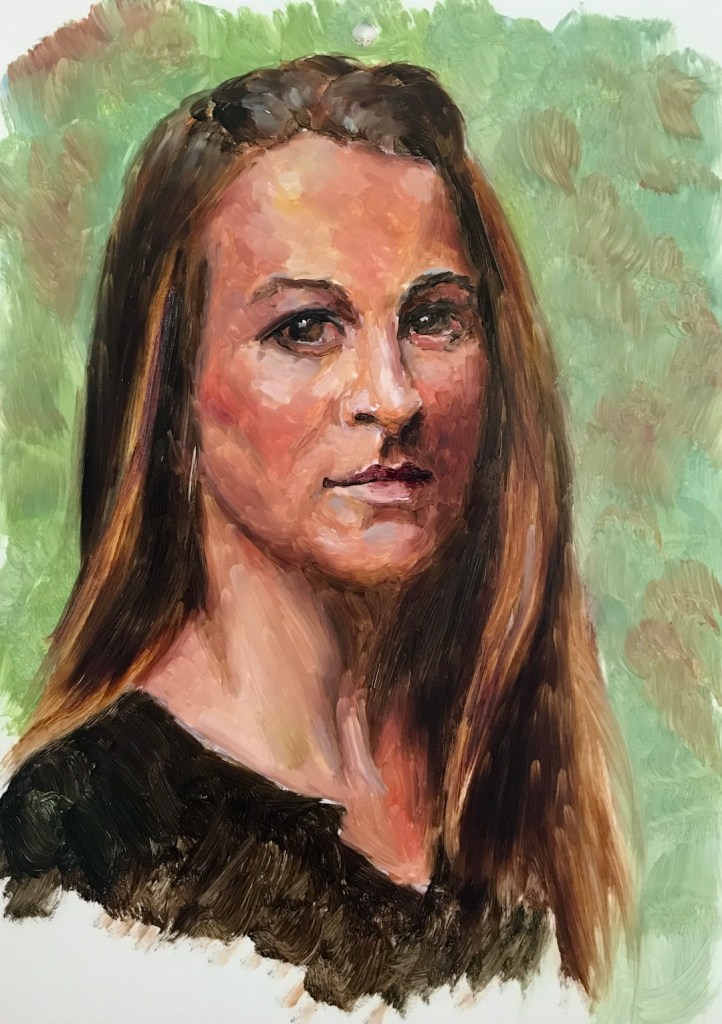
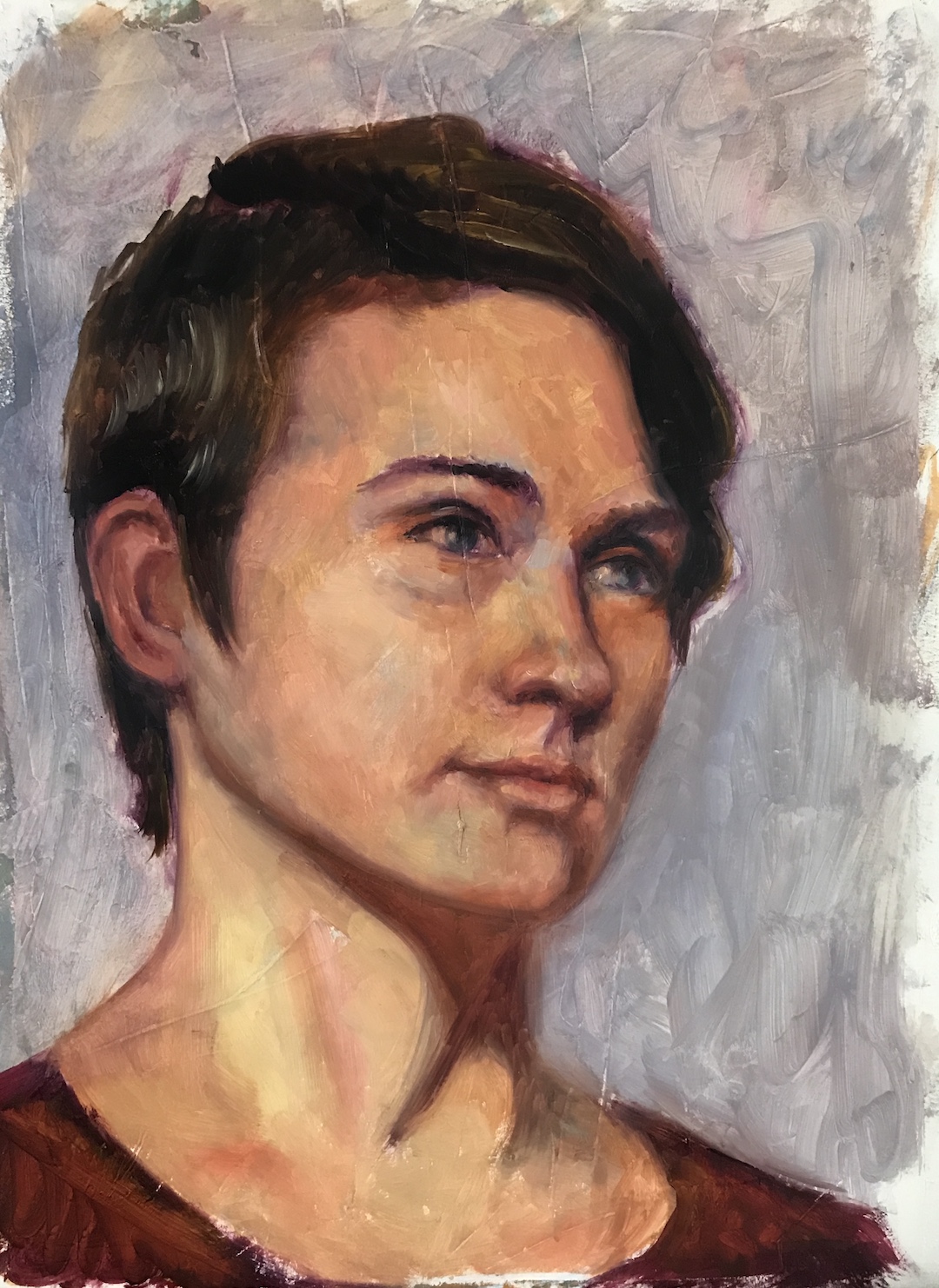
I saw this painting at the Getty Center, where I was drawn to Natoire’s emphasis on grace, charm, and a certain lightness. The luminous quality of the skin tones, achieved through soft, atmospheric light, created a sense of intimacy and warmth. His fluid, graceful brushwork contributed to the overall elegance, and a well-controlled value range allows smooth transitions between forms.
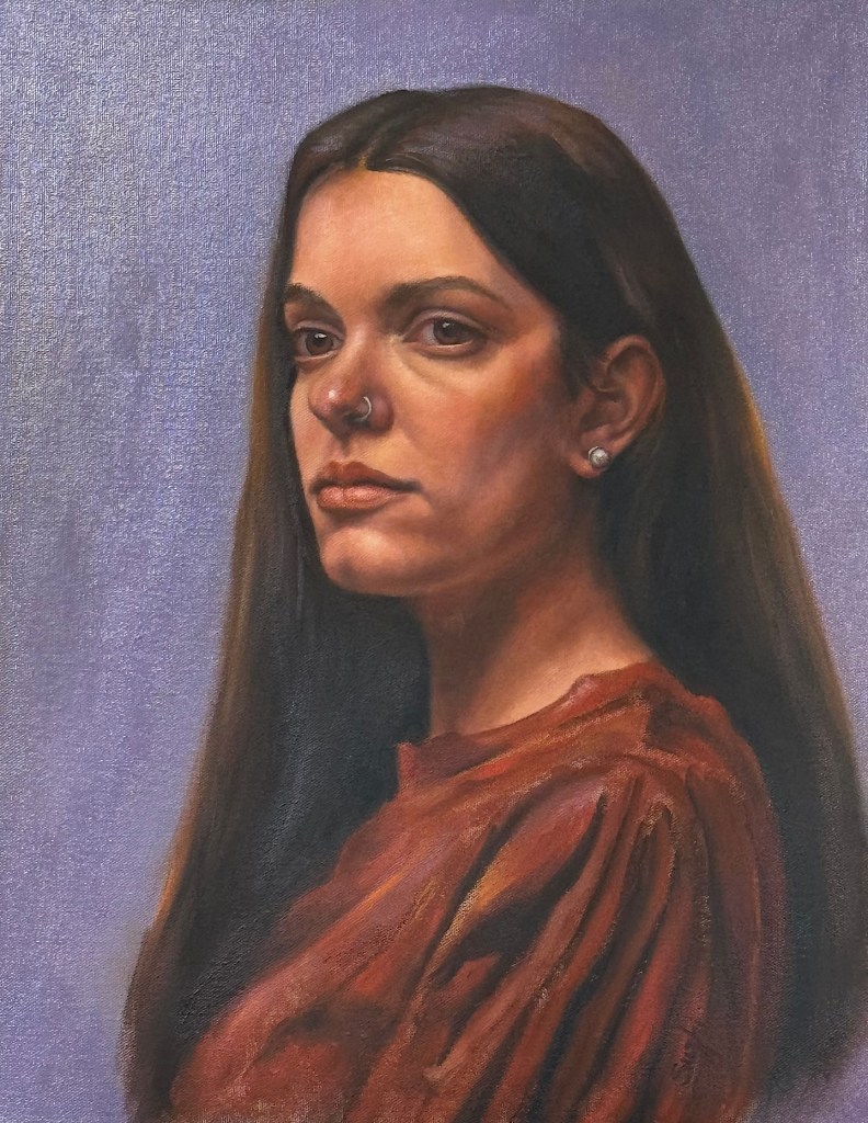
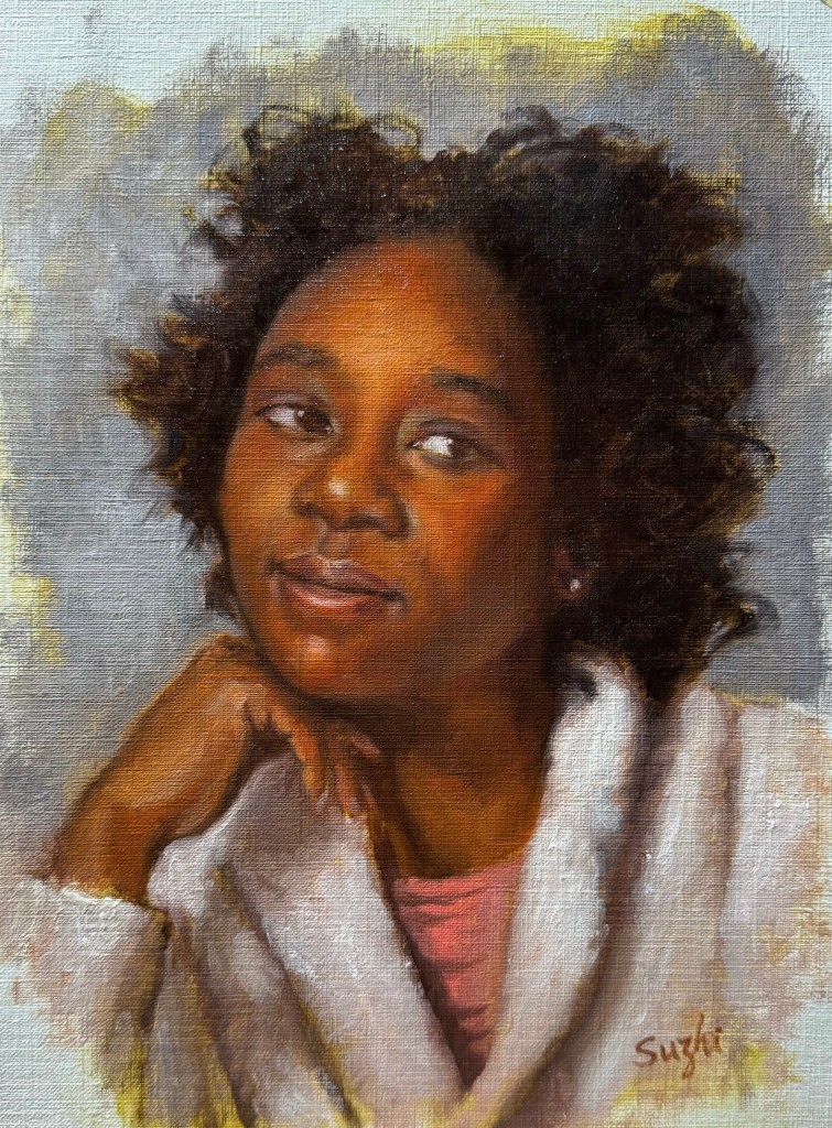
In attempting a master copy, I focused on replicating the subtle value changes. I have a tendency of using high contrast and high saturation in my own portrait painting. I hope, by compress and control the two, I could achieve a softness and luminous effect that is missing in my works. While oil paint is not as ideal to achieve this goal as pastel, I figured I would still learn a lot by pushing it as far as I could. I started a bit too heavy handed, and later had to spend layer upon layer to lighten things up, and contract the range of values. The result still felt too defined in some places, lacking the ethereal quality of Natoire’s original. Some of the airiness of the original comes from Natoire’s dancing line work, which I don’t have the skill to imitate with a brush. While Natoire captured a goddess, I painted a mortal – a lovely one, I think.

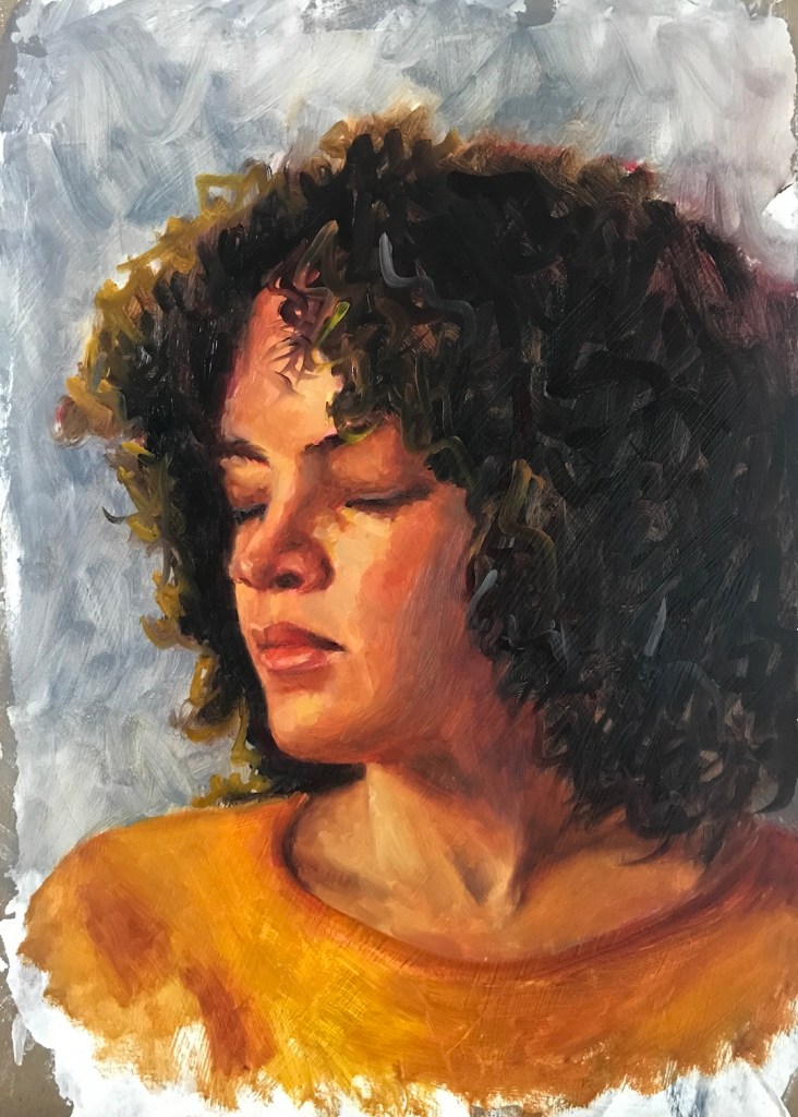
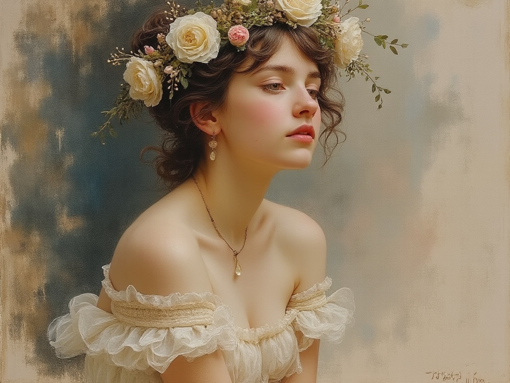
Curious about modern interpretations, I requested a pastel painting of a bacchante from both Grok 2 and MidJourney 6.1. Grok gave me a photo-realistic beauty with a somewhat painterly background. It seems Grok doesn’t respond well to traditional medium. MidJourney, on the other hand, at least attempted to emulate ‘a painting.’
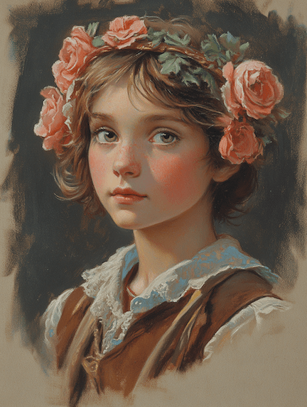
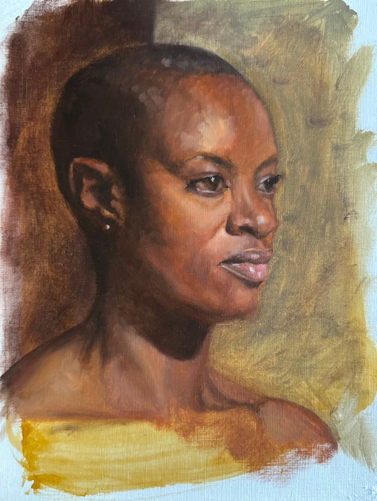
One can also twig the many perimeters MidJourney offers to achieve varied result:

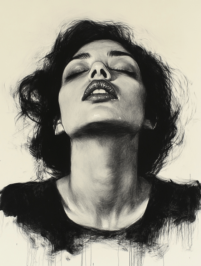
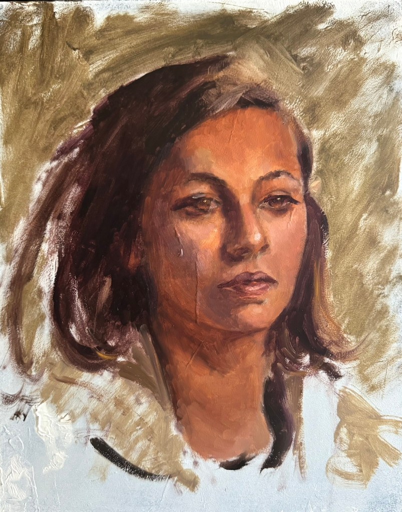
If I provide Natoire’s original as a prompt, MidJourney could fake a couple of masterpieces:

Me and my bots, we all had fun!