For the first time in four years I was able to travel to Beijing and hence the absence of new posts. At the first glance the city seems largely unchanged, except for the long lines outside every gallery and museum. I don’t know if people are just hungry for art or it is the “lipstick effect” of the flagging economy, but the never ending queues didn’t go well with the scorching weather on record. Soon I noticed an apparent missing of international tourists, and a lack of liveliness in general everywhere we went. People are getting by, but not looking forward too much. It could be the weather, or the “laying back” that everyone was talking about. Regardless, I ended up not doing too much.
The couple of exhibitions I did managed to attend shared some commonalities in a strange way. The Graduation Show from The Central Academy of Fine Art – China’s most prestigious art academy was an expose of vibrant young minds. Walking among a hodgepodge of contemporary media, we were constantly attacked by explosions of lights, sounds, and immersive installations. While traditional techniques were not completely forgotten, they took a back seat to ideas and functions behind art.
Meanwhile, the National Gallery of China celebrated its 60th anniversary with a display of its permanent collection. For the domestic part, the media were conservative and the contents were propagandistic. The international part featured many crafts from the “One Belt One Road Initiative” member countries. It could very well be the most diverse exhibition I have ever seen. In terms of media and the ideas represented, this was the opposite of the students’ show above mentioned. However, art was equally sidelined in both cases, which brought to mind an online comment on Chinese rock music I once read, “I heard the rock, but where’s the music?”
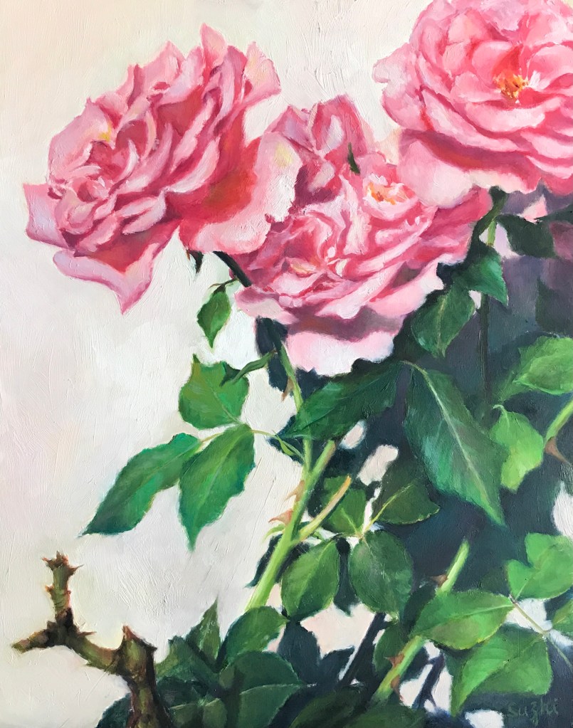
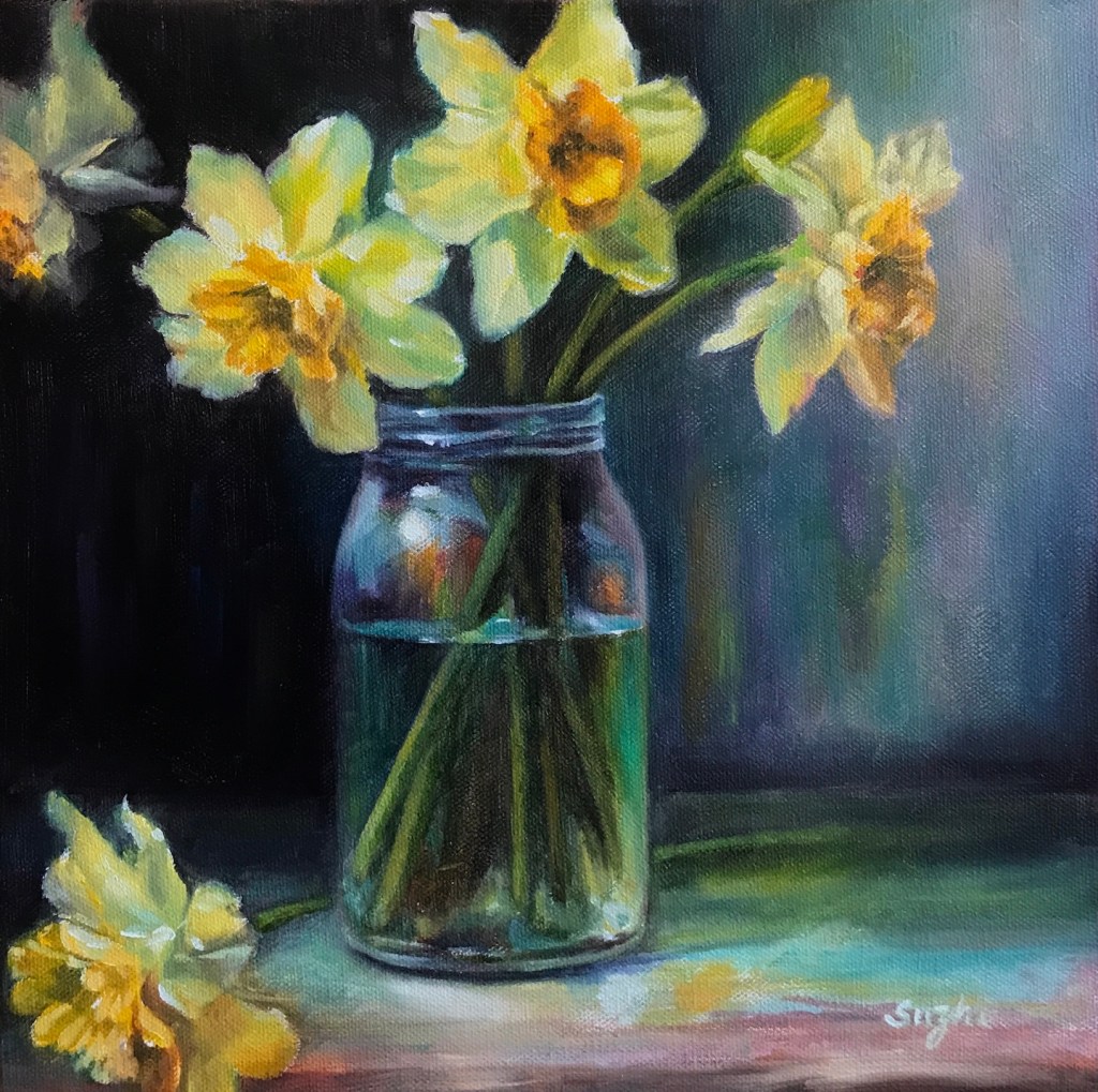
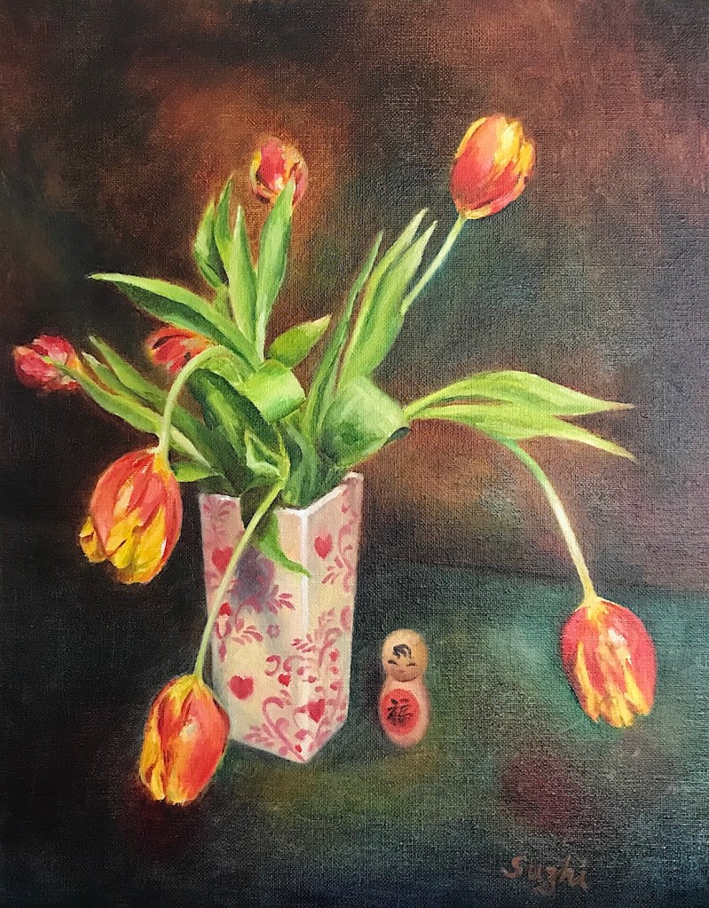
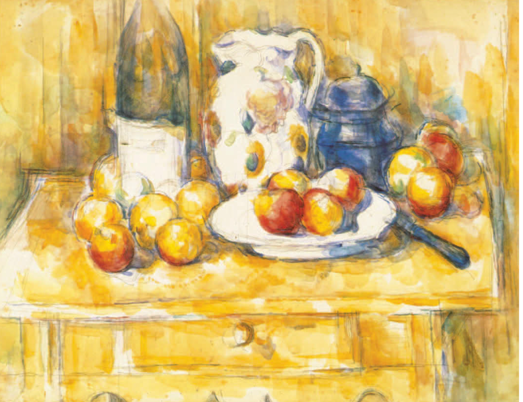
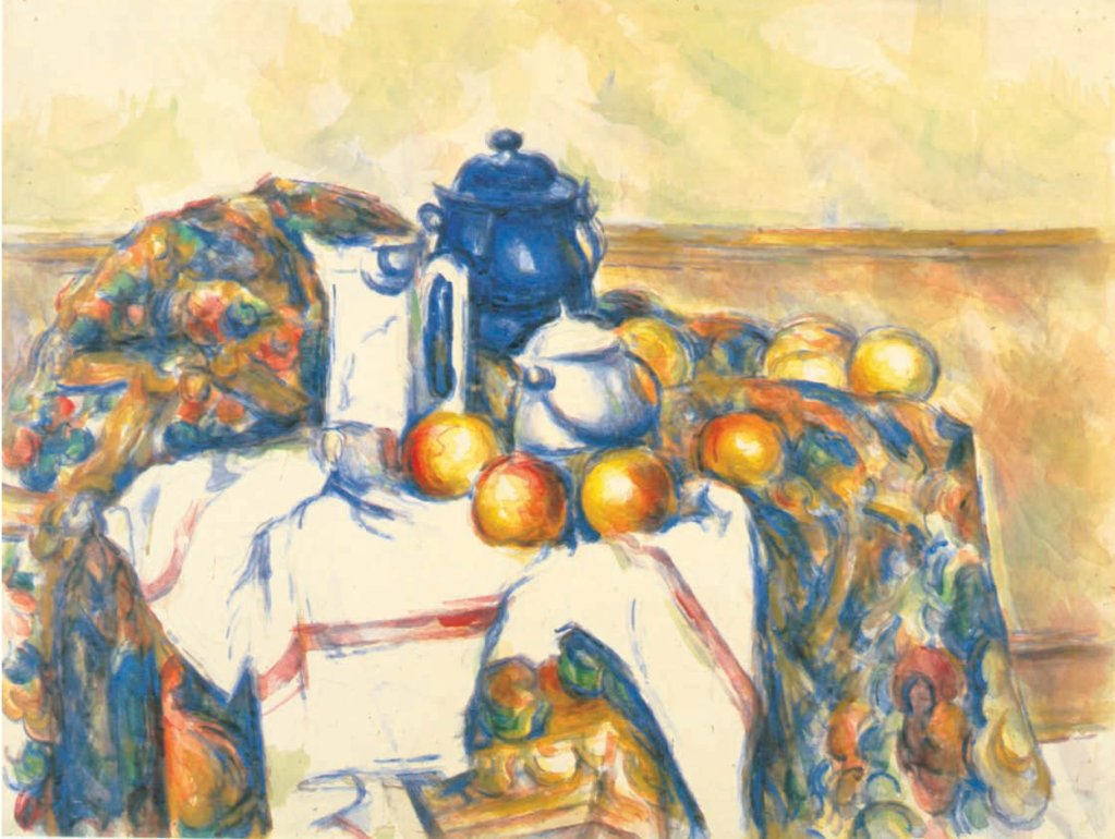
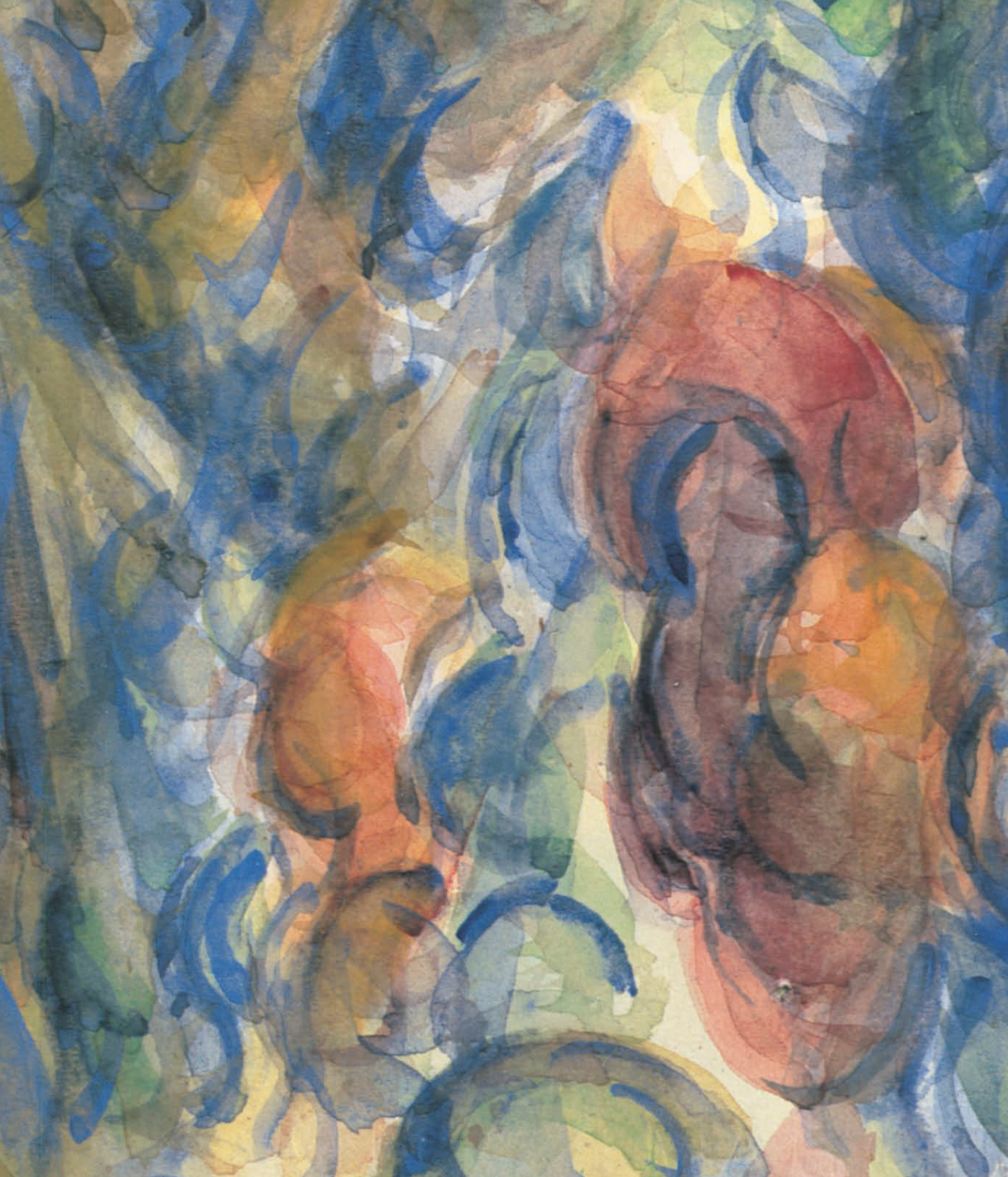
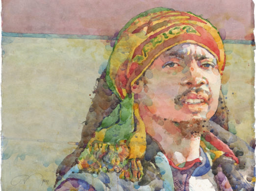
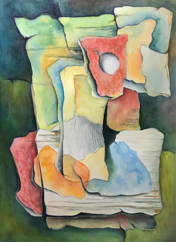
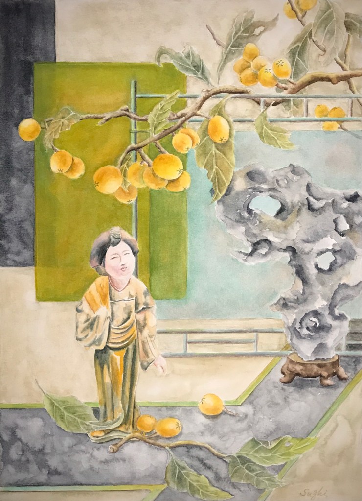
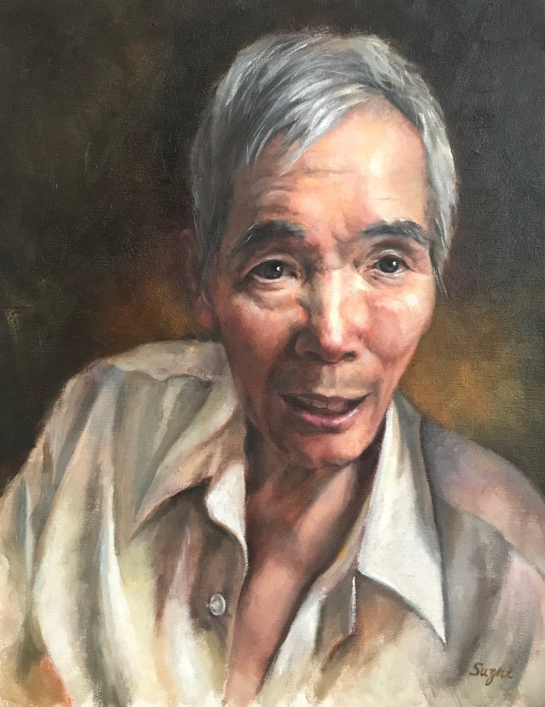
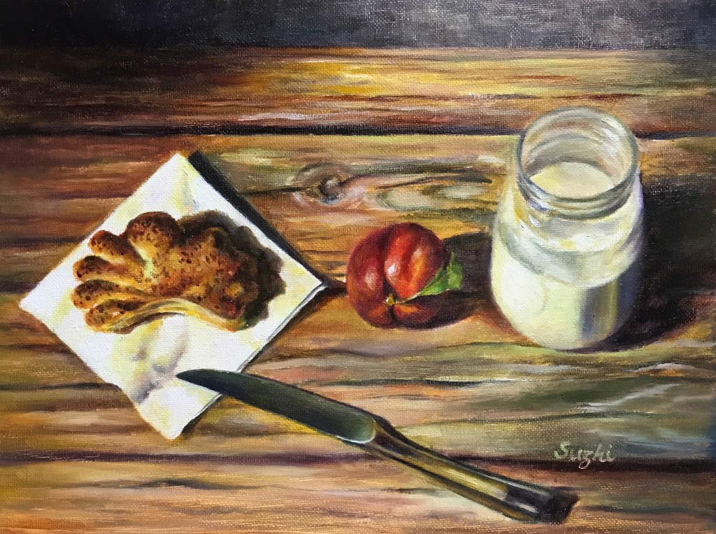
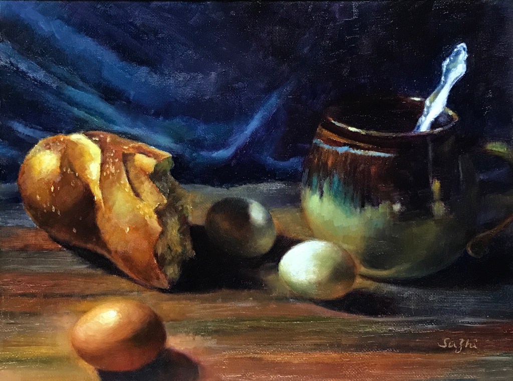
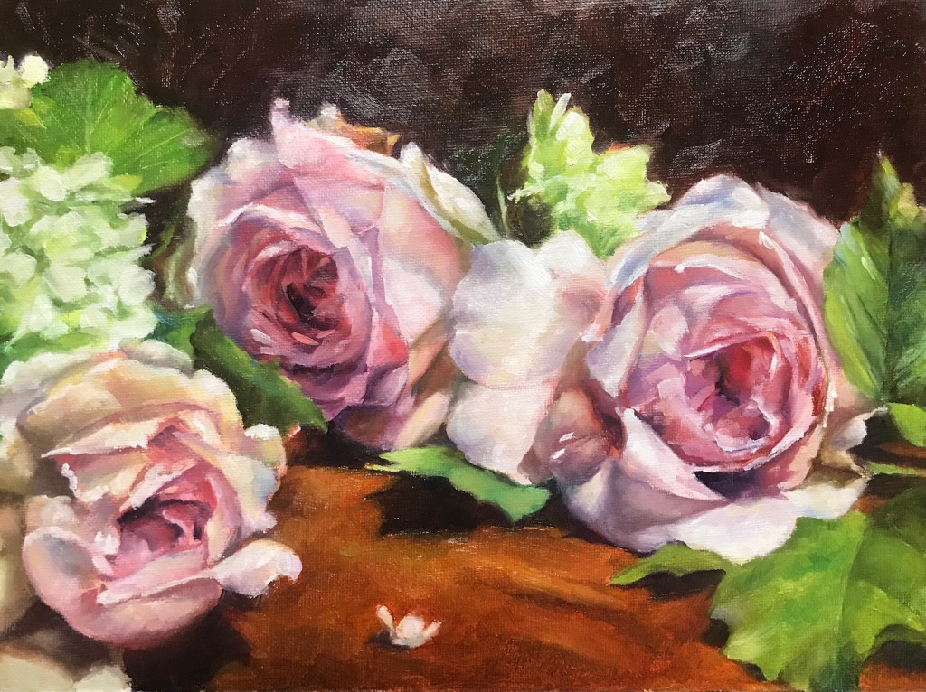
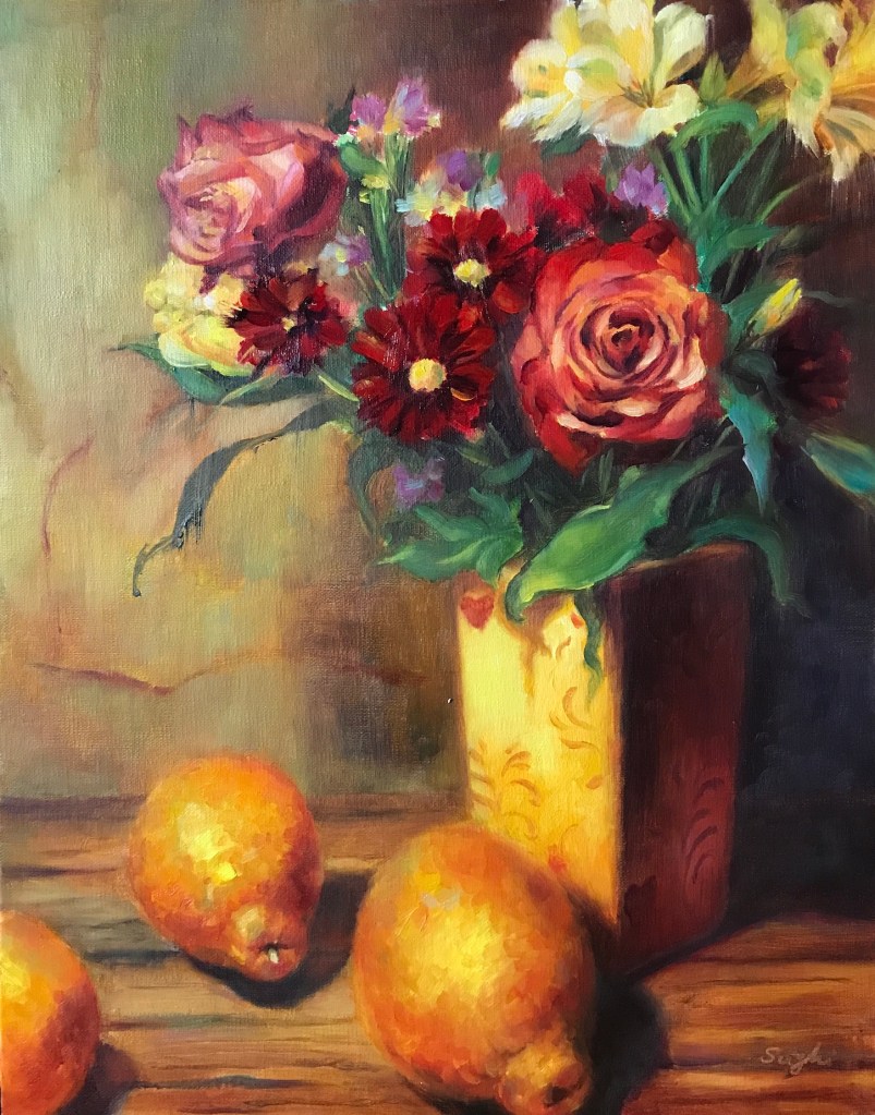
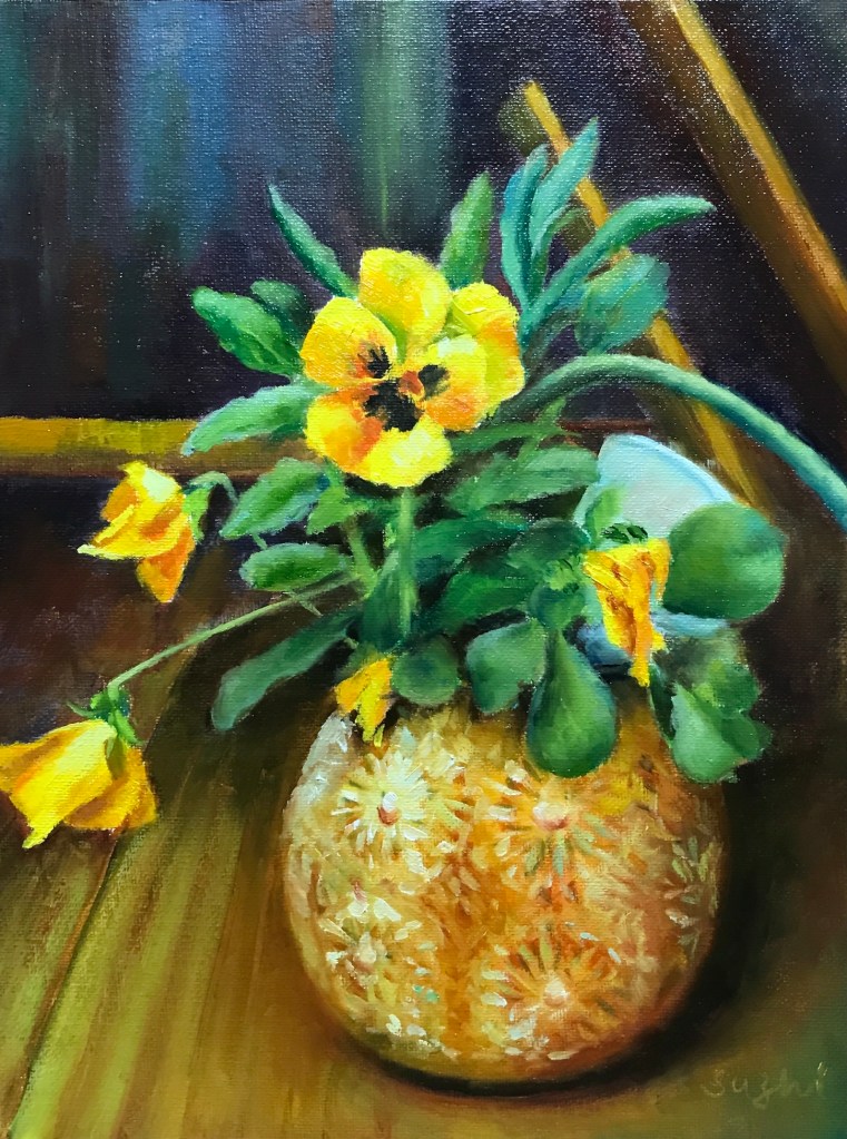
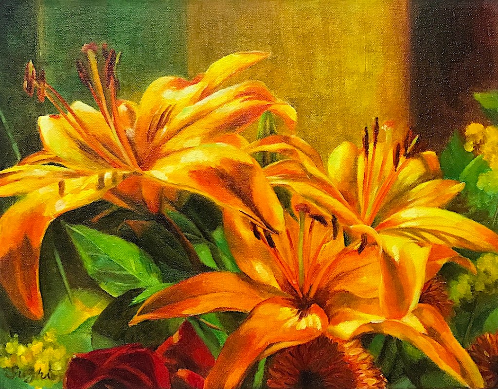
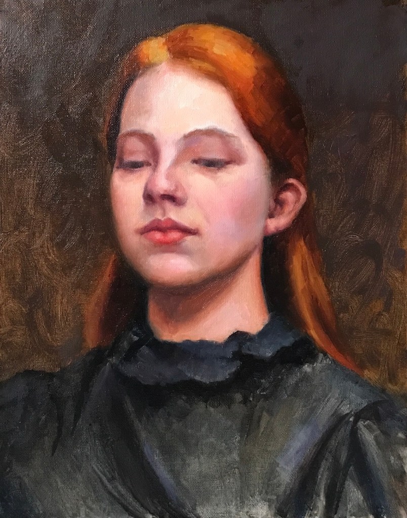
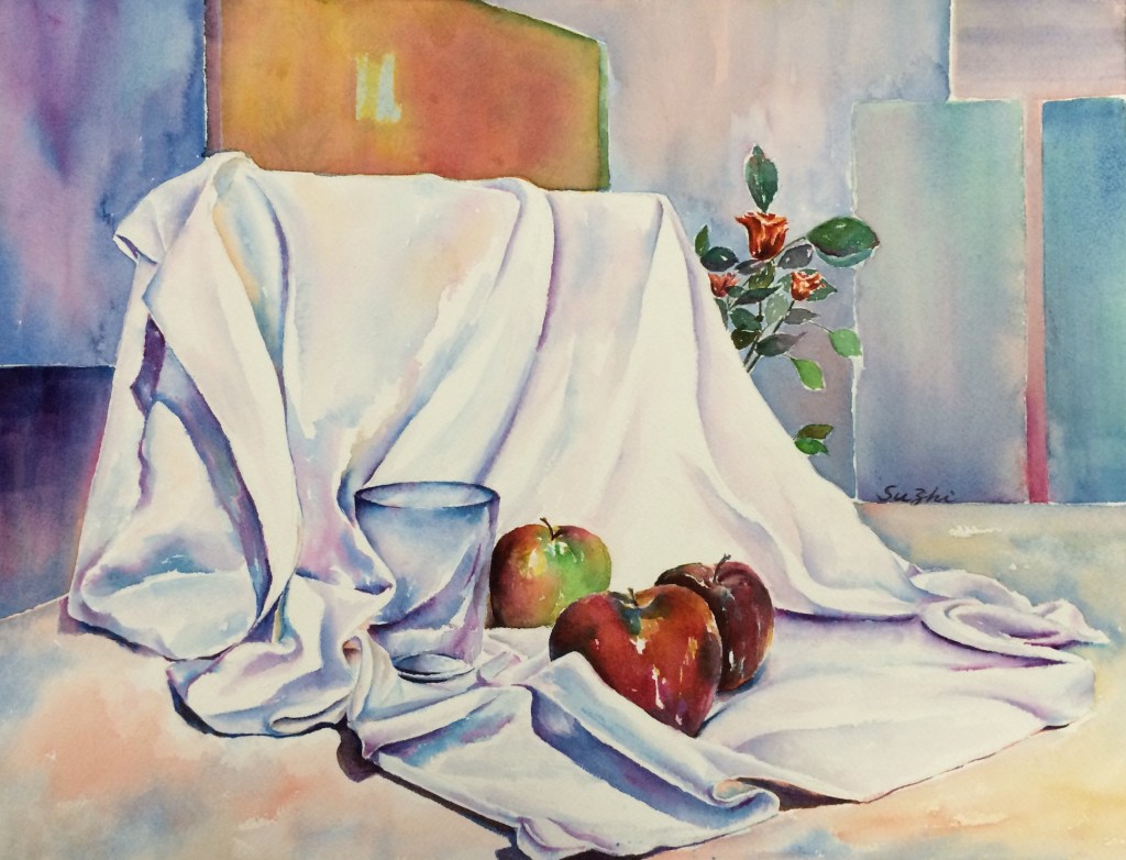
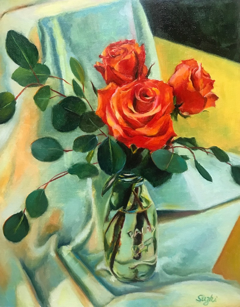
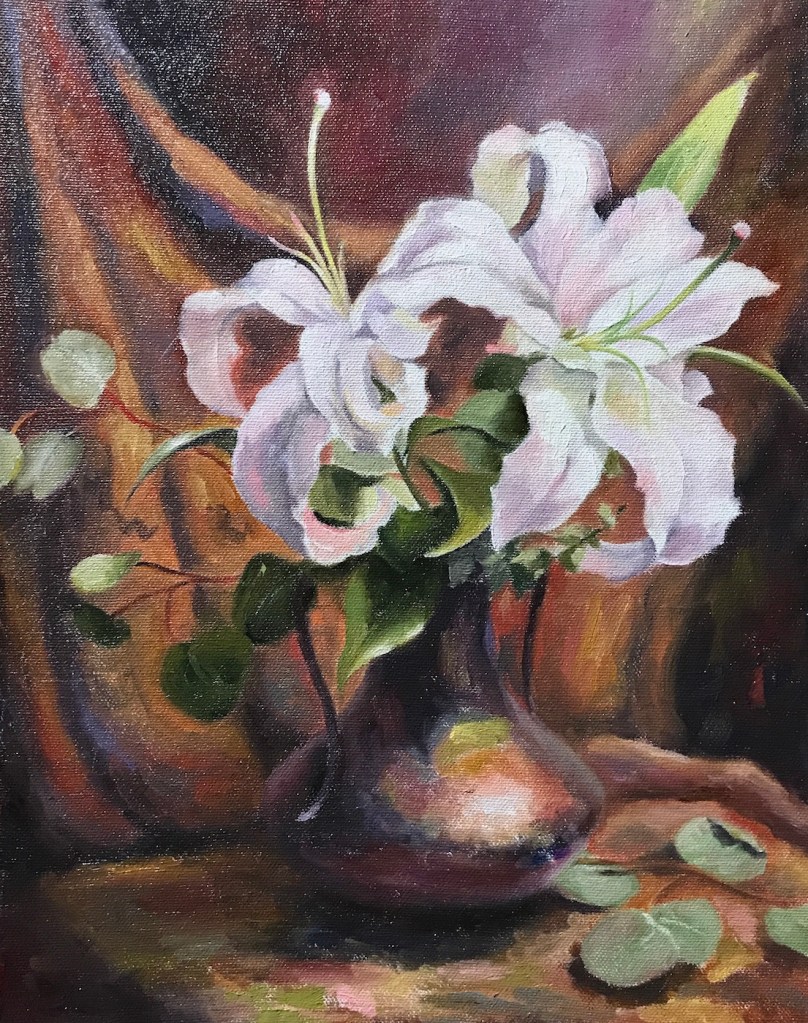
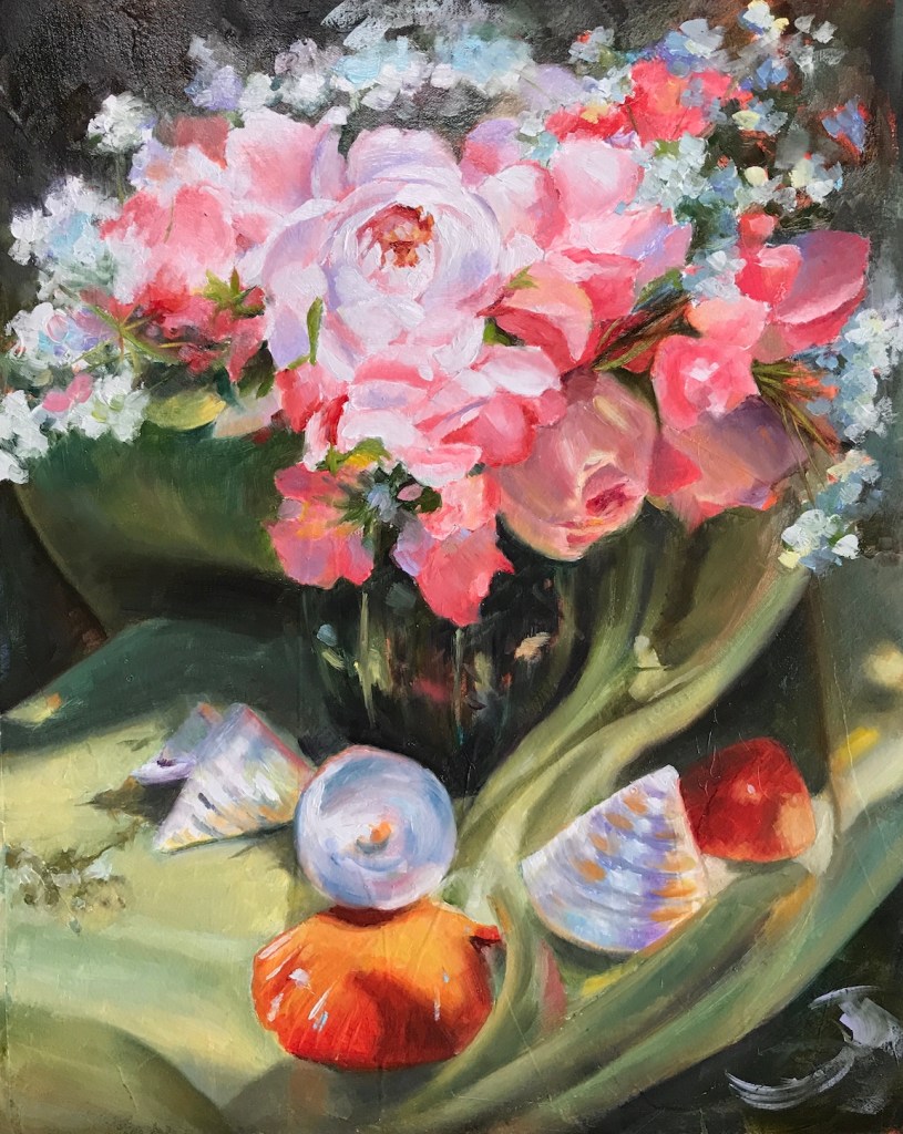
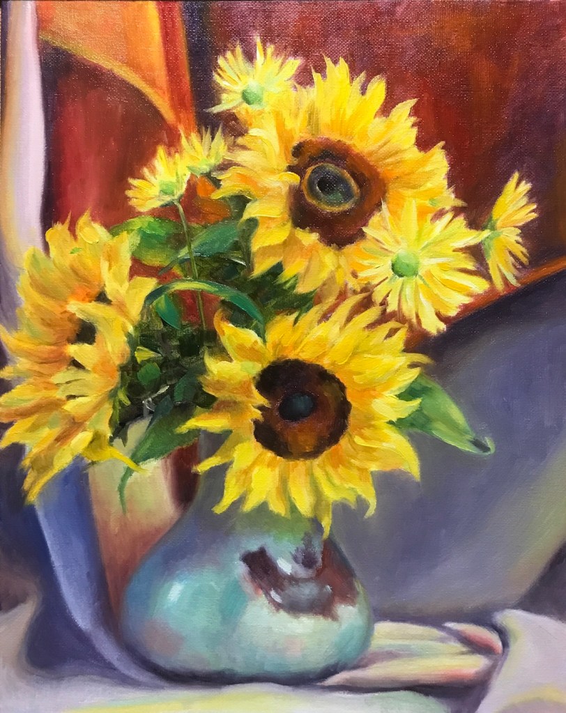
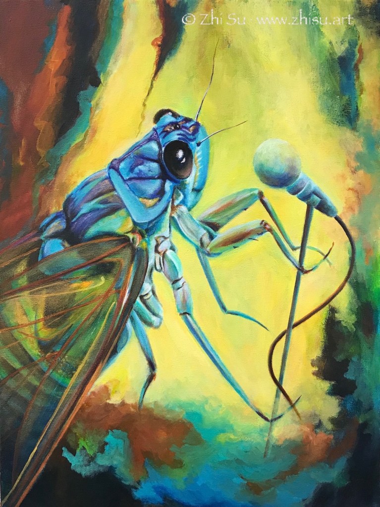
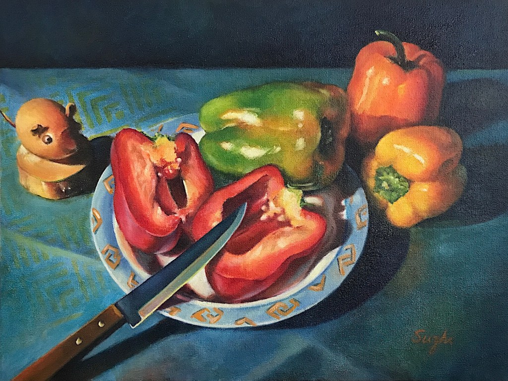
The shows also caused a little panic inside when I looked back on my extremely lack of “idea” art, for example:

I’ve always cherished the simple joys of composition and color harmony, but these exhibitions had me questioning—do I need to dig deeper? Must I have something grander to say? Do I truly have something to say? In an era that one can put ideas into MidJourney and let it generate a picture, does this make the traditional artistic skills obsolete, or on the contrary, make them more important in defining what is art?
In China, schools commence each year on September 1st. It seems fitting to conclude may summer idling and wondering on this day. Time to get back to the basics, back to work (and leave the thinking part to GPT)! 🙂