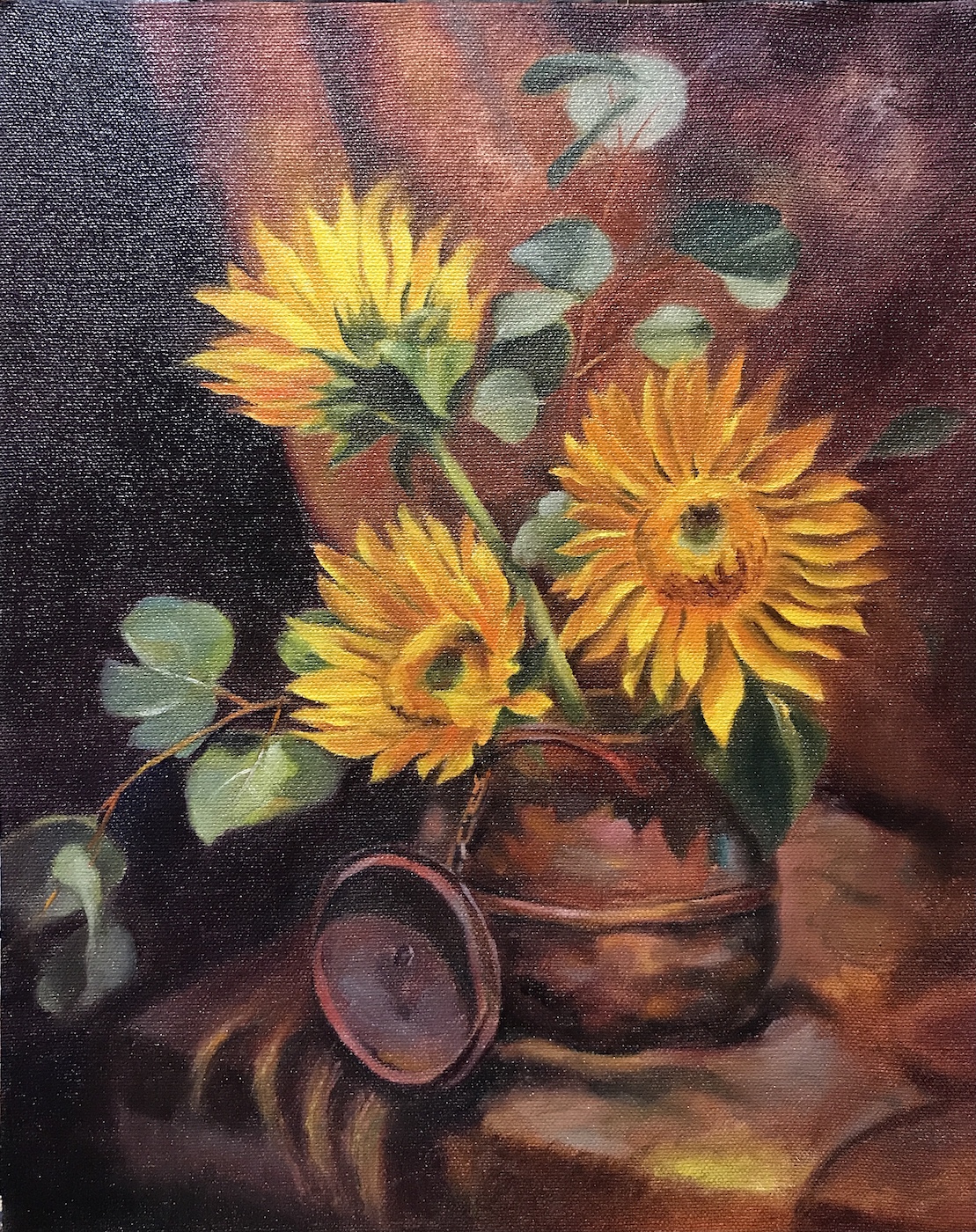
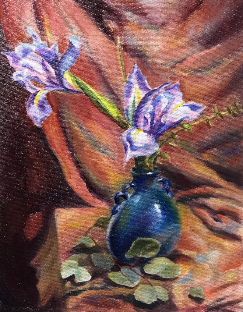
July kept the floral theme in my studio, with petals and my learning progressing.
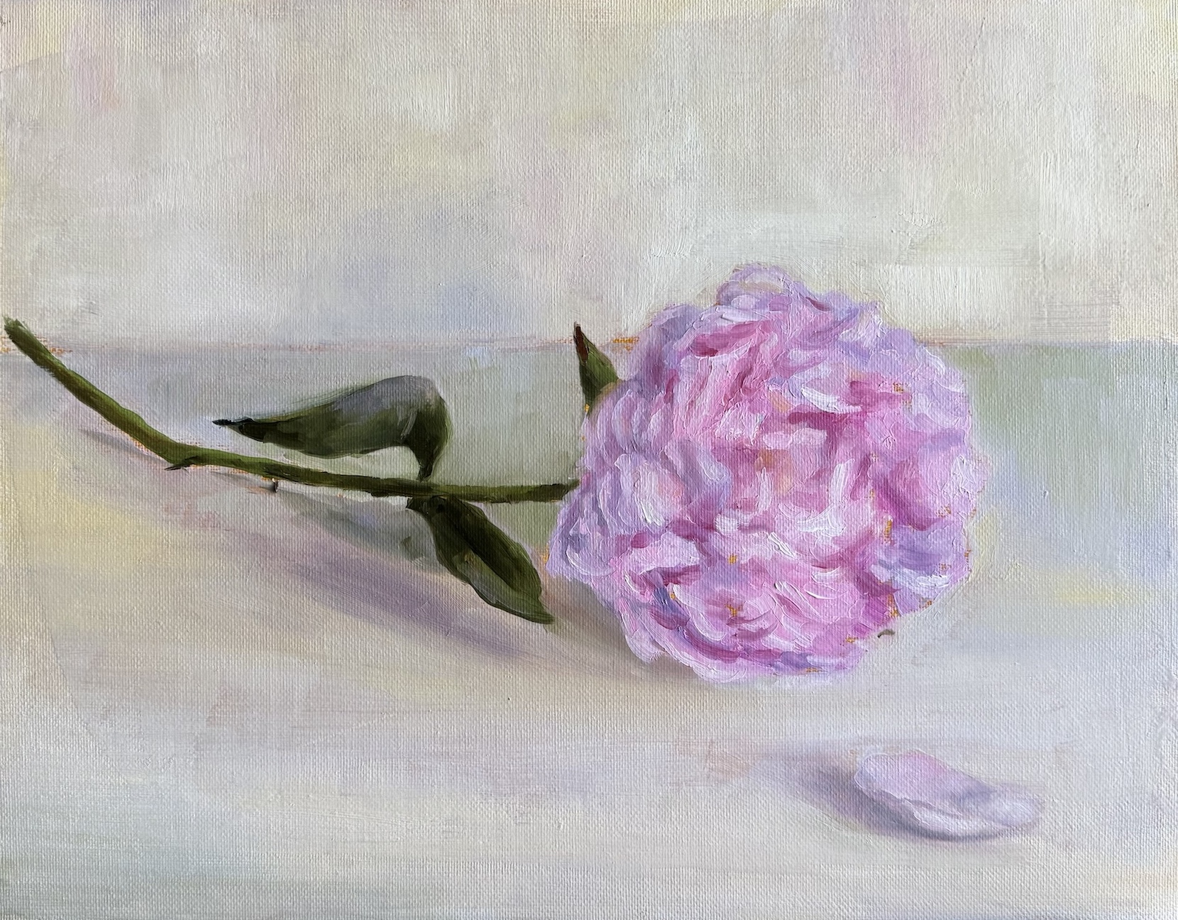
First up, I tried my hand at a peony. As I have mentioned before, Michael Klein is a big influence to me in the floral adventure, and peonies are featured in many of his creations. Those fluffy blooms look dreamy, but they’re a nightmare to paint and arrange. Petals were numerous and messy, dropping faster than I could arrange them in any manageable shape — whether in vase or on canvas. Soon I gave up my grand vision of a complex still life, and managed a simple single flower sketch.
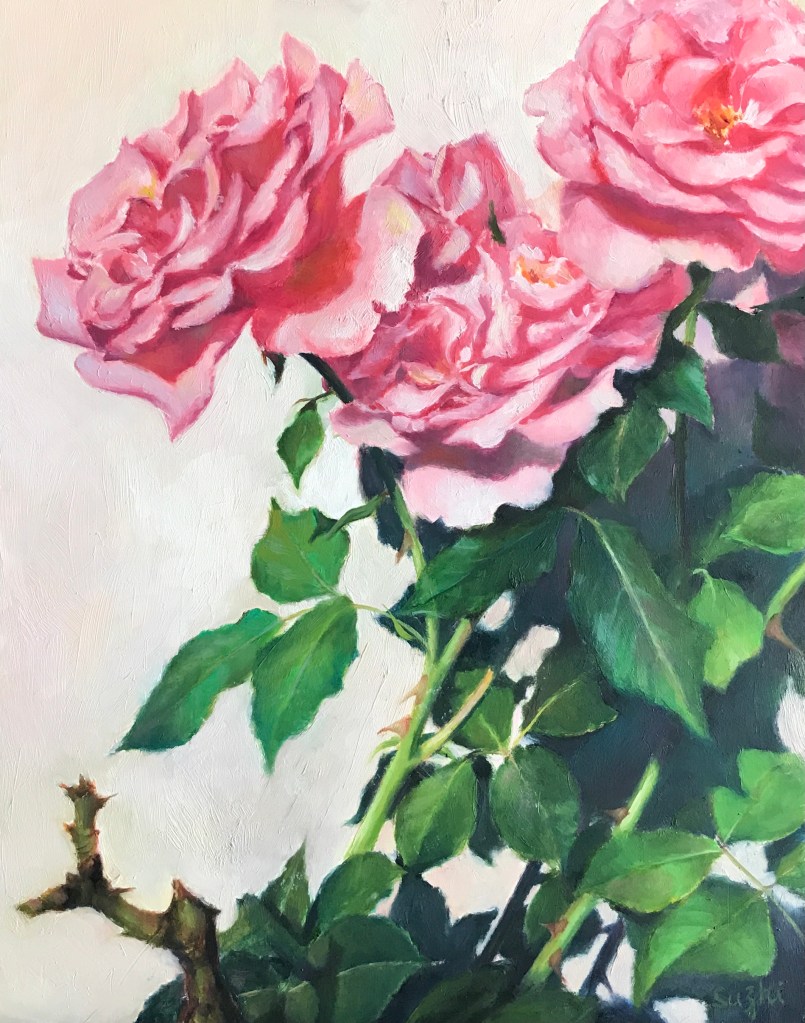
To comfort myself afterwards, I moved back to roses, a familiar subject. I thought a Trompe l’oeil (French: deceive the eye) would make the painting of a single rose more challenging and fun. The idea was basically a hyper realistic painting. Getting the shadows and texture just right was trickier than I expected. My rose still looks like a painting. Here I have a better understanding of why people always say you don’t paint exactly what you see, even in a realistic painting. I used ambient room light in my setting, and the rose was largely in a unified color. To make it “pop”, I need to accentuate the value contrast, vary the saturation, and better define the edges. To make it look real, I need to invent the reality – how ironic! As you can see, I didn’t go through these steps. I am not entirely sure I have the skill to reach the final goal, and honestly, I like the painting as is now. Sometimes you call it done and move on.

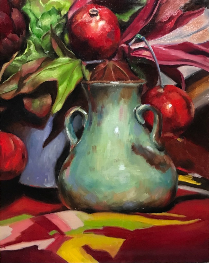
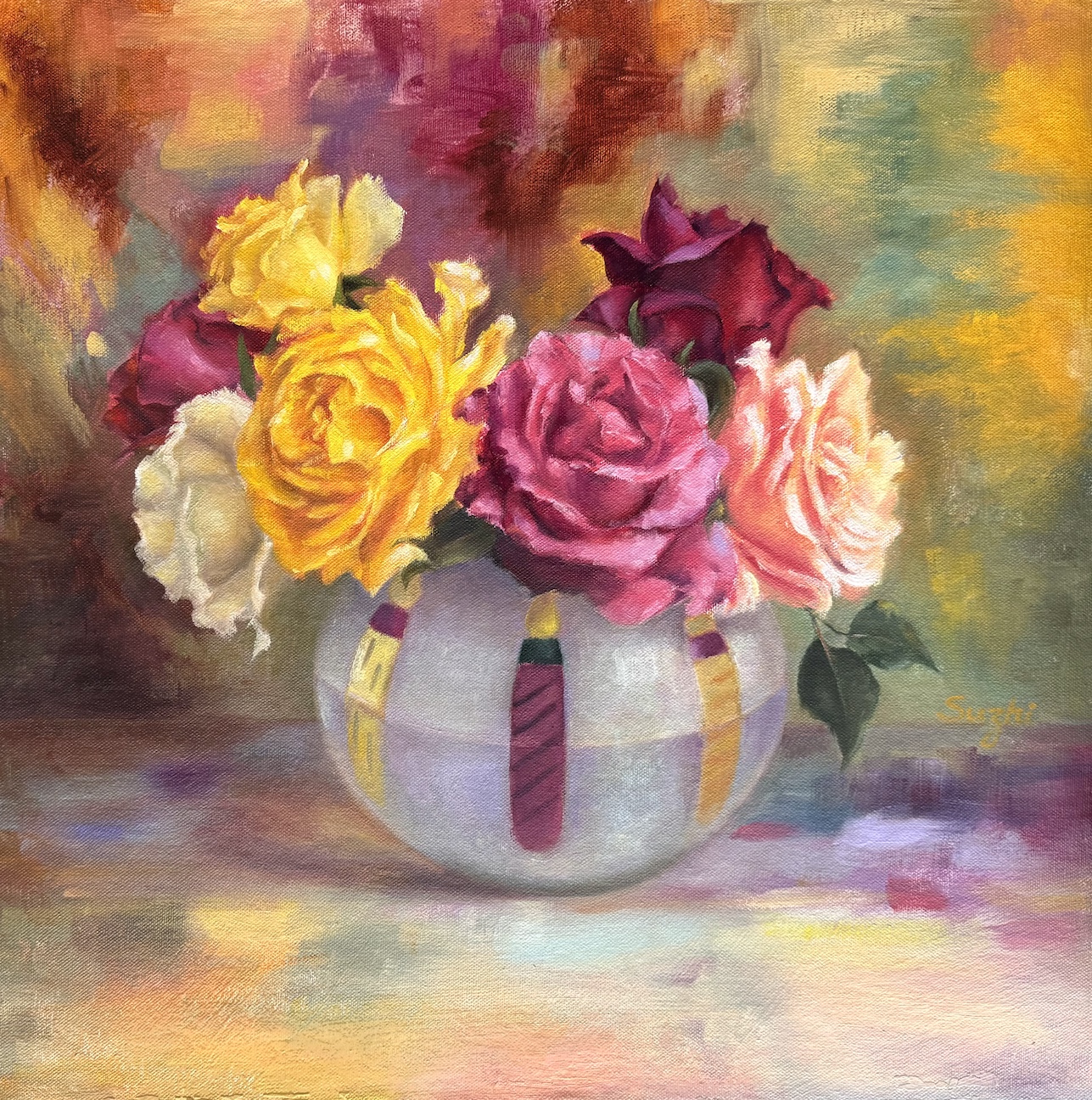
Next came a colorful bouquet, and my strong desire to paint something vibrant. In setting up the reference, my first thought was a dark, solid background for contrast. It worked, but it felt too safe. Leaning into the chaos, I draped a multicolored scarf behind the bouquet. I painted the scarf and surface in an abstract style, playing with saturation and value to keep things lively but balanced.
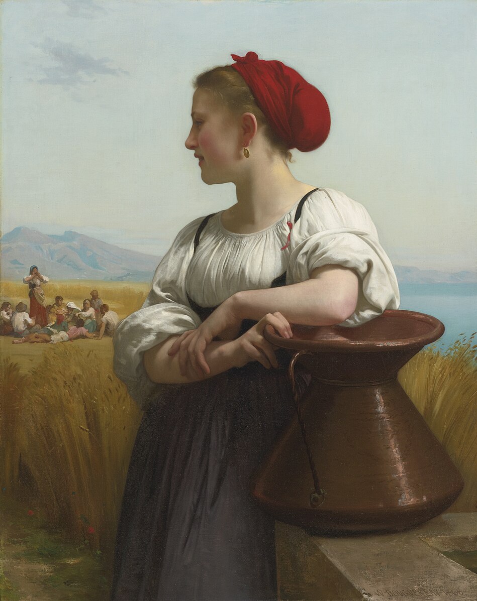
Between these floral adventures, I did a partial study of a Bouguereau painting. I’ve always admired his delicate and subtle handling of human faces, and this is also a study of handling backlighting. The softness is achieved through close value and gentle brushwork. When the entire face is away from light, the values are further condensed – something I still need to work on. I also painted a “selfie” as an alternate character—don’t ask. I was hoping for a Morandi-ish low-chroma tranquility… or, a quirky experiment in calm tones.

Lastly, MidJourney has pushed out video generation in recent months, and now you can upload your own image for animation (see the painting for the first video here). Like these:
Don’t laugh. The bizarreness comes from my own skill issues – both in painting and in prompting. Look at the shadows in the second video, that wisdom wasn’t from me. There are millions of fantastic generative videos out there for us to see the potential of extending and alternating the life of our paintings. Always more things to experience and explore!