February slipped by faster than I expected. I had some ideas about “strategizing” for 2026 (see previous post), but the month didn’t cooperate with any real planning. When I’ve been away from oils for a stretch, I usually warm up with quick portrait sketches. This time I happened to watch a live sketching session centered on pears at the beginning of the month, and so I thought, why not try pear portraits instead? I picked up three from the local grocer, arranged them simply, and set off quickly.
Midway through though, I lost interest in the setup. The lighting was too conventional, the composition flat, and the whole thing uninspiring. I decided to add reflections on the surface to give it more life. Mostly I just added frustration. As the paint thickened and got tacky, I gave up. Here’s the oil painting I set aside:
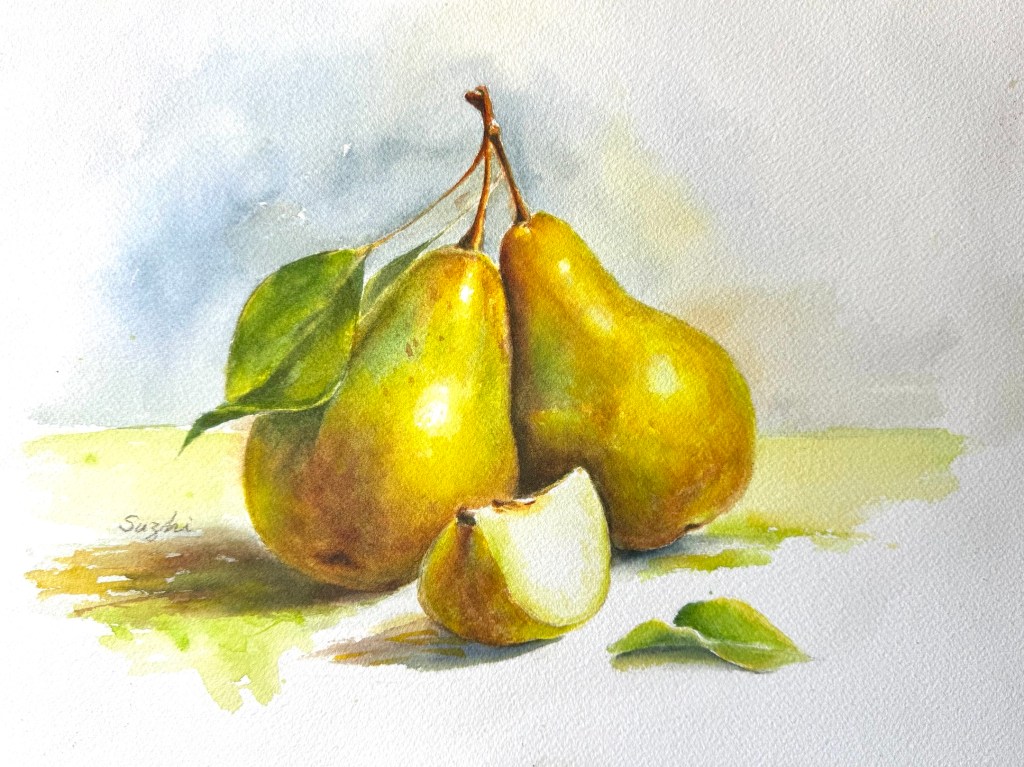
I switched to watercolor instead. In a recent cleanup effort, I found some unused Arches blocks. I’ve done a little watercolor in recent months, but only small sketches on inexpensive paper. I couldn’t wait to see what good quality paper could deliver after these practices. By then the pears were starting to rot, so I worked without a reference. Here’s the first attempt:
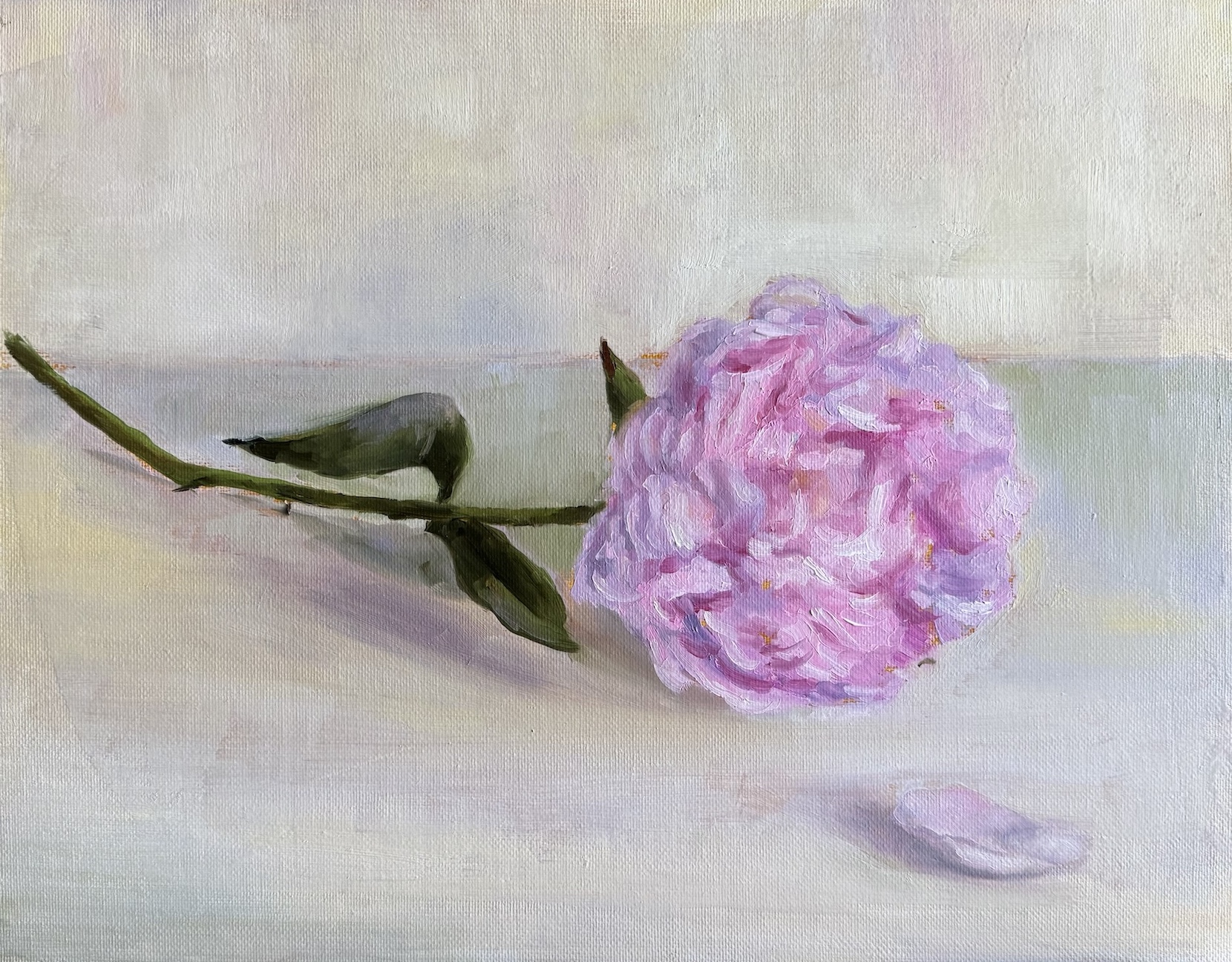
As expected, the paper could hold much more water than the cheap alternatives, but the texture was rougher than I remembered, which affected only the initial pencil drawing so far. The painting turned out muddier than intended, and that’s what happens without a clear plan. I originally wanted almost no background. just white space to frame the pears. Once I considered it finished, though, the large white areas felt too empty and didn’t support the cut pear properly. I began adding background colors, changed direction a few times, and a couple of unintended mixes later, everything neutralized into gray. The forms of the whole pears suffered too. With everything around muddied, I didn’t want to kill the fresher red-orange even though it was supposed to be in the shadow. I felt like choosing between two wrongs. You can mix colors on paper, of course, but it helps to know exactly how you want to approach it. This piece isn’t abandoned, but it feels unresolved.
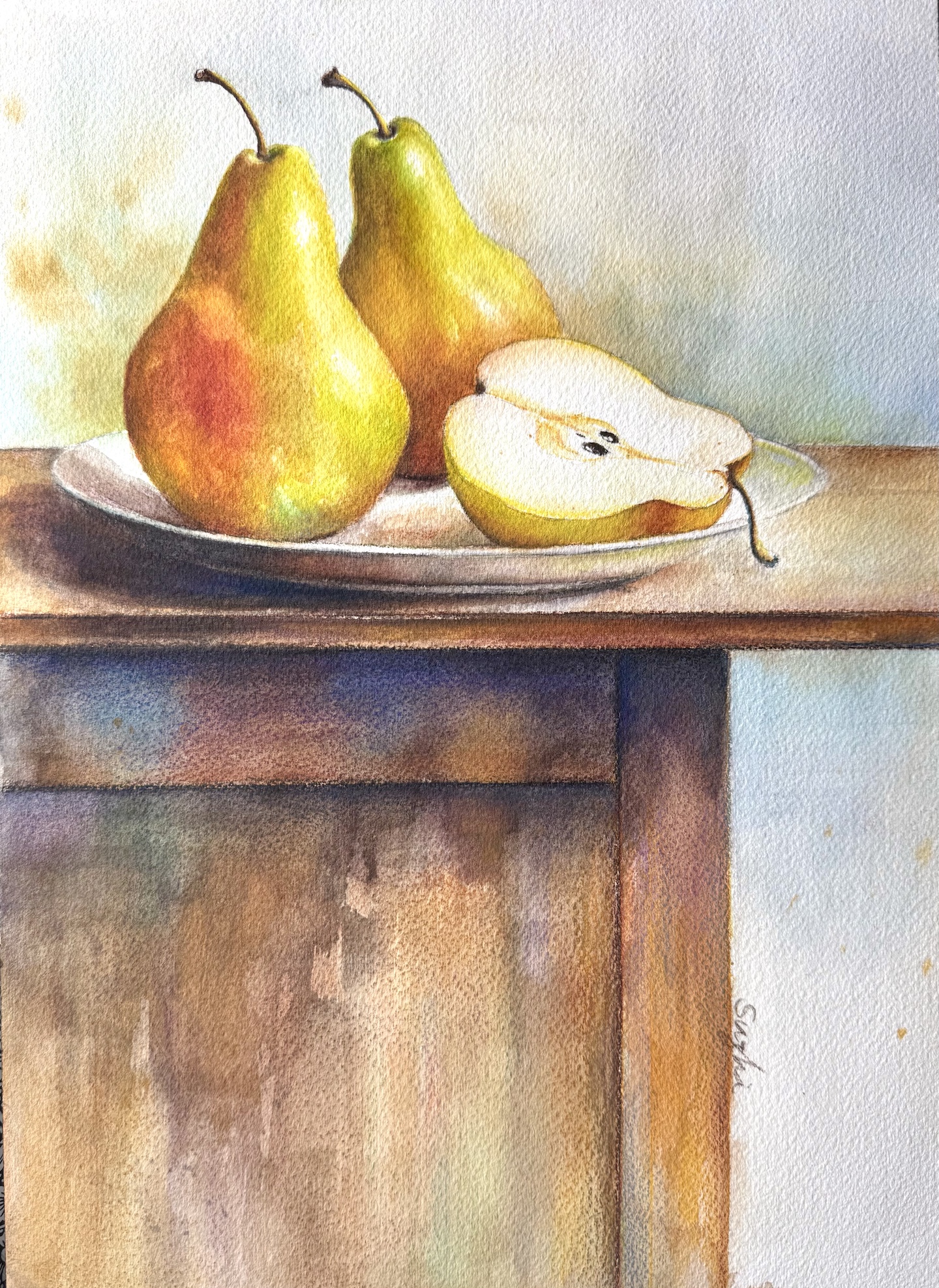
For the next one I made a conscious effort to avoid overworking the background. I still adjusted the pears more than I should have, but the result has better volume and value range, even if the colors lost a bit of their brightness. Pears do come in rustier, subdued tones, so I’ll take that as a feature rather than a flaw. This piece was also done without a reference.
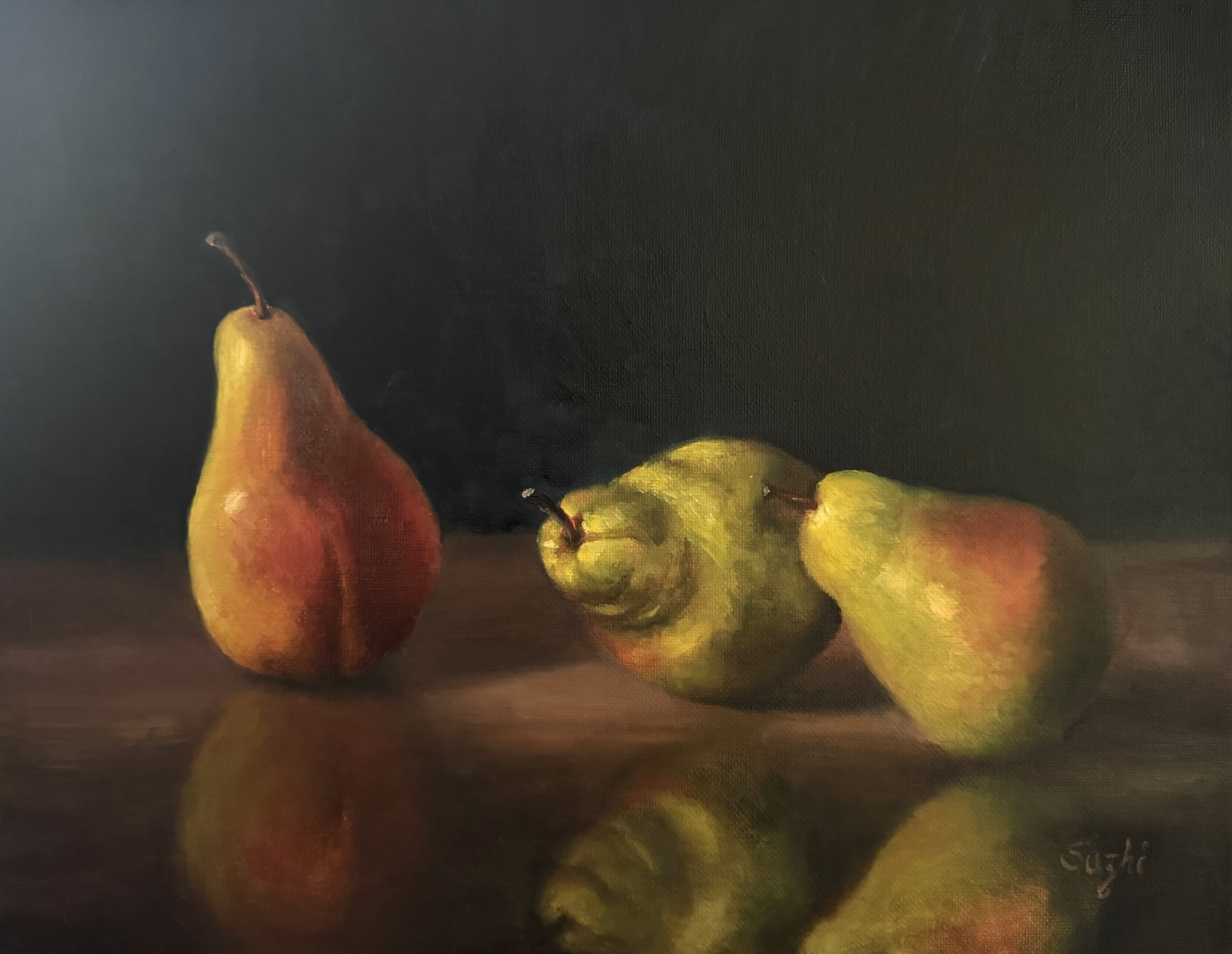
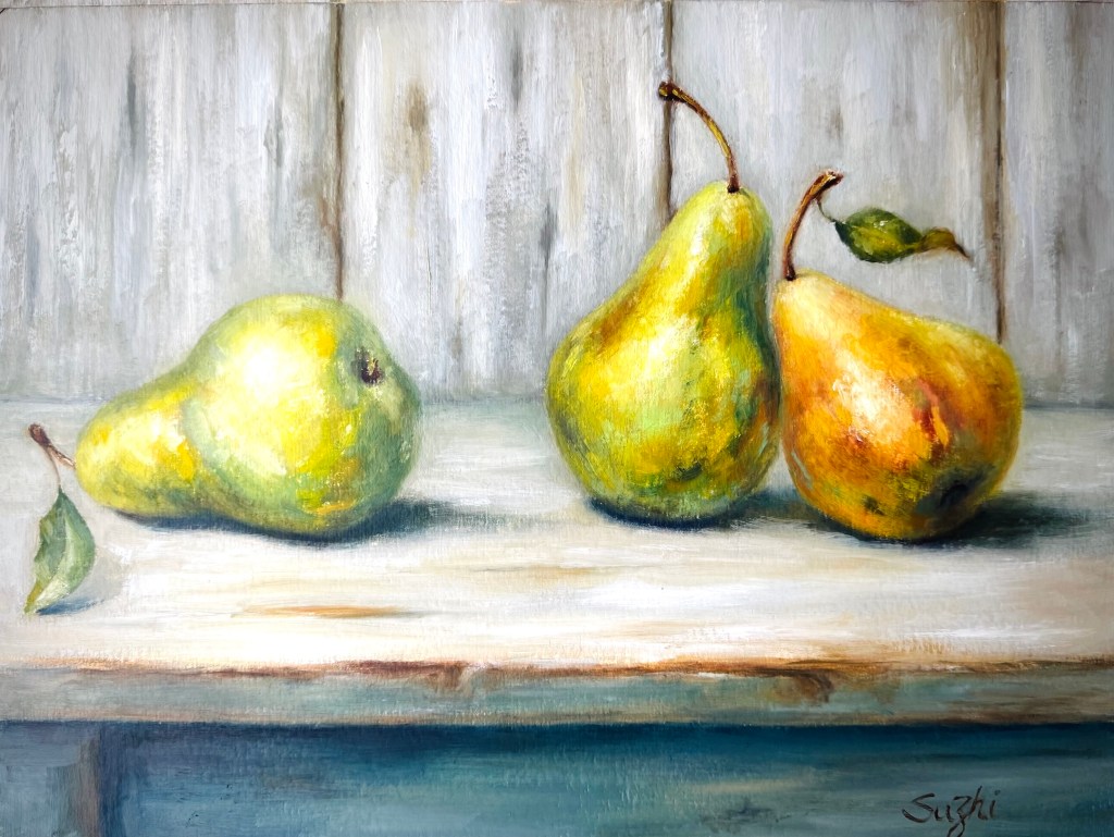
That gave me enough confidence to keep going. I returned to oil and worked on two different compositions at the same time, both on paper. One focused on color and a re-attempt at reflections, on Canson XL Oil and Acrylic paper; the other, on texture, on Canson Acrylic paper.
I have used the XL oil and acrylic paper before with a thin layer of shellac, but I found it was unnecessary. The paper handles paint very well and feels forgiving. Of all the paintings surfaces I’ve tried, this is the easiest to use and I like it more each time. The plain acrylic paper has a coarser surface that makes blending trickier, but it worked nicely for suggesting the wood grain of the table and backboard. It also encouraged (or forced) me to keep the pear colors varied and abstract rather than uniform. I may try a layer of shellac on it next time to see if it improves flow.
February passed in a mix of small frustrations and a few satisfying moments. I’m glad I moved between watercolor and oil. It kept the process interesting. I hope to maintain the momentum.
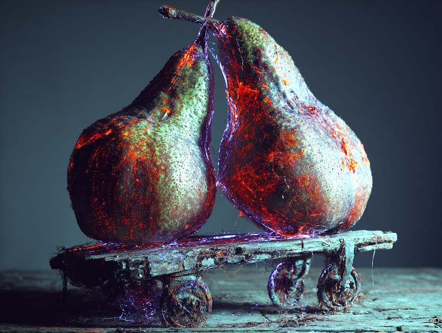
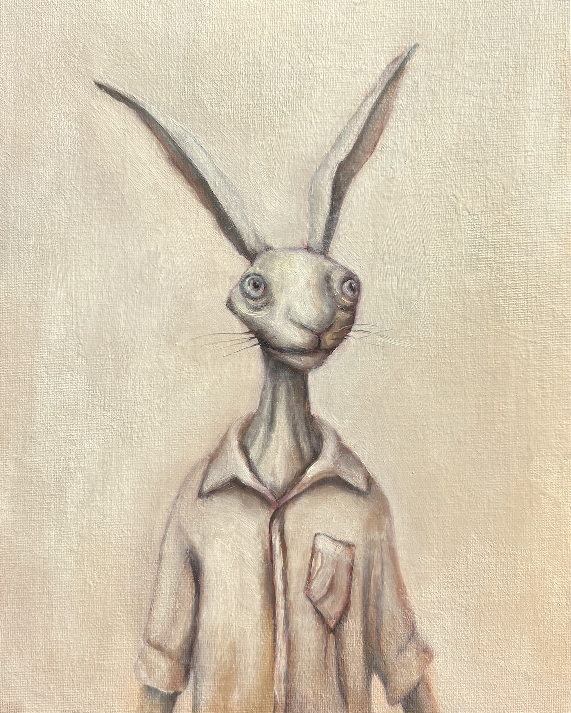
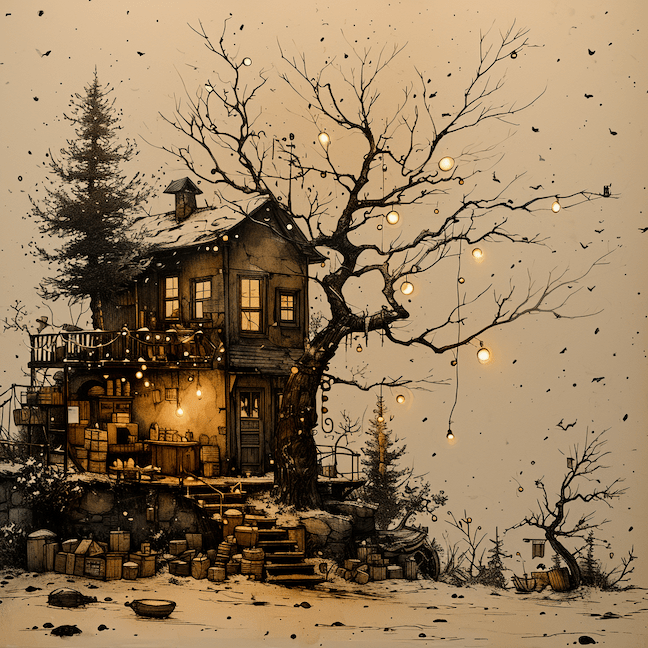
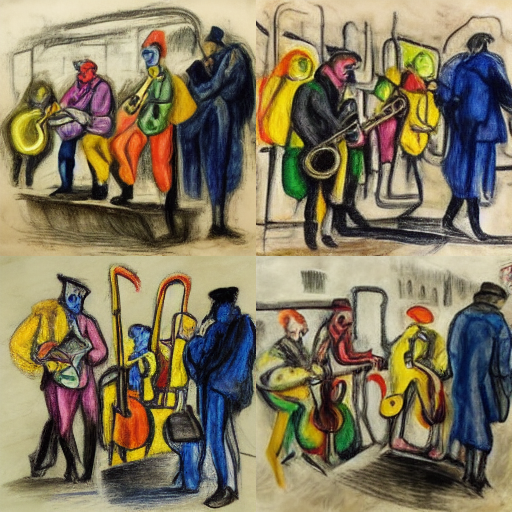
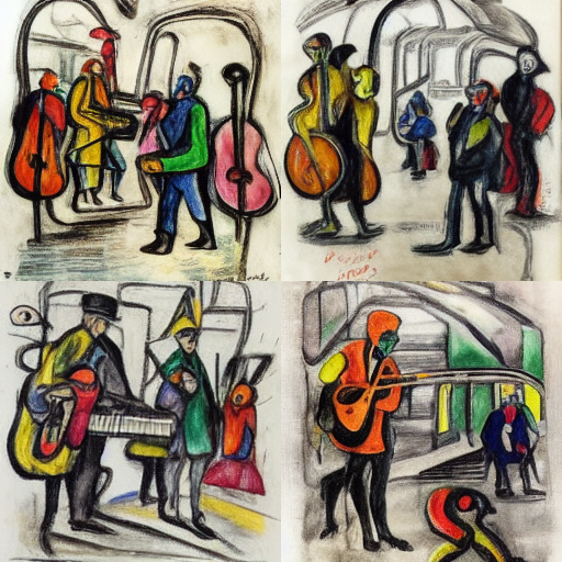
And just for fun, here’s a MidJourney piece on the same subject that I really like. The colorful glow and the roller-skate-like cart give it an eerie and playful feeling, quite beyond my imagination.