For most of September, I continued working on a new series featuring rabbits. I’ll dedicate a post to that when I’m done, hopefully soon. In moments of frustration, hesitation, or simply needing to look at something different, I distracted myself with a couple of portraits.
The inspiration, once again, came from the one and only earthsworld, though by the time I was done, the original photographs had mostly become scaffolding. I had three things in mind: don’t copy the photo, think in big shapes, and work some patterns into the painting.
I also wanted the two portraits to go in different directions. One would have stronger value and color contrasts; the other would stay closer in value, softer and more subdued.
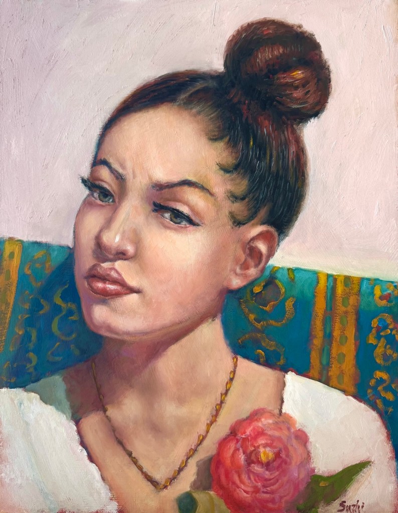
The woman with the high bun was meant to be the colorful one. I started with a fairly simple warm-cool contrast: the warm skin, flower, and touches of gold against that large teal shape running behind her. From there, I tried to let some visual rhythms travel through the painting. The curls and loops in her hair echo the curving lines in the sofa pattern, which in turn pick up the shapes of the flower petals. I didn’t want the patterns to simply decorate the background. Ideally, they would help pull the whole painting together.
For the most part, I think that worked.
The yellow pattern on the teal surface, though, was a little random. I knew I wanted something there, but I didn’t design it carefully enough before painting it, so parts of it feel more improvised than intentional. The flower suffered a similar fate. By the time I got there, apparently I had decided a flower was just a pink blob with enough petals to make its identity clear.
Still, I like the overall effect. The larger shapes remained reasonably intact, and the portrait feels decorative without becoming too ornamental. Most importantly, I managed not to chase every little detail in the reference, which, for me, counts as progress.
The second portrait was supposed to be almost the opposite.
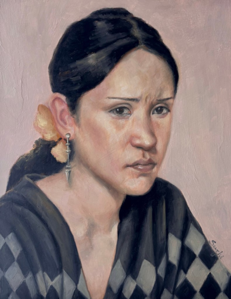
Before I started, I had a very clear mental image: a pale, pastel-ish painting with a narrow value range. The checkerboard sweater would be loose and barely defined, more suggestion than pattern. The face would emerge quietly from the surrounding grays and pinks. Nothing too sharp. Nothing too black.
That was the plan.
Halfway through, I found myself carefully painting folds into the sweater and defining one checker after another. Apparently the checkerboard had other ideas. Eventually the lower half of the painting became much stronger and more structured than I had intended.
I stopped. Left it alone on the easel for a few days, and looked at it from time to time.
Finally I decided that rather than trying to drag the painting back toward my original idea, I would follow where it had already gone. I deepened the black of the hair, strengthened the eyes, and clarified some of the facial features. That gave the upper part enough visual weight to hold its own against the sweater.
It is definitely not the painting I pictured before I started. But I like it.
There is something satisfying about the contrast between her very controlled, almost stern expression and all those large geometric shapes below. The darkened hair and the sweater also emphasizes the big shapes I aimed for from the beginning, just much more insistently than expected.
These two paintings reminded me of something that seems to happen over and over in my studio. I start with a fairly specific goal, then at some point the painting wanders off. Sometimes I fight it and make things worse. Sometimes I follow it and end up somewhere more interesting. The art is to pick the battle.
I still want to paint that second portrait I originally imagined: pale, quiet, loosely defined, with the pattern barely there. Someday I’ll give it another try.
For now, back to the rabbits.

