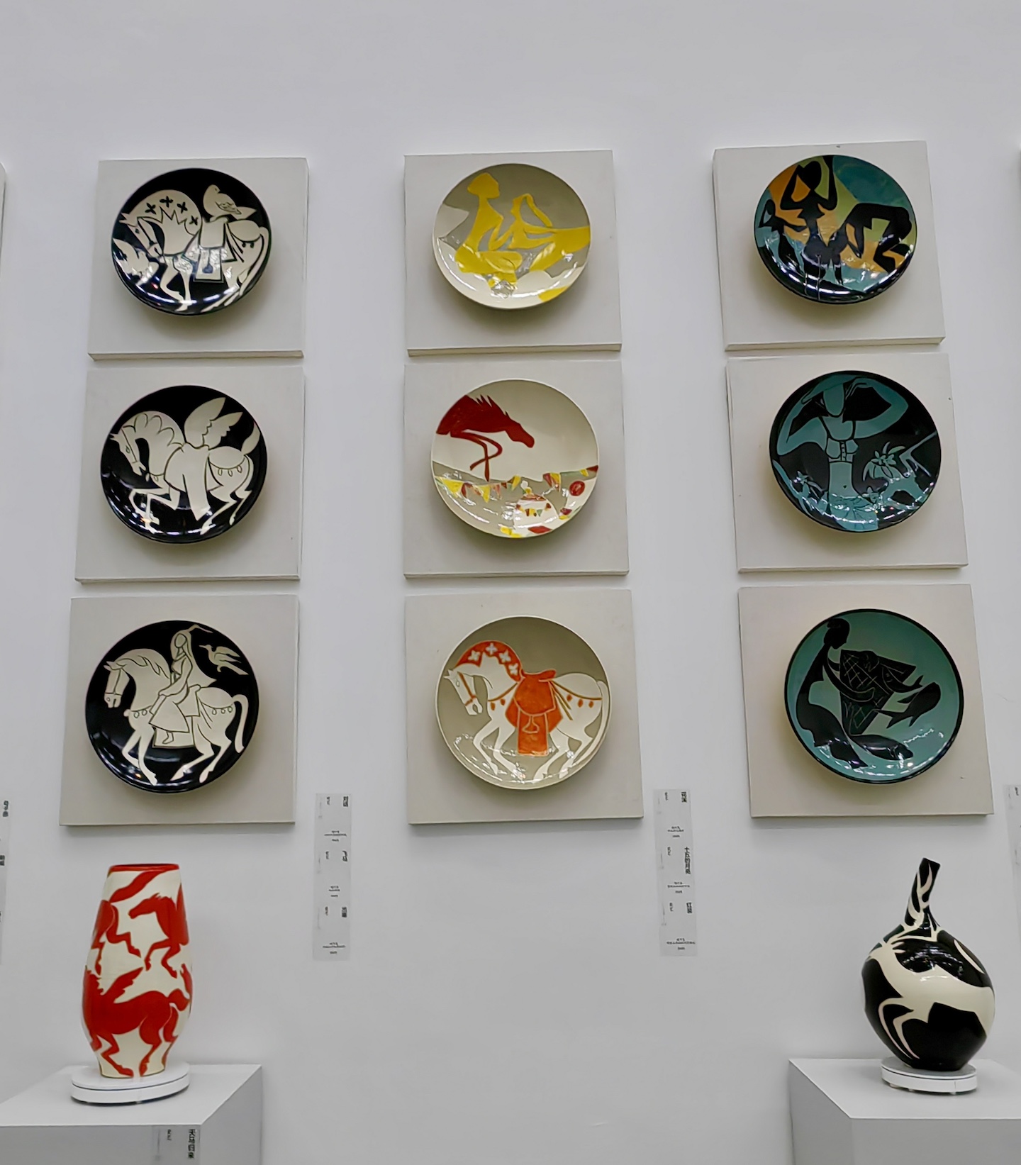
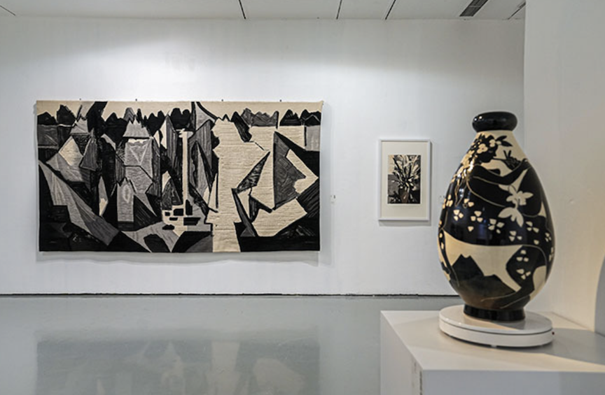
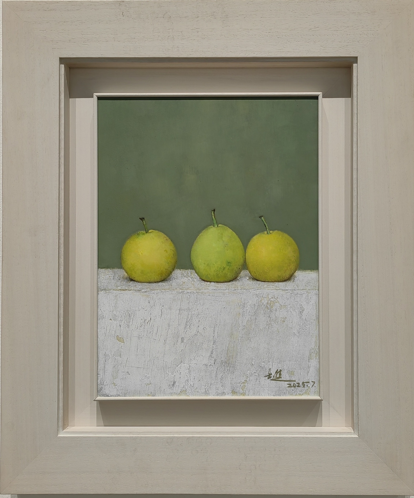
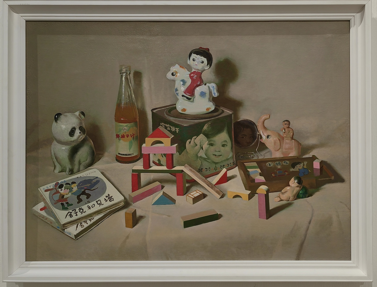
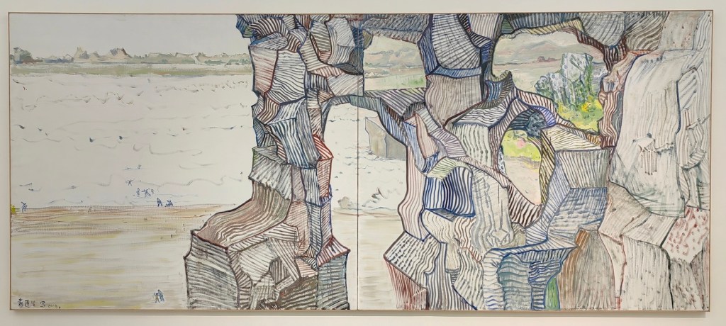
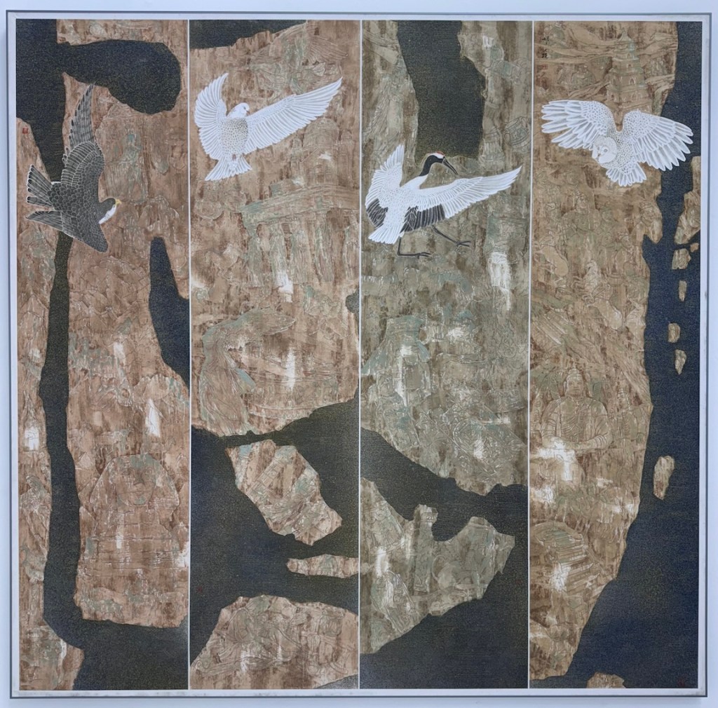
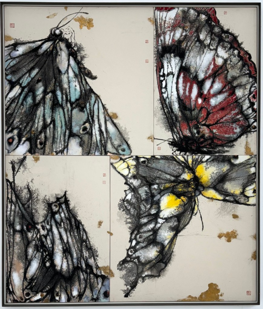
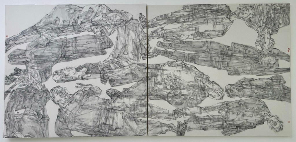
My previous trips to Shanghai were defined by the city’s kinetic buzz—skyscrapers, street food, and endless energy. This time, however, I dedicated the trip entirely to the city’s rich art scene.
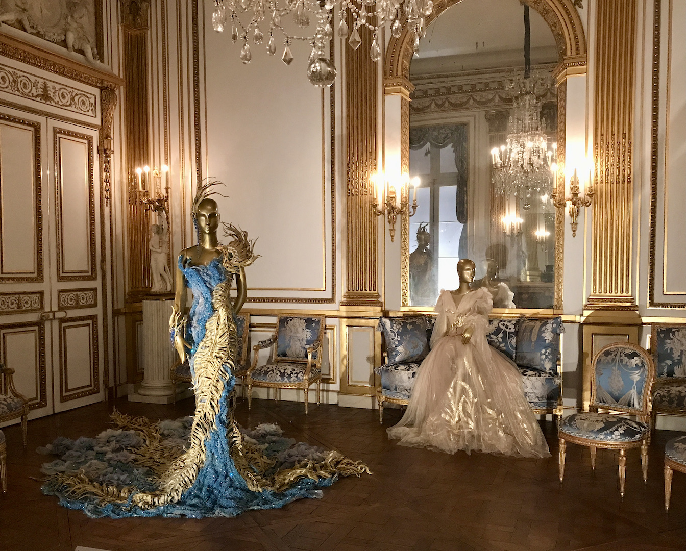
Positioning itself as a hub connecting China and the world, Shanghai offered a diverse array of experiences. I moved from the “30-year Retrospective of the China Oil Painting Society” to the “Guangdong Art Centennial Exhibition,” and then to the “Wonder of Patterns” exhibition from the Louvre. I saw Shanghai’s attempts to bridge time and space: “Comienzo 1922,” connecting Salvador Dalí’s origins in Madrid to the construction of the Bund City Hall, and “Waves in Motion,” a dual solo exhibition by Hong Kong designers Alan Chan and Craig Au-Yeung Ying Chai, which explored the cultures of many Chinese cities. I also saw Shanghai’s tribute to the Fluxus movement that influenced China: “Flux’s, by Chance.”
But the centerpiece of the trip was supposed to be the famous Shanghai Biennale. Founded in 1996 as mainland China’s first international contemporary art biennale, it has long been one of Asia’s most influential cultural events. After a positive experience at the Chongqing Biennale last year, my hopes for Shanghai were high.
This year’s edition, titled “Does the Flower Hear the Bee?”, aimed to operate at the intersection of human and nonhuman intelligence, featuring over 250 works by 67 individual artists from around the world. Most exhibits were installation or multimedia works that occupied vast spaces, often incorporating sound. They were meant to provide an “immersive experience” —the exhibition buzzword of the decade. Yet, walking through the Power Station of Art, I felt a profound emptiness and noisiness at the same time. The installations were not much different from the student shows I have seen at the Central Academy of Fine Arts (CAFA) over the last two decades. Obscure intentions, clichéd designs, and soundscapes meant to be unique to each piece instead bled into one another. I know it is also a cliché to criticize modern art as “flash” or “trying too hard to shock,” but I genuinely felt these works were demanding my attention without providing much in return. There was not much to see, only fatigue.
At the same venue, I saw Lin Tianmiao’s “There’s No Fun in It.” As a pioneer of Chinese installation art, Lin’s work was slightly more compelling than the Biennale. The two thematic axes unfolding in the exhibition—“Body” and “Everyday Objects”—presented a panoramic view of the artist’s continual experimentation with new materials and modes of expression. The “Body” constituted the core of her inward perception and self-reflection, while “Everyday Objects” functioned as vehicles for observing and responding to the external world. The exhibition was intended to invite viewers “to reconsider the fraught entanglements of body and everyday life.” Yet, the amount of space it demanded did not match the experience it provided. Lin Tianmiao states: “Bodily sensation is often the most reliable. It is not only the source of perception but also the material and medium of creation.” While I appreciated the point, I still believe that with great artistry, one can achieve that sensation in the small space of a single painting. That said, the show was coherent in meaning and proficient in technique; I enjoyed it more than the Biennale.
To understand my skepticism regarding installation art, I have to take you back a few decades to when the medium first arrived in China. It burst onto the scene in the mid-1980s amid the modern art wave, heavily influenced by American artist Robert Rauschenberg. Young artists credited him with bringing postmodernism to China, believing it would shape the landscape of Chinese art for decades to come. For these young artists, these new concepts were weapons to shatter the rigid, Soviet-influenced art systems in the post-Cultural Revolution era.
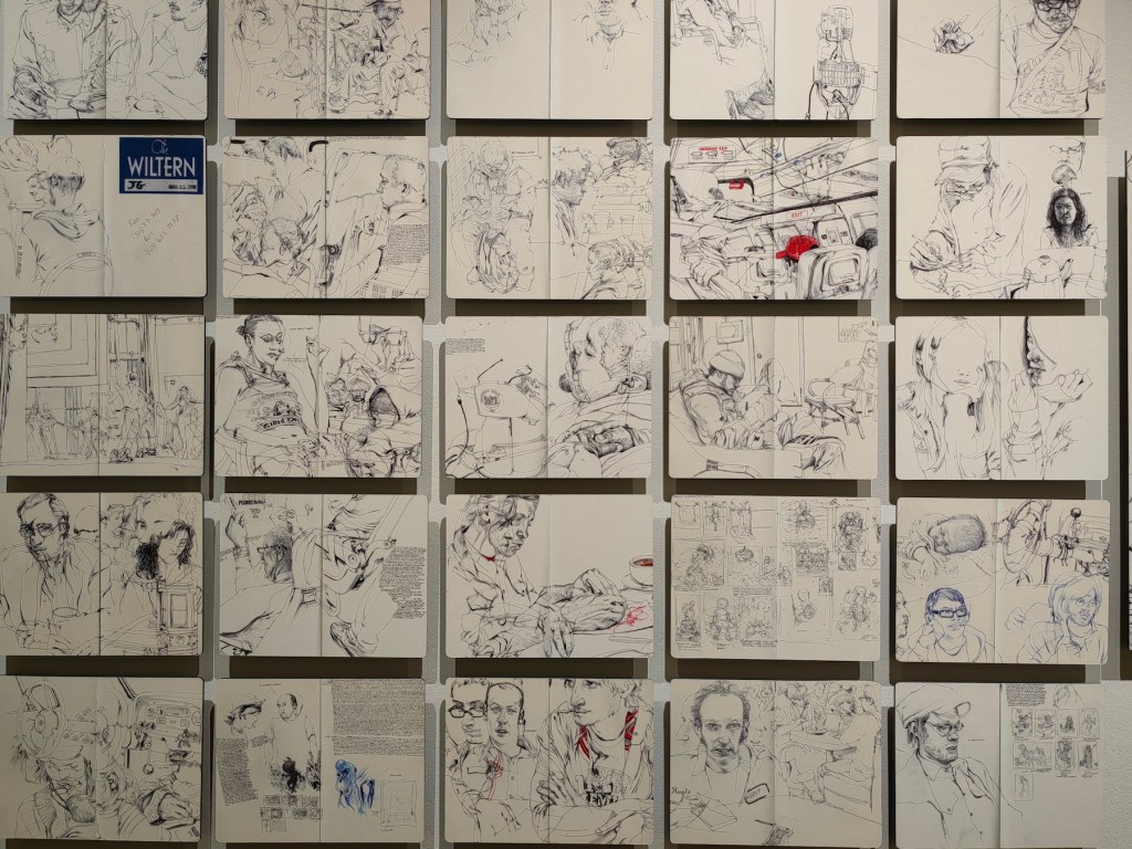
In February 1989, the China/Avant-Garde Exhibition opened at the National Art Museum of China. Growing up next door to the venue, this show was my initiation into installation art. The official record paints a vivid picture: banners paved across the plaza, condoms scattered in exhibition halls, and artists hatching eggs on the second floor. The museum eventually had to remove fake notices hung in restrooms, and the show was famously shut down after artist Xiao Lu fired gunshots into her installation Dialogue. I was young and not particularly art-literate. To me, it looked like a collection of weird stunts, but it was great fun. What young soul doesn’t enjoy chaos and the out-of-the-ordinary?
Little did I know at the time that this show was the epitome of the early stage of China’s installation art. After the events of 1989, modern art in China hit a nadir. Publications folded, and artists fled to France, the US, and Japan. It wasn’t until the mid-90s that artists returning from overseas revived the medium, shifting focus from grand political discourse to individual experience. Still, the National Art Museum never hosted anything that avant-garde again. In China, installation art became categorized within the broader framework of “Conceptual Art.” Due to the indifference and wariness of mainstream art circles, it remained marginalized in the allocation of resources. Some young artists mistakenly believed that only installation art was true avant-garde and that painting was dying, leading their practice to become purely performative.
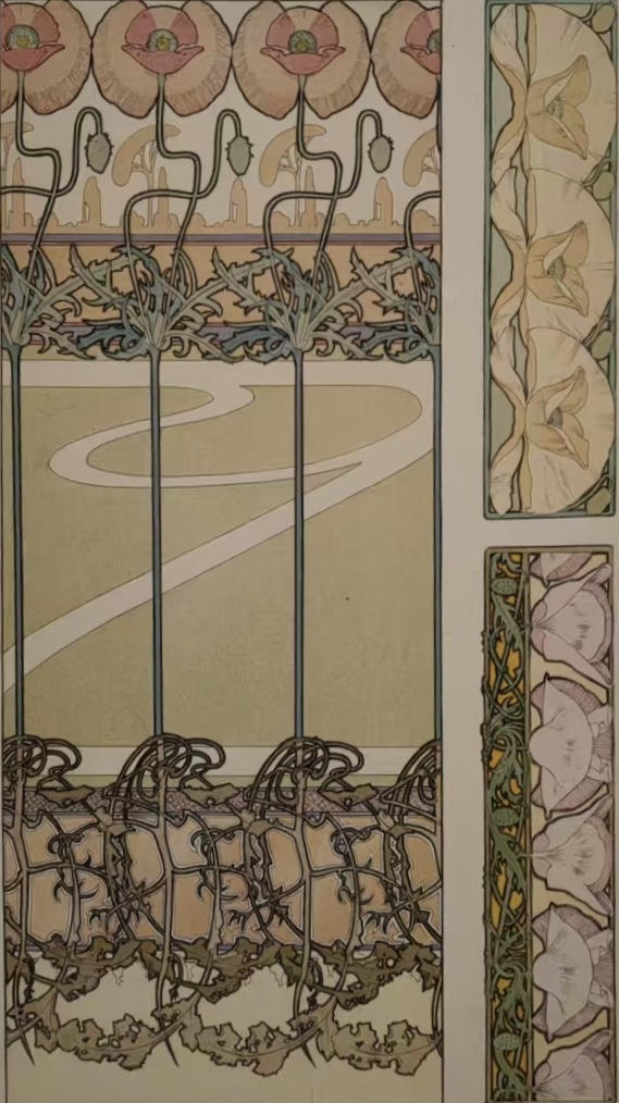
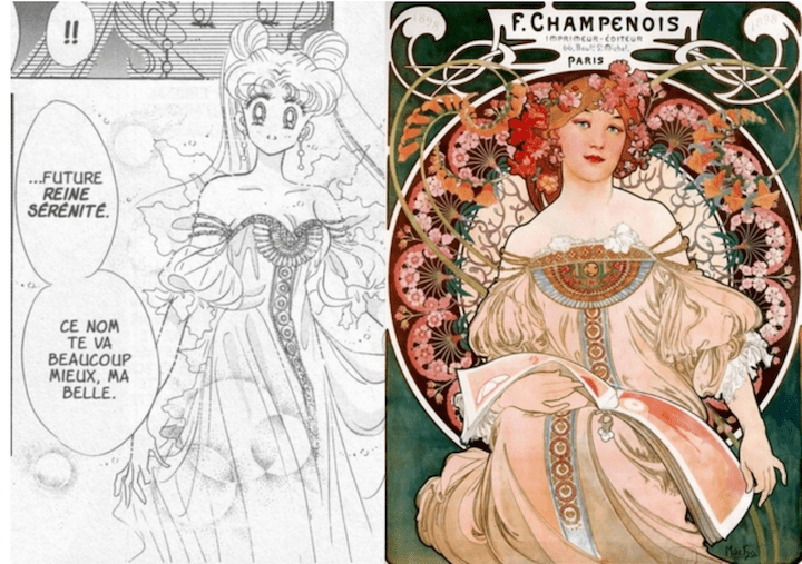
In the 1980s and 90s, installation and multimedia art were radical challenges to traditional forms. But can they still claim that subversive power in 2025? Today, “immersive” is a commercial cliché. It is the part of the venue that sells the most expensive tickets. And while an installation strives to provoke bodily sensation—an immersive experience—people can simply walk through projections of Starry Night or watch an animated Mucha. Why do I need to read a three-paragraph wall text to understand your grievance or why a pile of bricks is a masterpiece, when I can enjoy the new form of a time-tested beauty? To me, most of the installation art can be summarized as “There’s No Fun in It.”
This is not to say I am entirely against installation art. Over the years, some exhibitions have left a positive impression. In 2015, UCCA at 798 hosted William Kentridge’s Notes Towards a Model Opera. It was a comprehensive retrospective including works from nearly every major project the artist had undertaken up to that moment. The exhibition spanned a vast array of media: ink and charcoal drawings, kinetic sculptures, multi-channel video artworks, and a large-scale installation in the form of an operatic model. In his hand-drawn animations, he filmed the incremental creation, erasure, and reworking of drawings. The technology involved was called for by the art, not added to call attention to itself. One of the centerpieces was the Soho Eckstein cycle, a combination of art, storytelling, technology, and political messaging—a true interdisciplinary masterpiece. You could say these were postmodern artworks that were actually beautiful and therefore relatable. Art can be weird or shocking, but it must possess an aesthetic language that connects viscerally. What makes art “art” still matters even in postmodernism, and an installation only becomes powerful when it delivers both meaning and beauty, not just statement or protest in a different form.
With my expectations tempered, I walked into the Rockbund Art Museum to see “The Great Camouflage.” The venue itself is an Art Deco gem, built in 1933 for the Royal Asiatic Society. The exhibition layout was obscure and chaotic. At one point, I was told there was more to see in an elevator hall, and only found the piece after bumping into a janitor’s closet and a fuse box. The artwork consisted of three fliers with poorly printed words: “What time is it on the clock of the world,” posted on a window.
But then, I found it.
The piece that gripped me was Wang Tuo’s Distorting Words (2019), a three-channel 4K video installation running about 24 minutes. It is the second chapter of his Northeast Tetralogy, a critical examination of the geopolitical, ideological, and cultural transformations of Northeast China.
Distorting Words weaves together four stories to create a disorienting portrait of historical recurrence:
- The Martyr (1919): Guo Qinguang, a student activist in the May Fourth Movement, died of exhaustion after the protest, though it was widely believed at the time that he died of police violence. His death evoked immense public anger toward the government.
- The Avenger (2019): The execution of Zhang Koukou, a man who killed three neighbors to avenge his mother’s death decades prior. His death triggered intense debate regarding societal duty and justice.
- The Ghost: A retelling of “The Hanging Ghost” from the classic Strange Tales from a Chinese Studio (Liaozhai Zhiyi). In this version, a scholar with a hidden death wish repeatedly witnesses a woman hanging herself. Wang Tuo uses this to suggest that our internal desires summon historical traumas—we are not just watching the past; we are willing it to return.
- The Shaman: A story adapted from anthropologist Claude Lévi-Strauss regarding a Zuni boy accused of sorcery. To survive torture, the boy invents a story, “confessing” to being a shaman and performing a trick to “lose” his powers. He survives because he gave the crowd the performance they needed to validate their beliefs.
Wang Tuo uses these threads to explore “Pan-Shamanism.” He suggests that figures like Guo Qinguang and Zhang Koukou are not just individuals, but mediums—shamans forced to perform the roles of “martyr” or “avenger” to satisfy the collective psychological needs of society. The video is beautifully shot, skillfully edited, and accompanied by an evocative soundtrack by the underground band Manchufeierzi. This was an installation where the narrative, the aesthetic, and the philosophy coalesced perfectly. It did what great art should do: it bypassed my cynicism and connected directly.
The logical next step was trying to find where I could watch the other installations in the series, but another aspect of installation art struck me: the works were nowhere to be found. Unless there is another physical exhibition in my vicinity, I may never be able to see them.
I hadn’t thought about the transient nature of installation art before. Many works are site-specific, even perishable—dismantled after the show, most never sold. While Wang Tuo’s video installations can be reassembled and shown again, many cannot. I understand that part of the agenda is to challenge permanence (and my idea that there is a universal beauty standard) and to challenge commodification, much like Banksy’s self-destructing Girl with Balloon, an artwork shredded itself upon sale. The irony is that the most rebellious form has become the most exclusive. Contrast this with traditional fine art, which is easily reproduced and disseminated; installations are available only to those who have the time, money, and proximity to visit a museum in a major city. While traditional fine art can reach audiences through a smartphone, installation art’s dependence on traditional gatekeepers—like museums, galleries, and public institutions—is absolute.
This distinction feels increasingly vital in the age of AI. Tools like Midjourney can generate “Van Gogh-style” swirls or “Dalí-esque” dreams. The Mona Lisa is an image that permeates culture; you can own it on a postcard, a puzzle, a T-shirt, or a screen. Technology and commercialization have democratized fine art, and in doing so, destroyed traditional gatekeeping. What protest could be louder and more effective than this? Who are the true rebels now?
Maybe VR and the Metaverse can finally help installation art catch up.
As the tagline on the high-speed rail—an inspiration for Wang Tuo—reads: “The high-speed rail sets off at dusk and arrives at dawn, covering 2,000 km a night.”
We are moving fast. There will be a different world in the morning.
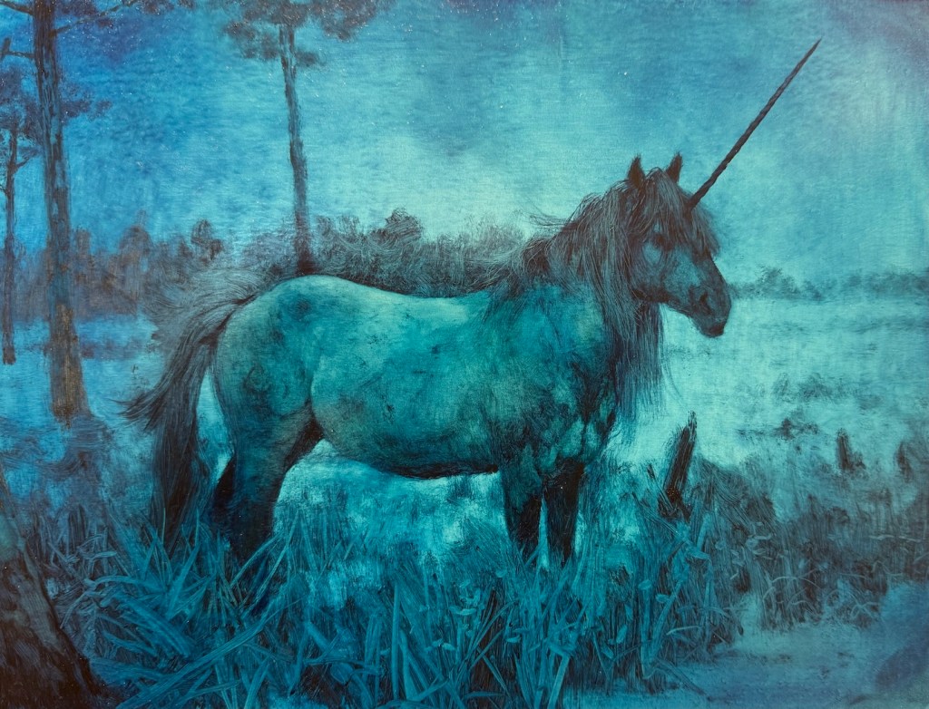
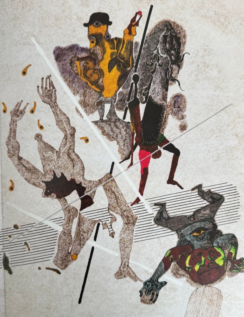
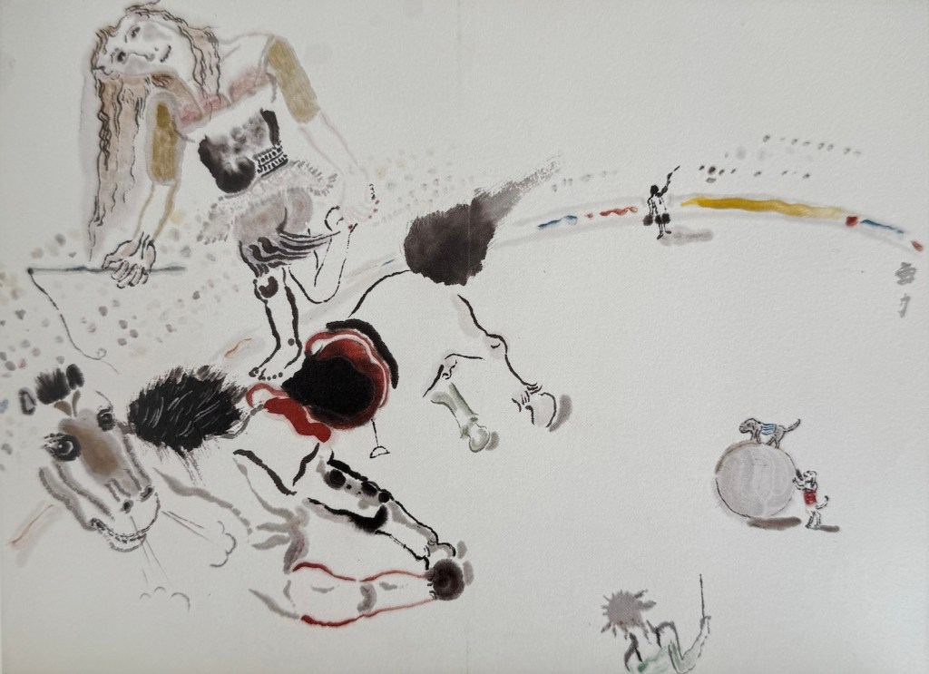
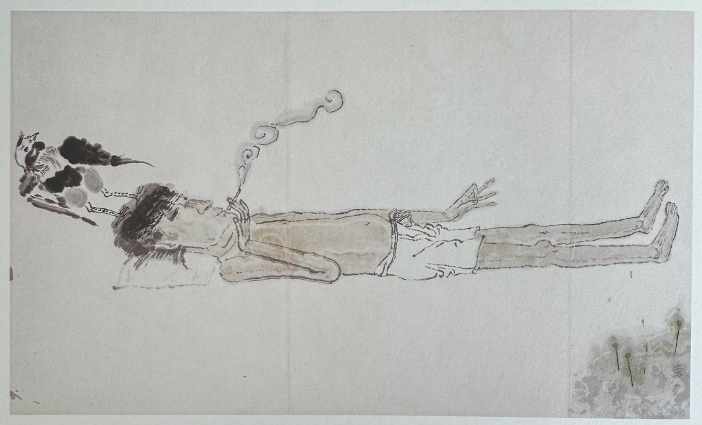
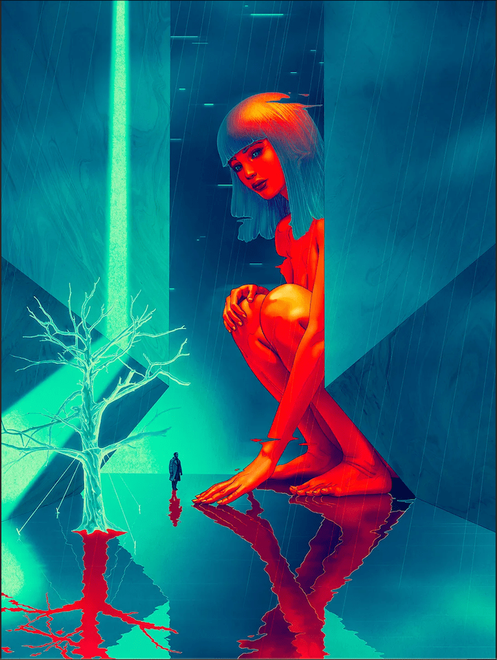
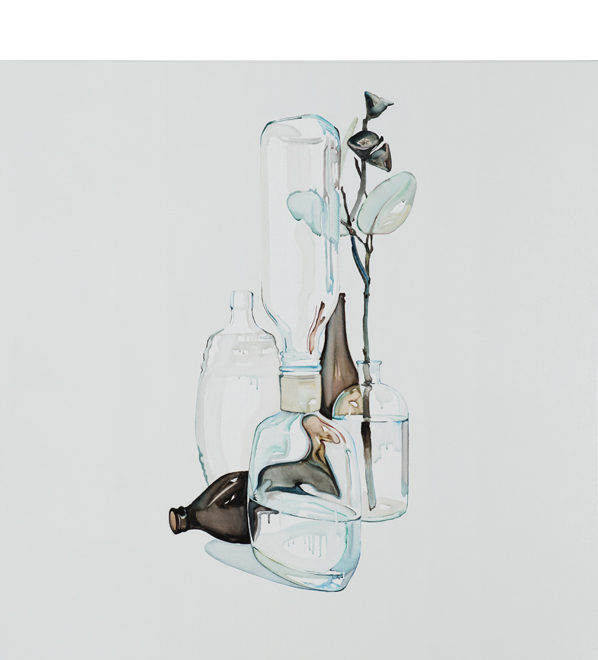
Happy New Year! Here’s my first installation art, brought to you by Grok Imagine: