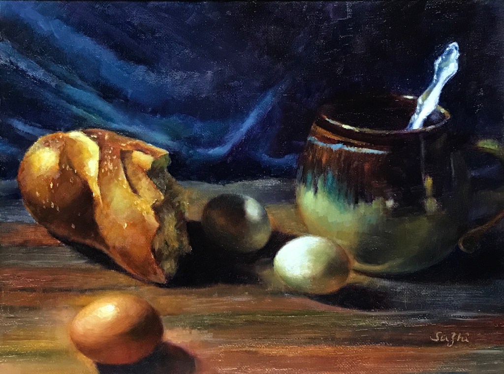
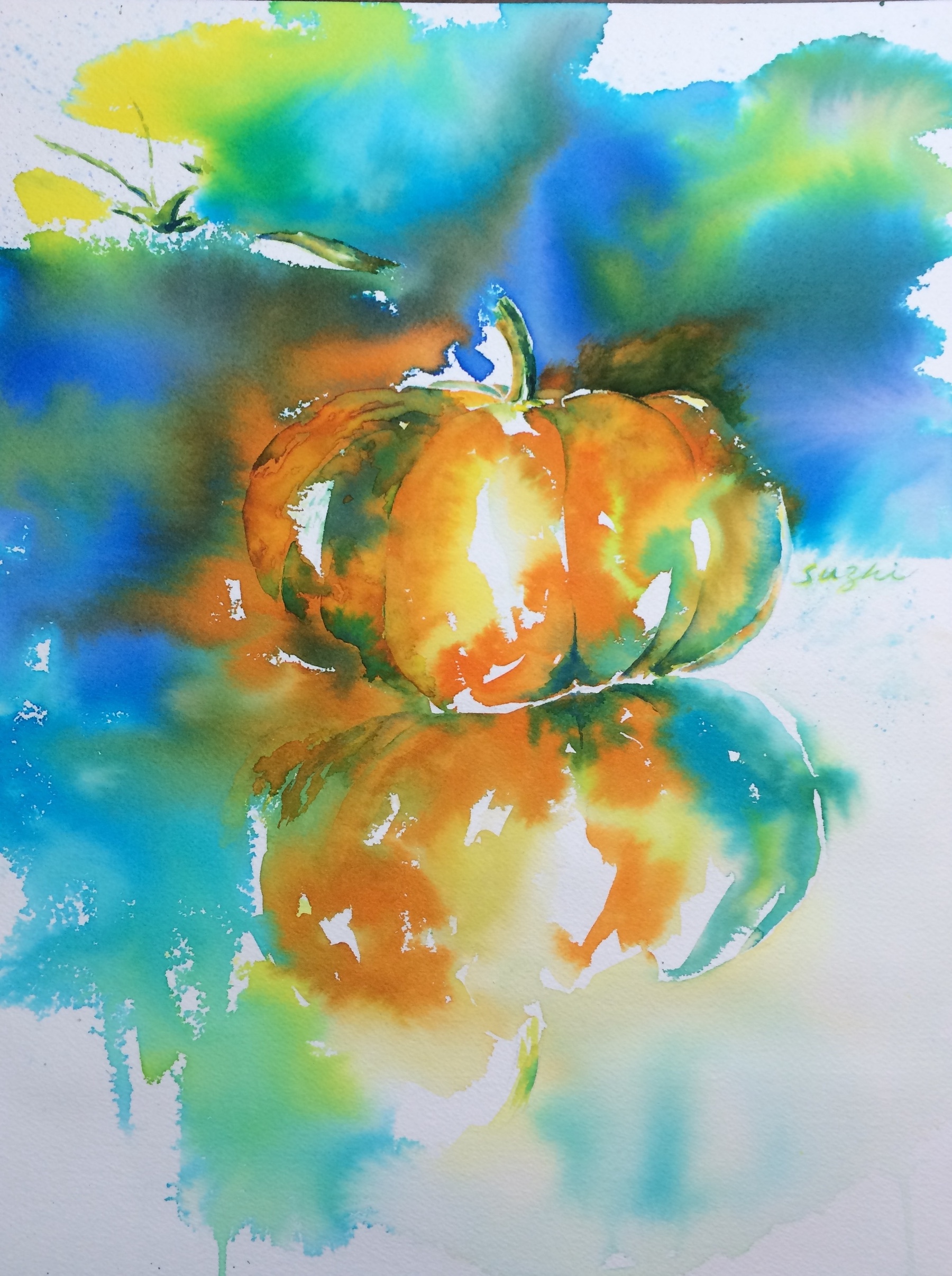
Nothing spooky here, just an old pumpkin! I can’t recall when I did this, maybe 10 years ago, when I could still feel the “water” in watercolor. Time flies!
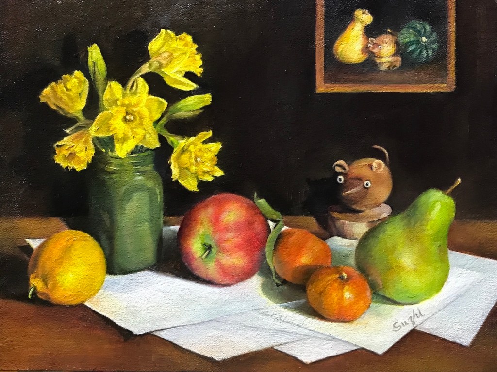
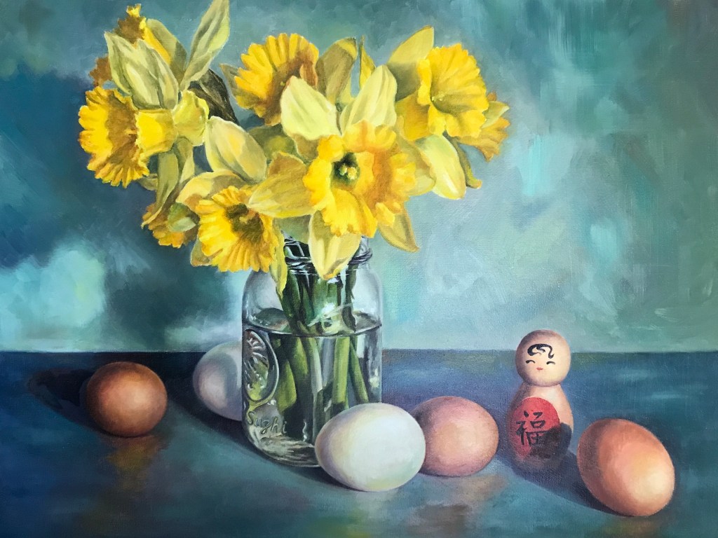
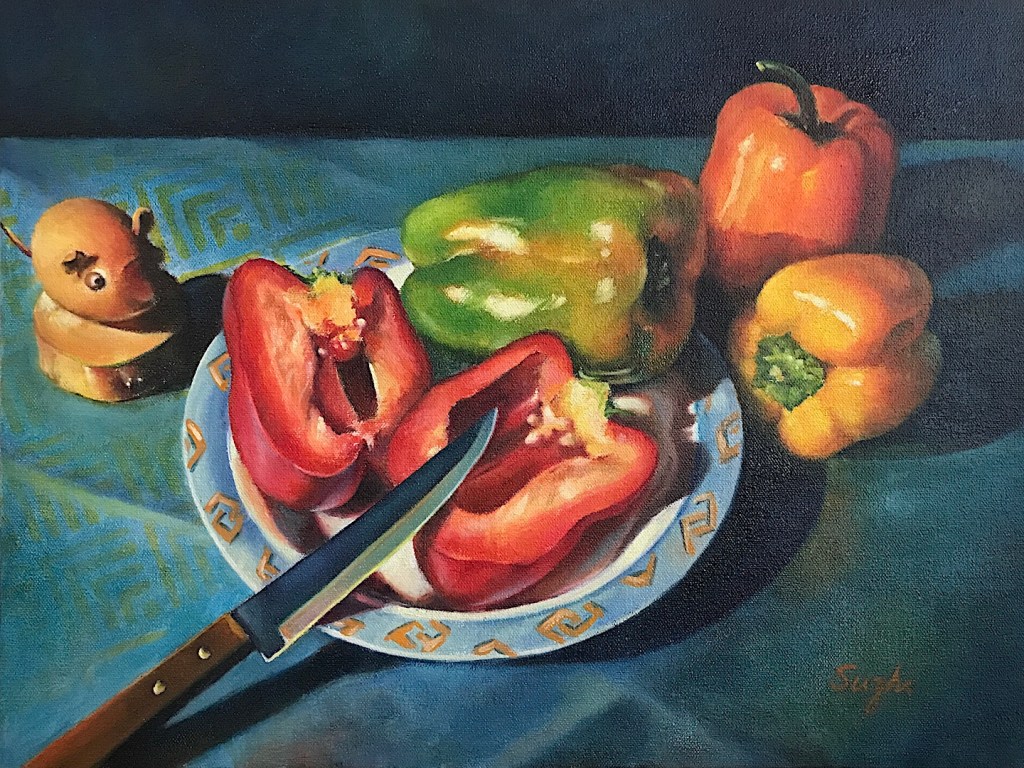
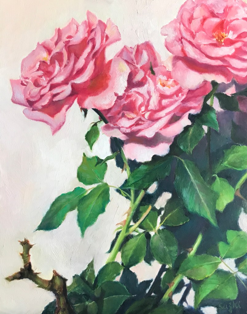
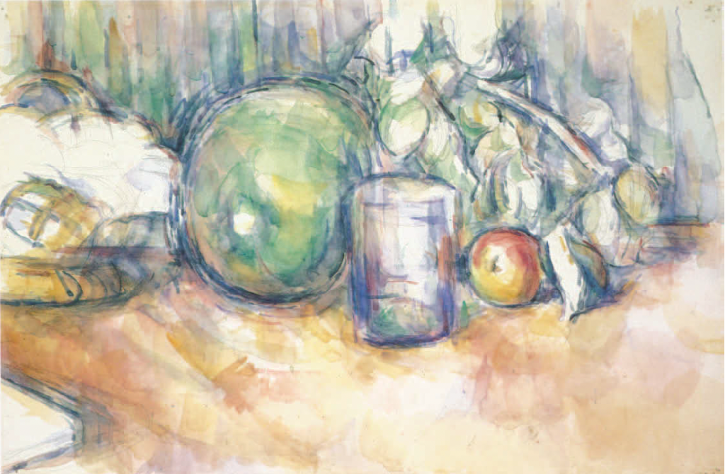
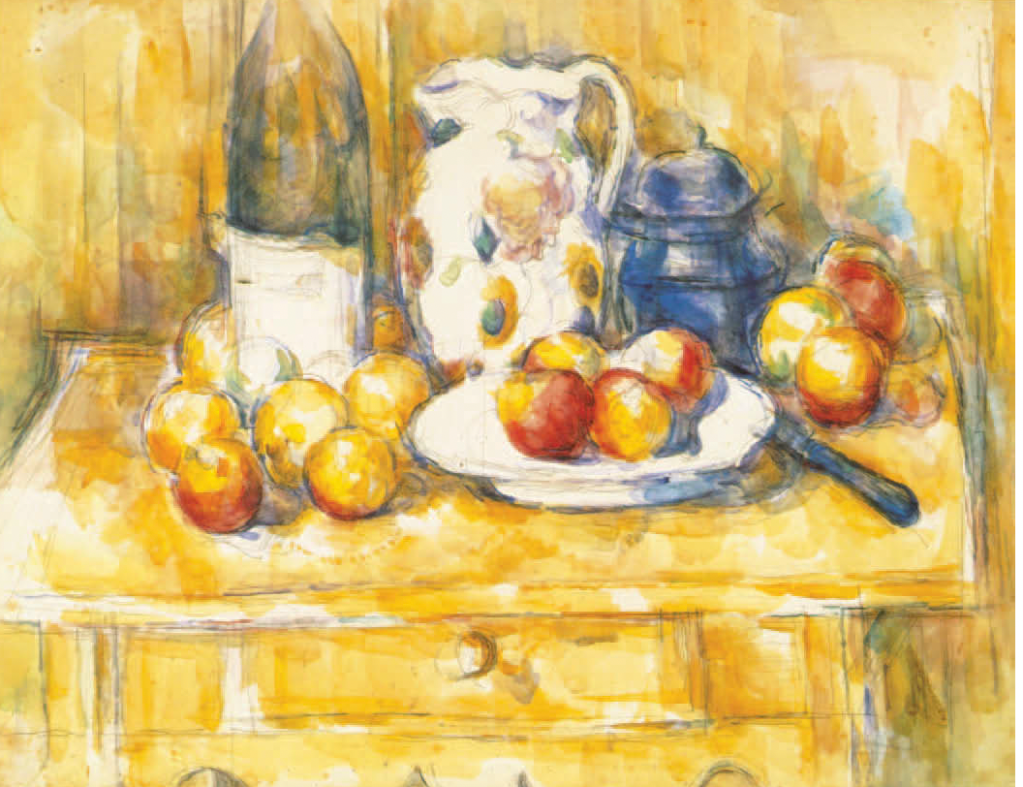
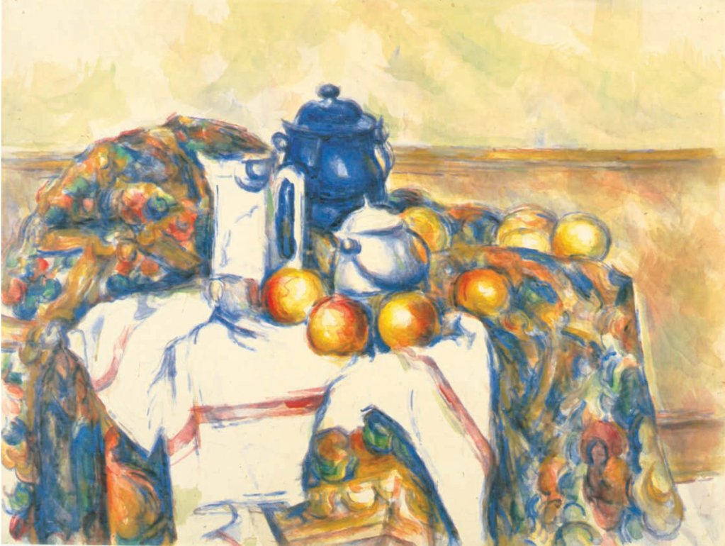
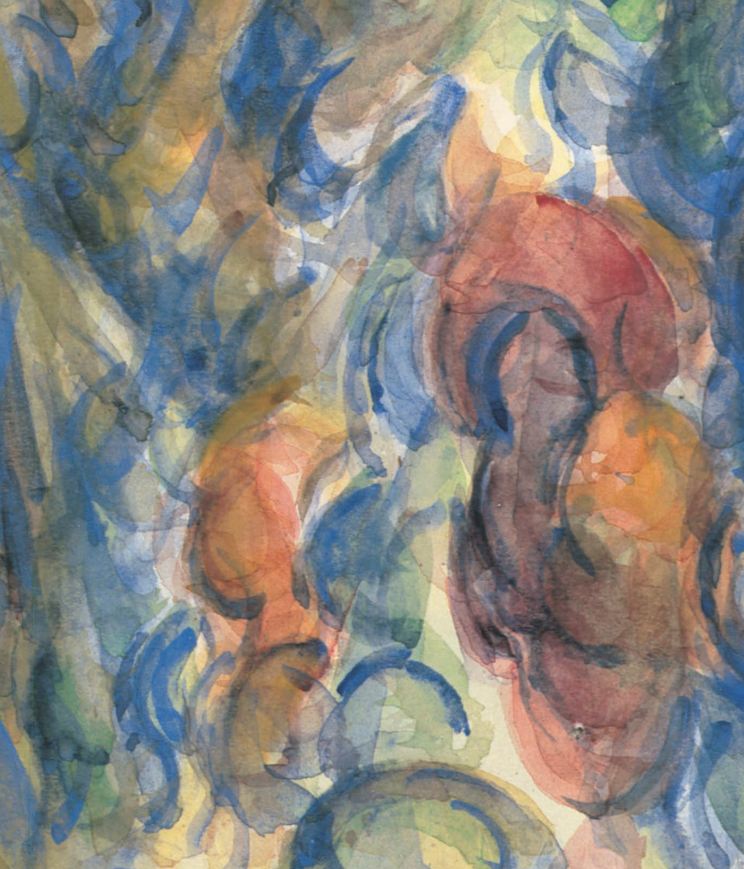
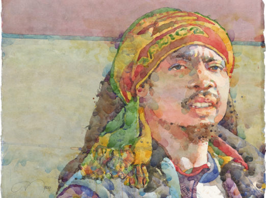
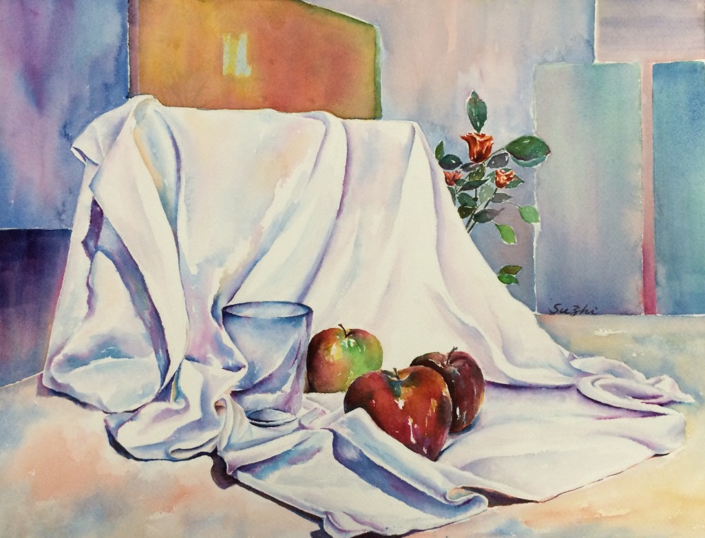
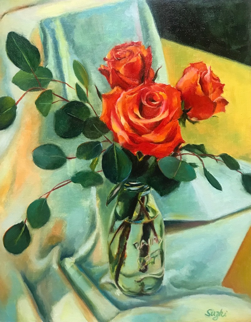
In the past, when I travelled, even with those lengthy stays abroad, I didn’t do any art. These past months when I stayed in China, inspired by all the art shows I attended (I will talk about these more in the future), I thought I should have kept things going. Oil being too troublesome, I managed to find watercolor paper and paint. My intention was to do some quick sketches or simple paintings, and these are what I’ve done:
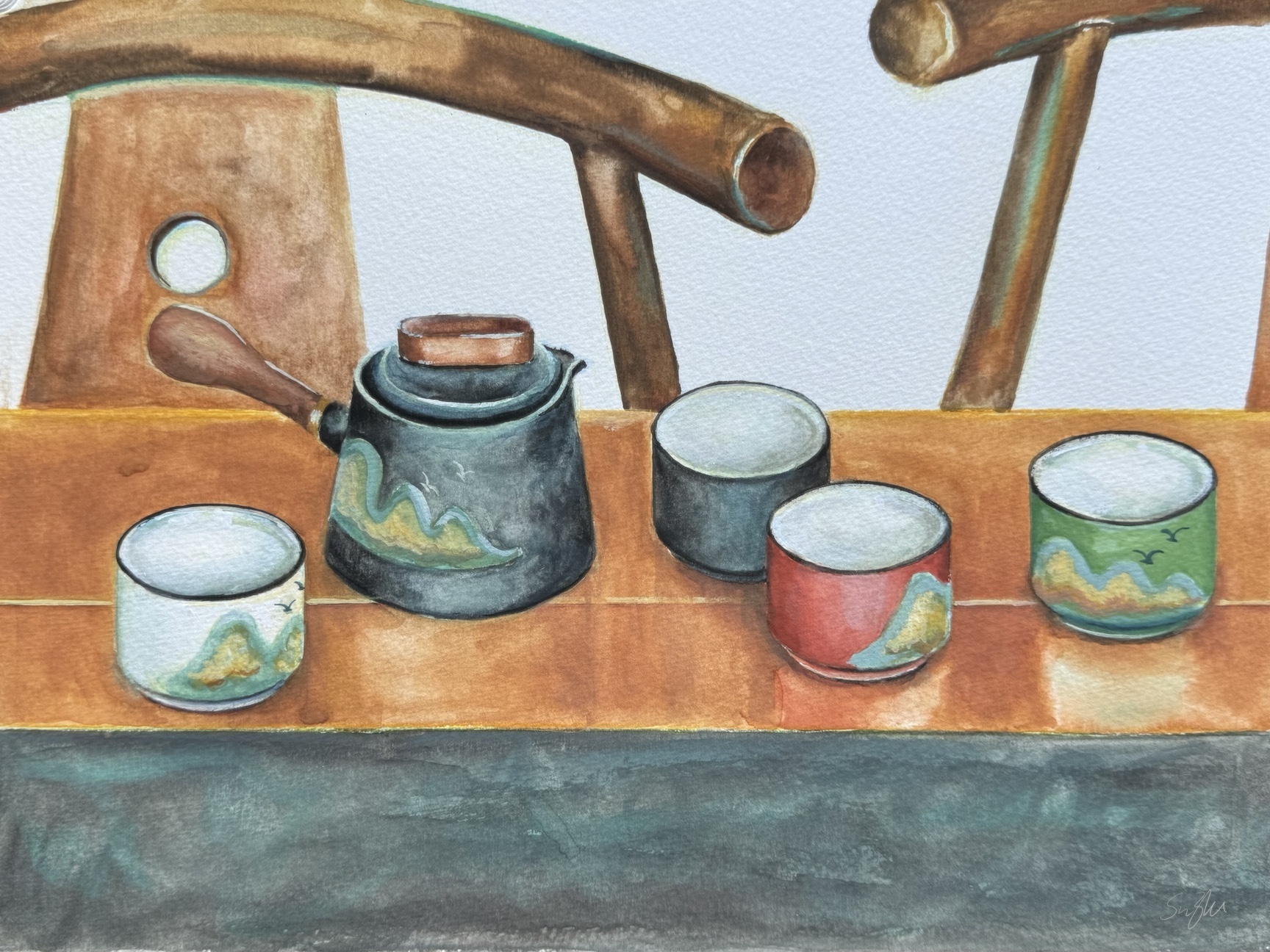

I found myself using watercolor the same way I use oil paint – controlled and layered. Despite their tight look, I didn’t spend that much time on each of these pieces, mainly because I gave up. I could have fine-tuned a lot more details, further emphasized the shadows and highlights, etc., but that was not what I set out to do. I missed the singing and dancing of colors in water.
In a way, the old pumpkin painting was not finished either, and the values probably don’t make sense. However, it was fun, and in my mind, it was what watercolor is supposed to be.
I am not upset though. I haven’t practiced watercolor for a while so a bit lack of touch is fair game. I like my compositions and color choices, and that’s something. Most importantly, I didn’t let the trip completely cut off my art practice, and that’s quite a step forward!