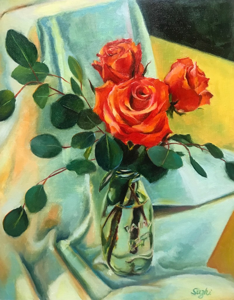
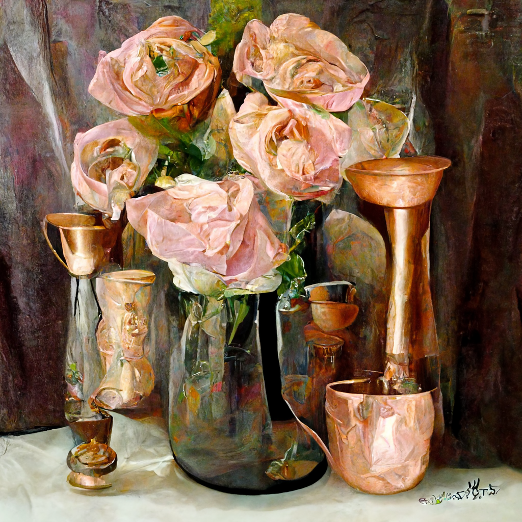
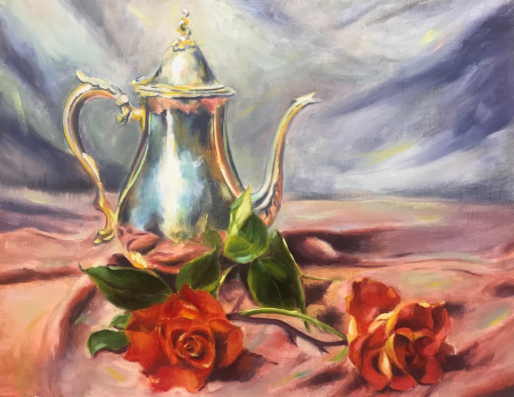
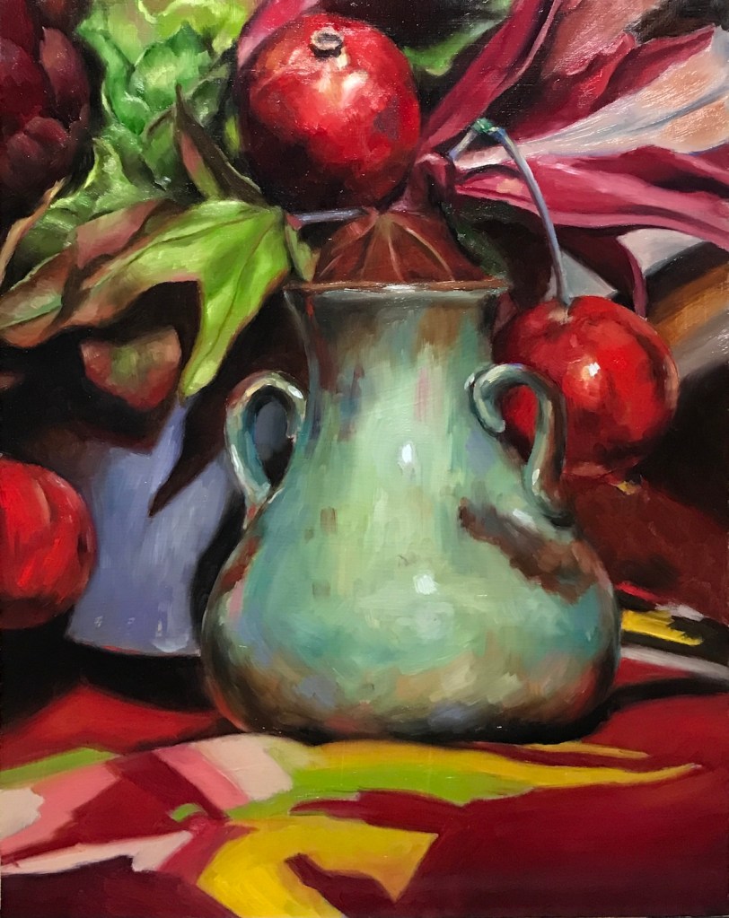
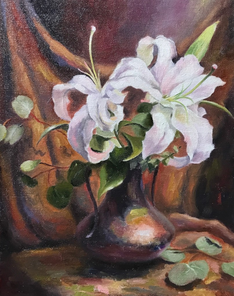
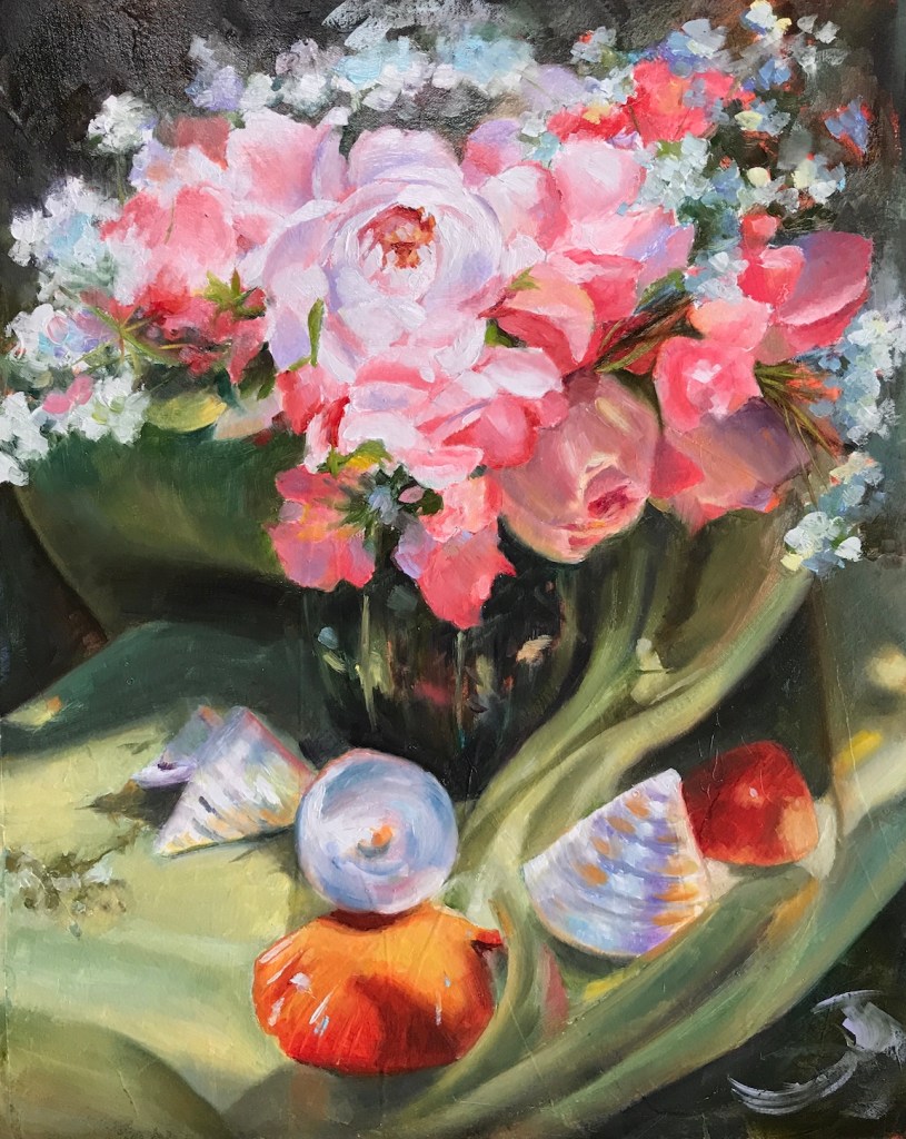
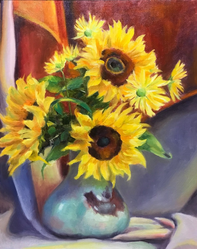
Red Roses and Pot, oil on canvas board, 11 x 14, 2022Roses, oil on canvas board, 11 x 14, 2022Pomegranates and Vase, oil on canvas board, 11 x 14, 2022Flowers and Vase, oil on canvas board, 11 x 14, 2022
According to Mr. Watts, there would be many more levels of still life courses after the gesture one. However, the people at the Atelier see no plans for new releases. I still have some catching up to do in the landscape area, but otherwise, I will focus on my own practice and projects in the coming months.
Lilies, oil on canvas board, 11 x 14, 2022Flowers and Shells, oil on canvas board, 11 x 14, 2022Sunflowers, oil on canvas board, 11 x 14, 2022Still Life, oil on canvas board, 11 x 14, 2022
The first one is a Zorn palette without time limit, and the rest are supposed to be gesture with an open palette. My plan is to finish the still life course soon, and I will write more about it when it’s all done.
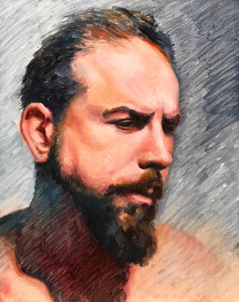
These are the final ones from Phase IV of Watts Atelier’s portrait painting courses:
Oil on canvas board, 11 x 14, 2022Oil on canvas board, 11 x 14, 2022Oil on canvas board, 9 x 12, 2022Oil on canvas board, 11 x 14, 2022Oil on canvas board, 11 x 14, 2022
A few notes:
This phase focuses on the “loose style and expressive edge work of gesture portrait painting.” It’s quite obvious that I need more practice and confidence to be more gestural. It takes a lot of effort to achieve the look of effortless.
Color wise, this stage is pretty open, but I still start with Zorn, and add others if necessary. It’s nice to have a familiar starting point.
According to Mr. Watts, there would be several more levels of portrait painting courses after this. However, I don’t see they have any plan for new releases in the near future.
For the time being, my “guided practice” of portrait painting will take a break and I will move on to “independent study.” The plan is to continue focusing on the looseness, giving more variety to the background design and trying to achieve a less rendered but more finished look.
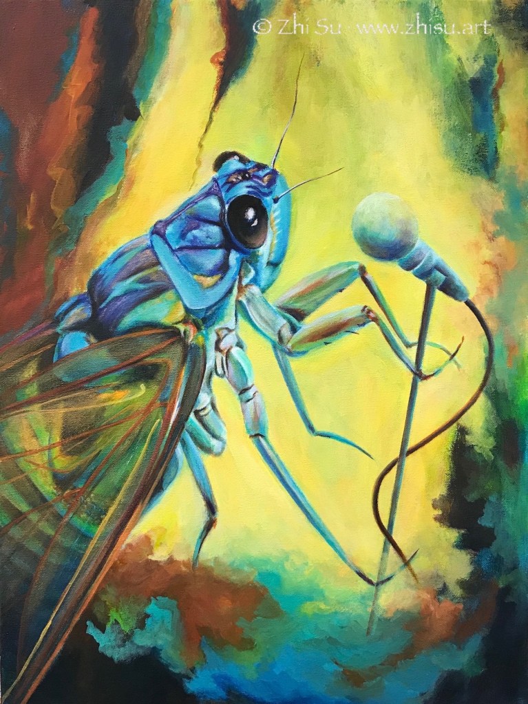
I am not a particular fan of insects, but the sound of cicadas is a constant in my childhood memory. Summer time in Beijing when the city was still haze free, kids with long bamboo sticks were searching for cicadas in the canopies of trees. The molt makes good ingredient in traditional Chinese medicine, probably for treating cold. When I first saw the picture of a blue cicada I was delightfully surprised. I never knew cicada could be this pretty. The ones we had in Beijing were black and brown. Yet, we all romanticize our memory, don’t we?
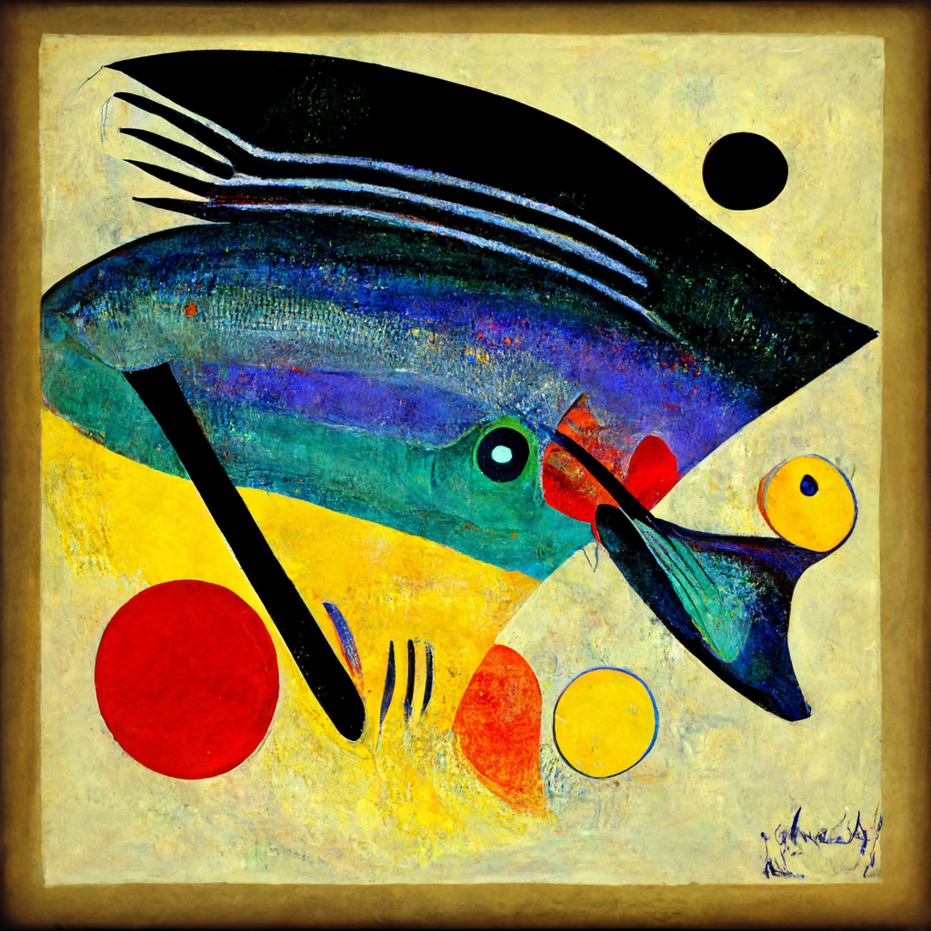
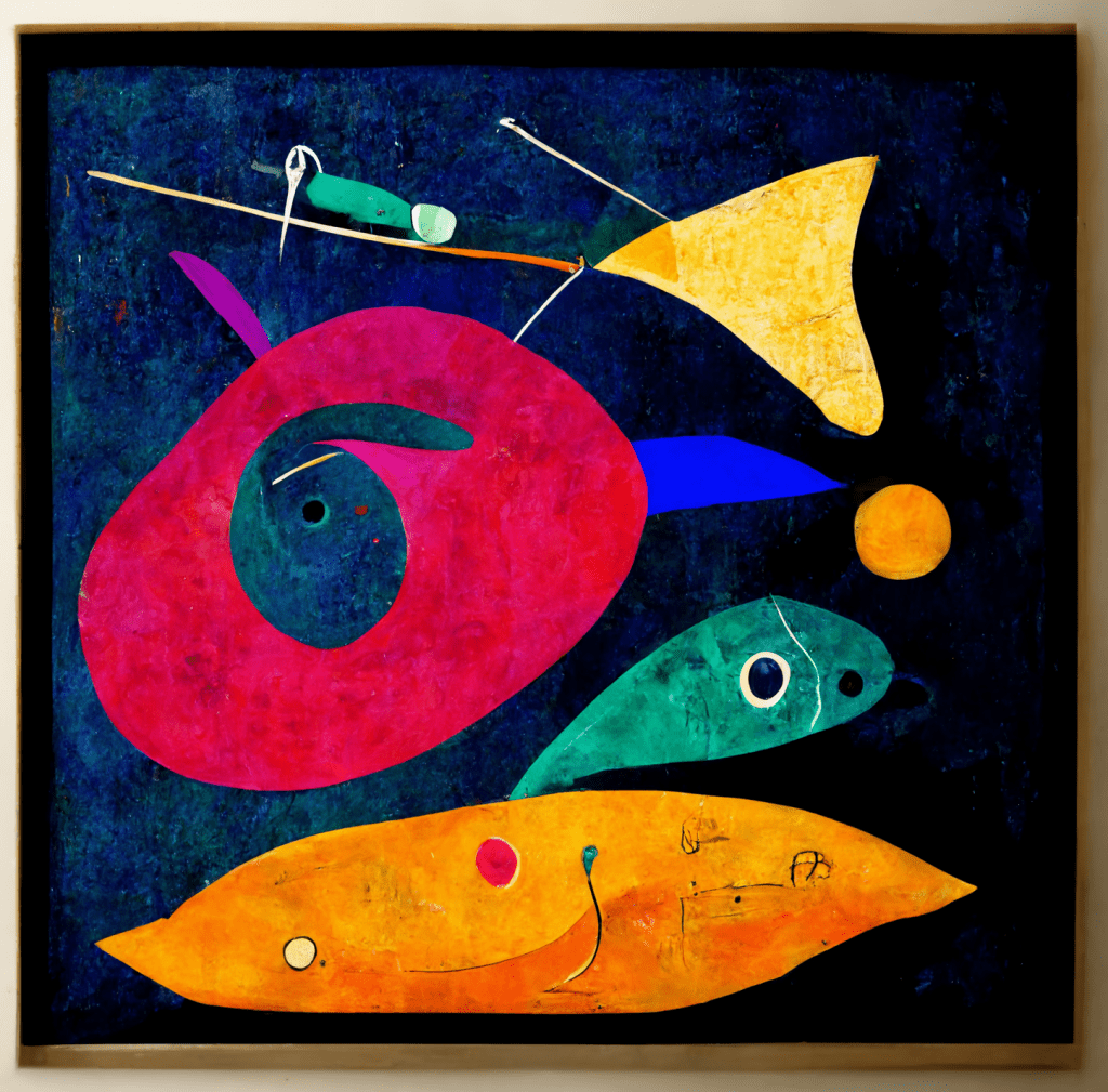
“Summer Dream,” which currently on view at the Pacific Art League gallery, was inspired by two of my previous pieces. The design came from “Marching” (not obvious, I know, long story still developing), while the color theme “Landscape.”
Summer Dream, acrylic on canvas, 22 x 28 in, 2021
By the way, naming the artwork is probably the hardest part of the creative process, at least for me. While “Sing” may be self-evident, it was still an afterthought. As for “Summer Dream,” hehe, I grabbed it out of nowhere the minute before submitting it for the show, and had to check the register sheet to remember what it was when I brought the artwork in. π
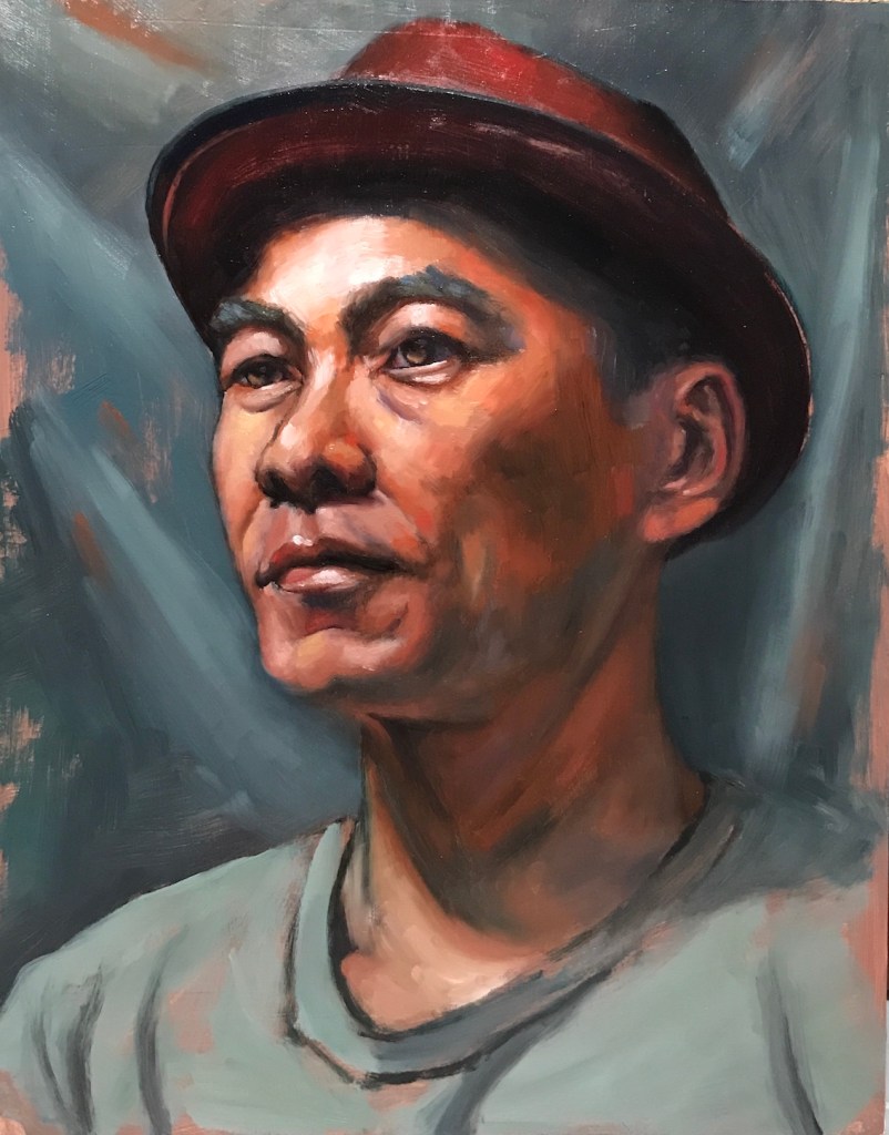
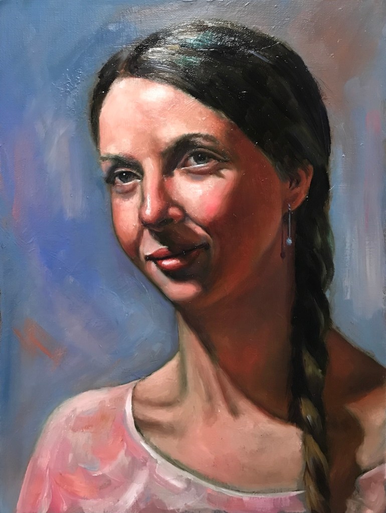
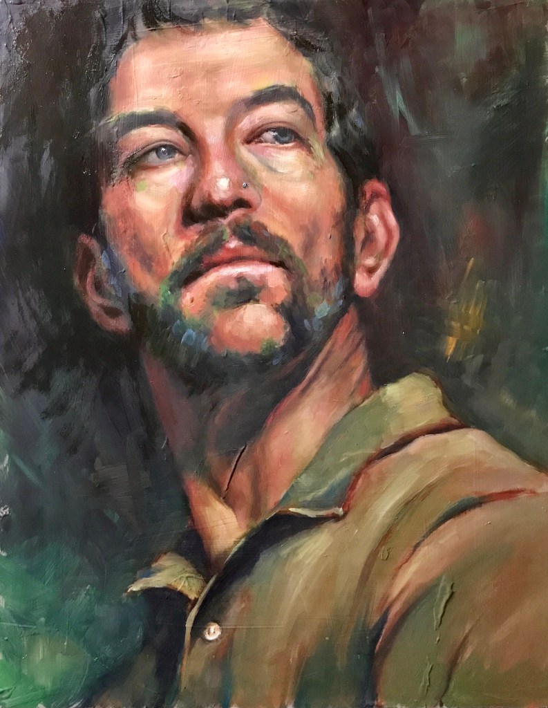
These are some of the portraits I’ve done recently. Palette wise I have pretty much opened myself to everything now:
Japanese Girl, oil on canvas board, 11 x 14 in, March, 2022Male Model, oil on canvas board, 11 x 14 in, March, 2022Female Model, oil on canvas board, 11 x 14 in, April, 2022
Here’s an old Zorn palette one:
Female Model, oil on canvas board, 11 x 14 in, December, 2021
A few notes:
The first three paintings are supposed to be gesture studies. I obviously overworked.
On the other hand, spending more time designing the background makes the process more interesting and the painting more finished. I like that.
Managing an open palette did distract me from better value control and cost more subtlety in skin tone.
I am thinking a two-step approach to improve: first spending more time preparing the palette – premixing most of the colors like I did with the Zorn palette; and then use a timer to push for a more gestural result. Two hours? Three? π
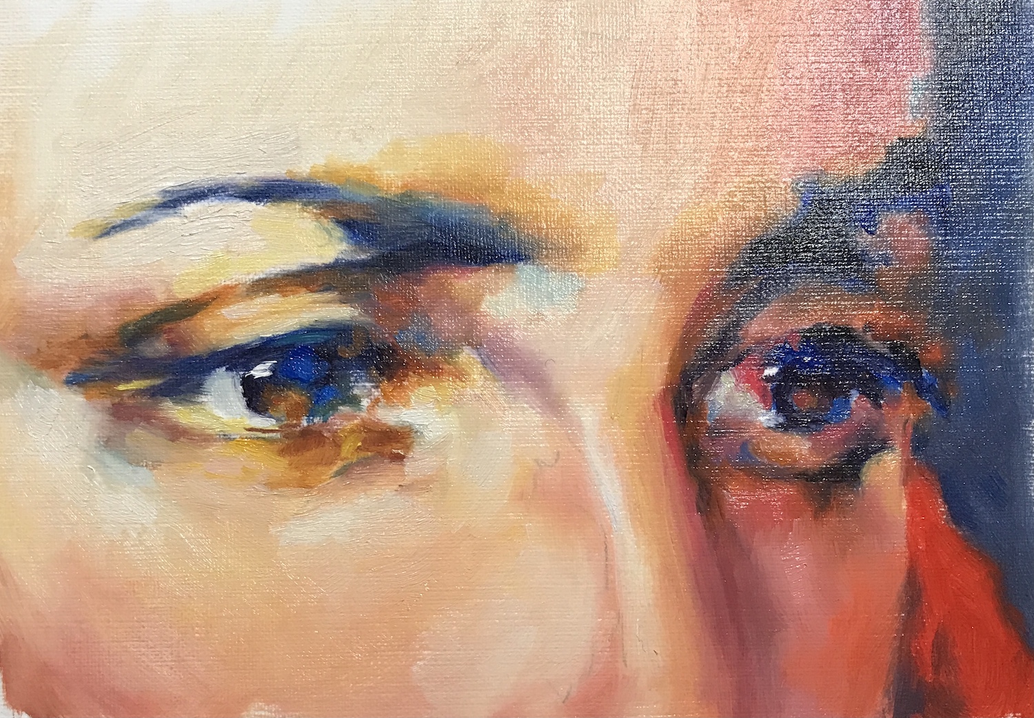
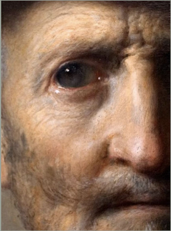
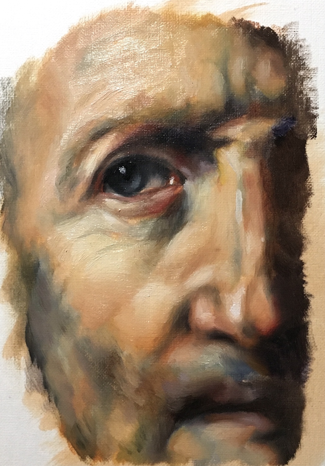
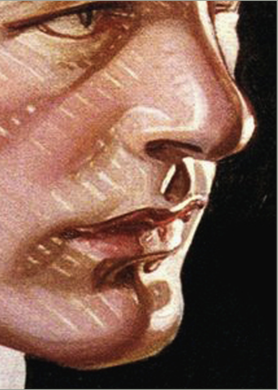
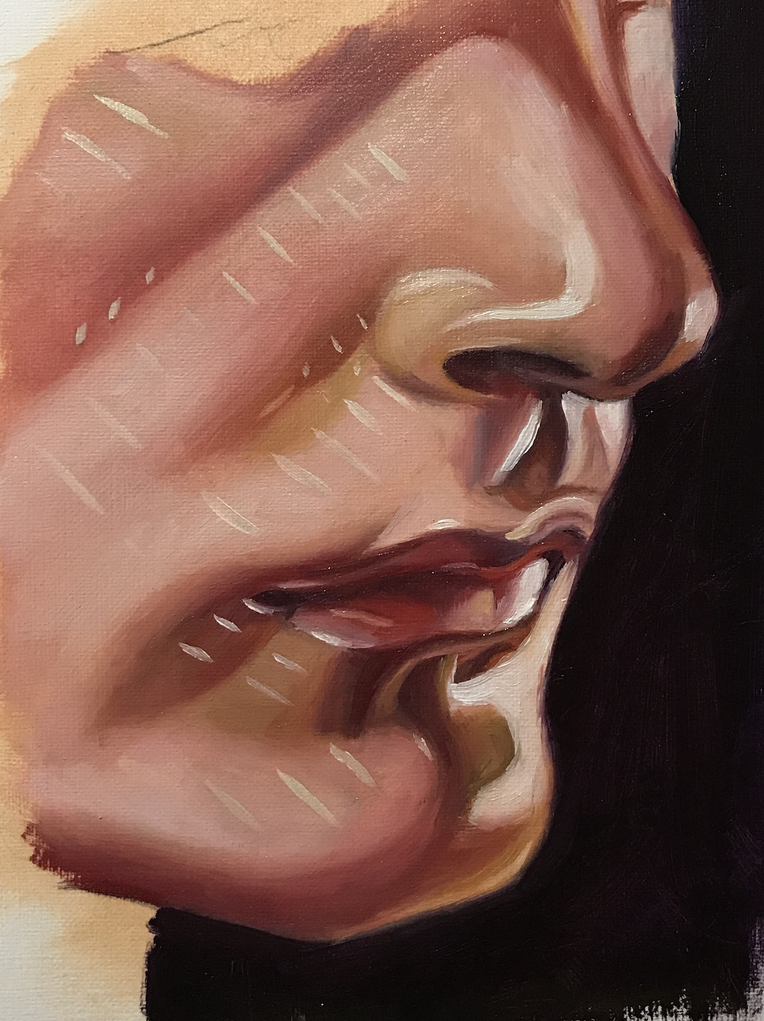
It’s been a while since I did any master studies, and luckily the Watts’ program forced me to catch up. Here are some of the facial features I copied recently:
Eyes – Fechin
Nose – Rembrandt
Lips – Leyendecker
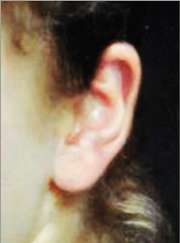
Ear – Bouguereau
A few notes:
The reference photos I used are provided by Watts Atelier, and some of them are not very close to the original. For example, I believe the last one is from William-Adolphe Bouguereau (1825 – 1905)’s Portrait de Gabrielle Cot. The original painting is high on realism. This doesn’t really affect the study though.
The most difficult thing I found is to re-create the texture, which is achieved by either manipulating the surface (Fechin) or brush strokes (Rembrandt). In the former case, it’s hard to guess how the manipulation was done. As for Rembrandt, it’s a laboring buildup that can’t be achieved in a few hours. For now, I am still focusing on the basics. Texture and brush strokes are like signatures. They are very personal and take long time to form.
I find choosing a topic and taking a small portion of the masterpiece to study is more effective than copying a whole painting. I also like the exposure to different styles. Bouguereau and Leyendecker are completely new to me and I find the highly stylized approach from the latter very refreshing.
2022 for me is not only moving on from the beloved Zorn palette, but also a broadening of the subject matters. The plan is to keep practicing portrait and still-life, with an emphasis on loosening up and becoming more gestural. Meanwhile, I will add landscape and later figures to the learning schedule. For medium, oil is the focus for now, but I’d like to do more watercolor sketches with or without ink.
Orchid and Buddha, 11 x 14, oil on canvas board, Dec. 2021Pines, 11 x 14, oil on canvas board, Jan. 2022Waves 1, 11 x 14, oil on board, Jan. 2022Old man, 11 x 14, oil on canvas board, Feb, 2022
A few notes:
Landscape is not a particular interest of mine, but for years, I used it as a check-mark to see if I have made any progress in techniques. After doing other subject matters for a while, I would attempt a few landscapes to see if I feel more confident and comfortable. It never did!
It took me some time to figure out that apart from value control, the key to a successful landscape painting is shape design. To deliver a believable tree, on surface you have more leeway than doing a portrait, but the lack of definitive guidance (the shape of an eye, a nose etc.), you need to come up with your own. That freedom can be a curse.
Looking above, it suddenly hits me that before doing trees, it might be a good idea to practice more bearded and hairy portraits first! π
Zorn is not the only limited palette used by artists. Well-known landscape artist Scott L. Christensen stayed with lemon yellow, cadmium red, ultramarine blue and white for many years, and his method has many followers. Presidential portrait artist Mark Carder teaches a palette of 5 colors, permanent alizarin crimson, cadmium yellow pale, french ultramarine, titanium white and burnt umber. Karen Blackwood painted her award winning coastal sceneries mainly with alizarin crimson, cadmium yellow pale, ultramarine blue, titanium white and viridian.
It’s not hard to see that all these are some versions of the primary colors. Replacing Zorn’s ivory black with Ultramarine and yellow ochre with a brighter yellow allows a more chromatic and less muted approach to painting.
Using a limited palette doesn’t mean you can’t use other colors. The above mentioned artists, Zorn included, all supplement their palette whenever necessary. Limiting color choices is to create harmony and in training, helps us focusing more on values. Eventually, we need to listen to the painting itself for what color comes in.
I have been staying with Zorn for months now, and it serves well for portrait painting. As I moving on to more still life and floral paintings, I began adding more colors to my palette. Zorn is still my starting point and foundation for each painting. Here are some recent exercises from my Watts classes:
Sunflowers, oil on canvas board, 11 x 14 in, 2021Irises, oil on canvas board, 11 x 14 in, 2021Roses, oil on canvas board, 11 x 14 in, 2021
Felicia, watercolor on paper, Fall, 2021Old Man, watercolor on paper, Fall 2021Charlotte, gouache on watercolor-board, Fall 2021
A few notes:
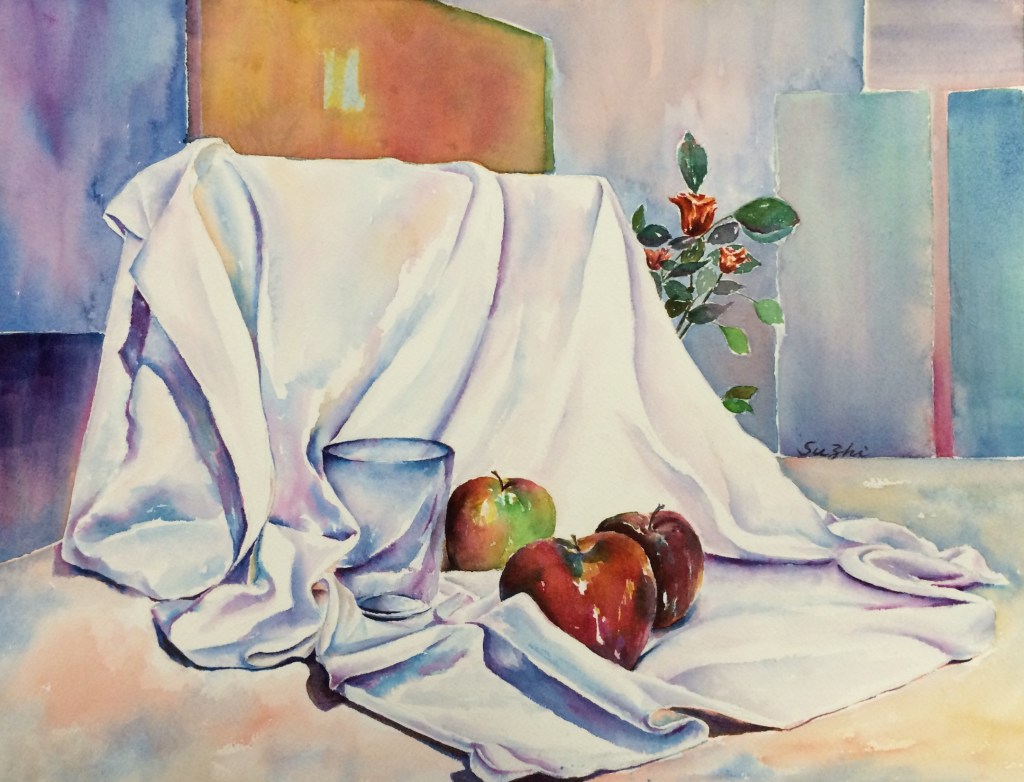
For the watercolor paintings, I planned two different approaches, a softer and muted one, vs a more vibrant and contrasted one. The results were somewhere in the middle. Especially for the first painting, I wish I had softened some edges and let go certain definitions instead of spelling out everything I saw.
The gouache one is a homework from Watts. It is a practice of the Zorn palette and the tiling technique. I found both the medium and the technique challenging. Tiling is to juxtapose thick layers of close-value paints and blend them (if necessary) later. It’s a good preparation and practice for oil painting, but it requires a lot of patience in value control and shape design. Hehe, patience! π
Skull – side view, oil on canvas board, 9 x 12, 2021Skull – quarter view, oil on MDF board, 11 x 14, 2021Skull – front view, oil on canvas board, 11 x 14, 2021
A few notes:
Still homework from Watts, burnt umber pick out, burnt umber and white, phthalo-blue, black and white respectively.
I like MDF board covered with canvas better than MDF board with gesso, because it’s more absorbent. On gessoed board, the paint takes longer to settle which can be frustrating. However, if you like the super smooth and realistic look, board it is.
I need to learn how to take photos of oil paintings. π