Category Archives: ink

“He Makes the Distance Between All Things Disappear.”

[Note: The title is a quote from Spanish sculptor Francisco Baron’s preface to Car Li’s 1992 solo show in Spain.]

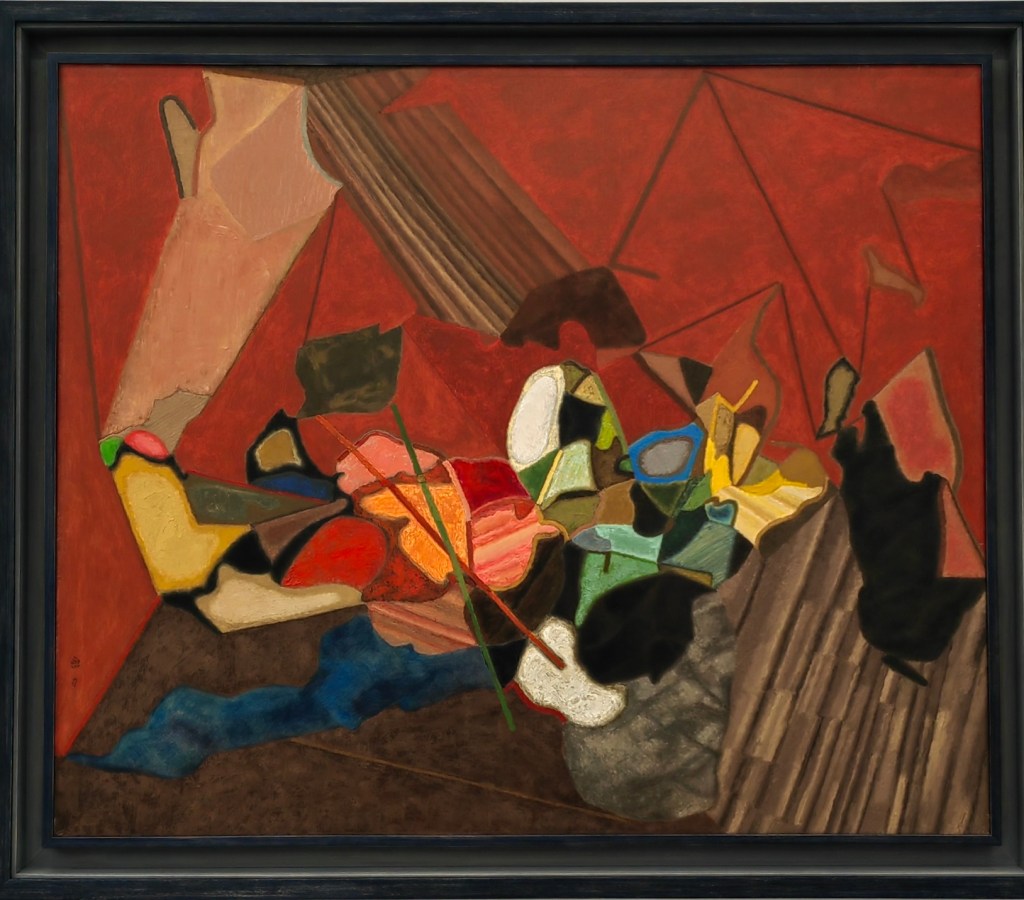
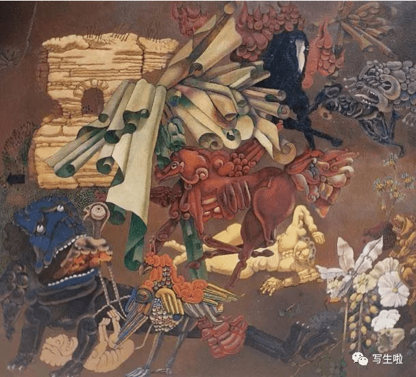
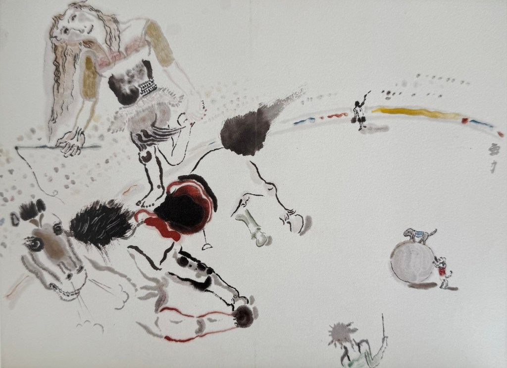
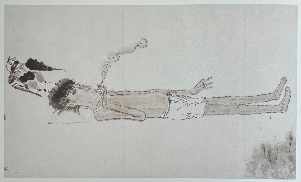
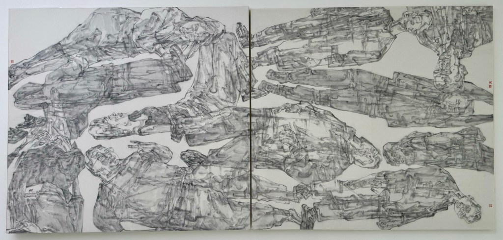
During my recent trip to China, I visited many exhibitions, and the works of one artist appeared in multiple shows, leaving a strong impression on me. He is Cao Li 曹力 (1954-), a professor of the Mural Department at the Central Academy of Fine Arts 中央美术学院. Cao Li has received traditional art training but does not carry the baggage of the academic style; in his work, he is unrestricted, and his imagination and artistic inspiration traverse ancient and modern, East and West. His themes range from reality to dreams, and his media include line drawing, watercolor, oil painting, wood carving, stone relief, etc.. His ability to move freely across different media reminds me of James Jean, though in terms of artistic expression, Cao Li is more mature and unrestrained. His works exhibit the absurdity of Dali, the seclusion of Klee, the alienating humor of Klimt, the multidimensional thinking of Picasso, the simplicity and innocence of Matisse, and the romantic imagination of Chagall. They also draw inspiration from traditional Chinese paintings, especially the murals of Dunhuang 敦煌, Yongle 永乐 Palace, and certain cave sculptures. 

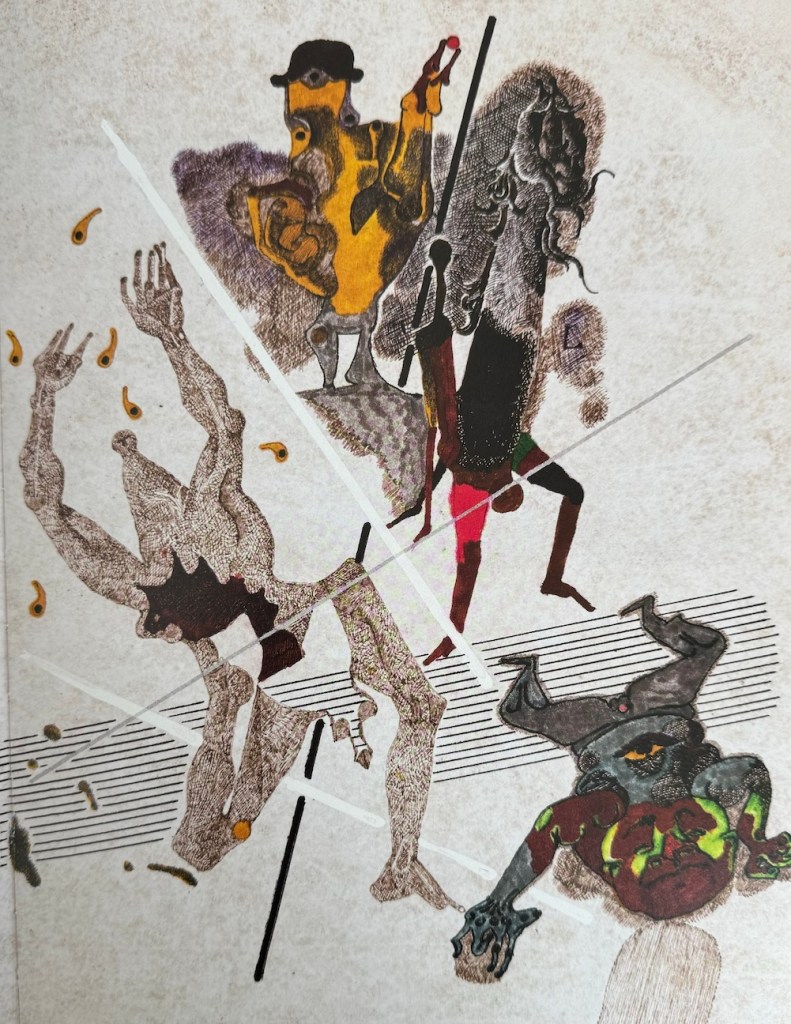
In the artist’s own words, “Art knows no boundaries; it is the product of the soul, an expression of true feelings, the natural flow of life, a free flight. Nature itself is not art; only what flows through the filter of an artist’s soul can be called ‘art.’ It’s like the process of making wine: grains and grapes themselves do not intoxicate, but after brewing, impurities are removed, leaving the essence that can captivate and enchant people.”

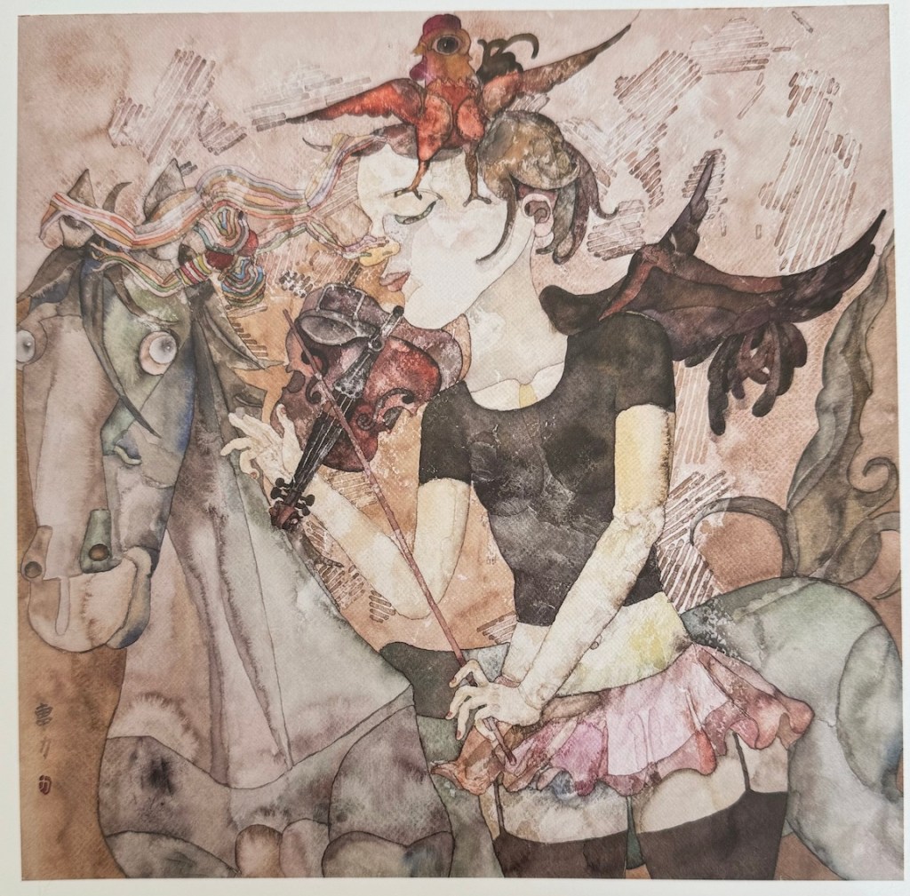
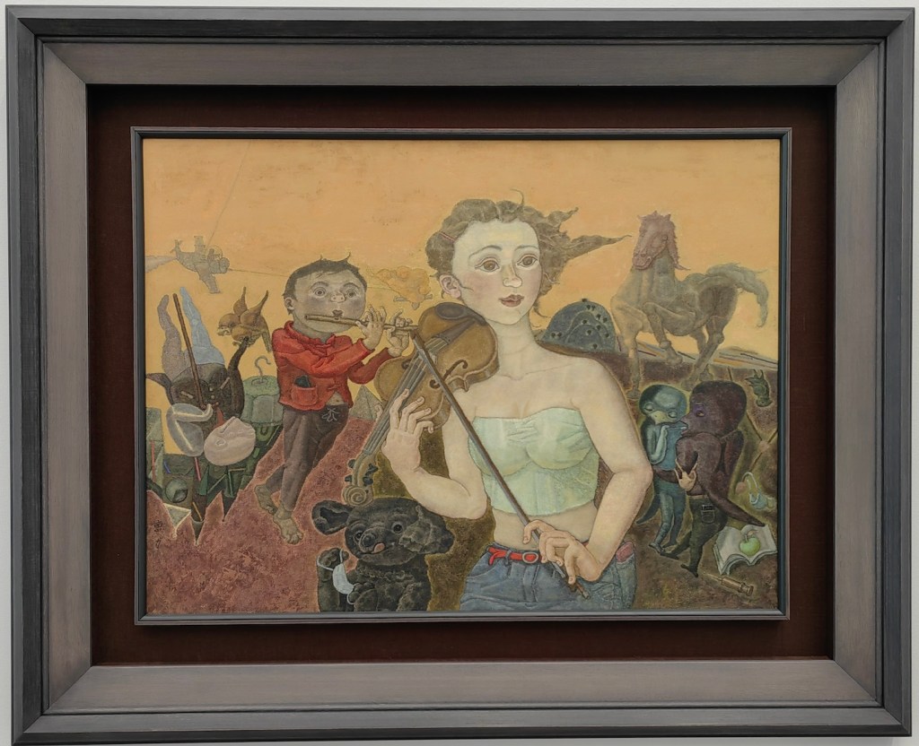
Cao Li enjoys music, a recurring theme in his paintings. His lines, compositions, and colors move like melodies, possessing a lively rhythm. Influenced by his line drawings, his oil paintings almost always start with a planar structure of lines as the initial outline and main framework. He then enriches, thickens, and adds depth to the work through the organic organization of colors. He says, “I control the blocks of color, dots of color, color areas, and lines in the same way a composer arranges notes, tones, rhythms, and tempo. Once these ‘force points’ are placed in the right spots and combined in myriad ways, the disrupted calm space is reordered.”

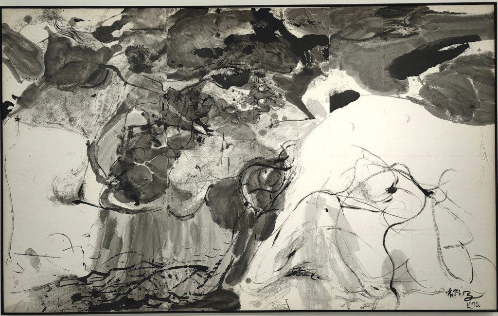
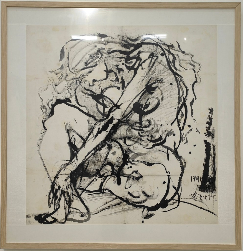
One aspect that interests me when viewing works by Chinese artists is their effort to blend traditional Chinese art with Western painting. The design of figures and the use of color in Cao Li’s works have a distinctly national character. His ink paintings even introduce modernist traditions. His teacher, the renowned artist Yuan Yunsheng 袁运生 (1937-), has taken this fusion even further by applying Abstract Expressionism to ink painting. In the 798 Art District in Beijing, I was fortunate enough to see an exhibition of his works.

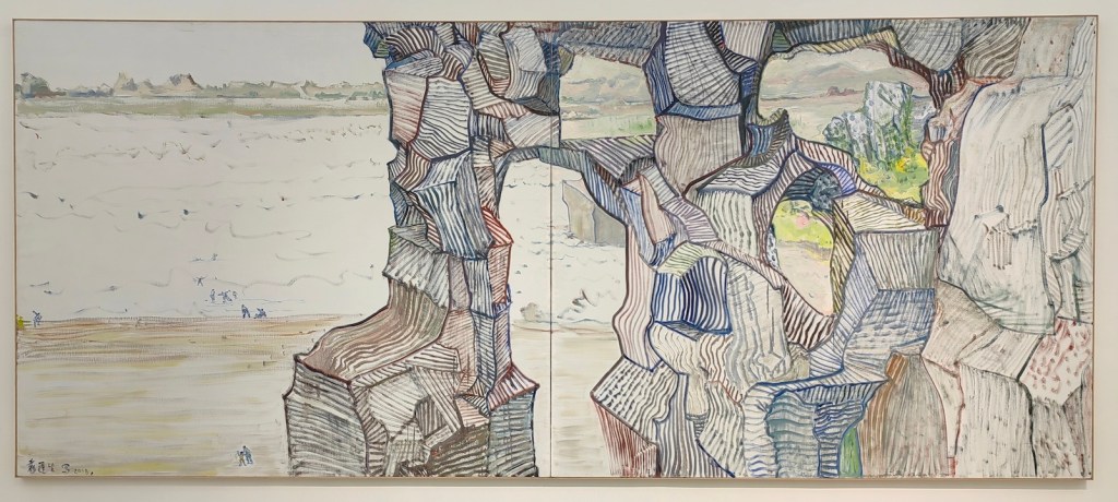
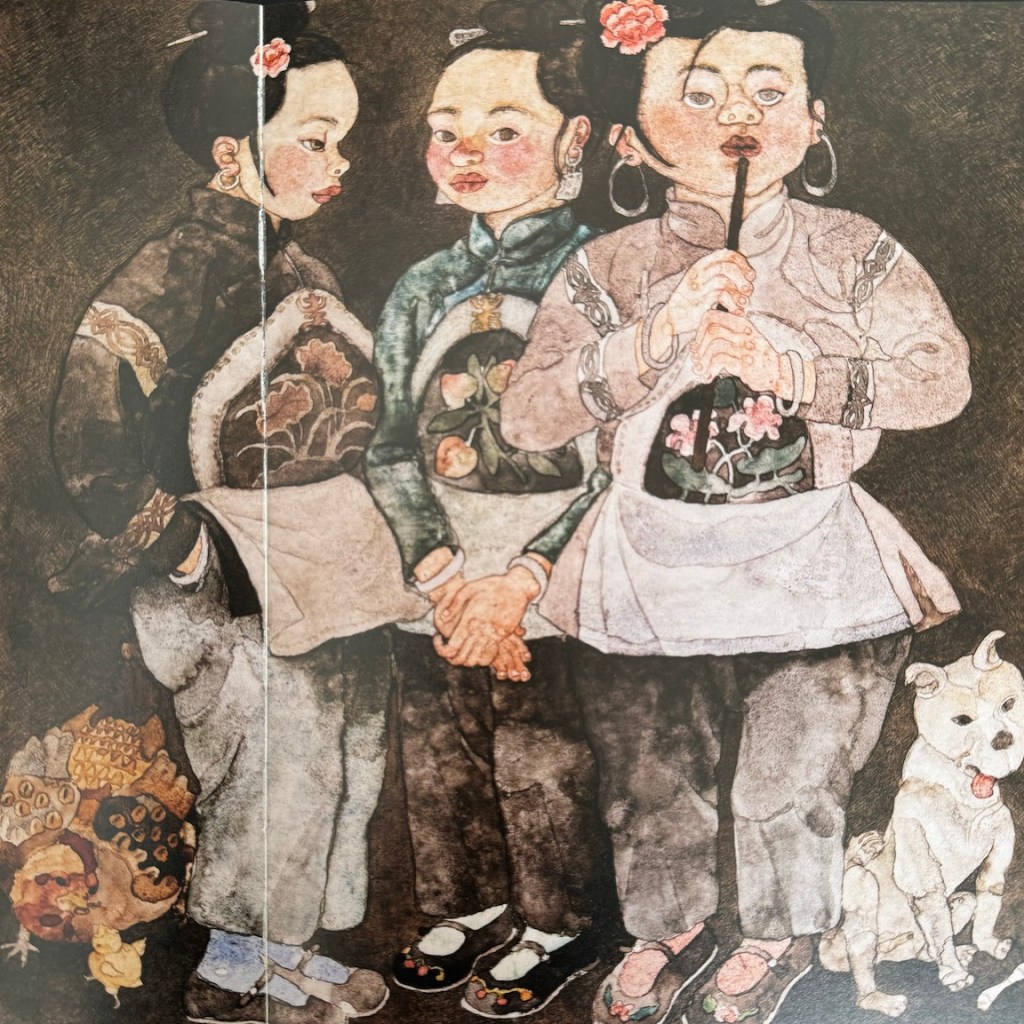
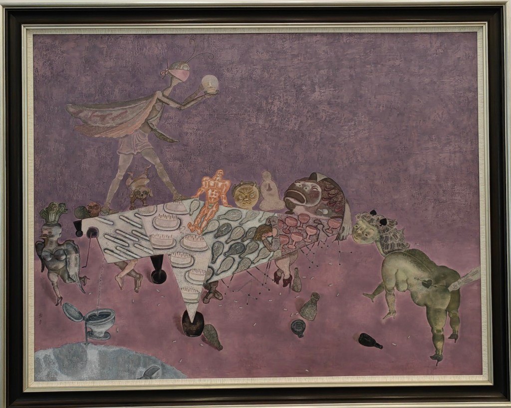
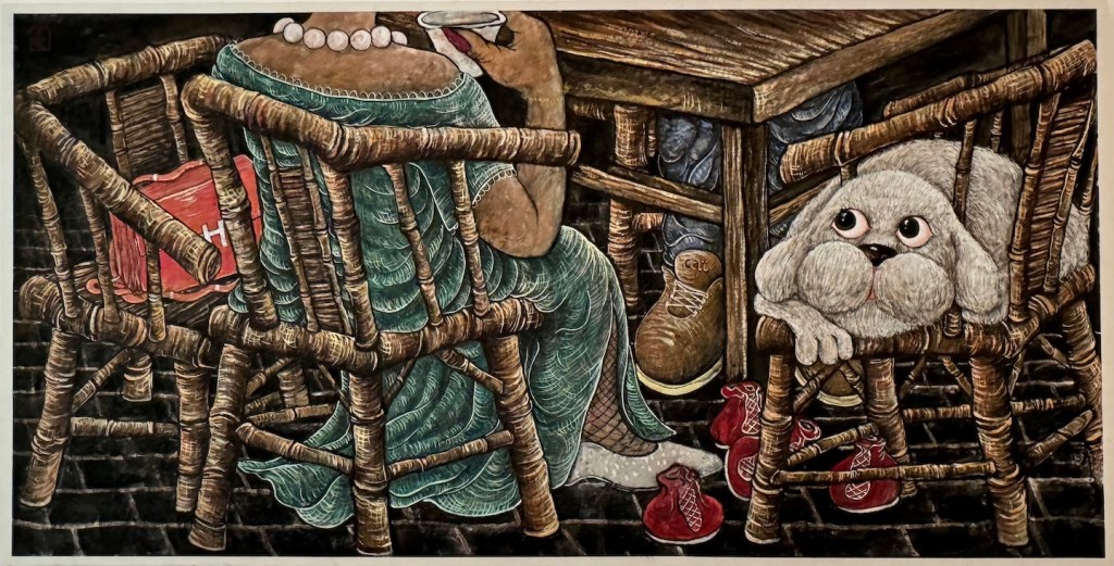
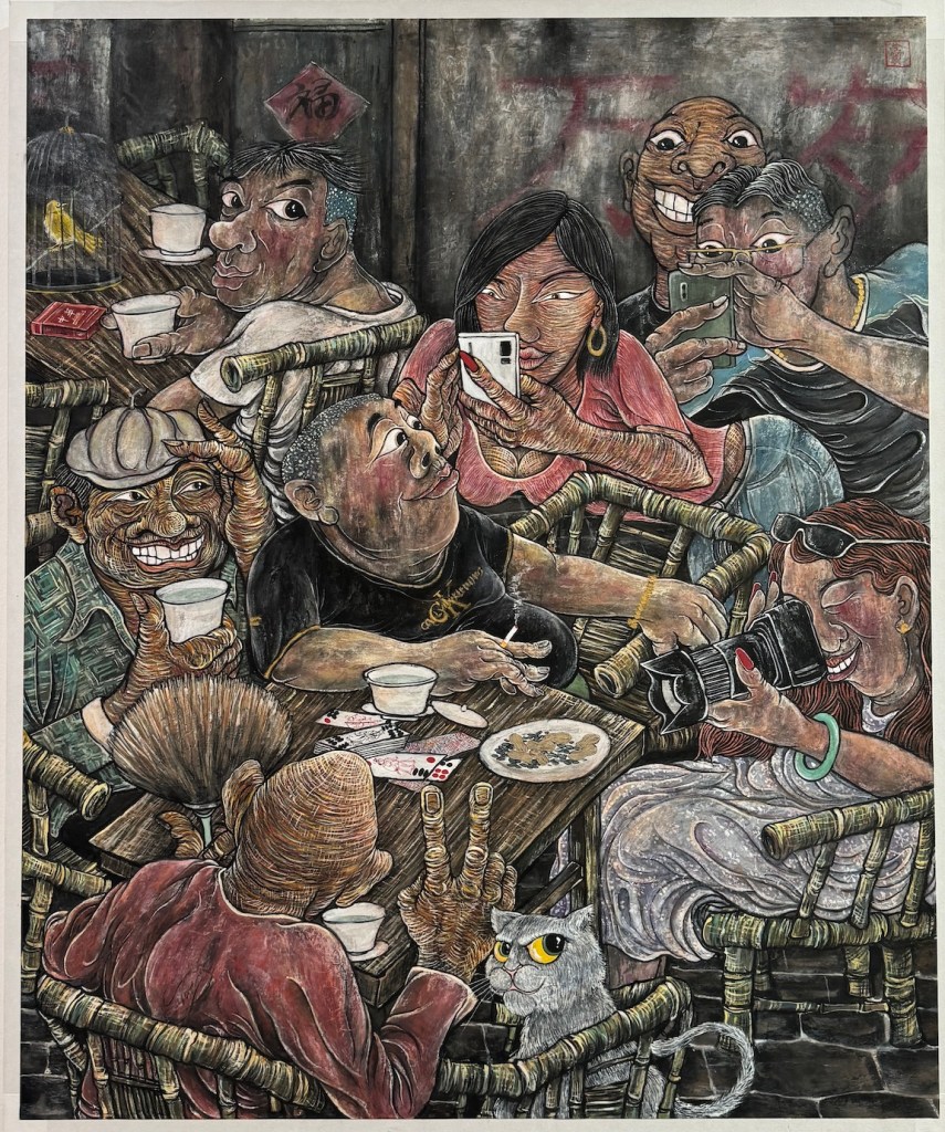
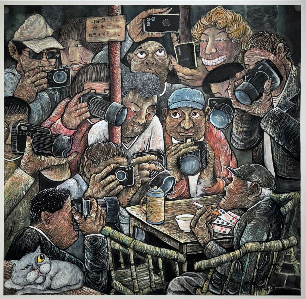
While visiting the Sichuan Fine Arts Institute 四川美术学院, I had the chance to view the “Chinese Painting MFA Invitational Exhibition 2000-2020.” These young artists originally studied Chinese painting, but now their works clearly show influences from oil painting, printmaking, and other art forms. Their use of media has also moved far beyond traditional paper and ink. They draw inspiration from the collision of diverse cultures, creating works that are more personal and profound. Unfortunately most of the artworks on display have glass cover, and makes it very difficult to photograph. I only captured a tiny portion of the treasures on display. 

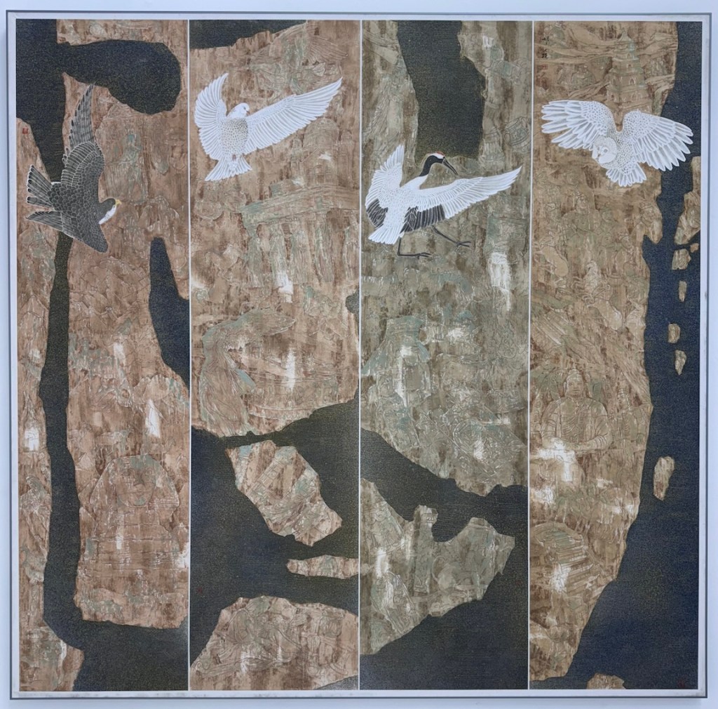
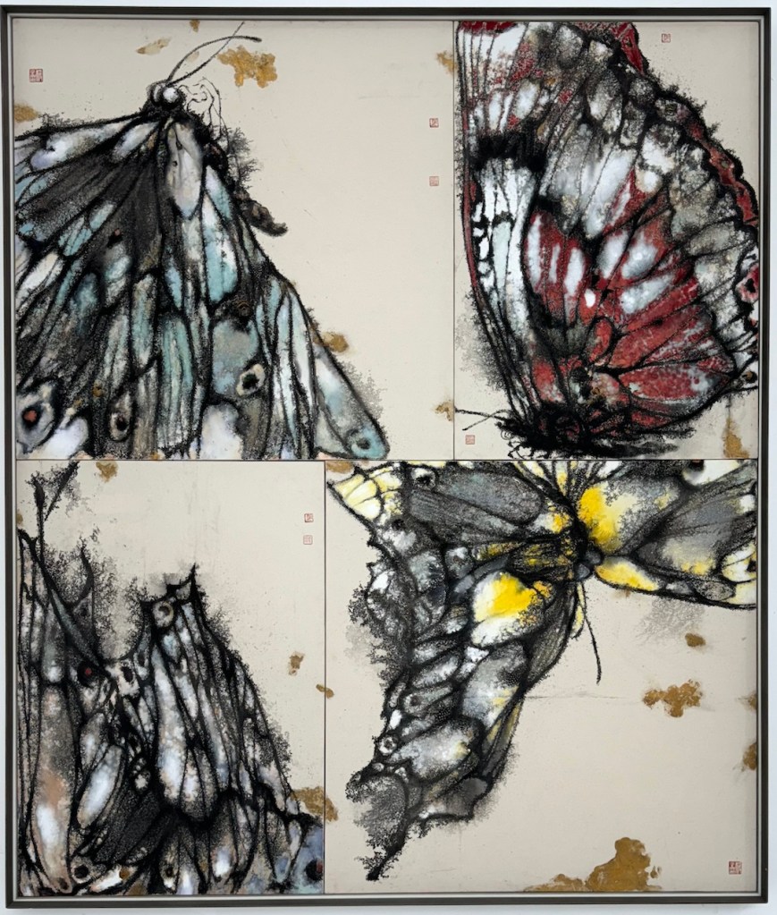
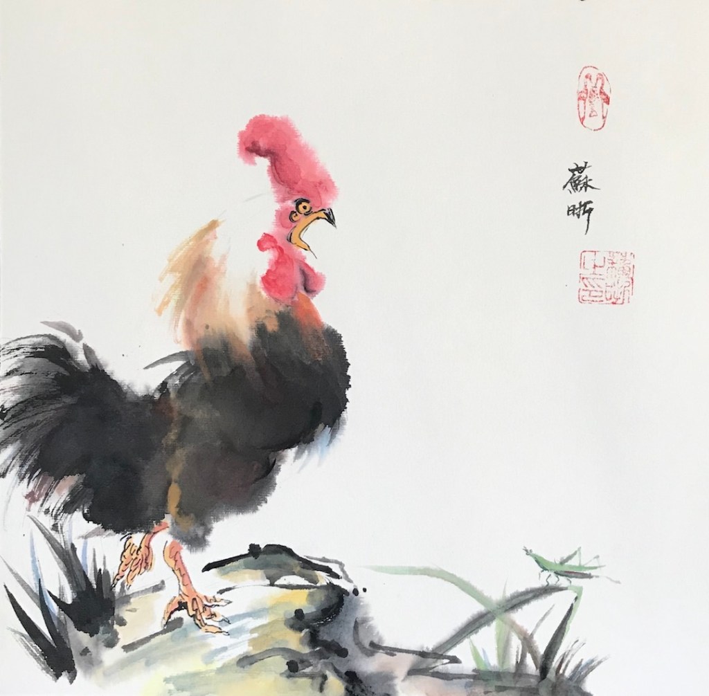
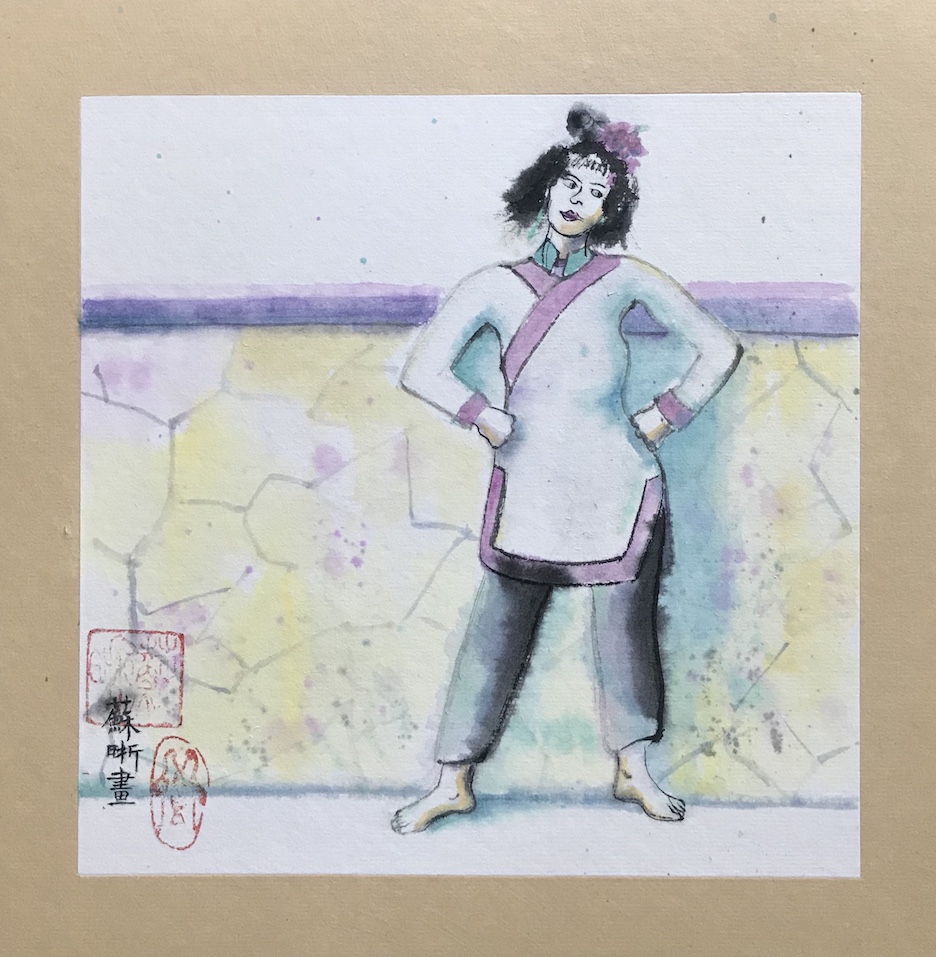
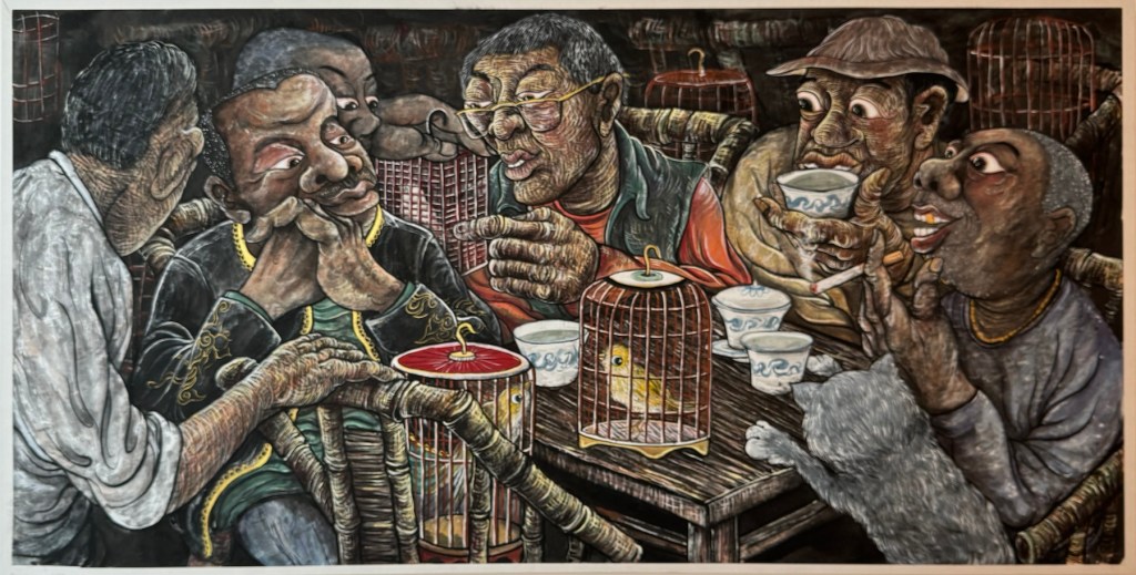
Here are some paintings from one of my favorite artists from the show:

Amid all the talking about the “lying flat” culture in China, it is quite exciting to see the art scene there is lively and flourishing.

P.S. Unlike in America, most of the Chinese artists don’t maintain personal websites. Artron 雅昌 is platform where many artists post their works, but the level of accuracy and maintenance vary. You can find more works from Cao Li here: 作品

Autumn Colors – A Throwback Series

The rich colors of the season remind me of a series I did years ago. It consists of four still life paintings, done in watercolor and ink pen. It was the first series I ever did and was done before I had any appreciation of doing things in some sort of consistency. My natural inclination is always jumping around among different things.

As I have better understanding of the creative process, I start to see the benefit of staying for a while with a particular technique, a color theme, a subject matter, a design concept, etc. It reenforces your strength, challenges your thought, and often leads to new discoveries.

Anyways, here they are:

Watercolor and ink pen, squashes, pumpkins and flowers, Autumn colors
Autumn Colors 1, watercolor and ink pen on paper, 16 x 12 in, 2015
Watercolor and ink pen, pumpkins and flowers, Autumn colors
Autumn Colors 2, watercolor and ink pen on paper, 12 x 16, 2015
Watercolor and ink pen, squashes, pumpkins and sun flowers, Autumn colors
Autumn Colors 3, watercolor and ink pen on paper, 16 x 12 in, 2015
Watercolor and ink pen, squashes, persimmons, and sun flowers, Autumn colors
Autumn Colors 4, watercolor and ink pen on paper, 12 x 16 in, 2015

The things that connect this series are techniques and subject matters. I set up some “fall” related objects and chose four settings. They are parallel to each other in terms of relationship. Another way to develop a series is to derive new pieces from the old one. I am in the process of an experiment of that and hope I will be able to show it soon.

Experimenting with Materials (1) – Rice Paper

I did a watercolor painting on pre-matted rice paper (xuan paper) before, and I tried it again recently with different paints:

After Feiniaogongzuoshi, 12 x 12 in.
Crazy Hair Day, 8 x 8 in, June 2020
Kaydee, 8 x 8 in, June 2020
Nikki, 8 x 8, Jun 2020

A few notes:

  • The paper I used is something like this, but I bought it from China and it was a lot cheaper.
  • The first two paintings were done with Chinese paints that commonly used for brush painting on rice paper. The brand is Marie, and it’s available on Amazon.
  • “Kaydee” is done in sumi ink, a cheap one from Daiso.
  • “Nikki” is in western watercolor.
  • The Chinese colors are a lot more opaque and hold better on rice paper, which is very absorbent.
  • The western watercolor dries very light and very flat. I went back multiple times trying to enhance the value. When the paper is wet, the pigment swims away to wherever with a blink of eye.
  • There’s no lifting with rice paper after it’s dry. You can pat it with a tissue paper and lift some pigment, but you can’t get rid of edges that way.
  • Sumi ink is the most staining of all.
  • I absolutely don’t know how to apply the skills involved in the first painting (the rooster one) to the later ones.

Pairs (IV), Ink Resist Revisited and Reuse Old Paintings

The first one is sumi ink, and the second one is ink resist with gouache. Both are on watercolor paper and they are separately composed.

Caroline, ink on paper, 9 x 12in, June 2020
Thoughts, ink and gouache on paper, 10 x 14 in, June 2020

A few notes:

  • The ink I use is from a Japanese dollar store called Daiso, and it’s really cheap.
  • You can manipulate the ink to some extent while it’s wet but when it’s dry, you can’t lift it as watercolor.
  • For ink resist with gouache, please see my previous post “Try New Things (1).”
  • The second painting is done on the back of an old painting (of a broccoli). When I soak the gouache painting in ink, I got some unintended texture. It’s probably because of the unevenness of the paper. I might have done some lifting or scrubbing for the old painting. I decided it didn’t hurt.
  • In general it’s fun to think about how many ways you can deal with a subject.

Now a few more words about old paintings. Good watercolor papers are expensive, so I never throw away old paintings, no matter how ugly they are. There are always ways to reuse them:

  • The obvious one is to paint on the back. If the paper is not flat, you can soak it in water, then lay it flat and add some weight on it (or re-stretch it). Sometimes the texture of the paper on the back is different. It’s still workable.
  • Another way is to examine the old painting and see if there are some elements can be used. The flames in the second painting was modeled after the leaves of the broccoli on the other side. Look at it upside down, side ways, hold it up against strong light, you may discover something different.
  • You can also directly use it. Tear it apart and make it into a new collage.
  • Take a picture of it and manipulate it into a new digital art with Photoshop, Procreate, etc.
  • These methods are not exclusive, and that one piece of paper can generate many artworks!