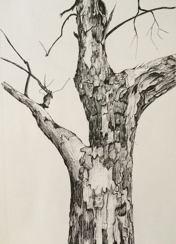
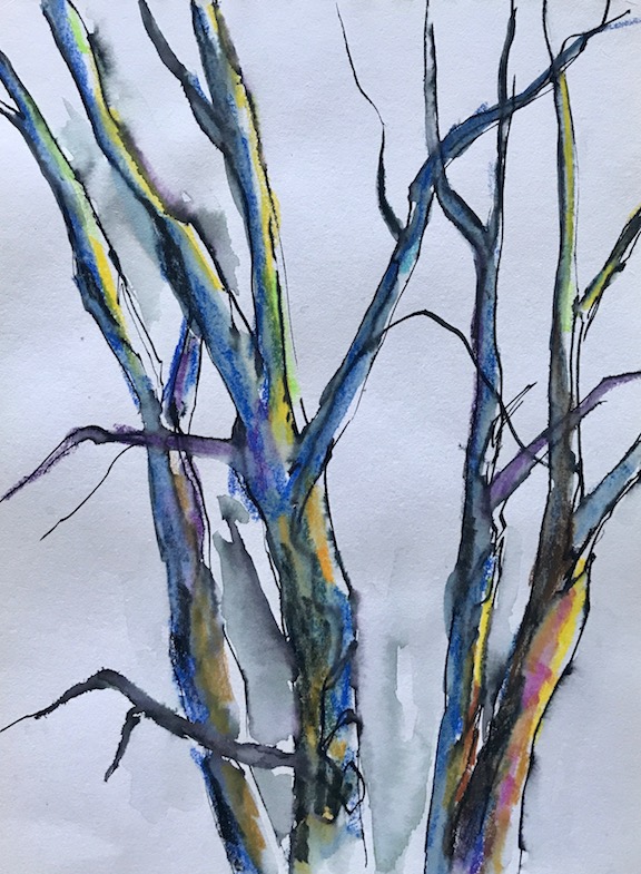
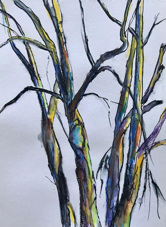
Sometimes when I run out of ideas, I stare at the trees outside my window. Occasionally, I draw or sketch them:
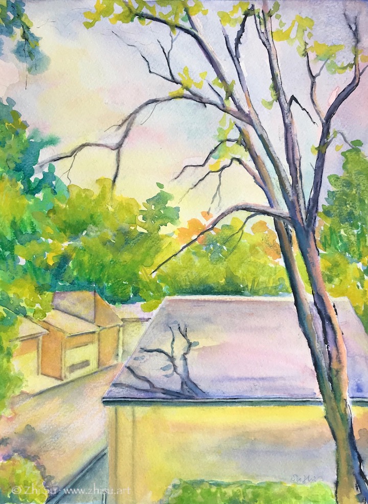
Since I am a bit running out of topic recently, I turned my window scene into a couple of paintings:
Window Scene 1, watercolor on paper, August, 2020Window Scene 2, watercolor on paper, August 2020
There are usually squirrels dancing on the branches and crows meeting on those roofs, and once in a while, I am waken up by wood peckers attacking the trunks. Some day, I will manage to catch them in my “window paintings.” 🙂
I know Crayola is a kid brand, and I don’t think Crayola Washable Markers are made for watercolor artists. However, for your daily doodling, and small art projects, they work wonders. The markers have conical tips that allow both broad and thin lines, and the colors are quite vibrant:
Rose, marker on paper, 4 x 4.
Flower, marker on paper, 4 x 4.
I recently got hold of a different brand, Tombow Dual Brush Pen Art Markers. You can see from the way it’s packaged (Primary, Secondary, Grayscale, Portrait etc.), Towbow is for artist. With a nylon brush on one side and a fine tip on the other, you can achieve more versatile marks with it. I tried Tombow and Crayola side by side and find them behave similarly:
Crayola
Tombow
A few notes:
I used 140lb watercolor paper, and all my paintings are small.
The colors are quite vibrant and they don’t dry lighter. However, if you have excessive water, it will wash the ink away.
You can go back lifting or adding colors. If you add colors with markers when the paper is wet, remember it is much hasher on the paper than applying watercolor with watercolor brushes.
As for lightfastness, both Crayola and Tombow claim their colors will fade over time. So maybe not use them in your masterpieces? The prickly pear flower one (top right) was on the wall without any protection for many years and I haven’t seen any color change yet.
It is convenient and fun!
Jazmine, Crayola and Tombow markers on paper, 5 x 5, 2020
Caran d’Ache is a brand not a specific product, but I only know that now! The product is Caran d’Ache Classic Neocolor II Water-Soluble Pastels. My former watercolor teacher introduced it to me many years ago, and called it Caran d’Ache. Even though I bought a 40 colors pack, all these years, I never bothered to read the words on the package, and thus I never knew it was pastel!
I didn’t like Caran d’Ache back then. It’s waxy and leaves a mark like that of a crayon. It also won’t completely dissolve in water. I didn’t appreciate texture very much at that time, and was afraid of any mark that I couldn’t get rid of or hide. I only recently started to pay attention to marks making and textures, and how they enrich composition and set free expression. That why I decided to give the product more chances.
Here are some of ways I tried. First I just used it to sketch, and them apply water and watercolor on top of it. Toward the end, I used them to add more accents.
Catherine, draft. Catherine, watercolor, 7.5 x 10 in, 2020
I also tried to wet the paper first, with some color, and then applied the Caran d’Ache before the paper dried. Some color bleeds more than others. In the red color figure, I went back and force a bit with the pastel and a wet brush to achieve a desirable result. In the greenish one, the paper dried quickly, and I was only able to do a drawing.
Female figure, 5 x 10 in, 2020Female figure, 9 x 12 in, 2020
Here a lot of the design in the painting came as an after thought, and Caran d’Ache is a very convenient tool to draw out ideas. While it won’t completely dissolve, it’s easy to hide it with gouache, and it’s also effective in adding textures:
Tigger, watercolor and gouache on paper, 18 x 24in.
A few notes about Caran d’Ache:
It’s versatile but overall, works better in expressive drawing – where you don’t care to hide your marks.
It’s useful in finalizing or amending a painting,
I am not entirely satisfied with the way I am using it, still too careful and too timid.
I feel like if I am more competent with or have more confidence in my drawing skill, I could make better use of this tool.
I’ll keep playing with it. I have a hunch that it will set me free some day. 🙂
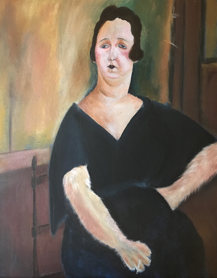
Amedeo Modigliani is an Italian artist famous for his uniquely stylized portraits. I always like his paintings and attempted a study years before. Somehow Modigliani’s Madame Amédée reminded me of my neighbor’s cat, and my original plan was to use the composition of the original painting, and replace the head with that of a cat’s. It didn’t work out and I switched back to the lady. The result wasn’t much of a copy, and you can still see the trace of my deviation.
Original
Madame Amédée (Woman with Cigarette), oil on canvas, 39.5 x 25.5 in, 1918
My copy:
Woman with a paw, acrylic on canvas panel, 16 x 20 in, 2016
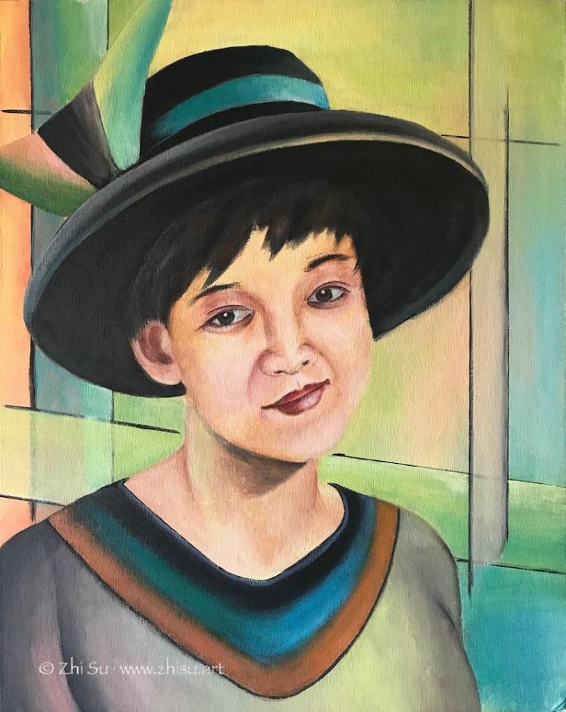
This is another try. This time it was not a copy, but I tried to stylize a self-portrait. I meant to focus on the inner world of subject, but somehow it was all spilled over into the background. As a result I went way beyond his typical palette, which is quite muted.
Me with a hat, acrylic on canvas board, 16 x 20 in, 2017
After learning drawing and painting humans for a while, I find myself even more fascinated by Modigliani’s ability to go beyond realist forms while stay true to the spirit and character of his subjects. I probably will do more studies of Modigliani in future.
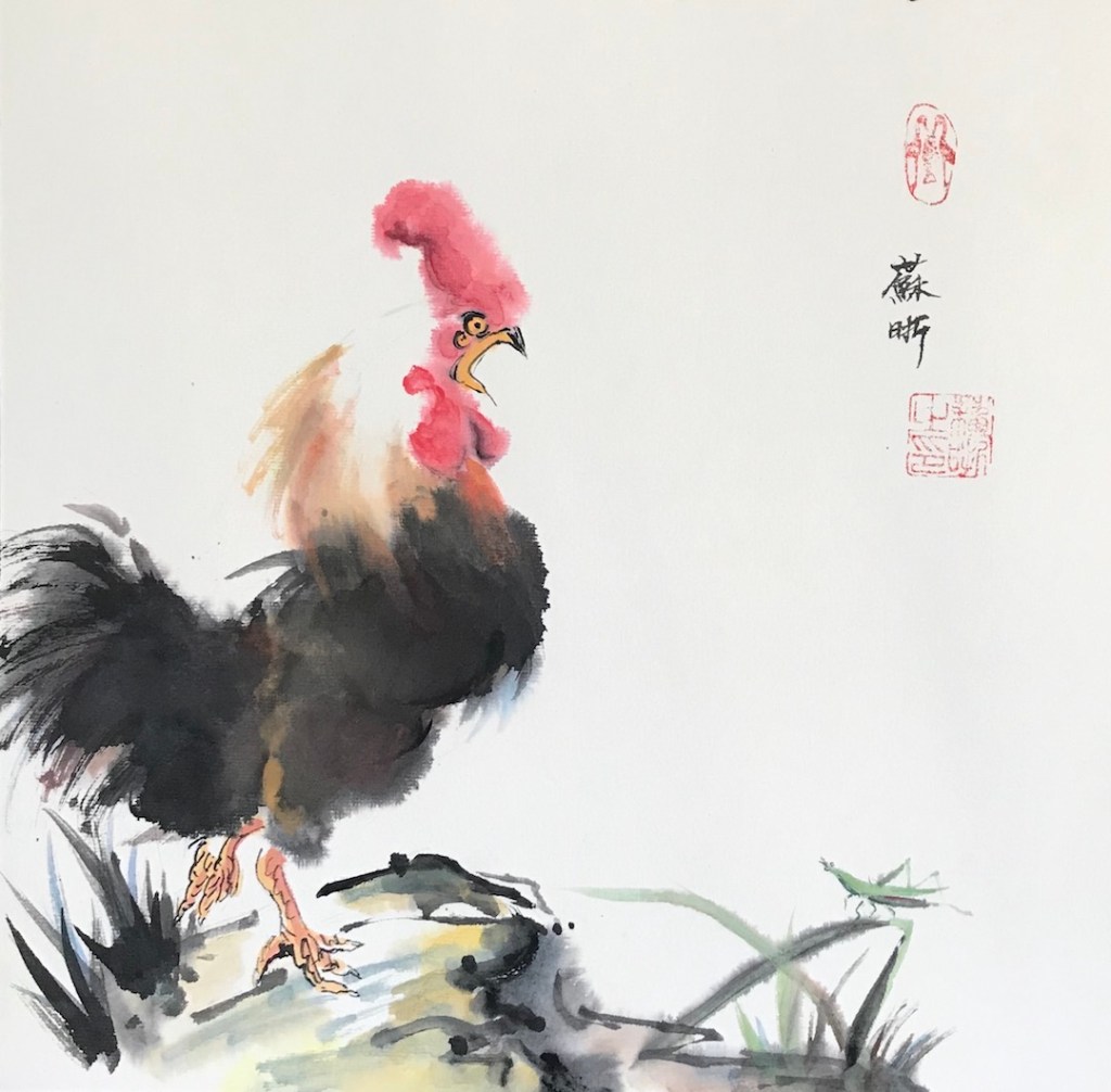
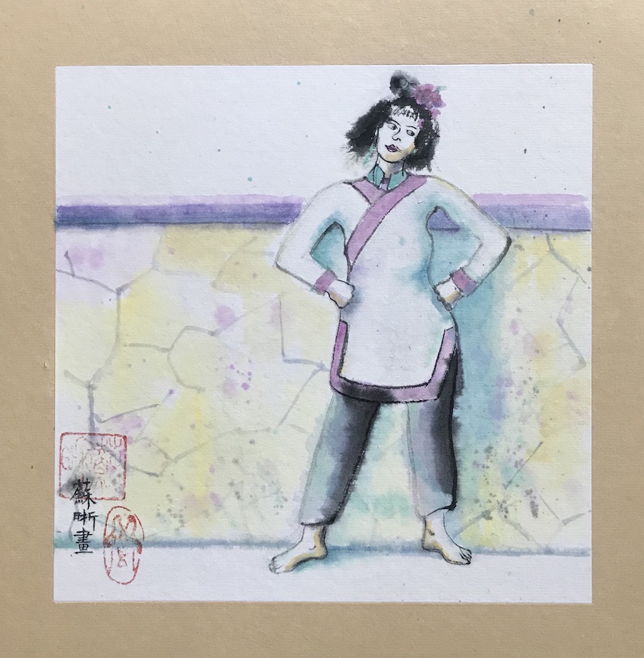
I did a watercolor painting on pre-matted rice paper (xuan paper) before, and I tried it again recently with different paints:
After Feiniaogongzuoshi, 12 x 12 in.Crazy Hair Day, 8 x 8 in, June 2020Kaydee, 8 x 8 in, June 2020Nikki, 8 x 8, Jun 2020
A few notes:
The paper I used is something like this, but I bought it from China and it was a lot cheaper.
The first two paintings were done with Chinese paints that commonly used for brush painting on rice paper. The brand is Marie, and it’s available on Amazon.
“Kaydee” is done in sumi ink, a cheap one from Daiso.
“Nikki” is in western watercolor.
The Chinese colors are a lot more opaque and hold better on rice paper, which is very absorbent.
The western watercolor dries very light and very flat. I went back multiple times trying to enhance the value. When the paper is wet, the pigment swims away to wherever with a blink of eye.
There’s no lifting with rice paper after it’s dry. You can pat it with a tissue paper and lift some pigment, but you can’t get rid of edges that way.
Sumi ink is the most staining of all.
I absolutely don’t know how to apply the skills involved in the first painting (the rooster one) to the later ones.
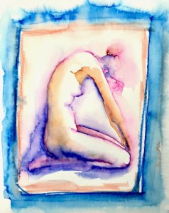
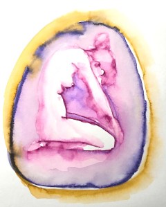
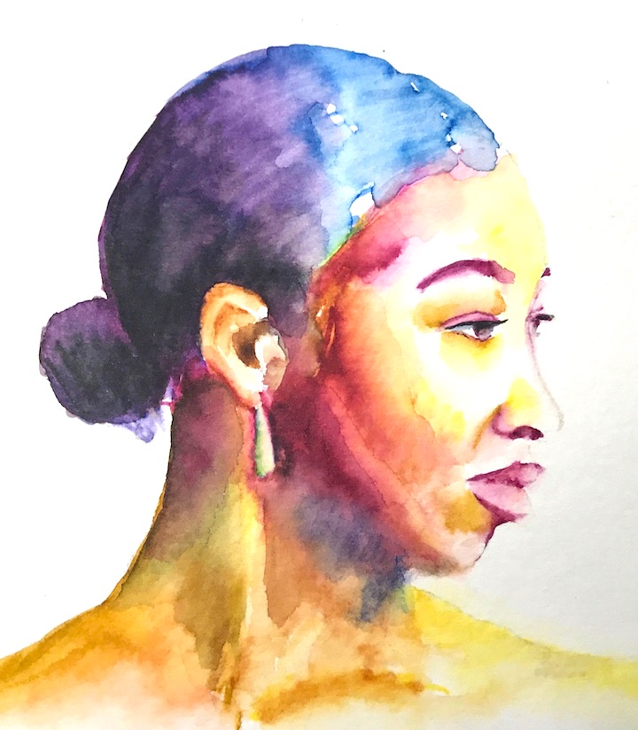
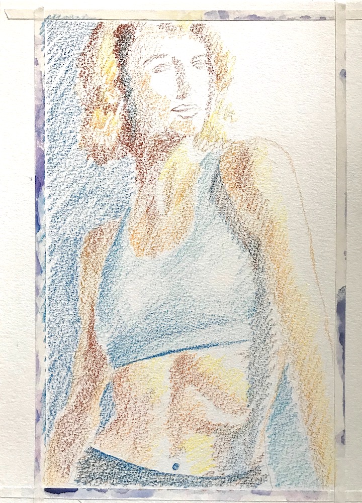
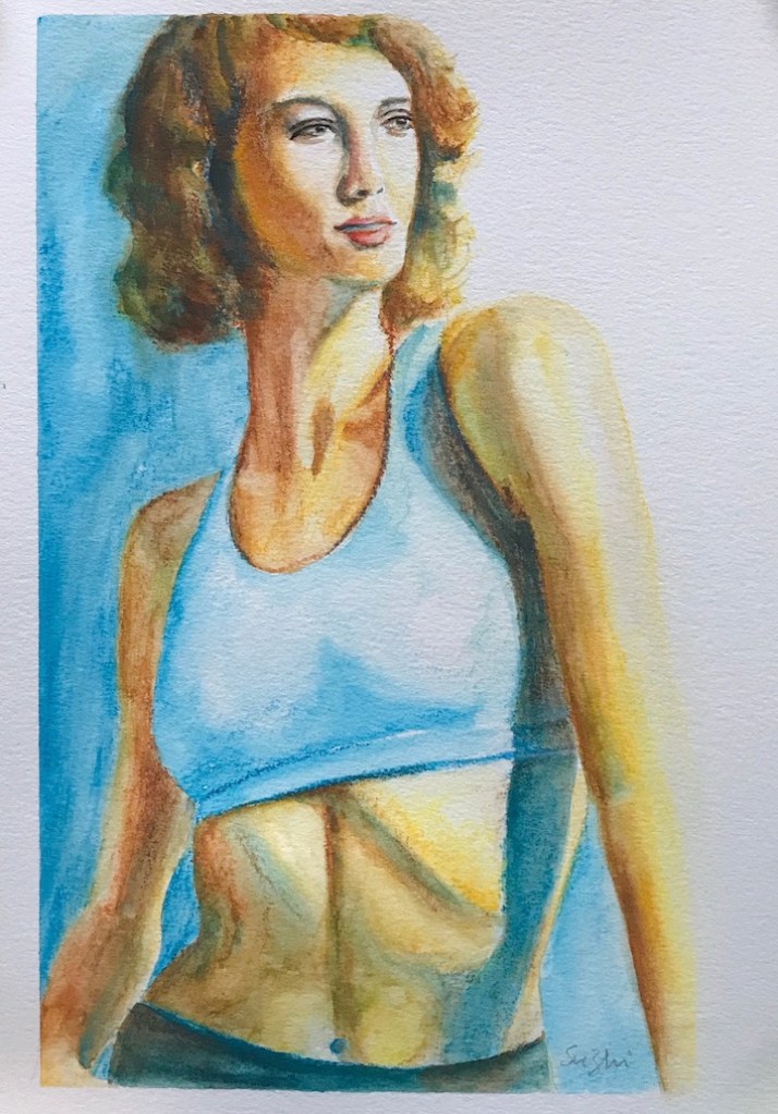
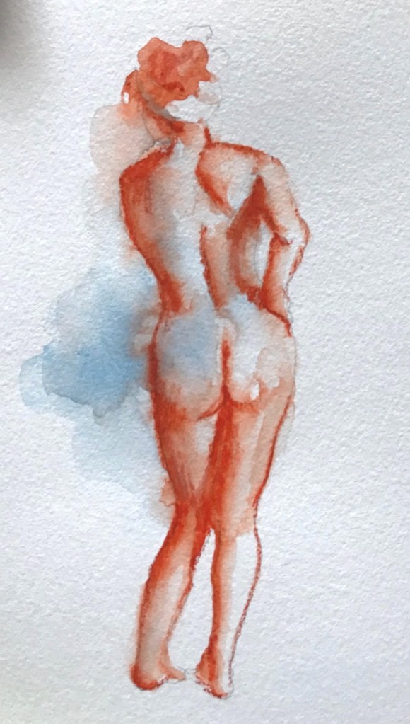
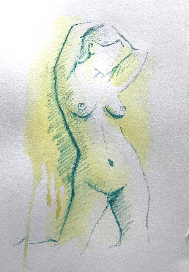
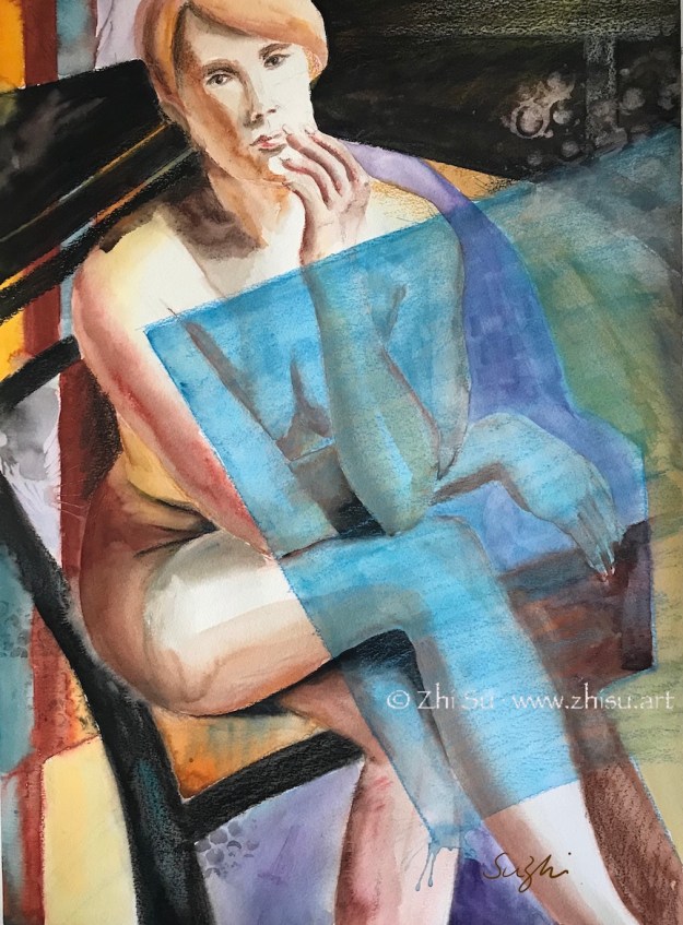
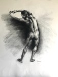
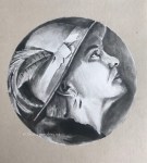
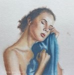
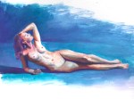
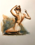
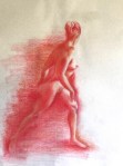
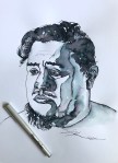
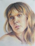
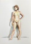
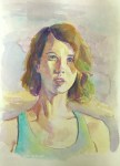
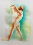
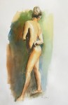
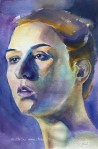
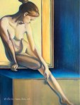
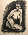
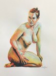
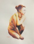
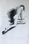
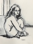
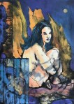
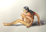
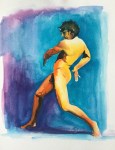
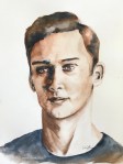
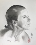
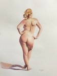
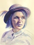
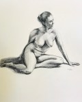
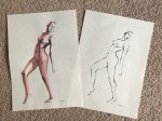
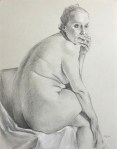
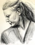
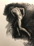
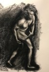
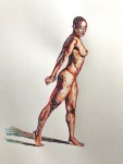
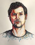
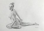
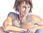
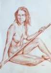
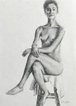
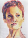
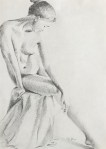
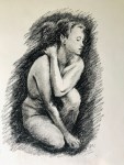
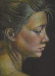
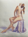
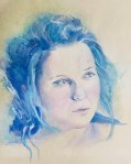
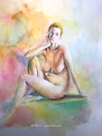
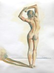
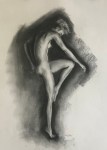
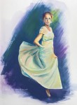
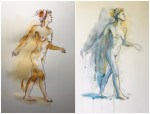
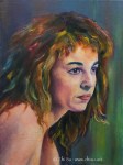
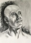
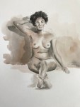
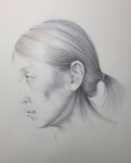
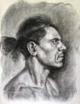
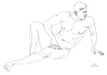
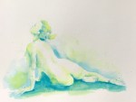
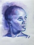
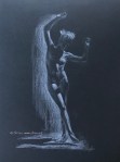
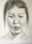
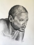
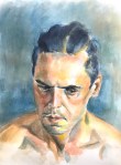
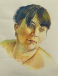
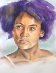
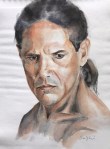
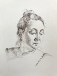
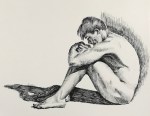
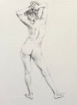
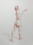
I’ve been doing the 100 Day Art Challenge at New Masters Academy for a while. I chose to focus on the figures and portraits for this challenge. Here are the first 25 days of the paintings and drawings I’ve done.
Take a look (click on the thumbnail to see a bigger image) :