The two watercolor books are a rich collection of the artist’s sketches, finished and unfinished works in the medium. Watercolor and gouache were often used by old masters as studies for a bigger oil piece, and it seems to the be case for Cézanne early on. However, later in his life, when his reputation began to be established, he increasingly make watercolors as independent works of art.
Cézanne’s watercolor is as unconventional as his oil paintings. The charcoal drawings, the white of the paper, and even the artist’s changing thought all become part of the composition. We see the draft, the negotiating and the final status on one page. This provides a unique window into the artist’s painting and the thinking process.
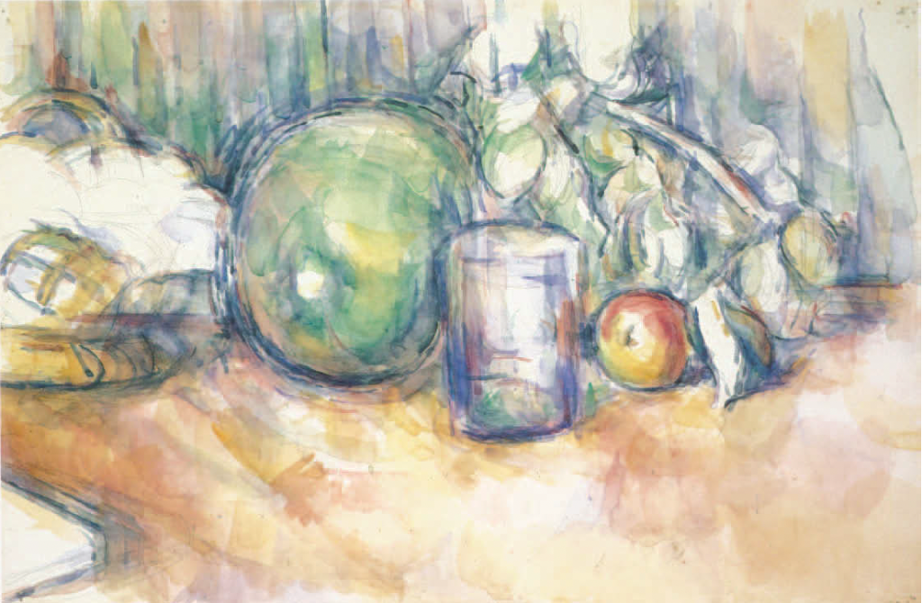
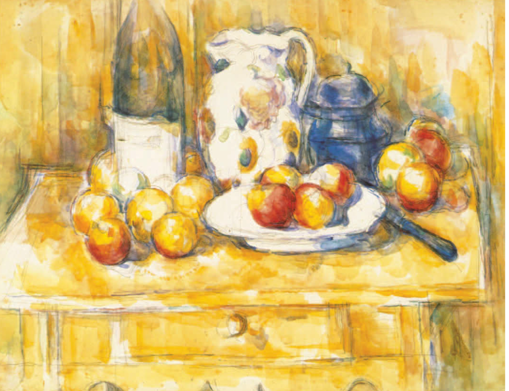
Still life with Green Melon, watercolor on paper, c.1906Still Life with Apples, a Bottle and a Milk Pot, watercolor on paper, c. 1904
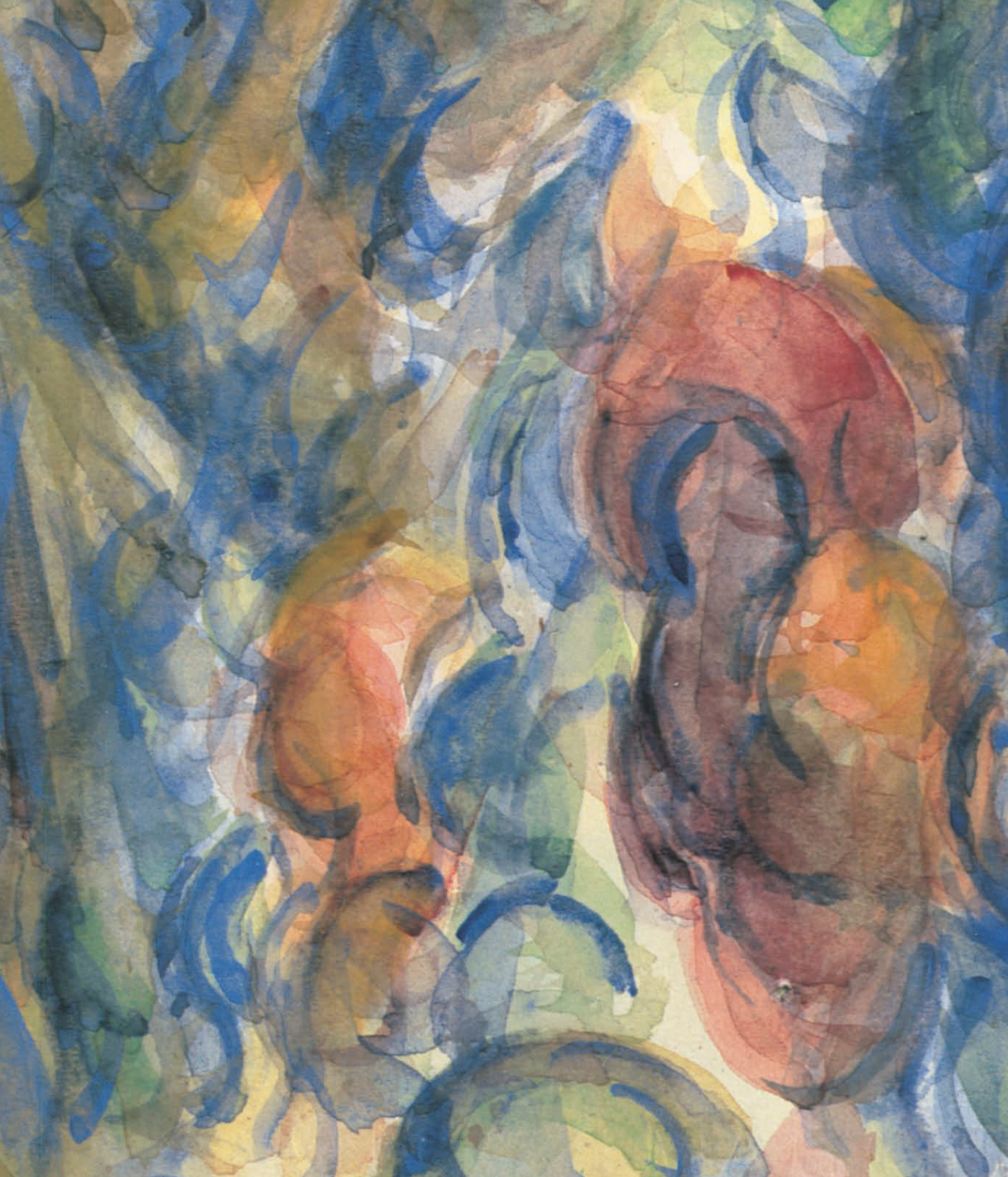
Unlike J. M. W. Turner (1775 – 1851) and other watercolorists, Cézanne adopts a touch by touch and color by color method. He layers translucent patches with gestural brushwork, resulting in a vibrant and casual overall appearance, with fragmentary and kaleidoscopic details. However, the actual process was deliberate and labor-intensive.
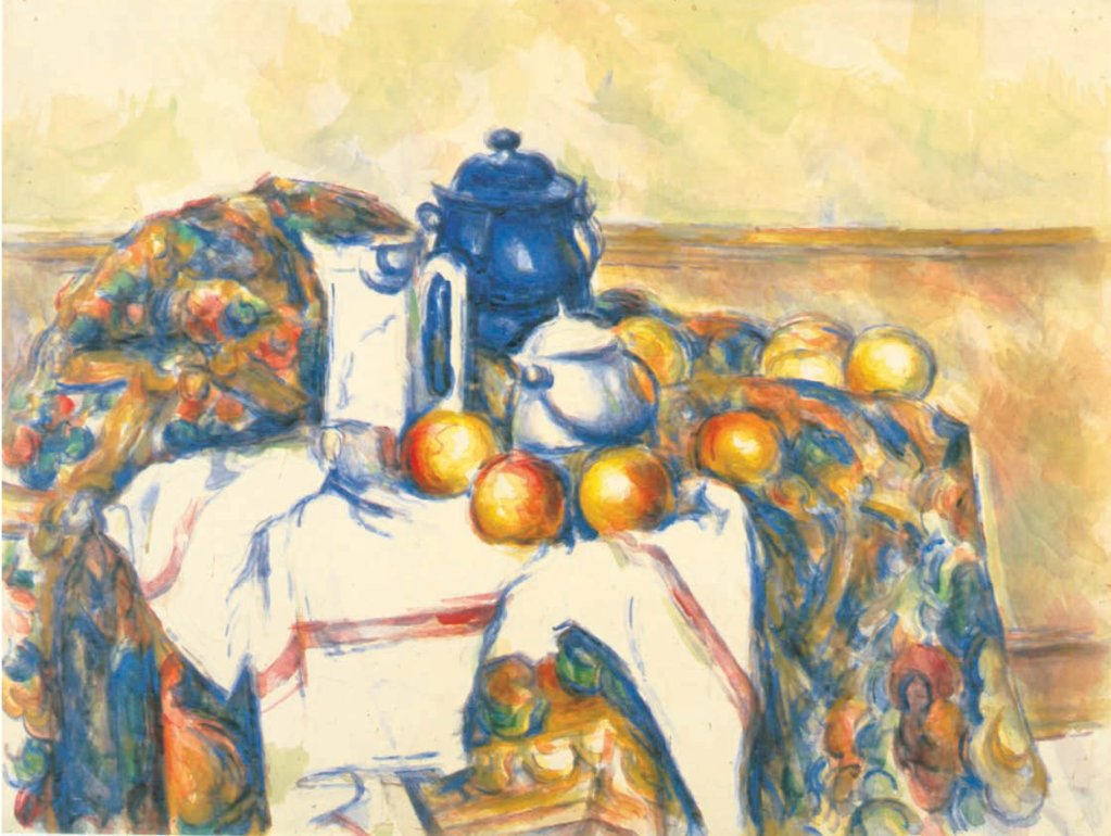
Still Life with Blue Pot, watercolor and graphite on paper, 48.1 x 632 cm, c 1900-1906
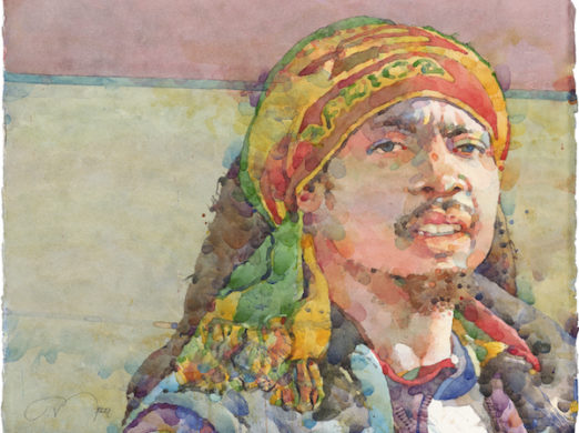
Contemporary figurative artist Ted Nuttall also employs transparent patches of colors to create energetic and vibrant paintings. While both artists are deliberate in their approach, Nuttall’s use of dots helps complete the painting, whereas Cézanne’s colors, used as lines, remain exploratory.
In an attempt to understand more about my “art parent,” (a term borrowed from the Draftsmen Podcast Season 1 Episode 5 YouTube), I recently did some some reading on Cézanne (1839 -1906). The two books by Alex Danchev, Cézanne : A Life, and The Letters of Paul Cézanne (edited and translated) are the most insightful to me.
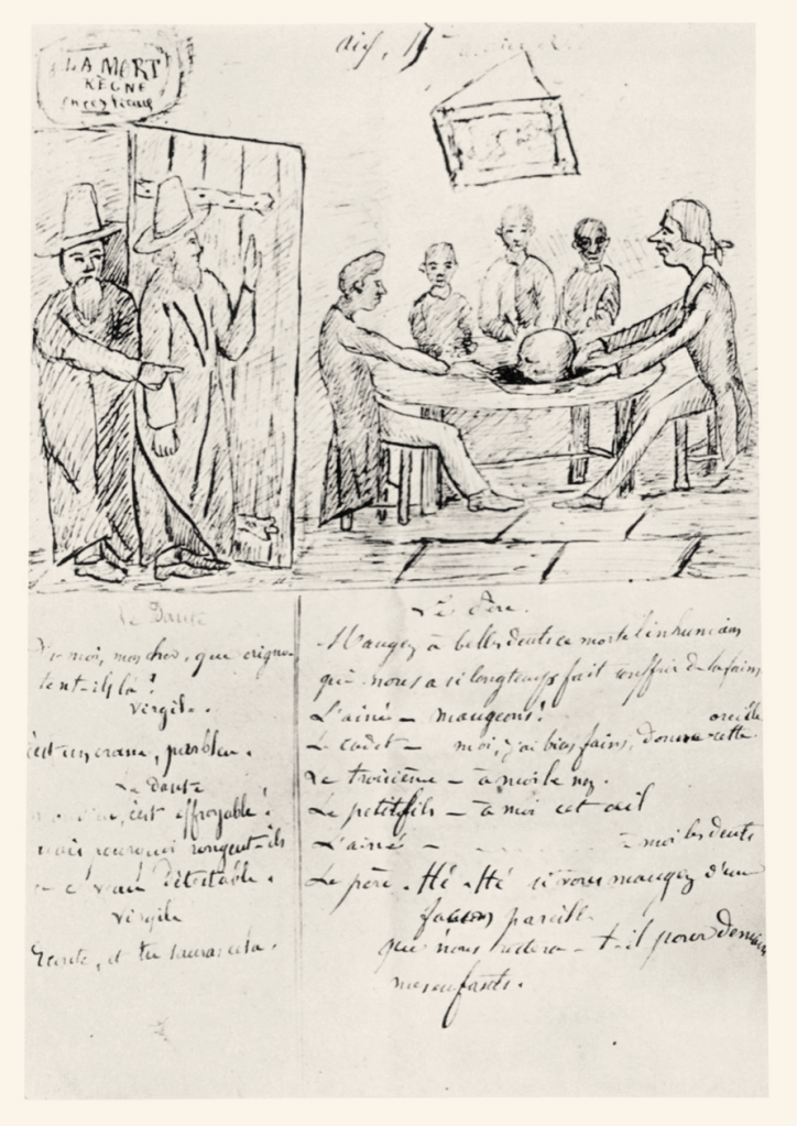
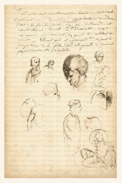
Instead of adhering to a chronological account of the artist’s life, Danchev seems more focused on contextualizing how Cézanne became the artist he was. The wealth of details in the book are well-constructed to provide a comprehensive understanding of the circumstances surrounding Cézanne, his self-perception, and the influence of the artistic community and environment on Cézanne’s paintings. The collection of letters not only serves as a valuable supplement to the biography, but also offers a glimpse into the artist’s penmanship doodles.
Two thoughts comes out of my reading:
First, Cézanne lived the ideal life of an artist. This is not to say he lived an ideal life, far from it, but the all the elements, good or bad, all line up working for him. Cézanne was from a wealthy middle-class background. Despite his family’s lack of support for his artistic pursuits, he was never deprived of financial resources, thanks in part to an inheritance from his father’s passing. Not formally trained as a draftsman, Cézanne was well-educated and immersed in a cultured and intellectual environment. He was a devotee of poetry, from Virgil to Baudelaire, and had a lifelong interest in writers such as Flaubert and Balzac. He may have been a loner in personality, but he managed a marriage and a son. He also was in close contact with devoted friends such as Zola and Pissarro. Despite lacking mainstream recognition for much of his life, Cezanne was always highly valued and admired by fellow artists like Renoir and Monet. Throughout his life, Cezanne faced enough challenges to maintain his edge, while being comfortable enough to never compromise his artistic beliefs and practices.
Secondly, Cézanne was a pure painter. A glance at his sketchbook and the doodles in his letters reveal that he was not an exceptional draftsman, mediocre at best. I once held the view that one must posses strong drawing skills to excel in painting. Cézanne did lament later in his life that he never “had a master” [meaning the traditional apprenticeship]. However, it seems this lack of training did not hinder him from cultivating sophisticated painting skills. Perhaps this was achieved through diligent and mindful practice, or perhaps it even shaped his unique style.
“Taste is the best judge. It is rare. Art speaks only to an excessively small group of people. The artist should scorn all opinion not based on the intelligent observation of character. He should be wary of the mind of the litterateur, who so often diverts the painter from his true path, the concrete study of nature, to waste too much time in abstract speculation. The Louvre is a good book to consult , but it should be only a means. The real, prodigious study to undertake is the diversity of the scene offered by nature.” – Cezanne (Letter to Emil Bernard, 12 May 1904)
I don’t know what to say with these “findings,” especially if they are applicable to us mortals in any sense. After all, as Danchev put it, “He is painting. This is it.” (Cézanne : A Life, p337)
Apart from studies, Emile Zola’s fiction The Masterpiece is both an interesting and relevant reading about Cézanne. The main character Claude Lantier, a revolutionary but ultimately failed artist, is based on Cézanne, while his writer friend, Sandoz, is Zola himself. In the story, the artist lost his son, and eventually hangs himself. Many details about the two friends are believed to be biographical, and the portrayal of the Parisian cultural scene is also quite accurate. However, the novel seems to end the long standing friendship between Zola and Cézanne. No more communication was found between the two ever after.
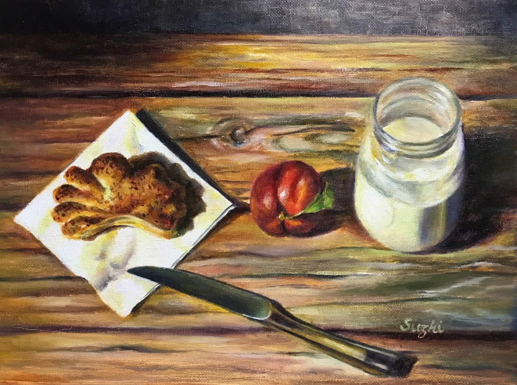
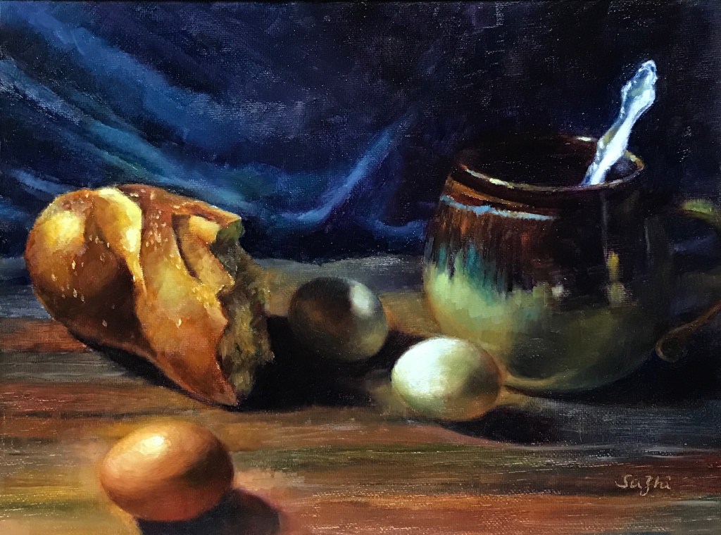
All these are oil on canvas board, 11 x 14 in. I want to keep the studies small so that I could do more.
Eggs are difficult, either in terms of shape, value or solidity. There’s a fabricated story in China about how Da Vinci was forced by his master to sketch hundreds of eggs. Well, I do see the need of it.
My problem with over saturation manifested itself best with the bread. I probably wouldn’t eat that last one :))).
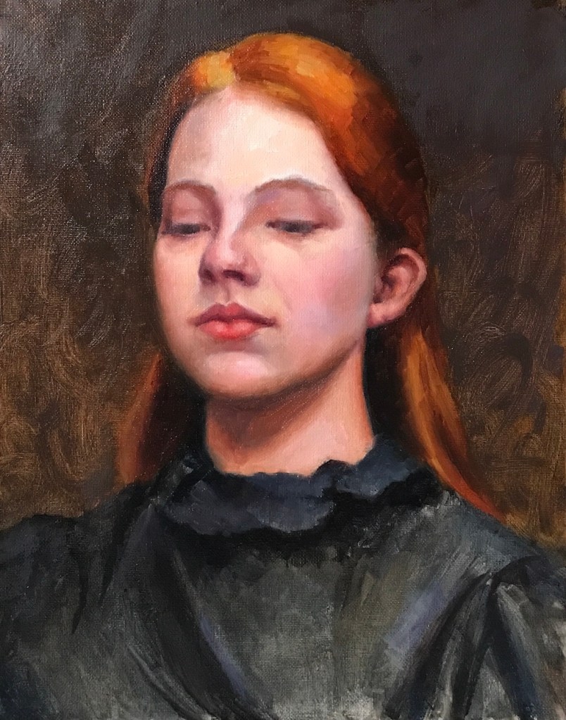
In early 2021, I audited an online workshop by artist Joseph Todorovitch (see a brief description here). At the time I felt the content was too advanced for me. It may still be. It came to my knowledge recently that the artist had a more fundamental series in 2020 called “Painting the Portrait with Ease.” It is a nearly 9 hours video series featuring step by step painting of the portrait of Abby. You can buy or rent (for 48 hours) from Vimeo.
It is more fundamental because the portrait involves no complex background and clothing, and the palette is limited (not as monochromatic as it seems though). The “ease” part comes from the artist’s clear explanation of his choices and thought process. If you are looking for shortcuts circumventing learning and practices, there’s none. In fact the artist’s approach is quite meticulous and laborious. He shows no hesitation in scraping off the “finished” part of a painting and going at it again. While there are plenty basic information on portrait painting for a student, the process he used is the same for completing advanced works. This is a series that deserves revisit from time to time.
Here’s the painting I did while following along the series:
Abby, 16 x 20 in, oil on panel, November 2022
Another young artist I took lessons from recently is Alex J. Venezia. The lessons are a 12 hours video recording from East Oaks Studio, featuring also the portrait of a young woman. Mr. Venezia used a layered approach, and the videos were recorded over weeks. If you want to follow through, you need to be patient and let the paint dry in between. The artist is also extremely particular about the subtle changes of value and color in his paint. I feel like I need a better habit of organizing my palette and more practice in mixing colors to make the best out of these lessons. The painting I did during this series is a not a step by step following along and is abandoned halfway. I do plan to revisit the lessons in future:
Portrait of a Young Woman, 11 x 14 in, oil on panel, December 2022
A few more words on East Oaks Studio: While you do need a subscription to access the above mentioned videos and many other recorded and live lessons, East Oaks has plenty free content posted on their YouTube channel. They feature quite some established working artists. It’s a rich resource that takes time to digest.
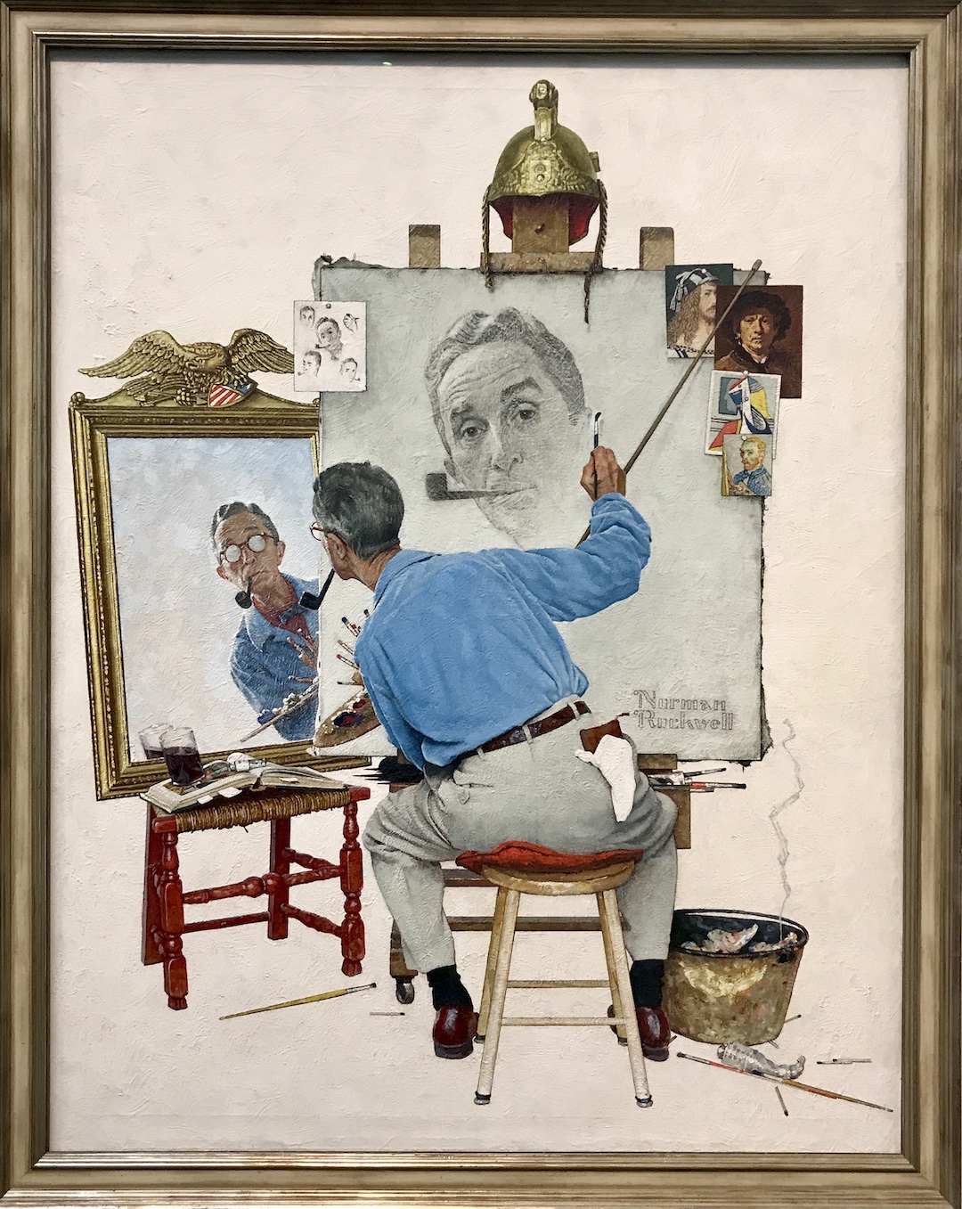
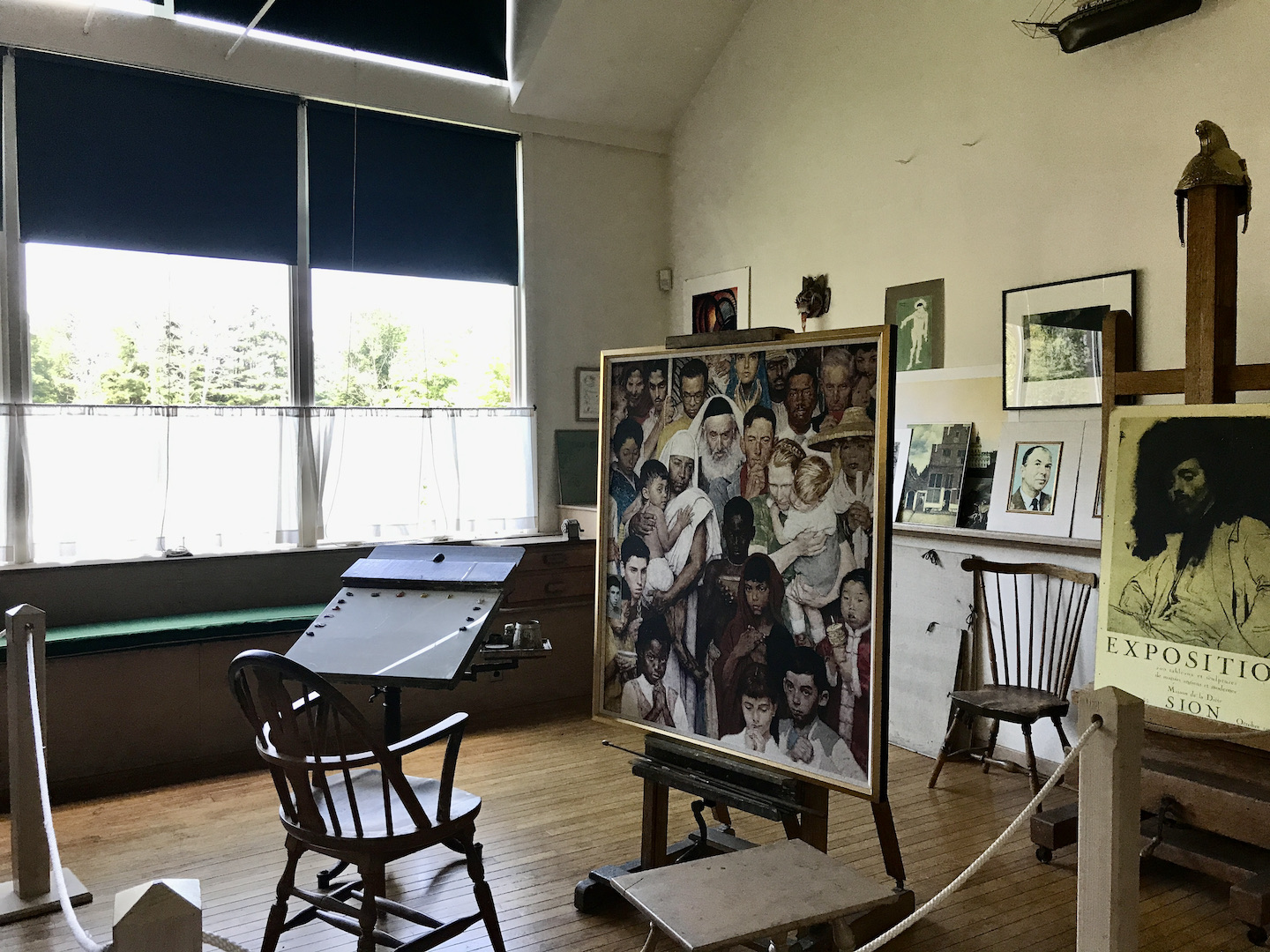
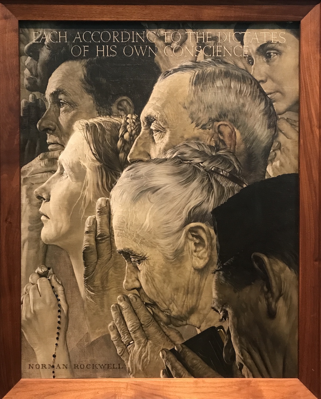
It’s been a while since I visited any museums and this summer while traveling from Boston to Ithaca, I accidentally found out that the Norman Rockwell Museum was on the way. What a delightful discovery! It was a tiny unassuming white building resting on a scenic site overlooking the Housatonic River Valley. The main exhibition features some of the most famous illustrations and paintings by the renowned artist. All the covers he made for the Saturday Evening Post – from 1916 to 1963, 323 in total – are on display at a lower level. His last studio in Stockbridge was also moved to the museum site in the 80s and guided tours are offered.
The museum also hosts other illustration related exhibitions, and virtual exhibitions on their website.
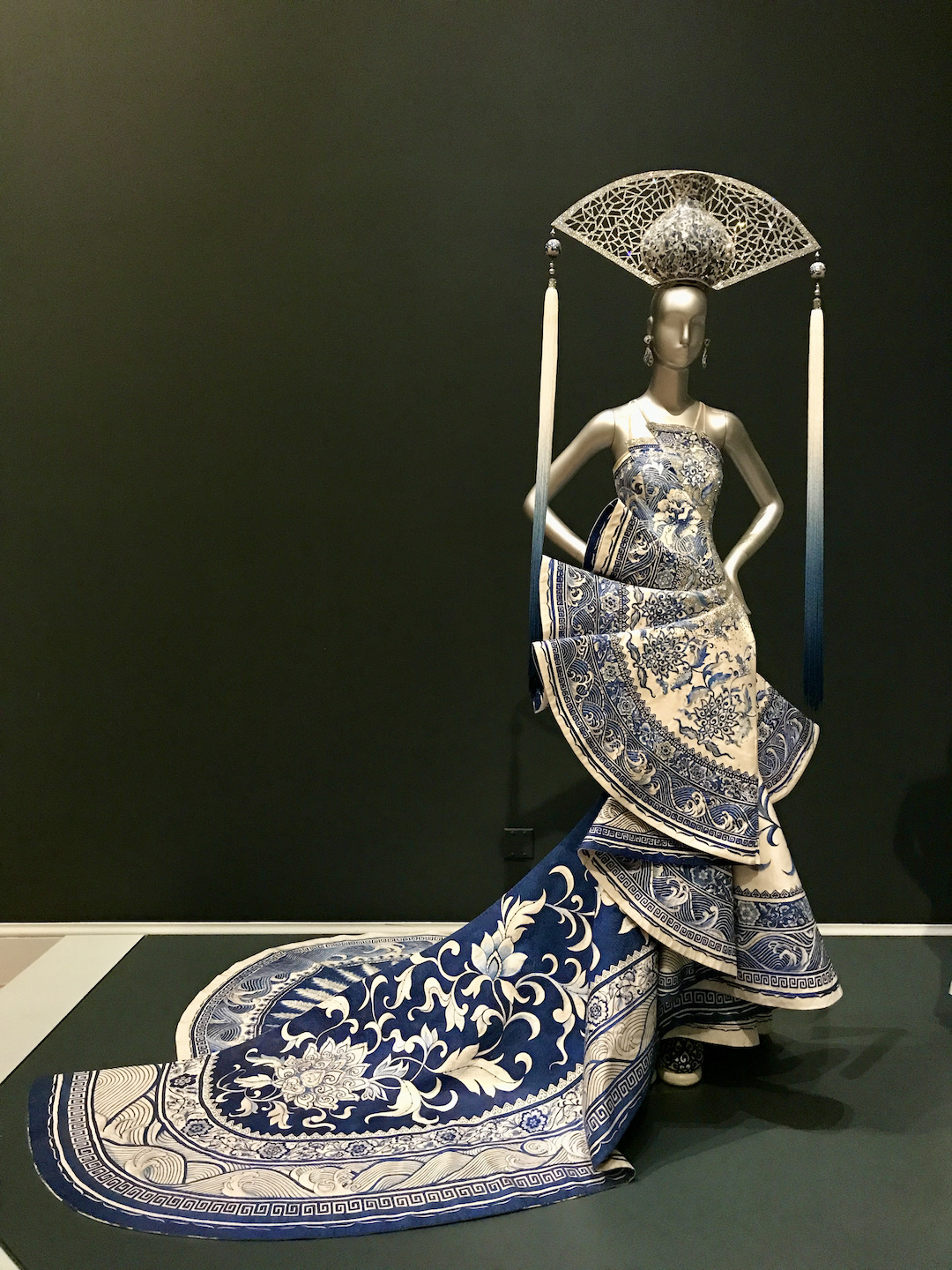
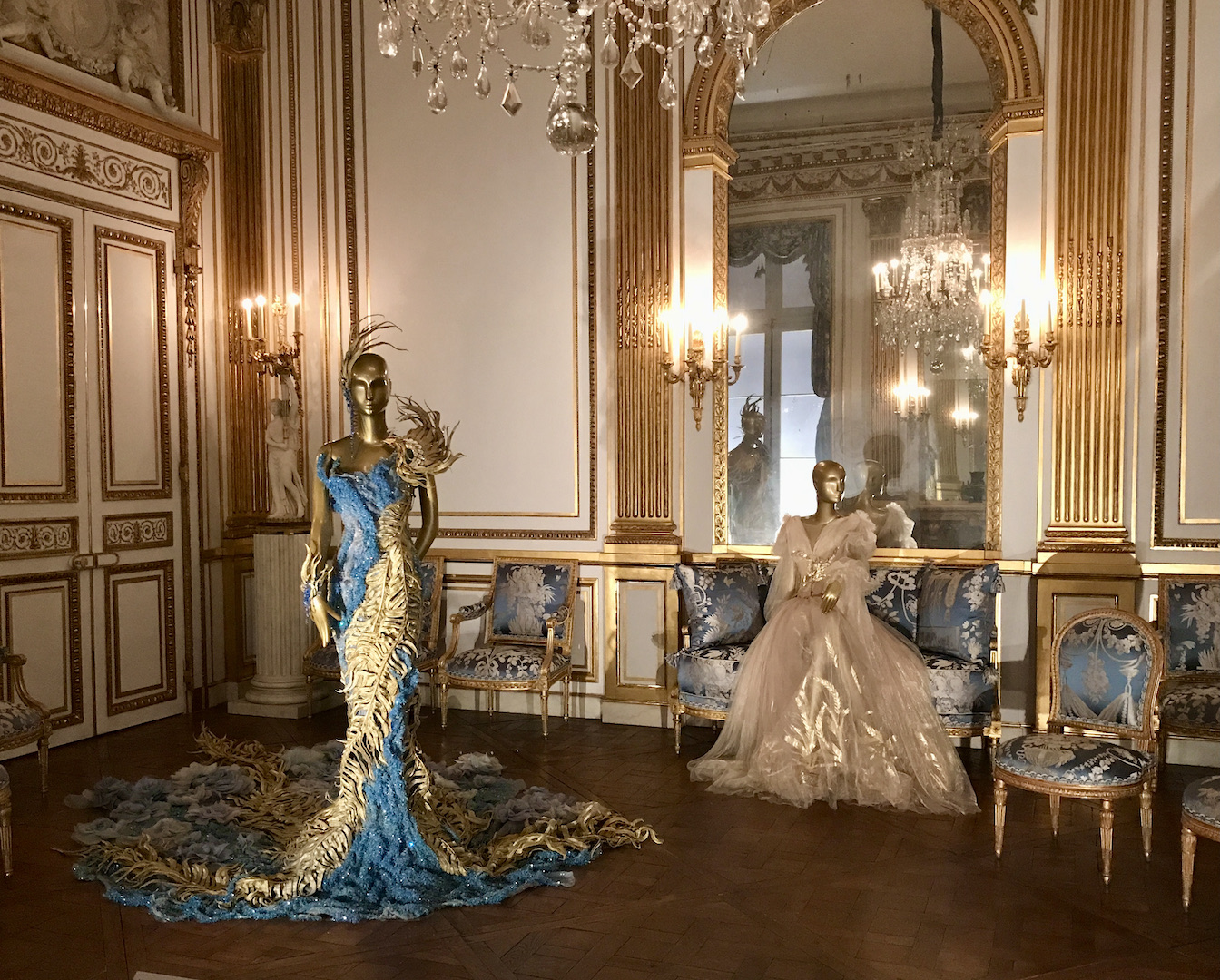
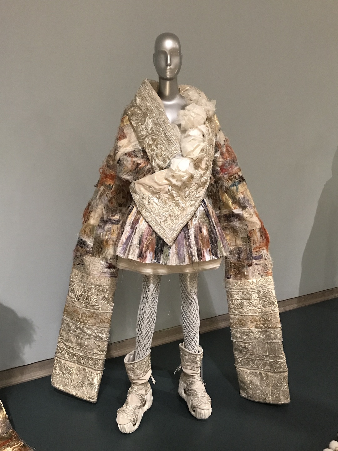
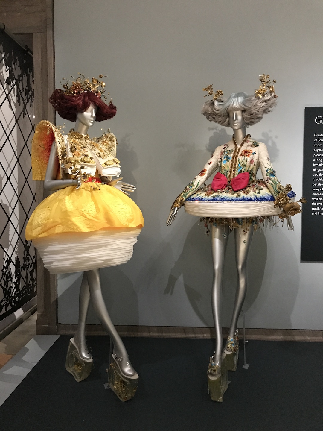
In a more recent and much shorter trip, I got to see Guo Pei’s Couture Fantasy at the Legion of Honor Museum in San Francisco. Guo Pei is a Chinese fashion designer who is very popular among Chinese and Western celebrities. She’s one who designed the spectacular 2015 Rihanna’s Met Gala gown. Many of Guo’s designs feature intricate embroidery and lavish materials. They are quite labor intensive, and some took thousands of hours to make.
Instead of putting all the items in one dedicated area, the museum chose to set some of her works up among their permanent collections, creating some interesting juxtaposition.
From cozy comic daily life to extravagant haute couture, each of these shows is a change of scene from my currently skill focused art practice. They make me think about what art is and what art serves. But most importantly, museums are fun and I am back!
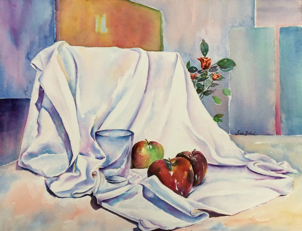
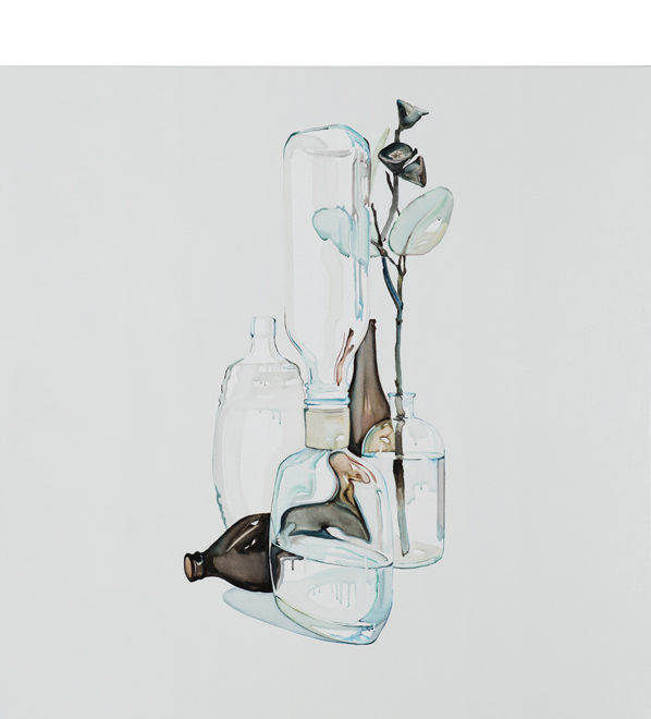
Years ago in a watercolor class, we practiced rendering glasses by choosing from a couple of setups. I got ambitious and turned the practice into a full painting:
Still Life, watercolor on paper, 14 x 20 in, c2015
The roses were supposed to be a different setting, and I didn’t choose it because I thought apples would be easier. However, in composing the whole piece, I thought the glimpse of the flowers would be interesting. As you can see, I indeed didn’t know how to handle those petals and leaves back then, but I think they added liveliness to the scene. I remember some fellow artist commented, “The roses are saying,’We are here! Our turn! Our turn!'”
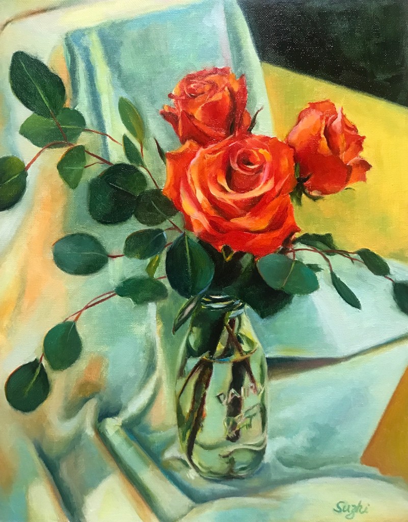
Recently when looking through some old reference photos, I was surprised to see that I actually took a few shots of the roses at the time. Hence, their turn:
Red Roses, oil on canvas board, 11 x 14 in, August, 2022
Hehe, the petals and the leaves are still challenging, but I feel they are happy to be in the spotlight!
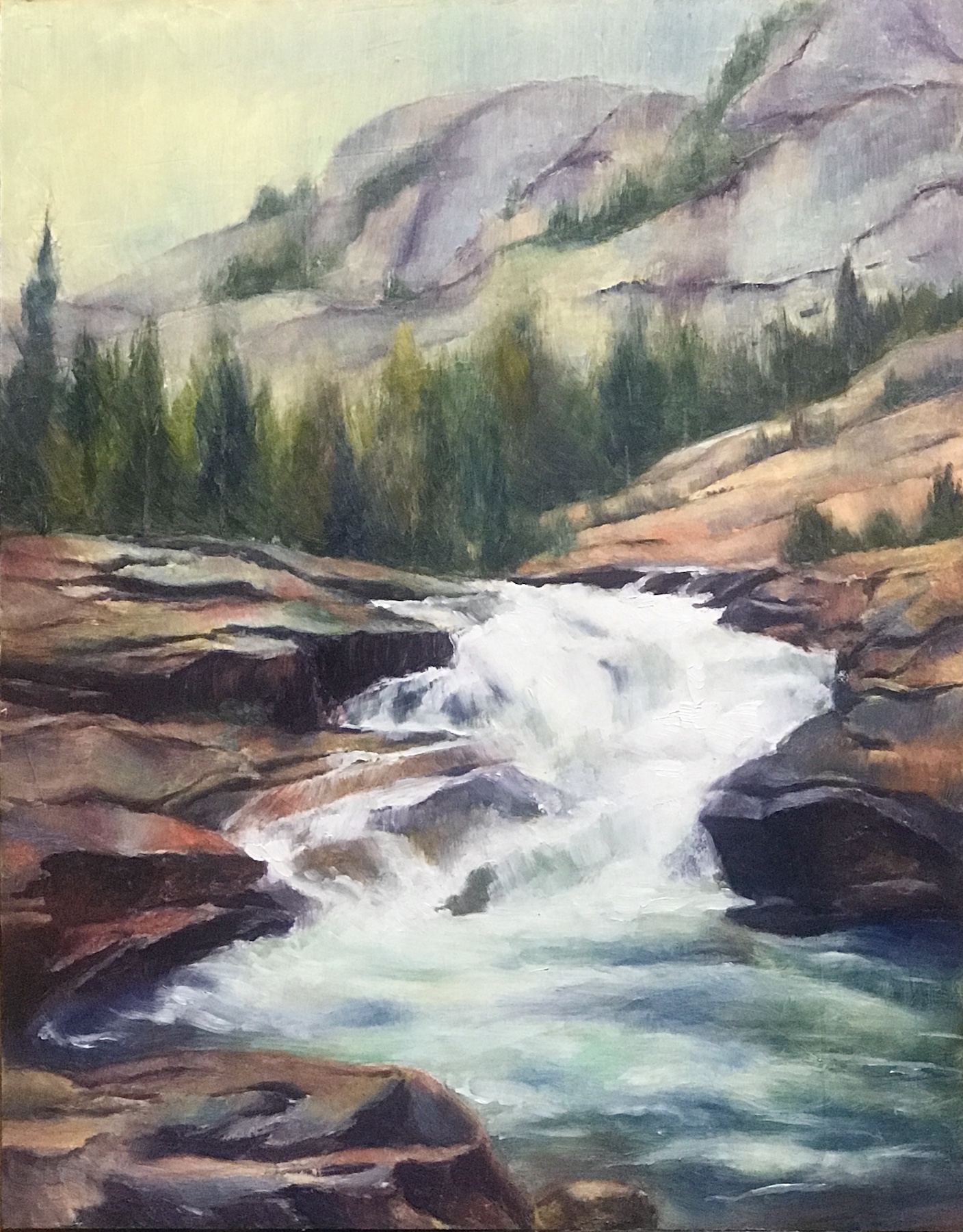
The way I learned to paint in oil, is to start with an underpainting. It could be a monochromatic value sketch, or a diluted full color draft. Either way, the underpainting would be covered by thicker paints as I progress and hopefully the process took the work to a better place. Once in a while, I just fell in love with the underpainting, and the continuation of the work was saturated with doubts.
This river landscape (a Watts homework) was an example. The one on the left was the underpainting and the one on the right, the final work. I hesitated quite a while after the first draft about whether I should proceed at all. There was a liveliness and richness of color that I loved and didn’t know how to preserve when I added more paint to it. Also got lost was a sense of flatness, something more graphic and watercolor-y. This is not to say the underpainting was a better painting, but it makes me wonder the different directions I could have taken in finishing up this work (if it is not a homework in realistic landscape). Even some of the pencil marks begged to stay!
Moreover, can I achieve a watercolor effect with oil paints? Well, somebody can.
That’s Australian artist Julian Meagher, who painted in oil but managed to achieve the transparency and the lucid aesthetics of watercolor. Apart from his website, Amber Creswell Bell’s collection Still Life: Contemporary Painters has a good section on Mr. Meagher’s work. He painted with extremely diluted oil paint, and did not hesitate to use the white of linen canvas instead of white paint. The result is a good combination of precision and fluency.
His works remind me of Giorgio Morandi (1890 – 1964), one of my favorite still life artists (as I mentioned many times before). The technical approach couldn’t be more different. Morandi is opaque and static, while Mr. Meagher is more colorful and vibrant, cleaner and much more scaled up. However, the solitude, the quietness and the thoughtfulness are there.
The more I see good art, the more I am wowed by the range and the potential of the each medium. We are only limited by our skills! (Is this a good thing or a bad thing? :))) )
You heard the buzz: there’s another way to do art. You type a few text prompts, and the AI will return results. One of the recent AI generative art lab is Midjourney. You can try it for free on MidJourney’s Discord server with a limited number of images.
Here are some of my attempts:
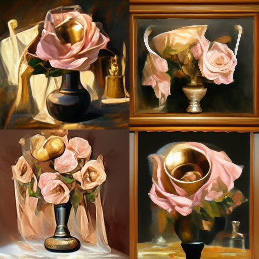
The prompts I gave are: “oil painting, still life, bronze vase, light pink roses, curtain, table, realism, expressive strokes, worn palette;” – basically, a Watts’ Atelier homework. The first result it returns contains 4 choices:
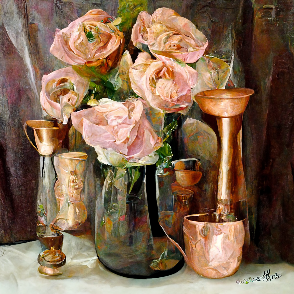
You can choose to further develop them and make variations till you are satisfied or give up. Some of the “final” ones:
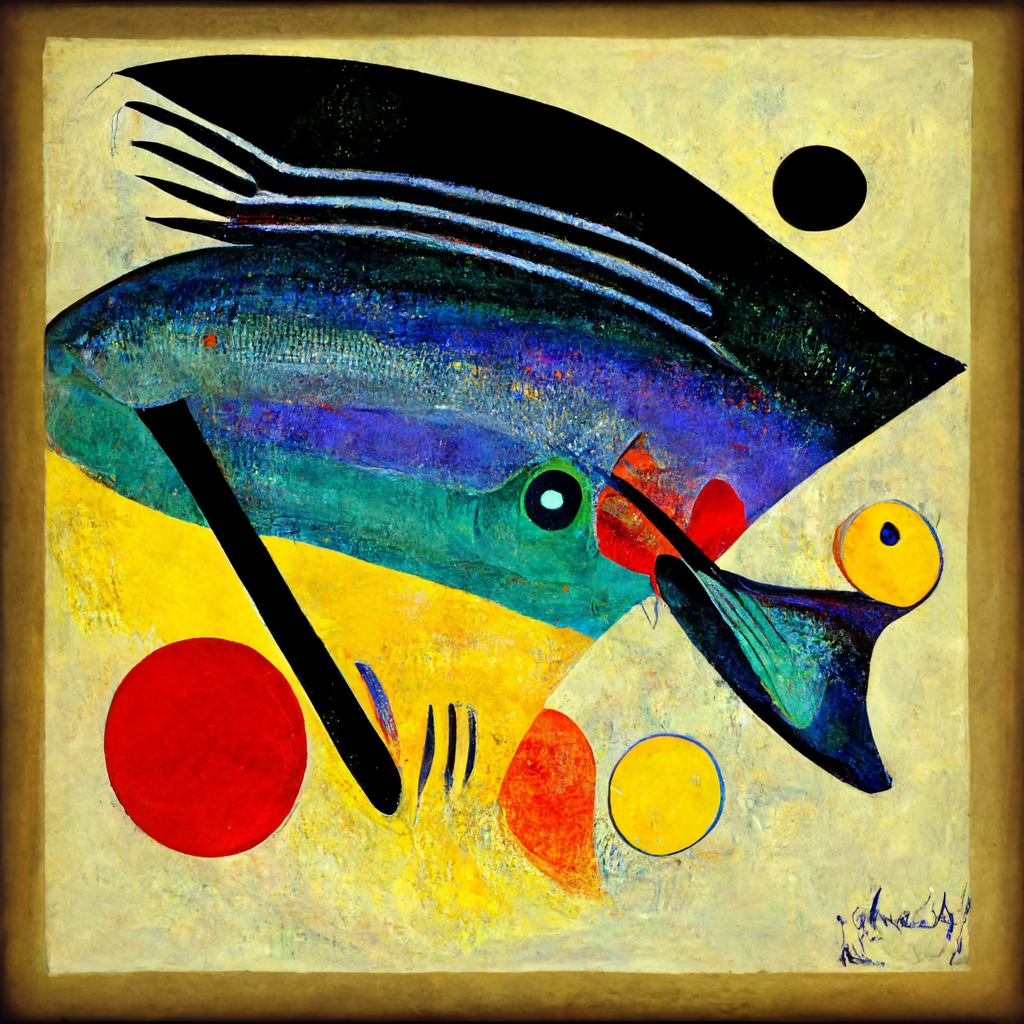
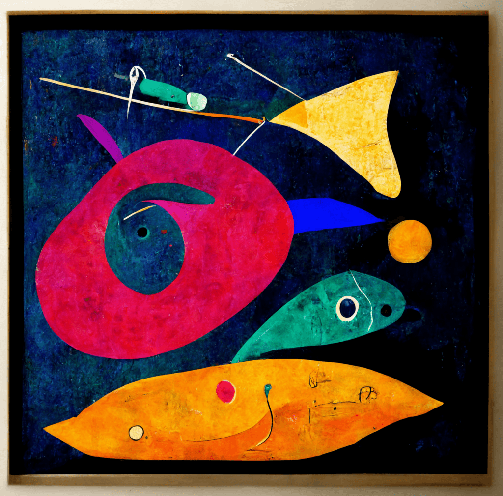
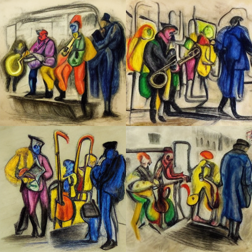
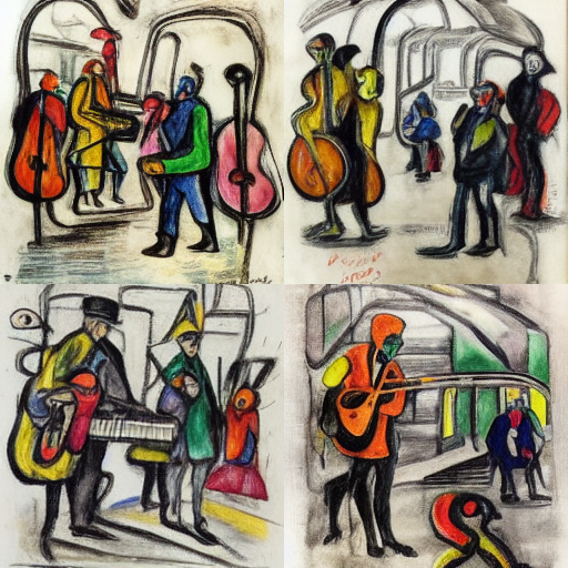
Here are some of my Kandinsky (kandinsky with expressive bold strokes, fish, abstract colors) and André Masson (André Masson drawing, colored pencil, street musicians, metro, gloomy):
A few notes:
It’s a lot of fun. Thanks to the limited number of trials that I didn’t end up spending my life on it.
I don’t really know how to make the best out of this Midjourney. I have seen amazing artworks coming out of it. I assume the the prompts you give make all the difference, but I didn’t spend time digging what the algorithm handling better, more general or specific instructions, more or fewer words etc.
Also, if the attempts are not limited (with a subscription I assume), you can keep manipulating them. The result may get much better or worse.
If you are into digital art, this can be a tool, and if you are making abstract art, this can be a great idea generator.
But, who can claim the authorship? In a few pieces, there’s even an attempt of signature. Whose signature? It seems to me like Kandinsky or Mason. So does the algorithm aims at creation or imitation?
I also like the fact that in some cases the painting comes with a frame.
One thing for sure, if the big names in art history and all the prodigies online haven’t stopped us attempting new artworks, AI wouldn’t either. Back to painting! 🙂
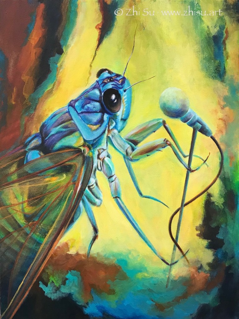
I am not a particular fan of insects, but the sound of cicadas is a constant in my childhood memory. Summer time in Beijing when the city was still haze free, kids with long bamboo sticks were searching for cicadas in the canopies of trees. The molt makes good ingredient in traditional Chinese medicine, probably for treating cold. When I first saw the picture of a blue cicada I was delightfully surprised. I never knew cicada could be this pretty. The ones we had in Beijing were black and brown. Yet, we all romanticize our memory, don’t we?
“Summer Dream,” which currently on view at the Pacific Art League gallery, was inspired by two of my previous pieces. The design came from “Marching” (not obvious, I know, long story still developing), while the color theme “Landscape.”
Summer Dream, acrylic on canvas, 22 x 28 in, 2021
By the way, naming the artwork is probably the hardest part of the creative process, at least for me. While “Sing” may be self-evident, it was still an afterthought. As for “Summer Dream,” hehe, I grabbed it out of nowhere the minute before submitting it for the show, and had to check the register sheet to remember what it was when I brought the artwork in. 😂
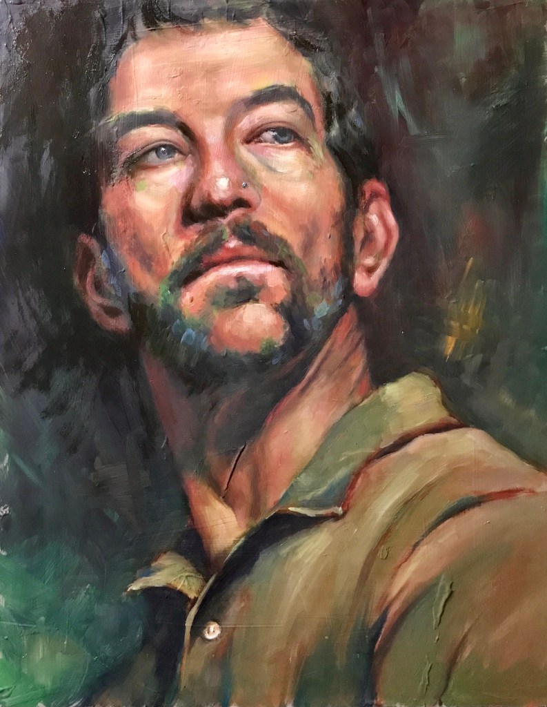
These are some of the portraits I’ve done recently. Palette wise I have pretty much opened myself to everything now:
Japanese Girl, oil on canvas board, 11 x 14 in, March, 2022Male Model, oil on canvas board, 11 x 14 in, March, 2022Female Model, oil on canvas board, 11 x 14 in, April, 2022
Here’s an old Zorn palette one:
Female Model, oil on canvas board, 11 x 14 in, December, 2021
A few notes:
The first three paintings are supposed to be gesture studies. I obviously overworked.
On the other hand, spending more time designing the background makes the process more interesting and the painting more finished. I like that.
Managing an open palette did distract me from better value control and cost more subtlety in skin tone.
I am thinking a two-step approach to improve: first spending more time preparing the palette – premixing most of the colors like I did with the Zorn palette; and then use a timer to push for a more gestural result. Two hours? Three? 🙂