Tag Archives: #oilpainting

Master Studies and Some More

Charles-Joseph Natoire (1700-1777), a prominent French Rococo painter and draftsman, was celebrated for his decorative paintings, mythological scenes, and religious paintings. Natoire was one of the artists who helped popularize the use of pastels in the 18th century. He often employed delicate pinks, blues, and greens to create a light, airy atmosphere in his works. His paintings are characterized by their pastel hues, delicate brushwork, and a playful charm.
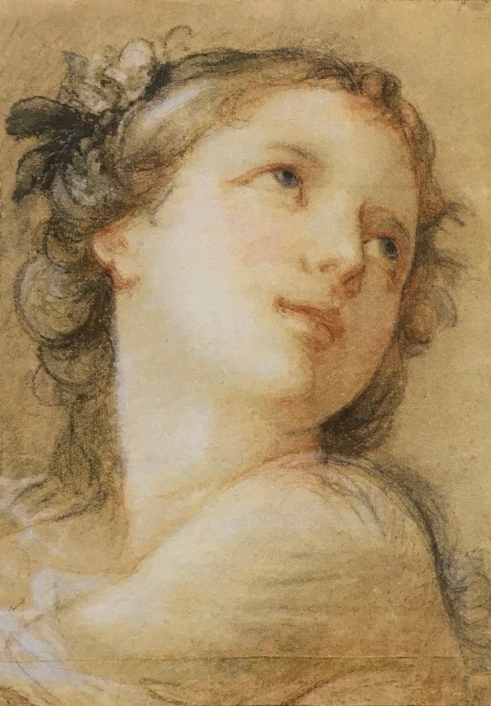
“Head of a Bacchante” (1741) is a fine example of his mastery in pastels. A bacchante, a female follower of Bacchus, the Roman god of wine, fertility, and theatrical performance, is often depicted in art as ecstatic or in states of divine possession.  Pastel allows for a softness and blendability not easily achieved with oil paints, making it ideal for capturing the delicate features and expressions of mythological figures.

I saw this painting at the Getty Center, where I was drawn to Natoire’s emphasis on grace, charm, and a certain lightness. The luminous quality of the skin tones, achieved through soft, atmospheric light, created a sense of intimacy and warmth. His fluid, graceful brushwork contributed to the overall elegance, and a well-controlled value range allows smooth transitions between forms.

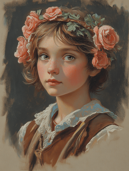
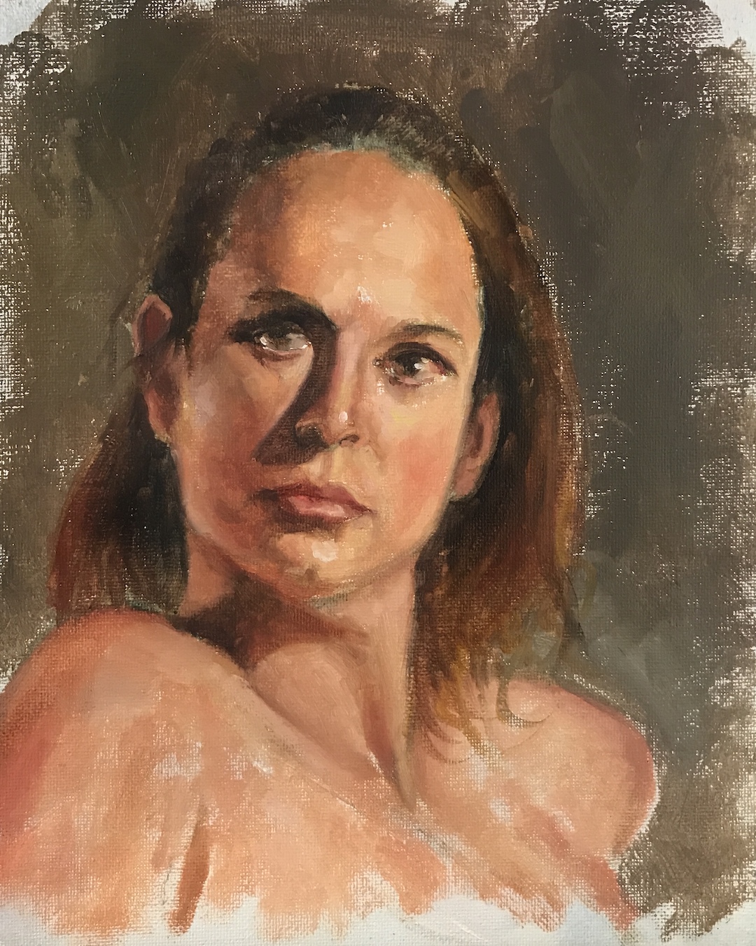
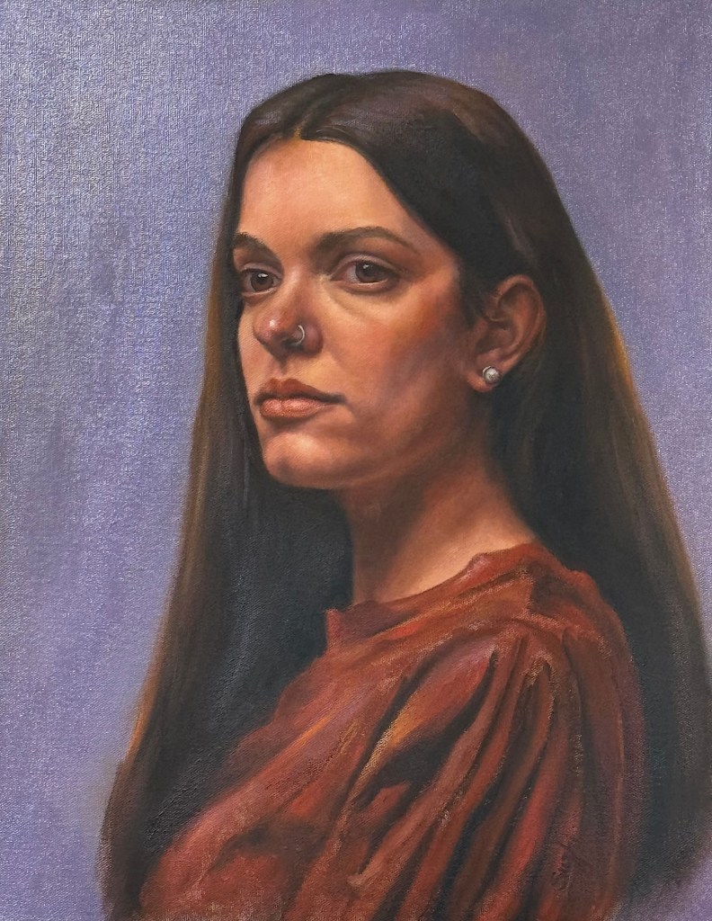
In attempting a master copy, I focused on replicating the subtle value changes. I have a tendency of using high contrast and high saturation in my own portrait painting. I hope, by compress and control the two, I could achieve a softness and luminous effect that is missing in my works. While oil paint is not as ideal to achieve this goal as pastel, I figured I would still learn a lot by pushing it as far as I could. I started a bit too heavy handed, and later had to spend layer upon layer to lighten things up, and contract the range of values. The result still felt too defined in some places, lacking the ethereal quality of Natoire’s original. Some of the airiness of the original comes from Natoire’s dancing line work, which I don’t have the skill to imitate with a brush. While Natoire captured a goddess, I painted a mortal – a lovely one, I think. 

After Natoire, oil on canvas board, 9 x 12 in. August, 2024

Curious about modern interpretations, I requested a pastel painting of a bacchante from both Grok 2 and MidJourney 6.1. Grok gave me a photo-realistic beauty with a somewhat painterly background. It seems Grok doesn’t respond well to traditional medium. MidJourney, on the other hand, at least attempted to emulate ‘a painting.’ 
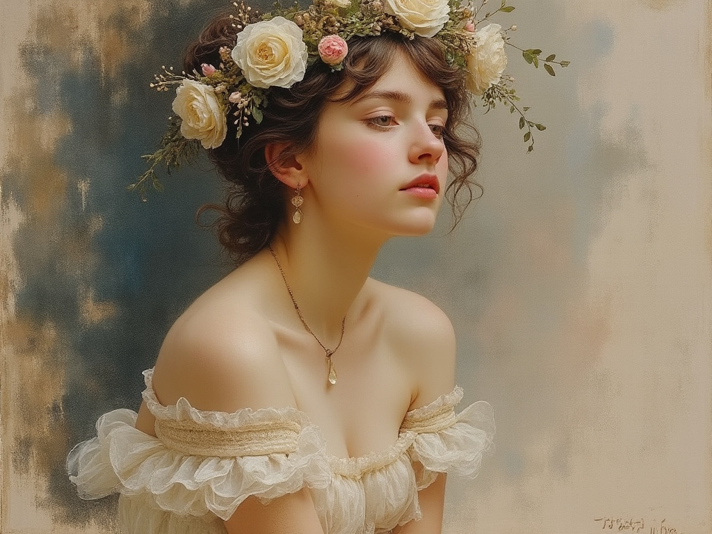
One can also twig the many perimeters MidJourney offers to achieve varied result: 

If I provide Natoire’s original as a prompt, MidJourney could fake a couple of masterpieces:
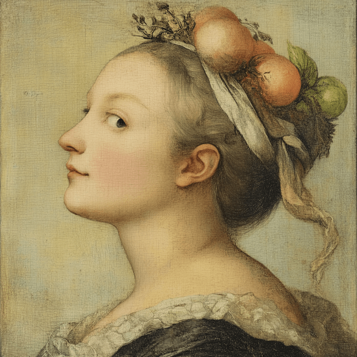
Me and my bots, we all had fun!
Some Filler Projects

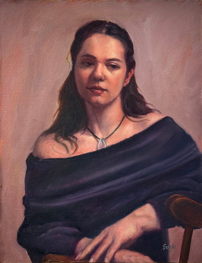
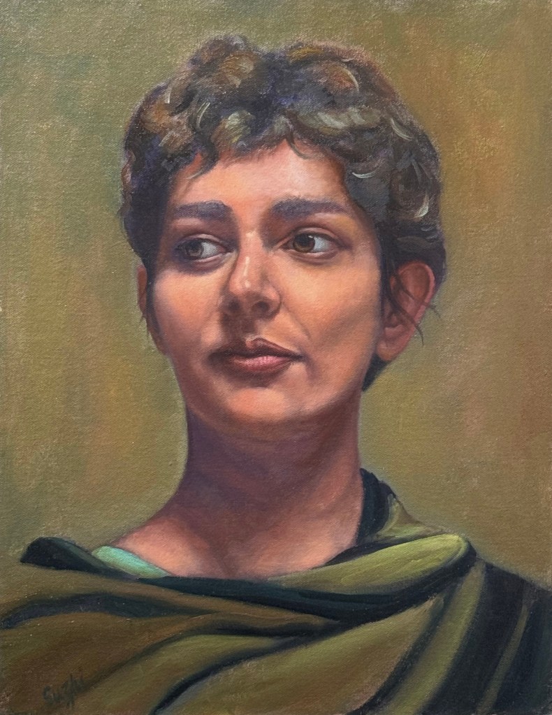
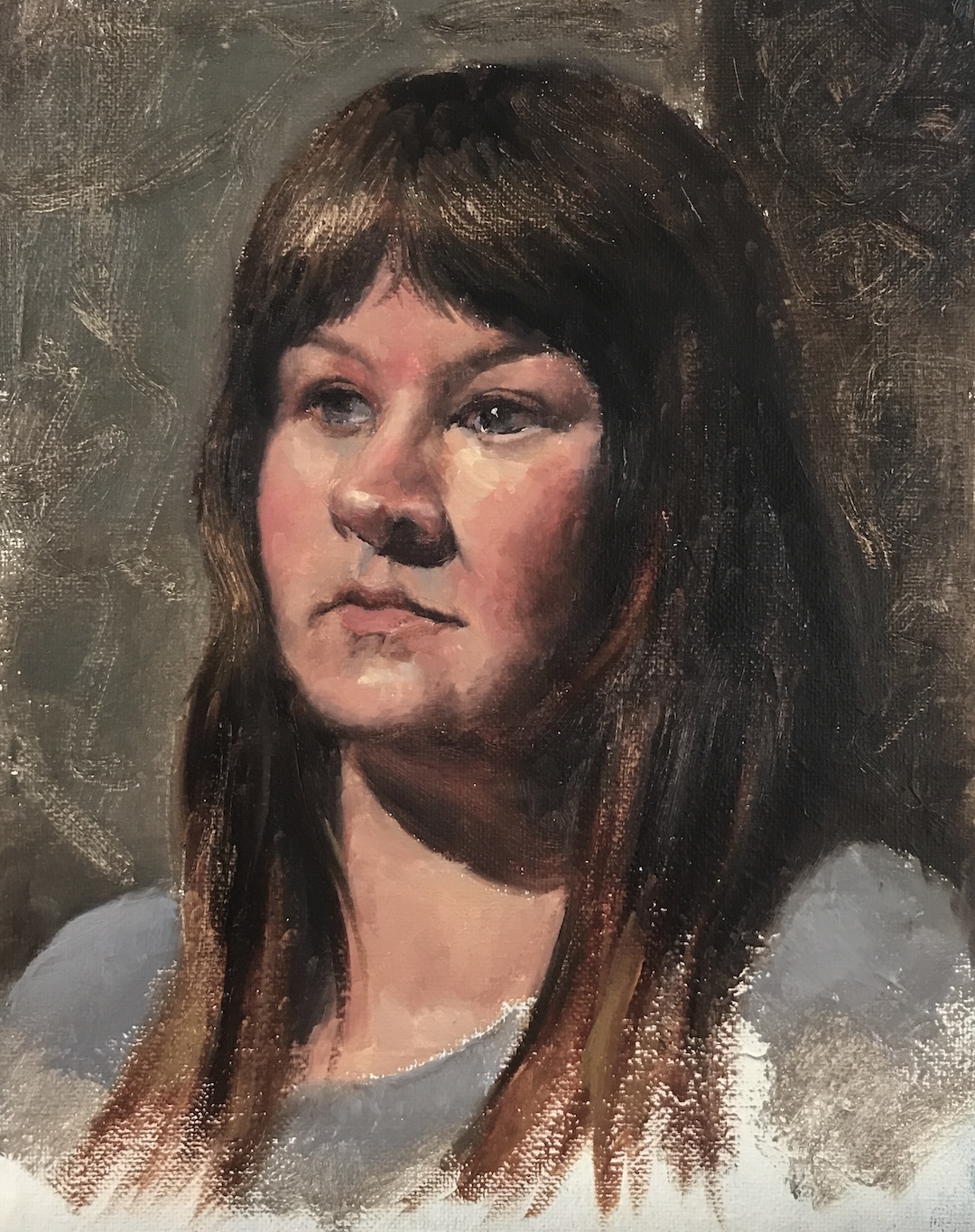
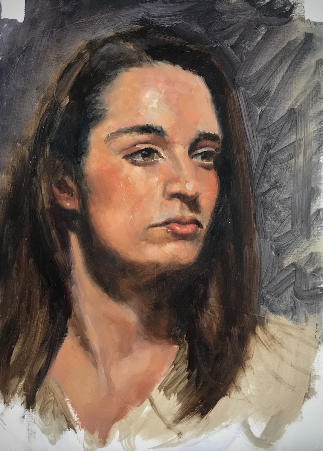
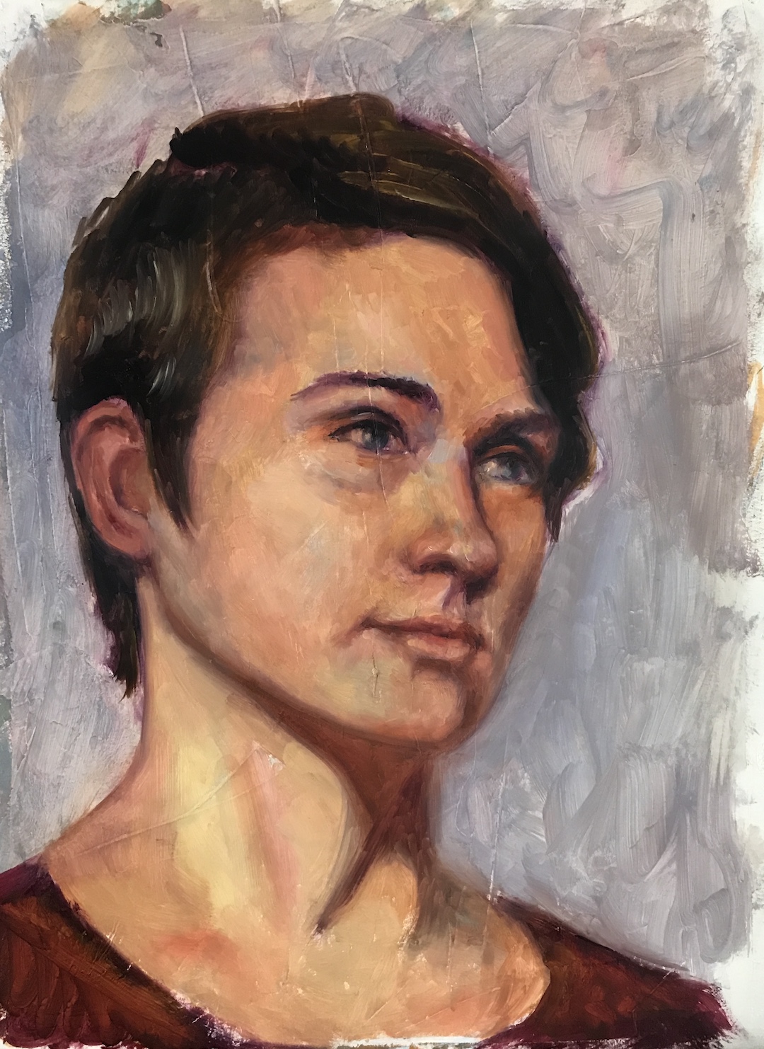
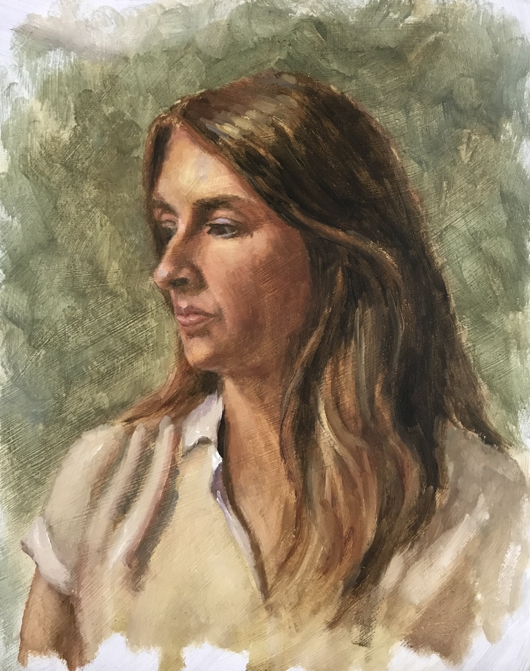
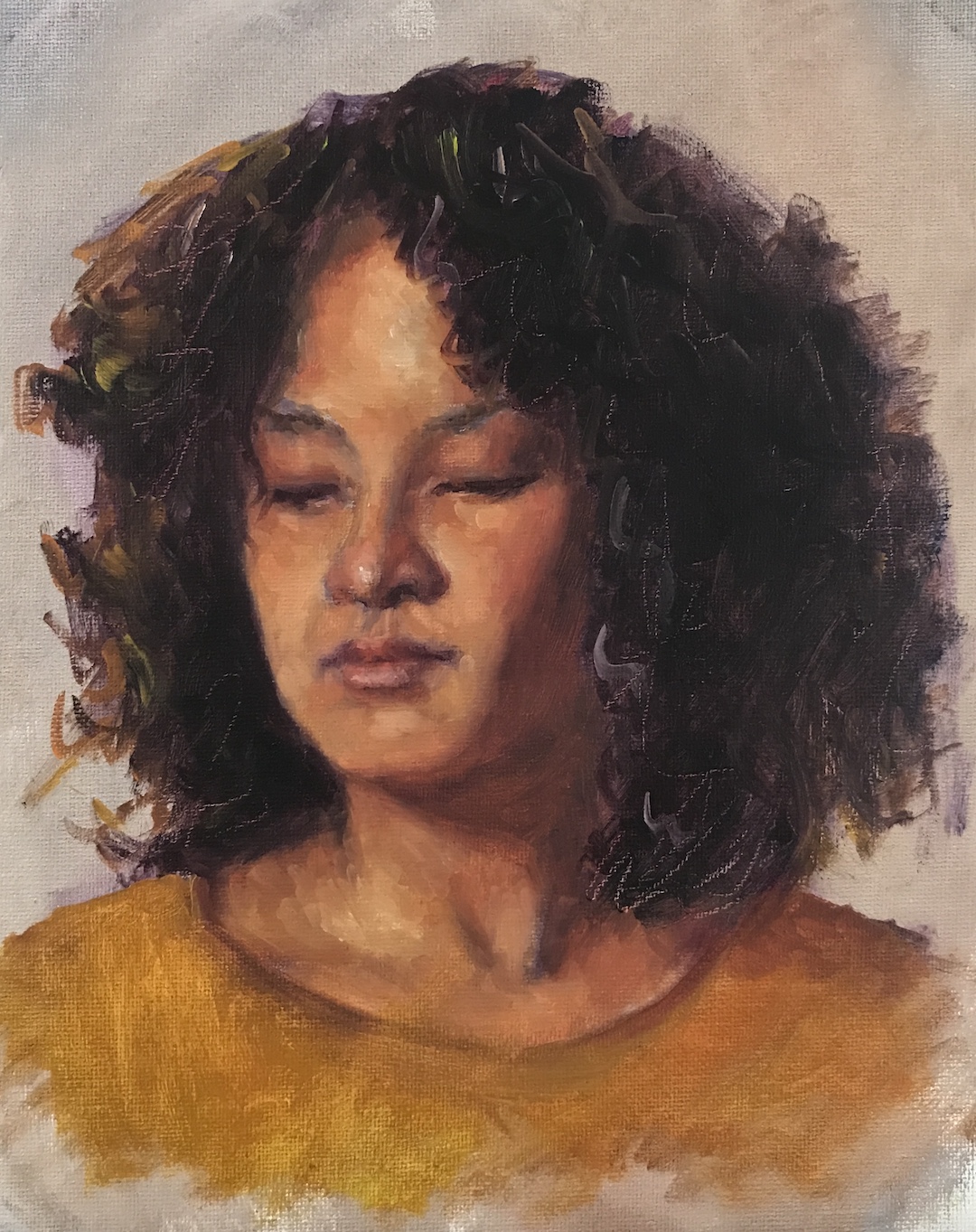
There are a couple of still life projects ongoing, and in between, I completed a few portraits using models from East Oaks Studio’s live streaming. Previously I focused on trying to finish the sketch, smaller in size, within 2 to 3 hours, aligning with each streaming session. This time, I used bigger panels, and allowed myself as much time as I wanted. The results are more rendered and complete-looking pieces:

Evee, oil on canvas panel, 14 x 18 in, July 2024
Tina, oil on canvas panel, 14 x 18 in, July 2024
Kailey, oil on canvas panel, 14 x 18 in, July 2024

A few notes:

  • I call these “filler projects” because they were not part of my summer plan. However, I find that while waiting for a layer to dry, or stalling at certain stages of the painting, doing something different alleviates my anxiety. It’s so much better than idling around not achieving anything!
  • I neither went for close likeness nor the exotic look in my previous Schiele-ish attempt. However, I do feel that Schiele exercise has left its mark.
  • For me, the greatest gain from these paintings is that I have started to consolidate my method. In each case, I started with a Zorn palette, and added to it as I went on.
  • Mix it up and never stop painting!

Channeling a Bit of Schiele?

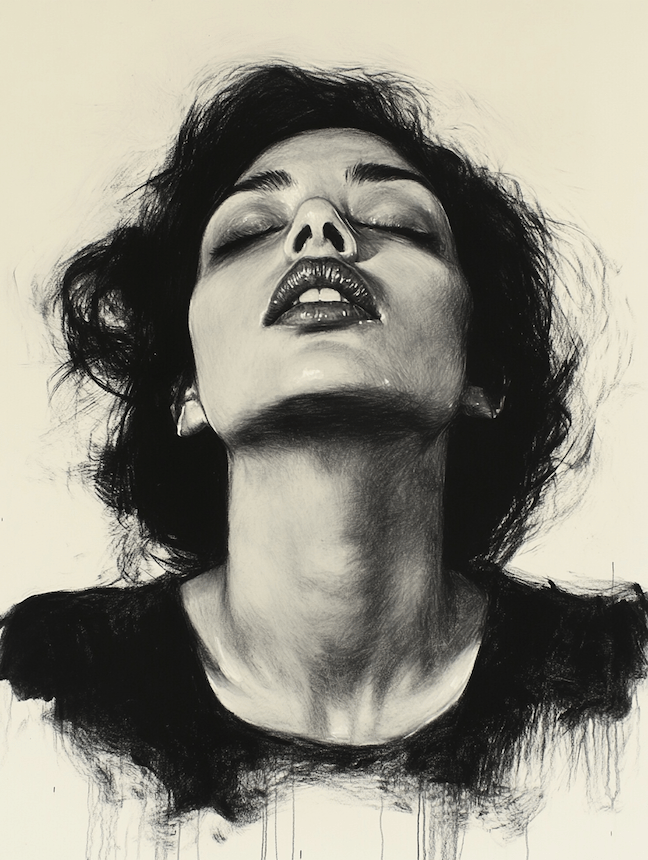
Feeling a bit lost with my portrait practice recently, I ventured to try something new. I was attracted to the works of the Austrian Expressionist, Egon Schiele (1890 -1918) by his unique use of colors and lines, and his focus on conveying strong emotions. After indulging myself with his art for a while, I have a desire to break from likeness and accuracy and focus on a feeling, a mood, or an air. Hence the following:

Monica, oil on canvas board, 11 x 14, May 2024
Still Monica, oil on canvas board, 11 x 14, May 2024
Annie, oil on canvas board, 11 x 14, May 2024

A few notes:

  • These are not done as studies of Schiele. I personally don’t think his style is replicable.
  • I tried to manipulate the mood with different color schemes.
  • I deviated from the reference a lot, with invented or exaggerated expressions.
  • As always, I found my shaky mastery of anatomy and the lack of understanding of the light effects the biggest barriers to go further in creation.
  • I am not sure where I go with this: it is fun to do something different, but it is also a painful reminder that I need to practice the basics more.
  • But again, did I say it is fun? So at least once in a while …

Fruits, Eggs, and More

Moderate still life endeavors on various surfaces:

Wooden Cup, oil on canvas board, 11 x 14, Spring 2024
Oil and Orange, oil on MDF board, 9 x 14, Spring 2024
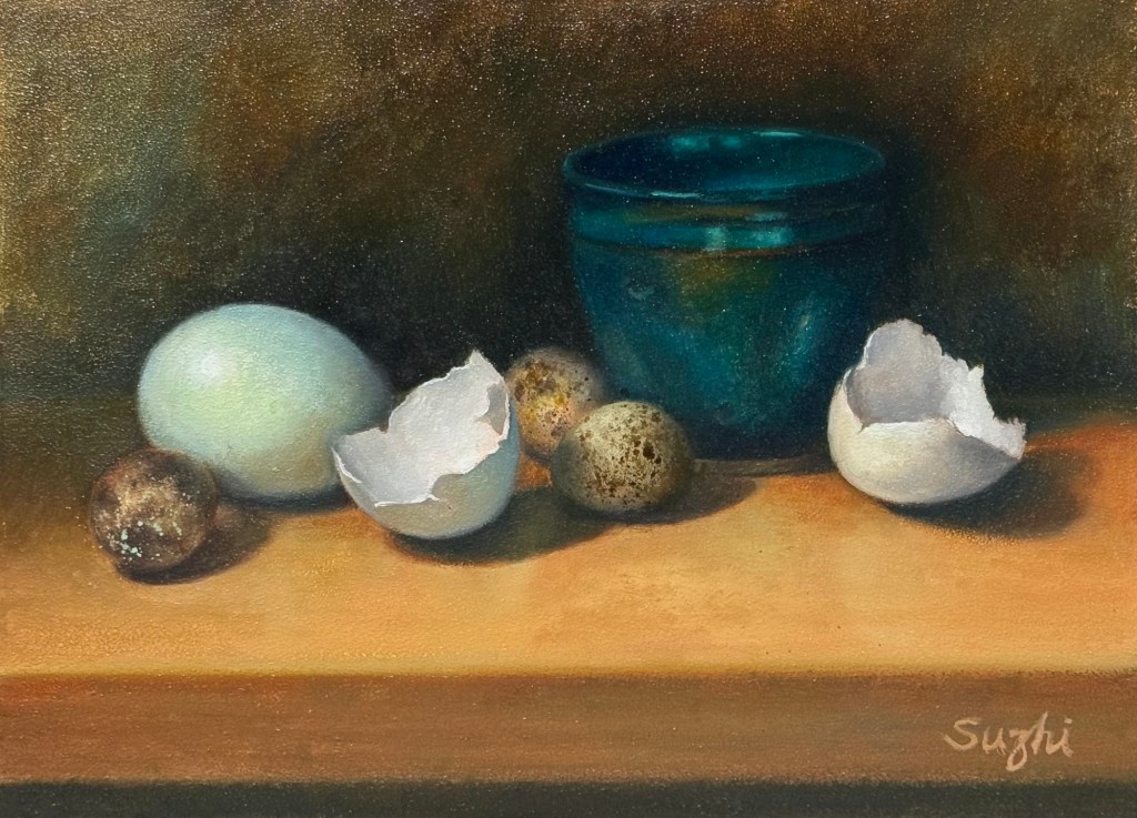
Quail Eggs and Shells, oil on aluminum board, 9 x 12, Spring 2024

Two things I am struggling with:
1. Sunken-in: it is the appearance of a dull matte area in a section of an oil painting, usually caused by overly absorbent grounds, too much solvent, or earthy pigments. In my case, it is the umber and the black. I tried oiling out – apply one part Gamsol + one part Galkyd to the dull area. It helps for a while, but overtime, it might go back a little. Varnishing is supposed to be another way to improve, but so far I find that even less helpful. The process is demanding of patience too, for you need to wait till the paints touch dry to apply the rescue, and then wait for the rescue to dry to see if it actually works.
2. Taking a decent photo. I assume it would be better if the I wait long enough for the paints to be drier, and somehow there’s no sunken-in – the shine is even. Or, invest in a better than iPhone camera? 😳

Portrait Sketches (1)

It is always a mystery to me how long it takes an Alla Prima painter to finish her work. Most of the demos I watched online were one to three hours long, and never did an artist claim it as a finished work. It is also hard to tell if the artist doing the demo was aiming at a complete work or just an oil portrait sketch. Plus, how do you even define the completeness of a piece? Those lovely and highly admired vignettes by the late Richard Schmid, are they finished works? 

When I was taking online classes at Watts Atelier, Jeff’s demo was usually a one-hour video, and he expected students to finish their piece in no more than 1.5 to 2 hours. That was a guideline I rarely followed. Not that I wasn’t willing to; I just didn’t have the adequate skills and mindset to achieve it. I took a video lesson from Susan Lyon earlier this year thanks to my East Oak Studio subscription. She advocates an exercise of doing a live portrait within one hour and then doing the same pose 2 more times in a row. The idea is to focus on the essence – what you can see when you squint. With repetition, you could improve your focus along the way. You go into these exercises with good preparation. She used a limited palette – transparent red oxide, ultramarine blue, and white, and she would premix colors into a value scale. The most important part is the mental preparation. You decide in advance where your darkest dark and lightest light is, and if they appear in multiple places in your reference (more than often, that’s the case), you must choose one. You also need to decide where the strongest edge would be – where the sharp contrast is (because when values are close to each other, the edge disappears). Other things that need to be considered include composition, what atmosphere to create, what types of strokes you want to employ, etc. I would say this is a great checklist to start any painting. Festina lente – as Sean Cheetham said, “Take your time on everything if you want to paint fast.”

East Oak Studio does a monthly free streaming called “Oil Painting from Life.” You can paint portraits and sometimes still life along with their resident artists and hear them chat. Most sessions are between 2 and 3 hours. I enjoyed the program very much, but I find myself constantly struggling when the time is up. Should I leave it as it is or keep working on it?  Deep down, I see myself as an indirect painter. I like to take my time and work in layers, just like most artists at East Oak, but they all vouched for the benefit of doing these shorter Alla Prima paintings. Leaving those paintings as they are is against my nature, but keeping going could yield diminishing returns. So far, I have managed to not go beyond the streaming timeframe. Before each painting, I reviewed the decision list from Susan Lyon’s lessons and tried to make my practice more effective. 

From the Portrait Society of America’s auction page, we can see artists do sell their sketches. Who knows, maybe after a million hours of practicing, someday, I will look at my two-hour painting and think, “Yep, that’s a thing.”

Here are some recent sketches I did, most of them are 9 x 12 or 11 x 14 and done within 2.5 hours:

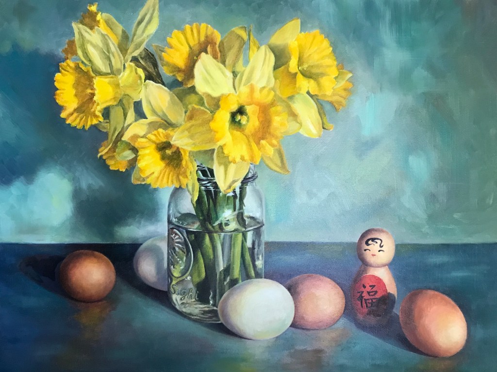
Daffodils 

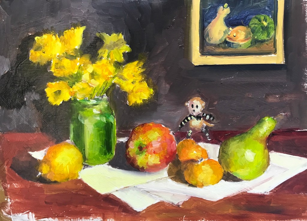
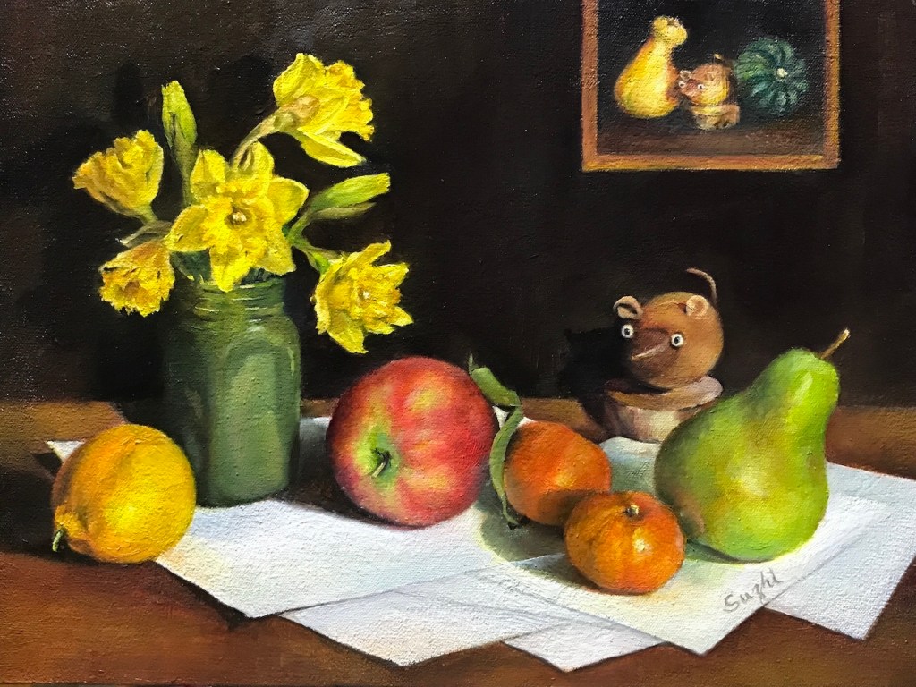
I know it’s the wrong season. I started these paintings in early spring, when Trader Joe’s still carried those cheap bunches of daffodils. It is a nostalgic flower for me; my father used to raise them around Spring Festivals. It is also a challenging flower to paint – yellow is not an easy color to keep clean. In addition, I wanted to try doing a quick preliminary study beforehand, a practice many accomplished artists advocate. 

Here they are:

Daffodils and Fruits, oil sketch on paper, 9 x 12 in. 2023
Daffodils and Fruits, oil on canvas board, 12 x 16 in, 2023
Daffodils and Eggs, watercolor sketch on paper, 10 x 10 in, 2023
Daffodils and Eggs, oil on canvas, 18 x 24 in, 2023

And here’s what I got from this experience:

  • As your can see, I did a one hour oil sketch before Daffodils and Fruits, and I liked the sketch better than the final painting itself. The looseness brings out a movement and a sense of humor that diminished in the meticulously rendered final painting. I am seriously  considering setting a timer for my future paintings.
  • The study for Daffodils and Eggs was done in watercolor and it was overworked for the purpose.
  • The blue overtone was an improvisation. The original setting was dull and it worked better with the watercolor than oil medium. I wanted to add some drama and energy to the rather mundane setup. I feel I made the right choice.
  • For me, doing a study beforehand took a bit of freshness out of the final painting process. It could be I was just doing it for the sake of doing it rather than as a process of exploring.
  • It occurred to me that still life as a genre that could be the most expressive for a realistic artist. You don’t get to do that much “directing” in portraiture or landscape. Though at this state, my main focus is still honing my technique, I need to be more thoughtful in choosing and orchestrating the subjects.
  • I did put a signature on Daffodils and Eggs. Can you find it?

Show News

Here are the group shows I participated recently:

“Works on Paper” exhibition, currently on view at the Pacific Art League:

Memory, watercolor on paper, 23 x 29 in.

Santa Clara Valley Watercolor Society 55th Annual Member’s Exhibition:

Once Upon A Time, watercolor on paper, 10.5 x 14 in.

“Portrait” Art Competition at Art Room Gallery:

Father, oil on canvas board, 14 x 18 in., February, 2023
Me, oil on canvas, 18 x 24 in, January 2023

A few notes:

  • The watercolors were originally painted a couple of years ago, but I did some major revisions this year before the shows. I have yet to figure out how to date works like these.
  • The experiment of revising past works gave me a lot of ideas. Some of the old paintings may find a new life, and some of the creating processes may never end!
  • The portraits are the first time I entered my oil paintings to a show. They both received “Honorable Mention.”
  • I feel lucky that the “Portrait” is an online show, because none of the pieces I entered is completely dry. Northern California was darn wet this past winter!

Some Breakfast …

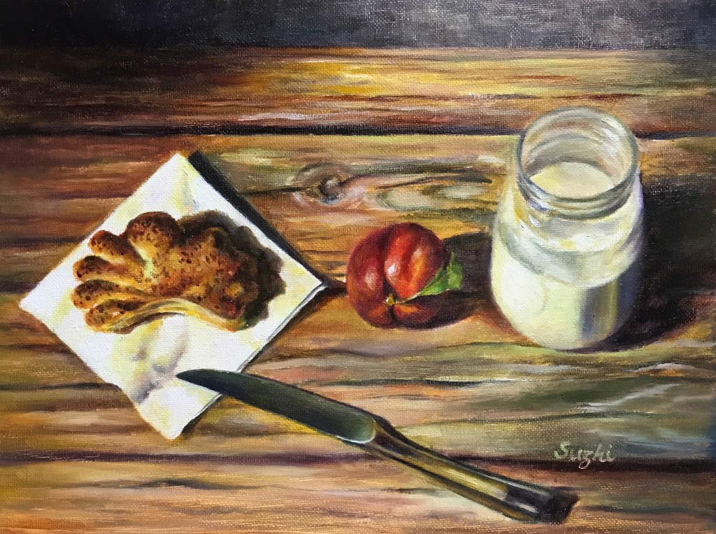
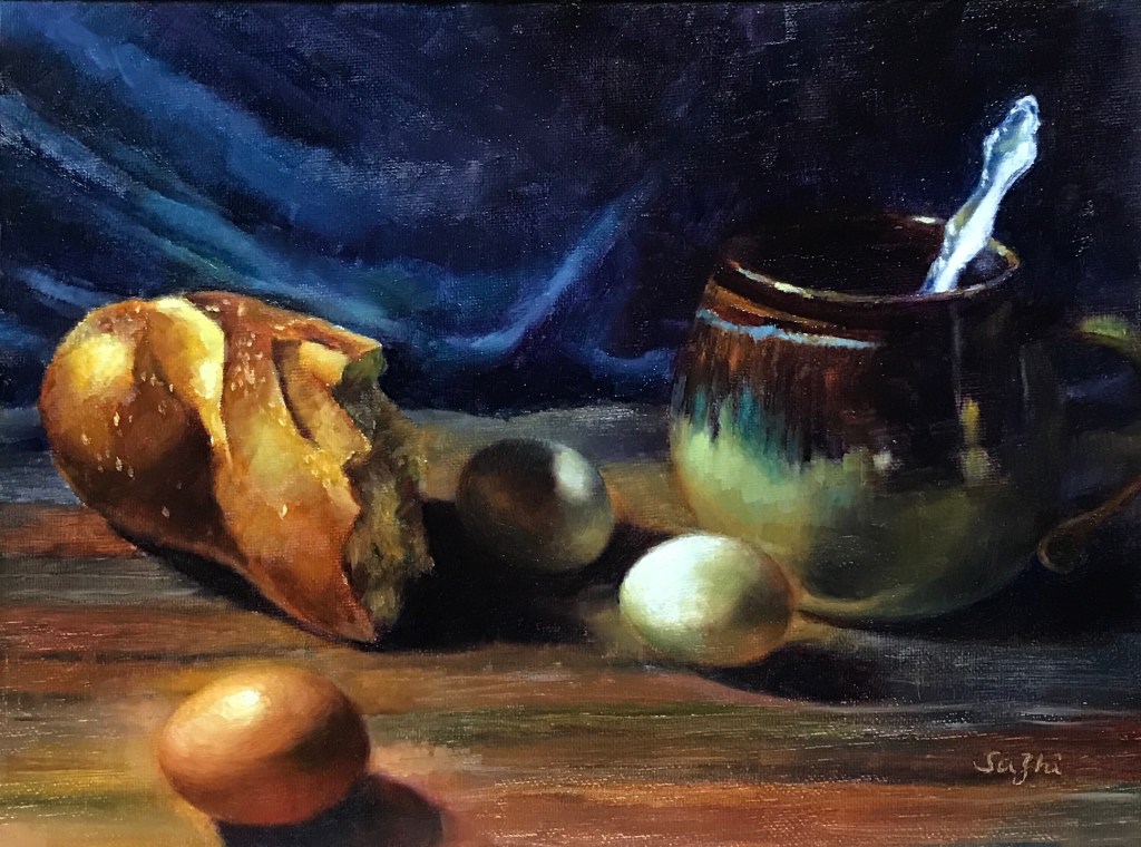
As promised, eggs and jars and some more:

A few notes:

  • All these are oil on canvas board, 11 x 14 in. I want to keep the studies small so that I could do more.
  • Eggs are difficult, either in terms of shape, value or solidity. There’s a fabricated story in China about how Da Vinci was forced by his master to sketch hundreds of eggs. Well, I do see the need of it.
  • My problem with over saturation manifested itself best with the bread. I probably wouldn’t eat that last one :))).

Turquoise in Earth’s World

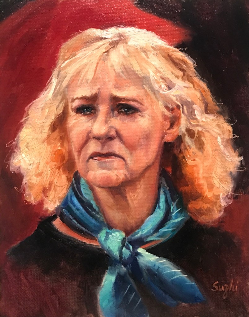
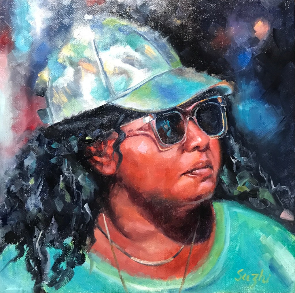
If you are interested in portrait art, you’ve probably heard of “earthsworld” – a photographer that took Candid photographs of Americans at county fairs. Over the years, I have multiple artists recommended this photographer to me. Take a look at the website or the Instagram account and you’ll know why this is such a rich resource for portrait painter, character designer and people watcher. To me, it opens up a side of America that beyond my natural habitat.

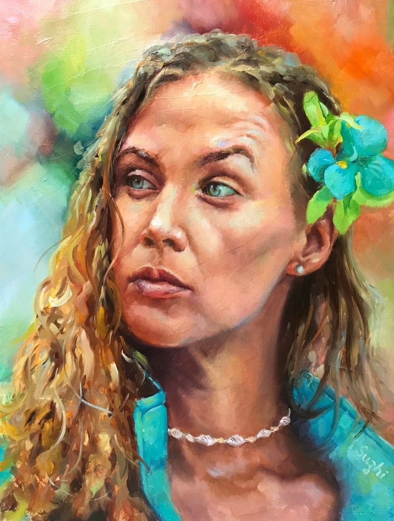
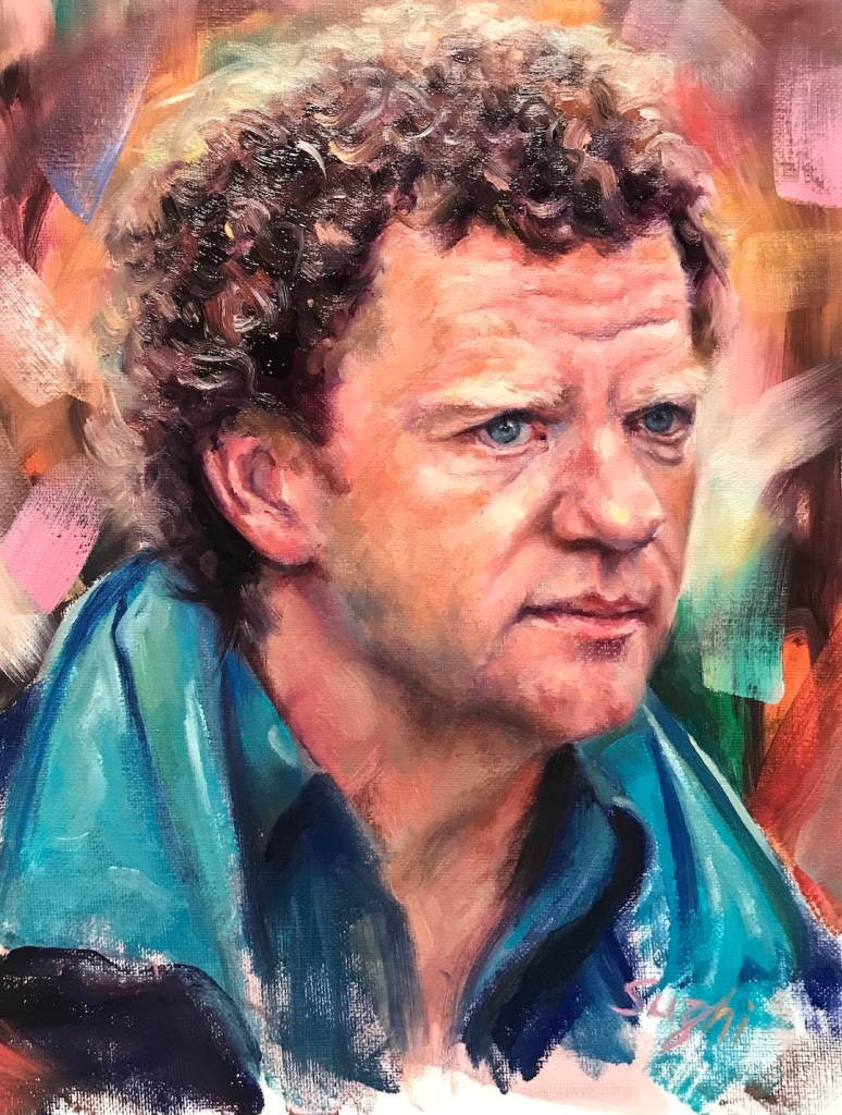
I picked a few photos from the collection as references to practice portrait painting, and only to notice that the ones I chose all features a touch of bluish green. Hence the title of my small series – “Turquoise in Earth’s World:”

A few notes:

  • Again, the above paintings all used references from various earthsworld’s county fair collections. They are all painted with oil on canvas board.
  • The collection is very helpful in practicing non-typical studio model expressions and props.
  • The nature of the subject matters do push me to loosen up a bit (not as much as I wished) and be creative with the composition and background design.
  • It’s such a wonderful treasure. Do check it out!

Our turn, finally …

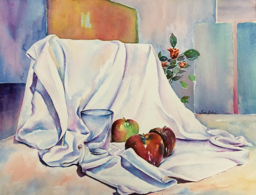
Years ago in a watercolor class, we practiced rendering glasses by choosing from a couple of setups. I got ambitious and turned the practice into a full painting:

Still Life, watercolor on paper, 14 x 20 in, c2015

The roses were supposed to be a different setting, and I didn’t choose it because I thought apples would be easier. However, in composing the whole piece, I thought the glimpse of the flowers would be interesting. As you can see, I indeed didn’t know how to handle those petals and leaves back then, but I think they added liveliness to the scene. I remember some fellow artist commented, “The roses are saying,’We are here! Our turn! Our turn!'”

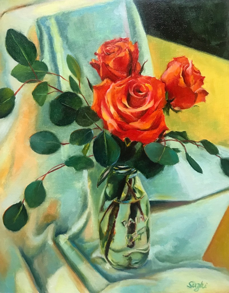
Recently when looking through some old reference photos, I was surprised to see that I actually took a few shots of the roses at the time. Hence, their turn:

Red Roses, oil on canvas board, 11 x 14 in, August, 2022

Hehe, the petals and the leaves are still challenging, but I feel they are happy to be in the spotlight!