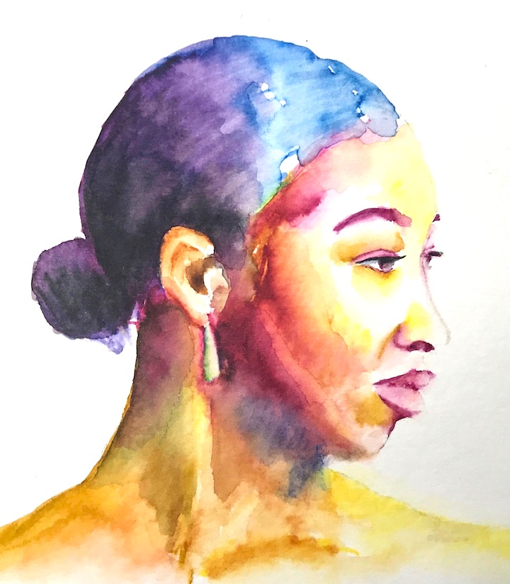
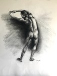
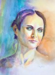
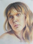
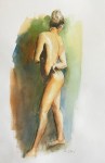
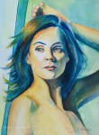
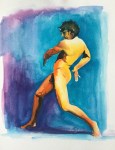
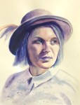
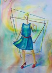
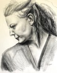
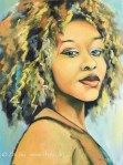
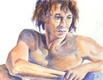
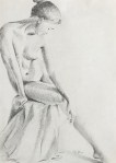
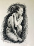
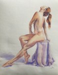
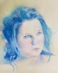
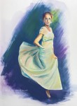
Felicia, watercolor on paper, Fall, 2021Old Man, watercolor on paper, Fall 2021Charlotte, gouache on watercolor-board, Fall 2021
A few notes:
For the watercolor paintings, I planned two different approaches, a softer and muted one, vs a more vibrant and contrasted one. The results were somewhere in the middle. Especially for the first painting, I wish I had softened some edges and let go certain definitions instead of spelling out everything I saw.
The gouache one is a homework from Watts. It is a practice of the Zorn palette and the tiling technique. I found both the medium and the technique challenging. Tiling is to juxtapose thick layers of close-value paints and blend them (if necessary) later. It’s a good preparation and practice for oil painting, but it requires a lot of patience in value control and shape design. Hehe, patience! 😉
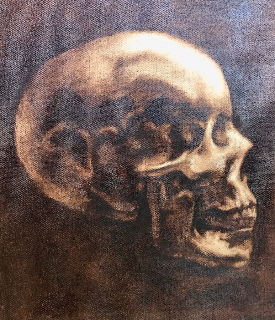
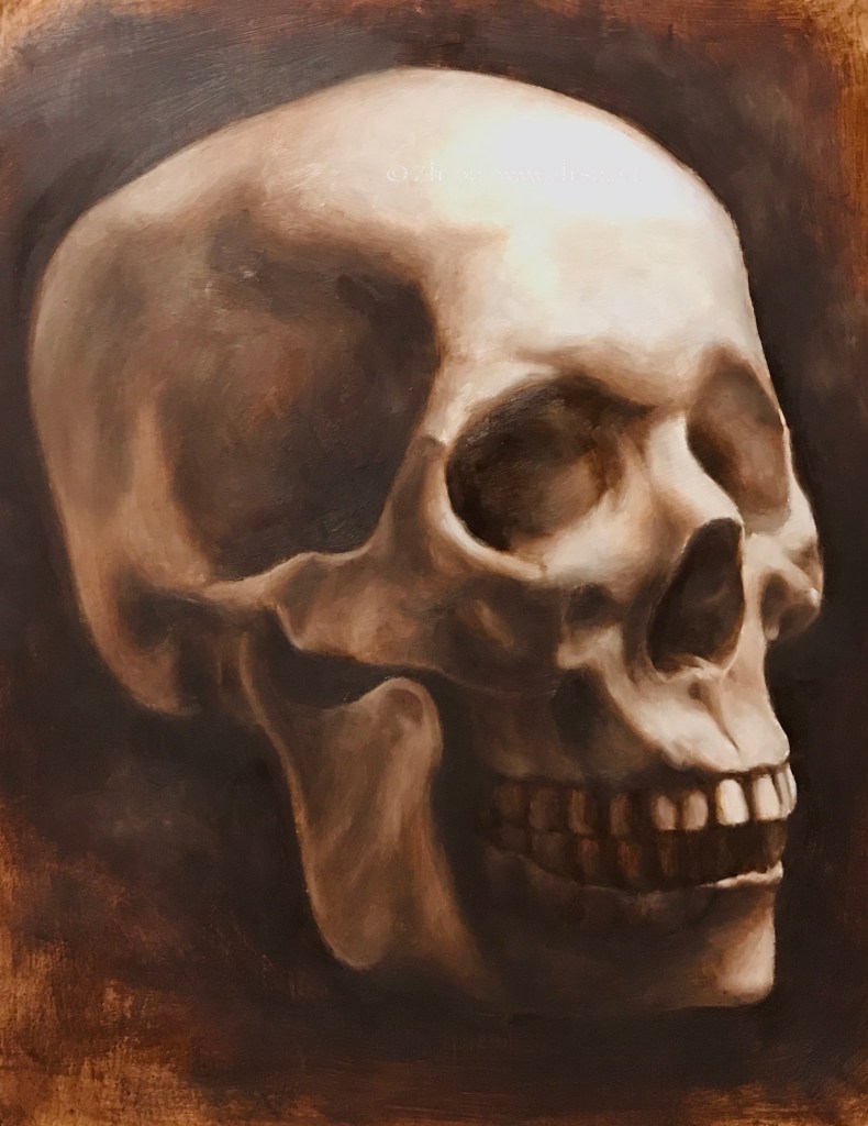
Skull – side view, oil on canvas board, 9 x 12, 2021Skull – quarter view, oil on MDF board, 11 x 14, 2021Skull – front view, oil on canvas board, 11 x 14, 2021
A few notes:
Still homework from Watts, burnt umber pick out, burnt umber and white, phthalo-blue, black and white respectively.
I like MDF board covered with canvas better than MDF board with gesso, because it’s more absorbent. On gessoed board, the paint takes longer to settle which can be frustrating. However, if you like the super smooth and realistic look, board it is.
I need to learn how to take photos of oil paintings. 😉
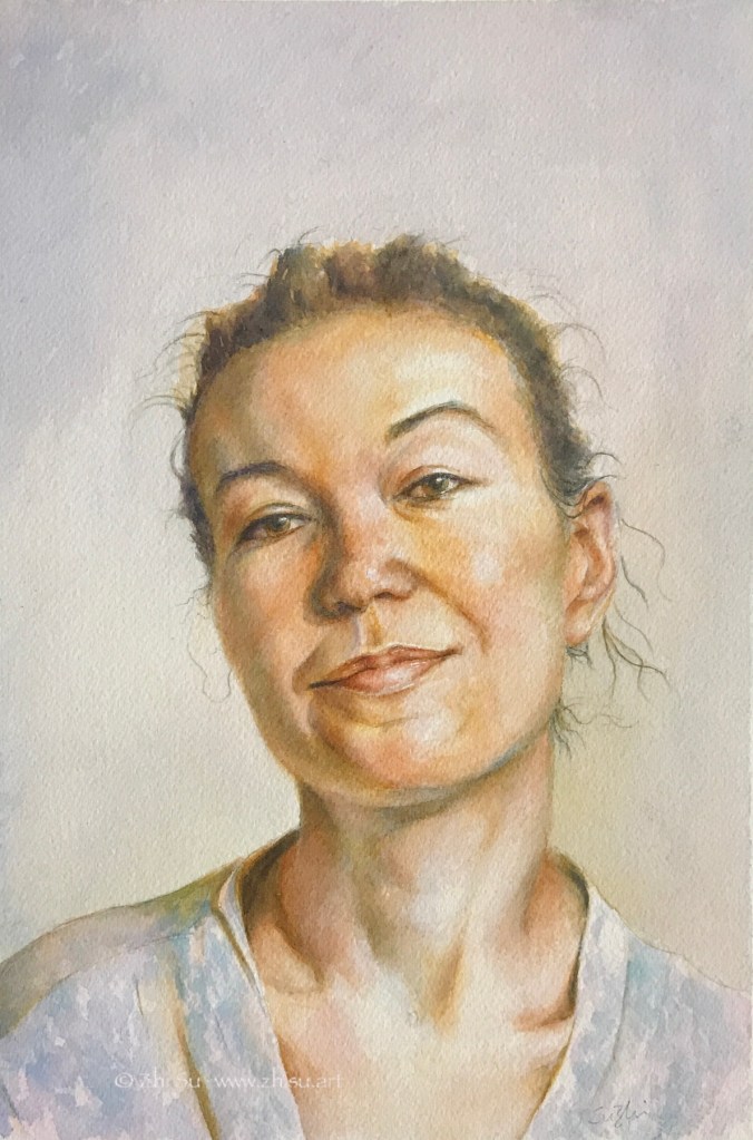
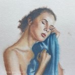
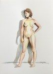
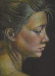
Young Woman, oil on canvas board, 11 x 14 in, July 2021Young woman, oil on canvas board, 11 x 14 in, July 2021
Watercolor:
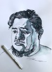
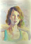
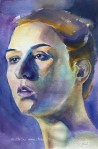
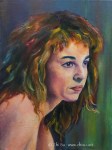
Jeff, watercolor on paper, 9 x 12, July 2021
The more I learned about anatomy and head drawing, the more I am afraid of making mistakes, and the tighter my paintings become. Especially in watercolors, things were all under control (to the extend of my ability of course). They rarely just happened. The recent Draftsmen podcast mentioned how as a student, one learns and memorizes everything, and later forgets everything to become an artist. Hehe, we’ll see.
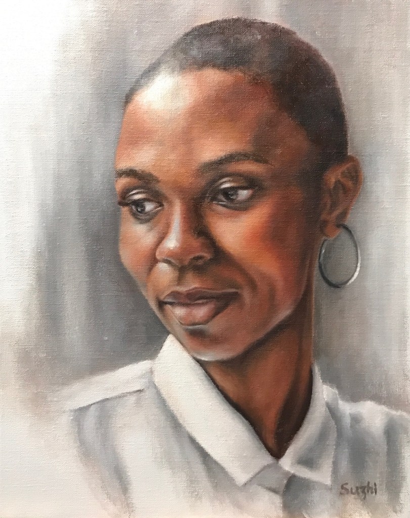
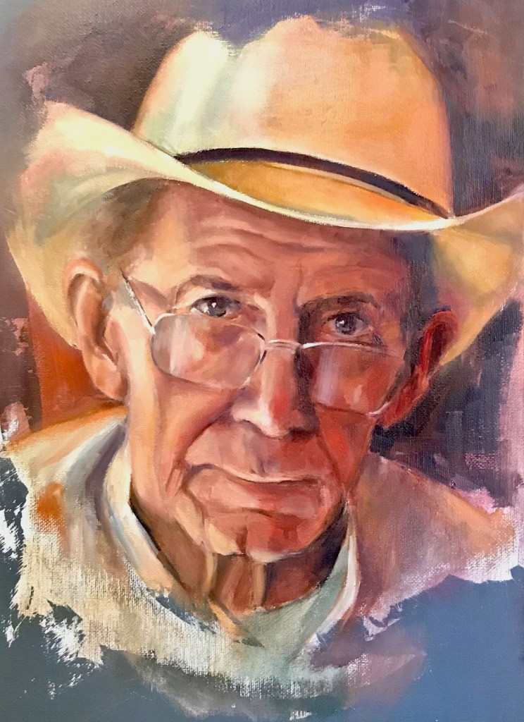
I have been more and more focusing on portrait painting in oil recently. Neither do I have the intention to become a portrait artist, nor do I want to switch my main medium to oil. It’s a practical choice. With portrait, I don’t need to spend much time choosing subject matters and thus narrowing on technique. There are plenty free references online, and there’s always the option of a mirror. Plus, it’s easier to find more comprehensive oil classes from online than other painting mediums.
Since last fall, I have taken three portrait classes. The format is similar – the teacher demoed in class, you did your painting at home and submit online for critique. In retrospect, the painting styles I was shown are quite different.
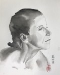
The first one was with an extremely talented young artist, Kailun Qu. Kai painted in alla prima style, fast, spontaneous, and effortless (seemingly). He gave effective critics without reservation, something I’ve been looking for for years. Here’s one of the portraits I did for the class:
Portrait, oil on paper, fall 2020
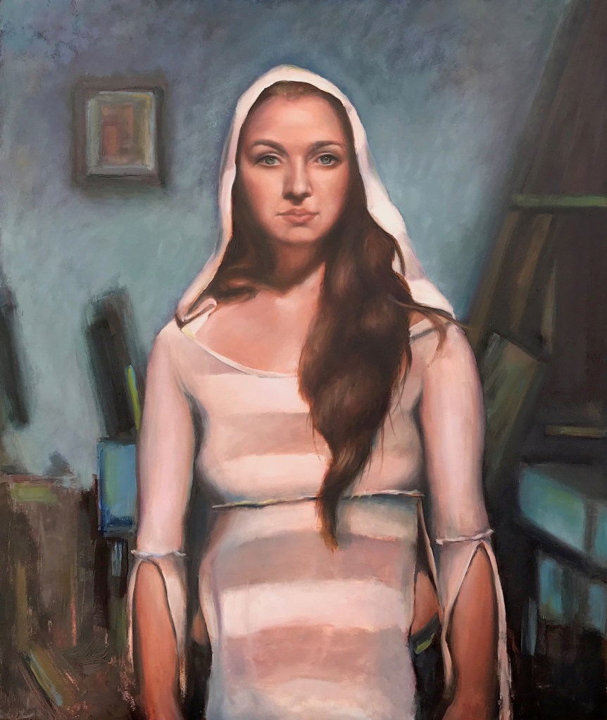
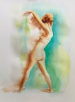
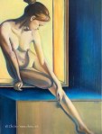
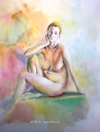
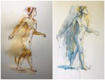
The next artist I studied with is almost the opposite of Kai. Renowned figurative artist Joseph Todorovitch held a 5 week workshops online, with 4 hours each week. The 20 hours were dedicated to one painting, and in the end he’s not done. Later we received 8 more hours’ demo. Take a look here and you’ll understand why the labored approach is fully justified. It’s quite surreal to witness the birth of a masterpiece, but I have to admit a couple of weeks into the workshop I realized this is way above my weight class. I didn’t spend even half of that many hours on my version:
Alexandra, 20 x 24 in, oil on panel, February, 2021
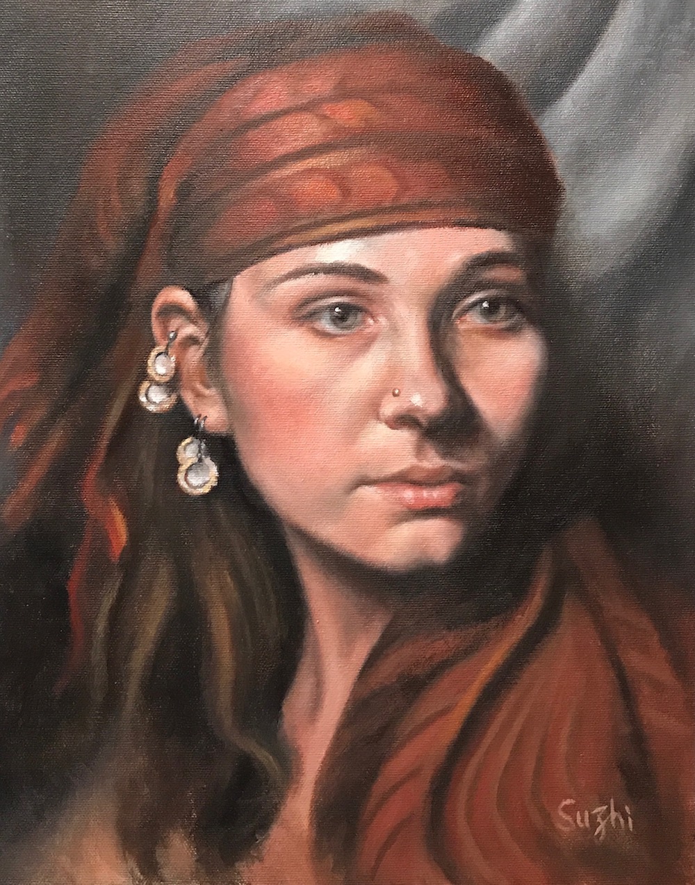
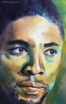
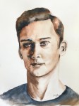
The most recent class is from Watts Atelier, Portrait in Oil with Ben M. Young. Watts has all sorts of art classes all year long, and is more focused on basic skills. You can choose to audit or participate in the class, and the feedback worths every penny. Here’s one of the class homework:
Portrait, oil on panel, Feb, 2021
The good thing about online classes is that if you pay for the critique, it’s not just a verbal feedback. The instructor could easily paint over digitally to show exactly what he meant. Plus you get to keep a video version and therefore the ability of constant review. I will repeat some of these classes on my own several times to get the most out of them, and probably take a few more from Watts. For the time being, that’s the plan.
Hopefully later on I could carry the techniques I learn this way onto other subject matters and even different mediums.
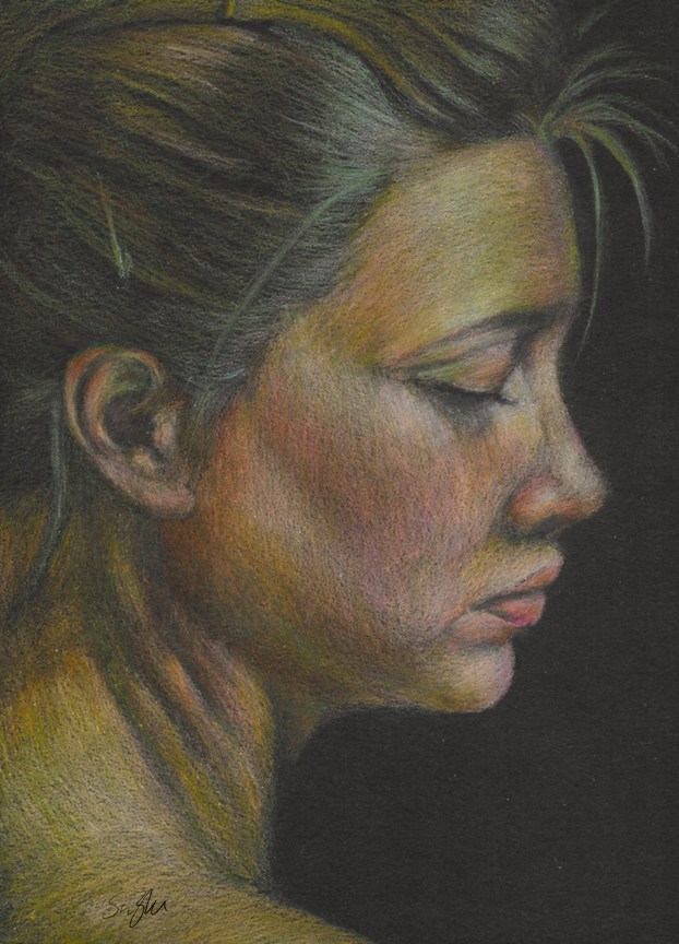
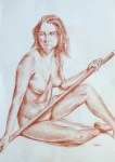
I have a Strathmore black drawing paper pad that I bought for colored pencil drawings. Unfortunately after a few attempts, I came to the conclusion that colored pencil is too testing for my patience and on black paper, that’s even more so. A drawing like the following, to reach the desired effect (smoother skin, brighter color etc.), would need probably another 20 to 50 layers of coloring (or skills I don’t have to begin with):
Lily, colored pencil, 9 x 12 in, 2020
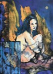
So what to do with the rest of the paper? Gouache came to mind because the colors come thick and don’t need much water (or at least you can use it that way).
Jazmine, gouache on paper, 9 x 12 in, 2020
I very much like the effect, but as you can see there are wrinkles on paper caused by accidental water drops.
Here’s another one:
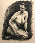
Monique, gouache on paper, 9 x 12 in, 2020
After I did these paintings, I found out that Stonehenge actually has a line of black watercolor paper. Order placed already, and stay tuned!
I know Crayola is a kid brand, and I don’t think Crayola Washable Markers are made for watercolor artists. However, for your daily doodling, and small art projects, they work wonders. The markers have conical tips that allow both broad and thin lines, and the colors are quite vibrant:
Rose, marker on paper, 4 x 4.
Flower, marker on paper, 4 x 4.
I recently got hold of a different brand, Tombow Dual Brush Pen Art Markers. You can see from the way it’s packaged (Primary, Secondary, Grayscale, Portrait etc.), Towbow is for artist. With a nylon brush on one side and a fine tip on the other, you can achieve more versatile marks with it. I tried Tombow and Crayola side by side and find them behave similarly:
Crayola
Tombow
A few notes:
I used 140lb watercolor paper, and all my paintings are small.
The colors are quite vibrant and they don’t dry lighter. However, if you have excessive water, it will wash the ink away.
You can go back lifting or adding colors. If you add colors with markers when the paper is wet, remember it is much hasher on the paper than applying watercolor with watercolor brushes.
As for lightfastness, both Crayola and Tombow claim their colors will fade over time. So maybe not use them in your masterpieces? The prickly pear flower one (top right) was on the wall without any protection for many years and I haven’t seen any color change yet.
It is convenient and fun!
Jazmine, Crayola and Tombow markers on paper, 5 x 5, 2020
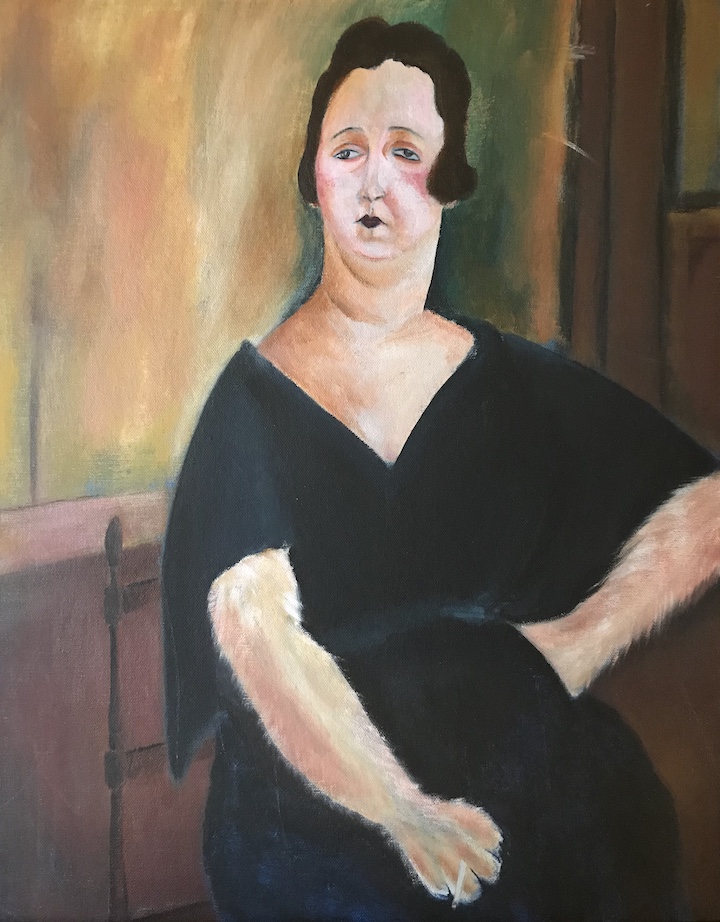
Amedeo Modigliani is an Italian artist famous for his uniquely stylized portraits. I always like his paintings and attempted a study years before. Somehow Modigliani’s Madame Amédée reminded me of my neighbor’s cat, and my original plan was to use the composition of the original painting, and replace the head with that of a cat’s. It didn’t work out and I switched back to the lady. The result wasn’t much of a copy, and you can still see the trace of my deviation.
Original
Madame Amédée (Woman with Cigarette), oil on canvas, 39.5 x 25.5 in, 1918
My copy:
Woman with a paw, acrylic on canvas panel, 16 x 20 in, 2016
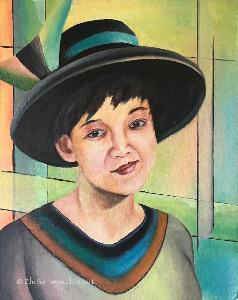
This is another try. This time it was not a copy, but I tried to stylize a self-portrait. I meant to focus on the inner world of subject, but somehow it was all spilled over into the background. As a result I went way beyond his typical palette, which is quite muted.
Me with a hat, acrylic on canvas board, 16 x 20 in, 2017
After learning drawing and painting humans for a while, I find myself even more fascinated by Modigliani’s ability to go beyond realist forms while stay true to the spirit and character of his subjects. I probably will do more studies of Modigliani in future.