Of the three components of color, hue, value and saturation, I personally find value the most difficult. Colors are attractive and distracting, and it could be difficult to discern values accurately from all the colors in front of us. Monochromatic painting is a great way to train your eyes this way.
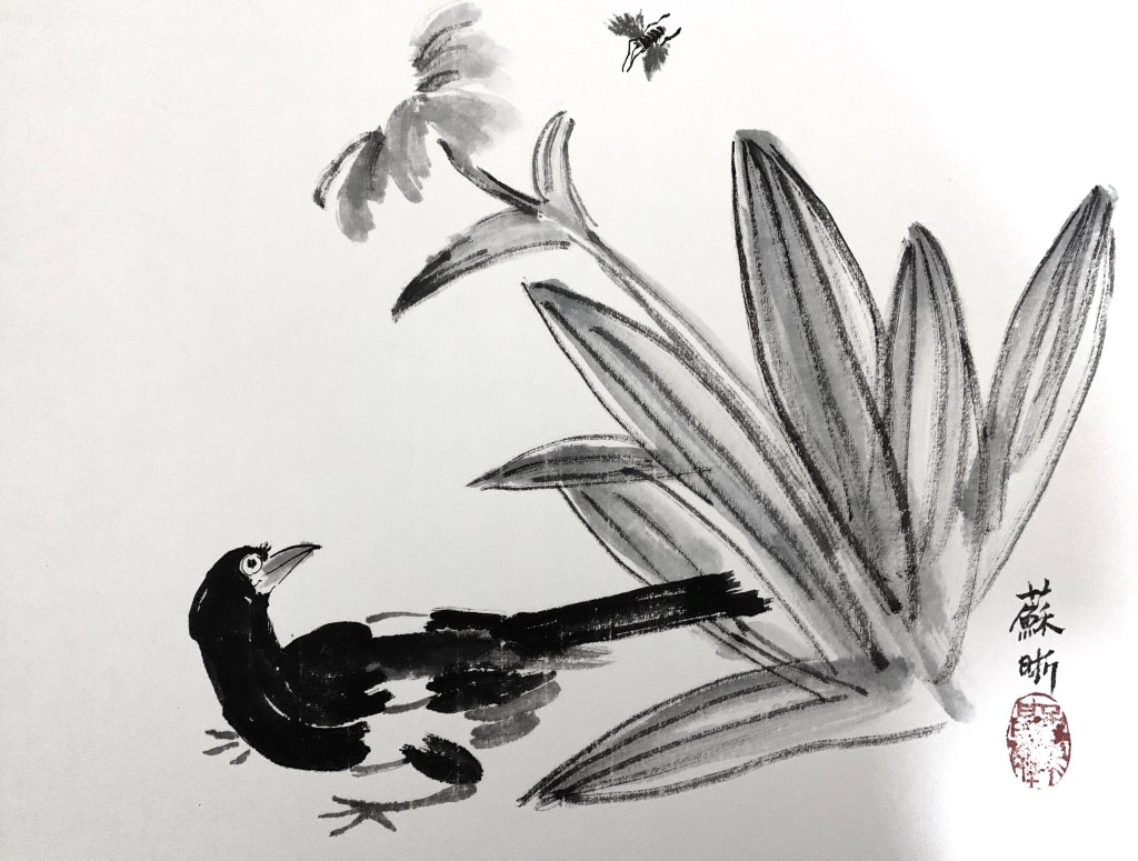
In traditional Chinese brush paintings, many of which are monochromatic, it’s the value changes through the control of water that create the art. I took a few lessons of Chinese brush painting one summer, and lessons were mainly copying old masters. This is one of the paintings I copied:
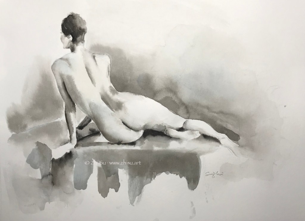
Monochromatic is a good strategy when time is limited. In life painting, it saves the trouble of finding the right skin color and allows me to focus on value and shape.
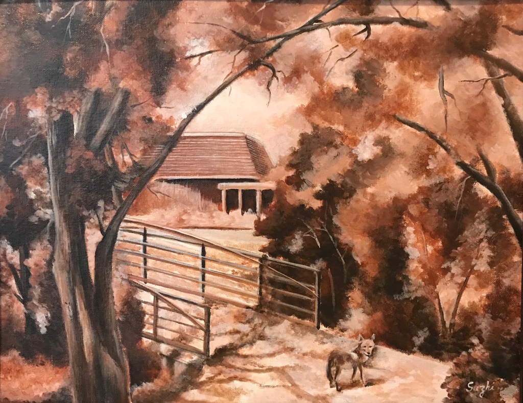
In landscape scene with overwhelming branches and leaves, monochromatic approach simplifies the view. This plein air was done in burnt sienna. I included some of the visitors I had during the painting – out of proportion, I know, but a lot of fun.
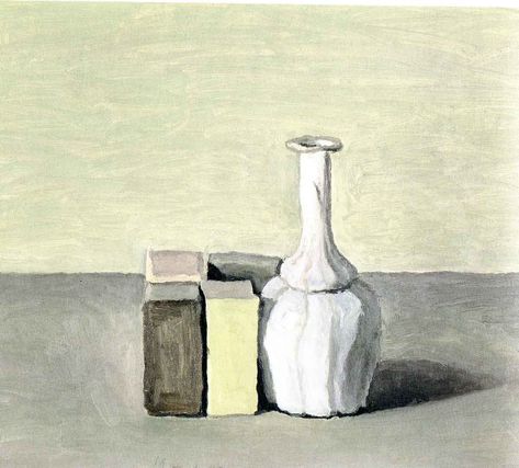
More than often, monochromatic painting is used as underpainting. It serves as a value map, but also allow some color strategies. (I found this post by Mitchel Albala very helpful.)
Another approach is to do a monochromatic underpainting, and glaze over it with transparent colors, often times many layers. For acrylic, that means adding quite some medium to the color. My selfie is done this way – dozens of layers. I have to admit, I doubt I will ever use this method again. Too tedious.
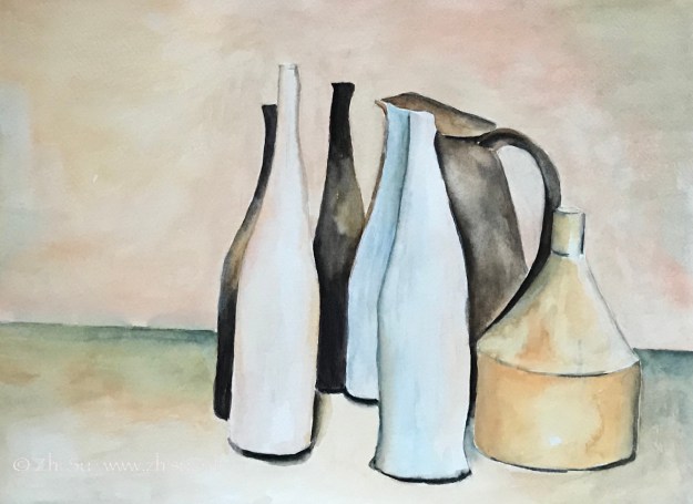
I think in theory it could be done with watercolor too, for watercolor is transparent in nature. Even the opaque ones, with enough water, become transparent to some extent. From what I heard, to glaze in watercolor, the key is to wait for the underpainting or the previous layer really really dry, bone dry. Maybe someday I will try it.


