A Delayed Plan for 2022: Portrait, Still Life, Landscape and More

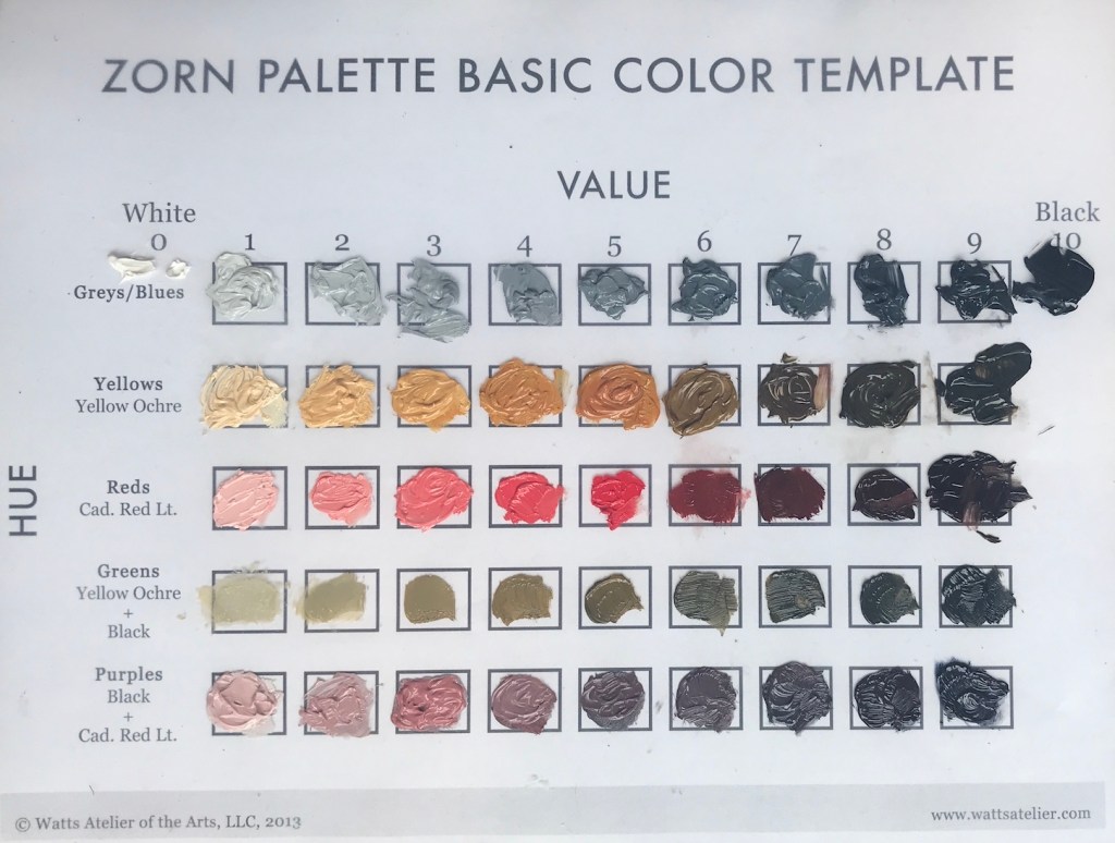
2022 for me is not only moving on from the beloved Zorn palette, but also a broadening of the subject matters. The plan is to keep practicing portrait and still-life, with an emphasis on loosening up and becoming more gestural. Meanwhile, I will add landscape and later figures to the learning schedule. For medium, oil is the focus for now, but I’d like to do more watercolor sketches with or without ink.

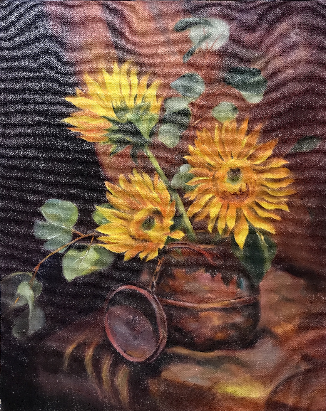
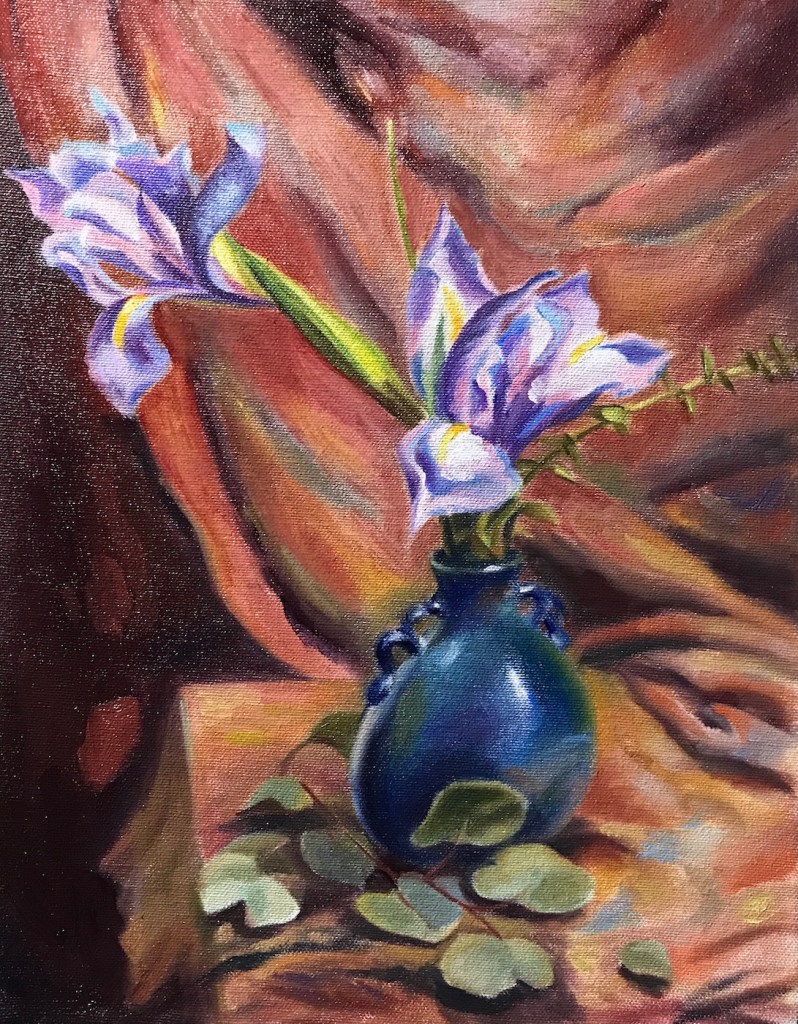
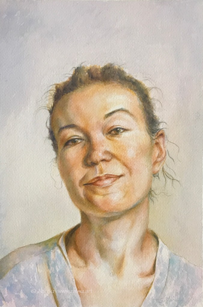
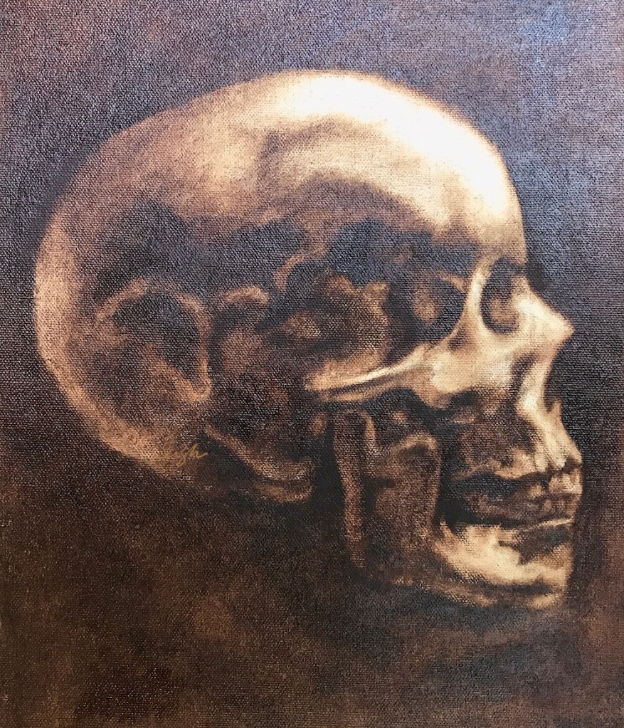
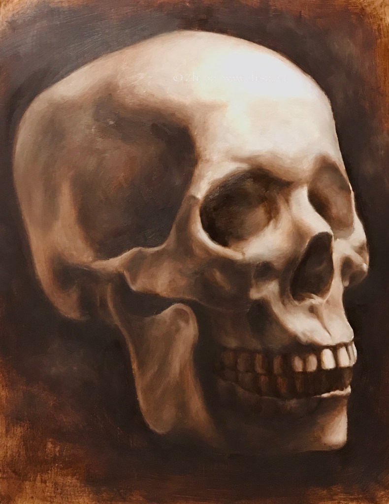
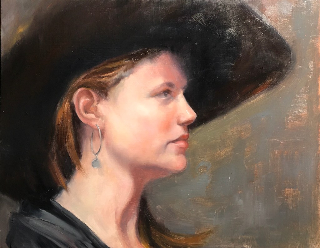
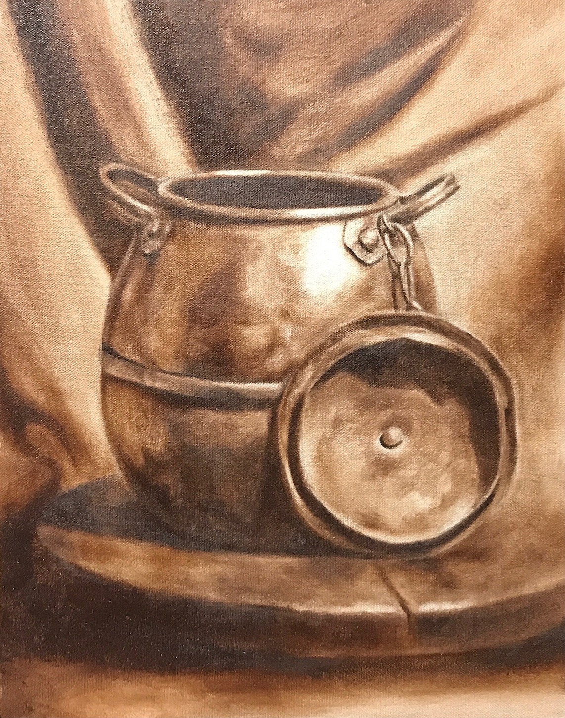
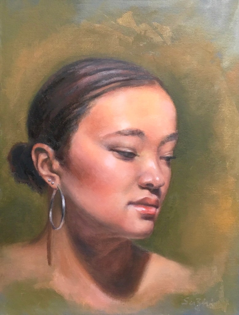
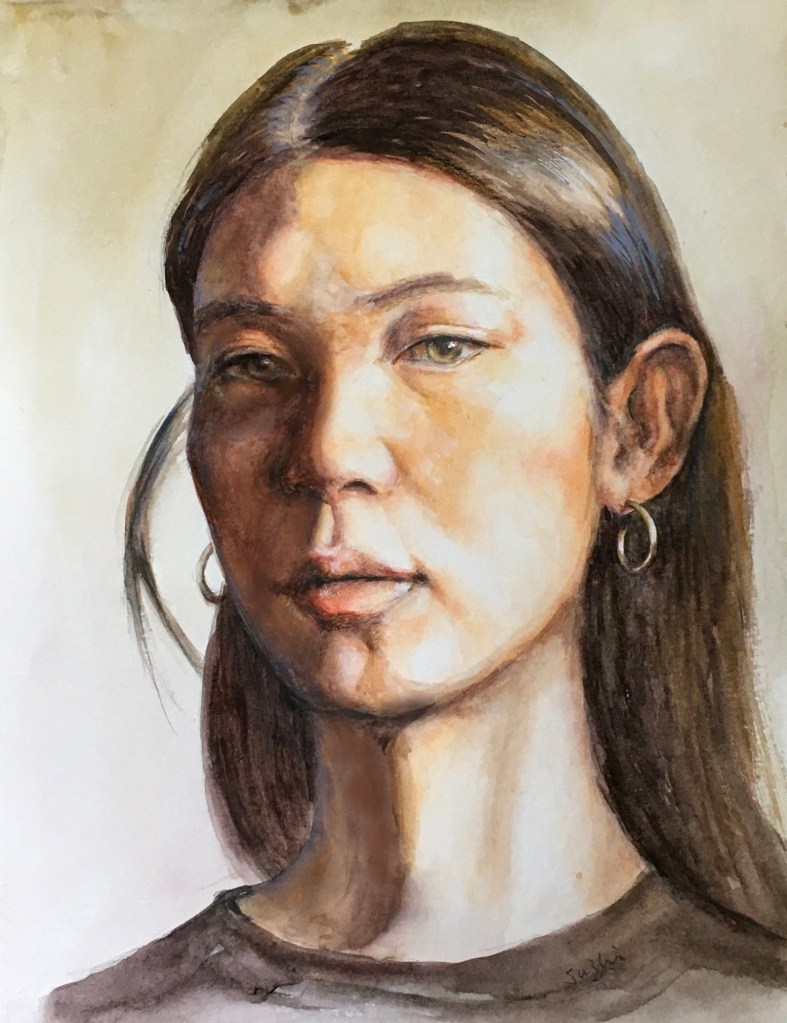
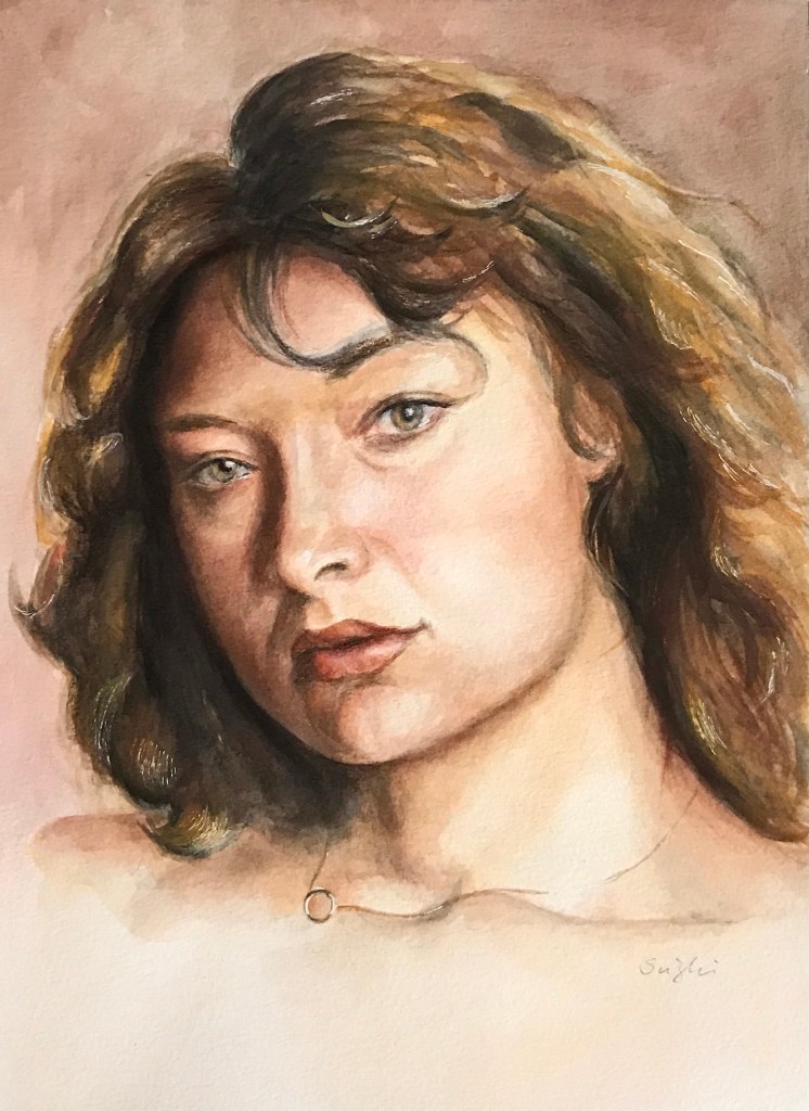
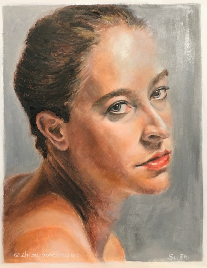
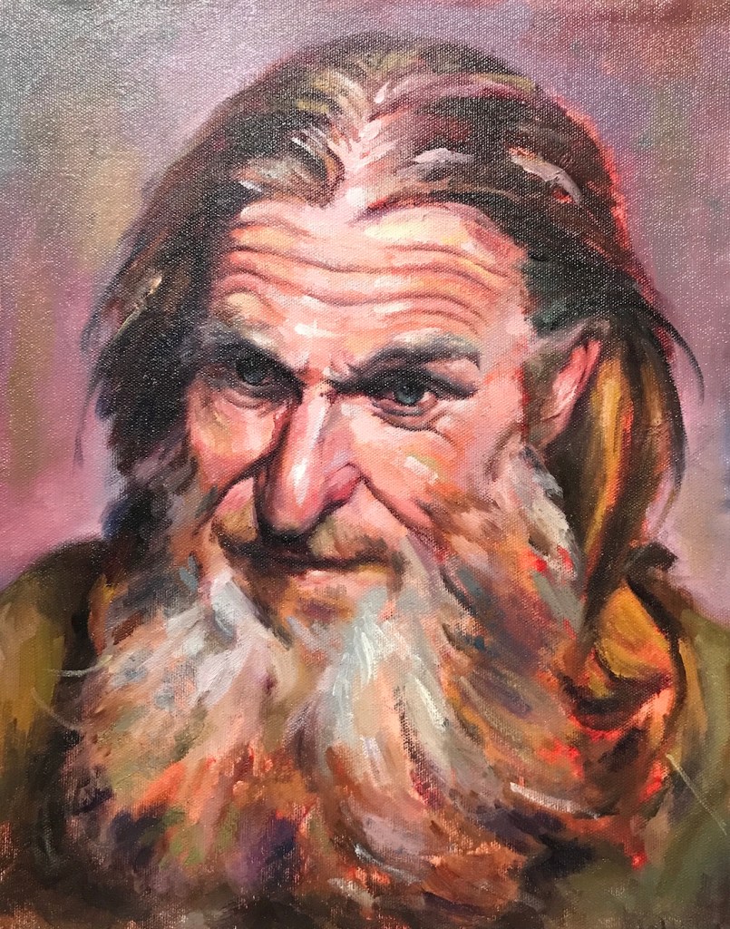
Here are some my recent homework from Watts:

Oil painting of orchid flowers and a Buddha statue with drapery, realism
Orchid and Buddha, 11 x 14, oil on canvas board, Dec. 2021
Pine trees in front of snowy mountain, oil painting, landscape
Pines, 11 x 14, oil on canvas board, Jan. 2022
Oil painting of crashing waves and rocks, seascape
Waves 1, 11 x 14, oil on board, Jan. 2022
Oil painting of an old man, gesture portrait, realism
Old man, 11 x 14, oil on canvas board, Feb, 2022

A few notes:

  • Landscape is not a particular interest of mine, but for years, I used it as a check-mark to see if I have made any progress in techniques. After doing other subject matters for a while, I would attempt a few landscapes to see if I feel more confident and comfortable. It never did!
  • It took me some time to figure out that apart from value control, the key to a successful landscape painting is shape design. To deliver a believable tree, on surface you have more leeway than doing a portrait, but the lack of definitive guidance (the shape of an eye, a nose etc.), you need to come up with your own. That freedom can be a curse.
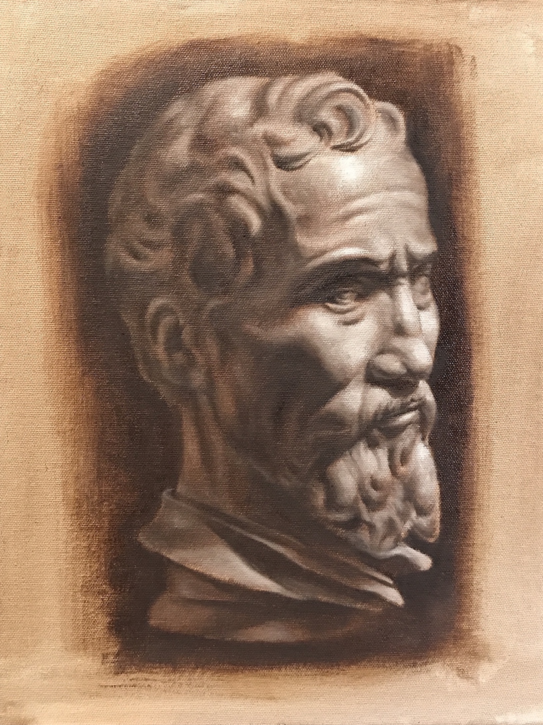
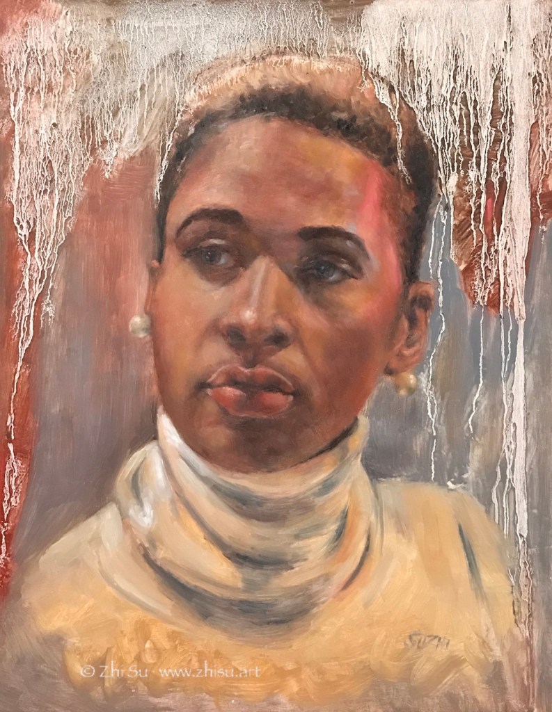
  • Looking above, it suddenly hits me that before doing trees, it might be a good idea to practice more bearded and hairy portraits first! πŸ˜‰

More Limited Palettes and Moving on …

Zorn is not the only limited palette used by artists. Well-known landscape artist Scott L. Christensen stayed with lemon yellow, cadmium red, ultramarine blue and white for many years, and his method has many followers. Presidential portrait artist Mark Carder teaches a palette of 5 colors, permanent alizarin crimson, cadmium yellow pale, french ultramarine, titanium white and burnt umber. Karen Blackwood painted her award winning coastal sceneries mainly with alizarin crimson, cadmium yellow pale, ultramarine blue, titanium white and viridian.

It’s not hard to see that all these are some versions of the primary colors. Replacing Zorn’s ivory black with Ultramarine and yellow ochre with a brighter yellow allows a more chromatic and less muted approach to painting.

Using a limited palette doesn’t mean you can’t use other colors. The above mentioned artists, Zorn included, all supplement their palette whenever necessary. Limiting color choices is to create harmony and in training, helps us focusing more on values. Eventually, we need to listen to the painting itself for what color comes in.

I have been staying with Zorn for months now, and it serves well for portrait painting. As I moving on to more still life and floral paintings, I began adding more colors to my palette. Zorn is still my starting point and foundation for each painting. Here are some recent exercises from my Watts classes:

Oil painting of sunflowers in bronze jar, realism
Sunflowers, oil on canvas board, 11 x 14 in, 2021
Oi painting of Irises in a blue vase, drapery, realism
Irises, oil on canvas board, 11 x 14 in, 2021
Oil painting of pink roses in a bronze vase, drapery, realism
Roses, oil on canvas board, 11 x 14 in, 2021

Zorn in Watercolor & Gouache

Watercolor portrait of model Felicia, Zorn palette, realism
Felicia, watercolor on paper, Fall, 2021
Watercolor portrait of old man, Zorn palette, realism
Old Man, watercolor on paper, Fall 2021
Gouache portrait of young girl, Charlotte, Zorn palette, realism
Charlotte, gouache on watercolor-board, Fall 2021

A few notes:

  • For the watercolor paintings, I planned two different approaches, a softer and muted one, vs a more vibrant and contrasted one. The results were somewhere in the middle. Especially for the first painting, I wish I had softened some edges and let go certain definitions instead of spelling out everything I saw.
  • The gouache one is a homework from Watts. It is a practice of the Zorn palette and the tiling technique. I found both the medium and the technique challenging. Tiling is to juxtapose thick layers of close-value paints and blend them (if necessary) later. It’s a good preparation and practice for oil painting, but it requires a lot of patience in value control and shape design. Hehe, patience! πŸ˜‰

Something Seasonal … :)))

Oil painting of skull, side view, burnt umber
Skull – side view, oil on canvas board, 9 x 12, 2021
Oil painting of skull, quarter view, burnt umber
Skull – quarter view, oil on MDF board, 11 x 14, 2021
Oil painting of skull, front view, blue
Skull – front view, oil on canvas board, 11 x 14, 2021

A few notes:

  • Still homework from Watts, burnt umber pick out, burnt umber and white, phthalo-blue, black and white respectively.
  • I like MDF board covered with canvas better than MDF board with gesso, because it’s more absorbent. On gessoed board, the paint takes longer to settle which can be frustrating. However, if you like the super smooth and realistic look, board it is.
  • I need to learn how to take photos of oil paintings. πŸ˜‰
  • Happy Halloween! πŸŽƒ πŸ‘»

Zorn Color Chart

Color chart and value scales are among the things that appear in almost every art book, and are practiced in some form, in every art class. They are also the things I have been avoiding. So tedious! A Zorn palette chart, 45 little squares in total, is a required assignment from my Watt’s Atelier class. Just the push I need.

The chart is quite self explanatory, and here are some paintings done with these colors:

Oil painting of a male with glasses, Zorn palette, realism
Male portrait, oil on canvas board, 11 x 14, 2021
Oil painting of a woman with a hat, Zorn palette, realism
Female portrait, oil on board, 11 x 14, 2021

A few notes:

  • This is by no means all the combinations you can get with a Zorn palette, but it still shows off the potential of these four colors.
  • The nice thing about oil paints is that after I mixed all these colors, added a few drops of clove oil, I could use most of them for weeks. This practical side is a huge motivation.
  • It’s quite handy when there are clean colors to go back to while painting. I use a large palette, but still run out of space and get muddy all the time. This is an improvement of my working condition.
  • Cad. red #1 is the first to dry out, followed by #2 in that array, no matter how much clove oil I add to them. There must be some weird chemical reactions going on, because all other stay buttery for weeks just fine.
  • The more I use Zorn palette, the more I am in love with it 😍.

Busy with the Basics

After some deliberation, I signed up for Watts Atelier‘s online program in July. The program has a drawing and a painting part, and both start with the basics. There are video demos, handouts, and homework to turn in. It is probably good enough for the money even if you just watch Jeff Watts doing the demos, but you don’t want to skip anything to do it right. That is to say, it is not a small commitment.

Here are a couple of paintings from the Phase I Portrait and Phase I Still Life homework:

Still Life, burnt umber pick-out, August, 2021
Cast Quarter View, two color, August, 2021
Still Life, 3 colors, August, 2021
Skull Front View, 3 colors, August 2021

A few notes:

  • In Phase I, the painting routine starts with a single color, burnt umber, progress to two colors, burnt umber and white, and then 3 colors, phthalo-blue, black and white.
  • I will go back to Zorn in Phase II.
  • I sometimes wonder if I will become one of those forever learners: keep taking classes and never become a standalone artist. I feel so comfortable following a routine and not to think what to do next. On the other hand, it’s not like I have nailed the skill part already. So this is an experiment. Let’s see if the intensive training at Watts would eventually set me free by building confidence through skills.
  • Watts has some gouache courses but no watercolor. Jeff once said many amateurs started with watercolor, but it is actually a most challenging medium to excel in. I do feel I see value better and have more control over shape and edges with oil. I still hope to apply whatever I am learning to watercolor. It is such an expressive medium.

Recent Works, Still Zorn …

Oil:

Oil painting of a young woman with head wrap, earrings, Zorn palette, realism
Young Woman, oil on canvas board, 11 x 14 in, July 2021
Oil painting of a young woman with earring, Zorn palette, realism
Young woman, oil on canvas board, 11 x 14 in, July 2021

Watercolor:

watercolor painting of a young man with  green jacket,, Zorn palette, realism
Jeff, watercolor on paper, 9 x 12, July 2021

The more I learned about anatomy and head drawing, the more I am afraid of making mistakes, and the tighter my paintings become. Especially in watercolors, things were all under control (to the extend of my ability of course). They rarely just happened. The recent Draftsmen podcast mentioned how as a student, one learns and memorizes everything, and later forgets everything to become an artist. Hehe, we’ll see.

Zorn and Quasi Zorn

Zorn in oil, the usual approach:

Raven, oil on board, 11 x 14, June 2021

Quasi Zorn in watercolor:

Girl, watercolor on paper, 9 x 12, June 2021
Amanda, watercolor on paper, 9 x 12, June 2021

Quasi Zorn is 1) when I realized that I didn’t have ivory black and cadmium red in watercolor and replaced them with neutral tint and pyrrole red; and 2) when I couldn’t decide if the white of the paper counts or I should use the titanium white. The paper white doesn’t help in mixing colors, but the titanium white turns everything too opaque. I will keep digging and meanwhile order some new colors!

Zorn Palette Continued …

Aeris, oil on wood board, 11 x 14 in, May 2021
Woman with hat, oil on wood board, 11 x 14in, May 2021
Young woman, oil on wood board, 11 x 14 in, May 2021

I just realize that I almost skipped the entire month of May. Well, I have been painting and taking online lessons from New Masters Academy, Watts Atelier, and Sentient Academy. The art world is online! (There is a potential danger of being overwhelmed with too many good stuffs though πŸ˜‚.)

I have continued working on portrait and oil with the Zorn palette (I talked about it here). There are still a lot of the basics about the oil medium that I need to grasp, such as keeping my paint clean, using layers, being mindful about brushstroke economy etc. These skills directly affect how far one could push the range of the Zorn palette. As muted as it is, there is drama to be laid out.

The last piece is a bit too much fun. I used Gamsol to dilute my paint and put on a thin layer of background in the beginning. Too much of it makes the paint “watery.” Normally I would wipe it off or wait for it to dry. This time instead, I added more to see what would happen. And wow! It ran down with all those interesting patterns! I don’t know if the piece was ruined or what – it’s a practice painting anyways, but it made me curious about what else this medium could do! πŸ˜‰

Show News

California watercolor artist Mike Bailey once said in his workshop that artists should keep going back to their old works and find inspiration there. In the past, that’s something I rarely did. My own works used to make me sad. If they are good, I feel like I haven’t made any progress, and if they are bad, I am bad. Last year when I started my social media presence: this blog and my Instagram, I managed to go through some of what I had done with Mike’s words in mind. It took some getting used to, but after many self-pitying moments, I saw sparks. There are things that generate ideas, things that remind me of techniques I learned and forgot, and things I simply want to re-do.

One of the sparks is an old abstract acrylic painting “Waterfall”, a design still excited me:

Abstract landscape, acrylic on canvas, primary colors
Landscape, acrylic on canvas, 24 x 30

I kept the design, but drifted away from the primary colors and brought in the fluidity of the watercolor medium. Here’s the new version:

Abstract landscape, watercolor, colorful
Waterfall 2, watercolor on paper, 22 x 28 in, 2020

The new piece entered the juried Watercolor Group Show at Blue Line Arts Gallery last year and is also part of the Santa Clara Valley Watercolor Society 53rd annual show. SCVWS is rolling out the participating artworks on Instagram now.

The “treasure hunt” will keep going! 😁

Earlier this month I also submitted a self-portrait to Art Room Gallery’s Portrait Show, and received an “Honorable Mention.” Here’s the artwork:

Watercolor portrait of the artist, abstract, pouring
Decision, watercolor on paper, 9 x 13 in, 2021

As I mentioned before I have been focusing on portrait this year. Though techniques are still my major concern, and I understand it takes far more than the a few months to grasp it, I do often think about if I could go deeper than just the face. “Decision” is an attempt to bring out a bit of the inner world of the subject.