Category Archives: Paintings

Pairs (I) – Watercolor vs Acrylic

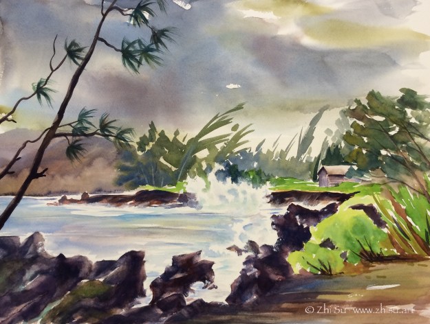
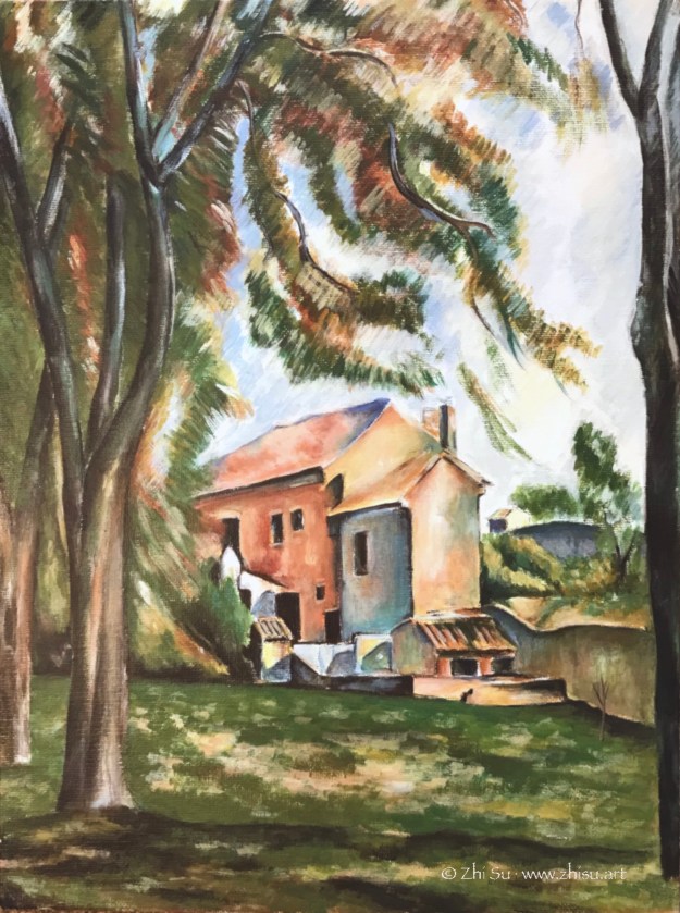
I posted this landscape in acrylic before, and I recently uncovered a watercolor version of it. So, sorry for repeating myself, but it’s interesting to look at them together:

landscape, trees, acrylic
Path, acrylic on canvas board, 12 x 16, 2015
landscape, trees, watercolor
Path, watercolor, 2015

I like the less defined forms and more spontaneous color ranges a wet-on-wet watercolor creates, but I also like the dark values the acrylic painting can bring out. The reference I used for the two is the same, and whatever difference you see from the these paintings are not by design. It seems the mediums just lead me there. How bizarre!

Once Upon A Time in Hawaii (II)

Hawaii, surfing, watercolor
Hawaii, waves and surfers, watercolor, 2015

I remember during the trip to O’ahu, we spent most of our time hanging around the usual tourist places in Honolulu. On the last day, thanks to a late flight, we drove around the island for some adventure. We came across some really good viewing spots on the North Shore of O’ahu for watching both surfing and sunset. There were some pretty handsome roosters too.

Once Upon A Time in Hawaii (1)

It’s vacation time and I dug out some paintings from previous Hawaiian trips.

Hawaii beach, watercolor
Hawaii, beach, watercolor, 2015

I couldn’t remember if this was sunset or sunrise, or maybe it’s just a feeling or memory. One thing I hope this blog would achieve is better documentation of my efforts.

Throwback (probably) 2015 Continued – Watercolor

I did some cleaning today and found a few old paintings. None of them was dated and my memory is just a blur. The only thing I could say is they were done around or before 2015. Lesson learned: date your artwork.

This one is after a photo I found online. Here’s the link, but I don’t know how to find the photographer’s information. (Google image search leads me to furniture stores and all sort of club chairs.) So, whoever took the beautiful photo, thank you. You can see back then I wasn’t able to go beyond the reference.

Chair, watercolor
Chair by the window, watercolor, 2015

Now some flowers for the holidays:

Tulips, watercolor
Tulips, watercolor, 2015
Irises, watercolor
Irises, watercolor, 2015

Copying Masters (4) – Another Cézanne

The original:

Farmhouse and Chestnut Trees at Jas de Bouffan, circa 1884, oil on canvas

My copy:

Cezanne landscape study, acrylic
Cezanne Landscape Study, acrylic, 16 x 12, 2016

Cézanne’s original is packed with details, there’s subtle changes of color and value on every plane of the house. The trees are built with expressive but economic strokes. I got lost among the leaves.

Copying Masters (3) – Paul Cézanne

Paul Cézanne  (1839–1906) is probably the most influential Post-Impressionist artist, and definitely the most inspiring for me. His colors are layered and strokes deliberate. It takes a lot more work than it seems. In this study I copied only a small section of the original painting.

Original:

File:Cézanne, Paul - Still Life with a Curtain.jpg
Still Life with a Curtain, circa 1898, oil on canvas

My copy:

Cezanne still life study, acrylic
Cezanne still life study, 2015

Try New Things (1) – Ink Resist with Gouache

I only recently came to know there’s such a thing called ink resist, and was pretty impressed by some of the artworks with this method. So I gave it a try. The result is a meh, but I l had fun and learned something.

Still life, ink and gouache on watercolor paper

So these are the steps I followed:

  • pencil drawing;
  • painting with gouache but leave some area blank; (some people leave only the pencil marks uncovered to achieve neat outlines)
  • after the painting is completely dry, covered the whole page with sumi ink;
  • again, wait till it’s completely dry, wash off the ink (I used the garden hose, no kidding.)
  • and again, wait till it’s dry, and went back to fix here and there. (This step is optional, but I wasn’t that lucky.)

And here are the things I learned:

  • Like drawing on black paper, this method is a bit counter-intuitive. The areas left blank in the first painting round will be the darkest after the wash. So planning ahead is important, which I didn’t do. In my painting, the blacks serve more like random texture than an organic part of the value pattern.
  • The paint should be thick, to “resist” the ink and also because gouache is easy to wash off.
  • This process asks for a lot of patience. 😜