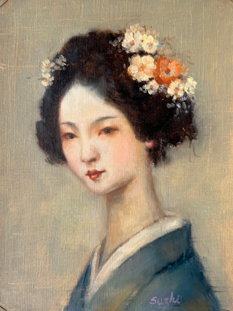
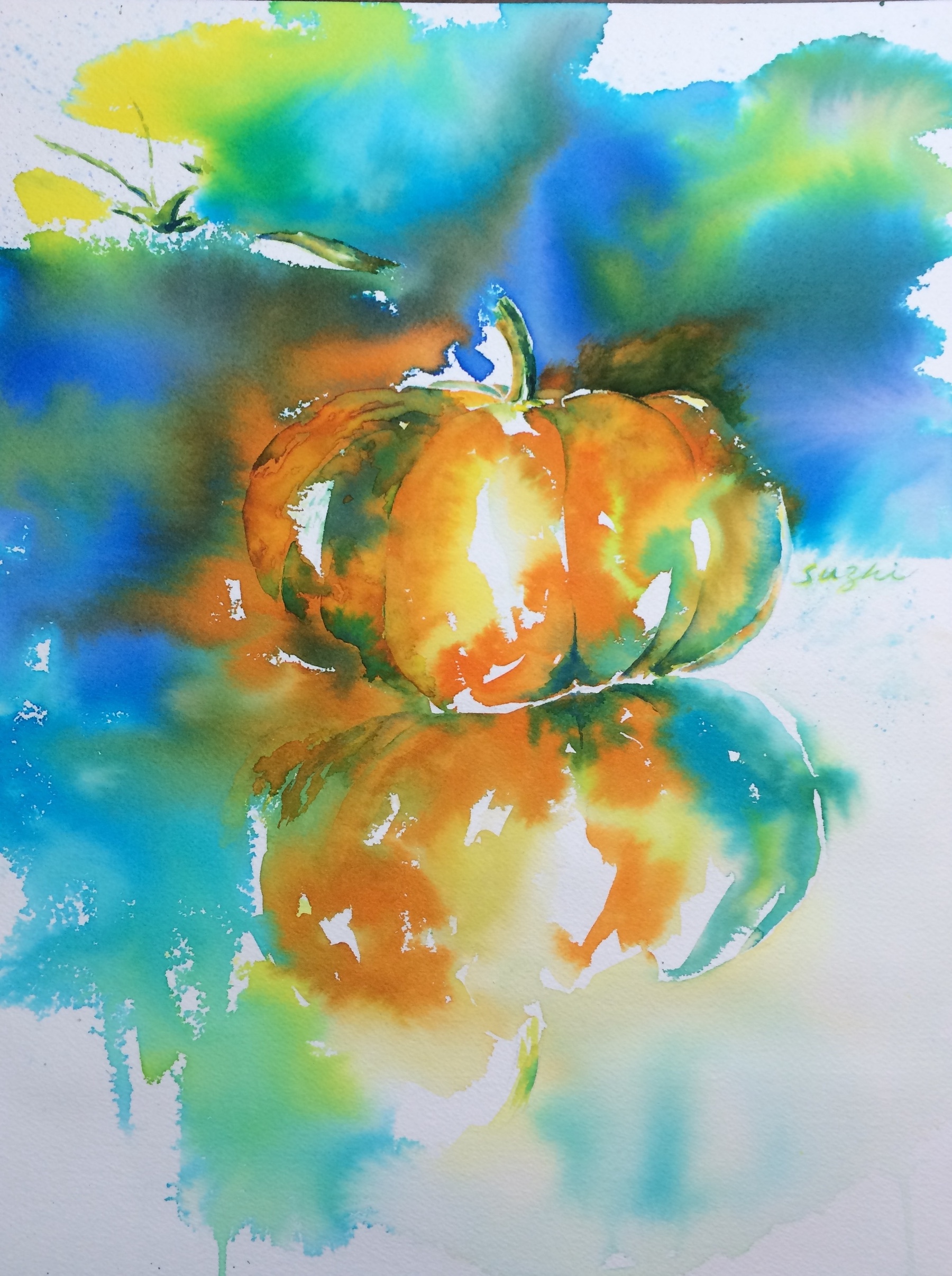
March kicked off with two leftover thoughts from the previous month. While cleaning up my studio, I also unearthed a block of hot press paper and I decided to give it a try.
As you can see, I approached it exactly the same way I would on cold press. The water and pigments mostly sat on the surface instead of sinking in, leaving some interesting but completely unintended marks. I do love the extra vibrance the colors gained, but I suspect hot press works best for well-defined shapes with minimal water. (Here’s a beautiful example of what hot press can do when handled right: Painting wet-into-wet on hot-press watercolor paper.)
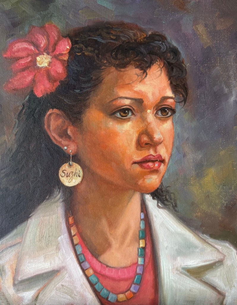
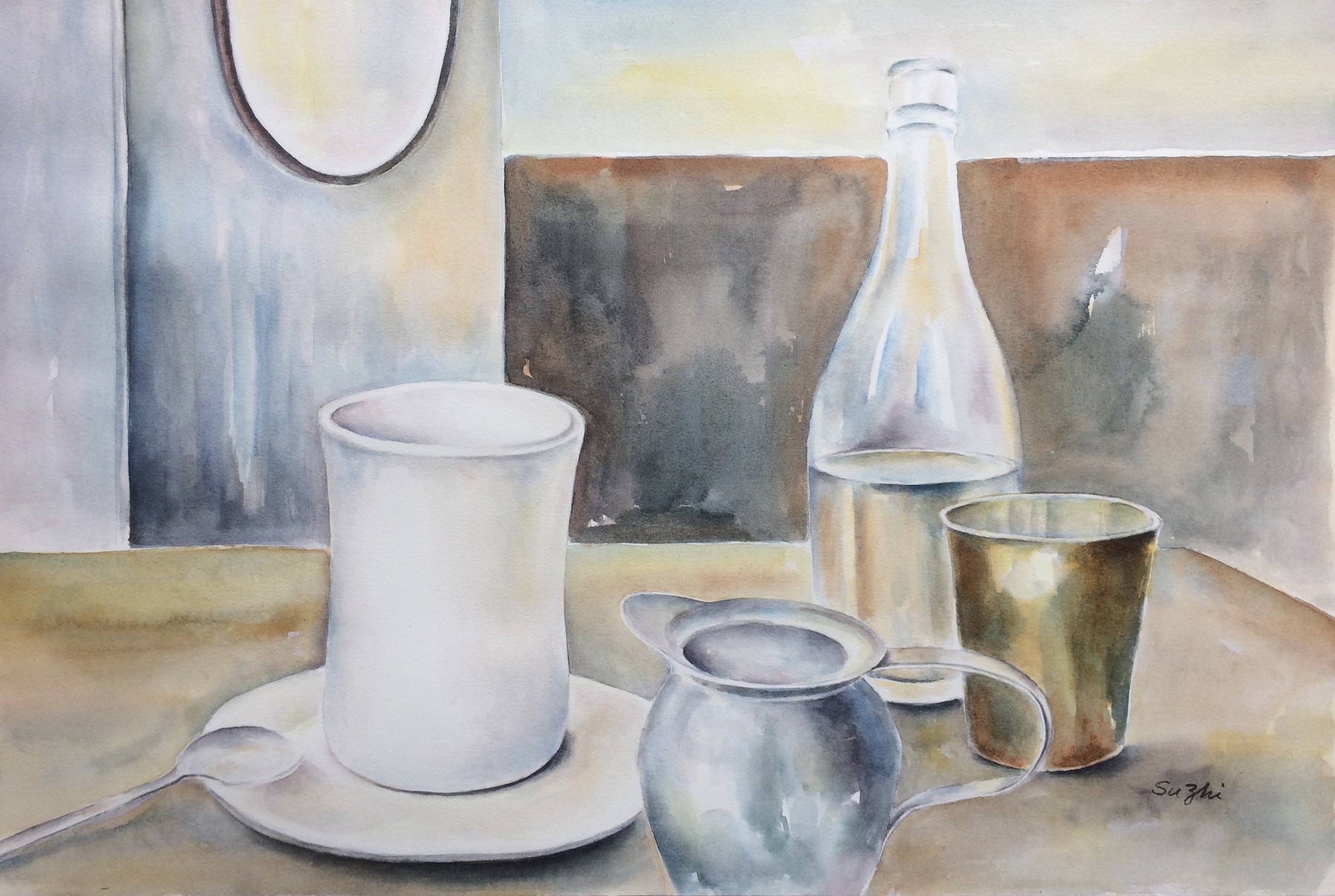
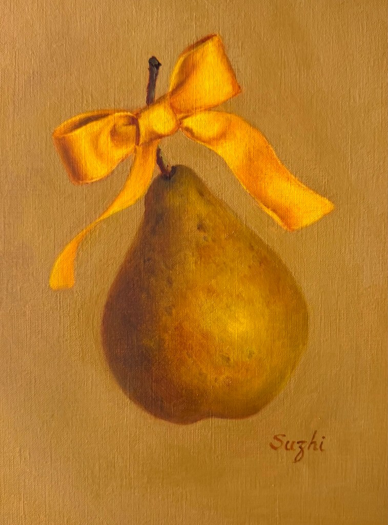
Meanwhile, I finally tested the Canson Acrylic paper I mentioned before with a layer of shellac. It definitely improved the paint flow.
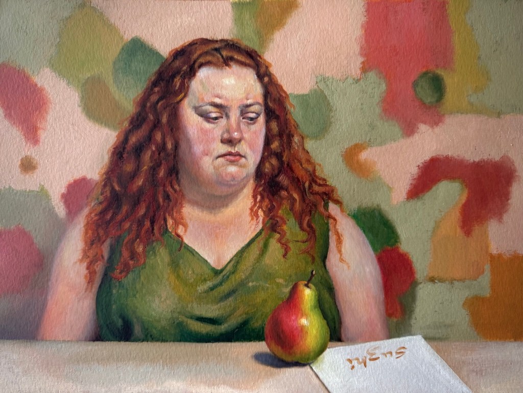
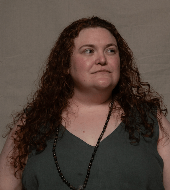
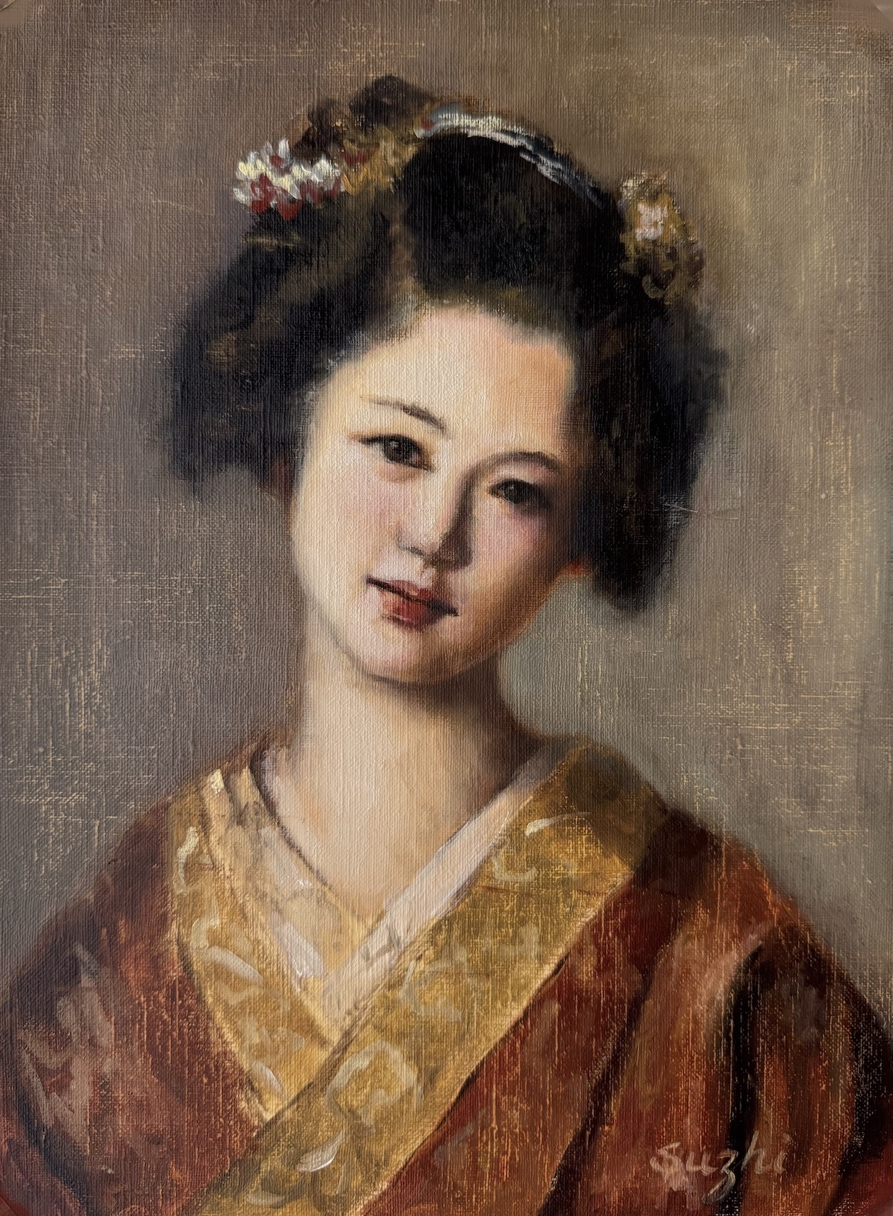
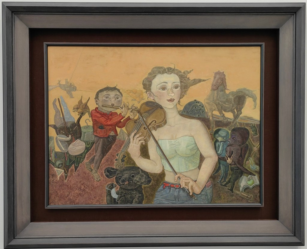
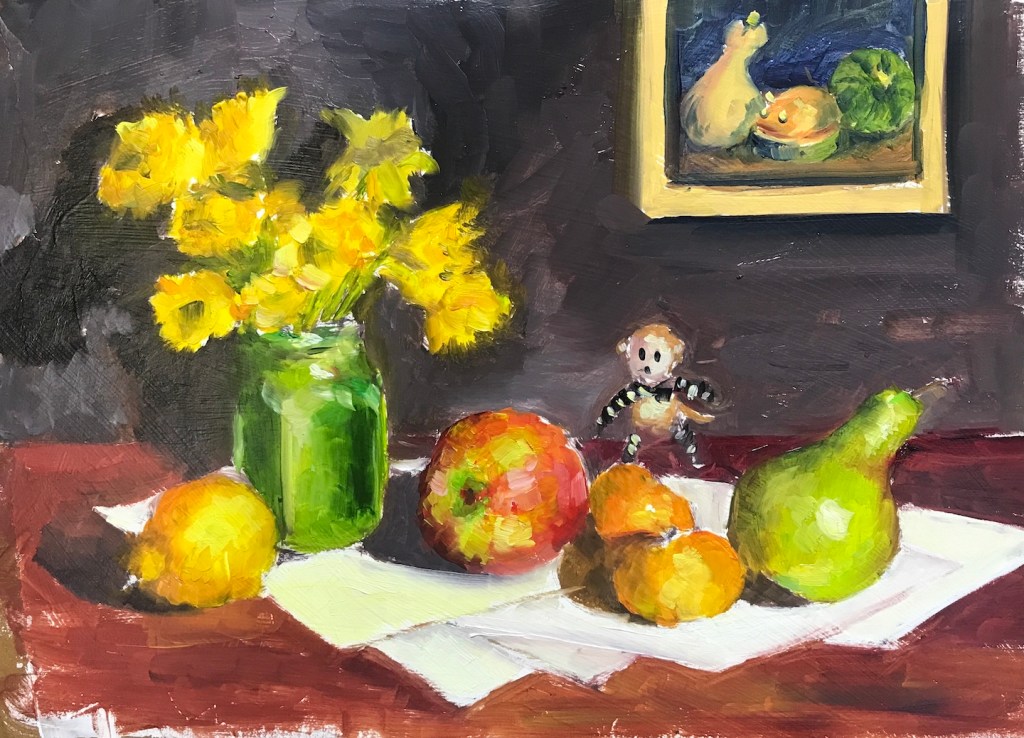
In this painting, I had much less trouble getting the paints to cooperate, but I struggled a lot with designing the woman’s expression and rendering the plumpness. The original reference came from East Oaks Studio, but I borrowed her general features but recreate the overall image to fit my little “plot.”
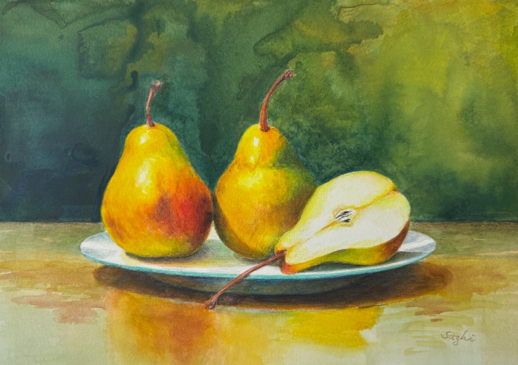
Next, I imagined a classical, nearly monochromatic head study and decided to practice it on a pear instead. I’m still not sure I handled the edges quite right, but it was a simple enough exercise. I might revisit this idea later.
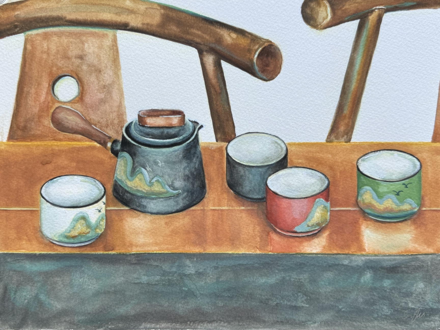
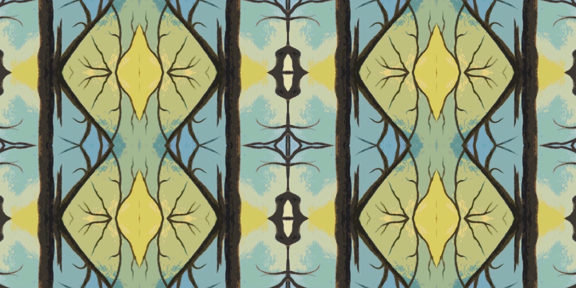
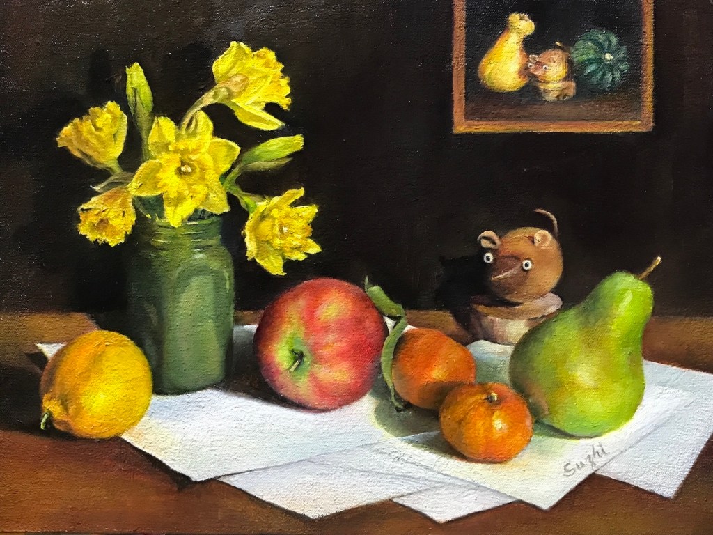
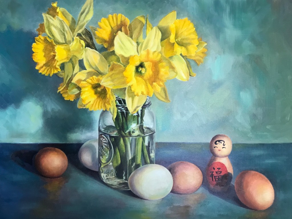
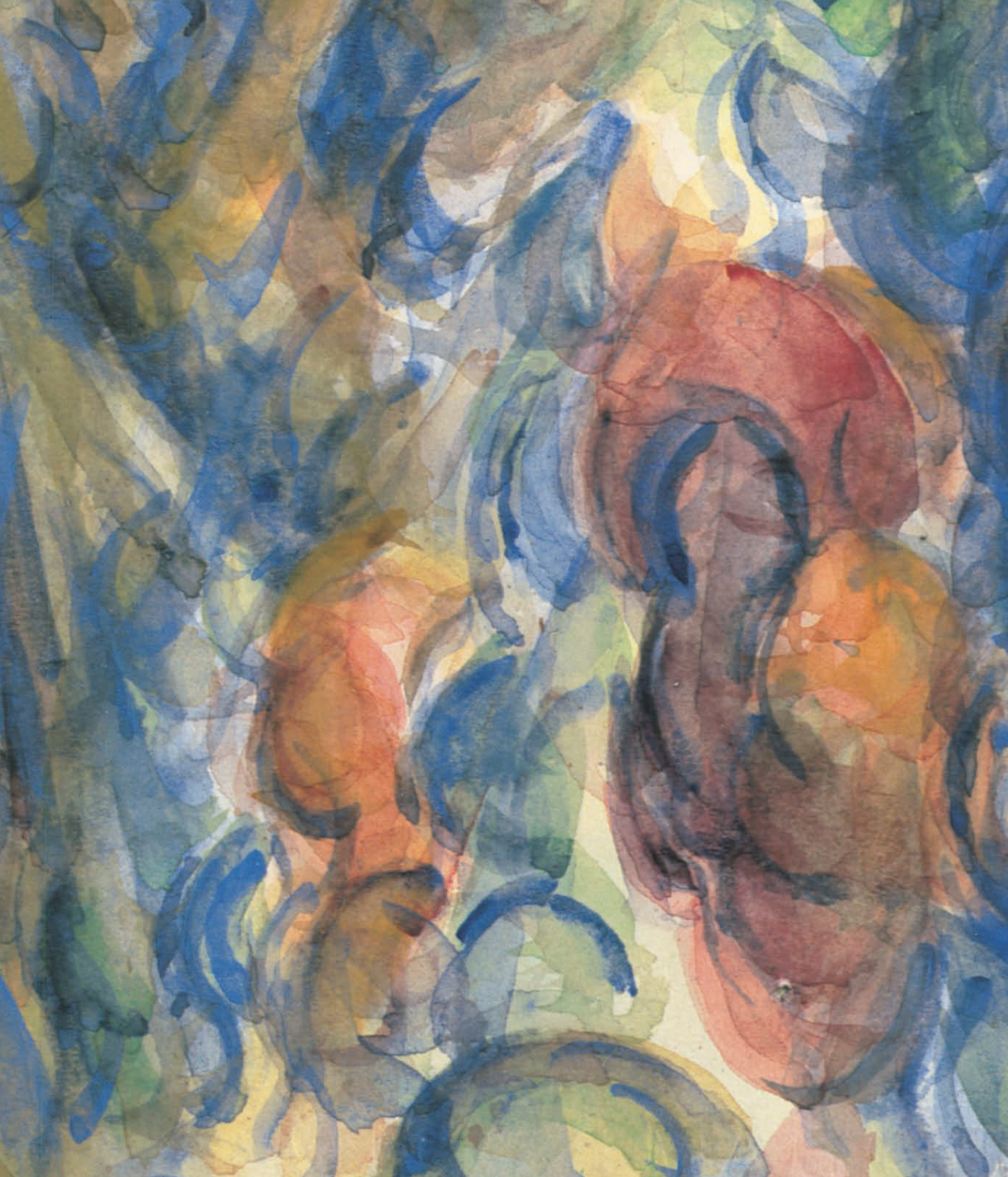
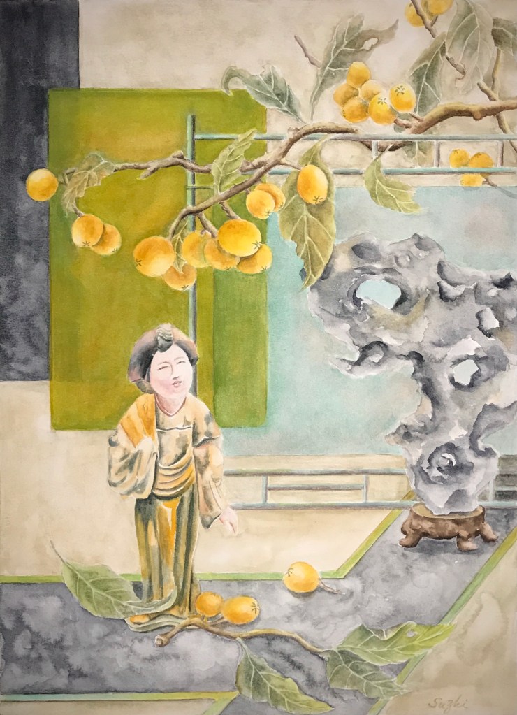
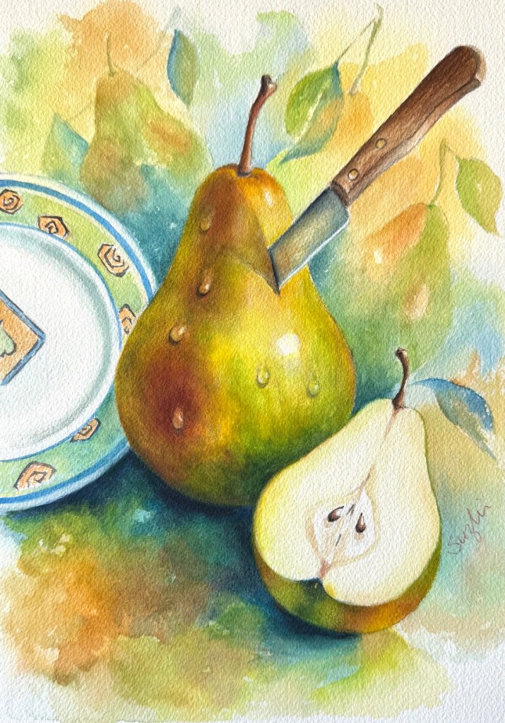
While juggling all these paintings with their mixed goals, I spent quite a bit of time designing the last two watercolors, both centered on our favorite theme. One is a still life with abstract patterns in the background, and the other is a semi self-portrait.
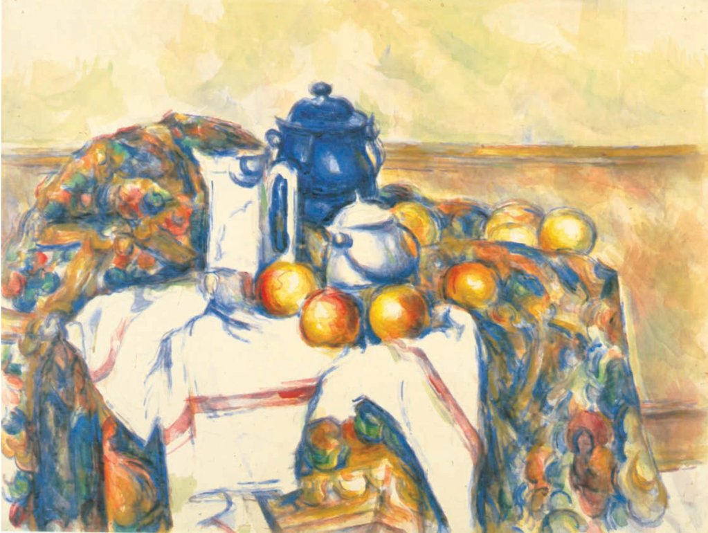
My original vision for the still life was actually a painting with much more elaborate, sharply defined patterns in the spirit of Klimt, in oil on canvas or watercolor on hot-press paper. Either way, it would have been a much more time-consuming project. I’m still holding onto that thought. This simpler cold-press version became more of a test of the main composition. I may come back and develop the idea further in the future.
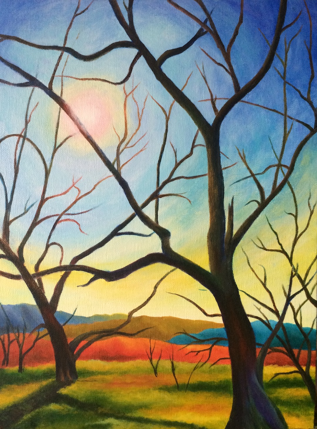
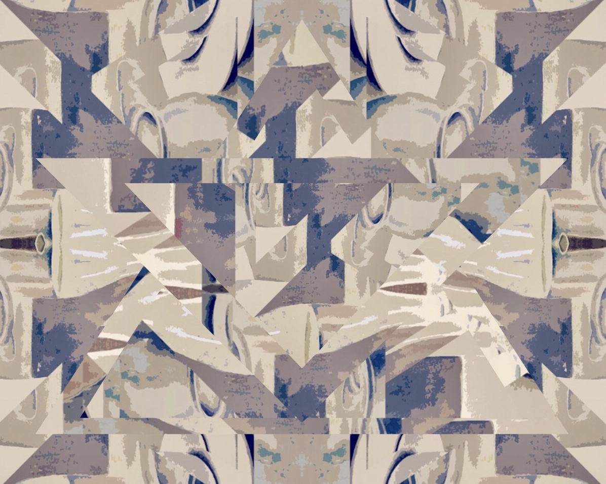
The final piece is, in my opinion, the best design of the month. I wanted a flat, almost monochromatic self-portrait (of course it’s a younger and prettier version of me), paired with one very saturated, juicy pear. In my original sketch, the head was meant to stay much flatter and more abstract. But as I painted, I couldn’t resist sharpening the features, especially around the eyes. I’m still not sure whether that was an improvement or a distraction. I had to drag myself away from the piece so I wouldn’t overwork it into a full realist portrait.
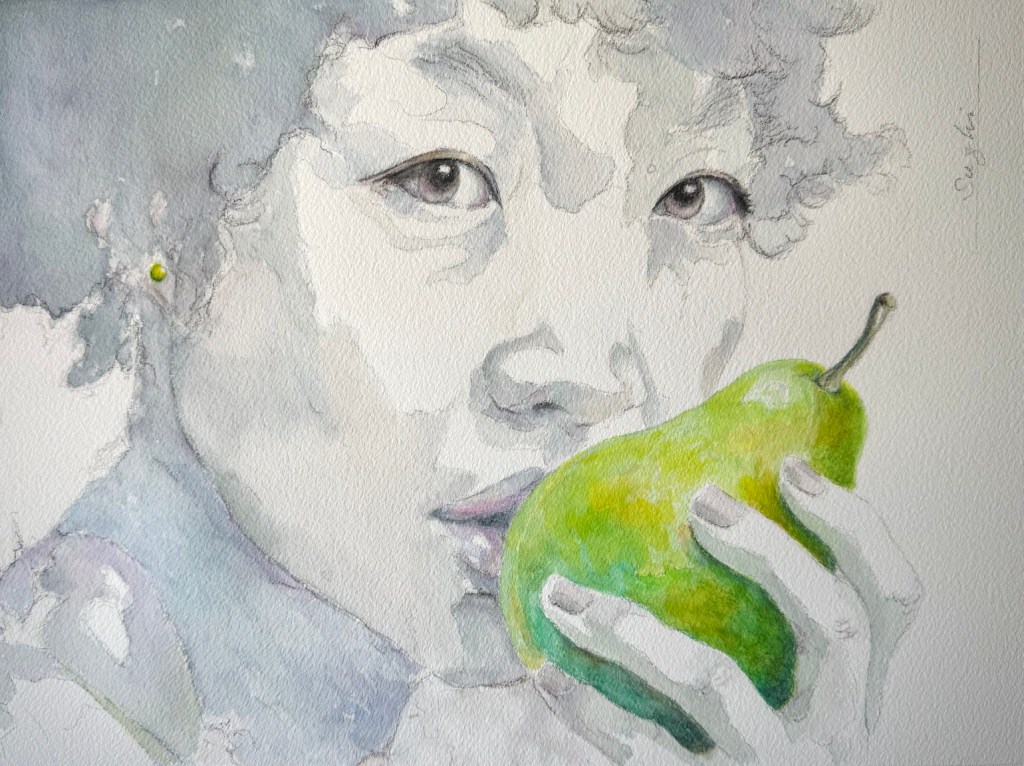
Overall, I love the design, the visible pencil marks, and that satisfying feeling of something unfinished yet strangely complete.
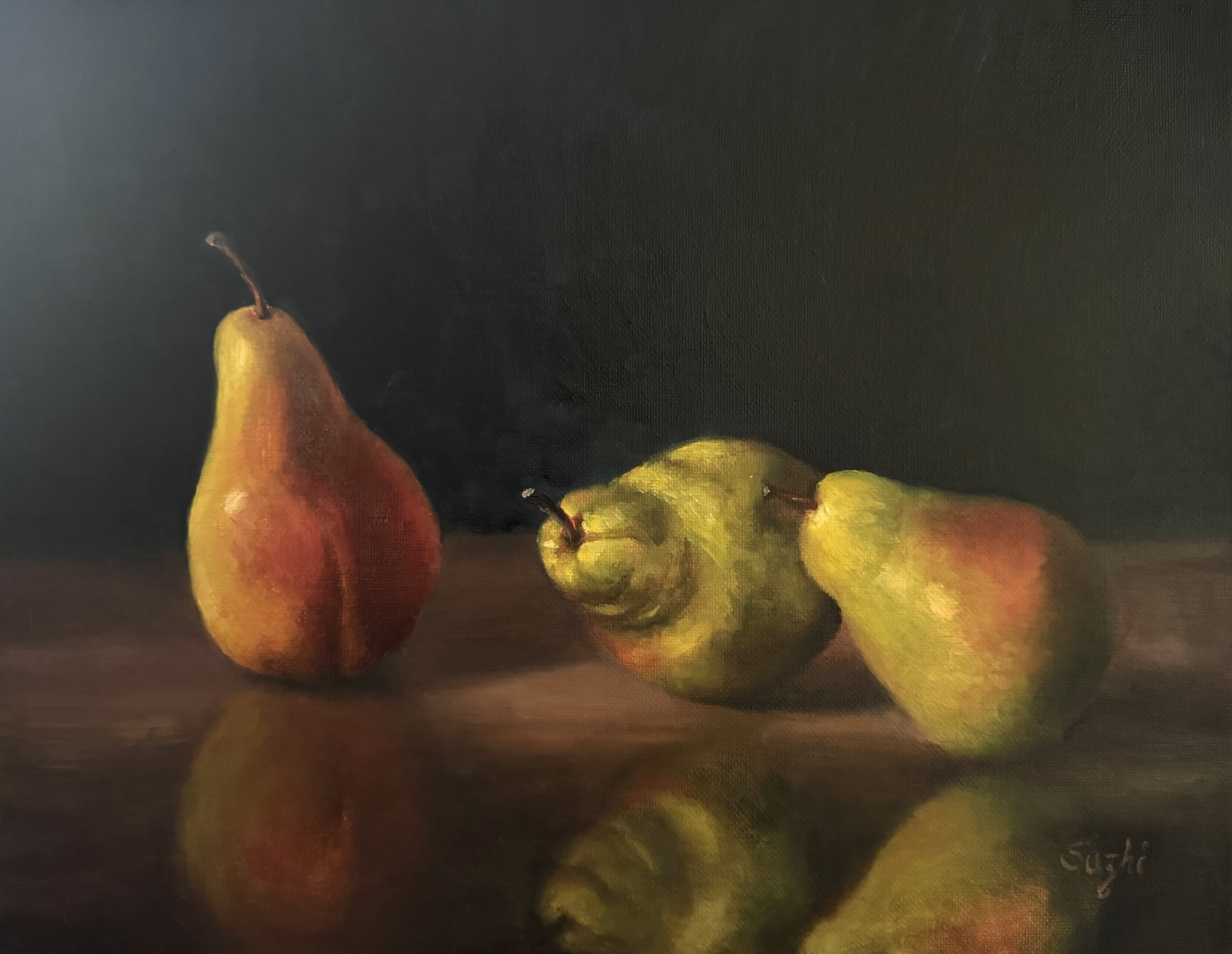
March turned out to be a fruitful month. Am I done with pears? Check back in a month.