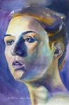
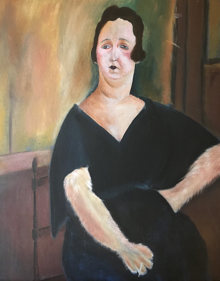
Amedeo Modigliani is an Italian artist famous for his uniquely stylized portraits. I always like his paintings and attempted a study years before. Somehow Modigliani’s Madame Amédée reminded me of my neighbor’s cat, and my original plan was to use the composition of the original painting, and replace the head with that of a cat’s. It didn’t work out and I switched back to the lady. The result wasn’t much of a copy, and you can still see the trace of my deviation.
Original
Madame Amédée (Woman with Cigarette), oil on canvas, 39.5 x 25.5 in, 1918
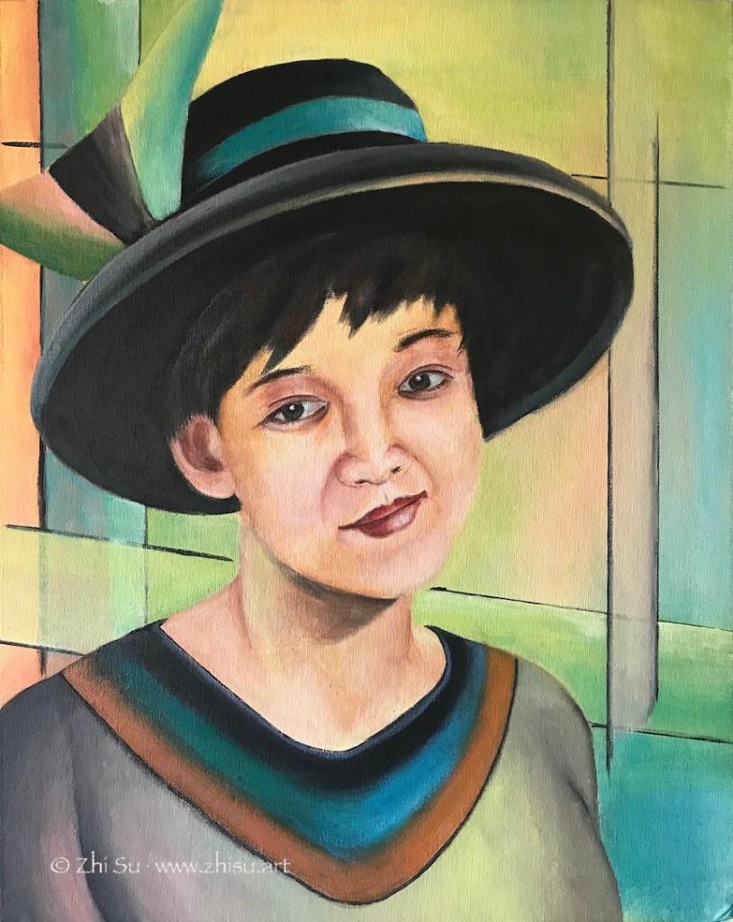
My copy:
Woman with a paw, acrylic on canvas panel, 16 x 20 in, 2016
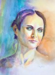
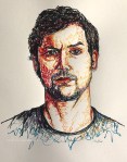
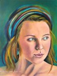
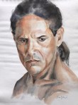
This is another try. This time it was not a copy, but I tried to stylize a self-portrait. I meant to focus on the inner world of subject, but somehow it was all spilled over into the background. As a result I went way beyond his typical palette, which is quite muted.
Me with a hat, acrylic on canvas board, 16 x 20 in, 2017
After learning drawing and painting humans for a while, I find myself even more fascinated by Modigliani’s ability to go beyond realist forms while stay true to the spirit and character of his subjects. I probably will do more studies of Modigliani in future.
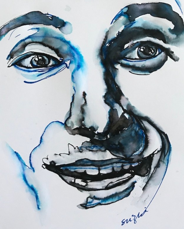
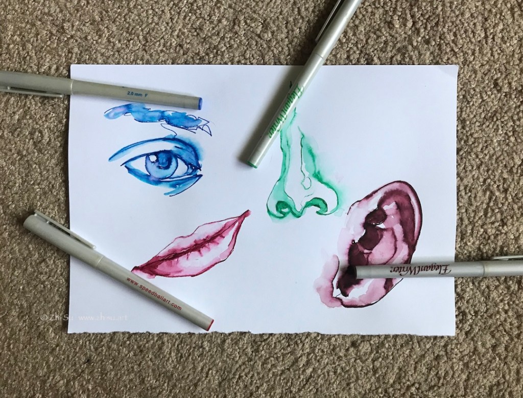
Elegant Writer is a special type of water-soluble marker that bleeds in various colors. They have chiseled nibs and are probably made for calligraphy. I couldn’t remember when I bought my set, but somehow for many years, rarely used them. It’s time to give these markers a chance before they completely dry out.
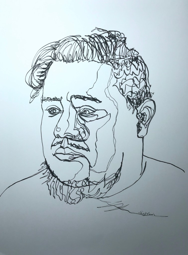
Black Elegant Writer on paper:
Dorian, marker on paper, 10 x 14 in, July 2020
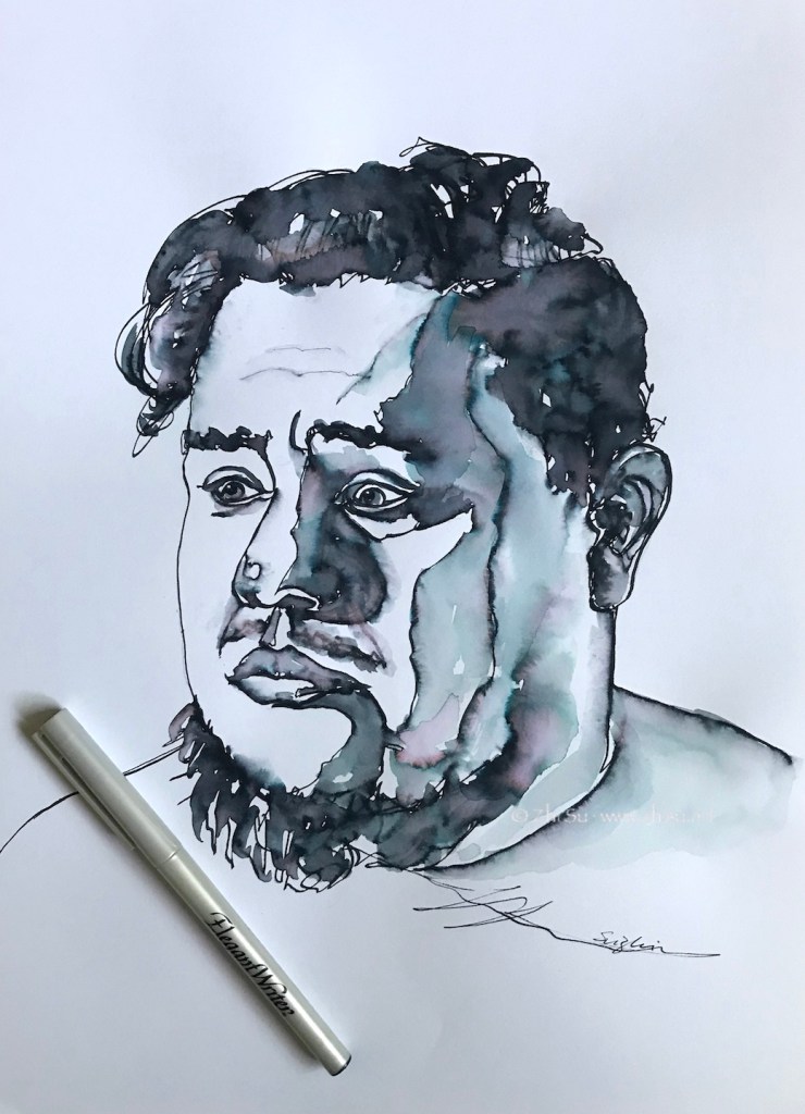
Add water to the above drawing:
Dorian, marker on paper, July 2020
Blue and black:
Serge, marker on paper, 7 x 8 in, July 2020
Testing other colors:
Colorful features, July 2020
A few notes:
I used regular Canson drawing paper, and I believe to what extend it’s soluble depends on paper. So test it.
The black one is the most interesting. It bleeds in blueish, greenish and reddish gray and really adds to the drawing.
The blue one gives out some pinkish hue in addition to blue, but the green, red and the brown ones are pretty much just their own colors.
The red, blue and green colors are more staining than black.
I have no training in calligraphy, but I can see a trained hand could produce more interesting lines with a chiseled nib.
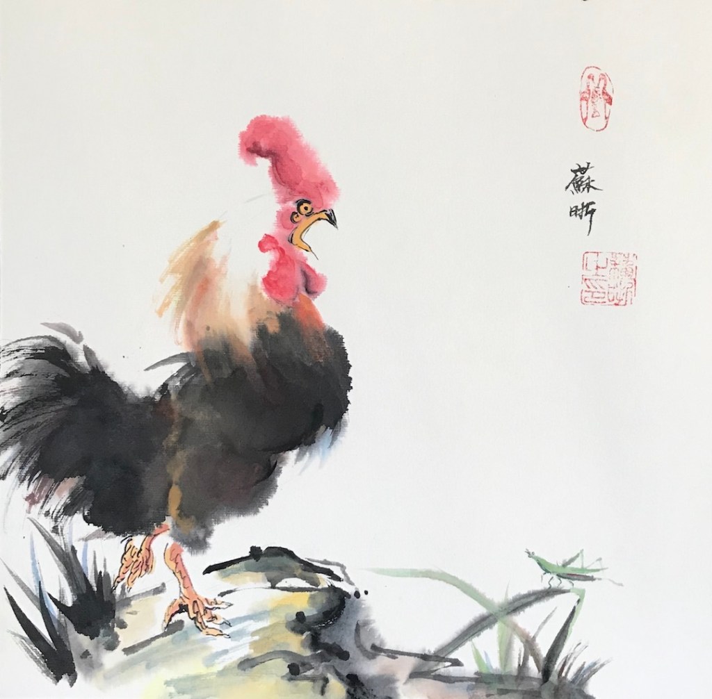
I did a watercolor painting on pre-matted rice paper (xuan paper) before, and I tried it again recently with different paints:
After Feiniaogongzuoshi, 12 x 12 in.Crazy Hair Day, 8 x 8 in, June 2020Kaydee, 8 x 8 in, June 2020Nikki, 8 x 8, Jun 2020
A few notes:
The paper I used is something like this, but I bought it from China and it was a lot cheaper.
The first two paintings were done with Chinese paints that commonly used for brush painting on rice paper. The brand is Marie, and it’s available on Amazon.
“Kaydee” is done in sumi ink, a cheap one from Daiso.
“Nikki” is in western watercolor.
The Chinese colors are a lot more opaque and hold better on rice paper, which is very absorbent.
The western watercolor dries very light and very flat. I went back multiple times trying to enhance the value. When the paper is wet, the pigment swims away to wherever with a blink of eye.
There’s no lifting with rice paper after it’s dry. You can pat it with a tissue paper and lift some pigment, but you can’t get rid of edges that way.
Sumi ink is the most staining of all.
I absolutely don’t know how to apply the skills involved in the first painting (the rooster one) to the later ones.
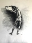
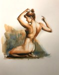
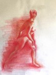
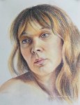
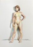
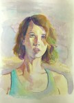
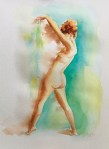
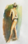
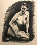
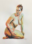
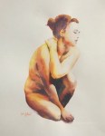
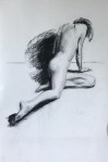
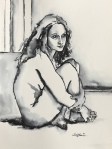
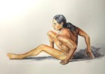
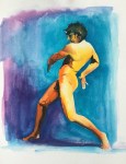
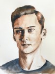
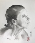
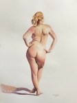
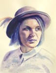
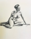
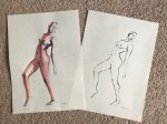
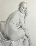
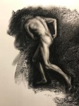
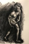
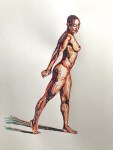
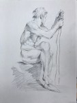
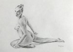
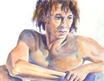
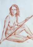
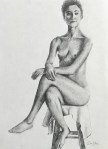
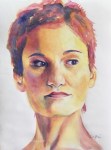
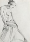
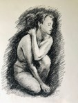
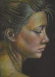
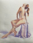
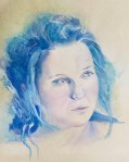
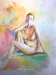
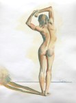
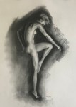
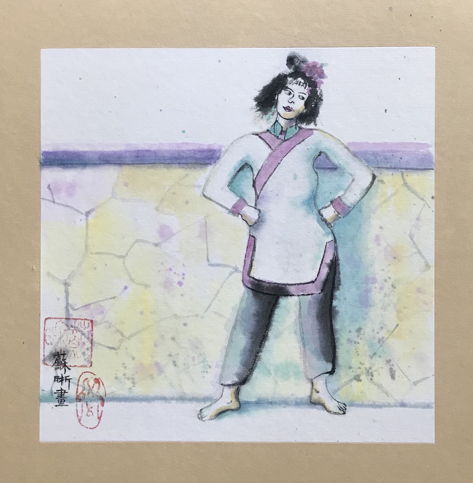
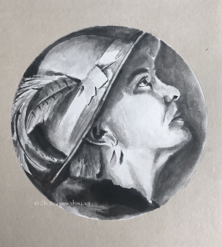
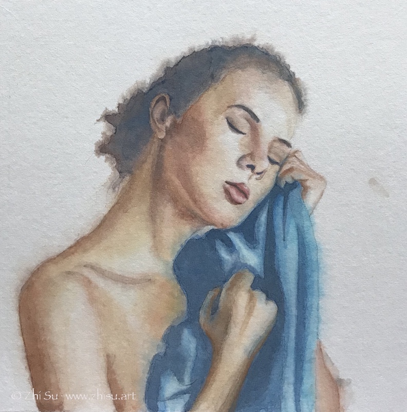
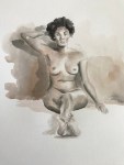
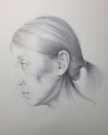
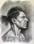
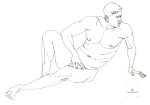
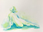
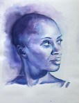
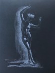
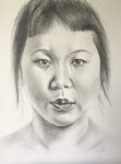
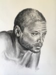
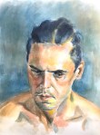
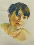
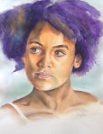
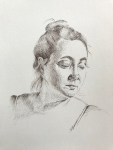
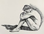
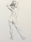
I’ve been doing the 100 Day Art Challenge at New Masters Academy for a while. I chose to focus on the figures and portraits for this challenge. Here are the first 25 days of the paintings and drawings I’ve done.
Take a look (click on the thumbnail to see a bigger image) :
The second painting is done on the back of an old painting (of a broccoli). When I soak the gouache painting in ink, I got some unintended texture. It’s probably because of the unevenness of the paper. I might have done some lifting or scrubbing for the old painting. I decided it didn’t hurt.
In general it’s fun to think about how many ways you can deal with a subject.
Now a few more words about old paintings. Good watercolor papers are expensive, so I never throw away old paintings, no matter how ugly they are. There are always ways to reuse them:
The obvious one is to paint on the back. If the paper is not flat, you can soak it in water, then lay it flat and add some weight on it (or re-stretch it). Sometimes the texture of the paper on the back is different. It’s still workable.
Another way is to examine the old painting and see if there are some elements can be used. The flames in the second painting was modeled after the leaves of the broccoli on the other side. Look at it upside down, side ways, hold it up against strong light, you may discover something different.
You can also directly use it. Tear it apart and make it into a new collage.
Take a picture of it and manipulate it into a new digital art with Photoshop, Procreate, etc.
These methods are not exclusive, and that one piece of paper can generate many artworks!
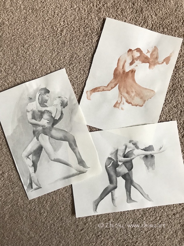
Found a beautiful book, The Art of Movement by Ken Brewer and Deborah Ory. It’s a collection of dance photography. It’s a great book to study figures and motions. I did some sketches and drawings from it:
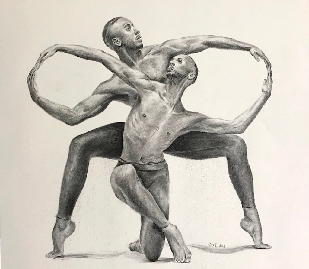
Dancers, watercolor on paper, May 2020Couple Dancers, watercolor on paper, May 2020Infinity, charcoal on paper, 18 x 24 in, May 2020
The last one is a strange pose. It has an enclosed and squarish quality and a lot of symmetry. The lighting is mainly top-down, making it more grounded and static. It’s not a composition that I would normally choose to work on. On the other hand, there’s a nice contrast between the infinity loop formed by the arm, and zig-zag pattern formed by heads, torso and the legs in the middle. There’s tension and connection between the two dancers at the same time and that’s what I was aiming for when starting the piece. However, as I worked on, and as always, I was distracted by the details, and lost my focus. I think the zigzagging is there, but the details of the hands cut in the flow of the loop. I also think the value contrast is not enough and shapeless. I think this is mainly because I am still copying what I see instead of using it as a reference to create. I hope when I have a better grasp of human figure, I could look beyond the photo and draw my interpretation.