This was a class assignment – choose an artist to study, and then paint in his/her style. I was very into Giorgio Morandi at the time (still am now), and he became the subject of my study. To my delight, during my research, I found out that Morandi was very much influenced by another favorite artist of mine, Paul Cézanne; and he in turn, heavily influenced a contemporary artist I admire, Wayne Thiebaud (b. 1920). Have I found my “art parents?” (A term I learned from Draftsmen Podcast, S1E5.)
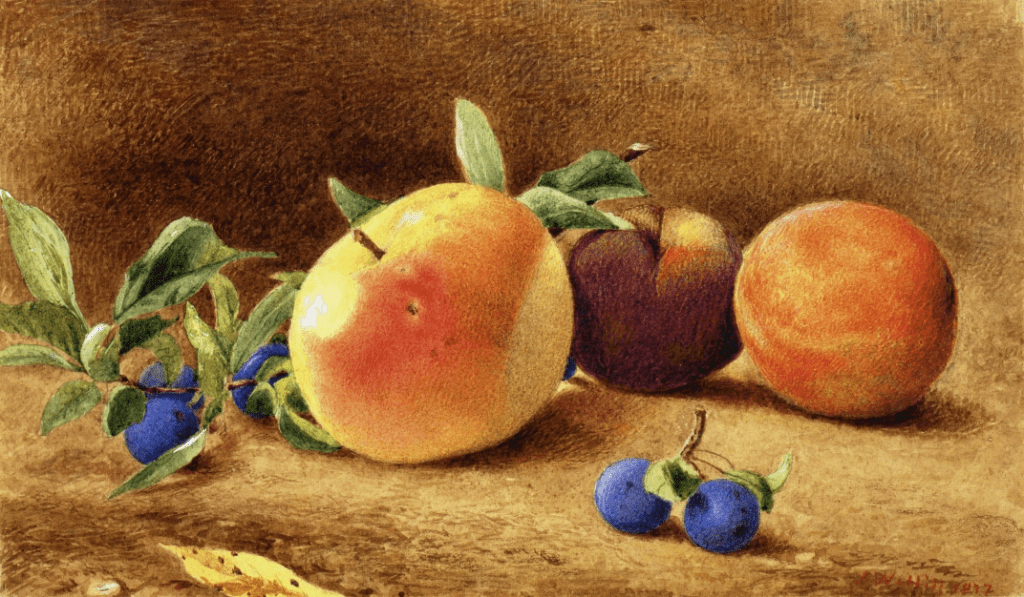
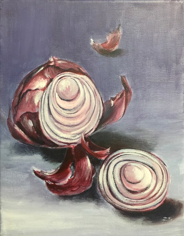
So I set up a still life scene and gave it a try:
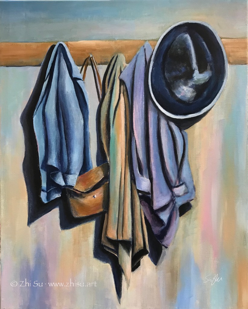
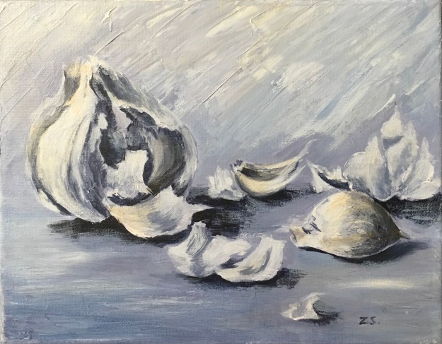
I know, there’s nothing Morandi about it (see my previous post about his style). The objects are asserting and the colors are singing. I don’t dislike it as a painting, but it’s definitely not the reservedness and tranquility I was after. So I gave it another try:
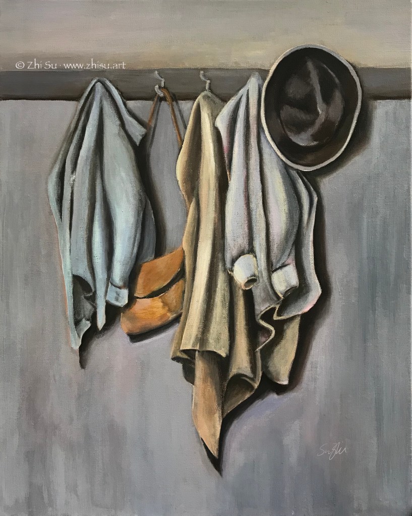
Well, this is still not Morandi. It’s still me, and it’s very hard not to be me. I understand I will never be Morandi, and that’s not the point of studying a master. If every painting is a self expression, every study of other’s style is a self reflection. I have a lot of passions that I don’t know how to control, and observations I don’t know how to choose and let go.
For sure, I am not done with Morandi yet.