Japanese woodblock printing (ukiyo-e) has a profound influence in western art since 19th century. “Japonism” has a visible presence in the art of many big names, such as Van Gogh, Degas, Gauguin etc.
Tsukioka Yoshitoshi 月岡芳年 (1839 -1892; also named as Taiso Yoshitoshi 大蘇芳年) was generally regarded as the last great master of the this art tradition. He was a very bold, imaginative and prolific artist. Some of the images he created are regarded as gruesome and disturbing. His most famous series are One Hundred Aspects of the Moon (1885–1892), and New Forms of Thirty-Six Ghosts (1889–1892).
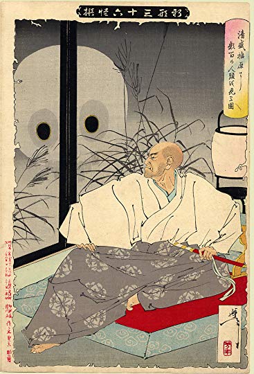
In “Kiyomori sees hundreds of skulls at Fukuhara,” from the series New Forms of Thirty-Six Ghosts, Yoshitoshi portrayed the famous Japanese general (or soldier-dictator) Taira Kiyomori (平清盛, 1118 – 1181), who created the the first samurai-dominated government. The main attraction for me is the decisive and effective line work, and the presence of the character:
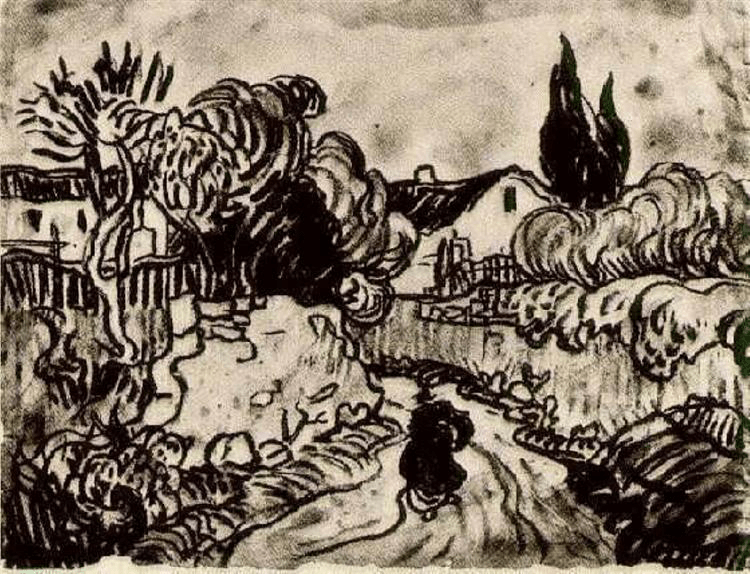
The original:
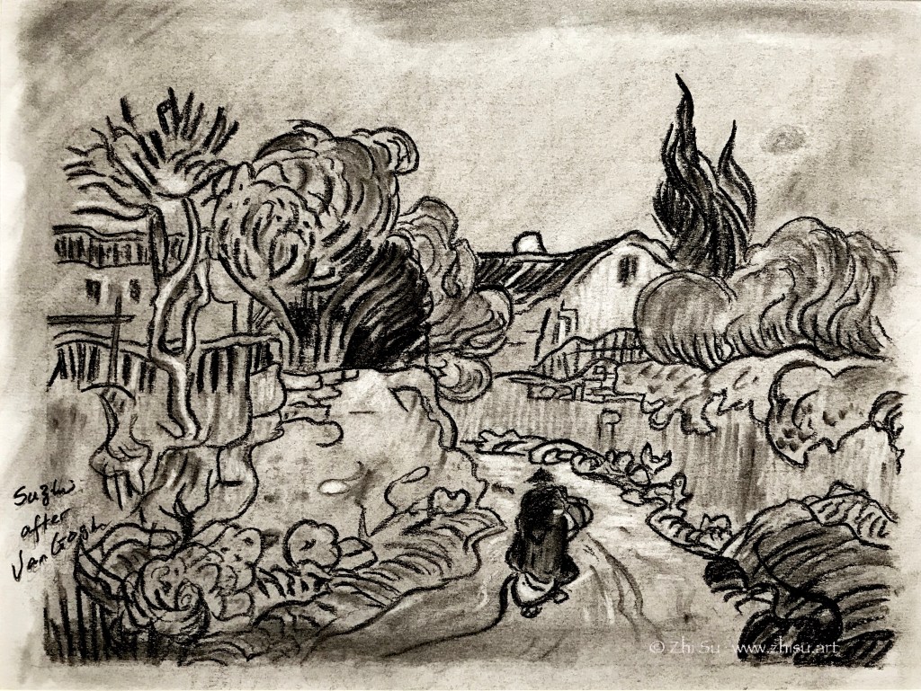
My copy:

A few notes:
- This is not an exact copy, partially because the paper I used was a failed texture experiment. I have to work with un-intended marks here and there.
- Copying line work is a tricky business: you want to be careful because the ink is permanent; but if you are too careful you’ll lose the force and the gesture of the line.
- Sometimes having random textures or marks on paper is not necessarily a bad thing. You are forced to be creative since you have to work around or work against it.
- My general has funny little hands.
Here’s my attempt of the ukiyo-e style:

This earlier post is in that line too:
By the way, the art of ukiyo-e fell out of fashion in Japan in the late 19th century but saw a come back since the 70s in Asia. Some young artists incorporated the line works and the fanciful contents into Chinese fine brush painting or watercolor painting.