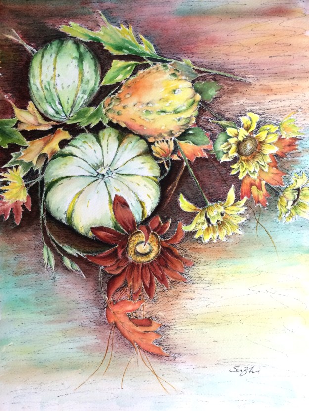
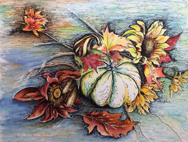
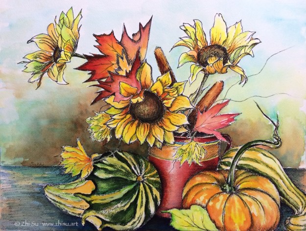
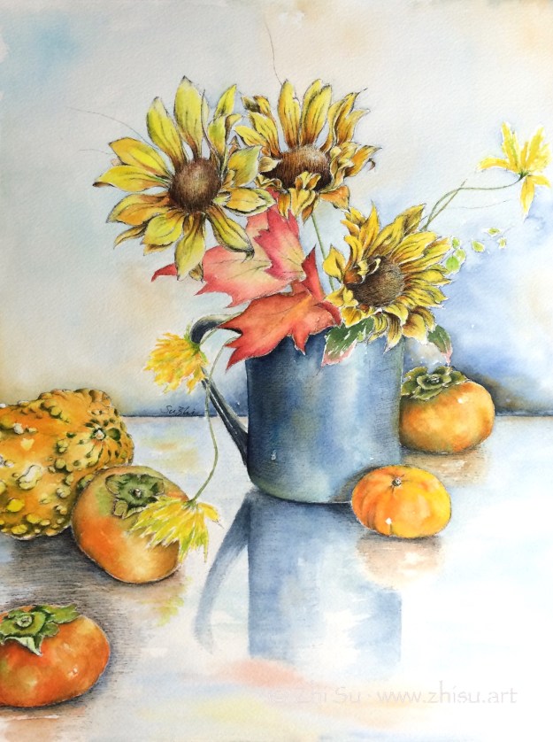
The rich colors of the season remind me of a series I did years ago. It consists of four still life paintings, done in watercolor and ink pen. It was the first series I ever did and was done before I had any appreciation of doing things in some sort of consistency. My natural inclination is always jumping around among different things.
As I have better understanding of the creative process, I start to see the benefit of staying for a while with a particular technique, a color theme, a subject matter, a design concept, etc. It reenforces your strength, challenges your thought, and often leads to new discoveries.
Anyways, here they are:
Autumn Colors 1, watercolor and ink pen on paper, 16 x 12 in, 2015Autumn Colors 2, watercolor and ink pen on paper, 12 x 16, 2015Autumn Colors 3, watercolor and ink pen on paper, 16 x 12 in, 2015Autumn Colors 4, watercolor and ink pen on paper, 12 x 16 in, 2015
The things that connect this series are techniques and subject matters. I set up some “fall” related objects and chose four settings. They are parallel to each other in terms of relationship. Another way to develop a series is to derive new pieces from the old one. I am in the process of an experiment of that and hope I will be able to show it soon.
This painting was done earlier this year, but gosh, is there a better time to post it?
Self-portrait, acrylic on masonite board, 30 x 24 in, 2020
In case you wonder, the cat is reading The Malleus Maleficarum (The Hammer of Witches), a 15th century treatise on witchcraft, written by the Catholic clergyman Heinrich Kramer. The book had a great influence on the prosecution of witchcraft in later centuries. You need to know your enemy I guess!
Yang Guifei 杨贵妃 (719-756), Imperial Consort Yang, is one of the four best known beauties in ancient China. She married Emperor Xuanzong 玄宗 (685-762) of Tang Dynasty in essence, granted the highest rank among the Emperor’s harem, but was not his official wife (I believe he didn’t have one at the time.) Her family rose to power because of the Emperor’s favoritism, but also caused a lot of tension in the court. During a rebellion that forced the Emperor to escape the capital, the imperial guards blamed Yang Guifei for distracting the Emperor from his royal duty and forced him to kill her. Her short but eventful life was commemorated in poetry, paintings, dramas, and novels throughout Chinese history till today. The legend even goes beyond China. Some Japanese believe she didn’t die but escape to Japan.
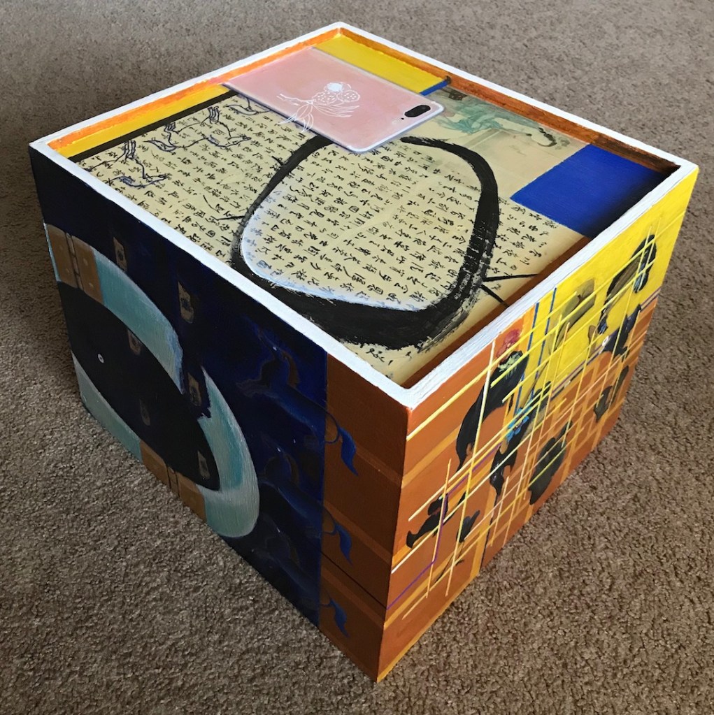
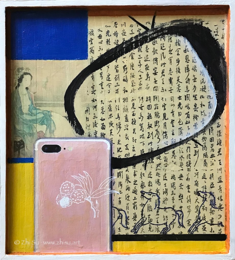
In the outskirt of Xi’an, a city in central China, and once the ancient capital of Tang Dynasty, there’s a tourist site called Huaqing Palace. It’s said to be the royal resort of Emperor Xuazong and Yang Guifei. I visited the site two years ago, and was fascinated by the story and the modern obsession of it in China. I always wanted to make an artwork about it, but find it very hard to condense a rich narrative. Eventually, I did it with 5 paintings – 5 sides of a box.
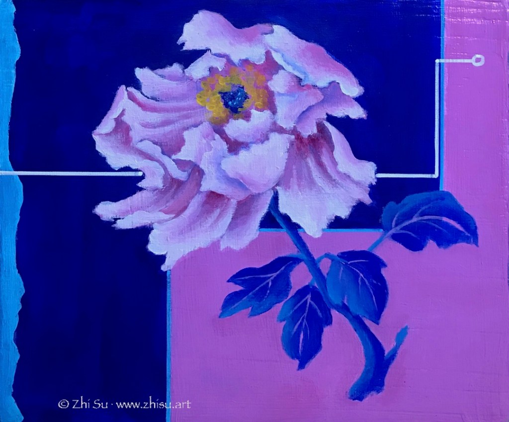
The story begins with a peony. In Chinese culture, peony not only implies beauty, but it’s beauty in richness and glory. It’s the national flower of China today. The blooming flower is Yang in her innocent years. The background design is a twist of the Taoist symbol. Legend has it she spent some years practicing Taoism in a temple before entering the palace, a fashionable thing to do among upperclass women at the time.
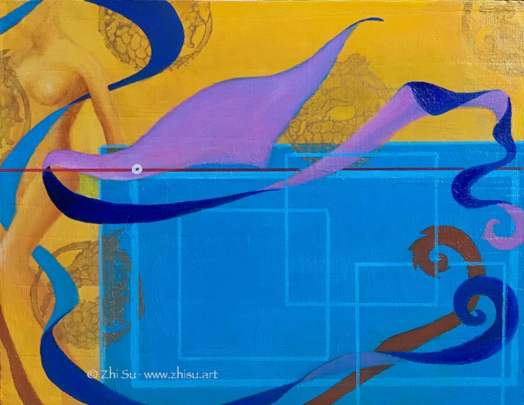
The story continue on to the Huaqing Palace panel, where she enjoyed the Emperor’s love. Yellow is an imperial color in Chinese culture, and dragon is a sign of the emperors. The figure on the left is after an modern statue of Yang in Huaqing Palace. Among the four ancient Chinese beauties, Yang was regarded as the plump one (that also reflects the aesthetics of the Tang Dynasty). However, her modern statue is not only slim, but also western – makes you wonder about the presentation, representation, and the interpretation of history. The ribbons were often used in traditional dance and Yang was an excellent dancer according to legend. Huaqing Palace is also a site for hot spring, and you can still see the pools where Yang and the Emperor enjoy themselves today.
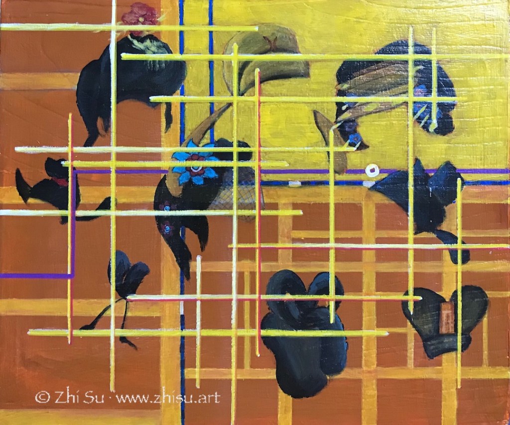
The next panel is a part of the map of the capital of Tang Dynasty, with the yellow part represents the royal palace. The hairdos and hats were an indication of the social position back then. As illustrious as the imperial couple, they were both just chess pieces on a political power grid. This is especially true for a woman like Yang. However she’s favored by the Emperor, she’s never the only woman around him.
The final part of her life story features a broken jade bracelet. Yang Guifei’s maiden name Yuhuan, in Chinese means jade bracelet. In Chinese culture, broken jade is also a symbol of the death of someone beautiful or virtuous. The battle horses and banners referenced ancient paintings about Tang battle scenes.
The top of the box is a collage of how Yang’s life story was remembered throughout history. The calligraphy is part of a long poem Chang hen ge 长恨歌, “Song of Everlasting Sorrow,” written by Tang poet Bai Juyi 白居易 (772-846). The poem is a retell of the love story of Yang and the Emperor. The painting next to it is done by a Japanese woman artist Uemura Shoen in 1922. There are still TV dramas produced present days in China. The cell phone is both our means to access history nowadays, and a tool to fulfill our desire to share some glory of a celebrity. I change the Apple symbol to Lichee fruits – a favorite of Yang Guifei. Legend has it the Emperor ordered the battle horses to transport the fresh fruit (native to southern China) to the capital (central China) for her in three days!
The most difficult part of the project is to balance the narrative and the art. I have a story to tell, but I also hope viewers could find the work interesting to look at even though they don’t know anything about the story. I want the symbols and the designs I use serve both as literary and artistic devices. For example, there a line running though the four sides of the story with a tiny circle on each side. It loosely follows the geographic route from her birth place, to the Huaqing palace, the capital, and finally her death place. The color changes of the line correspond to the vicissitude of her life. It links the narrative, and I hope it also moves the eyes.
The project is acrylic on a wooden box, and the surface of the box was quite textured. I sanded it, gessoed it, but it’s still very different from painting on canvas or masonite board. It’s a lot of work. Having so many surfaces to work on expand my ability to tell a complex story, but it also gives me the trouble of finding a place for it in the house! 🙂 Honestly speaking, I couldn’t tell if any of these makes sense, but I had a great time working on this project.
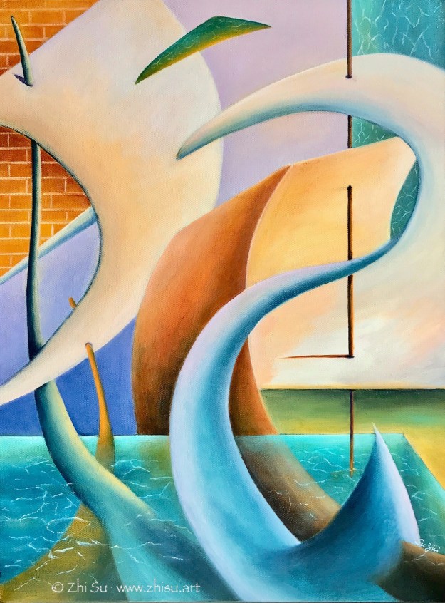
I recently became a member of the Pacific Art League and joined their 99th Anniversary Exhibit, “Beyond 2020.” My painting “Sail” was selected into the gallery show, and will be on view at their Palo Alto gallery till January 2021. Here’s the piece:
Sail, acrylic on canvas, 18 x 24 in, 2019
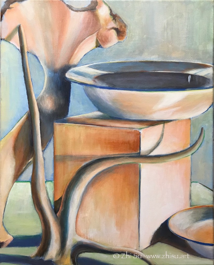
The painting was inspired by a still life study I did before:
Still life, acrylic on canvas, 16 x 20 in, 2019
My still life study was focused on how to paint white with color, but I found the way the lines curved, meandered and crossed very intriguing. After the painting was done, I kept looking at it and tried to follow those lines in my mind and in my sketchbook. The objects gradually disappeared and the lines and shapes led me to new ideas, and eventually, a new painting.
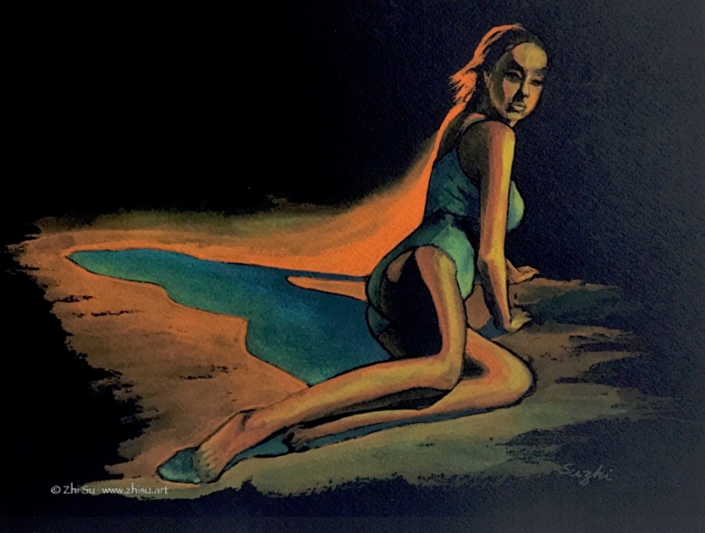
Nikki, watercolor on paper, 9 x 12, September, 2020Astrid in Design, gouache on paper, 9 x 10, September 2020
Here’s what I find out so far:
It behaves like a good quality 140lb watercolor paper. So in theory, you can use water.
However, as one can imagine, transparent color doesn’t fire well on black paper. You need a lot of pigment for a color to show, and the colors still dry lighter. So you can’t really use a lot of water.
Like any type of black paper, how you deal with value on it is quite counterintuitive.
In the first painting I used mostly watercolor and mixed in some gouache white in the highlight area. The second painting is gouache. I personally like the the gouache one better.
I feel like I am very lack of imagination with this paper. For the second painting, I believe I could achieve similar effect with ink resist method. While using black paper makes it easier in certain ways, ink resist could have some unexpected result. In other words, it is not particularly empowering.
It could be just I don’t know how to make the most out of it.
I have a Strathmore black drawing paper pad that I bought for colored pencil drawings. Unfortunately after a few attempts, I came to the conclusion that colored pencil is too testing for my patience and on black paper, that’s even more so. A drawing like the following, to reach the desired effect (smoother skin, brighter color etc.), would need probably another 20 to 50 layers of coloring (or skills I don’t have to begin with):
Lily, colored pencil, 9 x 12 in, 2020
So what to do with the rest of the paper? Gouache came to mind because the colors come thick and don’t need much water (or at least you can use it that way).
Jazmine, gouache on paper, 9 x 12 in, 2020
I very much like the effect, but as you can see there are wrinkles on paper caused by accidental water drops.
Here’s another one:
Monique, gouache on paper, 9 x 12 in, 2020
After I did these paintings, I found out that Stonehenge actually has a line of black watercolor paper. Order placed already, and stay tuned!
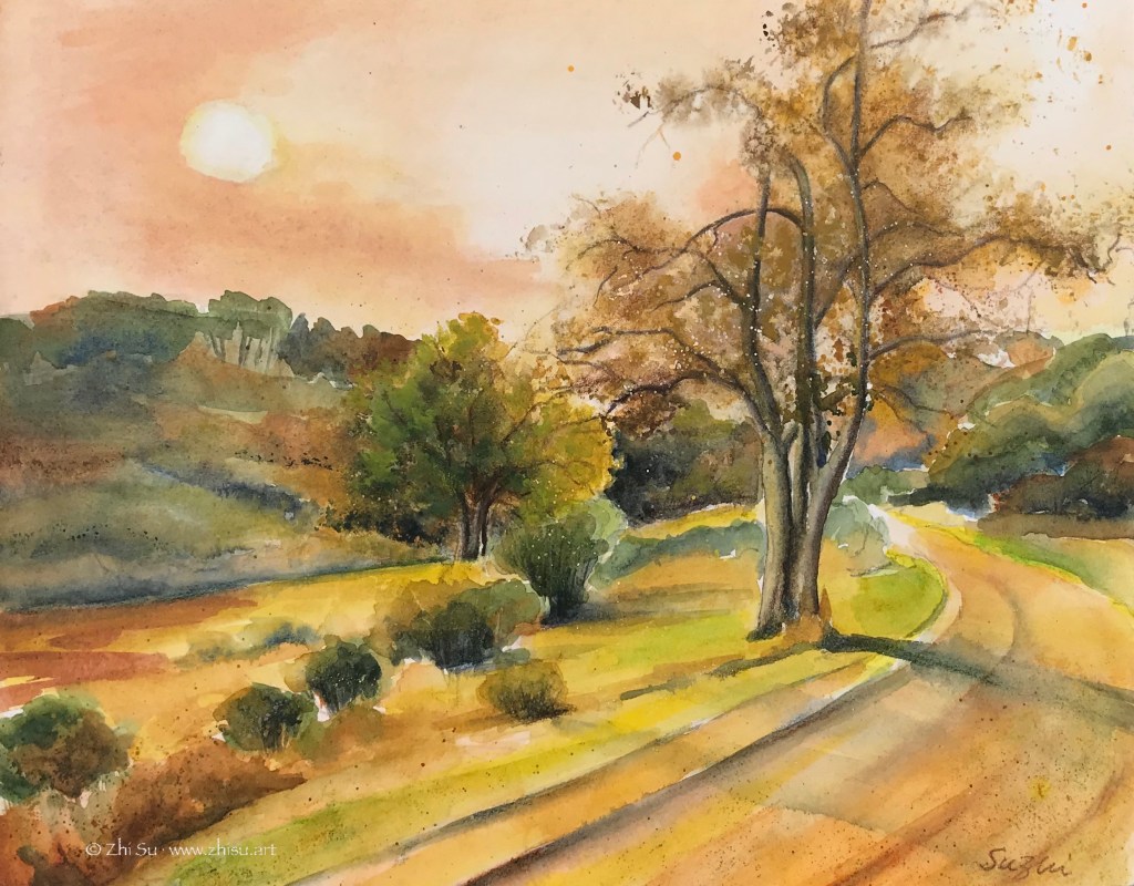
If you are on the west coast you know what I am talking about. The sky is literally orange the whole day, from Oregon to California! I painted this scenery a while ago, as a sunset scene. I mounted to a cradled wood panel, and varnished it (see my previous post about hanging with frame). I believe the varnish darkened the painting a bit, and the result is a perfect depiction of today:
Orange Day, watercolor on paper,11 x 14 in, 2020
As much as I enjoy being a prophet, I miss my neighborhood’s normal color:
Neighborhood walk 1, watercolor on paper, 9 x 12 in, 2020
I recently submitted a couple of artworks to an online exhibition “Patterns” at Light Space & Time Online Art Gallery. One of the submissions received an honorable mention and was selected into Top 15 Artists in the “Painting & Other Media category.”
This is the painting that received the recognition:
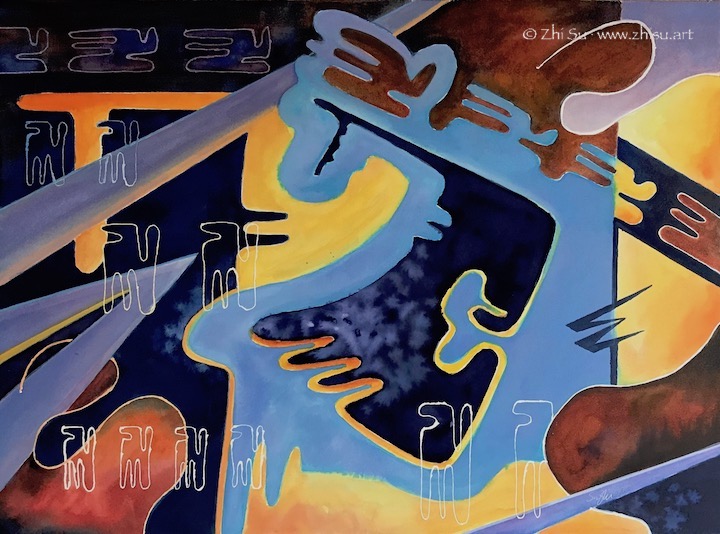
Marching, watercolor on paper, 22 x 30 in, 2019
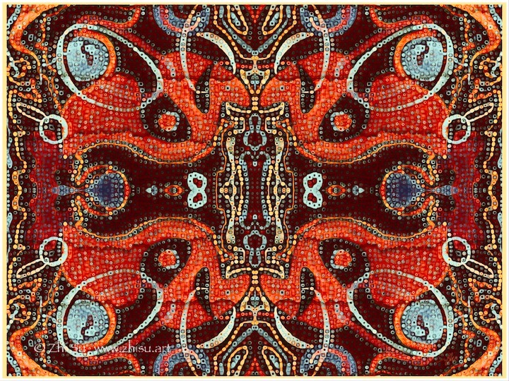
I also submitted one to a different category, “Photography and Digital.” I don’t really have any experience with digital art. I took a watercolor doodle and manipulated it in Photoshop Express and Procreate. It failed to enter the show, understandably, but I had a lot of fun making it:
Bubbly Dance, digital, 2020
Maybe I’ll make a carpet out of it some day!
I am taking a 2D design class this fall and learning some basics about Photoshop. Hopefully I will have some better stuffs to submit next time! 🙂
Light, Space & Time has online exhibitions of various themes and it is cheap to enter. Highly recommend for emerging artists.
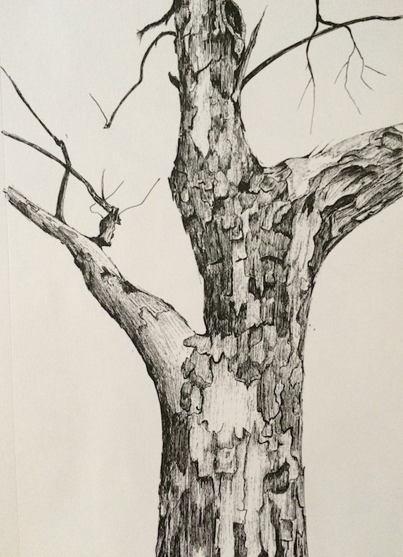
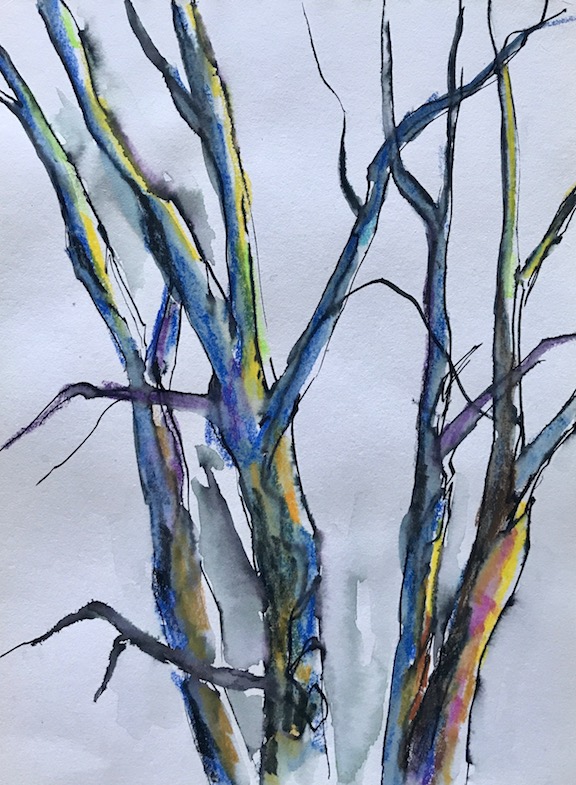
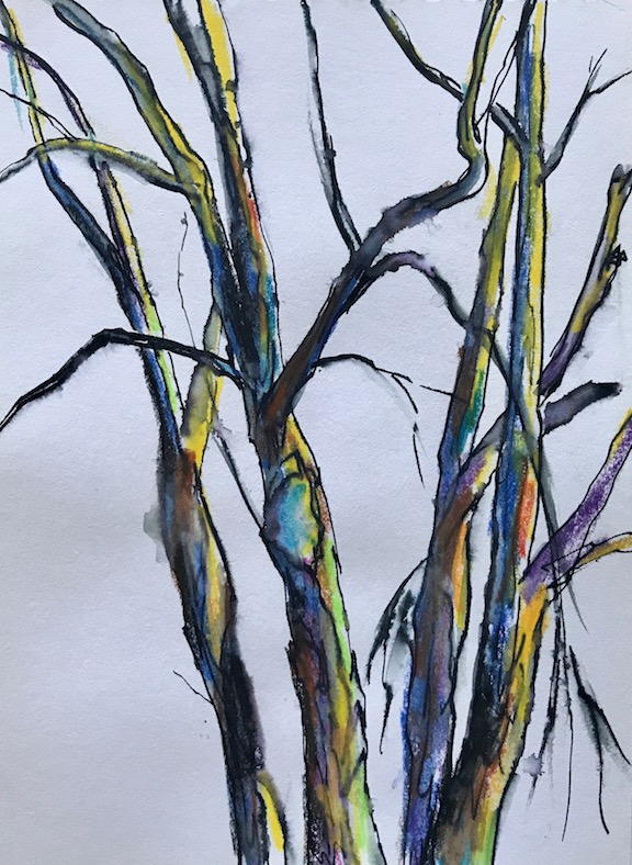
Sometimes when I run out of ideas, I stare at the trees outside my window. Occasionally, I draw or sketch them:
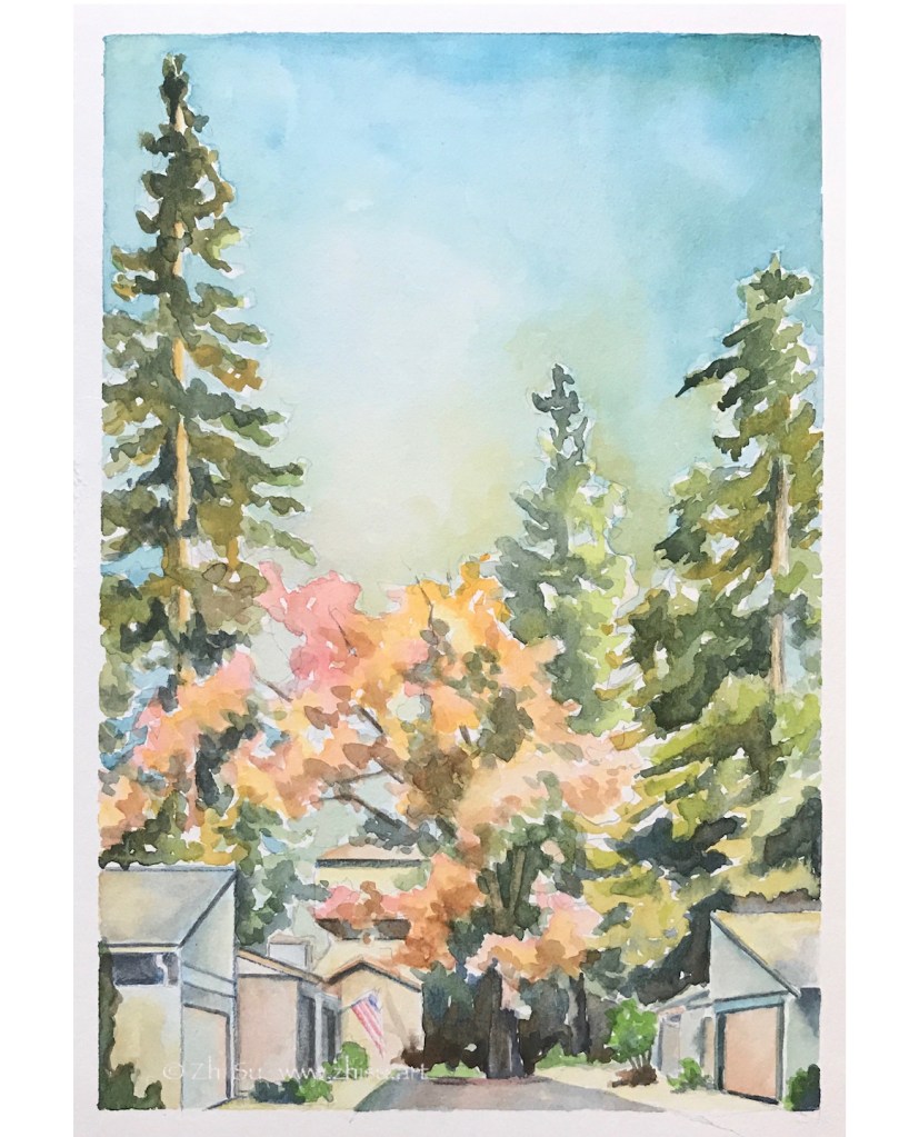
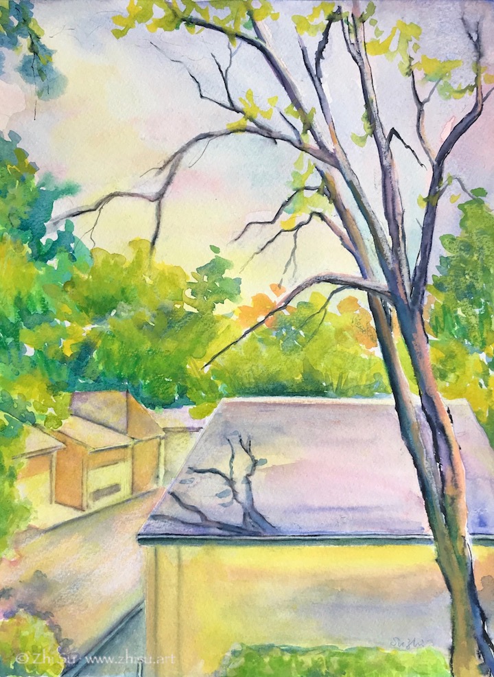
Since I am a bit running out of topic recently, I turned my window scene into a couple of paintings:
Window Scene 1, watercolor on paper, August, 2020Window Scene 2, watercolor on paper, August 2020
There are usually squirrels dancing on the branches and crows meeting on those roofs, and once in a while, I am waken up by wood peckers attacking the trunks. Some day, I will manage to catch them in my “window paintings.” 🙂