Zoltan Szabo (1928-2003) was born in Hungary and later immigrated to Canada, then US. He was a modern master of transparent watercolor, and his technique books are popular among watercolorist. I learned to use big brushes and bold colors from reading his paintings.
The study of “The Last Wink” though, was for a different purpose. It is the harmony of unity of the colors that attracts me. I have a tendency to be too “colorful” with my paintings, and often don’t know how to control it. I like how the colors in this Szabo painting is so rich yet without being noisy.
Zoltan Szabo, The Last Wink, watercolor on paper, 13.75″ x 18″
My copy:
After Zoltan Szabo, watercolor on rice paper, 2019
While Szabo’s original was on cold press watercolor paper, my study was done on pre-matted rice paper. It is intended for Chinese brush painting, and is very delicate and absorbent.
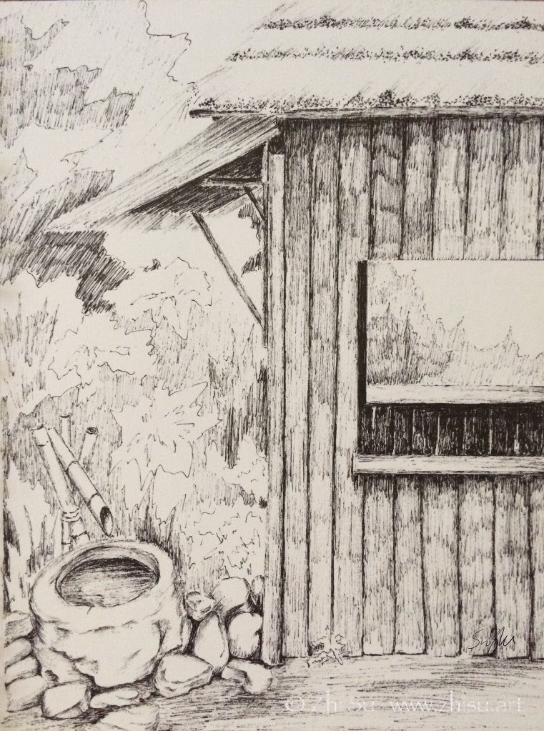
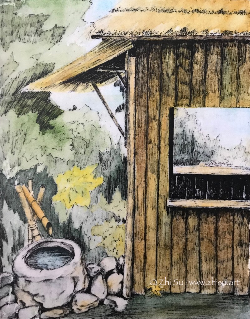
Park in Beijing, micron pen on sketchbookPark in Beijing, mixed media on canvas
I did a sketch with micron pen while traveling in Beijing many years ago. I quite like the result, but also wondered what it would look like with some color. I didn’t want to paint over the drawing, fearing that I might ruin it. So this was the solution I came up with:
I first made a photocopy of the drawing.
Then I transferred it onto a canvas (‘Glue’ the photocopy onto the canvas with acrylic medium and scrubbed off the paper when it’s dry. The image will stay.)
Next I glazed over the image with watercolor. The surface was not comparable to regular watercolor paper, so I only did a few layers of light washes.
When it’s bone dry, I varnished it with acrylic medium (gloss). I didn’t know there were spray-on varnishes back then, so I brushed on the medium, It did disturb the paint a bit, but since it’s very dry and very light layers, it’s not that bad.
Since it’s varnished, I could hang it without glass. And I still have my original sketch! 🙂
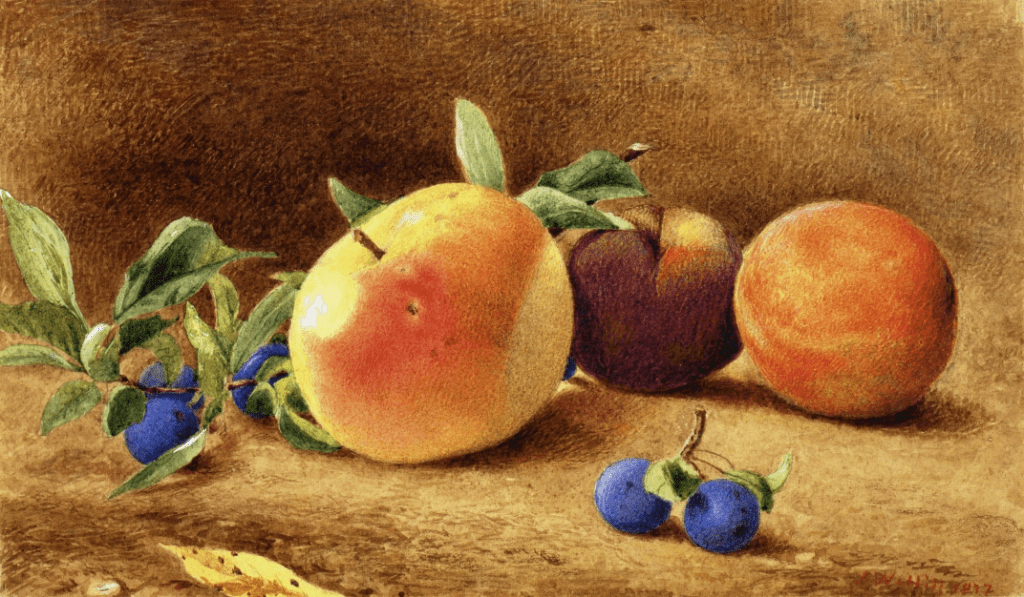
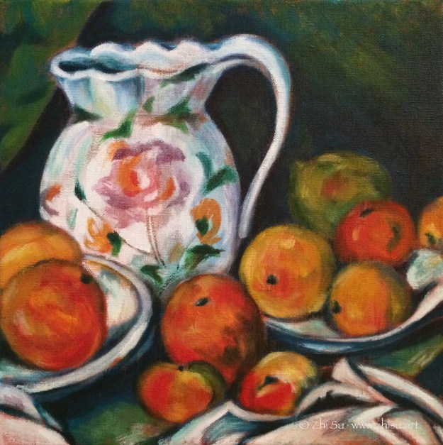
J. W. Hill (1812-1879) was a British born American watercolorist and lithographer. I came across his work in a still life anthology and was taken with soft, serene and tangible feeling he created with watercolor, quite different from the wet-in-wet method I was taught in. Upon close-up examination, it is full of tiny strokes, like an engraving. Some of the strokes in the background created interesting patterns and was applied in a very painterly way. Maybe that’s how you do impasto with watercolor! 😁
In my copy, I didn’t go for the strokes. I was at a moment that my colors often ran wild. I think Hill’s Study of Fruit is a good example of unity and harmony with colors, and that’s what I went for.
I almost missed this: obviously yesterday was J. W. Hill’s birthday. So happy birthday Mr. Hill! 🎂
J.W. Hill, Study of Fruit, 1877. Watercolor on paper, 6.13 x 10.63 in.
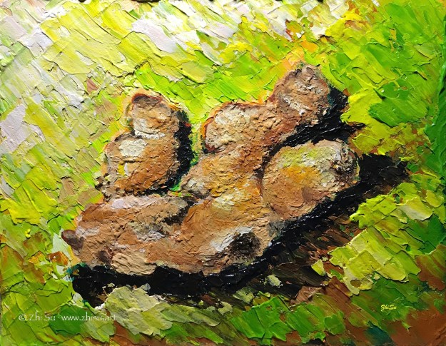
This was an assignment from a painting class (acrylic) a while ago. The purpose was to learn impasto. I chose ginger because I thought the bumpy, textured surface might go well with the technique, and also I usually bought them in bulk from Costco.
It’s a small painting with a single object, and I figured I could get it done in no time. I was so wrong.
There were two things that I couldn’t get used to. First, as someone who started painting first with watercolor, I wasn’t used to putting a lot of paint on canvas. For the purpose of this assignment, we were supposed to achieve a measurable thickness. And acrylic, a water-based medium, dries flat! I ended up working in layers, waited for a long time (longer then usual acrylic time at least) for the paint to dry, and went back to add more and more.
Another thing was the purpose of impasto technique itself. It supposed to be more about expressiveness than rendering, and I had trouble leaving my strokes in and my details out. So I kept going back and forth adding things in and taking them out. I have done so many paintings on this tiny canvas, and what a heavily loaded ginger! 🙂
I posted this landscape in acrylic before, and I recently uncovered a watercolor version of it. So, sorry for repeating myself, but it’s interesting to look at them together:
Path, acrylic on canvas board, 12 x 16, 2015Path, watercolor, 2015
I like the less defined forms and more spontaneous color ranges a wet-on-wet watercolor creates, but I also like the dark values the acrylic painting can bring out. The reference I used for the two is the same, and whatever difference you see from the these paintings are not by design. It seems the mediums just lead me there. How bizarre!
I’ve seen many people doodling and sketching with ballpoint pen before, but I never tried. I like the flow and the fineness of a micron or sharpie better. A ballpoint pen is just something you use for it’s conveniency and economy, right? How far can you push it as an art tool? Well, according to British artist James Mylne, this far:
Look at the range of values a single Bic Cristal could deliver!
No, I am not going to attempt that. I have neither the skill nor the patience. Mr. Mylne’s drawings average 60-100 hours per piece, with the longest 310 hours. While photorealism is probably always time-consuming regardless of the medium, ballpoint pen is extremely tricky because it’s a one way street. You can only go from light to dark, no erasing, no lifting, no painting over.
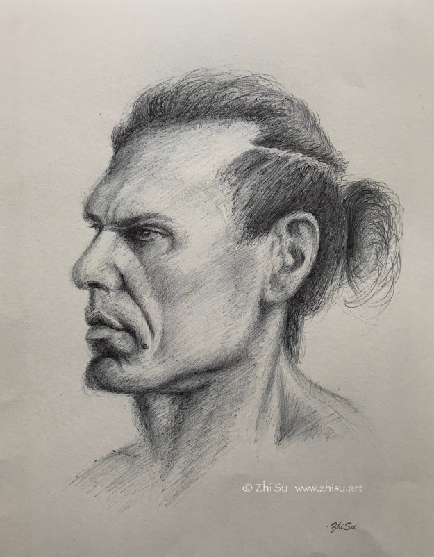
Still intrigued, I decided to at least give sketching with the Bic a try:
Portrait of a man, ballpoint pen, 2019. Model from NMA.
And here’s what I learned:
Compare to micron or sharpie, the touches are closer to those of using a graphite pencil. Especially in shading, with good control, you can go lighter than an ink pen, and build up a wider range of values.
Just like a micron or sharpie, since you can’t erase, it exposes all the weakness in your drawing. You need to be mindful about each mark throughout the working process. Scary, right? But also good learning opportunity. If there’s a unwanted mark, the only remedy is to work it into the drawing somehow. This is challenging, may not be possible sometimes, but lots of fun. A few missteps can lead to something unexpected:
Portrait of Jorgie, ballpoint pen, 2019 Model from Croquis Cafe
Don’t forget to keep a tissue paper handy because you need to constantly remove the buildup at the tip.
By the way, do check out James Mylne’s gallery. It’s not just photorealism, but also a lot of humor.
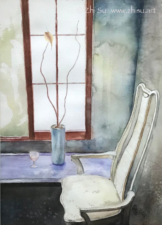
I did some cleaning today and found a few old paintings. None of them was dated and my memory is just a blur. The only thing I could say is they were done around or before 2015. Lesson learned: date your artwork.
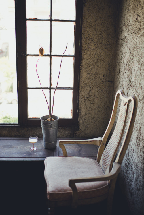
This one is after a photo I found online. Here’s the link, but I don’t know how to find the photographer’s information. (Google image search leads me to furniture stores and all sort of club chairs.) So, whoever took the beautiful photo, thank you. You can see back then I wasn’t able to go beyond the reference.
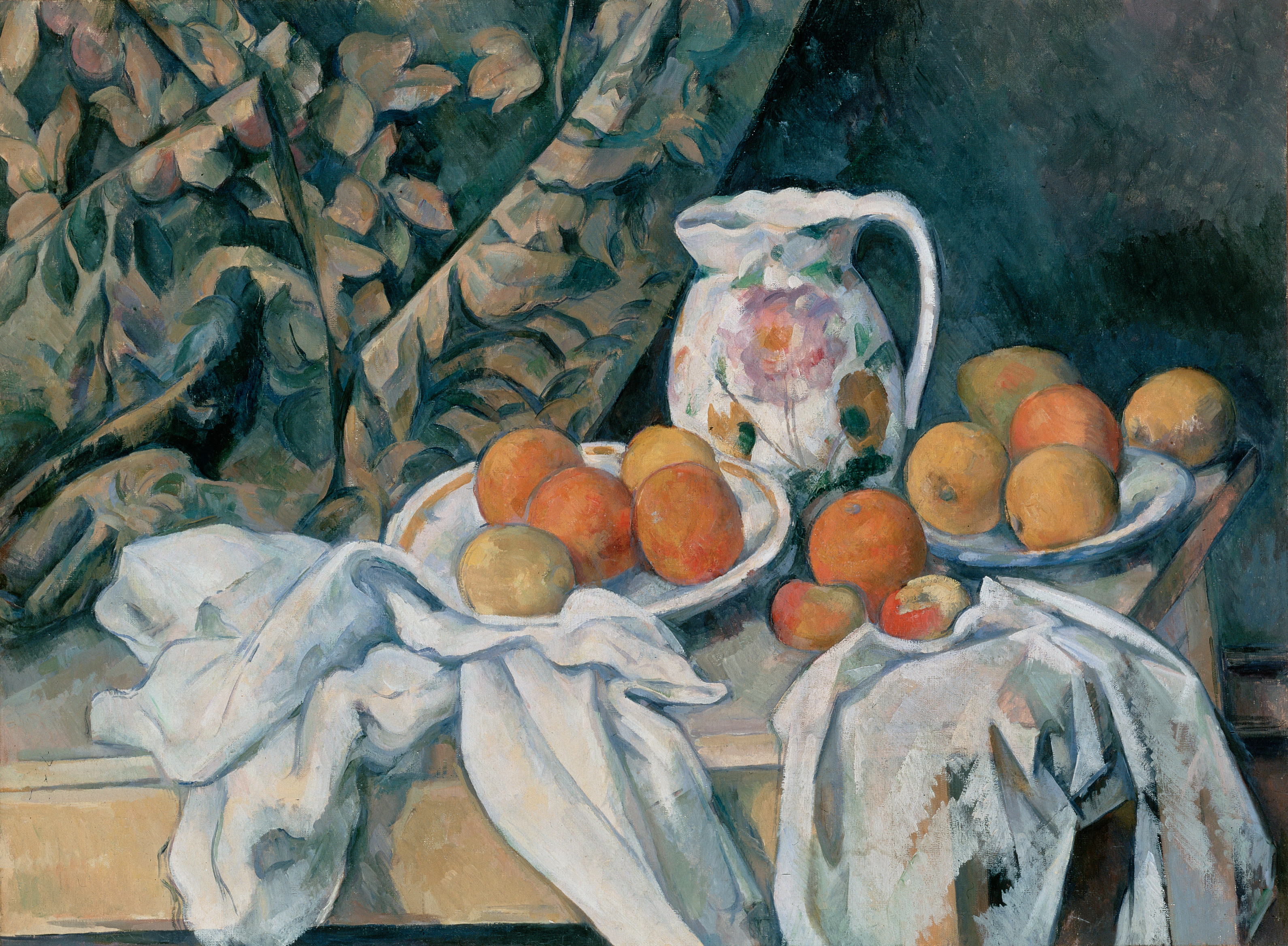
Paul Cézanne (1839–1906) is probably the most influential Post-Impressionist artist, and definitely the most inspiring for me. His colors are layered and strokes deliberate. It takes a lot more work than it seems. In this study I copied only a small section of the original painting.
I only recently came to know there’s such a thing called ink resist, and was pretty impressed by some of the artworks with this method. So I gave it a try. The result is a meh, but I l had fun and learned something.
Still life, ink and gouache on watercolor paper
So these are the steps I followed:
pencil drawing;
painting with gouache but leave some area blank; (some people leave only the pencil marks uncovered to achieve neat outlines)
after the painting is completely dry, covered the whole page with sumi ink;
again, wait till it’s completely dry, wash off the ink (I used the garden hose, no kidding.)
and again, wait till it’s dry, and went back to fix here and there. (This step is optional, but I wasn’t that lucky.)
And here are the things I learned:
Like drawing on black paper, this method is a bit counter-intuitive. The areas left blank in the first painting round will be the darkest after the wash. So planning ahead is important, which I didn’t do. In my painting, the blacks serve more like random texture than an organic part of the value pattern.
The paint should be thick, to “resist” the ink and also because gouache is easy to wash off.
This is a study done when I first experimented with acrylic (or painting with anything). I stared at the original for days couldn’t figure out how to achieve that sense of unity. Eventually I decided to paint the whole canvas with a dark shade of burnt sienna and “drawing” on top of it.


