A most common way to practice complementary colors is simple choose a pair and limited your palette to those two (plus tints, shades, mixtures maybe). Like this:
Skull (horse?), soft pastel on paper, 18×24 in, 2018
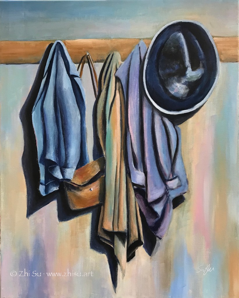
Whichever pair of colors we choose, it is most likely one warm and one cool. In a painting lesson I took years back, we used the complementaries a bit differently. We create a painting in cool colors, and paint the warm complementaries on top. Here’s the result:
Still life, acrylic on canvas board, 16×20 in, 2018
Unfortunately I failed to take a picture of the cool painting underneath, though I did let the cool colors showed through here and there. The colors were not strictly restricted to one pair of complementary colors, but it is within certain range.
I’d say the result is quite different than if I started with these topical colors. There’s a solidity and unity unique to this method.
My painting journey started with watercolor, and on the way, I also picked up acrylic and gouache. In other words, all water medium. Part of the reason I never tried oil is that I have more than enough art materials at home already, and I doubt I could ever use them up. Another part is that, I thought acrylic is the modern replacement of oil, and it could do everything oil can do.
Over the years, I met more than a few artists attesting that oil and acrylic are not the same at all. I started to wonder if I should give it try. A few weeks ago I attended a free lecture at University Art by an artist representing Williamsburg Oils (now part of Golden), and received some free colors. Well, I shouldn’t waste them, should I?
I dug out my very first acrylic landscape, and did a simplified copy of it in oil. Here they are:
Seascape, acrylic on canvas board, 12×16 in, 2015 (?)Seascape, oil on paper, 9x12in, Feb. 2020
A few notes:
The acrylic painting was varnished, hence the sheen.
The oil painting was done on acrylic/oil paper. I don’t know if that makes a difference for the outcome.
I only have a few oil colors to work with.
I LOVE how oil colors can be pushed around freely and mixed smoothly, even the next day! I do feel I have more control of precision with acrylic, but that could simply because I have no skill with oil at this stage. For now, I would love to try more landscapes or portraits with oil, but for more modern and abstract paintings, I will stay with acrylic. Also, if you work with collage and complicated textures and patterns, acrylic is probably much easier.
This was a class assignment – choose an artist to study, and then paint in his/her style. I was very into Giorgio Morandi at the time (still am now), and he became the subject of my study. To my delight, during my research, I found out that Morandi was very much influenced by another favorite artist of mine, Paul Cézanne; and he in turn, heavily influenced a contemporary artist I admire, Wayne Thiebaud (b. 1920). Have I found my “art parents?” (A term I learned from Draftsmen Podcast, S1E5.)
So I set up a still life scene and gave it a try:
Still life 1, acrylic on canvas, 16 x 20 in, Spring 2018
I know, there’s nothing Morandi about it (see my previous post about his style). The objects are asserting and the colors are singing. I don’t dislike it as a painting, but it’s definitely not the reservedness and tranquility I was after. So I gave it another try:
Still life 2, acrylic on canvas, 16 x 20 in, Spring 2018
Well, this is still not Morandi. It’s still me, and it’s very hard not to be me. I understand I will never be Morandi, and that’s not the point of studying a master. If every painting is a self expression, every study of other’s style is a self reflection. I have a lot of passions that I don’t know how to control, and observations I don’t know how to choose and let go.
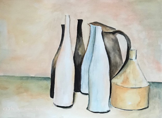
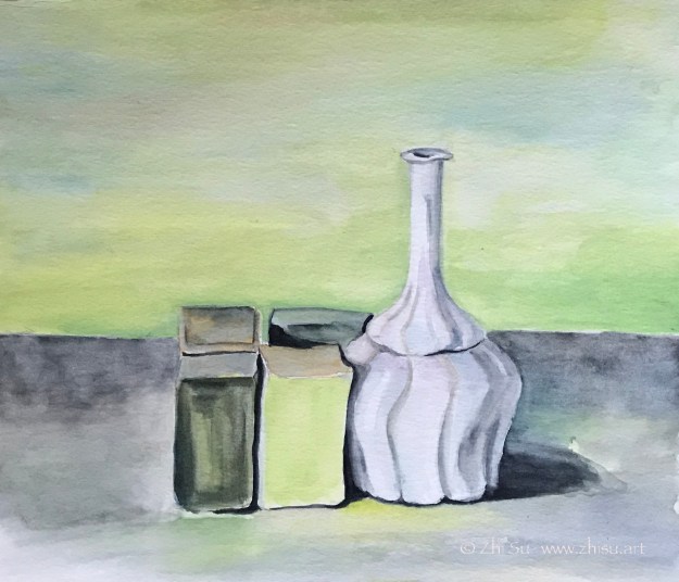
Some artists created wonders with limited subject matters. Like Cezanne, who famously claimed “with an apple I will astonish Paris.” He did, and the world. I don’t know if Italian artist Giorgio Morandi (1890-1964) ever made any statement about the bottles and jars, but he did say, “To achieve understanding it is necessary not to see many things, but to look hard at what you do see.” He did look at those bottles and jars of his very hard, for almost a life time.
Most of Morandi’s still life featuring nondescript household objects on tabletop against an unremarkable background. They look like a humble crowd pushed onto a stage, but nothing in the composition is random. Morandi spent days, even weeks arranging these objects. The assuming is carefully achieved. Just like his use of color. The paintings often have a monochromatic look, even though he employed a rich range of earthy colors.
There’s a sense of calm and tranquil in Morandi’s paintings that I find very attractive. Maybe because my own paintings are the opposite. Even when I limited my palette, the result is often loud or even noisy. My first copying attempts were done in watercolor. In retrospect, gouache could be a better choice. Here they are:
The originals:
Morandi, Vase and Still Life, 36 x 40 cm, oil on canvas, 1951Morandi, Natura morta, 40 x 46 cm, oil on canvas, 1954
My copies:
After Morandi, watercolor on paper, 9×12 in, 2018After Morandi, watercolor on paper, 10 x 12, 2018
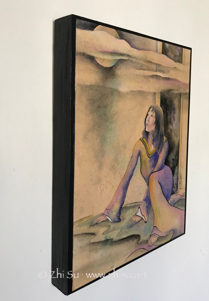
Full Moon, watercolor on tinted paper, 11 x 14 in, November 2019
There’s nothing new about the painting itself. I was fascinated by the Japanese ukiyo-e art, and tried to create something in that style. The new things for me are the preparing of the paper and the final display.
To prepare the paper, I boiled 10 bags of Liption black tea in a pot, pour the water in a tray, and after it cooled, soaked the watercolor paper in it for a couple of hours. The result is a nicely tinted paper.
For display, I always find matting and framing of watercolor a chore, and that’s part of force driving me to acrylic painting in the beginning. I recently came across two videos on how to display watercolor painting without glass, or even frame. I am sure there are many other videos on the topic, but these are the ones I referenced:
Simply put it, if you want to frame the artwork without glass:
Glue the artwork onto gator board with acrylic gel medium, and let it dry overnight
Varnish it with 2 coats of gloss and 2 coats of matte varnishes, in that order
Frame it
If you want to display the artwork directly:
Painted the edges of a cradled wood panel to desired color (this step is optional)
Glue the artwork to the panel with acrylic gel medium, and let it dry overnight
Varnish it (same as in previous method)
Mr. Burridge didn’t mention varnishing in his video, but I did it anyways. The result is a waterproof surface. There are artists online saying varnishing changes the color of their paintings. If you only use gloss varnish, the color will look more vibrant. If only matte varnish, it probably with dull or blur. I used both, and the result is fine. However, it always wise to test it on some old paintings first.
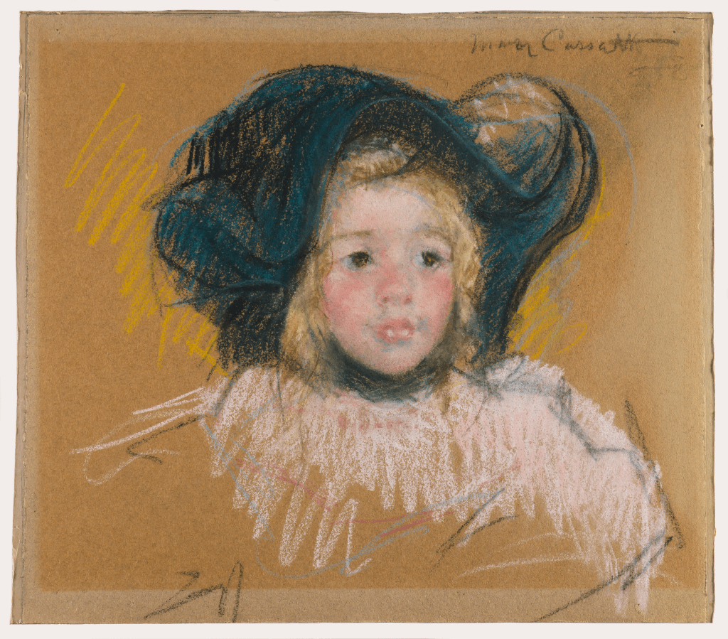
A couple of years ago, I went to Degas, Impressionism, and the Paris Millinery Trade exhibition at the Legion of Honor Museum in San Francisco. Among the 40 Impressionist paintings and drawings about French fashion, American artist Mary Cassatt (1844 – 1926)’s pastel drawing made quite an impression on me. The gentle and soft gradation on the face of the little kid is surrounded by quick and dynamic lines, showcasing of the caring nature of a woman and the expressiveness of an artist.
The original:
Mary Cassatt, Head of Simone in a Green Bonnet with Wavy Brim (No. 2), c. 1904, pastel on paper, 16 x 17.875 in.
Zoltan Szabo (1928-2003) was born in Hungary and later immigrated to Canada, then US. He was a modern master of transparent watercolor, and his technique books are popular among watercolorist. I learned to use big brushes and bold colors from reading his paintings.
The study of “The Last Wink” though, was for a different purpose. It is the harmony of unity of the colors that attracts me. I have a tendency to be too “colorful” with my paintings, and often don’t know how to control it. I like how the colors in this Szabo painting is so rich yet without being noisy.
Zoltan Szabo, The Last Wink, watercolor on paper, 13.75″ x 18″
My copy:
After Zoltan Szabo, watercolor on rice paper, 2019
While Szabo’s original was on cold press watercolor paper, my study was done on pre-matted rice paper. It is intended for Chinese brush painting, and is very delicate and absorbent.
Park in Beijing, micron pen on sketchbookPark in Beijing, mixed media on canvas
I did a sketch with micron pen while traveling in Beijing many years ago. I quite like the result, but also wondered what it would look like with some color. I didn’t want to paint over the drawing, fearing that I might ruin it. So this was the solution I came up with:
I first made a photocopy of the drawing.
Then I transferred it onto a canvas (‘Glue’ the photocopy onto the canvas with acrylic medium and scrubbed off the paper when it’s dry. The image will stay.)
Next I glazed over the image with watercolor. The surface was not comparable to regular watercolor paper, so I only did a few layers of light washes.
When it’s bone dry, I varnished it with acrylic medium (gloss). I didn’t know there were spray-on varnishes back then, so I brushed on the medium, It did disturb the paint a bit, but since it’s very dry and very light layers, it’s not that bad.
Since it’s varnished, I could hang it without glass. And I still have my original sketch! 🙂
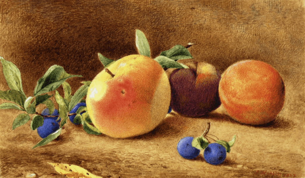
J. W. Hill (1812-1879) was a British born American watercolorist and lithographer. I came across his work in a still life anthology and was taken with soft, serene and tangible feeling he created with watercolor, quite different from the wet-in-wet method I was taught in. Upon close-up examination, it is full of tiny strokes, like an engraving. Some of the strokes in the background created interesting patterns and was applied in a very painterly way. Maybe that’s how you do impasto with watercolor! 😁
In my copy, I didn’t go for the strokes. I was at a moment that my colors often ran wild. I think Hill’s Study of Fruit is a good example of unity and harmony with colors, and that’s what I went for.
I almost missed this: obviously yesterday was J. W. Hill’s birthday. So happy birthday Mr. Hill! 🎂
J.W. Hill, Study of Fruit, 1877. Watercolor on paper, 6.13 x 10.63 in.