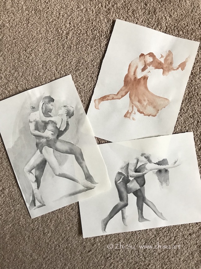
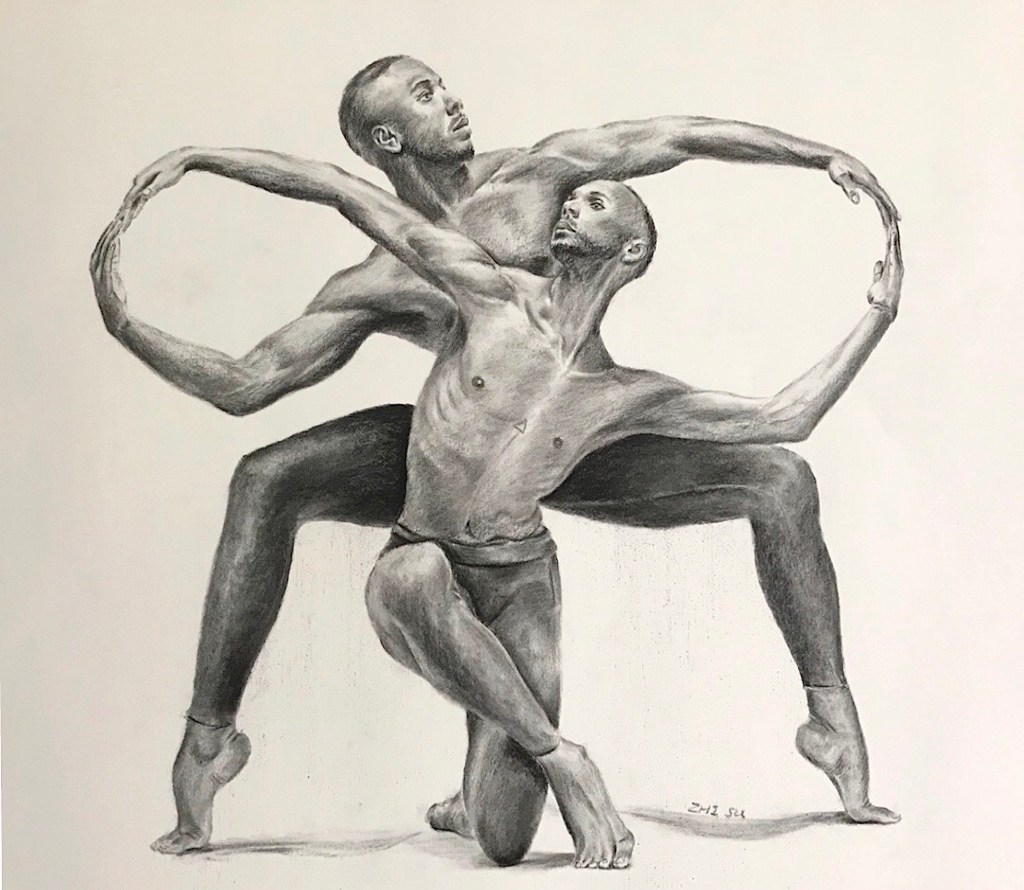
Found a beautiful book, The Art of Movement by Ken Brewer and Deborah Ory. It’s a collection of dance photography. It’s a great book to study figures and motions. I did some sketches and drawings from it:
Dancers, watercolor on paper, May 2020Couple Dancers, watercolor on paper, May 2020Infinity, charcoal on paper, 18 x 24 in, May 2020
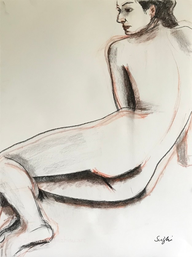
The last one is a strange pose. It has an enclosed and squarish quality and a lot of symmetry. The lighting is mainly top-down, making it more grounded and static. It’s not a composition that I would normally choose to work on. On the other hand, there’s a nice contrast between the infinity loop formed by the arm, and zig-zag pattern formed by heads, torso and the legs in the middle. There’s tension and connection between the two dancers at the same time and that’s what I was aiming for when starting the piece. However, as I worked on, and as always, I was distracted by the details, and lost my focus. I think the zigzagging is there, but the details of the hands cut in the flow of the loop. I also think the value contrast is not enough and shapeless. I think this is mainly because I am still copying what I see instead of using it as a reference to create. I hope when I have a better grasp of human figure, I could look beyond the photo and draw my interpretation.
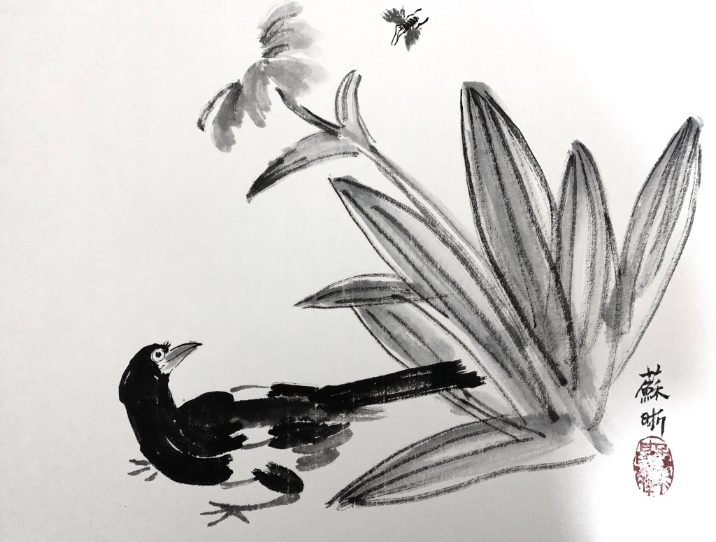
Japanese woodblock printing (ukiyo-e) has a profound influence in western art since 19th century. “Japonism” has a visible presence in the art of many big names, such as Van Gogh, Degas, Gauguin etc.
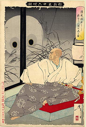
Tsukioka Yoshitoshi 月岡芳年 (1839 -1892; also named as Taiso Yoshitoshi 大蘇芳年) was generally regarded as the last great master of the this art tradition. He was a very bold, imaginative and prolific artist. Some of the images he created are regarded as gruesome and disturbing. His most famous series are One Hundred Aspects of the Moon (1885–1892), and New Forms of Thirty-Six Ghosts (1889–1892).
In “Kiyomori sees hundreds of skulls at Fukuhara,” from the series New Forms of Thirty-Six Ghosts, Yoshitoshi portrayed the famous Japanese general (or soldier-dictator) Taira Kiyomori (平清盛, 1118 – 1181), who created the the first samurai-dominated government. The main attraction for me is the decisive and effective line work, and the presence of the character:
The original:
My copy:
After Yoshitoshi, watercolor and ink on paper, 11 x 15 in, 2020
A few notes:
This is not an exact copy, partially because the paper I used was a failed texture experiment. I have to work with un-intended marks here and there.
Copying line work is a tricky business: you want to be careful because the ink is permanent; but if you are too careful you’ll lose the force and the gesture of the line.
Sometimes having random textures or marks on paper is not necessarily a bad thing. You are forced to be creative since you have to work around or work against it.
My general has funny little hands.
Here’s my attempt of the ukiyo-e style:
Where to, watercolor and ink on paper, 11 x 15 in, 2019
By the way, the art of ukiyo-e fell out of fashion in Japan in the late 19th century but saw a come back since the 70s in Asia. Some young artists incorporated the line works and the fanciful contents into Chinese fine brush painting or watercolor painting.
I changed the title of the previous post for better record keeping. I am still staying home, still doing art.
This week I tried triads – 3 colors evenly spaced around the color wheel. A word on color wheel: I use a commercial one from The Color Wheel Company. Many artist make their own, especially if you work in watercolor, because different brands of colors do differ slightly. It makes sense to lay out your frequently used colors in a circle, add shade and tint, or even make a value chart for each of it. You can also make a list of the complementary, analogous and triadic color schemes. I think this kind of work may help you to understand your color better, and I always feel like I should do it, but … What can I say? I am lazy and unorganized.
Back to triads. They are somewhere between analogous and complementaries. Much more vibrant than the former, and less contrasting than the latter. More importantly, the color spectrum yielded is much richer – if you mix them properly, they can give you almost everything.
That caused a problem for me. As you can see from my first try, I used red, blue and yellow, and I mixed them, got everything, and confused myself. What’s the difference between using a triad and using everything then?
Portrait of a Young Woman, watercolor on paper, 7.5 x 10 in, April 2020
So I tried to separate the colors in later attempts:
Portrait of a Young Woman, watercolor on paper, 7.5 x 10 in, April, 2020Portrait of a Young Man, watercolor on paper, 7.5 x 10 in, April, 2020
Of course later after a few minutes of googling, I found out that when using a triad in a design, you usually choose a dominant color and that’s how to differentiate it from using everything.
So far I’ve tried some of the most commonly used color schemes. These are things I learned from doing these studies:
Limiting palette helps me to explore the potential of each color more extensively.
It also forces me to pay more attention to value.
Colors are very distracting, so it’s good to have a strategic approach. Do I want a harmonious piece or a contrasting one? Do I want the solemnness or the richness? Etc.
Restrictions spur creativity.
There are more color combos one could explore: tetrad – four colors consisted of two sets of complementary; split complementary – choose one color, and add the two on each side of the complementary (a narrower triad) etc. Maybe I’ll come back to these in future. Maybe.
In order to push myself to work more, I participated a “100 Day Art Challenge” by New Masters Academy, of which I became a member last year upon a Black Friday sale. I committed myself to figure or portrait drawings or paintings for 100 days. We’ll see how it turns out.
Since it’s not a small commitment (for me at least), I think it would be a good idea to shoot a couple of more birds in the meantime, such as incorporating some color studies into the challenge.
This week I did a couple of small paintings using analogous colors. Analogous colors are a group of 3 to 5 colors next to each other on a color wheel. From a design point of view, complimentary colors are for contrast, and analogous ones are for harmony.
I tried to limit my choices to 3. With tint and shade of each color and various intensity, there should be enough to work with. In theory.
For the first painting, I planned to use red-orange, orange, and yellow-orange. In practice, the darkest I could get is a deep shade of red-orange. As it seemed not dark enough, I kept adding black to it, and in some places, I just used black directly. The black also contributed to the greenish color in the background. Meanwhile, since I mixed my yellow-orange with yellow and orange, some of that yellow also got in. Looking back, I blamed my disastrous control of color on a lack of design. The reference I chose has strong contrast, and darker colored clothing. If I want to use colors in a limited way, I need to go beyond a literal reading of the reference, and have a better strategy for value:
Portrait of a Young Woman, watercolor on paper, 9 x 12in, April 2020
For the second painting, I chose yellow-green, green, and blue-green. I think I still got the value wrong in some places, but at least I stayed within my color choices:
Female Figure, watercolor on paper, 9 x 12 in, April 2020
The last one I used blue, blue-violet, and violet. I started this painting with Tombow water-soluble markers. Tombow has a hard and a brush tip, allowing more diverse lines. However, they are not as water-soluble as Crayola. There are lines I couldn’t disappear with water, and a big part of the painting process was to resolve the problems caused by those lines.
Portrait of a Woman, watercolor on paper, 9 x 12 in, April 2020
In the end, I am very glad I did this experiment. Even with the painting I cheated, I can still see how analogous colors help bringing things together. It’s not that each painting has to follow a color formula, but these are tools to help us to achieve harmony. Because of that unifying power, using analogous colors is also a great way to create a mood in paintings.
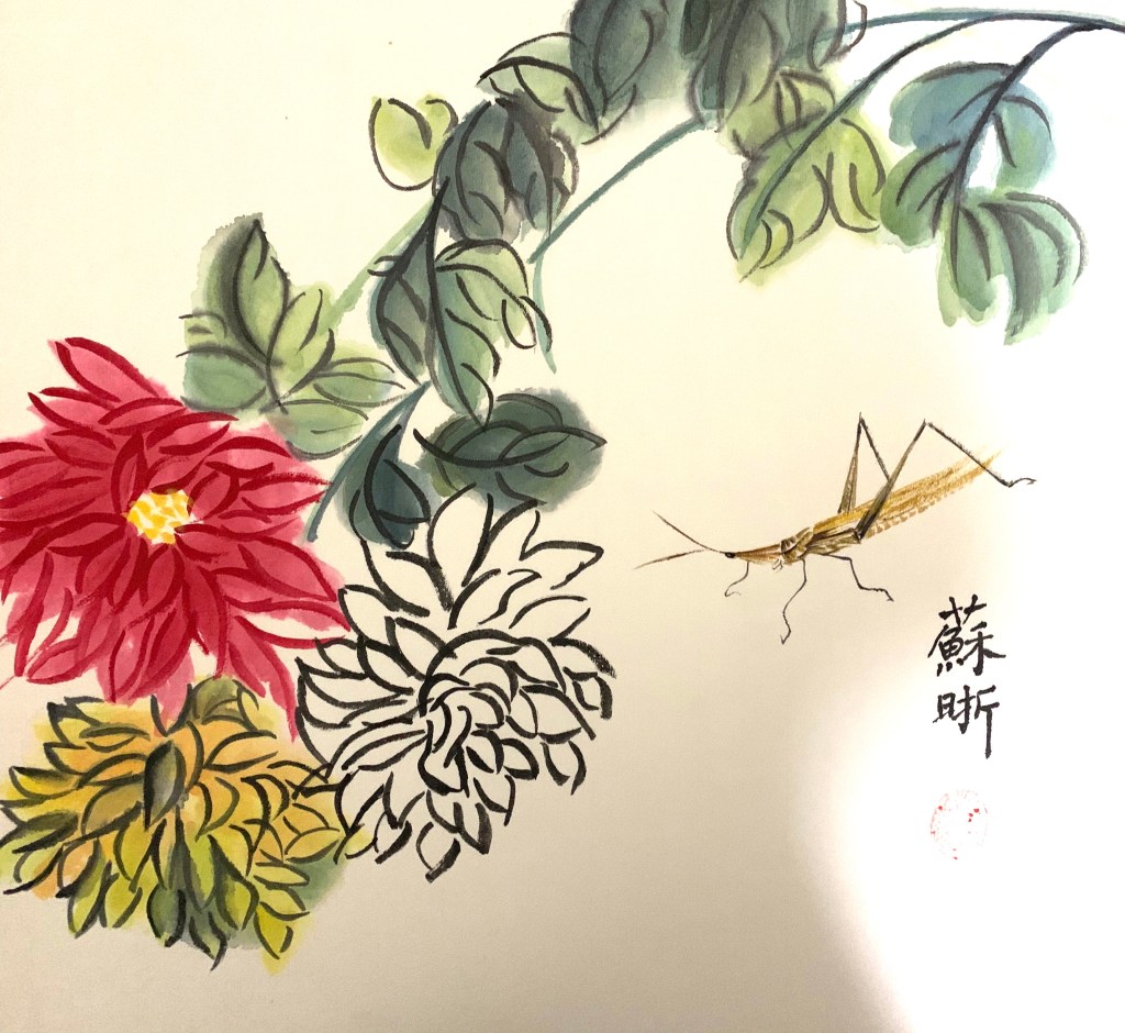
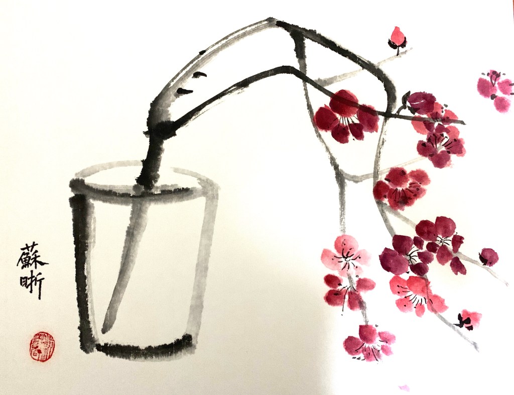
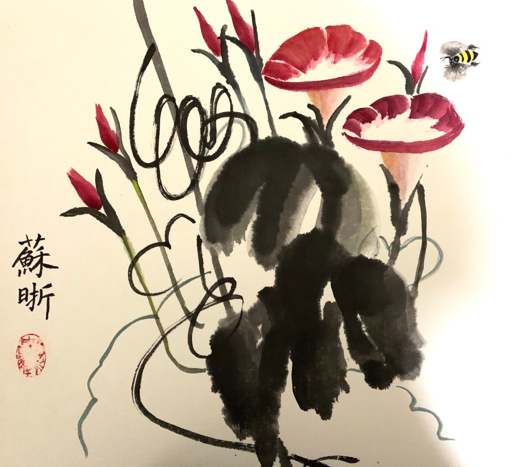
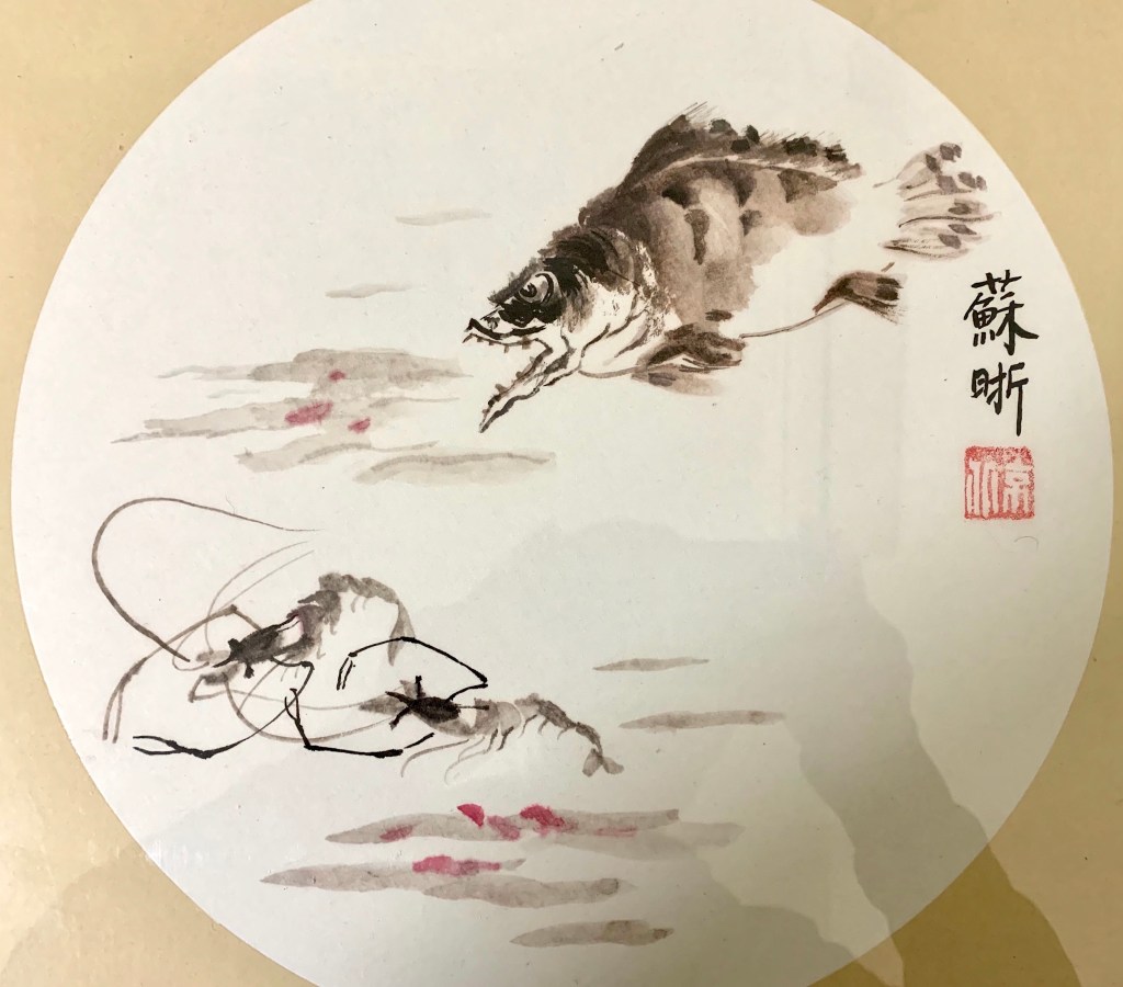
Based on my very limited survey, this is how people around me spend their time nowadays: cooking; shopping online for groceries; cleaning and reorganizing their homes; zoom meetings. I have my fair share of cooking and shopping everyday, and decided to do some house keeping for a change. And these are the thing I dug out:
Sorry for the weird shadows in the pictures. Obviously the person who took the photos for me also wanted to sign the paintings with his shadows. To some extend, this is a Chinese tradition among art collectors. In some old Chinese pieces, if you see many seals filling in the empty spaces, many of them are not belong to the artist, but the collectors (a way to say “this is mine!”).
Most of the paintings above are done by copying old masters. This is the way of learning traditional Chinese painting through time. In some of these pieces, I combined elements from different paintings and I remember the teacher was quite surprised by that “Oh, you started creating already!” Composing your own piece usually follows years after years of copying, and it’s not a common thing for beginners. Since Chinese paintings are usually signed and dated with Chinese calligraphy, that’s another thing you are supposed to practice for years by copying masters.
Staying home is a good time to copy and study old masters. This is probably the most efficient way of improving skills, but if you only do that for longer period of time, the side effect might be daunting your creativity. Strike a balance.
I know the title “Stay Home Doing Art” is a bit misleading this time. It is actually stay home digging out art. Hope next time I could post “doing art” for real.
I’ve been taking a life drawing class at a community college this year. My professor is great at teaching and extremely knowledgeable about anatomy. This is her last year at the school and she planned a happy ending to her teaching career and a smooth transition back to a full time artist. Now she has to move her class online through Zoom, and for someone who’s not particularly tech savvy, this is not easy. It’s been a couple of weeks now, but our class is still not on track. Meanwhile, she has found some really good materials for us to practice on our own. Here’s a list of stuffs she recommended and/or I’ve been using:
Proko – by Stan Prokopenko. It contains some of the best instruction videos on figure drawing. Enough free stuffs, but if you pay, more structured lessons and practice materials. I personally have been using this site for a while, and am a big fan of their Draftsmen Podcast.
Love Life Drawing – Great advice for beginners or artist seeking improvement.
New Masters Academy – They have a subscription plan that allows access to tons of good art classes or master classes. The free stuffs including many timed life drawing videos featuring photos of clothed or nude models.
Croquis Cafe – Videos and photos of models for life drawing. This is probably the closest you can get online to a real life drawing experience. Great models and so many to choose from. My only problem with it is that after they moved to Vimeo, the streaming is less smooth.
This is not just a time for staying in, but also coping, adapting and discovering!
As I mentioned before, the paintings of Giorgio Morandi (1890-1964) often have a monochromatic look, even though he used a lot of colors. The result is a very restful and understated effect – something I always find difficult to achieve. Usually the more time I spent on a piece, the more colorful it becomes, as if keeping quiet on canvas or paper is against my nature. The same goes with details and edges. The more time spent, the more definition, and the looseness and gestures are lost.
So I tried a couple with limited time and clear goals. 1)No more than 2 hours per piece; 2) limited palette to create near monochromatic effect; 3) less definition; 4) lost edges; 5) be quiet.
Still life, acrylic on canvas, 9 x 12 in, 2019Still life, acrylic on canvas board, 16 x 20 in, 2019
I think goal setting with time restriction is an effective way of practicing. Right? :))
Of the three components of color, hue, value and saturation, I personally find value the most difficult. Colors are attractive and distracting, and it could be difficult to discern values accurately from all the colors in front of us. Monochromatic painting is a great way to train your eyes this way.
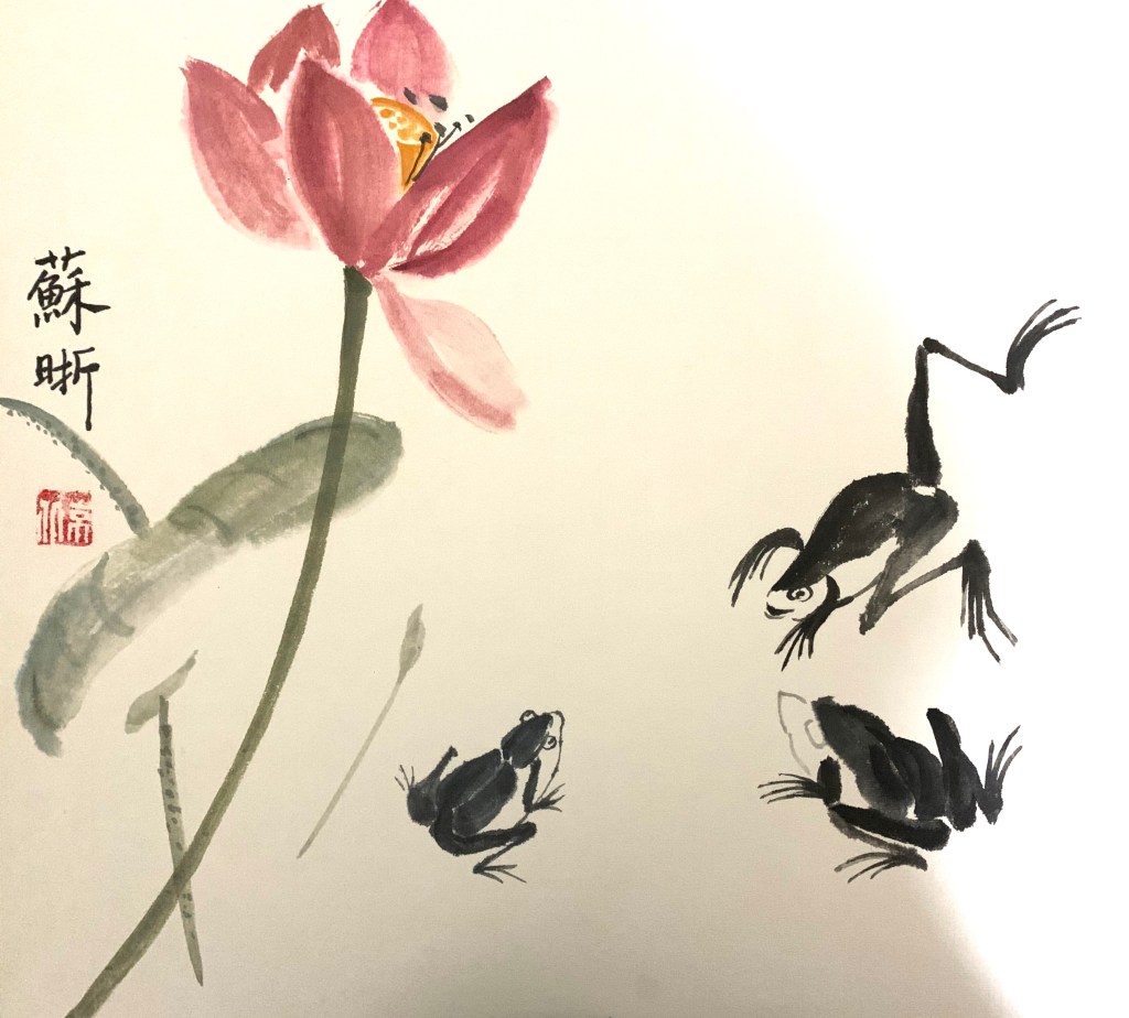
In traditional Chinese brush paintings, many of which are monochromatic, it’s the value changes through the control of water that create the art. I took a few lessons of Chinese brush painting one summer, and lessons were mainly copying old masters. This is one of the paintings I copied:
After Qi Baishi, ink on Xuan paper, summer 2018
Monochromatic is a good strategy when time is limited. In life painting, it saves the trouble of finding the right skin color and allows me to focus on value and shape.
Woman, ink on watercolor paper, 9 x 12 in, 2018
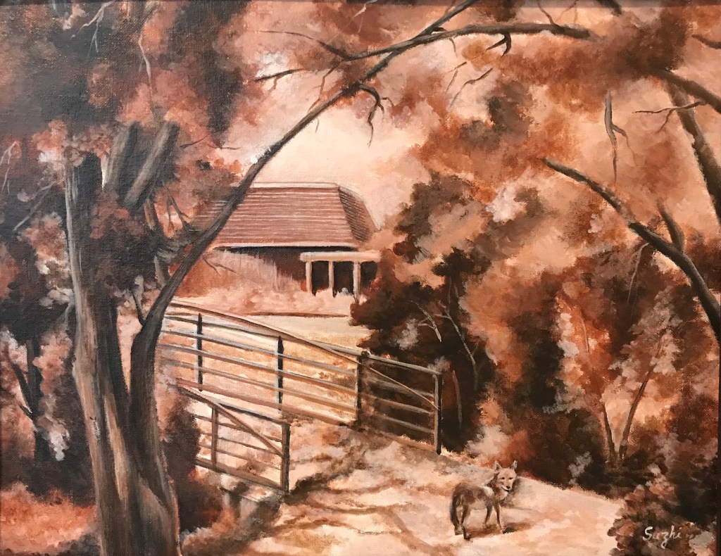
In landscape scene with overwhelming branches and leaves, monochromatic approach simplifies the view. This plein air was done in burnt sienna. I included some of the visitors I had during the painting – out of proportion, I know, but a lot of fun.
Fox and Caterpillar at West Valley, acrylic on canvas board, 16 x 20 in, 2018
More than often, monochromatic painting is used as underpainting. It serves as a value map, but also allow some color strategies. (I found this post by Mitchel Albala very helpful.)
Another approach is to do a monochromatic underpainting, and glaze over it with transparent colors, often times many layers. For acrylic, that means adding quite some medium to the color. My selfie is done this way – dozens of layers. I have to admit, I doubt I will ever use this method again. Too tedious.
Selfie, acrylic on canvas board, 16×20 in , 2018
I think in theory it could be done with watercolor too, for watercolor is transparent in nature. Even the opaque ones, with enough water, become transparent to some extent. From what I heard, to glaze in watercolor, the key is to wait for the underpainting or the previous layer really really dry, bone dry. Maybe someday I will try it.
A most common way to practice complementary colors is simple choose a pair and limited your palette to those two (plus tints, shades, mixtures maybe). Like this:
Skull (horse?), soft pastel on paper, 18×24 in, 2018
Whichever pair of colors we choose, it is most likely one warm and one cool. In a painting lesson I took years back, we used the complementaries a bit differently. We create a painting in cool colors, and paint the warm complementaries on top. Here’s the result:
Still life, acrylic on canvas board, 16×20 in, 2018
Unfortunately I failed to take a picture of the cool painting underneath, though I did let the cool colors showed through here and there. The colors were not strictly restricted to one pair of complementary colors, but it is within certain range.
I’d say the result is quite different than if I started with these topical colors. There’s a solidity and unity unique to this method.
My painting journey started with watercolor, and on the way, I also picked up acrylic and gouache. In other words, all water medium. Part of the reason I never tried oil is that I have more than enough art materials at home already, and I doubt I could ever use them up. Another part is that, I thought acrylic is the modern replacement of oil, and it could do everything oil can do.
Over the years, I met more than a few artists attesting that oil and acrylic are not the same at all. I started to wonder if I should give it try. A few weeks ago I attended a free lecture at University Art by an artist representing Williamsburg Oils (now part of Golden), and received some free colors. Well, I shouldn’t waste them, should I?
I dug out my very first acrylic landscape, and did a simplified copy of it in oil. Here they are:
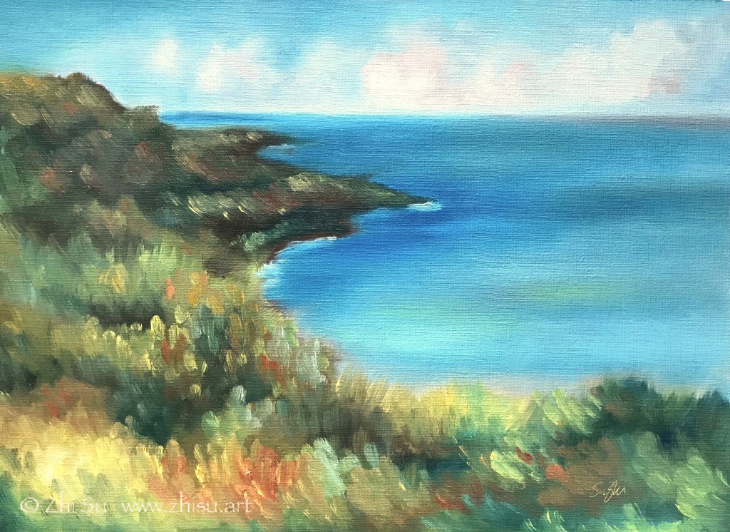
Seascape, acrylic on canvas board, 12×16 in, 2015 (?)Seascape, oil on paper, 9x12in, Feb. 2020
A few notes:
The acrylic painting was varnished, hence the sheen.
The oil painting was done on acrylic/oil paper. I don’t know if that makes a difference for the outcome.
I only have a few oil colors to work with.
I LOVE how oil colors can be pushed around freely and mixed smoothly, even the next day! I do feel I have more control of precision with acrylic, but that could simply because I have no skill with oil at this stage. For now, I would love to try more landscapes or portraits with oil, but for more modern and abstract paintings, I will stay with acrylic. Also, if you work with collage and complicated textures and patterns, acrylic is probably much easier.